


 本文介绍了如何在QtQuick的QML中控制组件的大小(size)和布局间的间距(spacing),包括固定大小与自适应策略,以及使用Layout.fillWidth和preferredWidth属性的应用技巧。
目录
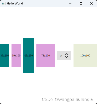
效果展示
保持组件界面原始大小
组件size固定,spacing自适应

组件size自适应,spacing固定

使用技巧总结
优先级
Layout.fillWidth > preferredWidth > width > implicitWidth
需要固定size的自定义组件(button)
内部申明 width/height
外部不要设置Layout.fillWidth:true
需要自适应size的组件
界面设置 anchor.fill: parent
组件设置Layout.fillWidth:true
界面结构
主界面 main.qml
最外围界面
import QtQuick 2.12
import QtQuick.Window 2.15
import QtQuick.Controls 2.15
import QtQuick.Layouts 1.15
import "./TestWidth"

Window {
    width: 1000
    height: 800
    visible: true
    title: qsTr("Hello World")

    LayoutSpacing{
        anchors.centerIn: parent
    }
}
功能界面 LayoutSpacing.qml
根节点是RowLayout ,子节点有
- RowLayout : 2 Rectangle
- Rectangle
- ComboBox
- BasicComponent :自定义组件
import QtQuick 2.15
import QtQuick.Layouts 1.15
import QtQuick.Controls 2.15

RowLayout {
    id: root
    spacing: 10
    RowLayout {
        Layout.fillWidth: true
        spacing: 10
        Rectangle {
            color: 'teal'
            Layout.fillWidth: true
            Layout.preferredWidth: 100
            Layout.preferredHeight: 100
            Text {
                anchors.centerIn: parent
                text: parent.width + 'x' + parent.height
            }
        }

        Rectangle {
            color: 'plum'
            Layout.fillWidth: true
            Layout.preferredWidth: 100
            Layout.preferredHeight: 100
            Text {
                anchors.centerIn: parent
                text: parent.width + 'x' + parent.height
            }
        }
    }

    Rectangle {
        color: 'teal'
        Layout.fillWidth: true // 优先级 > preferredWidth > width
        Layout.preferredWidth: 100
        Layout.preferredHeight: 150
        Text {
            anchors.centerIn: parent
            text: parent.width + 'x' + parent.height
        }
    }
    Rectangle {
        color: 'plum'
        Layout.fillWidth: true
        Layout.preferredWidth: 200
        Layout.preferredHeight: 100
        Text {
            anchors.centerIn: parent
            text: parent.width + 'x' + parent.height
        }
    }

    ComboBox{
        id: basicCombobox
        // 在Layou里面时,width不生效, must use "Layout."
        Layout.preferredWidth: 60
        currentIndex: 0
        model: ["config", " spectrometer"]
        popup.closePolicy: Popup.CloseOnEscape | Popup.CloseOnPressOutside
                           | Popup.CloseOnReleaseOutside
        onCurrentIndexChanged: {
            // 初始化时不会触发
            console.log("onCurrentIndexChanged", currentIndex)
            initCycle()
        }
        Component.onCompleted: {
            console.log("basicCombobox.width", basicCombobox.width)
        }
    }

    BasicComponent {
        // 如果内部,外部都没有指定size, 默认会为0
        Text {
            anchors.centerIn: parent
            text: parent.width + 'x' + parent.height
        }
    }
}
自定义组件 BasicComponent .qml
import QtQuick 2.15
import QtQuick.Layouts 1.15

Rectangle {
    id: root
    property color recColor: "#e9eed9"
//    implicitWidth: 30
//    implicitHeight: 50

    color: recColor
    width: 100
    height: 100
}
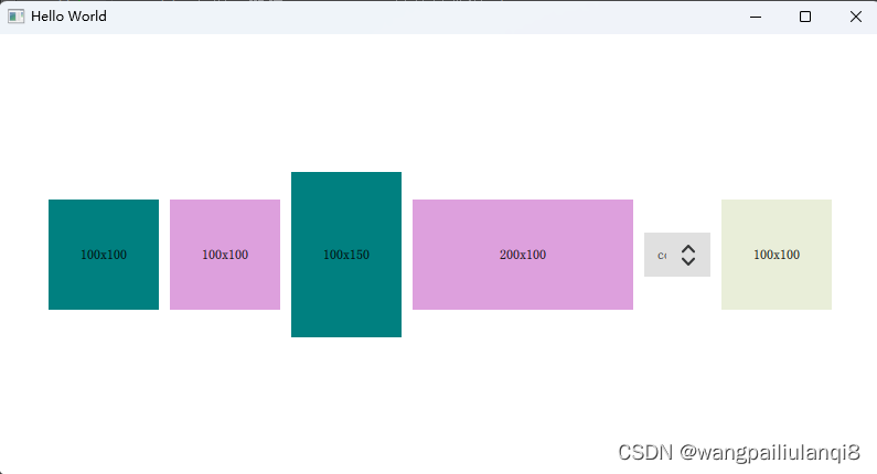
固定组件的size, Layout的spacing
如果想要展示组件的原始大小,不让其随着界面拉伸,同时固定spacing,可以注意以下
- 对于LayoutSpacing.qml的外部和外部,都不要使用anchors.fill: parent
- LayoutSpacing的内部根节点,不设定size,默认展示全部组件原始大小
main.qml
import QtQuick 2.12
import QtQuick.Window 2.15
import QtQuick.Controls 2.15
import QtQuick.Layouts 1.15
import "./TestWidth"

Window {
    width: 800
    height: 400
    visible: true
    title: qsTr("Hello World")

    LayoutSpacing{
        anchors.centerIn: parent
    }
}
LayoutSpacing.qml
import QtQuick 2.15
import QtQuick.Layouts 1.15
import QtQuick.Controls 2.15

RowLayout {
    id: root
    // 若对root的size不做任何设定,默认展示全部组件原始大小
    spacing: 10
    RowLayout {
        Layout.fillWidth: true
        spacing: 10
        Rectangle {
            color: 'teal'
            Layout.fillWidth: true
            Layout.preferredWidth: 100
            //            Layout.minimumHeight: 100
            Layout.preferredHeight: 100
            Text {
                anchors.centerIn: parent
                text: parent.width + 'x' + parent.height
            }
        }
        。。。。。。
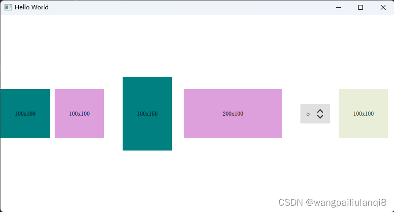
固定组件的size, spacing自动拉伸
如果外围界面比内部组件要大,但是希望固定住组件的原始大小,让spacing自动拉伸填充
- LayoutSpacing设置anchors.fill: parent, 在外部内部都可
- 界面内部组件不要设置 Layout.fillWidth: true
LayoutSpacing.qml
import QtQuick 2.15
import QtQuick.Layouts 1.15
import QtQuick.Controls 2.15

RowLayout {
    id: root
    anchors.fill: parent
    spacing: 10


    RowLayout {
        Layout.fillWidth: true
        spacing: 10
        Rectangle {
            color: 'teal'
//            Layout.fillWidth: true
            Layout.preferredWidth: 100
            Layout.preferredHeight: 100
            Text {
                anchors.centerIn: parent
                text: parent.width + 'x' + parent.height
            }
        }

        Rectangle {
            color: 'plum'
//            Layout.fillWidth: true
            Layout.preferredWidth: 100
            Layout.preferredHeight: 100
            Text {
                anchors.centerIn: parent
                text: parent.width + 'x' + parent.height
            }
        }
    }

    Rectangle {
        color: 'teal'
//        Layout.fillWidth: true // 优先级 > preferredWidth > width
        Layout.preferredWidth: 100
        Layout.preferredHeight: 150
        Text {
            anchors.centerIn: parent
            text: parent.width + 'x' + parent.height
        }
    }
    Rectangle {
        color: 'plum'
//        Layout.fillWidth: true
        Layout.preferredWidth: 200
        Layout.preferredHeight: 100
        Text {
            anchors.centerIn: parent
            text: parent.width + 'x' + parent.height
        }
    }

    ComboBox{
        id: basicCombobox
        Layout.preferredWidth: 60
        currentIndex: 0
        model: ["config", " spectrometer"]
        popup.closePolicy: Popup.CloseOnEscape | Popup.CloseOnPressOutside
                           | Popup.CloseOnReleaseOutside
    }

    BasicComponent {
        Text {
            anchors.centerIn: parent
            text: parent.width + 'x' + parent.height
        }
    }
}
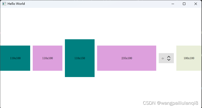
固定spacing, 组件的size自动拉伸
如果希望组件大小自适应,保证间距spacing固定
- LayoutSpacing设置anchors.fill: parent, 在外部内部都可
- 界面内部组件设置 Layout.fillWidth: true
LayoutSpacing.qml
import QtQuick 2.15
import QtQuick.Layouts 1.15
import QtQuick.Controls 2.15

RowLayout {
    id: root
    anchors.fill: parent
    spacing: 10

    RowLayout {
        Layout.fillWidth: true
        spacing: 10
        Rectangle {
            color: 'teal'
            Layout.fillWidth: true
            Layout.preferredWidth: 100
            Layout.preferredHeight: 100
            Text {
                anchors.centerIn: parent
                text: parent.width + 'x' + parent.height
            }
        }

        Rectangle {
            color: 'plum'
            Layout.fillWidth: true
            Layout.preferredWidth: 100
            Layout.preferredHeight: 100
            Text {
                anchors.centerIn: parent
                text: parent.width + 'x' + parent.height
            }
        }
    }

    Rectangle {
        color: 'teal'
        Layout.fillWidth: true // 优先级 > preferredWidth > width
        Layout.preferredWidth: 100
        Layout.preferredHeight: 150
        Text {
            anchors.centerIn: parent
            text: parent.width + 'x' + parent.height
        }
    }
    Rectangle {
        color: 'plum'
        Layout.fillWidth: true
        Layout.preferredWidth: 200
        Layout.preferredHeight: 100
        Text {
            anchors.centerIn: parent
            text: parent.width + 'x' + parent.height
        }
    }

    ComboBox{
        id: basicCombobox
        Layout.preferredWidth: 60
        currentIndex: 0
        model: ["config", " spectrometer"]
        popup.closePolicy: Popup.CloseOnEscape | Popup.CloseOnPressOutside
                           | Popup.CloseOnReleaseOutside
    }

    BasicComponent {
        Text {
            anchors.centerIn: parent
            text: parent.width + 'x' + parent.height
        }
    }
}
设置内部单个组件的size
作为Layout成员的组件,设置它的size必须使用Layout的属性,比如
Layout.minimumWidth: 100
Layout.preferredWidth: 200
Layout.preferredHeight: 100
    RowLayout {
        Layout.fillWidth: true
        spacing: 10
	    ComboBox{
	        id: basicCombobox
	        width: 10
	        currentIndex: 0
	        model: ["A", " B"]
	        Component.onCompleted: {
	            console.log("basicCombobox.width", basicCombobox.width)
	        }
	    }
    }
qml: basicCombobox.width 140
使用 Layout.preferredWidth属性,才能生效
    RowLayout {
        Layout.fillWidth: true
        spacing: 10
	    ComboBox{
	        id: basicCombobox
	        Layout.preferredWidth: 60
	        currentIndex: 0
	        model: ["A", " B"]
	        Component.onCompleted: {
	            console.log("basicCombobox.width", basicCombobox.width)
	        }
	    }
    }
qml: basicCombobox.width 60


 扫一扫
扫一扫


 326
326

 被折叠的 条评论
为什么被折叠?
被折叠的 条评论
为什么被折叠?
 到【灌水乐园】发言


