


一、引言:
在Google I/O 2014上,Google公布了Android L Preview版本,此版本的UI有了非常大的改变,很炫很给力!同时,Google也给出了两个可以向下兼容的控件放到了V7包中,分别是RecyclerView和CardView
二、用途:
CardView 属于Support v7 里面的新的Widget. 扩展于FrameLayout,
适用于突出背景1.边框圆角2.有阴影Shadow
用来突出个性,比如相册等。
二、用法:
整体用法还是比较简单的
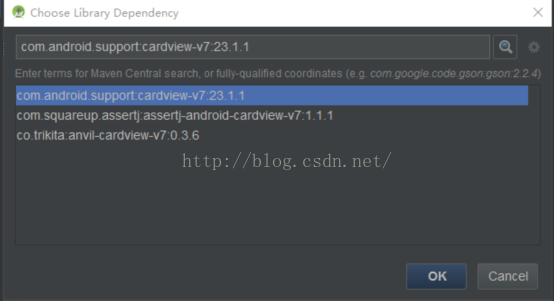
3.1 引入cardview依赖库
点击produceStructure ,点击denpendences 增加依赖库进行依赖

3.2 在布局xml文件中使用
引入命名空间:
xmlns:card_view="http://schemas.android.com/apk/res-auto"
CardView如Linearlayout、Framelayout一样都是ViewGroup,即其他控件的容器。
CardView继承于Framelayout,所以Framelayout的属性他都有,同时CardView还有几个特殊的属性:
l 其余(2.0以上)有属性cardBackgroundColor,意为CardView的卡片颜色,只能通过xml的cardBackgroundColor进行指定;
l 其余(2.0以上)有属性cardConerRadius,意为CardView卡片的四角圆角矩形程度,单位dimen(dp px sp),可以通过xml指定,也可以通过代码中的setRadius指定。
l 其余(2.0以上)有属性cardElevation,意为CardView卡片的 阴影shadow程度,单位dimen(dp px sp),可以通过xml指定,也可以通过代码中的setCardElevation指定。
四 、 demo代码示例
<android.support.v7.widget.CardView
android:id="@+id/cardview"
android:layout_width="match_parent"
android:layout_height="wrap_content"
android:layout_alignParentTop="true"
app:cardBackgroundColor="#426ab3"
card_view:cardCornerRadius="5dp"
card_view:cardElevation="3dp">
<LinearLayout
android:layout_width="match_parent"
android:layout_height="wrap_content"
android:layout_margin="5dp"
android:orientation="vertical">
<TextView
android:layout_width="match_parent"
android:layout_height="wrap_content"
android:text="wifi连接信息"
android:textColor="#fff"
android:textSize="17sp" />
<TextView
android:id="@+id/tv_name"
android:layout_width="match_parent"
android:layout_height="wrap_content"
android:textColor="#fff"
android:textSize="17sp" />
<TextView
android:id="@+id/tv_mac"
android:layout_width="match_parent"
android:layout_height="wrap_content"
android:textColor="#fff"
android:textSize="17sp" />
<TextView
android:id="@+id/tv_rssi"
android:layout_width="match_parent"
android:layout_height="wrap_content"
android:textColor="#FFF"
android:textSize="17sp" />
</LinearLayout>
</android.support.v7.widget.CardView>
效果图:很简单,就不截取了


 1915
1915


 被折叠的 条评论
为什么被折叠?
被折叠的 条评论
为什么被折叠?
 到【灌水乐园】发言


