


二、自定义组合控件
开发步骤
- 继承自linearLayout或者RelativeLayout
- 定义相关属性,获取属性(自定义属性)
- 加载组合View,初始化值
- 处理相关事件(如按钮的点击事件)
- 定义功能接口,对外暴露方法(把值传到外面)
例子:
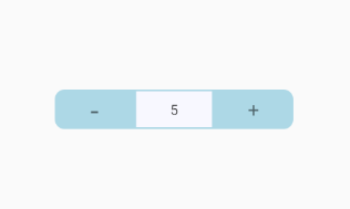
<?xml version="1.0" encoding="utf-8"?>
<LinearLayout xmlns:android="http://schemas.android.com/apk/res/android"
    android:gravity="center"
    android:layout_width="match_parent"
    android:layout_height="40dp">
    <TextView
        android:id="@+id/btn_minus"
        android:layout_width="80dp"
        android:layout_height="match_parent"
        android:background="@drawable/selector_num_btn_bg_left"
        android:gravity="center"
        android:text="-"
        android:textSize="30sp" />
    <EditText
        android:id="@+id/edt_value"
        android:layout_width="80dp"
        android:layout_height="match_parent"
        android:background="@drawable/shape_num_inp_bg"
        android:focusable="false"
        android:gravity="center"
        android:text="0"
        android:textSize="14sp" />
    <TextView
        android:id="@+id/btn_plus"
        android:layout_width="80dp"
        android:layout_height="match_parent"
        android:background="@drawable/selector_num_btn_bg_right"
        android:gravity="center"
        android:text="+"
        android:textSize="20sp" />
</LinearLayout>
1、继承RelativeLayout,三个构造方法统一入口
    // 1 继承relativeLayout
    public InputNumberView(Context context) {
        this(context, null);
    }
    public InputNumberView(Context context, AttributeSet attrs) {
        this(context, attrs, 0);
    }
    public InputNumberView(Context context, AttributeSet attrs, int defStyleAttr) {
        super(context, attrs, defStyleAttr);
        // 获取相关属性
        initAttrs(context, attrs);
        // 初始化控件
        initView(context);
        // 处理事件
        initEvent();
    }
2、定义相关属性,获取属性
values -> attrs.xml
<?xml version="1.0" encoding="utf-8"?>
<resources>
    <declare-styleable name="InputNumberView">
        <attr name="max" format="integer"/>
        <attr name="min" format="integer"/>
        <attr name="step" format="integer"/>
        <attr name="defaultValue" format="integer"/>
        <attr name="disabled" format="boolean"/>
        <attr name="btnColor" format="reference"/>
        <!-- dp sp px -->
        <attr name="valueSize" format="dimension"/>
    </declare-styleable>
</resources>
获取属性值
    private void initAttrs(Context context, AttributeSet attrs) {
        TypedArray a = context.obtainStyledAttributes(attrs, R.styleable.InputNumberView);
        mMax = a.getInteger(R.styleable.InputNumberView_max, 0);
        mMin = a.getInteger(R.styleable.InputNumberView_min, 0);
        mStep = a.getInteger(R.styleable.InputNumberView_step, 1);
        mDefaultValue = a.getInteger(R.styleable.InputNumberView_defaultValue, 1);
        this.currentNumber = mDefaultValue;
        mDisabled = a.getBoolean(R.styleable.InputNumberView_disabled, false);
        mBtnColor = a.getResourceId(R.styleable.InputNumberView_btnColor, -1);
        a.recycle();
    }
使用:
    <com.dy.viewstudy01.InputNumberView
        android:id="@+id/input_number"
        app:max="10"
        app:min="-10"
        app:step="2"
        app:disabled="true"
        app:defaultValue="5"
        android:layout_gravity="center"
        android:layout_width="wrap_content"
        android:layout_height="wrap_content"/>
3、加载View
    private void initView(Context context) {
        // 2 加载view
        LayoutInflater.from(context).inflate(R.layout.input_number_view, this);
        mBtnMinus = findViewById(R.id.btn_minus);
        mBtnPlus = findViewById(R.id.btn_plus);
        mEdtValue = findViewById(R.id.edt_value);
        // 初始化控件值
        updateText();
    }
4、处理事件
    private void initEvent() {
        mBtnMinus.setOnClickListener(new OnClickListener() {
            @Override
            public void onClick(View v) {
                if (currentNumber <= mMin)
                    return;
                currentNumber -= mStep;
                updateText();
            }
        });

        mBtnPlus.setOnClickListener(new OnClickListener() {
            @Override
            public void onClick(View v) {
                if (currentNumber >= mMax)
                    return;
                currentNumber += mStep;
                updateText();
            }
        });
    }
5、定义接口,暴露方法(这里是为了在外面获取到currentNumber的值)
private onNumberChangeListener onNumberChangeListener = null;

private void updateText() {
    mEdtValue.setText(String.valueOf(currentNumber));
    if (onNumberChangeListener != null)
        // 传值出去
        onNumberChangeListener.onNumberChange(this.currentNumber);
}
// 暴露方法
public void setOnNumberChangeListener(onNumberChangeListener listener) {
    this.onNumberChangeListener = listener;
}
// 接口
interface onNumberChangeListener {
    void onNumberChange(int value);
}
使用:
public class MainActivity extends AppCompatActivity implements InputNumberView.onNumberChangeListener {

    private static final String TAG = "MainActivity";

    @Override
    protected void onCreate(Bundle savedInstanceState) {
        super.onCreate(savedInstanceState);
        setContentView(R.layout.activity_main);
        InputNumberView inputNumberView = findViewById(R.id.input_number);
        inputNumberView.setOnNumberChangeListener(this);
    }

    @Override
    public void onNumberChange(int value) {
        // value就是传来出的值
        Log.e(TAG,"current value is -> " + value);
    }
}
样式的修改:
1、用xml文件绘制背景图,drawable -> shape_XXXX.xml
<?xml version="1.0" encoding="utf-8"?>
<shape xmlns:android="http://schemas.android.com/apk/res/android"
    android:shape="rectangle">
    <solid android:color="#1E90FF"/>
    <corners android:bottomLeftRadius="10dp"
        android:topLeftRadius="10dp"/>
</shape>

<?xml version="1.0" encoding="utf-8"?>
<shape xmlns:android="http://schemas.android.com/apk/res/android"
    android:shape="rectangle">
    <solid android:color="#F8F8FF"/>
    <stroke android:width="2dp"
        android:color="#ADD8E6"/>
</shape>
2、点击效果,drawable -> selector_XXX.xml
<selector xmlns:android="http://schemas.android.com/apk/res/android">
    <item android:state_pressed="true" android:drawable="@drawable/shape_num_btn_bg_left_press"/>
    <item android:drawable="@drawable/shape_num_btn_bg_left"/>
</selector>


 697
697


 被折叠的 条评论
为什么被折叠?
被折叠的 条评论
为什么被折叠?
 到【灌水乐园】发言


