


1、基本样式
对于一个组件,定义组件的布局样式通过style属性来定义。
例如:
<Text style = {{color: '#ff0000', fontSize: 15}}> 学习布局 </Text>这里通过style属性,定义了Text文本的字体颜色和字体大小。这里第一个大括号是:JSX语法,第二个大括号是:javaScript对象,我们把需要定义的样式都以对象的方式写在这个大括号里。
我们也可以把一个样式赋给一个变量:然后传进去。
例如:
<Text style = {styles.textContent}> 测试 </Text>
// ...
const styles = StyleSheet.create({
  textContent: {
    color: '#ff0000',
    fontSize: 1,
  },
});
这里我们使用React.StyleSheet创建了一个 JS对象,那么在组件上引用是这样的:style={{对象名称.对象属性}}。
知道组件中如何使用样式了以后,我们自然会想到一个组件都支持那些样式。此时我们可以通过查找一些手册去学习都有哪些样式,我们还可以通过编译器报的错误提示来查看。例如:我们随意写一个它不支持的属性test。
const styles = StyleSheet.create({
  textContent: {
    color: '#ff0000',
    fontSize: 1,
    test: 2,
  },
});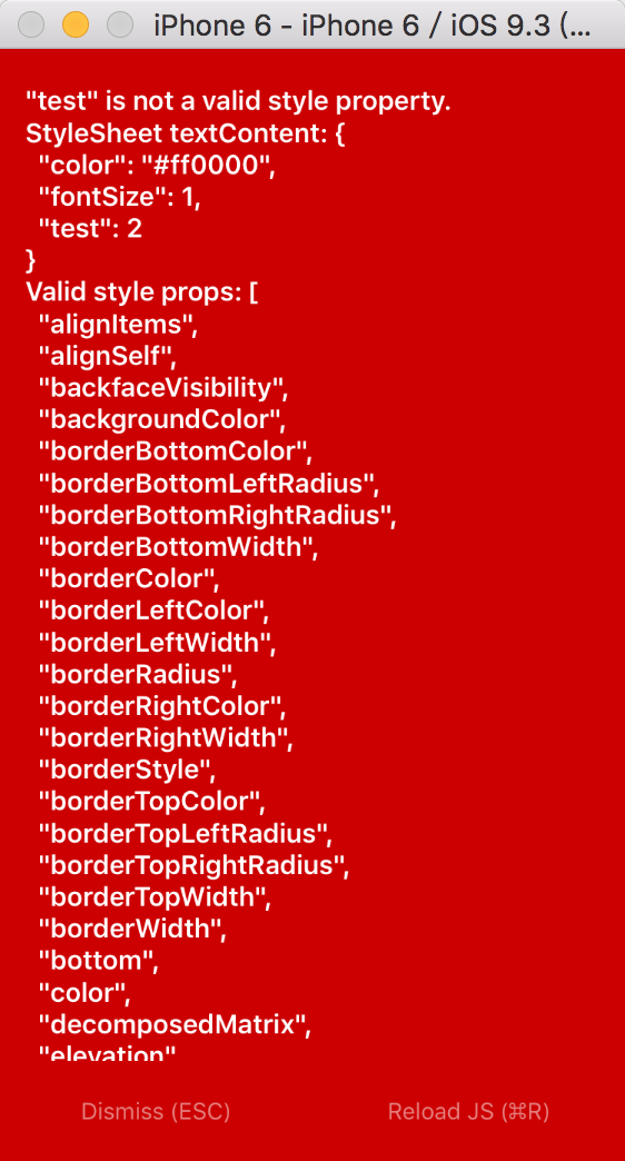
如上图,我们可以看到一些报错信息。在这些提示中给出了有效的样式提示。
2、Flexbox布局
弹性布局的主要思想是让容器有能力来改变项目的宽度和高度,以填满可用空间(主要是为了容纳所有类型的显示设备和屏幕尺寸)的能力。
flexbox是一个整体模块,而不是单一的一个属性。它们之中有一些是在父容器上设置,而有一些则是在子容器上设置。
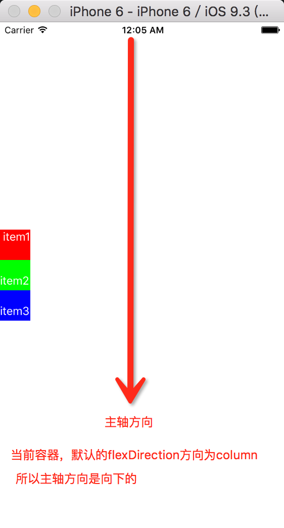
flex布局涉及到了两个概念:主轴和纵轴。如下图示意:
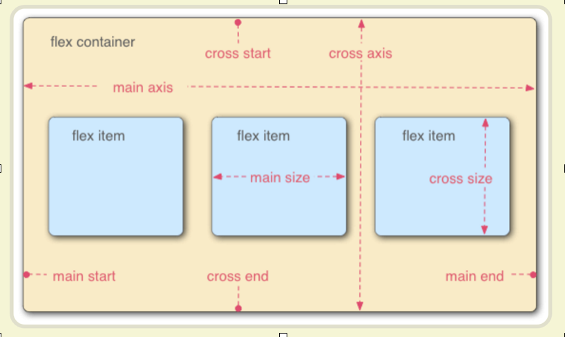
在React Native中主轴就是flexDirection定义的方向。另一个轴就为纵轴了。
为了方便表述,下面定义两个表述词:
container:定义为父容器,有些属性是作用在父容器上的,即需要设置在父容器上。
item:定义为子容器或当前容器(组件),有些属性是作用在当前容器上的,即需要设置在子容器上。
1)flex属性
flex属性是作用在item上的。当一个组件,定义了flex属性时,表示该元素是可伸缩的。当然flex的属性值是大于0的时候才伸缩,其小于和等于0的时候不伸缩。
<View style = {styles.container}>
        <View style = {styles.subContainer} >
            <View style = {styles.item1}>
              <Text style = {styles.textContent}> item1 </Text>
            </View>
            <View style = {styles.item2}>
              <Text style = {styles.textContent}> item2 </Text>
            </View>
            <View style = {styles.item3}>
              <Text style = {styles.textContent}> item3 </Text>
            </View>
          </View>
      </View>
const styles = StyleSheet.create({
  container: {
    flex: 1,
  },
  subContainer: {
    flex: 1,
    flexDirection: 'row',
  },
  item1: {
    flex: 1,
    height: 40,
    backgroundColor: '#ff0000',
  },
  item2: {
    flex: 1,
    height: 40,
    backgroundColor: '#00ff00',
  },
  item3: {
    flex: 1,
    height: 40,
    backgroundColor: '#0000ff',
  },
  textContent: {
    color: '#ffffff',
    fontSize: 20,
  },
如下图:
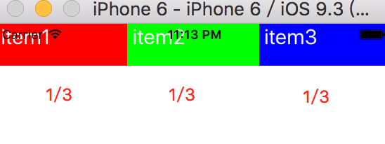
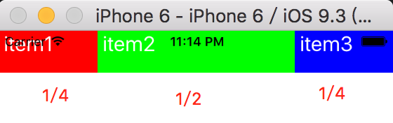
因为item1、item2、item3的flex属性都设置为1,所以它们都是可以伸缩布局的。flex也可以理解为权重。代表所占的比例。如上图它们的flex都设置为1时,它们是等宽的。如果设置它们的flex属性分别为:5:10:5,那么会得到如下的图:
2)flexDirection属性
flexDirection在React-Native中只有两个属性,一个是row(横向伸缩)和column(纵向伸缩)。在上面的设置中就已经运用到了flexDirection属性。subContainer定义的样式中就已经设置了flexDirection为row,设置了它为横向伸缩。该属性值默认是纵向伸缩的。
3)justifyContent属性
justifyContent属性定义Item在主轴上的对齐方式。它的可取值为[flex-start, flex-end, center, space-between, space-around]
例如:
<View style = {styles.container}>
            <View style = {styles.item1}>
              <Text style = {styles.textContent}> item1 </Text>
            </View>
            <View style = {styles.item2}>
              <Text style = {styles.textContent}> item2 </Text>
            </View>
            <View style = {styles.item3}>
              <Text style = {styles.textContent}> item3 </Text>
          </View>
      </View>
const styles = StyleSheet.create({
  container: {
    flex: 1,
    justifyContent: 'center',
  },
  item1: {
    width: 40,
    height: 40,
    backgroundColor: '#ff0000',
  },
  item2: {
    width: 40,
    height: 40,
    backgroundColor: '#00ff00',
  },
  item3: {
    width: 40,
    height: 40,
    backgroundColor: '#0000ff',
  },
  textContent: {
    color: '#ffffff',
    fontSize: 15,
  },
});
其他属性值如:flex-start, flex-end, center, space-between, space-around
读者可以自行去尝试它们的效果。
4)alignItems属性
Items 在垂直轴的对齐方式。它的可选值为:[flex-start, flex-end, center, stretch]。在上面的代码中container样式添加一个属性值:

在这个效果图中设置container的值为:
container: {
    flex: 1,
    justifyContent: 'space-around',
    alignItems: 'center',
  },
alignItem属性的flex-start, flex-end, center很容易知道它们的排布,下面说一下stretch。如下图:默认stretch如果Item未设置宽度(高度),将占满整个容器的宽度(高度)。

5)alignSelf属性
align-self属性允许单个项目有与其他项目不一样的对齐方式,可覆盖父container的alignItems属性。
<View style = {styles.container}>
            <View style = {styles.item1}>
              <Text style = {styles.textContent}> item1 </Text>
            </View>
            <View style = {styles.item2}>
              <Text style = {styles.textContent}> item2 </Text>
            </View>
            <View style = {styles.item3}>
              <Text style = {styles.textContent}> item3 </Text>
          </View>
      </View>

const styles = StyleSheet.create({
  container: {
    flex: 1,
    justifyContent: 'space-around',
    alignItems: 'center',
  },
  item1: {
    width: 40,
    height: 40,
    backgroundColor: '#ff0000',
  },
  item2: {
    height: 40,
    width: 40,
    alignSelf: 'flex-start',
    backgroundColor: '#00ff00',
  },
  item3: {
    width: 40,
    height: 40,
    backgroundColor: '#0000ff',
  },
  textContent: {
    color: '#ffffff',
    fontSize: 15,
  },
});
设置item2的alignSelf为flex-start,它覆盖了父视图的alignItems: ‘center’。

默认值为auto。 表示如果父容器定义了alignItems则继承alignItems,否则则取为stretch布局。
6) flex-wrap属性
flex-wrap设置或检索container的item超出父容器时是否换行。它有两个值:[wrap, nowrap]。该属性作用于container上。
nowrap:当子元素溢出父容器时不换行。(默认方式)
wrap:当子元素溢出父容器时自动换行。
如下代码演示:
  <View style = {styles.container}>
            <View style = {styles.item1}>
              <Text style = {styles.textContent}> item1 </Text>
            </View>
            <View style = {styles.item2}>
              <Text style = {styles.textContent}> item2 </Text>
            </View>
            <View style = {styles.item3}>
              <Text style = {styles.textContent}> item3 </Text>
          </View>
      </View>

  const styles = StyleSheet.create({
  container: {
    flex: 1,
    flexDirection: 'row',
    alignItems: 'center',
    flexWrap: 'wrap',
  },
  item1: {
    width: 300,
    height: 40,
    backgroundColor: '#ff0000',
  },
  item2: {
    height: 40,
    width: 300,
    backgroundColor: '#00ff00',
  },
  item3: {
    width: 300,
    height: 40,
    backgroundColor: '#0000ff',
  },
  textContent: {
    color: '#ffffff',
    fontSize: 15,
  },
});
运行效果如图:


设置container样式的flexWrap属性后,通过上图的对比,就可以看到该属性所起的作用。
在学习这一部分的时候,通过运行小的demo,查看运行后的效果,就能很快的掌握这一部分的属性用法。


 1万+
1万+


 被折叠的 条评论
为什么被折叠?
被折叠的 条评论
为什么被折叠?
 到【灌水乐园】发言


