


swift音频合成
In this article, I’ll be demonstrating how easy it is to create an orthogonal scrolling page by using UICollectionViewCompositionalLayout. We will have a detailed look of the view hierarchy to learn the core concepts of modern collection view in iOS 13, and build an orthogonal scrolling collection view step by step.
在本文中,我将演示使用UICollectionViewCompositionalLayout创建正交滚动页面是多么容易。 我们将详细介绍视图层次结构,以了解iOS 13中现代集合视图的核心概念,并逐步构建正交滚动集合视图。
1.使用嵌套UICollectionViews的过去 (1. The Old Days of Using Nested UICollectionViews)
Through the years, iOS developers strive to achieve cross-scrolling pages like Apple does within their App Store. Developers are impressed by how Apple mixes the horizontal scrolling and vertical scrolling within the same page.
多年来,iOS开发人员努力实现跨滚动页面,就像Apple在其App Store中所做的那样。 苹果在同一页面中如何混合水平滚动和垂直滚动给开发人员留下了深刻的印象。
Before iOS 13 was released, there was only one way to achieve this: wrapping the UICollectionView instance within the UICollectionViewCell of another UICollectionView. It certainly can be within an UITableViewCell; it just depends on whether you’re using an UICollectionView or UITableView as the parent view. But normally UICollectionView is more popular, as it is more flexible for a customised layout. The internal UICollectionView implements horizontal flow layout, while the outer UICollectionView implements vertical flow layout or vice versa.
iOS版13发布之前,只有一个达到这个方式:包裹UICollectionView的内实例UICollectionViewCell另一个UICollectionView 。 当然可以在UITableViewCell ; 它仅取决于您使用UICollectionView还是UITableView作为父视图。 但是通常UICollectionView更为流行,因为它对于自定义布局更灵活。 内部UICollectionView实现水平流布局,而外部UICollectionView实现垂直流布局,反之亦然。
The architecture has been fine for years, but it will easily become messy when page and data goes massive, as the two instances of UICollectionView implement different data sources and hook up with different delegates. You need to define different instances of UICollectionViewLayout for them too.
多年来,该体系结构一直很好,但是当页面和数据变得庞大时,它很容易变得混乱,因为UICollectionView的两个实例实现了不同的数据源并连接了不同的委托。 您还需要为其定义UICollectionViewLayout不同实例。
2.现代构图的详细外观 (2. Detailed Look of Modern Compositional Layout)
The compositional collection view is built on several core compositional elements. Let’s take a detailed look at them on the hierarchy.
成分集合视图基于几个核心成分元素。 让我们在层次结构上对其进行详细研究。
NSCollectionLayoutItem (NSCollectionLayoutItem)

NSCollectionLayoutItem image by Eric Yang
NSCollectionLayoutItem image by Eric Yang
The three rectangles labeled with Item 1, Item 2 and Item 3 are three instances of NSCollectionLayoutItem. They are initialised by different dimensions of NSCollectionLayoutSize and are the base elements repeatedly displayed at the collection view.
标有Item 1 , Item 2和Item 3的三个矩形是NSCollectionLayoutItem三个实例。 它们由NSCollectionLayoutSize的不同维度初始化,并且是在集合视图中重复显示的基础元素。
Item 1 is 0.7 faction in width and equal in height (1.0 faction) with the group it belongs to. Item 2 and Item 3 are both 0.3 faction in width of the group they belong to. The height of Item 2 is in absolute value: 120 points, while the height of Item 3 is 60 points.
Item 1 宽度为0.7派,高度等于其所属的组(1.0派)。 Item 2和Item 3的宽度均为0.3派系。 Item 2的高度为绝对值:120分,而Item 3的高度为绝对值 是60分。
To create the three instances of NSCollectionLayoutItem , we use the code as following:
要创建NSCollectionLayoutItem的三个实例,我们使用以下代码:
There are three different layout dimensions:
共有三种不同的布局尺寸:
Fractional width or height: The dimension is computed as a fraction of the group’s width or height.
宽度或高度的小数部分 :尺寸是按组的宽度或高度的分数计算的。
Absolute: The dimension is with an absolute point value.
绝对 : 尺寸具有绝对点值。
Estimated: The dimension is set as an estimated value and will determine the actual size when element is rendered.
估计的 :尺寸被设置为估计值,并将在渲染元素时确定实际大小。
NSDirectionalEdgeInsets (NSDirectionalEdgeInsets)
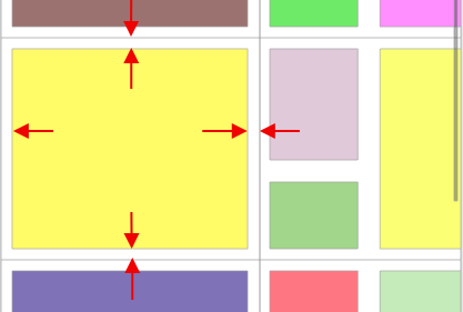
When we need to define the content insets of the item to allow margins surrounding them, we use NSDirectionalEdgeInsets.
当我们需要定义项目的内容插图以允许周围有边距时,可以使用NSDirectionalEdgeInsets 。
For the sample image shown above, the top/leading/bottom/tailing insets of the three items are set as following:
对于上面显示的示例图像,三个项目的顶部/顶部/底部/尾部插图 设置如下:
NSCollectionLayoutGroup (NSCollectionLayoutGroup)

The three instances of NSCollectionLayoutItem — Item 1, Item 2, and Item 3 — are grouped by the instance of NSCollectionLayoutGroup to arrange their relative positions and dimensions.
NSCollectionLayoutItem的三个实例( Item 1 , Item 2和Item 3 )按NSCollectionLayoutGroup的实例分组,以排列它们的相对位置和尺寸。
For this partially sample image, the hierarchy is Item 2 and Item 3 vertically wrapped within Group 2 , while Group 1 horizontally wraps Item 1 and Group 2 . The code is pretty straightforward:
对于此部分样本图像,层次结构是垂直包裹在Group 2 Item 2和Item 3 ,而Group 1水平包裹在Item 1和Group 2 。 该代码非常简单:
NSCollectionLayoutSection (NSCollectionLayoutSection)

NSCollectionLayoutSection is how the groups are segmented and wrapped. One instance of NSCollectionLayoutSection can only contain one instance of NSCollectionLayoutGroup. Different instances of NSCollectionLayoutSection build the modern compositional layout UICollectionViewCompositionalLayout, which is used as the layout of UICollectionView.
NSCollectionLayoutSection是如何对组进行分段和包装的。 NSCollectionLayoutSection一个实例只能包含NSCollectionLayoutGroup一个实例。 的不同实例NSCollectionLayoutSection建立现代构图布局UICollectionViewCompositionalLayout ,这是用来作为布局UICollectionView 。
You may have seen it — the orthogonalScrollingBehavior does the trick of orthogonal scrolling!
你可能已经看到了它- orthogonalScrollingBehavior做垂直滚动的伎俩!
The orthogonal scrolling is achieved by one line of code! 🙌 🎉
正交滚动是通过一行代码实现的! 🎉
We are using continuous as the behaviour for this sample page, but there are some more options if you look into the enum:
在此示例页面中,我们使用了continuous作为行为,但是如果您查看枚举,还有更多选择:
3.总结 (3. Wrap Up)
The article recaps the old approach of using nested UICollectionView to build the cross-scrolling collection view. It then introduces the modern compositional concepts from bottom to top by following the hierarchy. It also demonstrates how easy and clean it is to build the orthogonal scrolling page by using the compositional collection view.
本文回顾了使用嵌套的UICollectionView来构建交叉滚动集合视图的旧方法。 然后按照层次结构从下至上介绍现代构图概念。 它还演示了使用合成集合视图来构建正交滚动页面是多么容易和干净。
It’s time to get your hands dirty! You can find all the code mentioned in the article at this repo.
是时候弄脏您的双手了! 您可以在此仓库中找到本文中提到的所有代码。
swift音频合成


 2223
2223


 被折叠的 条评论
为什么被折叠?
被折叠的 条评论
为什么被折叠?
 到【灌水乐园】发言


