


ios macos
Home screen widgets were one of the most anticipated features leading up to WWDC2020. It redefines how your app presents the user with new information. Your widget is an extension to your app. You can display important information without users opening your app.
主屏幕小部件是WWDC2020之前最令人期待的功能之一。 它重新定义了您的应用如何向用户显示新信息。 小部件是应用程序的扩展。 您可以显示重要信息,而无需用户打开您的应用程序。
You can find Apple’s guidelines regarding widgets here. There is also an introduction video. I’m going to build widgets for the Twitter app as we go while keeping and reiterating the guidelines from Apple.
您可以在此处找到有关小部件的Apple准则。 还有一个介绍视频 。 我将继续为Twitter应用构建窗口小部件,同时保留并重申Apple的准则。
构想 (Ideation)
Widgets should help users avoid performing repetitive actions. Your widget needs to be:
小部件应帮助用户避免执行重复操作。 您的小部件必须为:
Informational: Don’t make a widget if it’s only a larger icon. Use it to pass information to the user, which adds value.
信息性 :如果它只是一个较大的图标,请不要制作它。 使用它可以将信息传递给用户,从而增加价值。
Personal: Provide personal information that helps establish a connection with the user. The Photos widget is an excellent example of how personal a widget can be.
个人 :提供有助于与用户建立联系的个人信息。 “照片”小部件是一个很好的示例,说明了小部件的个性。
Contextual: Update widgets to provide relevant information. If there are no events left on my calendar, the widget updates itself to show tomorrow’s summary.
上下文 :更新小部件以提供相关信息。 如果我的日历上没有剩余事件,则小部件会自动更新以显示明天的摘要。
尺码 (Sizes)
Regardless of the size of your widget, it should always focus on one thing. In most cases, a widget would provide information based on your app’s primary function.
无论小部件的大小如何,它都应始终专注于一件事。 在大多数情况下,小部件会根据您应用的主要功能提供信息。
点击样式 (Tap Styles)
The Human Interface Guidelines give us three styles we can use to get started on our Twitter widget.
人机界面指南为我们提供了三种样式,可用于在Twitter小部件上入门。
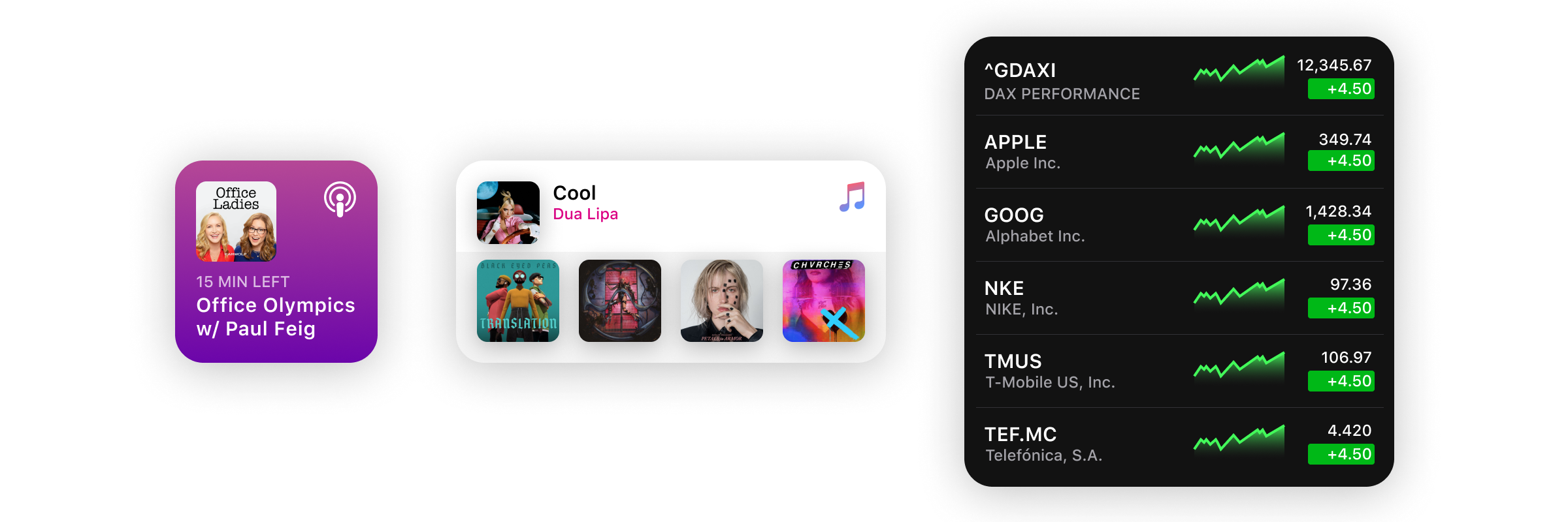
Fill Style: As the name suggests, fill the widget with rich colours and content. Suitable when you are deep-linking to a single piece of content.
填充样式 :顾名思义,用丰富的颜色和内容填充小部件。 当您深入链接到单个内容时,此选项适用。
Cell Style: Every tappable cell contains different elements. With multiple tap target support, each cell leads to different locations in the app.
单元格样式 :每个可点击的单元格包含不同的元素。 有了多个点击目标支持,每个单元格都可以指向应用程序中的不同位置。
Content Style: When your content is unconfined in the widget. Again, each is leading to different locations in the app.
内容样式 :当您的内容未限制在窗口小部件中时。 再次,每个都指向应用程序中的不同位置。
As you can see, there’s only one “tap target” in the Fill style, while others have multiple tap targets.
如您所见,“填充”样式中只有一个“点击目标”,而其他的则有多个点击目标。
点击目标 (Tap Targets)
Tap Targets are areas when tapped would have a specific action. The small widget acts like a single tap target; present limited content. We cannot deep-link different sections to different parts of the app. Medium and large widget sizes support multiple tap targets.
点按目标是在点击时将执行特定操作的区域。 小窗口小部件的作用就像单击目标。 目前内容有限。 我们无法将不同部分深度链接到应用程序的不同部分。 中型和大型窗口小部件支持多个点击目标。
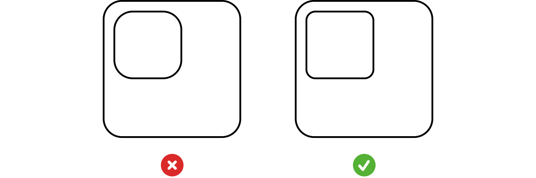
Since the small size supports only a single tap target, all small widgets follow the Fill style. Using the Fill style in larger sizes is not advisable. It only wastes space when you can have way more elements.
由于小尺寸仅支持一个点击目标,因此所有小窗口小部件均遵循“填充”样式。 不建议在较大尺寸中使用“填充”样式。 只有当您拥有更多元素时,它才会浪费空间。
间距 (Spacing)
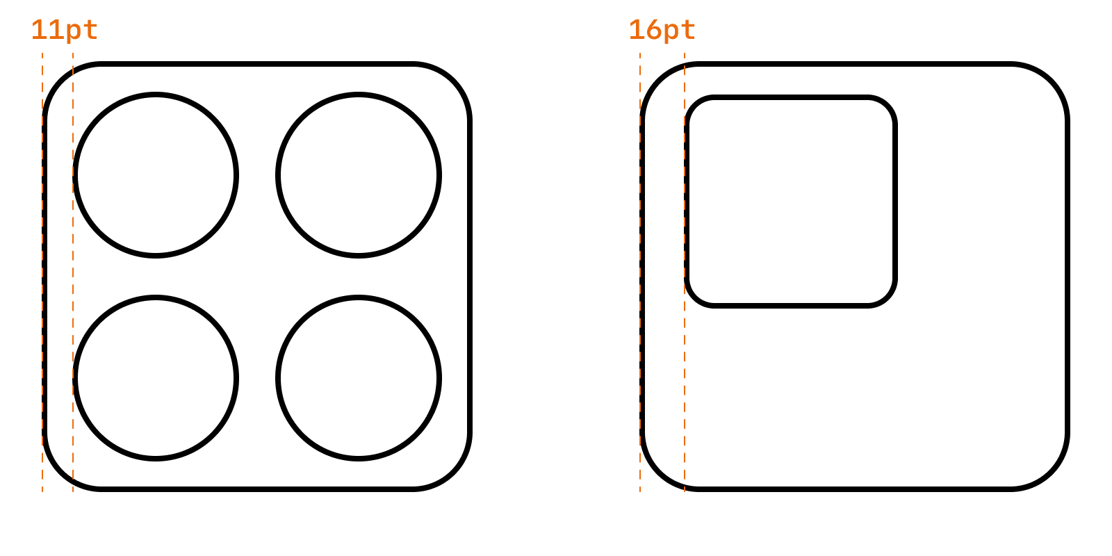
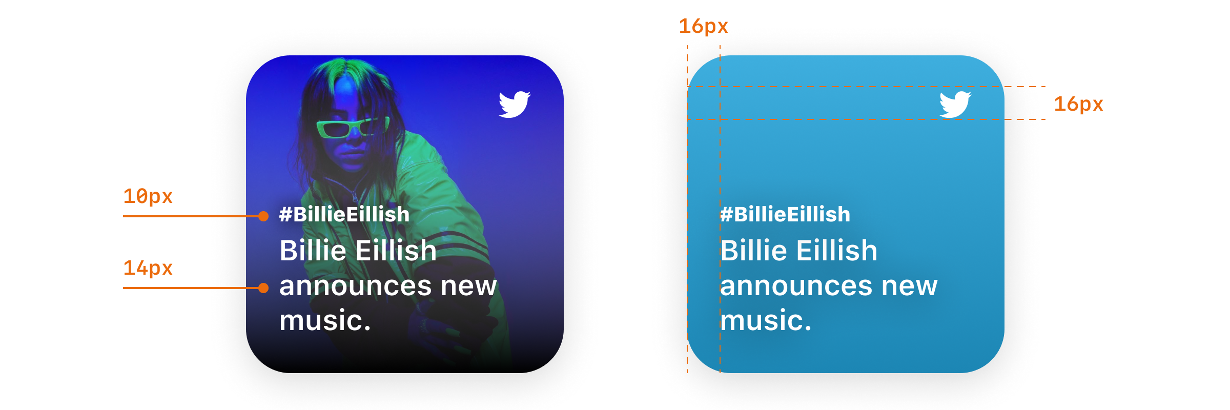
As always, the spacing between elements is a crucial aspect of your design. Apple recommends having a 16pt margin from the edges of the widget. In layouts with graphics, use a tighter 11pt margin.
与往常一样,元素之间的间距是设计的关键方面。 Apple建议在小部件边缘留出16pt的边距。 在带有图形的布局中,使用更窄的11pt边距。
内容和个性 (Content and Personality)
When designing a widget, think about content and personality together.
设计小部件时,请同时考虑内容和个性。
You can derive personality of your widget from your app’s design and its icon. Use familiar colours and typography to help users make the connection. Rich images, a simplistic look or a tint colour are some of the ways to add some personality.
您可以从应用程序的设计及其图标得出小部件的个性。 使用熟悉的颜色和字体来帮助用户进行连接。 丰富的图像,简单的外观或淡淡的颜色是增加个性的一些方法。
Content layouts can either scale between sizes or have a different look across sizes.
内容布局可以在大小之间缩放,也可以在大小上具有不同的外观。
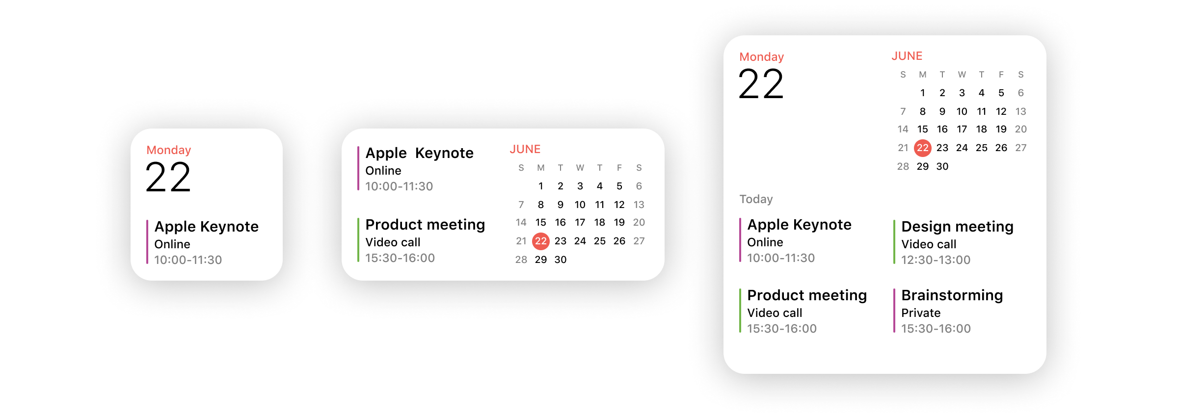
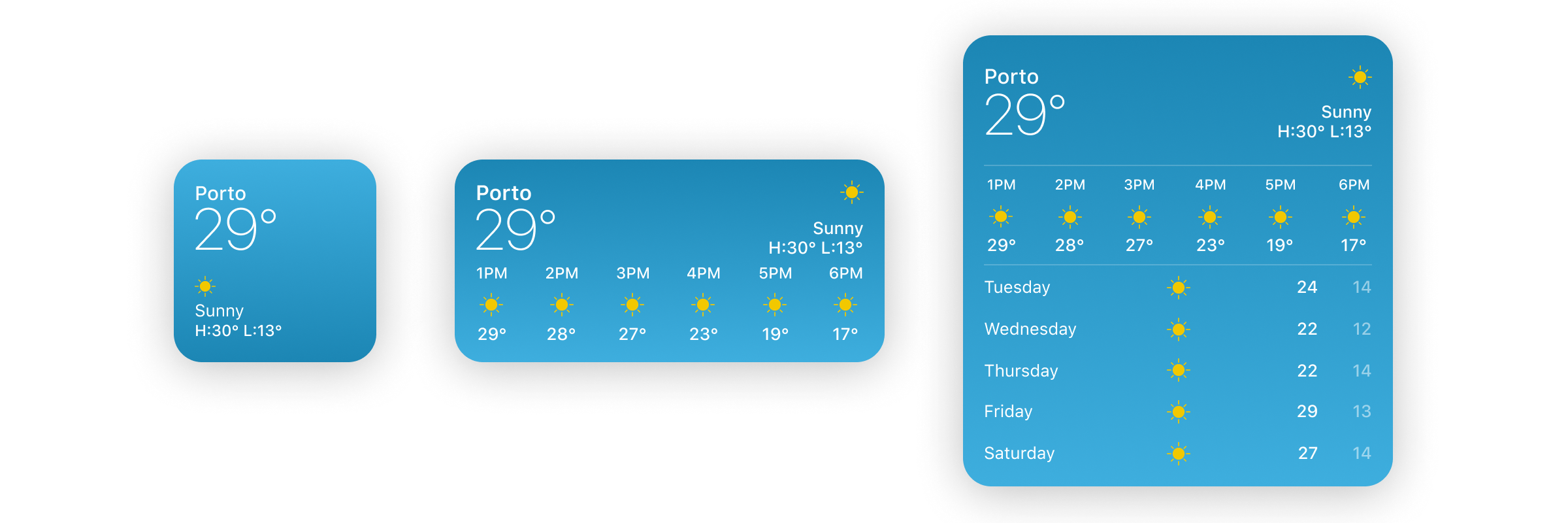
The Weather widget expands by adding some more content as size increases. The idea behind the widget remains the same. The Calendar widget combines different elements as it gets more space.
随着大小的增加,天气小部件会通过添加更多内容来扩展。 小部件背后的想法保持不变。 “日历”小部件在获得更多空间时会组合不同的元素。
创建 (Creation)
Now that we have some basic info, we are ready to start building our Twitter widget.
现在我们有了一些基本信息,我们准备开始构建我们的Twitter小部件。
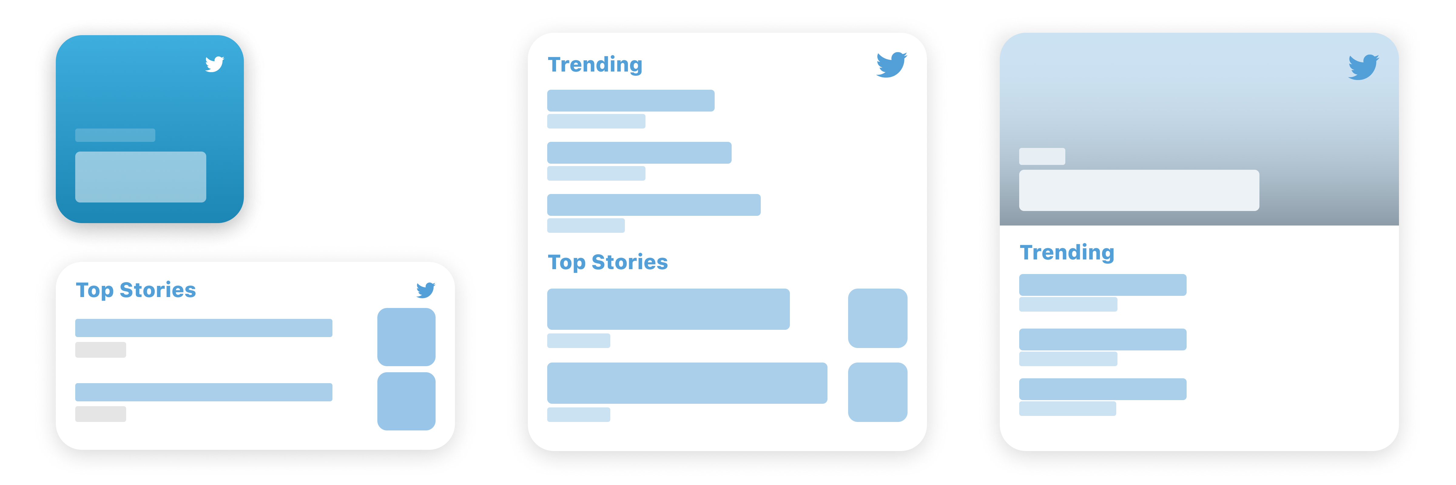
Let’s start with the small size and use the Fill style.
让我们从小尺寸开始,并使用“填充”样式。
That looks pretty good. It presents information about the latest trend, updating with time (contextually). Twitter presents curated trends in the ‘For You’ section so we don’t have to worry about it being personal. The rich background image adds more personality compared to the gradient background.
看起来不错。 它提出的最新潮流资讯 ,随着时间的推移( 上下文 )更新。 Twitter在“为您”部分介绍了精选趋势,因此我们不必担心它是私人的 。 与渐变背景相比,丰富的背景图像增加了更多个性。
Let’s see how it looks when we try to scale this up to support the other two sizes.
让我们看看当我们尝试扩大规模以支持其他两种尺寸时的外观。
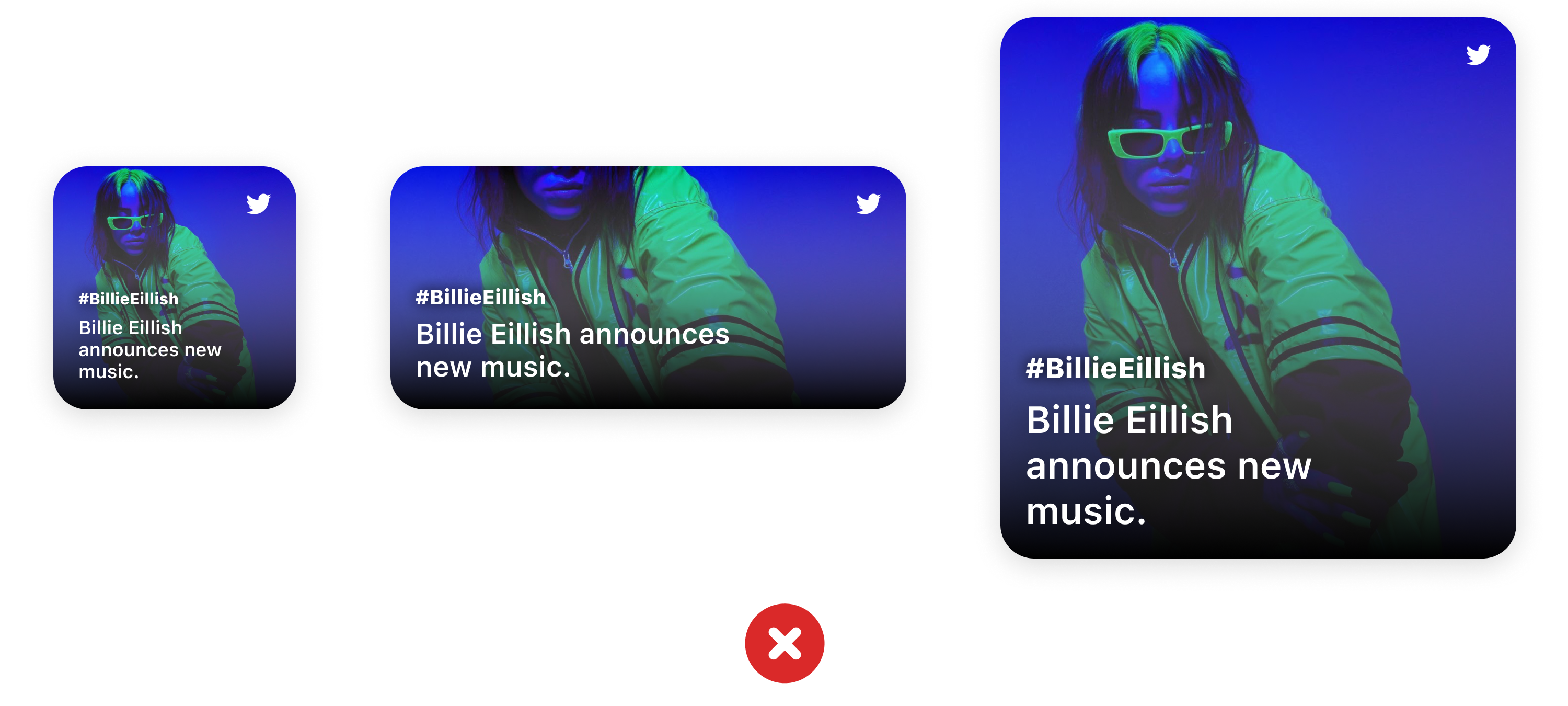
It doesn’t add any value even though we end up using up to 4x space. That’s why it’s important to not scale up your widget for the sake of adding support. If it does not add value, you should not add support for that size.
即使最终使用多达4倍的空间,它也不会增加任何值。 这就是为什么为了增加支持而不必扩展窗口小部件很重要 。 如果它没有增加价值,则不应添加对该大小的支持。
Let’s start with our medium-sized widget. Now that we have multiple tap targets, we can have more elements in the widget. Each title can lead to a different location in the app using deep-linking.
让我们从中型小部件开始。 现在我们有了多个点击目标,我们可以在小部件中包含更多元素。 每个标题都可以使用深层链接指向应用程序中的不同位置。
The layout seems fine to me, but I feel that adding a bit of corner radius would complement the soft look of the widget.
布局对我来说似乎很好,但我觉得增加一点拐角半径将补充小部件的柔和外观。
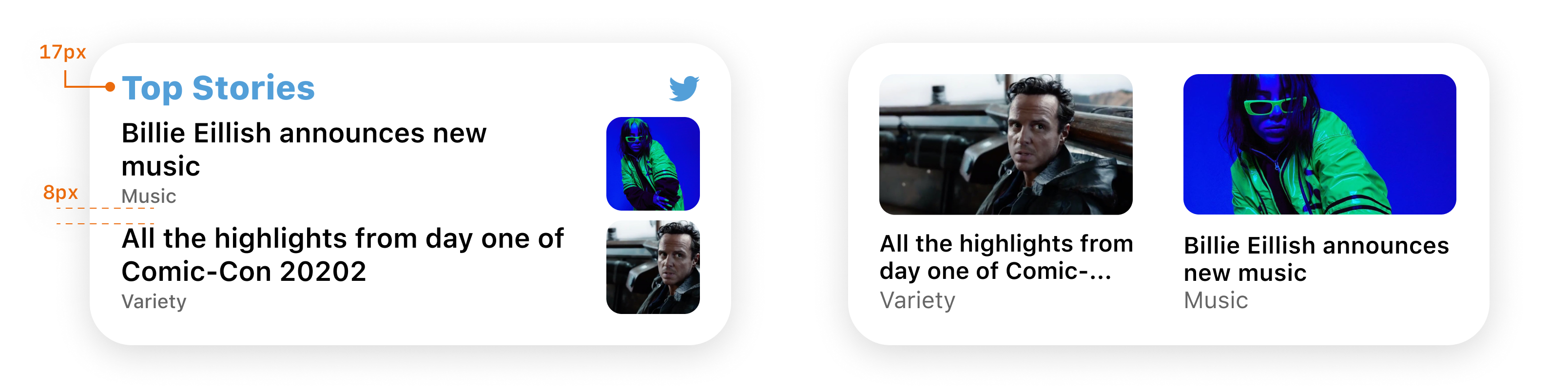
That’s much better. SwiftUI provides a method which applies corner-radius based on the properties of the element. You can find more about it here. Make sure you add corner radius in moderation, overdoing will also be detrimental.
那好多了。 SwiftUI提供了一种基于元素属性应用角半径的方法 。 您可以在这里找到更多有关它的信息 。 确保适度添加拐角半径,过度使用也会造成不利影响。
Now moving to the largest size, I think going with the content style would look good. Here’s what I came up with:
现在移到最大尺寸,我认为采用内容样式会看起来不错。 这是我想出的:
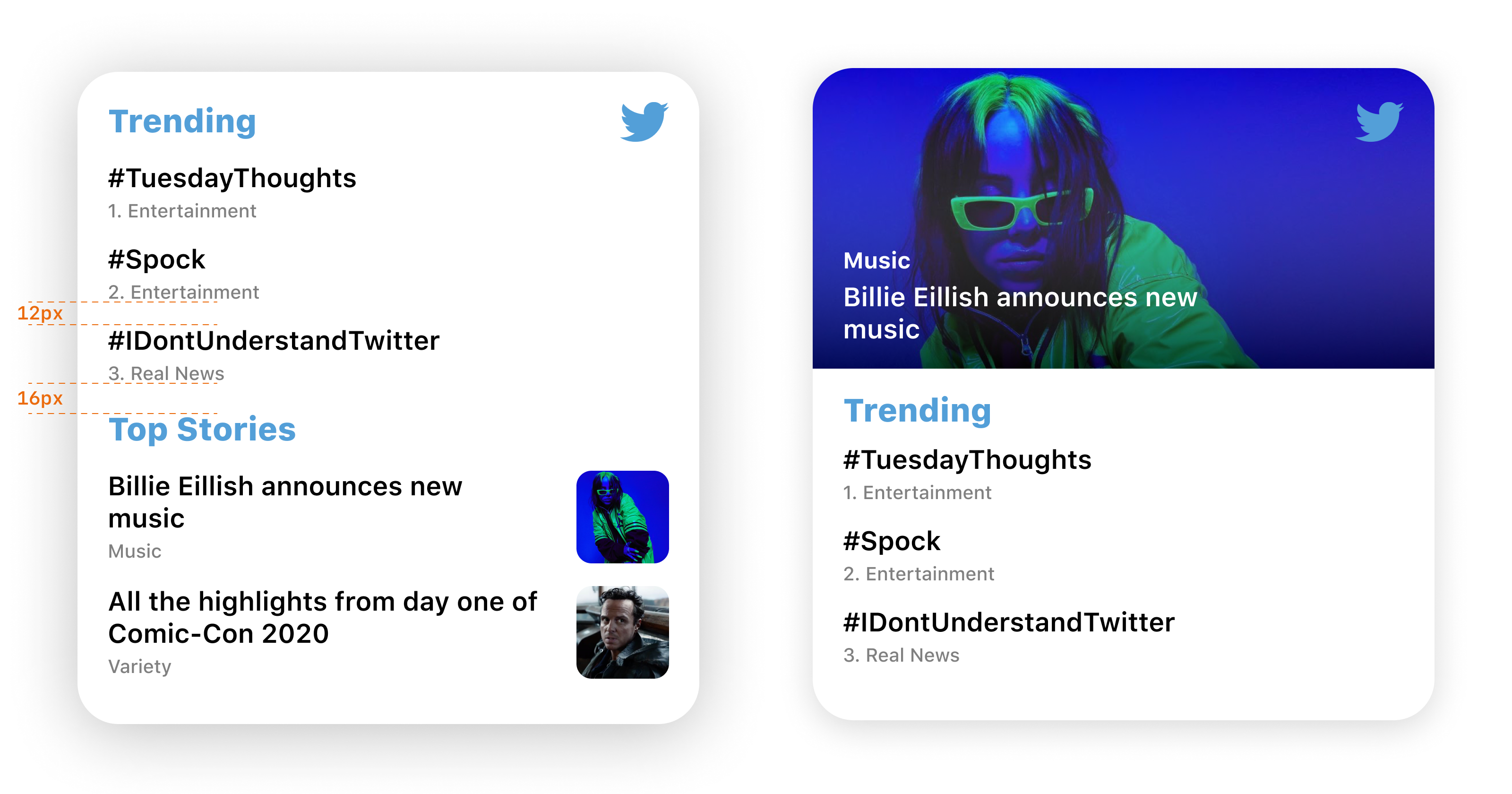
It adds a new Trending section. As I said earlier, this is not the only way you can design it. There are countless ways, and you should go with the design that suits your app the best.
它添加了一个新的趋势部分。 正如我之前所说,这不是设计的唯一方法。 有无数种方法,您应该选择最适合您的应用程序的设计。
示例2 — Duolingo (Example 2 — Duolingo)
Duolingo presents a gamified learning experience. Learners can maintain streaks and earn gems to buy unlockables. Streaks are the only thing that keep me going. Naturally, a small widget with my streak would be a welcome addition to my home screen. A medium widget shows the languages I am currently learning. I can tap any of them to go straight to the challenge screen.
Duolingo提供游戏化的学习体验。 学习者可以维持条纹并赚取宝石以购买可解锁的物品。 条纹是唯一让我前进的东西。 自然,带有我的条纹的小部件将是我主屏幕的一个受欢迎的补充。 一个中型窗口小部件显示了我当前正在学习的语言。 我可以点击其中任何一个直接进入挑战屏幕。
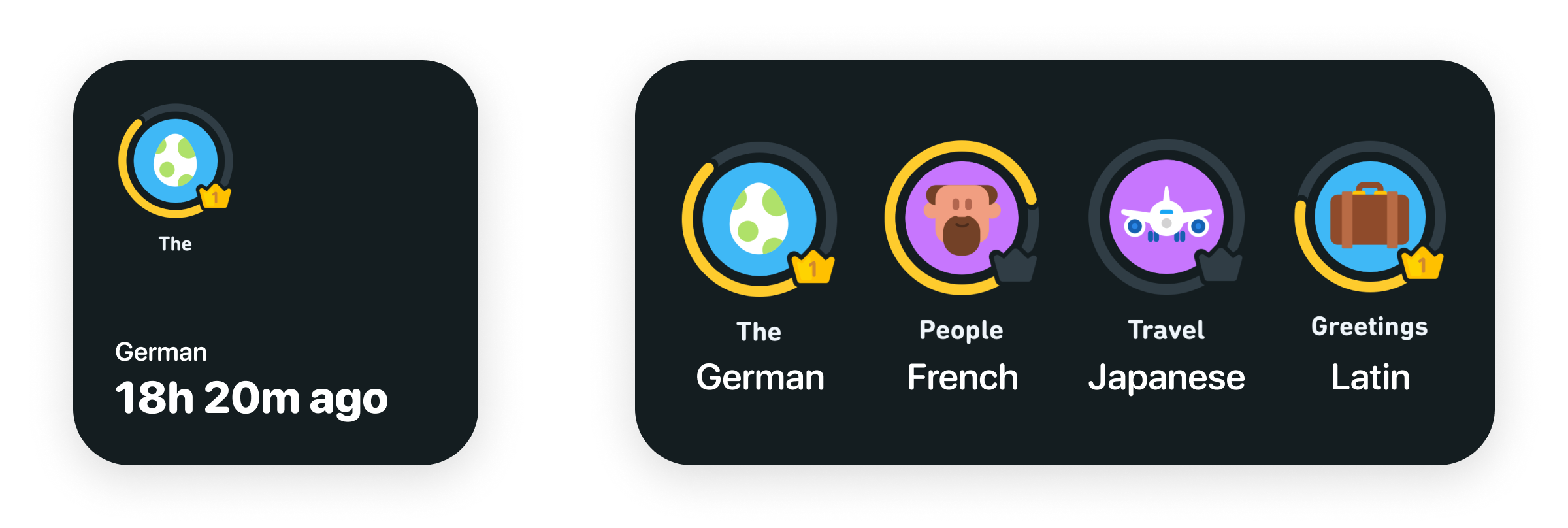
Notice “18h 20m ago” in the small widget. Apple recommends against using language along the lines of “Last updated X ago.”
在小窗口小部件中注意“ 18h 20m ago”。 Apple建议不要使用“最后更新为X以前”的语言。
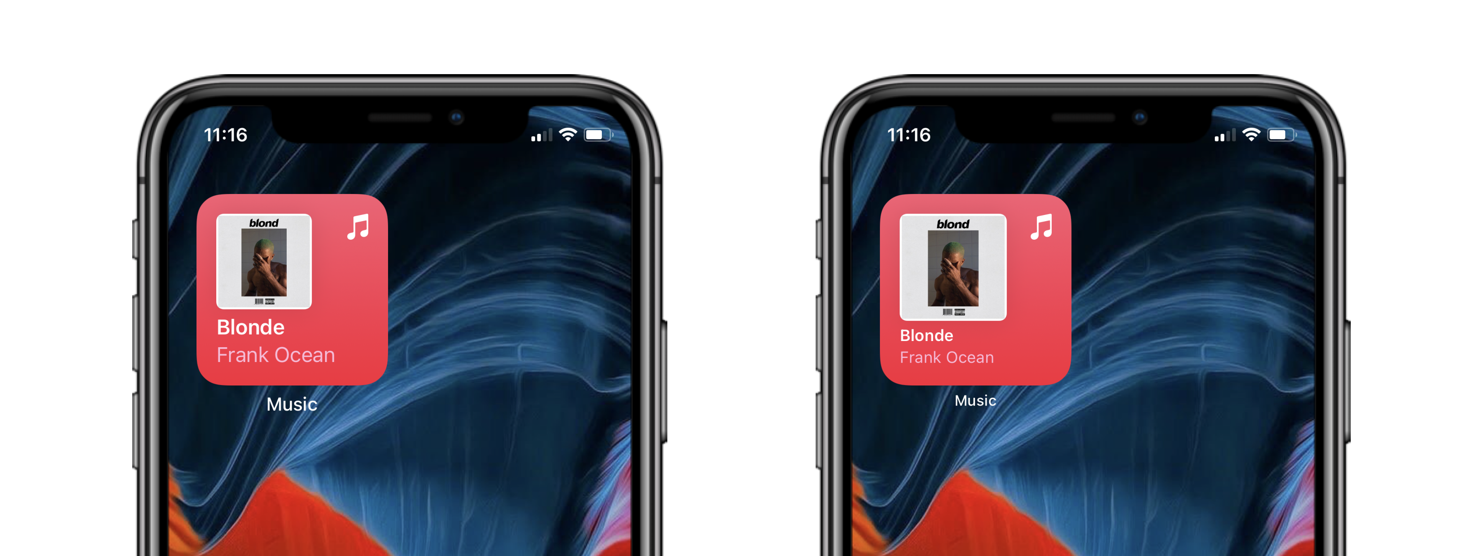
占位符 (Placeholders)
When the widget is inactive or isn’t able to load data, Apple shows placeholders. Here’s an example:
当小部件处于非活动状态或无法加载数据时,Apple将显示占位符。 这是一个例子:
SwiftUI generates placeholders without much code. You can find out more here.
SwiftUI无需太多代码即可生成占位符。 你可以在这里找到更多。
可配置的小部件 (Configurable Widgets)
Widgets also let users have some preferences over what content the widget displays. For instance, you can edit the location in the Weather widget.
小部件还使用户对小部件显示的内容有一些偏好。 例如,您可以在“天气”小部件中编辑位置。
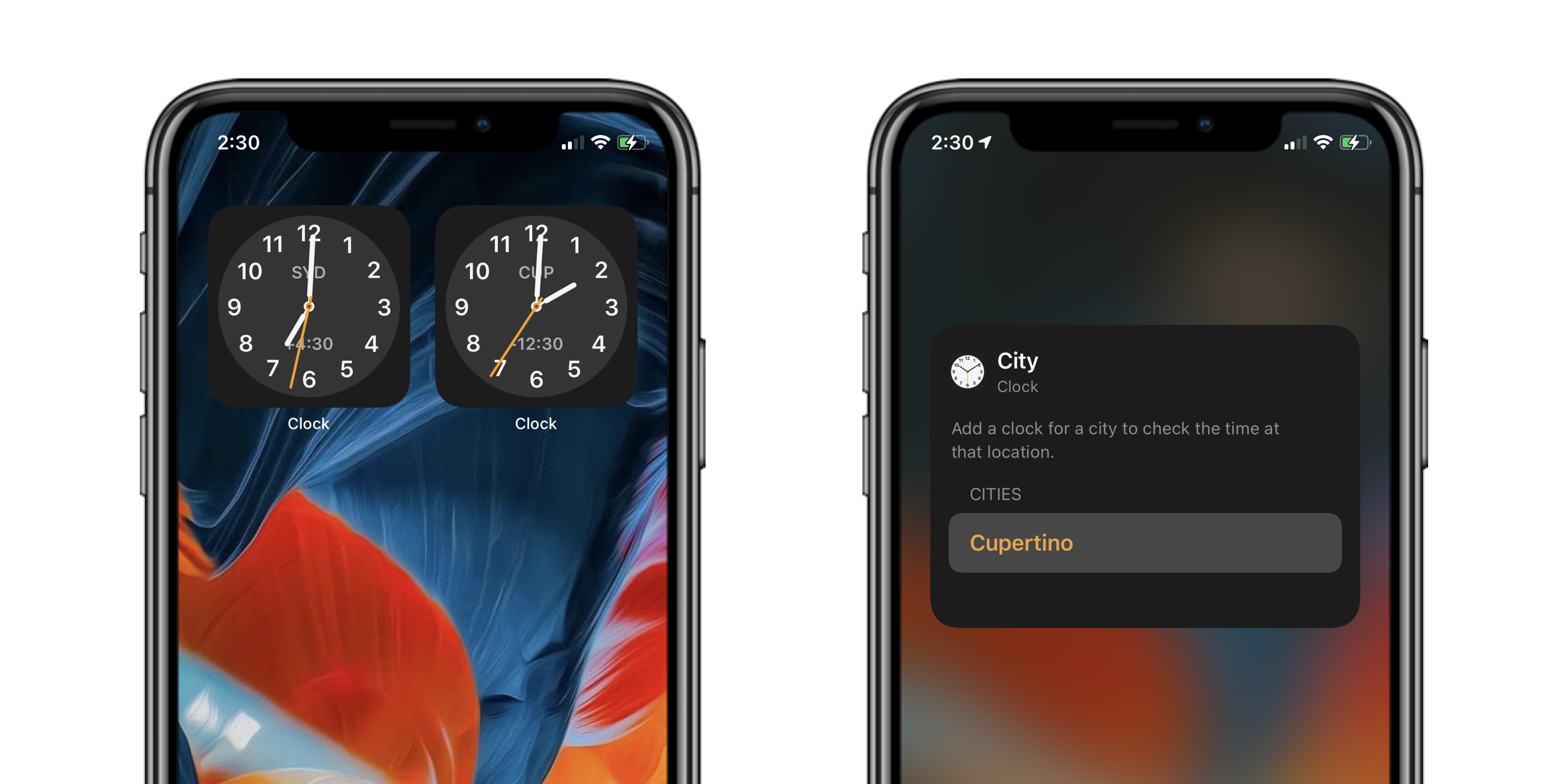
I can also end up having two instances of the same widget with different configurations. For example, I can have two clock widgets, each showing me time from a different timezone.
我最终还可以拥有具有不同配置的同一小部件的两个实例。 例如,我可以有两个时钟小部件,每个小部件显示我来自不同时区的时间。
暗模式 (Dark Mode)
As the devices switch between display mode, your widget must adjust with it. The Fill style uses a rich background, so in most cases, it won’t need changes to support Dark Mode. To learn how to design for dark mode, checkout Chethan’s ultimate guide.
当设备在显示模式之间切换时,您的窗口小部件必须随之调整。 填充样式使用丰富的背景,因此在大多数情况下,不需要更改即可支持暗模式。 要了解如何设计黑暗模式,请查看Chethan的终极指南 。
辅助功能支持 (Accessibility Support)
Make sure that elements have enough breathing space on your widget. If a user is using a huge font size on their device, your widget should be able to scale its content up. Testing for different situations is straightforward on Xcode 12. You can find more here.
确保小部件上的元素具有足够的呼吸空间。 如果用户在其设备上使用了巨大的字体,则您的小部件应该能够放大其内容。 在Xcode 12上测试不同情况非常简单。您可以在此处找到更多信息 。
花絮 (Tidbits)
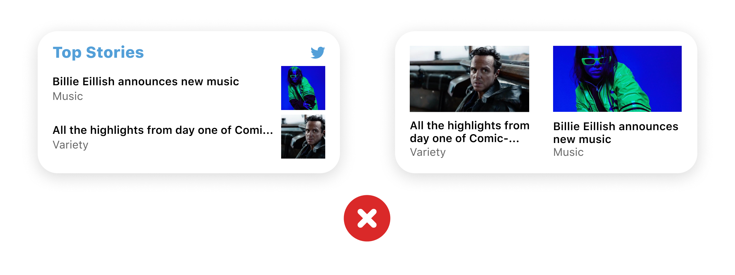
Apple only allows adding your app icon to the widget if your app acts as an aggregator of content. Apps like Twitter or News.
如果您的应用程序充当内容的聚合者,Apple仅允许将您的应用程序图标添加到小部件中。 诸如Twitter或新闻之类的应用。
They also do not allow having your app’s name on the widget since it is redundant.
它们也不允许在小部件上使用您的应用名称,因为它是多余的。
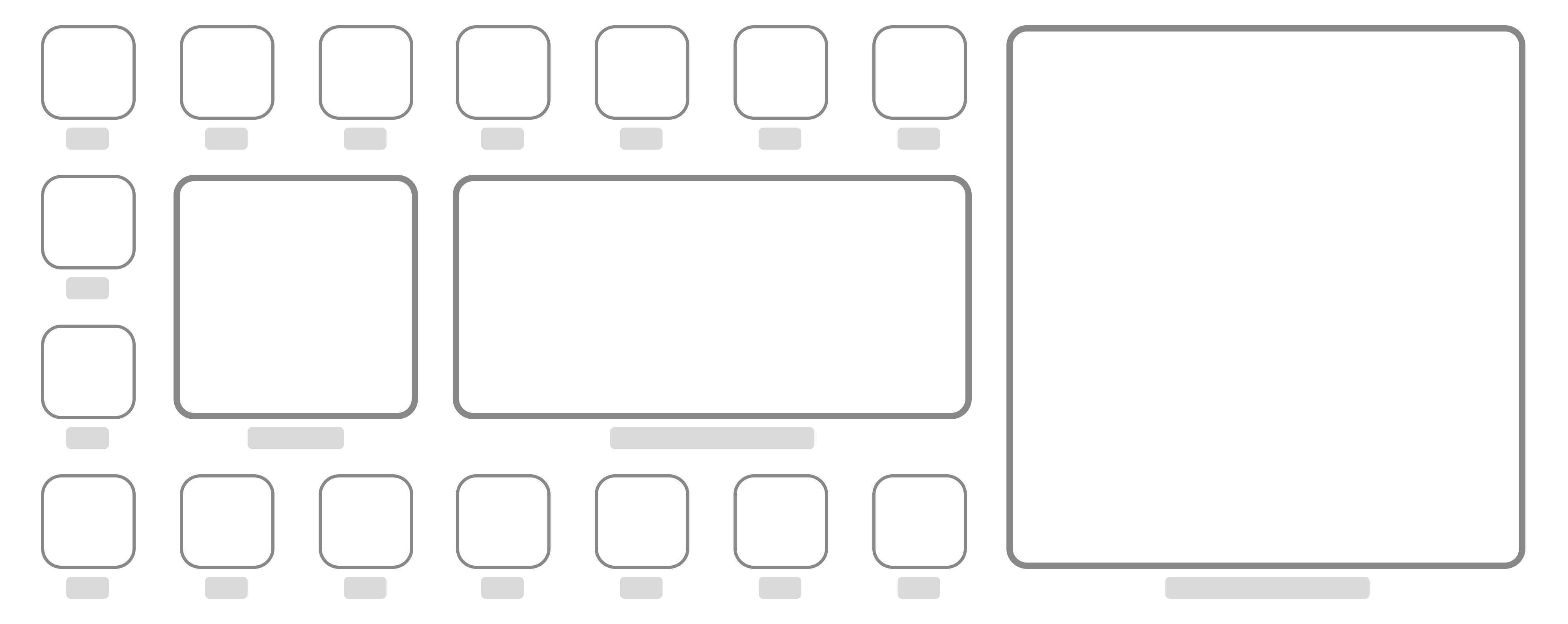
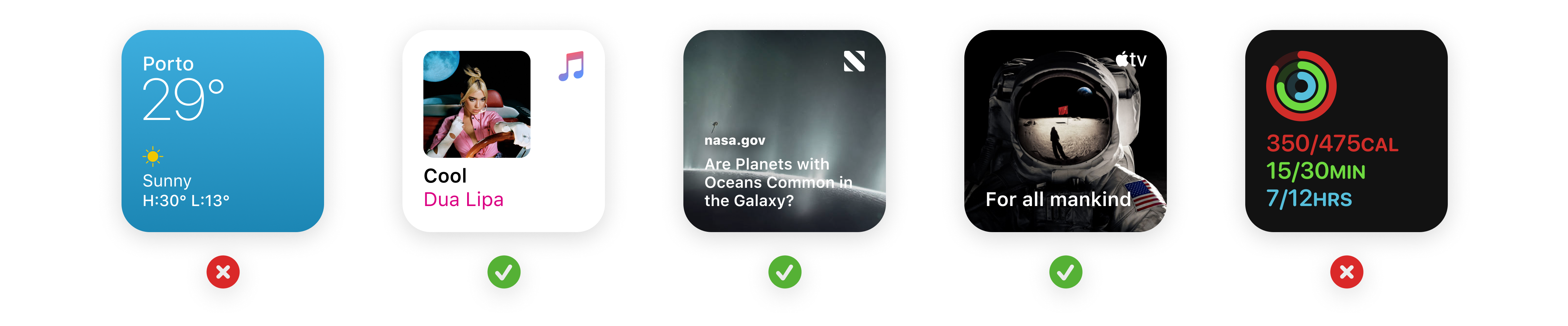
通用布局 (Common Layouts)


结语 (Wrap Up)
That is pretty much all you need to know to get started on your first widget. I would love to see what you come up with, feel free to get in touch with me.
这是您开始第一个小部件所需的几乎所有知识。 我很想知道您的想法,请随时与我联系。
资源资源 (Resources)
For some SwiftUI tutorials:
对于一些SwiftUI教程:
翻译自: https://uxdesign.cc/designing-widgets-for-ios-macos-and-ipados-the-ultimate-guide-737fb284a9df
ios macos


 1180
1180


 被折叠的 条评论
为什么被折叠?
被折叠的 条评论
为什么被折叠?
 到【灌水乐园】发言


