


swift 创建类扩展
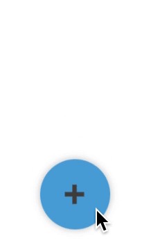
We’re going to build a custom expandable button in Swift, like the one below:
我们将在Swift中构建一个自定义的可扩展按钮,如下所示:
First off, it’s important to understand the view structure that is necessary to implement a component like this one.
首先,重要的是要了解实现这样的组件所必需的视图结构。
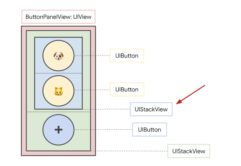
We will create a subclass of UIView that will be composed of 5 subviews like so:
我们将创建UIView的子类,该子类将由5个子视图组成,如下所示:
A
containerStackViewthat will hold themenuButtonand theexpandedStackView一个
containerStackView,将保存menuButton和expandedStackViewA
menuButtonthat, when tapped, will handle the expanding animation一个
menuButton,在点击时将处理扩展的动画An
expandedStackViewthat will be shown or hidden when themenuButtonis tapped一个
expandedStackView将被显示时,或者当隐藏menuButton被点击A
dogButtonthat will be part of theexpandedStackView一个
dogButton将成为一部分expandedStackViewA
catButtonthat will also be part of theexpandedStackView一个
catButton这也将是部分expandedStackView
创建我们的自定义UIView (Creating our custom UIView)
Let’s start by setting up our view, which we will call ButtonPanelView. We will first create 3 instances of UIButton and 2 instances of UIStackView.
让我们从设置视图开始,我们将其称为ButtonPanelView 。 我们将首先创建3个UIButton实例和2个UIStackView实例。
We will add dogButton and catButton as arranged subviews of expandedStackView. We will then add expandedStackView and menuButton as arranged subviews of containerStackView.
我们将增加dogButton和catButton作为安排子视图expandedStackView 。 然后,我们将添加expandedStackView和menuButton的排列子视图containerStackView 。
We can do some view styling (e.g. add color and shadows) as well as add any necessary constraints when the ButtonPanelView is initialized.
在初始化ButtonPanelView时,我们可以进行一些视图样式设置(例如,添加颜色和阴影)以及添加任何必要的约束。
动画 (Animation)
The animation itself is very simple; every time the menu button is tapped, we will flip the isHidden state of the expandedStackView’s subviews (i.e. dogButton and catButton) and of the expandedStackView itself, using UIKit’s UIView.animate method.
动画本身非常简单。 每一个菜单按钮被点击的时候,我们会翻转isHidden的状态expandedStackView的子视图(即dogButton和catButton )和中expandedStackView本身,使用UIKit的UIView.animate方法。
We can also make some simple modifications to our animation code in handleTogglePanelButtonTapped so that the ➕ emoji changes to ❌ when the panel is expanded, and vice versa when collapsed.
我们还可以在handleTogglePanelButtonTapped对动画代码进行一些简单的修改,以便在扩展面板时将➕表情符号更改为❌,而在折叠时则相反。
Here’s the final implementation of our ButtonPanelView class:
这是我们的ButtonPanelView类的最终实现:
Thanks for reading! You can find a full demo of the expandable button on GitHub.
翻译自: https://medium.com/swlh/creating-an-expandable-button-in-swift-8368165b999e
swift 创建类扩展


 9757
9757


 被折叠的 条评论
为什么被折叠?
被折叠的 条评论
为什么被折叠?
 到【灌水乐园】发言


