


In my last post, I introduced a way to integrate the d3.js library into React Native, enabling yourself to reach out to a broader audience using mobile apps. In that article, we started to build a basic map in the azimuthal equal-area projection. Now let’s make this map more interesting and add some data-driven colorization and interactive panning and pinch-zooming. Make sure you read the first article beforehand, as we will continue manipulating the code we created there. You can also check out my Youtube playlist of this tutorial series.
在 上 一篇 文章中 ,我介绍了一种将d3.js库集成到React Native中的方法,使您可以使用移动应用程序接触更广泛的受众。 在那篇文章中,我们开始在方位角等面积投影中构建基本地图。 现在,让该贴图更有趣,并添加一些数据驱动的着色以及交互式平移和缩放。 确保您事先阅读了第一篇文章,因为我们将继续处理在那里创建的代码。 您也可以查看 本教程系列的 Youtube播放列表 。
准备数据 (Prepare the data)
First, we need some data to apply colorization on the country level. I selected the COVID-19 data published by the WHO. It is in CSV format, but I transformed it into a JSON file and stored it in the assets/data folder. The file looks like this:
首先,我们需要一些数据以在国家/地区级别应用颜色。 我选择了WHO发布的COVID-19数据 。 它是CSV格式,但我将其转换为JSON文件并将其存储在assets/data文件夹中。 该文件如下所示:
{
   "Afghanistan": [
      {
         "date": "2020-02-24",
         "country_code": "AF",
         "region": "EMRO","deaths": 0,
         "deaths_cum": 0,"confirmed": 1,
         "confirmed_cum": 1
      },
      {
         "date": "2020-02-25",
         "country_code": "AF",
         "region": "EMRO",
         "deaths": 0,
  ...
添加滚动平均值 (Adding a rolling average)
Each country includes a list of data for each date following different starting dates. The attributes we are interested in for our dashboard is the number of deaths and confirmed cases per day. However, we shouldn’t go with the raw data, because the data provided from governments may follow weekly patterns (e.g. fewer tests on weekends or due to reporting delays). Therefore, we should follow best practices here and include a rolling seven-day average, that is, to transform the data of each date to be the average of that attribute for the last seven days including that date. (It should be noted that there is some debate around the recommended time scale.) For that, I created a new folder “functions” inside our parent folder that stores the movingAverage.js file, which looks like this:
每个国家/地区都包含不同开始日期后每个日期的数据列表。 我们对仪表板感兴趣的属性是每天的死亡人数和确诊病例。 但是,我们不应该使用原始数据,因为政府提供的数据可能遵循每周的模式(例如,周末的测试较少或由于报告延迟)。 因此, 我们在这里应遵循最佳实践,并包括一个连续7天的平均值 ,即将每个日期的数据转换为该属性在过去7天(包括该日期)的平均值。 (应该注意的是,关于建议的时间范围存在一些争论。)为此,我在父文件夹内创建了一个新文件夹“ functions ”,用于存储movingAverage.js文件,如下所示:
What the heck happens here? First, we have two input variables data and windowSize, where windowSize is the number of previous days we want to include to our moving average (we agreed on seven days). After initializing our newData array we are looping through the data starting from the index windowSize - 1 because days before that would not include enough dates for the average calculation. Then there is another loop for each of our attribute we want to derive the average for (confirmed and deaths). Now we slice() the data to include only the current date x and previous 6 dates o:
这里到底发生了什么? 首先,我们有两个输入变量data和windowSize ,其中windowSize是我们要包括到移动平均值中的前几天(我们同意在7天之内)。 初始化newData数组后,我们将循环从索引windowSize - 1开始的data ,因为在此之前的几天将没有足够的日期用于平均计算。 然后,我们要推导出的每个属性的另一个循环( confirmed和deaths的平均值)。 现在我们将数据slice() ,使其仅包含当前日期x和前6个日期o :
[o,o,o,o,o,o,x]
[ o,o,o,o,o,o,x ]
Using the reduce() function we then calculate the average of the seven dates, add the prefix avg_ to its keyName and assign the rounded value to the averages object. Finally, we store all of the previous data along with the newly created averages into the newData array using the spreading operator ... .
然后,使用reduce()函数计算七个日期的平均值,将avg_前缀avg_到其keyName并将round值分配给averages对象。 最后,我们使用扩展运算符...将所有先前的data以及新创建的averages到newData数组中。
在App.js 文件中执行数据准备 (Perform the data preparation in the App.js file)
Now that we have our data ready, we can head to our App.js file and load the data into our app. First, let’s import our data and the movingAverage.js file:
现在我们已经准备好数据,我们可以转到App.js文件并将数据加载到我们的应用程序中。 首先,让我们导入数据和movingAverage.js文件:
import movingAverage from "./functions/movingAverage";
import covidData_raw from "./assets/data/who_data.json";
Once this is done, we need to set up the state of the statistic as well as the date we want to display. Let’s go with the avg_confirmed for the initial statistic and my birthday 2020–02–24 first (date selection will eventually be interactive, as you’ll see in my next article, so this is just a starting point) and handle each state with the useState hook:
完成此操作后,我们需要设置统计信息的状态以及要显示的日期。 让我们先使用avg_confirmed作为初始统计数据, 2020–02–24首先确定我的生日2020–02–24 (日期选择最终将是交互式的,就像您在下一篇文章中看到的那样,所以这只是一个起点),并使用useState钩子:
import React, { useState } from 'react';//...inside the App component:const [stat, setStat] = useState("avg_confirmed");
const [date, setDate] = useState("2020-02-24");
Now we can prepare our data for the visualization. Inside our App component, we add the following:
现在,我们可以为可视化准备数据。 在我们的App组件内,添加以下内容:
You will recognize that we store the covidData using the useMemo hook, as it will not change throughout the render life cycle in our case. Inside of it, we transform our covidData_raw to an array of objects {name: country, data: covidData_raw[country]}. After that, we add the moving average to the data using our movingAverage() function and a specified windowSize = 7. Finally, we may only be interested in countries that at least one time exceeded 10 daily cases on a 7-day average and, hence, we filter() them out.
您将认识到我们使用useMemo钩子存储了covidData ,因为在我们的情况下,它在整个渲染生命周期中都不会改变。 在其中,我们将covidData_raw转换为对象数组{name: country, data: covidData_raw[country]} 。 之后,我们使用movingAverage()函数和指定的windowSize = 7将移动平均值添加到数据中。 最后,我们可能只对至少一次超过7天平均每天超过10个每日案例的国家感兴趣,因此,我们将它们filter()掉了。
数据驱动的着色 (Data-Driven Colorization)
You still with me? Great! Because now we start the colorful stuff!
你还和我在一起吗? 大! 因为现在开始彩色的东西!
完成App.js文件 (Finalize the App.js file)
As we want to create a choropleth map, we should set our color scale first, for which we need the upper limit of our current stat value. To do so, let’s add another constant that stores this upper limit:
当我们要创建一个choropleth贴图时 ,我们应该首先设置颜色比例,为此我们需要当前stat值的上限。 为此,让我们添加另一个存储此上限的常量:
import * as d3 from "d3";//... inside the App component
const maxY = useMemo(() => {
  return d3.max(covidData, (country) =>
    d3.max(country.data, (d) => d[stat])
  );
}, [stat]);
I am calling it maxY, because later on, the statwill represent the y-axis of our line chart (more on that in the next article). Using the d3.max() function we can derive the maximal value of the current stat (whenever the stat changes, maxY will do as well). Now we can create our colorScale:
我称它为maxY ,因为稍后,该stat将代表折线图的y轴(在下一篇文章中会对此进行更多介绍)。 使用d3.max()函数,我们可以得出当前stat的最大值(每当stat更改时, maxY也会执行)。 现在我们可以创建我们的colorScale :
const colorScale = useMemo(() => {
  return d3.scaleSequentialSymlog(d3.interpolateReds)
      .domain([0, maxY]);
}, [maxY]);
Here, we create a sequential scale with bi-symmetric log transformation to allow both zero values and insights for our widely ranged data. The range we specify is the interpolated color space of a single red hue using d3.interpolateReds.
在这里,我们使用双对称对数转换创建一个顺序标度,以允许零值和洞察力适用于广泛的数据。 我们指定的范围是使用d3.interpolateReds的单个红色色调的插值色彩空间。
We now finished our setup in the App.js file. The only thing that is left is to pass the things we calculated to the <Map> component as props:
现在,我们在App.js文件中完成了设置。 剩下的唯一事情就是将我们计算出的内容作为道具传递给<Map>组件:
return (
  <View style={styles.container}>
    <Map
      dimensions={dimensions}data={covidData}
      date={date}
      colorScale={colorScale}
      stat={stat}
    />
  </View>
);
调整Map.js文件 (Adjust the Map.js file)
Now let’s prepare our Map.js file. For this, we can extend our object destructuring of the props to add the newly created values:
现在,让我们准备我们的Map.js文件。 为此,我们可以扩展props对象props以添加新创建的值:
const {
  dimensions,data,
  date,
  colorScale,
  stat
} = props;
Then we head over to our useEffect section, where we build our SVG<Path> for each country:
然后,我们useEffect部分,在此我们为每个国家/地区构建SVG <Path> :
Several things were added here. The countryPaths constant (that we created in the previous article) stores the SVG paths of each country (so something like M 10 10 L 30 10 L 20 30 z) from the TopoJSON file we used for this tutorial. The problem is, that the country names used in that file may not match the ones from the WHO COVID-19 data (e.g. USA and United States of America). One solution to overcome this is to go through each file manually and match the names one by one or use some text analysis approach. But for our purpose let’s just check if the curCountry name exists in the COVID-19 dataset. If so, we get the curCountryData, and if not we assign null to it using the ternary operator. Next, we check if for the selected date data actually exists for that country and store the boolean outcome in isDataAvailable. Finally, if data exists for that particular date, we want to get the dateIndex inside the curCountryData. Once this is done, we can apply our colorScale for the currently selected stat of that dateIndex to the fill attribute of the <Path>. In case there was no data available, we fill the country with a light grey and decrease the opacity.
这里添加了几件事。 countryPaths常量(我们在上一篇文章中创建的)存储了我们用于本教程的TopoJSON文件中每个国家的SVG路径(例如M 10 10 L 30 10 L 20 30 z )。 问题在于,该文件中使用的国家名称可能与WHO COVID-19数据中的国家名称不匹配(例如, USA和United States of America )。 解决此问题的一种方法是手动浏览每个文件,然后一个一个地匹配名称,或使用某种文本分析方法。 但是出于我们的目的,我们只需要检查COVID-19数据集中是否存在curCountry名称。 如果是这样,我们得到curCountryData ,如果不是,我们使用三元运算符为其分配null 。 接下来,我们检查所选date数据是否确实存在于该国家/地区,并将布尔结果存储在isDataAvailable 。 最后,如果存在该特定日期的数据,我们希望在dateIndex获取curCountryData 。 完成此操作后,我们可以将colorScale用于该colorScale的当前选定stat信息dateIndex <Path>的fill属性。 如果没有可用数据,我们用浅灰色填充该国家并降低不透明度。
I present to you: A d3 choropleth map in React Native!
我向您呈现: React Native中的d3弦谱图!

Editor’s note: It is not good practice to use absolute data for choropleth maps or red for visualizing COVID data as we did in this example. If you want to know more about when to use choropleth maps, visit here or here or here. Read more about how to visualize COVID data responsible here or here.
编者注:像我们在本示例中那样,对于绝对值映射,使用绝对数据,对于可视化COVID数据,使用红色不是一个好习惯。 如果您想了解何时使用Choropleth映射的更多信息,请访问 此处 或 此处 或 此处 。 在此处 或 此处 阅读有关如何可视化COVID数据的更多信息 。
增加互动 (Adding Interactivity)
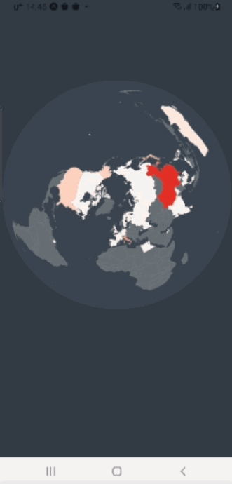
Great! So on February 24, 2020, China was still the hot spot regarding confirmed cases. In Europe, Italy was the country with the leading number of confirmed cases. And the Netherlands … well … uhm … I cannot really see it. So, it is time to add some zooming!
大! 因此,在2020年2月24日,中国仍然是确诊病例的热点。 在欧洲,意大利是确诊病例数最高的国家。 还有荷兰……嗯……嗯……我真的看不到它。 因此,是时候添加一些缩放了!
捏缩放 (Pinch-Zooming)
Luckily there are libraries we can utilize for our purpose of adding interactivity to our map. In this case, the React Native Gesture Handler library will serve us well. After installing it with
幸运的是,我们可以利用一些库来为地图添加交互性。 在这种情况下, React Native Gesture Handler库将很好地为我们服务。 用后安装
expo install react-native-gesture-handlerwe can import the PanGestureHandler for panning, the PinchGestureHandler for pinch-zooming and the State component for getting the current state of the handler to our Map.js file:
我们可以导入PanGestureHandler进行平移, PinchGestureHandler进行缩放,以及State组件以将处理程序的当前状态导入到我们的Map.js文件中:
import {
  PanGestureHandler,
  PinchGestureHandler,
  State
} from "react-native-gesture-handler";
A typical State flow of a gesture handler is:
手势处理程序的典型状态流为:
UNDETERMINED -> BEGAN ---> ACTIVE ---> END -> UNDETERMINEDBefore blindly diving into pinch-zooming, we should first try to understand what we actually want to achieve. Let’s take a look at the following example, in which we try to scale up a square by spreading two fingers away from each other:
在盲目地放大之前,我们应该首先尝试了解我们真正想要实现的目标。 让我们看下面的示例,在该示例中,我们通过将两个手指彼此分开来尝试扩大正方形:

The PinchGestureHandler includes the scale attribute which is “the scale factor relative to the points of the two touches in screen coordinates.” That means, when the two fingers are placed over the square the scale attribute is assigned with the value 1. By moving the fingers towards each other (i.e. reducing the distance of the two touch events) this value decreases towards 0 and vice versa. If the only purpose would be to just scale the square we can now just assign a scale attribute to our square and provide it with the scale value of the gesture handler. However, in SVG, scaling means the object expands from the top left corner towards the bottom right (see graphic). This results in the effect that the focal point of the touch event (i.e. the center between the two touches) actually travels towards the top left on our scaled square. This is of course not what we want on a map zoom because we want to zoom in on a specific location that should constantly stay over the focal point of the touch event. To achieve that we not only need to scale the square but also translate it constantly during the pinch-zooming.
PinchGestureHandler包含scale属性,该属性是“ 相对于屏幕坐标中两次触摸的点 的 比例因子。 ”这意味着,当两个手指放在正方形上时, scale属性分配值1 。 通过使手指彼此相对移动(即减小两个触摸事件的距离),该值朝0减小,反之亦然。 如果唯一的目的只是缩放正方形,我们现在可以为正方形分配一个scale属性,并为其提供手势处理程序的scale值。 但是,在SVG中,缩放表示对象从左上角向右下角扩展(请参见图形)。 这导致触摸事件的焦点(即两次触摸之间的中心)实际上朝着缩放正方形的左上方移动。 当然,这不是我们想要的地图缩放,因为我们希望放大特定位置,该位置应始终停留在触摸事件的焦点上。 为此,我们不仅需要缩放正方形,还需要在缩放过程中不断转换正方形。
Knowing this, let’s implement our pinch-zooming by adding some states to our Map component first:
知道了这一点,让我们通过将一些状态首先添加到Map组件来实现捏缩放:
const [translateX, setTranslateX] = useState(0);
const [translateY, setTranslateY] = useState(0);
const [scale, setScale] = useState(1);
const [prevScale, setPrevScale] = useState(1);
const [lastScaleOffset, setLastScaleOffset] = useState(0);
In the next step, we can already add the gesture handlers to the return statement, for which we wrap the handlers around the Svg component of our map and also assign the scale and translate transformation to the map using the above states scale, translateX and translateY:
在下一步中,我们已经可以将手势处理程序添加到return语句中,为此,我们将处理程序包装在地图的Svg组件周围,还可以使用上面的状态scale , translateX和translateY来分配scale并将translate转换到地图:
You see that we have two properties for each gesture handler:
您会看到每个手势处理程序都有两个属性:
onGestureEvent: “Takes a callback that is going to be triggered for each subsequent touch event while the handler is in an ACTIVE state.”onGestureEvent:“ 在处理程序处于 ACTIVE 状态 时,将为每个后续的touch事件触发一个回调 。 ”onHandlerStateChange: “Takes a callback that is going to be triggered when state of the given handler changes.”onHandlerStateChange:“接受一个回调,该回调将在给定处理程序的状态更改时触发。 ”
Now it is time to create the functions pinchGestureHandler and pinchStateHandler (right below our state initializations):
现在是时候创建函数pinchGestureHandler和pinchStateHandler (在我们的状态初始化下面):
Imagine scaling a map one time, then terminating the pinching, and then restarting to scale it again. The pinchStateHandler takes care of preventing that the scale starts at 1 again (as we want to continue scaling from the current scale state), but rather stores the final scale state value offset from 1 of one pinch gesture in the lastScaleOffset state. This value can then be used in the pinchGestureHandler. First, it checks if the sum of the current scale event and the lastScaleOffset is larger than 1 or smaller than 5 to limit the range of possible zooming. If this is the case, the values for the scaling and translating of the map are calculated. For the scaling, it is straightforward as it is the sum of the current scale event and the lastScaleOffset. For translating, however, it is a little bit more complicated. Let’s look at the basic formula for translateX:
想象一下缩放地图一次,然后终止缩放,然后重新开始再次缩放它。 pinchStateHandler负责防止缩放再次从1开始(因为我们要从当前缩放状态继续缩放),而是将最终scale状态值从一个捏合手势的1偏移到lastScaleOffset状态。 然后可以在pinchGestureHandler使用此值。 首先,它检查当前缩放事件和lastScaleOffset是否大于1或小于5以限制可能的缩放范围。 在这种情况下,将计算地图的缩放和平移值。 对于缩放,它很简单,因为它是当前缩放事件和lastScaleOffset 。 但是,对于翻译而言,它有点复杂。 让我们看一下translateX的基本公式:
translateX = translateX - (focalX / scale - focalX / previousScale)where previousScale is the former state of scale. But because this formula would result in increased value for scaling up (which means moving to the right instead of moving to the left which we want to achieve), we negate the result in our transform attribute in the SVG code (see above return statement). The same is then applied to translateY.
其中previousScale是以前的scale状态。 但是因为此公式将导致按比例放大的值增加(这意味着要向右移动而不是向左移动),所以我们在SVG代码的transform属性中取反了结果(请参见上面的return语句) 。 然后将相同的内容应用于translateY 。
平移 (Panning)
Now that we finished our pinch-zooming feature, the panning is going to be easy. First, let’s add two more states to our list:
现在我们完成了捏缩放功能,平移将变得很容易。 首先,让我们在列表中再添加两个状态:
const [lastTranslateX, setLastTranslateX] = useState(0);
const [lastTranslateY, setLastTranslateY] = useState(0);
Similar to lastScaleOffset these states store the final translate value of the previous PanGestureHandler event and are set in the callback function of the onHandlerStateChange property:
与lastScaleOffset相似,这些状态存储前一个PanGestureHandler事件的最终转换值,并在onHandlerStateChange属性的回调函数中进行onHandlerStateChange :
In the panGestureHandler function we must remember to negate the calculated value again.
在panGestureHandler函数中,我们必须记住再次否定计算值。
重置地图按钮 (Reset Map Button)
You may say that we are finished now. But assume you are panning your map to the edge of the screen and want to put it back to the center. This would be pretty cumbersome to do manually:
您可能会说我们现在完成了。 但是,假设您将地图平移到屏幕边缘,并想将其放回中心。 手动执行会很麻烦:

So how about having a little button that does this for us automatically?! To do so, let’s create a button component file Button.js in our /components folder and add the following code to it:
那么,有一个小按钮会自动为我们做到这一点呢? 为此,让我们在/ components文件夹中创建一个按钮组件文件Button.js ,并向其中添加以下代码:
Several things happening here. First, there is the Animated.View component, which utilizes the Animated API of React Native. This is done to add a fading animation to the button (more on that soon). Then inside of this Animated.View is a TouchableOpacity component, which can be seen as an equivalent of a <button> with hover effect in a web environment. It has an onPress event handler that is fired when the component is touched. And finally, there is a Text component to store the content of the button. Besides the style of the Text component (which is set using StyleSheet) all other settings are coming from the props we are passing from a parent component to the Button.
这里发生了几件事。 首先,有一个Animated.View组件,它利用了React Native的Animated API。 这样做是为了向按钮添加淡入淡出的动画(稍后会有更多介绍)。 然后,在此Animated.View内部是一个TouchableOpacity组件,可以将其视为与<button>等效,并在网络环境中具有悬停效果。 它具有一个onPress事件处理程序,当触摸组件时会触发该事件处理程序。 最后,还有一个Text组件来存储按钮的内容。 除了Text组件的style (使用StyleSheet设置)以外,所有其他设置都来自我们从父组件传递给Button的props 。
Now we can use this Button component by importing it into our Map.js file:
现在,我们可以通过将其导入到Map.js文件中来使用此Button组件:
import Button from "./Button";and adding it to our return statement:
并将其添加到我们的return语句中:
...
</PanGestureHandler>
<Button
buttonStyle={{
opacity: buttonOpacity
}}
onPress={initializeMap}
text={<>↻</>}
/>
</View>
);The text property is set using React Native’s Fragments <>...</> (in this case with an HTML entity for a circular arrow ↩️). The buttonOpacity value inside the buttonStyle property is a state for the opacity of the button which we still need to add:
使用React Native的Fragments <>...</>设置text属性(在这种情况下,带有HTML实体的圆形箭头↩️)。 buttonStyle属性内的buttonOpacity值是buttonStyle的不透明度的状态,我们仍然需要添加它:
const [buttonOpacity, _] = useState(new Animated.Value(0));You can see that we are using the Animated API again, this time to initialize the buttonOpacity state with an Animated.Value(). By doing this, we can now make use of the magic behind this API by adding a fading animation to the button when any of the two gesture handlers are ACTIVE (include the following in both onHandlerStateChange callback functions, i.e. pinchStateHandler and panStateHandler):
您可以看到我们再次使用了Animated API,这次用Animated.Value()初始化buttonOpacity状态。 这样,我们现在可以通过在两个手势处理程序中的任何一个处于活动状态时在按钮上添加淡入淡出的动画来利用此API背后的魔力(在两个onHandlerStateChange回调函数中都包含以下内容,即pinchStateHandler和panStateHandler ):
if (event.nativeEvent.oldState === State.ACTIVE) {
  Animated.timing(buttonOpacity, {
    toValue: 1,
    duration: 1000,
    useNativeDriver: true
  }).start();
};
The final step is to create the initializeMap function of the onPress property of the button where we just assign the initial state values to all the states:
最后一步是创建按钮的onPress属性的initializeMap函数,在此我们将初始状态值分配给所有状态:
const initializeMap = () => {
  setTranslateX(0);
  setTranslateY(0);
  setScale(1);
  setPrevScale(1);
  setLastScaleOffset(0);
  Animated.timing(buttonOpacity, {
    toValue: 0,
    duration: 1000,
    useNativeDriver: true
  }).start();
};
And that’s it! Let’s have a look at how our interactive map performs:
就是这样! 让我们看一下交互式地图的性能:
接下来 (Coming Up)
We are not finished with our journey yet. In the last episode of this tutorial I will walk you through the process of how to add a multiple line chart to our dashboard, how to add date selection and filter functionality as well as selecting and highlighting countries. So stay tuned for more DataViz in React Native!
我们的旅程还没有结束。 在本教程的最后一集中,我将引导您完成如何向我们的仪表板添加多条折线图,如何添加日期选择和过滤功能以及选择和突出显示国家/地区的过程。 因此,请继续关注React Native中的更多DataViz!
P.S.: You can check out the final code on Github.
PS:您可以在 Github 上查看最终代码 。
In the same series:
在同一系列中:
Related YouTube playlist:
相关的YouTube播放列表:


 382
382


 被折叠的 条评论
为什么被折叠?
被折叠的 条评论
为什么被折叠?
 到【灌水乐园】发言


