


 本文探讨了数学建模在时间序列分析中的应用,详细介绍了如何进行建模及验证过程,结合机器学习和人工智能算法,为数据分析提供有力工具。
数学建模时间序列分析
时间序列预测 (Time Series Forecasting)
背景 (Background)
This article is the fourth in the series on the time-series data. We started by discussing various exploratory analyses along with data preparation techniques followed by building a robust model evaluation framework. And finally, in our previous article, we discussed a wide range of classical forecasting techniques that must be explored before moving to machine learning algorithms.
本文是有关时间序列数据的系列文章中的第四篇。 我们首先讨论各种探索性分析以及数据准备技术,然后建立一个强大的模型评估框架。 最后,在我们的前一篇文章中,我们讨论了广泛的经典预测技术,在转向机器学习算法之前必须对其进行探索。
Now, in the current article, we are going to apply all these learnings to a real-life dataset. We will work through a time series forecasting project from end-to-end, from importing the dataset, analyzing and transforming the time series to training the model, and making predictions on new data. The steps of this project that we will work through are as follows:
现在,在当前文章中,我们将所有这些学习应用于实际数据集。 我们将从头到尾完成一个时间序列预测项目,从导入数据集,分析和转换时间序列到训练模型,以及对新数据进行预测。 我们将完成的该项目的步骤如下:
- Problem Description 问题描述
- Data Preparation and Analysis 数据准备与分析
- Set up an Evaluation Framework 建立评估框架
- Stationary Check: Augmented Dickey-Fuller test 固定检查:增强的Dickey-Fuller测试
- ARIMA Models ARIMA模型
- Residual Analysis 残差分析
- Bias corrected Model 偏差校正模型
- Model Validation 模型验证
问题描述 (Problem Description)
The problem is to predict the number of monthly airline passengers. We will use the Airline Passengers dataset for this exercise. This dataset describes the total number of airline passengers over time. The units are a count of the number of airline passengers in thousands. There are 144 monthly observations from 1949 to 1960. Below is a sample of the first few rows of the dataset.
问题是要预测每月的航空公司乘客数量。 我们将使用航空公司乘客数据集进行此练习。 该数据集描述了一段时间内航空公司乘客的总数。 单位是数千名航空公司乘客的总数。 从1949年到1960年,每月进行144次观测。下面是数据集前几行的样本。

You can download this dataset from here.
您可以从此处下载该数据集。
此项目的Python库 (Python Libraries for this Project)
We need the following libraries to work on this project. These names are self-explanatory but don’t worry if you are not getting any of them. As we go along you will understand the usage of these libraries.
我们需要以下库来进行此项目。 这些名称是不言自明的,但是不用担心这些名称。 随着我们的前进,您将了解这些库的用法。
import numpy
from pandas import read_csv
from sklearn.metrics import mean_squared_error
from math import sqrt
from math import log
from math import exp
from scipy.stats import boxcox
from pandas import DataFrame
from pandas import Grouper
from pandas import Series
from pandas import concat
from pandas.plotting import lag_plot
from matplotlib import pyplot
from statsmodels.tsa.stattools import adfuller
from statsmodels.tsa.arima_model import ARIMA
from statsmodels.tsa.arima_model import ARIMAResults
from statsmodels.tsa.seasonal import seasonal_decompose
from statsmodels.graphics.tsaplots import plot_acf
from statsmodels.graphics.tsaplots import plot_pacf
from statsmodels.graphics.gofplots import qqplot
数据准备与分析 (Data Preparation and Analysis)
We will use the read_csv() function to load the time series data as a series object, a one-dimensional array with a time label for each row. It is always good to take a peek at the data to confirm that data has been loaded correctly.
我们将使用read_csv()函数将时间序列数据加载为序列对象,即一维数组,每行带有时间标签。 偷看数据以确认已正确加载数据始终是一件好事。
series = read_csv('airline-passengers.csv', header=0, index_col=0, parse_dates=True, squeeze=True)
print(series.head())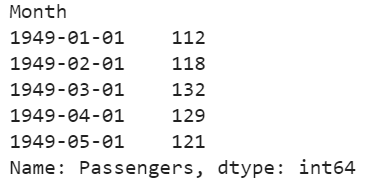
让我们通过查看汇总统计数据开始数据分析,我们将快速了解数据分布。 (Let’s begin the data analysis by looking into the summary statistics, we will get a quick idea of the data distribution.)
print(series.describe())
We can see the number of observations matches our expectations, the mean is about 280 which we can consider our level in this series. Other statistics like standard deviation and percentiles suggest a large spread of the data.
我们可以看到观察次数与我们的期望相符,平均数约为280,我们可以将其视为本系列的水平。 其他统计数据(例如标准差和百分位数)表明数据分布广泛。
下一步,我们将可视化折线图上的值,该工具可以为问题提供很多见解。 (As a next step, we will visualize the values on a line plot, this tool can provide a lot of insights into the problem.)
series.plot()
pyplot.show()
Here, the line plot suggests that there is an increasing trend of airline passengers over time. We can also observe a systematic seasonality to the travel pattern for each year and the seasonal signal appears to be growing over time, which suggests a multiplicative relationship.
在此,线图表明,随着时间的推移,航空公司的乘客数量呈增长趋势。 我们还可以观察到每年出行方式的系统季节性,并且季节性信号似乎随着时间的推移而增长,这表明存在乘法关系。
This insight gives us a hint that data may not be stationary and we can explore differencing with one or two levels to make it stationary before modeling.
这种见解给我们一个暗示,即数据可能不是固定的,我们可以在建模之前探索一个或两个级别的差异以使其稳定。
我们可以通过年度线图来确认我们的假设。 (We can confirm our assumption by yearly line plots.)
For the following plot, created year-wise separate groups of data and plotted a line plot for each year from 1949 to 1957. You can create this plot for any number of years.
对于下面的图,创建了逐年的数据组,并绘制了从1949年到1957年的每一年的线图。您可以创建任意年的图。
groups = series['1949':'1957'].groupby(Grouper(freq='A'))
years = DataFrame()
pyplot.figure()
i = 1
n_groups = len(groups)
for name, group in groups:
  pyplot.subplot((n_groups*100) + 10 + i)
  i += 1
  pyplot.plot(group)
pyplot.show()
We can observe that seasonality is a yearly cycle by looking at line plots of the dataset by year. We can see a dip at each year-end and rise from July to August. This pattern exists across the years which again suggests us to adopt season based modeling.
通过按年份查看数据集的线图,我们可以观察到季节性是一个年度周期。 我们可以看到每年年底都有下降,从7月到8月上升。 多年来一直存在这种模式,这再次表明我们采用基于季节的建模。
让我们探索观察的密度,以进一步了解我们的数据结构。 (Let’s explore the density of observations for further insight into our data structure.)
pyplot.figure(1)
pyplot.subplot(211)
series.hist()
pyplot.subplot(212)
series.plot(kind='kde')
pyplot.show()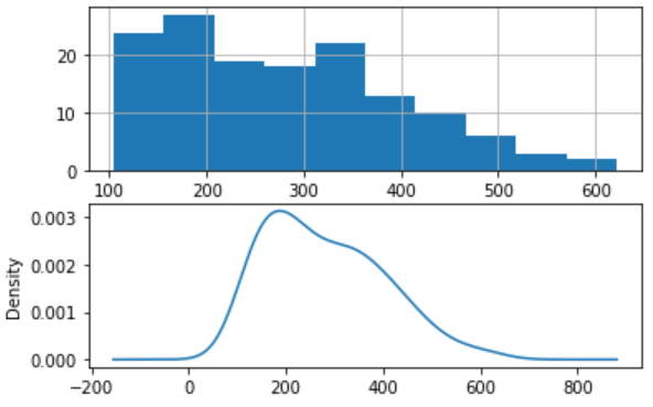
We can observe that the distribution is not Gaussian, and this insight encourages us to explore some log or power transforms of the data before modeling.
我们可以观察到分布不是高斯分布,这种见解鼓励我们在建模之前探索数据的一些对数或幂变换。
让我们按年份分析每月数据,并了解每年观测值的分布范围。 (Let’s analyze monthly data by year and get an idea of the spread of observations for each year.)
We will perform this analysis through a box and whisker plot.
我们将通过箱形图和晶须图进行此分析。
groups = series['1949':'1960'].groupby(Grouper(freq='A'))
years = DataFrame()
for name, group in groups:
  years[name.year] = group.values
years.boxplot()
pyplot.show()
The spread of the data (blue boxes) suggests a growth trend over the years which also suggests our assumption of non-stationarity of the data.
数据的散布(蓝色框)表明多年来的增长趋势,这也表明我们假设数据是非平稳的。
分解时间序列可以更清楚地了解其组成部分-水平,趋势,季节性和噪声。 (Decompose the time series for more clarity on its components — Level, Trend, Seasonality, and Noise.)
Based on our analysis till now, we have an intuition that out time series is multiplicative. So, we can decompose the series assuming a multiplicative model.
根据到目前为止的分析,我们可以直观地看出时间序列是可乘的。 因此,我们可以假设乘法模型来分解序列。
result = seasonal_decompose(series, model='multiplicative')
result.plot()
pyplot.show()
We can see that the trend and seasonality information extracted from the series validate our earlier findings that series has a growing trend and yearly seasonality. The residuals are also interesting, showing periods of high variability in the early and later years of the series.
我们可以看到,从该系列中提取的趋势和季节性信息验证了我们先前的发现,即该系列具有不断增长的趋势和年度季节性。 残差也很有趣,显示了该系列早期和后期的高变异期。
建立评估框架以建立稳健的模型 (Set up an Evaluation Framework to Build a Robust Model)
Before proceeding to model building exercise we must develop an evaluation framework to assess the data and evaluate different models.
在进行模型构建之前,我们必须建立一个评估框架来评估数据并评估不同的模型。
第一步是定义验证数据集 (The first step is defining a validation dataset)
This is historical data, so we cannot collect the updated data from the future to validate this model. Therefore, we will use the last 12 months of the same series as the validation dataset. We will split this time series into two subsets — training and validation, throughout this exercise we will use this training dataset named ‘dataset’ to build and test different models. The selected models will be validated through the ‘validation’ dataset.
这是历史数据,因此我们无法收集将来的更新数据来验证此模型。 因此,我们将使用同一系列的最后12个月作为验证数据集。 我们将这个时间序列分为两个子集-训练和验证,在整个练习中,我们将使用名为“数据集”的训练数据集来构建和测试不同的模型。 所选模型将通过“验证”数据集进行验证。
series = read_csv('airline-passengers.csv', header=0, index_col=0, parse_dates=True, squeeze=True)
split_point = len(series) - 12
dataset, validation = series[0:split_point], series[split_point:]
print('Train-Dataset: %d, Validation-Dataset: %d' % (len(dataset), len(validation)))
dataset.to_csv('dataset.csv', header=False)
validation.to_csv('validation.csv', header=False)
We can see the training set has 132 observations and the validation set has 12 observations.
我们可以看到训练集有132个观测值,而验证集有12个观测值。
第二步是开发基线模型。 (The second step is developing a baseline model.)
The baseline prediction for time series forecasting is also known as the naive forecast. In this approach value at the previous timestamp is the forecast for the next timestamp.
时间序列预测的基线预测也称为天真的预测。 在此方法中,上一个时间戳的值是下一个时间戳的预测。
We will use the walk-forward validation which is also considered as a k-fold cross-validation technique of the time series world. You can explore this technique in detail in one of my previous articles “Build Evaluation Framework for Forecast Models”.
我们将使用前向验证,它也被视为时间序列世界的k倍交叉验证技术。 您可以在我之前的文章“ 为预测模型构建评估框架 ”中详细探讨该技术。
series = read_csv('dataset.csv', header=None, index_col=0, parse_dates=True, squeeze=True)
X = series.values
X = X.astype('float32')
train_size = int(len(X) * 0.5)
train, test = X[0:train_size], X[train_size:]
Here is the implementation of our Naive model and walk forward validation result for single-step forecasts.
这是我们朴素模型的实现,并逐步验证了单步预测的结果。
history = [x for x in train]
predictions = list()
for i in range(len(test)):
  yhat = history[-1]
  predictions.append(yhat)
  obs = test[i]
  history.append(obs)
  print('>Forecast=%.3f, Actual=%3.f' % (yhat, obs))
# display performance report
rmse = sqrt(mean_squared_error(test, predictions))
print('RMSE: %.3f' % rmse)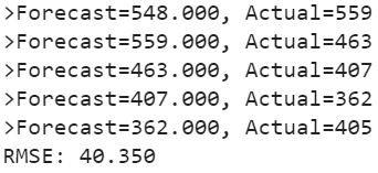
As a performance measure, we have used RMSE (root mean squared error). Now, we have a baseline model accuracy result, RMSE: 40.350
作为性能指标,我们使用了RMSE(均方根误差)。 现在,我们有一个基准模型准确性结果,RMSE:40.350
Our goal is to build a model with higher accuracy than this baseline.
我们的目标是建立一个比该基准更准确的模型。
固定检查—增强的Dickey-Fuller测试 (Stationary Check — Augmented Dickey-Fuller test)
We already have some evidence from insights generated from exploratory data analysis that our time series is non-stationary.
从探索性数据分析中得出的见解,我们已经有了一些证据,证明我们的时间序列是不稳定的。
We will confirm our hypothesis using this Augmented Dickey-Fuller test. This is a statistical test, It uses an autoregressive model and optimizes an information criterion across multiple different lag values.
我们将使用增强的Dickey-Fuller检验来确认我们的假设。 这是一项统计测试,它使用自回归模型并针对多个不同的滞后值优化信息标准。
The null hypothesis of the test is that the time series is not stationary.
该检验的零假设是时间序列不是平稳的。
As we have a strong intuition that time series is not stationary, so let’s create a new series with differenced values and check this transformed series for stationarity.
由于我们有很强的直觉,即时间序列不是固定的,因此让我们创建一个具有不同值的新序列,并检查此变换后的序列的平稳性。
让我们创建一个不同的系列。 (Let’s create a differenced series.)
We will subtract the previous year’s same month value from the current value to make this new series.
我们将从当前值中减去上一年的同月值,以创建新的系列。
def difference(dataset, interval=1):
  diff = list()
  for i in range(interval, len(dataset)):
    value = dataset[i] - dataset[i - interval]
    diff.append(value)
  return Series(diff)
X = series.values
X = X.astype('float32')# differenced datamonths_in_year = 12
stationary = difference(X, months_in_year)
stationary.index = series.index[months_in_year:]
现在,我们可以将ADF测试应用于差异序列,如下所示。 (Now, we can apply the ADF test on the differenced series as below.)
We will use adfuller function to test our hypothesis as below.
我们将使用adfuller函数来检验我们的假设,如下所示。
result = adfuller(stationary)
print('ADF Statistic: %f' % result[0])
print('p-value: %f' % result[1])
print('Critical Values:')
for key, value in result[4].items():
  print('\t%s: %.3f' % (key, value))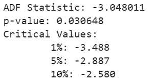
The results show that the test statistic value -3.048011 is smaller than the critical value at 1% of -3.488. This suggests that we can reject the null hypothesis with a significance level of less than 1%.
结果表明,测试统计值-3.048011小于临界值-3.488的1%。 这表明我们可以拒绝显着性水平低于1%的原假设。
Rejecting the null hypothesis means that the time series is stationary.
拒绝零假设意味着时间序列是固定的。
让我们可视化差异化的数据集。 (Let’s visualize the differenced dataset.)
We can see a pattern in the plot looks random, does not show any trend or seasonality.
我们可以看到图中的一个模式看起来是随机的,没有显示任何趋势或季节性。
stationary.plot()
pyplot.show()
It’s ideal to use a differenced dataset as the input for our ARIMA model. As we know this dataset is stationary, therefore parameter ‘d’ can see set to 0.
最好使用差异数据集作为ARIMA模型的输入。 我们知道此数据集是固定的,因此参数“ d”可以看到设置为0。
接下来,我们必须确定自回归(AR)和移动平均(MA)参数的滞后值。 (Next, we have to decide lag values for Autoregression (AR) and Moving Average (MA) parameters.)
These parameters are also known as p and q respectively. we can identify these parameters using Autocorrelation Function (ACF) and Partial Autocorrelation Function (PACF).
这些参数也分别称为p和q。 我们可以使用自相关函数(ACF)和部分自相关函数(PACF)识别这些参数。
pyplot.figure()
pyplot.subplot(211)
plot_acf(stationary, lags=25, ax=pyplot.gca())
pyplot.subplot(212)
plot_pacf(stationary, lags=25, ax=pyplot.gca())
pyplot.show()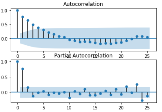
ACF shows a significant lag of 4 months, which means an ideal value for p is 4. PACF shows a significant lag of 1 month, which means an ideal value for q is 1.
ACF显着滞后4个月,这意味着p的理想值为4。PACF显着滞后1个月,这意味着q的理想值为1。
Now, we have all the required parameters for the ARIMA model.
现在,我们有了ARIMA模型的所有必需参数。
- Autoregression parameter (p): 4 自回归参数(p):4
Integrated (d): 0 (We could have used 1, had we considered original observations as the input. We have seen our series transformed into stationary after one level of differencing)
积分(d):0( 如果我们将原始观测值作为输入,我们可以使用1。经过一阶微分后,我们的序列变成了平稳 )
- Moving Average parameter (q): 1 移动平均线参数(q):1
让我们创建一个函数来反转差值 (Let’s create a function to invert differenced value)
As we are modeling on a differenced dataset, we have to bring back the predicted values at the original scale by adding the same month value from the previous year.
当我们在不同的数据集上建模时,我们必须通过添加上一年的相同月份值来恢复原始比例的预测值。
def inverse_difference(history, yhat, interval=1):
  return yhat + history[-interval]
ARIMA模型使用手动识别的参数 (ARIMA model using manually identified parameters)
history = [x for x in train]
predictions = list()
for i in range(len(test)):
  # difference data
  months_in_year = 12
  diff = difference(history, months_in_year)
  # predict
  model = ARIMA(diff, order=(3,0,1))
  model_fit = model.fit(trend='nc', disp=0)
  yhat = model_fit.forecast()[0]
  yhat = inverse_difference(history, yhat, months_in_year)
  predictions.append(yhat)
  # observation
  obs = test[i]
  history.append(obs)
  print('>Forecast=%.3f, Actual=%.3f' % (yhat, obs))
# report performance
rmse = sqrt(mean_squared_error(test, predictions))
print('RMSE: %.3f' % rmse)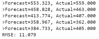
We can see, an error has reduced significantly as compared to baseline.
我们可以看到,与基线相比,错误已大大减少。
我们将进一步尝试使用Grid Search优化参数 (We will further try to optimize the parameters using Grid Search)
We will evaluate multiple ARIMA models with varying parameter (p,d,q) values.
我们将评估具有不同参数(p,d,q)值的多个ARIMA模型。
# grid search ARIMA parameters for time series
# evaluate an ARIMA model for a given order (p,d,q) and return RMSE
def evaluate_arima_model(X, arima_order):
  # prepare training dataset
  X = X.astype('float32')
  train_size = int(len(X) * 0.66)
  train, test = X[0:train_size], X[train_size:]
  history = [x for x in train]
  # make predictions
  predictions = list()
  for t in range(len(test)):
    # difference data
    months_in_year = 12
    diff = difference(history, months_in_year)
    model = ARIMA(diff, order=arima_order)
    model_fit = model.fit(trend='nc', disp=0)
    yhat = model_fit.forecast()[0]
    yhat = inverse_difference(history, yhat, months_in_year)
    predictions.append(yhat)
    history.append(test[t])
  # calculate out of sample error
  rmse = sqrt(mean_squared_error(test, predictions))
  return rmse
# evaluate combinations of p, d and q values for an ARIMA model
def evaluate_models(dataset, p_values, d_values, q_values):
  dataset = dataset.astype('float32')
  best_score, best_cfg = float("inf"), None
  for p in p_values:
    for d in d_values:
      for q in q_values:
        order = (p,d,q)
        try:
          rmse = evaluate_arima_model(dataset, order)
          if rmse < best_score:
            best_score, best_param = rmse, order
          print('ARIMA%s RMSE=%.3f' % (order,rmse))
        except:
          continue
print('Best ARIMA%s RMSE=%.3f' % (best_param, best_score))
# load dataset
series = read_csv('dataset.csv', header=None, index_col=0, parse_dates=True, squeeze=True)
# evaluate parameters
p_values = range(0, 5)
d_values = range(0, 2)
q_values = range(0, 2)
warnings.filterwarnings("ignore")
evaluate_models(series.values, p_values, d_values, q_values)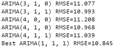
We have found the best parameters through the grid search. We can further reduce the errors by using suggested parameters (1,1,1).
我们通过网格搜索找到了最佳参数。 我们可以使用建议的参数(1,1,1)进一步减少错误。
RMSE: 10.845
RMSE:10.845
残差分析 (Residual Analysis)
A final check is to analyze residual errors of the model. Ideally, the distribution of the residuals should follow a Gaussian distribution with a zero mean. We can calculate residuals by substracting predicted values from actuals as below.
最后检查是分析模型的残留误差。 理想情况下,残差的分布应遵循均值为零的高斯分布。 我们可以通过从实际值中减去预测值来计算残差,如下所示。
residuals = [test[i]-predictions[i] for i in range(len(test))]
residuals = DataFrame(residuals)
print(residuals.describe())
And then simply use describe function to get summary statistics.
然后只需使用describe函数来获取摘要统计信息。
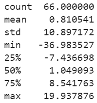
We can see, there is a very small bias in the model. Ideally, the mean should have been zero. We will use this mean value (0.810541) to correct the bias in our prediction by adding this value to each forecast.
我们可以看到,模型中的偏差很小。 理想情况下,平均值应为零。 我们将使用此平均值(0.810541)通过将这个值添加到每个预测中来校正我们的预测中的偏差。
偏差校正模型 (Bias Corrected Model)
As a last improvement to the model, we will produce a biased adjusted forecast. Here is the Python implementation.
作为模型的最后改进,我们将产生有偏差的调整后预测。 这是Python实现。
history = [x for x in train]
predictions = list()
bias = 0.810541
for i in range(len(test)):
  # difference data
  months_in_year = 12
  diff = difference(history, months_in_year)
  # predict
  model = ARIMA(diff, order=(1,1,1))
  model_fit = model.fit(trend='nc', disp=0)
  yhat = model_fit.forecast()[0]
  yhat = bias + inverse_difference(history, yhat, months_in_year)
  predictions.append(yhat)
  # observation
  obs = test[i]
  history.append(obs)
# report performance
rmse = sqrt(mean_squared_error(test, predictions))
print('RMSE: %.3f' % rmse)
# errors
residuals = [test[i]-predictions[i] for i in range(len(test))]
residuals = DataFrame(residuals)
print(residuals.describe())
We can see errors have slightly reduced and mean has also shifted towards zero. The graphs also suggest a gaussian distribution.
我们可以看到误差有所减少,均值也已趋于零。 该图还暗示了高斯分布。

In our example we had a very small bias, so this bias correction may not have proved to be a significant improvement, but in real-life scenarios, this is an important technique to be explored at the end in case any bias exists.
在我们的示例中,我们有一个非常小的偏差,因此该偏差校正可能没有被证明是明显的改进,但是在实际情况下,如果存在任何偏差,这是最后要探索的一项重要技术。
检查残差中的自相关 (Check autocorrelation in the residuals)
As a final check, we should investigate if there any autocorrelation exists in the residual. If exists, it means there is an opportunity for improvement in the model. Ideally, there should not be any autocorrelation left in the residuals if the model is fitted well.
作为最后的检查,我们应该调查残差中是否存在任何自相关。 如果存在,则意味着存在改进模型的机会。 理想情况下,如果模型拟合得当,则残差中不应保留任何自相关。
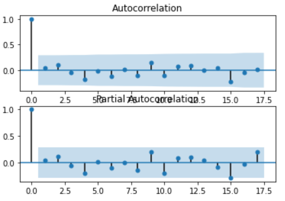
The graphs suggest that all the autocorrelation has been captured in the model and there is no autocorrelation exists in the residuals.
这些图表明,所有自相关都已在模型中捕获,并且残差中不存在自相关。
So, our model has passed all the criteria. We can save this model for later use.
因此,我们的模型已通过所有标准。 我们可以保存此模型供以后使用。
模型验证 (Model Validation)
We have finalized the model, now it can be saved as a .pkl file for later use. Bias number can also be saved separately.
我们已经完成了模型的确定,现在可以将其另存为.pkl文件以供以后使用。 偏置号也可以单独保存。
model.pkl: This includes the coefficients and all other internal data required for prediction.
model.pkl:包括系数和预测所需的所有其他内部数据。
model bias.npy: This is the bias value stored in a NumPy array.
模型bias.npy:这是存储在NumPy数组中的偏差值。
bias = 0.810541
# save model
model_fit.save('model.pkl')
numpy.save('model_bias.npy', [bias])
加载模型并评估验证数据集 (Load the Model and Evaluate on Validation Dataset)
This is the final step of this exercise. We will load our saved model along with a bias number and make predictions on the validation dataset.
这是本练习的最后一步。 我们将加载保存的模型以及偏差数,并对验证数据集进行预测。
# load and evaluate the finalized model on the validation dataset
validation = read_csv('validation.csv', header=None, index_col=0, parse_dates=True,squeeze=True)
y = validation.values.astype('float32')
# load model
model_fit = ARIMAResults.load('model.pkl')
bias = numpy.load('model_bias.npy')
# make first prediction
predictions = list()
yhat = float(model_fit.forecast()[0])
yhat = bias + inverse_difference(history, yhat, months_in_year) predictions.append(yhat)
history.append(y[0])
print('>Forecast=%.3f, Actual=%.3f' % (yhat, y[0]))
# rolling forecasts
for i in range(1, len(y)):
  # difference data
  months_in_year = 12
  diff = difference(history, months_in_year)
  # predict
  model = ARIMA(diff, order=(1,1,0))
  model_fit = model.fit(trend='nc', disp=0)
  yhat = model_fit.forecast()[0]
  yhat = bias + inverse_difference(history, yhat, months_in_year)
  predictions.append(yhat)
  # observation
  obs = y[i]
  history.append(obs)
  print('>Forecast=%.3f, Actual=%.3f' % (yhat, obs))
# report performance
rmse = sqrt(mean_squared_error(y, predictions))
print('RMSE: %.3f' % rmse)
pyplot.plot(y)
pyplot.plot(predictions, color='red')
pyplot.show()
We can observe the actual and forecasted values for the validation dataset. These values are also plotted on a line plot which shows a promising result of our model.
我们可以观察验证数据集的实际值和预测值。 这些值也绘制在线图中,显示了我们模型的有希望的结果。


You can find the entire code at my Gist repository.
您可以在我的Gist存储库中找到整个代码。
摘要 (Summary)
This tutorial can be used as a template for your univariate time series specific problems. Here, we learned every step involved in any forecasting project, starting from exploratory data analysis to model building, validation, and finally, saving the model for later use.
本教程可以用作针对单变量时间序列的特定问题的模板。 在这里,我们了解了任何预测项目涉及的每个步骤,从探索性数据分析到模型构建,验证,最后保存模型以备后用。
There are some additional steps that you should explore to improve the result. You can try box cox transformation on the original series and use that as input for the model, apply grid search on the transformed dataset to find optimal parameters.
您应该探索一些其他步骤来改善结果。 您可以尝试对原始序列进行box cox转换,并将其用作模型的输入,对转换后的数据集进行网格搜索以找到最佳参数。
Thanks for reading! Please feel free to share any comments or feedback.
谢谢阅读! 请随时分享任何评论或反馈。
Hope you found this article informative. In the next few articles, I will discuss some advanced forecasting techniques.
希望您发现本文内容丰富。 在接下来的几篇文章中,我将讨论一些高级的预测技术。
翻译自: https://towardsdatascience.com/time-series-analysis-modeling-validation-386378cd3369
数学建模时间序列分析


 431
431

 被折叠的 条评论
为什么被折叠?
被折叠的 条评论
为什么被折叠?
 到【灌水乐园】发言


