


 The Python visualisation landscape consists of several useful python libraries. Every library shines in its own unique way. While some libraries are easy to use, the others have superior functionaliti...
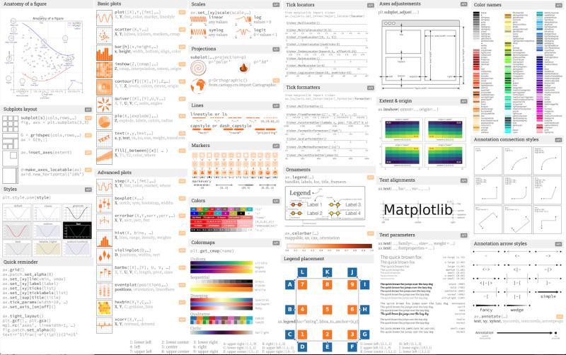
The Python visualisation landscape consists of several useful python libraries. Every library shines in its own unique way. While some libraries are easy to use, the others have superior functionalities. Matplotlib is one such component of this visualisation ecosystem and a vital one. Matplotlib offers multiple ways to represent numbers into meaningful graphs and plots. The following cheat sheet provides an excellent glimpse of the various functionalities of Matplotlib and how to make our visualizations more effective.
Python可视化环境由几个有用的python库组成。 每个图书馆都以自己独特的方式闪耀。 尽管某些库易于使用,但其他库则具有出色的功能。 Matplotlib是该可视化生态系统中的此类组件之一,也是至关重要的组件。 Matplotlib提供了多种将数字表示为有意义的图形和图表的方法。 以下备忘单很好地介绍了Matplotlib的各种功能以及如何使我们的可视化效果更有效。
The basic capabilities of matplotlib, including the ability to create bar graphs, histograms, pie charts, etc. are well known. However, in this article, I will showcase some of the advanced plots in matplotlib, which can take our analysis a notch higher.
matplotlib的基本功能(包括创建条形图,直方图,饼图等的功能)是众所周知的。 但是,在本文中,我将展示matplotlib中的一些高级图,这可以使我们的分析高出一个档次。
Animations in matplotlib is another interesting functionality, and I have a dedicated a complete article to it. The article can be read here: Animations with Matplotlib.
matplotlib中的动画是另一个有趣的功能,我有专门的完整文章。 可以在这里阅读本文: Matplotlib的动画。
1.跨度选择器 (1. Span Selector)
Span Selector is a mouse widget in matplotlib. Widgets are python objects which are used to include some interactive functionality. Span Selector returns the maximum and minimum values of a selected r
 最低0.47元/天 解锁文章


 479
479


 被折叠的 条评论
为什么被折叠?
被折叠的 条评论
为什么被折叠?
 到【灌水乐园】发言


