


 本文详细介绍了数据探索性分析的概念,通过Python工具揭示数据背后的模式、趋势和关联,为大数据和人工智能领域的深入分析奠定基础。
数据探索性分析
When we hear about Data science or Analytics , the first thing that comes to our mind is Modelling , Tuning etc. . But one of the most important and primary steps before all of these is Exploratory Data Analysis or EDA.
当我们听到有关数据科学或分析的知识时,想到的第一件事就是建模,调整等。 但是,在所有这些步骤中最重要和最主要的步骤之一是探索性数据分析或EDA。

为什么选择EDA (Why EDA)
In Data Science one of the Major problem Data Scientists/Analysts are facing today is the Data Quality . Since we rely on multiple sources for data , data quality is often compromised.The quality of Data determines the quality of models which we are building on it .As the adage goes,Garbage in , garbage out . The above statement holds very true in the case of Data science.
在数据科学领域,数据科学家/分析师当今面临的主要问题之一是数据质量。 由于我们依赖于多个数据源,因此数据质量常常受到损害。数据的质量决定了我们在其上构建的模型的质量。 上面的陈述在数据科学领域非常正确。
We cannot build Empire State Building or Burj Khalifa on a shaky foundation !
我们不能在摇摇欲坠的基础上建造帝国大厦或哈利法塔!
And that explains why 60–80% of time of Data Scientists are being spent on Data gathering and Data preparation.
这就解释了为什么将60-80%的数据科学家的时间都花在数据收集和数据准备上。
When we are working with Data , EDA or Exploratory Data Analysis is the most important step .It is very important to gather as much information and insights from data as we could before processing it . This could be done by EDA. EDA Also help us to analyse the underlying trends and patterns in data and also help us to formulate our problem statement in a better way .
当我们处理数据时,EDA或探索性数据分析是最重要的步骤。在处理数据之前,从数据中收集尽可能多的信息和见解非常重要。 这可以由EDA完成。 EDA还可以帮助我们分析数据的潜在趋势和模式,还可以帮助我们更好地制定问题陈述。
“ Well begun is half done”
“ 好的开始已经完成了一半”
Exploratory Data Analysis helps to understand the data better and also it helps to understand what Data speaks.This could be done both by visual analysis as well as with few other analysis.Also EDA helps to distinguish between what to be pursued further and what is not worth following up.
探索性数据分析有助于更好地理解数据,也有助于理解数据的含义,这既可以通过可视化分析也可以通过很少的其他分析来完成,此外EDA有助于区分需要进一步追求的目标和不追求的目标值得跟进。
Exploratory Data Analysis
探索性数据分析
Let’s explore steps of Exploratory data analysis using Bank loan Data set
让我们探索使用银行贷款数据集进行探索性数据分析的步骤
Import the Libraries:
导入库:
To perform initial analysis , we would need libraries like Numpy, Pandas,Seaborn and Matplotlib. Numpy is an array processing package.Its a library for numerical computations .Pandas is used for data manipulation and analysis. Matplotlib and Seaborn are statistical libraries used for data visualization
为了进行初步分析,我们需要Numpy,Pandas,Seaborn和Matplotlib之类的库。 Numpy是一个数组处理程序包,它是一个用于数值计算的库.Pandas用于数据处理和分析。 Matplotlib和Seaborn是用于数据可视化的统计库

Import Dataset:
导入数据集:
Data is stored in csv file format, hence we are importing it using pd.read_csv
数据以csv文件格式存储,因此我们使用pd.read_csv导入数据
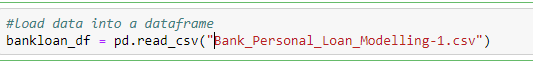
Imported data from the file is stored in bankloan_df dataframe
从文件导入的数据存储在bankloan_df数据框中
Information of data set:
数据集信息:
.info() will display information about the data frames
.info()将显示有关数据帧的信息

It shows the column names,number of rows and columns, data types etc.It gives an idea about what type of data it is .It is very important to understand whether a column represents categorical or numerical variable , if categorical we should understand whether its ordinal or nominal .We need to treat each of these data types differently which I will explain in another post.You can use .astype to change the datatype of a column
它显示列名,行数和列数,数据类型等。它给出有关数据类型的信息。了解列是表示类别变量还是数值变量非常重要,如果是类别变量,则应了解其类型顺序或标称。我们需要对每种数据类型进行不同的处理,这将在另一篇文章中进行解释。您可以使用.astype更改列的数据类型

If need to know only the number of rows and columns .shape can be used
如果只需要知道行数和列数,可以使用.shape

To see the data type , bankloan_df.dtypes can be used
要查看数据类型,可以使用bankloan_df.dtypes
To check the null values bankloan_df.isnull().sum() can be used
要检查空值,可以使用bankloan_df.isnull()。sum()

Descriptive Analysis :
描述性分析:
.describe() is used for descriptive analysis , it provides details like count, mean, standard deviation, Inter Quartile Range etc.This analysis helps to understand the skewness of data.
.describe()用于描述性分析,它提供了诸如计数,均值,标准差,四分位数间距等详细信息。此分析有助于理解数据的偏度。

In the case of categorical variables,to check the representation of different groups , we use groupby. This is used to analyze whether any group is over represented than other . If such under representation is there for target variable, we need to treat it with certain techniques like SMOTE.
对于分类变量,为了检查不同组的表示形式,我们使用groupby。 这用于分析是否有任何一个组比另一个组高。 如果目标变量存在这种表示不足的情况,则需要使用某些技术(例如SMOTE)对其进行处理。

Graphical analysis:
图形分析:
Graphs are very important tool to understand the data distribution .We use different graphs for analyzing data. We use it for Univariate, Bi Variate and Multi Variate Analysis. Seaborn is a very good library to explore different graphs. I will explain few very common graphs in the analysis here and will write a post in detail about graphs later.
图是了解数据分布的非常重要的工具。我们使用不同的图来分析数据。 我们将其用于单变量,双变量和多变量分析。 Seaborn是一个很好的图书馆,可以探索不同的图形。 在这里的分析中,我将解释一些非常常见的图形,稍后将详细撰写有关图形的文章。
Uni variate Analysis — Analysis where we consider only one variable. Few uni variate graphs are Count Plot, Box Plot etc.
单变量分析-仅考虑一个变量的分析。 很少有单变量图是计数图,箱形图等。
Countplot:-Countplot shows the counts of observations in each category using bars
Countplot:-Countplot使用条形图显示每个类别中的观察计数


Boxplot:-A box plot (or box-and-whisker plot) shows the distribution of quantitative data.The box shows the quartiles of the dataset while the whiskers extend to show the rest of the distribution, except for points that are determined to be “outliers” using a method that is a function of the inter-quartile range.
Boxplot:-箱形图(或箱须图)显示定量数据的分布。框显示数据集的四分位数,而晶须延伸以显示其余分布,确定点除外使用四分位间距范围的函数的“异常值”。

To identify outliers also we use boxplots
为了识别异常值,我们还使用箱线图

Bi Variate Analysis is where relationship between two variables are plotted in the graph and in Multi variate Analysis , relationship between different variables represented using graphs.
双变量分析是在图中绘制两个变量之间的关系的地方,而在多变量分析中,则是使用图表表示的不同变量之间的关系的地方。
Pairplot is a Bi Variate graph which is used to analyse the relationship between different variables in a dataset. This is very important step for Model building.
Pairplot是Bi Variate图,用于分析数据集中不同变量之间的关系。 这对于模型构建非常重要。

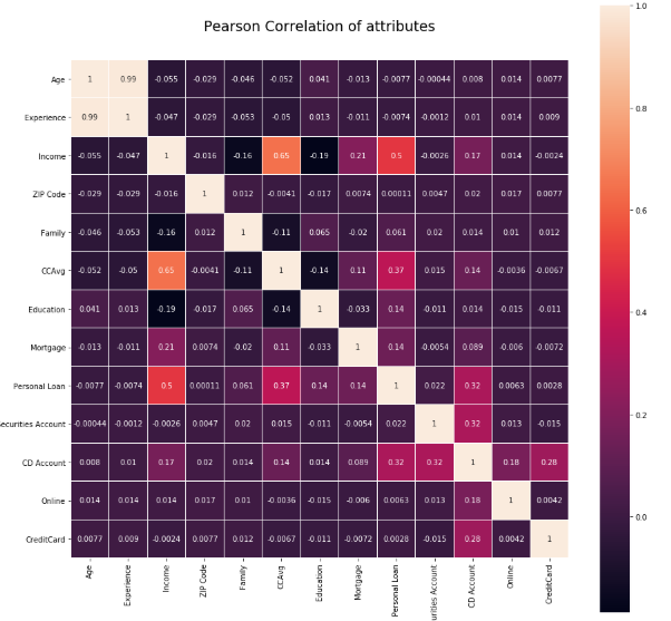
Correlation
相关性
Correlation is another important step of EDA. While building a model, its important to understand whether any correlation exists between the independent variables and also with independent variable and dependent variable. This also helps in feature selection/elimination.
关联是EDA的另一个重要步骤。 在构建模型时,重要的是要了解自变量之间以及自变量和因变量之间是否存在任何关联。 这也有助于特征选择/消除。
Values closer to +1 and -1 are considered as maximum correlated variables.The values in diagonal is the correlation of variable with itself and it will always be +1.
接近+1和-1的值被视为最大相关变量。对角线的值是变量与其自身的相关性,它将始终为+1。

Correlation graphs can be designed using the below code snippet
可以使用以下代码片段设计相关图

These are initial few steps of Exploratory data analysis. Based on the findings of each step ,one can take appropriate action to improve data quality ,analyse the trend or to treat missing variables/Outliers or anomaly appropriately.
这些是探索性数据分析的最初几个步骤。 根据每个步骤的发现,可以采取适当的措施来改善数据质量,分析趋势或适当地处理缺失的变量/异常值或异常。
“Information is the oil of the 21st century, and analytics is the combustion engine.” — Peter Sondergaard,Gartner Research
“信息是21世纪的石油,分析是内燃机。” -Peter Sondergaard,Gartner研究
翻译自: https://medium.com/@viveksmenon/exploratory-data-analysis-d464f3adb777
数据探索性分析


 1357
1357

 被折叠的 条评论
为什么被折叠?
被折叠的 条评论
为什么被折叠?
 到【灌水乐园】发言


