


大数据可视化应用
The following post is a summarized version of the article accepted to the 2020 Visualization for Communication workshop as part of the 2020 IEEE VIS conference to be held in October 2020. The full paper has been published as an OSF Preprint and can be accessed here.
以下文章是 作为2020年10月举行的2020 IEEE VIS会议的一部分而 被 2020可视化通信研讨会 接受的文章的摘要 。全文已作为OSF预印本发布,可在 此处 访问 。
The Urban Institute’s mission is to open minds, shape decisions, and offer solutions. To advance that mission, we must think intentionally about how we can learn from and speak to audiences who reflect the rich diversity of America’s communities, and we must foster a culture where employees from different backgrounds and perspectives enjoy mutual respect, inclusivity, and collegiality.
城市学院的使命是开放思想,制定决策并提供解决方案。 为了实现这一使命,我们必须认真思考如何向反映美国社区丰富多样性的听众学习和与之交谈,并且我们必须培育一种文化,使来自不同背景和不同视角的员工享有相互尊重,包容性和合作性。
For the past few months, we have been working on revising and updating Urban’s Data Visualization Style Guide. In addition to reorganizing the guide and updating various style decisions, we have also been thinking critically about how we communicate data and information about the groups we study. Just as Urban has carefully considered the words we use in our written reports and platforms, we should be equally careful in how we visually present data to our readers, users, and audiences and what words we should use in and around those visuals. (We are also working on a separate section about accessibility in data visualization, which we will share at a later date.)
在过去的几个月中,我们一直在致力于修订和更新Urban的《 数据可视化样式指南》 。 除了重新组织指南和更新各种样式决策外,我们还一直在认真思考如何交流有关所研究小组的数据和信息。 正如Urban仔细考虑了我们在书面报告和平台中使用的词语一样,我们也应同样谨慎地以视觉方式将数据呈现给读者,用户和听众,以及在这些视觉内容中和周围使用哪些词语。 (我们还在研究数据可视化中的可访问性的单独部分,稍后将进行分享。)
Although more people are thinking and writing about these issues, there hasn’t been much agreement around best practices for taking an equity lens to data visualization, especially as it applies to setting standards for entire organizations. As best we can, we have been reading a variety of posts and papers (a short list can be found below) and discussing ways we can develop a more diverse, equitable, and inclusive approach to presenting and visualizing data. We view this effort as just the beginning of our process and anticipate growing and expanding our work as we learn more and receive feedback from colleagues, partners, and readers.
尽管有更多的人正在思考和写这些问题,但是关于最佳实践的共识还不足以使数据可视化,特别是因为它适用于为整个组织设置标准。 尽我们所能,我们一直在阅读各种文章和论文(可以在下面找到一个简短列表),并讨论了我们可以开发出一种更加多样化,公平和包容的方法来呈现和可视化数据的方法。 我们认为这项工作只是我们过程的开始,随着我们了解更多并收到同事,合作伙伴和读者的反馈,我们预计我们的工作会不断扩大和扩展。
To that end, we have identified eight areas in which researchers, analysts, and anyone working with data can be more inclusive in how they present their data.
为此,我们确定了八个领域,在这些领域中,研究人员,分析人员以及任何处理数据的人都可以在他们如何展示数据时更具包容性。
Using language with a racial equity awareness. Titles, text, and labels are among the first things readers scan (PDF) when encountering a chart, so they present an important opportunity to apply racial equity awareness thinking. Urban researchers often rely on our organization’s guides for accessible and inclusive language for labeling and annotating graphs. Consistent with Urban style, we want our researchers to label their data using people-first language, such as “people with disabilities” rather than “disabled people.” Terms should also refer to people and not strictly to their skin color; for example, “Black people” not “Blacks.”
使用具有种族平等意识的语言。 标题,文本和标签是读者在遇到图表时首先扫描 (PDF)的内容,因此它们为应用种族平等意识提供了重要的机会。 城市研究人员通常依靠我们组织的指南来获取易于使用且具有包容性的语言来标记和注释图形。 与城市风格一致,我们希望研究人员使用以人为本的语言来标记数据,例如“残疾人”而不是“残疾人”。 术语还应指人,而不是指肤色。 例如,“黑人”而不是“黑人”。
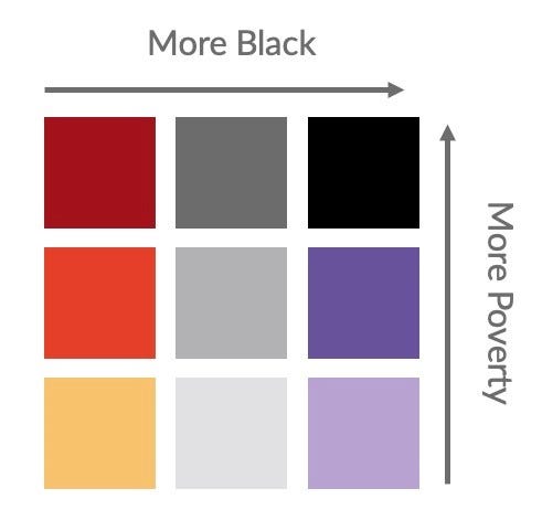
As just one example, in a June 2020 project, a series of bivariate choropleth maps showed the relationship between race and poverty. In the original visualization, the labels along the legend were “More Poverty” and “More Black.” That language is not inclusive of different groups: poverty refers to an experience not a static description and “More Black” references skin color, not people. A more inclusive way to label the legend might be “Larger proportion of people experiencing poverty” and “Larger Black Population” (the author of the visualization did later change “More Black” to “Larger Black Population”).
仅举一个例子,在2020年6月的一个项目中 ,一系列的双变量Choroppleth图显示了种族与贫困之间的关系。 在原始可视化中,图例上的标签是“更多贫困”和“更多黑色”。 该语言不包括不同的群体:贫穷是指一种体验,而不是一成不变的描述,“更多黑人”是指肤色,而不是人。 标记传说的一种更具包容性的方式可能是“更多的贫困人口”和“更大的黑人人口”(可视化的作者后来将“更多黑人”改为“更大的黑人人口”)。
The terms and phrases we use continue to change. In writing about terminology around and about people with disabilities, Nicolas Steenhout writes, “Disability language is never straightforward. It’s always nuanced. It always evolves.” That sentiment can extend to any underrepresented group, so as researchers, developers, and designers, we need to monitor the current lexicon and reflect the experiences of the people we study and the people we communicate with. Graph creators may want to consider including a footnote or endnote explaining why a particular term was used. We also encourage researchers to talk to their target audiences to give them the option to self-identify their preferred terminology.
我们使用的术语和短语会不断变化。 Nicolas Steenhout在撰写有关残疾人的术语时,写道:“残疾人语言从来都不是简单易懂的。 总是很细微。 它总是在发展。” 这种情绪可以扩展到任何代表性不足的人群,因此,作为研究人员,开发人员和设计师,我们需要监视当前的词典,并反映我们研究的人员和与之交流的人员的经验。 图形创建者可能需要考虑添加脚注或尾注,以说明使用特定术语的原因。 我们还鼓励研究人员与目标受众交谈,以使他们可以选择自己确定自己喜欢的术语。
Ordering data labels in a purposeful way. Many of our graphs and tables include different demographic groups, ordered simply as they appear in the raw data. There is likely little thought given to how estimates in tables or bars in graphs or small multiples are ordered, such as “White,” “Black,” “Hispanic,” and “Other.” As graph producers, however, we should take a more active role in choosing how to order and present data values for different groups. Which group we choose to show as the first row in a table or the first bar in a graph can affect how readers perceive the relationship or hierarchy between groups; always starting with “White” or “Men” can make these groups appear as the default against which other groups should be compared, suggesting they’re the most important populations. How we choose to order may also reflect who we view as the intended audience for our visualizations. Starting with “White” or “Men” can make it seem as though those are the most important groups we are trying to communicate with. Urban does not have a universal rule that applies to all visuals, but a few issues are worth considering:
有目的地订购数据标签。 我们的许多图形和表格都包含不同的人口统计组,其排序方式与原始数据中的显示方式相同。 几乎没有考虑过如何排列表或条形图中的估计值或小的倍数,例如“白色”,“黑色”,“西班牙裔”和“其他”。 但是,作为图形制作者,我们应该在选择如何排序和显示不同组的数据值方面扮演更积极的角色。 我们选择显示哪个组作为表的第一行或图形的第一条,会影响读者对组之间关系或层次结构的理解; 始终以“白人”或“男性”开头可以使这些组作为应与其他组进行比较的默认值,表明它们是最重要的人群。 我们选择订购的方式也可能反映出我们将哪些人视为可视化的目标受众。 以“白人”或“男子”开头可以使他们似乎是我们尝试与之交流的最重要的群体。 Urban没有适用于所有视觉效果的通用规则,但有几个问题值得考虑:
· Does your study focus on a particular community? If it does, that group should be presented first.
·您的研究重点是特定社区吗? 如果确实如此,则应首先提出该小组。
· Is there a particular argument or story you are trying to tell? If so, the order or presentation of results should reflect that argument.
·您要讲一个特定的论点或故事吗? 如果是这样,结果的顺序或表示应反映该论点。
· Is there a quantitative relationship that can guide how the groups are ordered? Can they be sorted alphabetically or by population size, sample size (weighted or unweighted), or magnitude or effect of the results?
·是否存在可以指导各组订购方式的定量关系? 可以按字母顺序或按人口规模,样本规模(加权或未加权)或结果的大小或影响对它们进行排序吗?
Considering the missing groups. It is also important to acknowledge who is and is not included in our data and charts. Many charts on race and ethnicity only show white people, Black people, and Latinx people but not smaller racial or ethnic groups. Often this is because of data limitations; in particular, small sample sizes. But even in those cases, how can researchers be more proactive to help organizations conducting surveys be more inclusive? How can we communicate to those organizations to help them conduct better surveys? Just because it may be harder to obtain data about certain groups doesn’t mean we shouldn’t still try to better understand their lives.
考虑缺少的群体。 同样重要的是要确认数据和图表中包含和不包含谁。 许多种族和族裔图表仅显示白人,黑人和拉丁裔,但没有显示较小的种族或族裔群体。 通常这是由于数据限制; 特别是样本量小。 但是即使在那种情况下,研究人员又如何能更加主动地帮助组织进行调查,使其更具包容性? 我们如何与这些组织沟通以帮助他们进行更好的调查? 仅仅因为获取有关某些群体的数据可能更加困难并不意味着我们不应该仍然试图更好地了解他们的生活。
Similarly, charts showing breakdowns by gender often neglect nonbinary and transgender people by only presenting males and females. Again, many major surveys, especially at the federal level, do not include these groups as response options, but we should be asking ourselves how and to what extent we should note omitted groups and when. Should researchers assume readers will recognize that certain datasets treat gender as binary? How can we anticipate that assumption?
同样,显示按性别细分的图表通常只显示男性和女性而忽略了非二元和跨性别的人。 同样,许多大型调查,尤其是在联邦一级,并未将这些群体作为应对方案,但我们应该问自己,如何以及在何种程度上应注意被遗漏的群体以及何时出现。 研究人员应该假设读者会认识到某些数据集将性别视为二元吗? 我们如何预计这个假设?
Another topic we’ve been considering is how to avoid lumping groups with few observations into the seemingly innocuous “Other” category. In some cases, the “Other” category may be necessary to achieve sufficient sample size for statistical analyses — in which case, we should ask ourselves if it is appropriate to lump these groups together (do they show the same trends in the data?) and be sure to clearly define in the notes section of the chart who is included in this category. But in other cases, we may use the “Other” category as a shortcut to make the presentation and related writing easier. Should we start considering labels besides “Other,” which can have an exclusionary connotation? Even though it might take more words, maybe we should use the appropriate name for each group in our tables, charts, and text.
我们一直在考虑的另一个主题是,如何避免在看似无害的“其他”类别中很少观察到的结成团。 在某些情况下,可能需要“其他”类别才能获得足够的样本量进行统计分析-在这种情况下,我们应该问自己是否适合将这些组放在一起(它们在数据中显示出相同的趋势吗?)并确保在图表的“注释”部分中明确定义此类别中的对象。 但是在其他情况下,我们可以使用“其他”类别作为捷径,以简化演示文稿和相关写作。 除了“其他”以外,我们是否应该开始考虑可能具有排他性含义的标签? 即使可能需要更多的单词,也许我们应该为表格,图表和文本中的每个组使用适当的名称。
In cases where data were collected about a specific group but that group was not presented separately in the chart, it may be worth listing in the chart’s notes all racial and ethnic groups included in the original dataset. This can both inform readers that data do exist for these smaller groups (even though they may be limited) and offer transparency about the chart maker’s decision about groups they included in their visualization.
如果收集的是有关特定人群的数据,但图表中未单独显示该人群,则可能值得在图表注释中列出原始数据集中包含的所有种族和民族。 这既可以告知读者这些较小的组确实存在数据(即使它们可能是有限的),也可以使图表制作者对其可视化中所包含的组的决策保持透明。
Using colors with a racial equity awareness. Urban’s color palette is consistent for people with certain color vision deficiencies, and the contrast between those colors and white and black text meet basic accessibility guidelines. Urban does not use color palettes that reinforce gender or racial stereotypes, such as baby pink and baby blue to represent women and men. We have not set a specific standard for which Urban color refers to which gender group or racial group, although we certainly recommend that researchers avoid using colors associated with skin tones (or worse, racial stereotypes).
使用具有种族平等意识的色彩。 Urban的调色板对于具有某些色觉缺陷的人们是一致的,并且这些颜色与黑白文本之间的对比度符合基本的辅助功能准则 。 Urban不使用会增强性别或种族刻板印象的调色板,例如淡粉红色和淡蓝色代表女性和男性。 尽管我们当然建议研究人员避免使用与肤色有关的颜色(或更糟的是种族刻板印象),但我们尚未为城市色彩指的是哪个性别组或种族组制定具体标准。
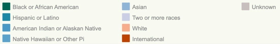
As an example, the Massachusetts Institute of Technology Office of the Provost’s “Diversity Dashboard” enables users to explore demographic characteristics of the school’s students, faculty, and staff. The June 2020 version of the dashboard used three distinct hues to represent nine racial and ethnic groups. Five of the distinct race and ethnicity groups were represented with red, a similar lighter pink color for the “Two or more races” category, two shades of gray for the “International” and “Unknown” groups, and blue for the “White” group.
例如,麻省理工学院教务长的“多元化仪表板”办公室使用户能够探索学校学生,教职员工的人口统计学特征。 2020年6月版的仪表板使用了三种不同的色调来代表9个种族和族裔群体。 五个不同的种族和种族组分别用红色表示,“两个或多个种族”类别用类似的浅粉色表示,“国际”和“未知”组用两种灰色表示,“白色”用蓝色表示组。
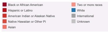
There are multiple problems with this design. First, the red color ramp for the five groups on the left side of the legend others those groups and creates a visual divide that seems to position nonwhite students against white students. Secondly, the gray colors tend to fade to the background, which diminishes international students and students whose race or ethnicity is unknown. All of this creates an effect where the “White” category moves to the foreground and is highlighted, as if it is the most important group and the norm against which all other groups should be compared. An update to the dashboard in July 2020 partly remedied the color issues by using more hues and creating larger breaks between the now-blue color ramp.
这种设计存在多个问题。 首先,图例左侧的五个组的红色渐变与其他组一样,并创建了视觉上的鸿沟,似乎使非白人学生与白人学生相对应。 其次,灰色趋于淡化为背景 ,从而减少了国际学生和种族或种族未知的学生。 所有这一切都产生了一种效果,“白色”类别移到了最前面并被突出显示,好像它是最重要的组以及所有其他组都应与之进行比较的规范。 2020年7月对仪表盘进行的更新部分通过使用更多的色调并在现在的蓝色渐变之间创建了较大的间隔来部分解决了颜色问题。
In general, as data visualization producers, we need to be aware of how our use of colors, words, and categorizations can perpetuate or exacerbate inequities.
通常,作为数据可视化生成器,我们需要意识到我们对颜色,文字和分类的使用如何使不平等现象长期存在或加剧。
Using icons and shapes with a racial equity awareness. We want to be careful and thoughtful when using icons in any data visualization. When showing groups of people, we should consider a mix of genders, races, and ethnicities. We don’t often use icons at Urban, but when we do, we should consider to whom we are presenting our results and how our icons might be perceived. We need to be conscious of how certain icons may not correspond to the content, such as an icon of a baby in a chart about child mortality.
使用具有种族平等意识的图标和形状。 在任何数据可视化中使用图标时,我们都需要谨慎周到。 在显示人群时,我们应考虑性别,种族和种族的混合。 我们在Urban并不经常使用图标,但是当我们这样做时,我们应该考虑向谁展示我们的结果以及如何看待我们的图标。 我们需要意识到某些图标可能与内容不符,例如关于儿童死亡率的图表中的婴儿图标。
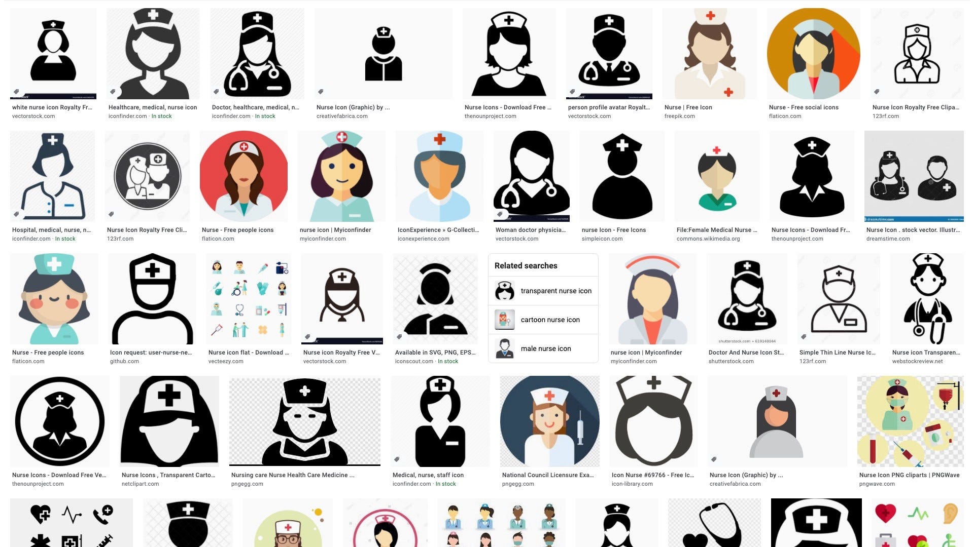
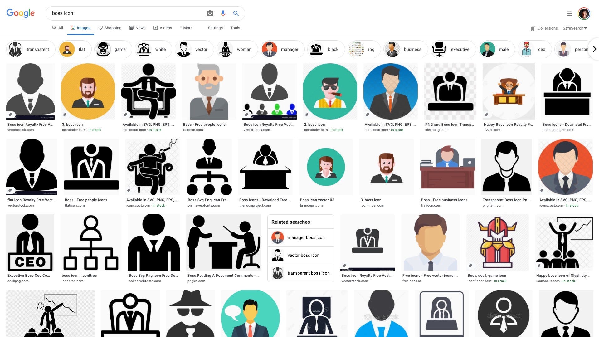
Mis- or underrepresentation of certain groups in imagery and iconography also fails to take a racial or gender equity awareness perspective toward our data visualization work. A 2018 study by the Pew Research Center found that “men are overrepresented in online image search results across a majority of jobs examined” and that “women appear lower than men in such search results for many jobs.” This disparity continues to this day; the image on the left shows Google search results for the phrase “nurse icon,” and the image on the right shows results for the phrase “boss icon.” Notice how nearly all the images on the top are similar to images we might imagine as feminine and the images on the bottom we might traditionally consider masculine.
在图像和图像学中某些群体的代表性不足或代表性不足,也无法从种族或性别平等意识的角度来对待我们的数据可视化工作。 皮尤研究中心(Pew Research Center)于2018年进行的一项研究发现,“在所检查的大多数工作中,男性在在线图像搜索结果中所占的比例过高”,并且“在许多工作中,女性在此类搜索结果中的表现低于男性。” 这种差距一直持续到今天。 左图显示短语“护士图标”的Google搜索结果,右图显示短语“老板图标”的搜索结果。 请注意,顶部几乎所有图像与我们可能想象为女性的图像相似,而底部传统上我们通常认为是男性的图像几乎相似。
Data visualization creators should ensure a variety of races and genders are depicted when using icons and avoid icons that make inappropriate depictions of people or communities or reinforce stereotypes.
数据可视化创建者应确保在使用图标时能够描绘出各种种族和性别,并避免使用图标对人或社区进行不恰当的描绘或加强刻板印象。
Demonstrating empathy. One of the big challenges in visualizing data, and quantitative research in general, is the ability to help readers connect with the content. Standard graphs like bar charts, line charts, and pie charts, while informative, can abstract from the content and people being represented. Taking an empathetic view of the reader’s needs as they read or perceive information is one step to better data communication. This kind of empathy is often couched in terms of producing specific graphs that meet the needs and expertise of our readers. But viewing empathy through a diversity, equitability, and inclusivity (DEI) lens would mean considering how the specific lived experiences and perspectives of our readers (not to mention the actual study populations) will perceive the information. As journalist Kim Bui wrote in 2019, “approaching stories — and people — with more empathy creates better relationships with marginalised communities, builds trust and increases diverse coverage.”
表现出同理心。 通常,在可视化数据和进行定量研究方面,最大的挑战之一是如何帮助读者与内容建立联系。 条形图,折线图和饼图之类的标准图形虽然内容丰富,但可以从所代表的内容和人物中抽象出来。 对读者在阅读或感知信息时的需求持同理心的态度是更好地进行数据交流的第一步 。 这种同理心通常表现在产生满足我们读者需求和专业知识的特定图表方面。 但是,通过多样性,公平性和包容性(DEI)视角来观察同情心,就意味着要考虑读者的具体生活经历和观点(更不用说实际的研究人群)将如何理解这些信息。 正如记者金布伊 ( Kim Bui )在2019年写道,“以更多的同情心对待故事和人们,可以与边缘化社区建立更好的关系,建立信任并扩大覆盖面。”
Empathy in data visualization also extends to when we use abstract shapes versus shapes that resemble people or communities, which can evoke a little more humanity. Graphics that specifically represent people — the anthropomorphizing of data graphics, or, as Jeremy Boy and colleagues (PDF) refer to them, “anthropographics” — is sometimes seen as a way to evoke empathy (though Boy and his coauthors do not find this to be the case; see also Groeger). The idea of helping readers understand the “near and far” — a wide lens of overall metrics or data paired with individual- or group-level data — may be a way to help readers connect with content. The guiding principle here is to put people first and help the reader better understand and recognize the people behind the data. “One possibility,” web developer Jacob Harris wrote, “is that if your data is about people, make it extremely clear who they are or were.”
数据可视化的同理心也延伸到我们使用抽象形状而不是类似于人或社区的形状时,这可以唤起更多人性化。 专门代表人的图形-数据图形的拟人化,或者,正如Jeremy Boy及其同事 (PDF)所称的“人类学”-有时被视为唤起共情的一种方式(尽管Boy和他的合著者并未发现这种共鸣)实际情况;另请参阅Groeger )。 帮助读者理解“ 近与远 ”的想法(可以将总体指标或数据与个人或团体级别的数据配对使用)可以帮助读者与内容建立联系 。 这里的指导原则是以人为本,帮助读者更好地理解和认识数据背后的人。 网络开发人员雅各布·哈里斯(Jacob Harris)写道:“一种可能性是,如果您的数据是关于人的,则要非常清楚他们是谁。”
Another way to think about empathy in data visualization is whether particular chart types lend themselves to more of a human connection than others. For example, bar charts represent each data value with a single rectangle. On the other hand, unit charts and waffle charts visualize each data point using a collection of smaller individual shapes.
在数据可视化中思考移情的另一种方法是,特定的图表类型是否比其他图表类型更适合人类。 例如,条形图用单个矩形表示每个数据值。 另一方面,单位图和华夫饼图使用较小的单个形状的集合可视化每个数据点。
The former approach could be seen as more abstract, collapsing all of the people reflected in that data point into just one shape, while the latter chart type might offer more of an opportunity to connect with the subject by reminding readers of the number of people represented through the use of multiple individual shapes, particularly if each dot represents one person.
前一种方法可以看作是更抽象的方法,它将反映在该数据点中的所有人员都折叠成一个形状,而后一种图表类型可以通过提醒读者代表的人数来提供更多与该主题联系的机会通过使用多个单独的形状,特别是如果每个点代表一个人时。
Connecting directly with people and communities and trying to better understand their lived experiences can help content producers create visualizations and tell stories that better reflect the true experiences of different people. This connection may come more naturally for journalists than for data scientists, but we believe this is a key dimension for researchers to explore to help them put their work into the hands of policymakers, stakeholders, community members, and changemakers who can use it to affect change. Furthermore, inclusive and thoughtful data visualization that respectfully reflects the people we are studying can also help us build trust with those communities.
直接与人和社区联系并尝试更好地了解他们的生活经验,可以帮助内容制作者创建可视化效果并讲故事,以更好地反映不同人的真实经历。 对于记者而言,这种联系可能比对数据科学家而言更自然,但是我们认为,这是研究人员探索以帮助他们将工作交给决策者,利益相关者,社区成员和变革者手中的一个关键方面,他们可以使用它来影响更改。 此外,具有包容性和周到的数据可视化能够恭敬地反映我们正在研究的人员,也可以帮助我们建立与这些社区的信任。
Questioning default visualization approaches. It is often reflexive when presenting data disaggregated by race or ethnicity to plot all of the groups on the same chart. However, as Pieta Blakely writes, doing so “encourages [the reader] to compare each of the groups to the highest performing groups” which can lead to a “deficit-based perspective” that focuses attention on what low-performing groups are lacking when compared with the high performers. Instead, Blakely proposes plotting each race on its own chart as a set of small multiples, which can better encourage readers to think about the specific needs and challenges facing each group.
质疑默认的可视化方法。 当呈现按种族或族裔分类的数据时,通常将其反映出来,以在同一图表上绘制所有组。 然而,正如皮塔·布雷克利 ( Pieta Blakely)所写的那样,这样做“鼓励[读者]将每个小组与表现最好的小组进行比较”,这可能导致形成“基于赤字的观点”,从而将注意力集中在缺乏表现的小组缺少什么与高绩效的人相比。 相反,布雷克利(Blakely)建议将每场比赛以一组小的倍数绘制在自己的图表上,这可以更好地鼓励读者考虑每组面临的特定需求和挑战。
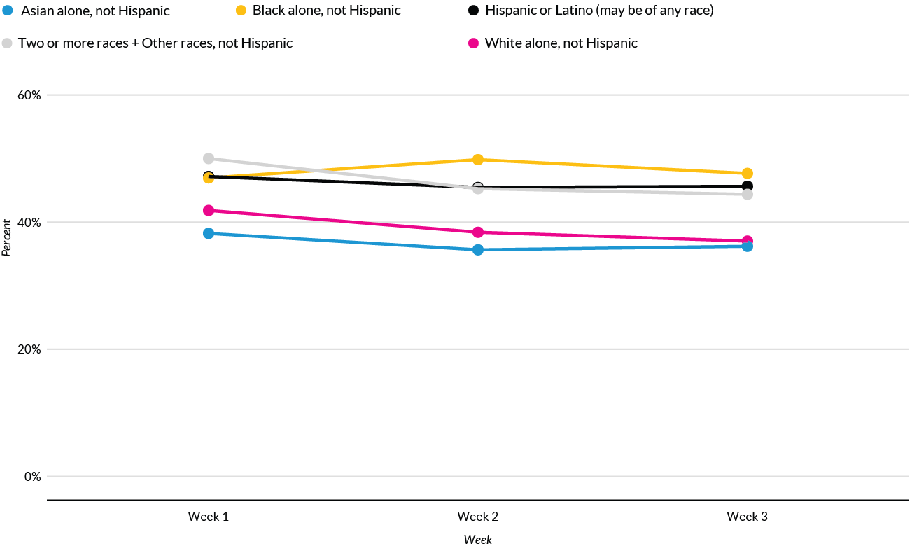
This was the approach we took with Urban’s Tracking COVID-19’s Effects by Race and Ethnicity data tool, which seeks to present the disparate impact of the COVID-19 pandemic by race and ethnicity for various metrics. Initially, line charts were proposed that displayed all of the races in the same chart.
这是我们采用Urban的“ 按种族和种族划分COVID-19效果”数据工具所采用的方法,该工具旨在按种族和种族呈现各种指标的COVID-19大流行的不同影响。 最初,提出了折线图,该折线图在同一张图表中显示所有比赛。
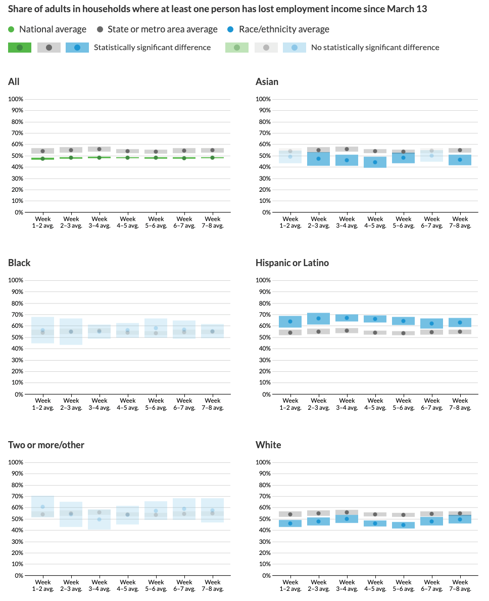
But as our work on the project progressed, we applied a racial equity awareness lens to how we were visualizing the data and began to question our initial approach. For one, putting all of the races on the same chart focused attention on only the hardest-hit groups, rather than on how members from all races and ethnicities have been negatively affected by the pandemic. Another issue was that plotting all of the races on one graph made it seem like the least-affected group was the goal the other races and ethnicities should seek to achieve. But why should that be the case? Upon further questioning, we decided a better comparison would show the state- or metrowide average. This approach had a couple benefits. First, it offered a consistent standard all groups could be measured against. Secondly, it meant we did not promote any particular racial or ethnic group as being the default group against which everyone else must be compared.
但是随着我们在该项目上的工作进展,我们将种族平等意识镜头应用于如何可视化数据并开始质疑我们的初始方法。 一方面,将所有种族放在同一图表上,仅将注意力集中在受灾最重的群体上,而不是关注各个种族和种族的成员如何受到这种流行病的负面影响。 另一个问题是,将所有种族绘制在一张图表上似乎使受影响最小的群体似乎是其他种族和种族应寻求实现的目标。 但是为什么会这样呢? 经过进一步的询问,我们决定更好地进行比较,以显示州或都市范围内的平均值。 这种方法有很多好处。 首先,它提供了可以衡量所有群体的一致标准。 其次,这意味着我们没有提倡任何特定的种族或族裔群体作为必须与其他所有人进行比较的默认群体。
Our final design presents the data using a set of small multiples faceted by each racial and ethnic group with the relevant local average included as a benchmark. The estimates are shown as points surrounded by confidence interval blocks because of statistical and data collection concerns. The distance between the grey and green or grey and blue blocks reflects how much better or worse the group is doing compared with the average, and the change in that distance week to week indicates whether the disparity is worsening or improving over time. In weeks when the difference was not statistically significant, the estimates are shown using a lower opacity to reflect our uncertainty about the magnitude of the gap. We also made a conscious decision to sort the groups alphabetically rather than by data value. Because users can select different metrics in the final project, sorting alphabetically maintains the same order across all views rather than having the graphs shift around.
我们的最终设计使用每个种族和族裔群体面对的一组小的倍数来显示数据,并以相关的本地平均值作为基准。 由于统计和数据收集方面的考虑,估计值显示为由置信区间块包围的点。 灰色和绿色或灰色和蓝色块之间的距离反映了该组与平均水平相比好还是坏,并且该距离的逐周变化表明差距是否随着时间的推移而加剧或改善。 在差异没有统计学意义的几周内,使用较低的不透明度显示估算值,以反映出我们对差距幅度的不确定性。 我们还做出了明智的决定,即按字母顺序而不是按数据值对组进行排序。 由于用户可以在最终项目中选择不同的指标,因此按字母顺序排序可以在所有视图中保持相同的顺序,而不是使图形四处移动。
Engaging or reflecting lived experience. Ideally, chart makers would not just implement our guidelines above but would also reach out to members of the communities being visualized and ask for their feedback and advice. Are we using language consistent with how they refer to themselves and others? What have we missed in our visuals that are inconsistent with a DEI framework? How can we take a more empathetic approach to creating data visualizations that accurately and respectfully account for other people’s lived experiences? It’s important to remember that data are a reflection of the lives of real people, not just a sterile abstraction.
参与或反映生活经验。 理想情况下,图表制作者不仅要执行上述准则,还应与可视化社区的成员联系,并征求他们的反馈和建议。 我们使用的语言是否与他们对自己和他人的称呼一致? 我们错过了与DEI框架不一致的视觉效果吗? 我们如何才能采用一种更具同理心的方法来创建数据可视化,以准确,尊重地考虑其他人的生活经历? 重要的是要记住,数据是真实人生活的反映,而不仅仅是无菌的抽象。
Looking forward
期待
As we continue to revise our data visualization style guide, we’ve noticed few, if any, style guides from other organizations mention accessibility, inclusion, or diversity. Our approach has been to create a set of recommendations and issues to consider rather than a set of rules that researchers must follow. Ultimately, we hope researchers will be thoughtful and deliberate about their design choices, not just relying on software defaults or the status quo. If you or your organization has gone about setting guidelines for DEI in your visualizations, we would love to hear about them.
随着我们继续修订数据可视化样式指南,我们注意到其他组织的样式指南 (如果有的话)很少提及可访问性,包含性或多样性。 我们的方法是创建一组要考虑的建议和问题,而不是研究人员必须遵循的一组规则。 最终,我们希望研究人员能够对设计选择进行深思熟虑,而不是仅仅依靠软件默认值或现状。 如果您或您的组织打算在可视化中设置DEI准则,我们将很乐意为您提供指导。
The authors wish to thank Shena Ashley, Kreg Steven Brown, Kilolo Kijakazi, Heather Kraus, and Alexandra Tammaro for their thoughtful comments and feedback.
作者要感谢Shena Ashley,Kreg Steven Brown,Kilolo Kijakazi,Heather Kraus和Alexandra Tammaro的周到评论和反馈。
Want to learn more? Sign up for the Data@Urban newsletter.
Further reading:
进一步阅读:
· “Presenting data for a Targeted Universalist approach”
· Design Justice: towards an intersectional feminist framework for design theory and practice (PDF)
· 设计正义:走向设计理论与实践的交叉女性主义框架 (PDF)
· “Designing data visualisations with empathy”
·“ 以同理心设计数据可视化 ”
· “Can Visualization Elicit Empathy? Our Experiments with ‘Anthropographics”
· “可视化可以激发移情作用吗? 我们的“人类学 ” 实验
· “连接点”
大数据可视化应用


 1733
1733

 被折叠的 条评论
为什么被折叠?
被折叠的 条评论
为什么被折叠?
 到【灌水乐园】发言


