


鲜活数据数据可视化指南
Exploratory data analysis (EDA) is an essential part of the data science or the machine learning pipeline. In order to create a robust and valuable product using the data, you need to explore the data, understand the relations among variables, and the underlying structure of the data. One of the most effective tools in EDA is data visualization.
探索性数据分析(EDA)是数据科学或机器学习管道的重要组成部分。 为了使用数据创建强大而有价值的产品,您需要浏览数据,了解变量之间的关系以及数据的基础结构。 数据可视化是EDA中最有效的工具之一。
Data visualizations tell us much more than plain numbers. They are also more likely to stick to your head. In this post, we will try to explore a customer churn dataset using the power of visualizations.
数据可视化告诉我们的不仅仅是单纯的数字。 他们也更有可能坚持你的想法。 在本文中,我们将尝试使用可视化功能探索客户流失数据集 。
We will create many different visualizations and, on each one, try to introduce a feature of Matplotlib or Seaborn library.
我们将创建许多不同的可视化,并在每一个上尝试引入Matplotlib或Seaborn库的功能。
We start with importing related libraries and reading the dataset into a pandas dataframe.
我们首先导入相关的库,然后将数据集读取到pandas数据框中。
import pandas as pd
import numpy as npimport matplotlib.pyplot as plt
import seaborn as sns
sns.set(style='darkgrid')
%matplotlib inlinedf = pd.read_csv("/content/Churn_Modelling.csv")df.head()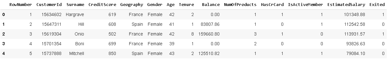
The dataset contains 10000 customers (i.e. rows) and 14 features about the customers and their products at a bank. The goal here is to predict whether a customer will churn (i.e. exited = 1) using the provided features.
该数据集包含10000个客户(即行)和银行中有关客户及其产品的14个特征。 这里的目标是使用提供的功能预测客户是否会流失(即退出= 1)。
Let’s start with a catplot which is a categorical plot of the Seaborn library.
让我们从猫图开始,这是Seaborn库的分类图。
sns.catplot(x='Gender', y='Age', data=df, hue='Exited', height=8, aspect=1.2)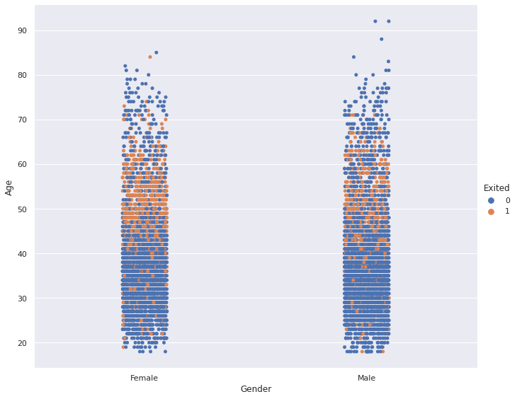
Finding: People between the ages of 45 and 60 are more likely to churn (i.e. leave the company) than other ages. There is not a considerable difference between females and males in terms of churning.
发现 :45至60岁的人比其他年龄段的人更容易流失(即离开公司)。 男性和女性在搅动方面没有显着差异。
The hue parameter is used to differentiate the data points based on a categorical variable.
hue参数用于基于分类变量来区分数据点。
The next visualization is the scatter plot which shows the relationship between two numerical variables. Let’s see if the estimated salary and balance of a customer are related.
下一个可视化是散点图 ,它显示了两个数值变量之间的关系。 让我们看看客户的估计工资和余额是否相关。
plt.figure(figsize=(12,8))plt.title("Estimated Salary vs Balance", fontsize=16)sns.scatterplot(x='Balance', y='EstimatedSalary', data=df)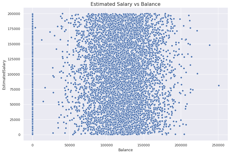
We first used matplotlib.pyplot interface to create a Figure object and set the title. Then, we drew the actual plot on this figure object with Seaborn.
我们首先使用matplotlib.pyplot接口创建一个Figure对象并设置标题。 然后,我们使用Seaborn在此图形对象上绘制了实际图。
Finding: There is not a meaningful relationship or correlation between the estimated salary and balance. Balance seems to have a normal distribution (excluding the customers with zero balance).
调查结果 :估计的薪水和余额之间没有有意义的关系或相关性。 余额似乎具有正态分布(不包括余额为零的客户)。
The next visualization is the boxplot which shows the distribution of a variable in terms of median and quartiles.
下一个可视化效果是箱线图 ,它以中位数和四分位数的形式显示了变量的分布。
plt.figure(figsize=(12,8))ax = sns.boxplot(x='Geography', y='Age', data=df)ax.set_xlabel("Country", fontsize=16)
ax.set_ylabel("Age", fontsize=16)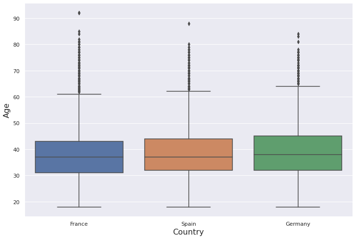
We also adjusted the font sizes of x and y axes using set_xlabel and set_ylabel.
我们还使用set_xlabel和set_ylabel调整了x和y轴的字体大小。
Here is the structure of boxplots:
这是箱线图的结构:
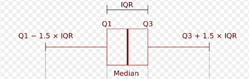
Median is the point in the middle when all points are sorted. Q1 (first or lower quartile) is the median of the lower half of the dataset. Q3 (third or upper quartile) is the median of the upper half of the dataset.
中点是对所有点进行排序时中间的点。 Q1(第一个或下一个四分位数)是数据集下半部分的中位数。 Q3(第三或上四分位数)是数据集上半部分的中位数。
Thus, boxplots give us an idea about the distribution and outliers. In the boxplot we created, there are many outliers (represented with dots) on top.
因此,箱线图使我们对分布和异常值有了一个了解。 在我们创建的箱线图中,顶部有许多离群值(以点表示)。
Finding: The distribution of the age variable is right-skewed. The mean is greater than the median due to the outliers on the upper side. There is not a considerable difference between countries.
结果 :年龄变量的分布右偏。 由于上侧的异常值,平均值大于中位数。 各国之间没有显着差异。
Right-skewness can also be observed in the univariate distribution of a variable. Let’s create a distplot to observe the distribution.
右偏度也可以在变量的单变量分布中观察到。 让我们创建一个distplot来观察分布。
plt.figure(figsize=(12,8))plt.title("Distribution of Age", fontsize=16)sns.distplot(df['Age'], hist=False)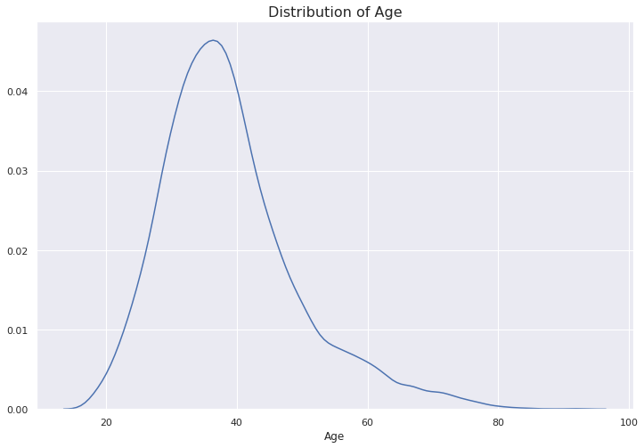
The tail on the right side is heavier than the one on the left. The reason is the outliers as we also observed on the boxplot.
右侧的尾巴比左侧的尾巴重。 原因是离群值,正如我们在箱线图上所观察到的。
The distplot also provides a histogram by default but we changed it using the hist parameter.
默认情况下,distplot还提供直方图,但我们使用hist参数对其进行了更改。
Seaborn library also provides different types of pair plots which give an overview of pairwise relationships among variables. Let’s first take a random sample from our dataset to make the plots more appealing. The original dataset has 10000 observations and we will take a sample with 100 observations and 4 features.
Seaborn库还提供了不同类型的成对图,概述了变量之间的成对关系。 首先,我们从数据集中随机抽取一个样本,使图更具吸引力。 原始数据集具有10000个观测值,我们将抽取一个具有100个观测值和4个特征的样本。
subset=df[['CreditScore','Age','Balance','EstimatedSalary']].sample(n=100)g = sns.pairplot(subset, height=2.5)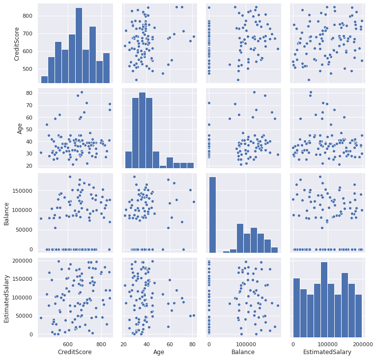
On the diagonal, we can see the histogram of variables. The other part of the grid represents pairwise relationships.
在对角线上,我们可以看到变量的直方图。 网格的另一部分表示成对关系。
Another tool to observe pairwise relationships is the heatmap which takes a matrix and produces a color encoded plot. Heatmaps are mostly used to check correlations between features and the target variable.
观察成对关系的另一个工具是热图 ,它采用矩阵并生成彩色编码图。 热图通常用于检查要素与目标变量之间的相关性。
Let’s first create a correlation matrix of some features using the corr function of pandas.
首先,我们使用熊猫的corr函数创建一些要素的相关矩阵。
corr_matrix = df[['CreditScore','Age','Tenure','Balance',
'EstimatedSalary','Exited']].corr()
We can now plot this matrix.
现在我们可以绘制该矩阵。
plt.figure(figsize=(12,8))sns.heatmap(corr_matrix, cmap='Blues_r', annot=True)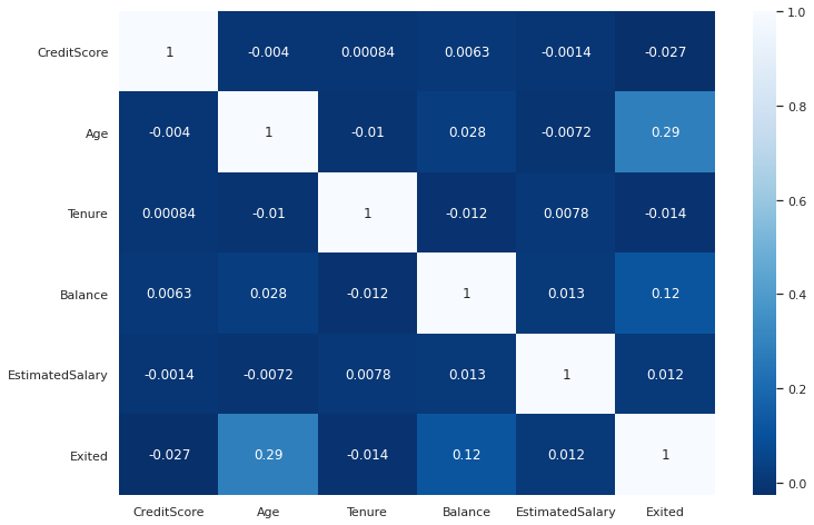
Finding: The “Age” and “Balance” columns are positively correlated with customer churn (“Exited”).
结果 :“年龄”和“平衡”列与客户流失(“退出”)呈正相关。
As the amount of data increases, it gets trickier to analyze and explore it. There comes the power of visualizations which are great tools in exploratory data analysis when used efficiently and appropriately. Visualizations also help to deliver a message to your audience or inform them about your findings.
随着数据量的增加,分析和探索数据变得更加棘手。 可视化的强大功能是有效和适当使用探索性数据分析的重要工具。 可视化还有助于向您的听众传达信息或告知他们您的发现。
There is no one-fits-all kind of visualization method so certain tasks require different kinds of visualizations. Depending on the task, different options may be more suitable. What all visualizations have in common is that they are great tools for exploratory data analysis and the storytelling part of data science.
没有一种万能的可视化方法,因此某些任务需要不同类型的可视化。 根据任务,不同的选项可能更合适。 所有可视化的共同点在于,它们是探索性数据分析和数据科学讲故事部分的出色工具。
Thank you for reading. Please let me know if you have any feedback.
感谢您的阅读。 如果您有任何反馈意见,请告诉我。
翻译自: https://towardsdatascience.com/a-practical-guide-for-data-visualization-9f1a87c0a4c2
鲜活数据数据可视化指南


 661
661


 被折叠的 条评论
为什么被折叠?
被折叠的 条评论
为什么被折叠?
 到【灌水乐园】发言


