


鲜活数据数据可视化指南
How do you get information across through visualization?
您如何通过可视化获取信息?
Data visualization is the graphic representation of data and information. Data visualization makes use of charts, graphs, software or other visualization tools to provide a quick overview of data and show trends and relationships that exist.
数据可视化是数据和信息的图形表示。 数据可视化利用图表,图形,软件或其他可视化工具来提供数据的快速概览,并显示存在的趋势和关系。
Data visualization is not just about plotting charts or making colorful images, in data visualization, the goal is to pass information to the end users as well as:
数据可视化不仅涉及绘制图表或制作彩色图像,在数据可视化中,目标是将信息传递给最终用户以及:
- Visualize trend in dataset 可视化数据集中的趋势
- Easily recognize outliers轻松识别异常值
- Recognize data patterns识别数据模式
- Understand relationship between data了解数据之间的关系
数据科学家的数据可视化(Data Visualization for Data Scientists)
Data science has found application in various industries leading to the employment of data scientists, analysts and engineers across industries in varying capacities. This is why it is good to have an understanding of chart types for visualizations.
数据科学已在各种行业中得到应用,从而导致以不同的能力雇用各个行业的数据科学家,分析师和工程师。 这就是为什么对可视化图表类型有所了解的原因。
In finance, line charts are very useful as they show trends in prices and can also be used to forecast future trends. Gantt charts are used to keep track of project and event start and end times and have found useful application in project management.
在金融中,折线图非常有用,因为它们可以显示价格趋势,也可以用于预测未来趋势。 甘特图用于跟踪项目以及事件的开始和结束时间,并在项目管理中发现有用的应用程序。
In data science, Exploratory Data Analysis is an important process that often employs visual methods to summarize data in order to gain insight from data (the whole data science process is aimed at gaining insight from data).
在数据科学中,探索性数据分析是一个重要过程,通常使用可视化方法来汇总数据以从数据中获得洞察力(整个数据科学过程旨在从数据中获得洞察力)。
Data visualization can be carried out via visualization tools as they are commonly called. These tools include websites and services that offer visualization, visualization software and visualization libraries in programming.
数据可视化可以通过通常称为可视化工具进行。 这些工具包括在编程中提供可视化,可视化软件和可视化库的网站和服务。
Data visualization tools include:
数据可视化工具包括:
- Power BI Power BI
- Tableau 画面
- Adaptive Insights适应性见解
- Plotly密谋
- Google ChartsGoogle图表
The above visualization tools do not require any coding experience.
上面的可视化工具不需要任何编码经验。
探索性数据分析 (Exploratory Data Analysis)
Exploratory Data Analysis (EDA) is the process of summarizing the important aspects of data often using visualization. EDA is an important part of the Data Science process. EDA seeks to check assumptions and test hypothesis as well as discover patterns/trends in the data.
探索性数据分析(EDA)是通常使用可视化对数据重要方面进行汇总的过程。 EDA是数据科学过程的重要组成部分。 EDA试图检查假设并检验假设,并发现数据中的模式/趋势。
Popular programming languages for data visualization include:
用于数据可视化的流行编程语言包括:
- Python Python
- R[R
- MATLAB 的MATLAB
While popular, visualization libraries include:
流行的可视化库包括:
- Matplotlib Matplotlib
- Seaborn Seaborn
- Bokeh 散景
- ggplotggplot
I recall having to make a presentation during my internship, nothing difficult, my tools were simply Excel and PowerPoint. Before then I was familiar with both Excel and PowerPoint and I did not feel a presentation would be difficult. However, when I submitted my ‘finished work’ to my supervisor he made so many corrections I felt beat. My good work was not so good after all. Let me tell you some of the mistakes I made:
我记得在实习期间必须进行演示,没什么困难,我的工具只是Excel和PowerPoint。 在此之前,我对Excel和PowerPoint都很熟悉,并且我不觉得演示很困难。 但是,当我将我的“完成的工作”提交给我的主管时,他做了很多更正,使我感到不胜其烦。 我的好工作毕竟还不是很好。 让我告诉你我犯的一些错误:
我没有正确标记图表 (I did not label my charts properly)
Rookie move, I know. Me of today, cannot believe I did that and I will simply rule it as an omission.
新秀动作,我知道。 今天的我,无法相信我做到了,我将其简单地排除在外。
图表比例与显示不匹配。 (Chart proportion did not match the presentation.)
Let me explain, you see, this was a presentation, I was going to use a projector and my charts were too big. I did not know that was even possible.
让我来解释一下,你看,这是一个演讲,我将使用一个投影仪和我的图表是太大了。 我什至不知道那是可能的。
I had to learn how to proportion my charts with the rest of my presentation so that they look good.
我必须学习如何将图表与演示文稿的其余部分成比例,以使它们看起来不错。
Looks do matter when it comes to visualization because the eyes perceive the data before our mind even starts to process it. Now if you are carrying out Exploratory Data Analysis in a notebook environment that will never be published on any platform, you might not give this much thought. Also, notebooks are easier to navigate and often times, with little effort, your visualizations will look good.
当涉及到可视化时,外观确实很重要,因为在我们的大脑甚至开始处理之前,眼睛就已经意识到了这些数据。 现在,如果您要在永远不会在任何平台上发布的笔记本环境中进行探索性数据分析,那么您可能不需要考虑太多。 此外,笔记本电脑更易于浏览,并且通常不费吹灰之力,您的可视化效果就会很好。
我使用错误的图表来表示数据。 (I used wrong plots to represent data.)
My data type was nominal— categorical — a plot of the quantity of some items (can’t remember what exactly), and I had used a line plot.
我的数据类型是名义的(绝对的),是一些项目的数量图(不记得确切是什么),并且我使用了折线图。
In my defense, I thought it looked really good and the colors, splendid. When my supervisor looked at it, he asked me what I was plotting, first strike. The whole point of visualizing data is to give a quick, easy to understand overview of the data. Recall I did not even label my charts so I can only imagine my supervisor trying to make sense of it all.
在我的辩护中,我认为它看起来非常不错,而且颜色鲜艳。 当我的主管看着它时,他问我在密谋什么,第一次罢工。 可视化数据的重点是提供快速,易于理解的数据概览。 回想一下,我什至没有给图表加标签,所以我只能想象我的主管试图弄清楚这一切。
If your visualization confuses the audience, you should probably — definitely — rethink your charts and plots.
如果您的可视化使观众感到困惑,则可能(绝对)应该重新考虑图表和图表。
Back to the story, when I told him what I wanted to plot, he simply turned it into a bar chart. He explained that to visualize quantity of items, bar charts are better for the job. Line charts should be used if you want to show relationship. You’ll see what I mean soon enough.
回到故事中,当我告诉他我想绘制的内容时,他只是将其变成了条形图。 他解释说,为了可视化项目数量,条形图更适合这项工作。 如果要显示关系,则应使用折线图。 您很快就会明白我的意思。
Some Important Lessons I learned:
我学到的一些重要经验教训:
Bigger is not better
更大不是更好
Your plot should be easy to understand
您的情节应该很容易理解
Label plots properly
正确标记图
Understand chart relationships
了解图表关系
Take your data type into consideration when choosing charts
选择图表时请考虑您的数据类型
The presentation medium also matters. Graphic designers are familiar with the RGB and CMYK color schemes. The RGB is the color we get from our screen, while CMYK is print color. Graphic designers often have to convert their work from RGB to CMYK so that they get a good look of how their work will look when in print.
演示媒体也很重要。 图形设计师熟悉RGB和CMYK配色方案。 RGB是我们从屏幕上获得的颜色,而CMYK是打印颜色。 图形设计师通常必须将其工作从RGB转换为CMYK,以便他们可以很好地了解其在印刷时的外观。
With advancements in technology, this process may not be necessary and because most presentations are made on screens, you may not never have to worry about this, especially as a Data scientist.
随着技术的进步,此过程可能不是必需的,并且由于大多数演示都是在屏幕上进行的,因此您可能永远不必担心这一点,特别是作为数据科学家。
普通图表 (Common Charts)
Charts give quick summary of data and can be used to show the relationship between variables or features. Charts have two axes, the x-axis and the y-axis. The x-axis (horizontal) represents the independent variable while the y-axis (vertical) represents the dependent variable.
图表提供了数据的快速摘要,可用于显示变量或特征之间的关系。 图表有两个轴,x轴和y轴。 x轴(水平)代表自变量,而y轴(垂直)代表因变量。
Below are some common charts, their application and information that can be derived from such charts. We will be using Python and Matplotlib through out for consistency. However, I advise you to explore other visualization tools and libraries.
以下是一些常见的图表,其应用程序以及可以从此类图表中得出的信息。 为了保持一致性,我们将一直使用Python和Matplotlib 。 但是,我建议您探索其他可视化工具和库。
I also make use of the Titanic dataset. I refer to this data set frequently because it is very popular especially amongst beginners and can be accessed via Kaggle.
我还利用了泰坦尼克号数据集。 我经常引用此数据集,因为它在初学者中非常流行,并且可以通过Kaggle进行访问。
条形图 (Bar Chart)
The bar chart is used to represent categorical data. On one axis, we plot the nominal / discreet variables, while on the other axis, we have the dependent quantitative variables. The quantitative values may be discreet or continuous. The heights of the bar charts are proportional to their values. Bar charts may be horizontal or vertical (column charts), placed side-by-side or stacked.
条形图用于表示分类数据。 在一个轴上,我们绘制标称/离散变量,而在另一轴上,我们绘制因变量。 定量值可以是离散的或连续的。 条形图的高度与其值成正比。 条形图可以是水平或垂直(柱形图),可以并排放置或堆叠放置。
The following information can be obtained from bar charts:
可从条形图中获得以下信息:
- Highest and lowest values in a dataset 数据集中的最高和最低值
- A type of bar chart, the Histogram, can also be used to display the distribution of data (normal, binomial etc)直方图是一种条形图,也可以用于显示数据分布(正态,二项式等)
- The count or measure of each category 每个类别的计数或度量
- Compare categorical variables比较分类变量
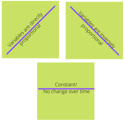
线图(LINE CHART)
The line chart is used to visualize the relationship between quantitative — independent and dependent — variables. With the line chart, it is easy to spot changes in data over time. The data points are represented by markers connected by lines or curves. The direction of the plot also denotes the type of relationship between the variables.
折线图用于可视化定量(独立变量和因变量)之间的关系。 使用折线图,可以轻松发现数据随时间的变化。 数据点由线或曲线连接的标记表示。 绘图的方向还表示变量之间的关系类型。
The Line Chart can be used to:
折线图可用于:
- Display history trend of data 显示数据的历史趋势
- Forecast future trend预测未来趋势
- Track changes that occur over a period跟踪一段时间内发生的更改
Line Plot with a lot of data can be quite messy so take note of that. However, line plots are very useful tools for time-series data which is why it is useful in viewing stock prices and forex.
包含大量数据的线图可能非常混乱,因此请注意。 但是,线图是用于时间序列数据的非常有用的工具,这就是为什么它在查看股票价格和外汇时非常有用。
散点图 (SCATTER PLOT)
The scatter plot is similar to the line plot, without the lines. The scatter plot is a plot of two independent quantitative variables. The advantage of the scatter plot is that clusters can easily be identified.
散点图类似于折线图,没有折线。 散点图是两个独立的定量变量的图。 散点图的优点是可以轻松识别群集。
Other information that can be obtained from scatter plots include:
可以从散点图获得的其他信息包括:
- Relationship between the numerical variables 数值变量之间的关系
Variables may be positively correlated, negatively correlated or not correlated at all. Variables can also be strongly or weakly correlated depending on how close the data points lie to the line.
变量可以是正相关,负相关或根本不相关。 变量也可以强相关或弱相关,具体取决于数据点与线的接近程度。
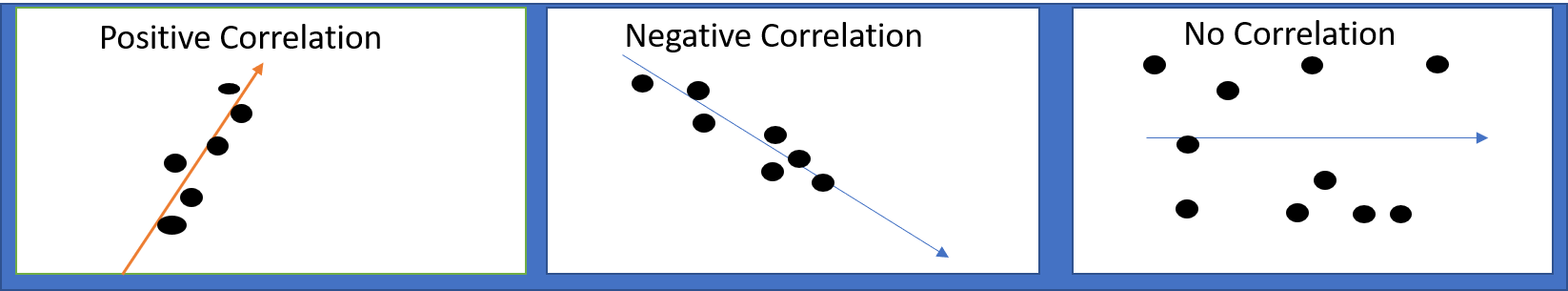
- Delineates clusters 描绘集群
- Easily spot outliers轻松发现异常值
甘特图(GANTT CHART)
The Gantt chart is a type of bar chart — Horizontal bar chart. Nominal data is plotted on the y-axis and quantitative data on its x-axis. The position and length of the Gantt chart are important features as Gantt charts are often used to show stages of projects and relationships between activities. It is therefore an important tool for project management.
甘特图是条形图的一种-水平条形图。 标称数据绘制在y轴上,定量数据绘制在其x轴上。 甘特图的位置和长度很重要,因为甘特图通常用于显示项目的阶段以及活动之间的关系。 因此,它是项目管理的重要工具。
From Gantt chart we are able to identify:
从甘特图,我们可以确定:
- Start and stop time of activity 活动的开始和结束时间
- Overlapping activities重叠活动
- Order of activities活动顺序
饼状图(PIE CHARTS)
Pie charts are circular charts used to illustrate numerical proportions of categorical variables. The pie chart proportions can be represented in degrees totaling up to 360 degrees or in percentage up to 100% or decimals up to 1. Each slice of the pie represents a part of a whole.
饼图是用于说明分类变量的数值比例的圆形图表。 饼图比例可以用总计360度的度数表示,也可以用不超过100%的百分数表示,或不超过1的小数点表示。
Pie charts are useful for:
饼图可用于:
- Comparison 比较方式
- Showing compositions of a whole显示整体组成
- Proportions of classes班级比例
- Quick summary of data数据快速汇总
直方图(HISTOGRAMS)
Histograms are bar charts where the values are grouped into ranges called bins. A tall bar indicates that many values fall within that range while a short bar indicates the opposite. Histograms are especially useful for displaying distribution of the data — normal, binomial, Poisson etc.
直方图是条形图,其中将值分组为称为bin的范围。 高条表示许多值都在该范围内,而短条表示相反。 直方图对于显示数据分布(正态,二项式,泊松等)特别有用。
Histograms are used to:
直方图用于:
- Identify highest and lowest ranges 确定最高和最低范围
- Used for statistical analysis (mean, median, mode etc.)用于统计分析(平均值,中位数,众数等)
- Denotes distribution of dataset 表示数据集的分布
结论(Conclusion)
Understanding the characteristics of charts and their application will help you make better visualizations. Knowing what to plot and how to make your plots, will enable you gain valuable insight from data.
了解图表的特征及其应用将有助于您更好地可视化。 知道要绘制什么以及如何进行绘制,将使您从数据中获得有价值的见解。
While I focused on Matplotlib, there are other visualization libraries that can help you make simple plots.
当我专注于Matplotlib时,还有其他可视化库可以帮助您绘制简单图。
Remember, your visualization should be clean, clutter-free and suitable for the data type you are visualizing. Don’t forget to label those charts!
请记住,您的可视化应该干净,整洁并且适合您要可视化的数据类型。 不要忘了给那些图表贴标签!
翻译自: https://medium.com/swlh/simple-guide-to-data-visualization-6ef6fa726e38
鲜活数据数据可视化指南


 661
661


 被折叠的 条评论
为什么被折叠?
被折叠的 条评论
为什么被折叠?
 到【灌水乐园】发言


