


数据可视化工具
Visualizations are a great way to show the story that data wants to tell. However, not all visualizations are built the same. My rule of thumb is stick to simple, easy to understand, and well labeled graphs. Line graphs, bar charts, and histograms always work best. The most recognized libraries for visualizations are matplotlib and seaborn. Seaborn is built on top of matplotlib, so it is worth looking at matplotlib first, but in this article we’ll look at matplotlib only. Let’s get started. First, we will import all the libraries we will be working with.
可视化是显示数据要讲述的故事的好方法。 但是,并非所有可视化文件的构建都是相同的。 我的经验法则是坚持简单,易于理解且标签清晰的图形。 折线图,条形图和直方图总是最有效。 最受认可的可视化库是matplotlib和seaborn。 Seaborn是建立在matplotlib之上的,因此值得首先看一下matplotlib,但是在本文中,我们将只看一下matplotlib。 让我们开始吧。 首先,我们将导入将要使用的所有库。
import numpy as npimport matplotlib.pyplot as plt%matplotlib inlineWe imported numpy, so we can generate random data. From matplotlib, we imported pyplot. If you are working on visualizations in jupyter notebook, you can call the %matplotlib inline command. This will allow jupyter notebook to display your visualizations directly under the code that was ran. If you’d like an interactive chart, you can call the %matplotlib command. This will allow you to manipulate your visualizations such as zoom in, zoom out, and move them around their axis.
我们导入了numpy,因此我们可以生成随机数据。 从matplotlib中,我们导入了pyplot。 如果要在jupyter Notebook中进行可视化,则可以调用%matplotlib内联命令。 这将使jupyter Notebook在运行的代码下直接显示可视化效果。 如果需要交互式图表,可以调用%matplotlib命令。 这将允许您操纵可视化效果,例如放大,缩小并围绕其轴移动它们。
直方图 (Histograms)
Fist, lets take a look at histograms on matplotlib. We will look at a normal distribution. Let’s build it with numpy and visualize it with matplotlib.
拳头,让我们看看matplotlib上的直方图。 我们将看一个正态分布。 让我们使用numpy构建它,并使用matplotlib对其进行可视化。
normal_distribution = np.random.normal(0,1,10000)plt.hist(normal_distribution)plt.show()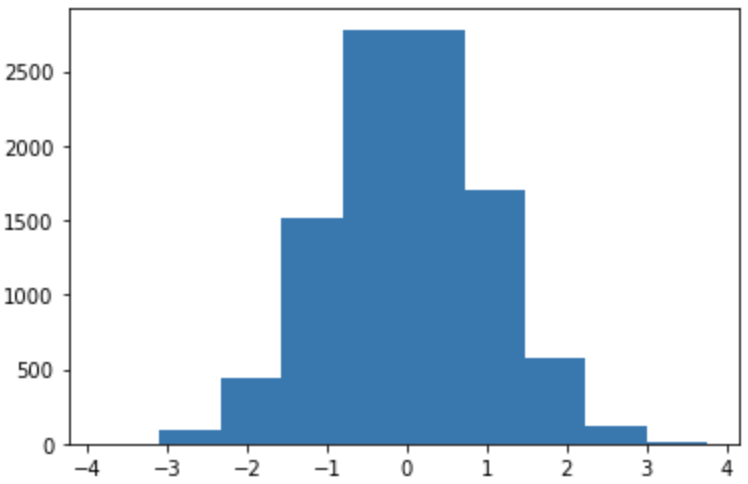
Great! We had a histogram. But, what did we just do? First, we took 10,000 random sample from a distribution of mean 0 and standard deviation of 1. Then, we called the method hist() from matplotlib. Last, we called the show() method to display our figure. However, our histogram looks kind of…squared. Fear not! You can modify the width of each bin with the bins argument. Matplotlib defaults to 10 if an argument isn’t given. There are multiple ways to calculate bins, but I prefer to set it to ‘auto’.
大! 我们有一个直方图。 但是,我们只是做什么? 首先,我们从均值为0且标准差为1的分布中抽取了10,000个随机样本。然后,从matplotlib中调用了hist()方法。 最后,我们调用了show()方法来显示我们的图形。 但是,我们的直方图看起来有点...平方。 不要怕! 您可以使用bins参数修改每个垃圾箱的宽度。 如果未提供参数,则Matplotlib默认为10。 有多种计算垃圾箱的方法,但我更喜欢将其设置为“自动”。
plt.hist(normal_distribution,bins='auto')plt.show()!
!
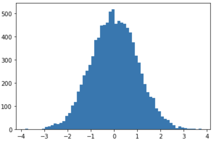
Much better. You know what would be twice as fun? If we visualize another distribution, but if we visualize it on the same histogram, then that would be three times as fun. That’s exactly what we are going to do.
好多了。 您知道会带来两倍的乐趣吗? 如果我们可视化另一个分布,但是如果我们在相同的直方图中可视化它,那将是三倍的乐趣。 这正是我们要做的。
modified_distribution = np.random.normal(3,1.5,10000)plt.hist(normal_distribution,bins='auto',color='purple',label='Purple')plt.hist(modified_distribution,bins='auto',color='green',alpha=.75,label='Green')plt.legend(['Purple','Green'])plt.show()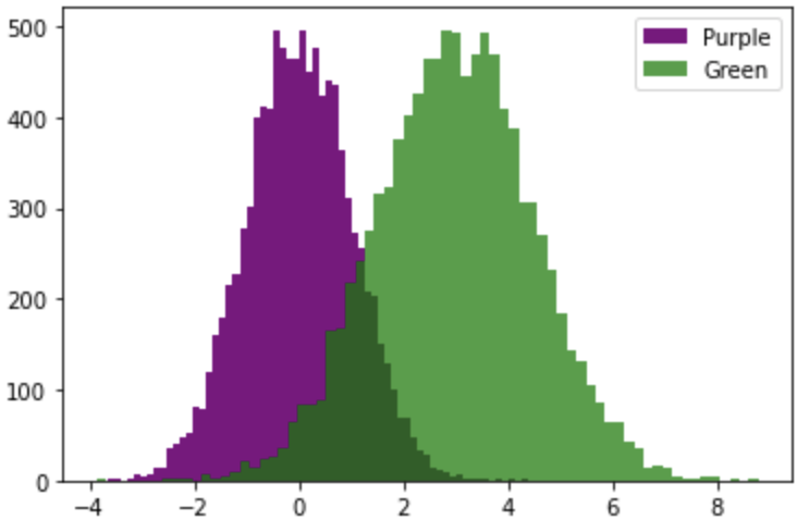
Wow! Now that’s a fun histogram. What just happen? We went from one blue histogram to one purple and one green. Let’s go over what we added. First, we created another distribution named modified_distribution. Then, we changed the color of each distribution with the color argument, passed the labelargument to name each distribution, and we passed the alpha argument to make the green distribution see through. Last, we passed the name of each distribution to the legend() method. When you have more than one set of data on a single chart, it is required to label the data to be able to tell the data apart. In this example, the data can be told apart easy, but in the real world each data can represent things that cannot be identified by color. For example, green can represent height of male college students, and purple the height of female college students. Of course, if that was the case the X axis would be on a different scale.
哇! 现在,这是一个有趣的直方图。 刚刚发生什么事 我们从一个蓝色直方图变为一个紫色和一个绿色。 让我们来看看添加的内容。 首先,我们创建了另一个名为modified_distribution的发行版。 然后,我们使用color参数更改每个分布的颜色 ,传递label参数以命名每个分布,然后传递alpha参数使绿色分布透明。 最后,我们将每个发行版的名称传递给legend()方法。 如果单个图表上有多个数据集,则需要标记数据以便能够区分数据。 在此示例中,可以轻松区分数据,但在现实世界中,每个数据都可以代表无法用颜色标识的事物。 例如,绿色可以代表男性大学生的身高,而紫色可以代表女性大学生的身高。 当然,如果是这种情况,则X轴将处于不同的比例。
条形图 (Bar Charts)
Let’s continue the fun. Now we are going to look at bar charts. This kind of charts are really useful when trying to visualize quantities, so let’s look at an example. In this case we will visualize at how people voted when asked about what type of pet they have or would like to have. Let’s randomly generate data.
让我们继续乐趣。 现在我们来看看条形图。 当试图可视化数量时,这种图表非常有用,因此让我们看一个示例。 在这种情况下,我们将可视化当人们问起他们拥有或想要拥有哪种类型的宠物时人们如何投票。 让我们随机生成数据。
options = ['Cats','Dogs','Parrots','Hamsters']
votes = [np.random.randint(10,100) for i in range(len(options)]
votes.sort(reverse=True)
Perfect, we have a list of pets and a list of randomly generated numbers. Notice, we sorted the list in descending order. I like to order list this way because it is easier to see which category is the largest and smallest. Of course, in this example we just ordered the votes without ordering the options that match up to it. In reality, we would have to order both. I found that the easiest way to go about this is to make a dictionary and order the dictionary by values. Click herefor a helpful guide on stackoverflow on how to order dictionaries by values. Now, let’s visualize our data.
完美,我们有一个宠物清单和一个随机生成的数字清单。 注意,我们以降序对列表进行排序。 我喜欢以此方式订购商品,因为这样可以更轻松地查看最大和最小的类别。 当然,在此示例中,我们只是对投票进行了排序,而没有对与之匹配的选项进行排序。 实际上,我们将必须同时订购两者。 我发现最简单的方法是制作字典并按值对字典进行排序。 单击此处以获取有关如何按值对字典进行排序的stackoverflow的有用指南。 现在,让我们可视化我们的数据。
plt.bar(options,votes)plt.title('Favorite Pet Survey')plt.xlabel('Options')plt.ylabel('Votes')plt.show()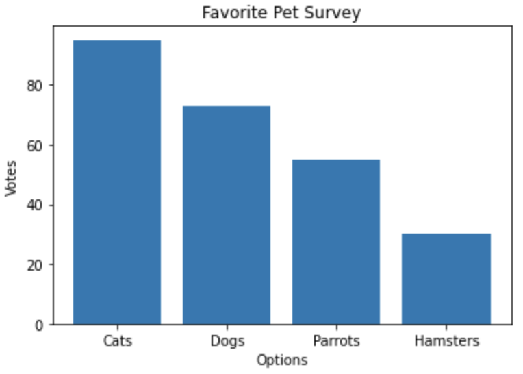
Great! We have an amazing looking graph. Notice, we can easily tell cats got the most votes, and hamsters got the least votes. Let’s look at the code. After we defined our X and height, we called the bar() method to build a bar chart. We passed options as X and votes as height. Then, we labeled the title, X axis, and y axis with methods title(), xlabel(), and ylabel() respectively. Easy enough! However, this bar chart looks a bit boring. Let’s make it look fun.
大! 我们有一个惊人的外观图。 注意,我们可以很容易地看出猫的得票最多,而仓鼠的得票最少。 让我们看一下代码。 定义X和高度后,我们调用bar()方法来构建条形图。 我们将选项作为X传递,将投票作为高度。 然后,我们分别使用方法title(),xlabel()和ylabel()标记标题,X轴和y轴。 很简单! 但是,此条形图看起来有些无聊。 让它看起来有趣。
with plt.style.context('ggplot'):
    plt.bar(options,votes)
    plt.title('Favorite Pet Survey')
    plt.xlabel('Options')
    plt.ylabel('Votes')
    plt.show()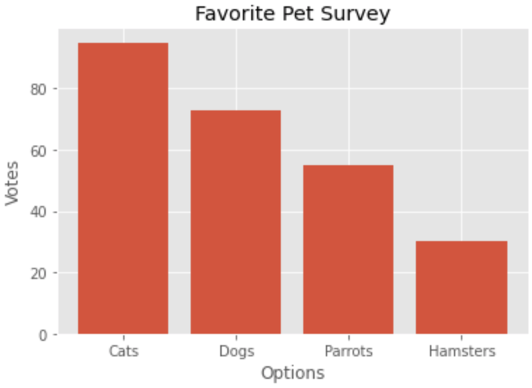
This graph is so much fun. How did we do this? Notice, all our code looks mostly the same, but there is important code we added, and we changed the format. We added the with keyword and the context() method from plt.style to change our chart style. Really cool thing is that it only changes it for everything that’s directly under it and indented. It is important to indent the code after the first line. We used the ggplot style to make our graph more fun. Click here to view all the styles available in matplotlib. If we want to compare two datasets with the same options, it is a little harder than in histograms, but it is equally as fun. Let’s say we want to visualize male vs female vote on each category.
该图非常有趣。 我们是如何做到的? 注意,我们所有的代码看起来几乎相同,但是添加了重要的代码,并且更改了格式。 我们从plt.style添加了with关键字和context()方法来更改图表样式。 真正很酷的事情是,它仅针对直接在其下方并缩进的所有内容进行更改。 在第一行之后缩进代码很重要。 我们使用了ggplot样式使我们的图表更加有趣。 单击此处查看matplotlib中可用的所有样式。 如果我们想比较两个具有相同选项的数据集,这比直方图要难一些,但同样有趣。 假设我们要形象化每个类别的男性和女性投票。
votes_male = votes
votes_female = [np.random.randint(10,100) for i in range(len(options))]import pandas as pdwith plt.style.context('ggplot'):
    pd.DataFrame({'male':votes_male,'female':votes_female,index=options).plot(kind='bar')
    plt.title('Favorite Pet Survey (Male vs Female)')
    plt.xticks(rotation=0)
    plt.ylabel('votes')
    plt.show()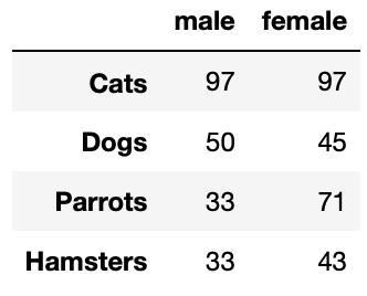
Lots going on here, but you have seen most of it already. Let’s start from the top. First, we renamed the votes data to votes_male, and we generated new data for votes_female. Then, we imported pandas which is a library to work with data frames. We created a data frame for our data with male and female as our columns and pet options as our index. After, we called the plot() method from the data frame and passed bar for the kind arguement, so we can plot a bar chart. With the data frame plot method, it adds X labels for you, but they are at a 90-degree angle. To fix this, you can call the xticks() method from pyplot and pass the argument rotation 0. This will make the text like the graph above.
这里有很多事情,但是您已经看到了大部分。 让我们从头开始。 首先,我们将选票数据重命名为voices_male,并为votes_female生成了新数据。 然后,我们导入了pandas,这是一个用于处理数据框的库。 我们为数据创建了一个数据框,其中男性和女性为列,宠物选项为索引。 之后,我们从数据框中调用plot()方法,并通过柱形图进行类型争论,因此可以绘制条形图。 使用数据框绘图方法时,它会为您添加X标签,但它们成90度角。 要解决此问题,您可以从pyplot调用xticks()方法并传递参数rotation0。这将使文本像上面的图形一样。
线形图 (Line Graph)
Now, let’s look at line graphs. These graphs are great to visualize how Y changes as X changes. Most commonly, they are used to visualize time series data. In this example, we will visualize how much water a new town uses as their population grows.
现在,让我们看一下折线图。 这些图表非常适合可视化Y随着X的变化。 最常见的是,它们用于可视化时间序列数据。 在此示例中,我们将可视化一个新城镇随着人口增长而消耗的水量。
town_population = np.linspace(0,10,10)
town_water_usage = [i*5 for i in town_population]with plt.style.context('seaborn'):
    plt.plot(town_population,town_water_usage)
    plt.title('Water Usage of Cool Town by Population')
    plt.xlabel('Population (in thousands)')
    plt.ylabel('Water usage (in thousand gallons)')
    plt.show()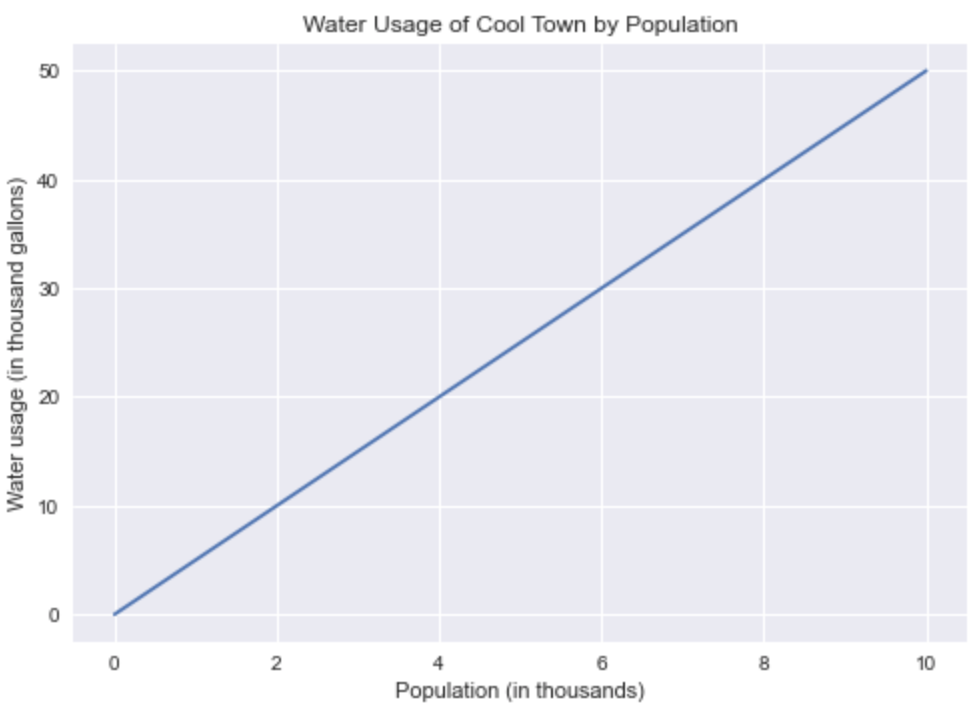
What a nice graph! As you can see, we used everything we learned so far to create this graph. The only difference is the method we called is not as intuitive as the other ones. In this case we called the plot() method. We passed our X and Y, labeled our chart, and we visualized it with our show() method. Let’s add more data. This time, we are going to add the water usage of a nearby town.
多么漂亮的图! 如您所见,我们使用到目前为止所学的所有知识来创建该图。 唯一的区别是我们调用的方法不像其他方法那样直观。 在这种情况下,我们称为plot()方法。 我们传递了X和Y,标记了图表,然后使用show()方法将其可视化。 让我们添加更多数据。 这次,我们将增加附近城镇的用水量。
nearby_town_water_usage = [i*.85 for i in town_water_usage]with plt.style.context('seaborn'):
    plt.plot(town_population,town_water_usage,label='Cool Town')
    plt.plot(town_population,nearby_town_water_usage,label='Lame Town')
    plt.title('Water Usage of Cool Town and Lame Town')
    plt.xlabel('Population (in thousands)')
    plt.ylabel('Water usage (in thousand gallons)')
    plt.legend(['Cool Town','Lame Town'])
    plt.show()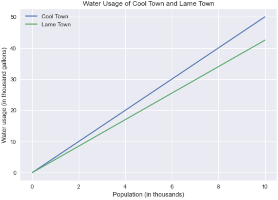
As you can see we just added another plot(), labeled, each line, updated the title, and we showed a legend of the graph. For the most part is the same process as other graphs. From the graph we can see that Lame Town is actually using less water than Cool town. I guess Lame Town isn’t so lame after all.
如您所见,我们只是添加了另一个plot(),标记为每行,更新了标题,并显示了图例。 在大多数情况下,该过程与其他图形相同。 从图中可以看出,me脚镇实际上比凉爽镇使用的水少。 我猜La子镇毕竟不是那么la子。
结论 (Conclusion)
We covered some of the basics of visualizing data. We even went into how to generate random data! As you can see these are very versatile and efficient ways of showing data. Nothing too crazy, just old school ways of showing the story that the data tells.
我们介绍了可视化数据的一些基础知识。 我们甚至研究了如何生成随机数据! 如您所见,这些是显示数据的非常通用和有效的方法。 没什么太疯狂的了,只是老式的方式来显示数据所讲述的故事。
翻译自: https://medium.com/@a.colocho/data-visualization-9e151698a921
数据可视化工具


 4598
4598


 被折叠的 条评论
为什么被折叠?
被折叠的 条评论
为什么被折叠?
 到【灌水乐园】发言


