


css 拟态框居中技巧
Skeuo-什么? (Skeuo-what?)
You might not have heard the term before, but skeuomorphism is something you likely interact with daily. Whether using the calculator app on your phone, or dragging an unwanted file into the bin icon, you are utilising a user interface design concept known as skeuomorphism. Essentially, skeuomorphism describes user interface objects that mimic their real-world counterparts in how they appear or how the user can interact with them.
您以前可能没有听说过该词,但是拟态是您每天可能会与之交互的东西。 无论是在手机上使用计算器应用程序,还是将不需要的文件拖到bin图标中,您都在利用一种称为拟态的用户界面设计概念。 本质上,拟态描述了模仿其真实世界对应物的用户界面对象,它们的外观或用户如何与之交互。
I’m a UX designer within Certsy, SEEK’s very own credential verification platform. I recognised early on that a lot of the metaphors we were using consistently to describe the Certsy product and purpose lent themselves extremely well to skeuomorphic design.
我是SEEK自己的凭据验证平台Certsy中的UX设计师。 我很早就意识到,我们一直在使用许多比喻来描述Certsy产品,并且目的非常适合于拟态设计。
In this article I’ll share my top 3 tips on using skeuomorphic design, and illustrate them with examples of how we’re applying it at Certsy.
在本文中,我将分享有关使用拟态设计的三大技巧,并通过示例说明如何在Certsy上应用它。
提示1:选择有意义的隐喻 (Tip #1: Choose a meaningful metaphor)
Not all skeuomorphic design metaphors are equal. So make sure you choose one that people readily understand, has strong positive associations, and ideally that you can own… or at least bring a unique twist to. It’s worth playing with multiple options so you can compare and contrast them, and involving your wider team to review in order to get different perspectives.
并非所有拟态设计隐喻都是平等的。 因此,请确保您选择一个人们容易理解的,具有很强的积极联系,理想情况下您可以拥有的人,或者至少带来一种独特的感觉。 值得考虑的是多个选项,因此您可以进行比较和对比,并让更广泛的团队进行审查,以获得不同的观点。
For example, Certsy was often described in internal discussions as either a “digital wallet” or “passport” that organised a user’s verified credentials, whilst also acting as a “document vault” that housed their licences and other sensitive documents securely.
例如,内部讨论中经常将Certsy描述为组织用户验证凭证的“数字钱包”或“护照”,同时还充当“文件库”,以安全地存储其许可证和其他敏感文件。
Knowing I wanted to utilise some of these real-world objects as design inspiration, I brought this perspective into team discussions about which analogy — wallet or a passport? — was best to use when describing Certsy.
知道我想利用这些现实世界中的一些对象作为设计灵感之后,我将这种观点引入了小组讨论中,以哪种类比-钱包还是护照? -描述Certsy时最好使用。
As we unpacked the options, it became apparent the term “digital wallet” was already strongly associated with payment-related products and apps; something outside of Certsy’s market. Using this terminology held the risk of people potentially misunderstanding what we do, plus it’s a concept that we’d never be likely to “own” given that much larger organisations like Google and Apple have their own versions.
当我们打开选件的包装时,很明显,术语“数字钱包”已经与支付相关的产品和应用紧密相关; Certsy市场之外的东西。 使用此术语会冒着人们可能误解我们所做工作的风险,而且考虑到像Google和Apple这样的大型组织都有自己的版本,我们永远不可能“拥有”这个概念。
However, the passport analogy seemed to have legs. A real-world travel passport acts as your key to world travel, and as a career passport we would be your key to the world of work. I saw great potential to translate some of a traditional passport’s features into recognisable elements that fit the Certsy version of a career passport.
但是,比喻护照似乎有腿。 现实世界的旅行护照是您前往世界旅行的钥匙,而作为职业护照,我们将是您进入职场的钥匙。 我看到了将传统护照的某些功能转换成适合职业护照的Certsy版本的可识别元素的巨大潜力。
For example, a traditional passport contains passport stamps, representing either permission to enter a country or a record of when you entered or left that place. The Certsy equivalent of a new passport stamp would be a new licence, registration, or skill, etc — all variations on the idea of permission to do something or a record of your achievements.
例如,传统护照包含护照印章,代表进入国家的许可或您进入或离开该地方的时间的记录。 与Certsy等效的新护照印章将是新的执照,注册或技能等,这是许可做某事或记录您的成就的所有想法。
And what better digital reward for an achievement than a badge? Plus, the thing about badges is — much like travel destinations — you’re rarely content with just the one. Over time, you’d want to collect more, gradually building your passport into a comprehensive representation of an exceptional (career) journey.
还有什么比徽章更好的数字奖励呢? 另外,关于徽章的事情是-就像旅行目的地一样-您很少只满足于徽章。 随着时间的流逝,您希望收集更多,逐渐将您的护照构建为一次非凡(职业)旅程的全面代表。

提示2:仅在有意义时使用它 (Tip #2: Only use it when it makes sense)
Striking the right balance with skeuomorphic design is important so that you don’t make the UI appear too cluttered or old-fashioned. You shouldn’t be using skeuomorphism for its own sake, but instead to help users quickly understand your product and interface. So be thoughtful and judicious in when you choose to use it — don’t feel like you have to use it everywhere!
通过拟态设计来达到适当的平衡很重要,这样就不会使UI显得过于混乱或过时。 您不应出于自身目的而使用拟态,而应帮助用户快速了解您的产品和界面。 因此,在选择使用它时要慎重而明智-不必觉得必须在任何地方使用它!
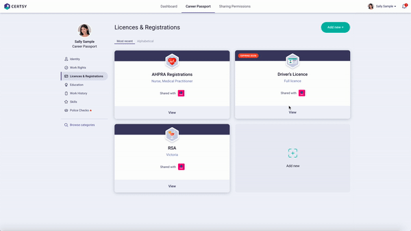
Passport. With the above in mind, I wasn’t about to design the Certsy interface to resemble a 5-by-4-inch digital leaflet. Instead, I took inspiration from the concept of a passport when setting the overall information architecture and feel for the product. It should feel like it’s your career passport, so I decided to help personalise the navigation with your photo. We also added clear sections to make more visible the sorts of things that are included in your career passport.
护照。 考虑到以上所述,我不会设计类似于5 x 4英寸数字传单的Certsy界面。 相反,在设置产品的整体信息架构和感觉时,我从护照的概念中得到启发。 它应该觉得这是你的职业生涯的护照,所以我决定帮助个性与您的照片导航。 我们还添加了清晰的部分,以使您的职业护照中包含的各种内容更加明显。

Cards. Once the overall passport metaphor was established, I took a little inspiration from the wallet analogy for the licences section. No harm in mixing and matching — as long as it’s relatable and useful for the user, and doesn’t break or clash with your overall positioning. In this case, people are used to having cards for their licences and registrations so that was the natural choice for this section.
牌。 一旦建立了总体的护照比喻,我就从许可证类比的钱包类比中获得了一些启发。 只要它是相关的且对用户有用的,并且不会破坏或冲突您的整体位置,就不会对混合和匹配造成任何损害。 在这种情况下,人们习惯于使用许可证和注册卡,这是本节的自然选择。
Certificates. Similarly, for the skills section of the passport, I thought about which metaphors were best. The nice thing about sections is they give us freedom to do things a little differently in each area. So for our upcoming skill assessments, I opted for a certificate metaphor.
证书。 同样,对于护照的技能部分,我考虑了哪种隐喻是最好的。 关于部分的好处是,它们使我们可以自由地在每个区域中做一些不同的事情。 因此,对于即将进行的技能评估,我选择了证书隐喻。

提示3:取得适当的平衡 (Tip #3: Strike the right balance)
Utilising the skeuomorphic approach to UX design is more of an art than a science.
将拟态方法用于UX设计,更多的是艺术而非科学。
In an age of pared-back minimalist interfaces, the key to good skeuomorphic design is to not get too hung up on the literal but instead capture just enough of the object’s essence without sacrificing user recognition.
在一个精简的简约界面时代,良好的拟态设计的关键是不要过于依赖文字,而要在不牺牲用户识别度的情况下捕获对象的本质。
Common mistakes with skeuomorphic design include:
拟态设计的常见错误包括:
- Harming usability by being too purist or literal in sticking to a metaphor 通过过于单纯或直率地坚持隐喻来损害可用性
- Not considering the negative connotations of a real-world concept 没有考虑现实世界概念的负面含义
- Adding excessive complexity or workload for your front-end developers. For example, one thing I consider is how many different components our front end developers will have to build. When to re-use existing components vs when is it important enough to represent a concept with its own metaphor or different treatment? As an example, we use the same card components across the Licences & Registrations aa well as Work Rights sections. 为您的前端开发人员增加了过多的复杂性或工作量。 例如,我考虑的一件事是我们的前端开发人员必须构建多少个不同的组件。 什么时候可以重用现有的组件,什么时候可以用自己的隐喻或不同的方式来代表一个概念足够重要? 例如,我们在“许可和注册”以及“工作权利”部分中使用相同的卡组件。
I hope this article has inspired you to consider skeuomorphic design as a powerful and relevant tool in your UX repertoire.
我希望本文能启发您将拟态设计视为您的用户体验库中一个功能强大且相关的工具。
Done well, skeuomorphic design can help differentiate your product from the sea of sameness out there, making your product and brand more memorable and interesting.
如果做得好,拟态设计可以帮助您将产品与同类海洋区分开来,从而使您的产品和品牌更加令人难忘和有趣。

翻译自: https://medium.com/seek-blog/3-tips-for-skeuomorphic-design-4868372d0c7e
css 拟态框居中技巧


 1404
1404


 被折叠的 条评论
为什么被折叠?
被折叠的 条评论
为什么被折叠?
 到【灌水乐园】发言


