


苹果系统影楼设计排版
This series of posts aims to help you get started in creating an adaptive, multi-use design system from scratch.
本系列文章旨在帮助您从头开始创建自适应的,多用途的设计系统。
Throughout the series, I will discuss my preferred path, helpful tools and best practices to keep in mind.
在整个系列中,我将讨论我的首选路径,有用的工具和最佳实践。
Design systems can be daunting but can pay off in a big way if you spend the time to lay the foundations. If you want to use a robust design system right away, visit simplekits.co and give my very own design system a go!
设计系统可能令人生畏,但如果您花费时间为基础打下基础,则可以大有作为。 如果您想立即使用功能强大的设计系统,请访问simplekits.co,并尝试使用我自己的设计系统!
So here are the areas we will cover (I will update the links as they get posted)
所以这是我们将要覆盖的领域(我将在发布链接时更新链接)
- Typography Styles (This one)字体样式(此)
- Complex Buttons 复杂按钮
- Conditional Inputs条件输入
- Interchangeable Dropdowns可互换的下拉菜单
- Responsive Cards & Modals响应卡和模态
I have made a Figma File for you to duplicate and use/follow along if you would rather that than create from scratch
我制作了一个Figma文件供您复制和使用/跟随,如果您愿意而不是从头开始创建
This part of the series talks about how we go about choosing our Fonts, weights and sizes as well as how we can set them up in Figma so that we can easily use and update our fonts across all future projects.
本系列的这一部分讨论了如何选择字体,粗细和大小以及如何在Figma中进行设置,以便我们可以在以后的所有项目中轻松使用和更新字体。
Let’s get started.
让我们开始吧。
挑选字体的规则 (Rules For Picking Your Fonts)
Many will refer to this as one of the hardest parts when creating a design system. There are so many fonts to choose from, with subtle details that can change the entire feel of the system itself.
在创建设计系统时,许多人会将其称为最困难的部分之一。 有很多字体可供选择,并且细腻的细节可以改变系统本身的整体感觉。
保持简单。 (Keepin’ it simple.)
The approach I typically take when creating an adaptive design system is to keep it as neutral as possible — meaning, something trendy and nice-looking, but not something with too much unique flair.
在创建自适应设计系统时,我通常采用的方法是使它尽可能保持中立-意味着一些时髦且美观的东西,但不要具有太多独特的风格。
Keeping it generic makes it easier to modify it when the time comes, as you are not working around the more unique choices some fonts make.
保持通用性可以使您更容易在需要时进行修改,因为您无法解决某些字体所做的更多独特选择。
But obviously, choose one that fits the style you want your design system to have as its default.
但是显然,选择一种适合您希望设计系统作为其默认样式的样式。
When I am looking for generic, but well-received fonts, I typically browse Google Fonts for their most popular/trendy and pick one from there.
当我寻找通用但广受欢迎的字体时,通常会浏览Google字体,以了解它们最受欢迎/最流行的字体,然后从中选择一种。

家庭数 (Number of families)
The rule here is, don’t overdo it. It is usually good practice to limit your designs to two fonts max. But, you can get away with just one font too, depending on how you use hierarchy within your system.
这里的规则是,不要过度使用它。 通常最好将您的设计限制为最多两种字体。 但是,您也可以只使用一种字体,具体取决于您在系统中使用层次结构的方式。
If you decide upon two fonts, pick the one you plan to use as “main” font. Usually titles headers, etc. And the other to be “supporting” and “body” fonts. Ones that compliment the main font well, but are also easy to read at smaller levels. Think of it as one for style, one for function.
如果决定使用两种字体,请选择要用作“主”字体的一种。 通常是标题标题等。另一个是“支持”和“正文”字体。 可以很好地补充主字体,但在较小的层次上也易于阅读。 认为它是一种风格,一种是功能。
For our system, I am going to go with one Font Family (Open Sans) to keep things simple.
对于我们的系统,我将使用一个字体家族(Open Sans)来简化事情。
设置字体样式 (Setting Your Type Styles)
As I mentioned in Part One, I use Figma so some of this section will have references to how I use Figma to setup my styles, but the sizing, naming and other conventions can be used anywhere you like, but may have different ways about setting them up.
正如我在第一部分中提到的那样,我使用Figma,因此本节中的某些内容将参考如何使用Figma设置样式,但是大小,命名和其他约定可以在您喜欢的任何地方使用,但是设置的方式可能不同。他们起来。
类型刻度 (Type Scales)
When it comes to design, there are so many subtle decisions that go un-noticed but play an essential role. One of these subtle decisions is the scaling rhythm of your font sizes.
在设计方面,有许多微妙的决定虽然没有引起注意,但却起着至关重要的作用。 这些微妙的决定之一是字体大小的缩放节奏。
To figure out this scale, you would typically start at a base size (usually 16px, 17px or 18px and then multiply each “step” by X.
为了弄清楚这个比例,您通常会以基本尺寸(通常为16px,17px或18px)开始,然后将每个“步长”乘以X。
For example, if we wanted to follow the golden ratio we would multiply our 16px base value by 1.618, and that would be our next step, then times that by 1.618 again to get our next step, and so on.
例如,如果我们要遵循黄金分割率,则将16px基本值乘以1.618,这将是下一步,然后将其乘以1.618再进行下一步,依此类推。
However, I am not much of a math guy and prefer to use various tools to do this for me, as well as explore my options. Type-Scale is great for single-font systems, and archetype is perfect for those who decide to go with two font families.
但是,我不是一个数学家,我更喜欢使用各种工具为我做这件事,以及探索我的选择。 Type-Scale非常适合单字体系统,原型对于决定使用两种字体系列的用户而言是完美的。
Once you have your scales selected, apply those settings to some lines of text within your design file. (You may find you need to round up the numbers, decimals are a no go in most cases!) Like so -
选择比例后,将这些设置应用于设计文件中的某些文本行。 (您可能会发现需要四舍五入数字,多数情况下小数点是不行的!)像这样-
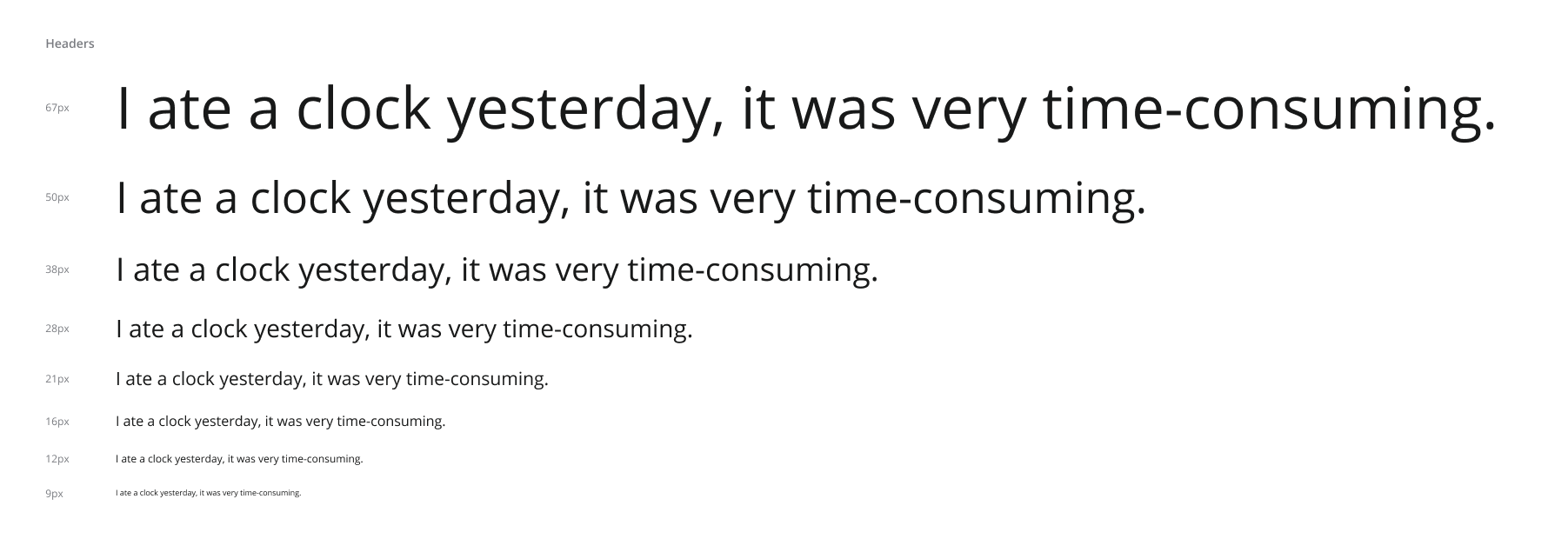
It’s good practice to use either a sentence that uses every letter of the alphabet (also known as a pangram), or if you so fancy, a funny one liner.
优良作法是使用一个使用字母表中每个字母的句子(也称为“连字”),或者如果您愿意的话,使用一个有趣的衬线。
I typically have a set of headers ranging from around 10px — 12px up to the maximum size I want to use. Then, I also make a set of body text, which is usually 12px, 14px, 16px, 18px, but can sometimes vary.
我通常会有一组标题,范围从10像素-12像素到我要使用的最大大小。 然后,我还制作了一组正文,通常为12px,14px,16px,18px,但有时可能会有所不同。

字型设定(Font Settings)
At this point, it is worth messing around a little bit with your font settings. Consider things such as Paragraph spacing, Line height and letter spacing. These settings will likely be different for each font size as well as font “use”.
此时,值得对字体设置进行一些修改。 考虑诸如段落间距,行高和字母间距之类的东西。 对于每种字体大小以及字体“使用”,这些设置可能会有所不同。
For example, my headers line-height is usually pretty close to the default font line-height. However, my body line-height is generally set to around 150–170%, as it allows for easy reading and less eye strain for users.
例如,我的标题行高通常非常接近默认字体的行高。 但是,我的身体线条高度通常设置为150-170%,因为它使用户易于阅读并减少了眼睛疲劳。
A good way to test line height, is simply placeholder text (usually I settle for Lorem Ipsum) so that there is enough content to test line heights & paragraph spacing.
测试行高的一种好方法是简单地使用占位符文本(通常我选择Lorem Ipsum),以便有足够的内容来测试行高和段落间距。

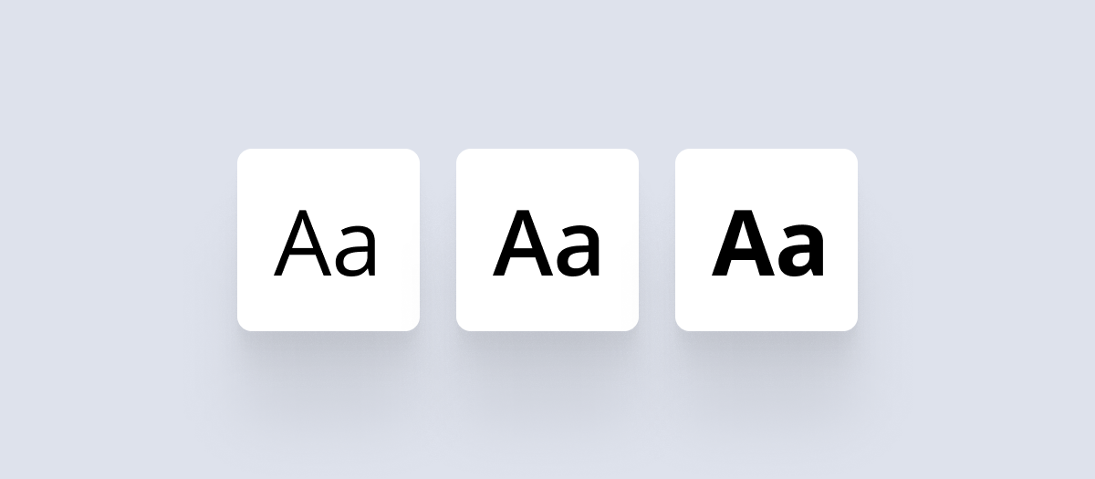
字体粗细 (Font Weights)
Now that your set of default font styles are ready, you may want to save them into the Figma font style tool. However, I would first take the time to duplicates with varying font weights.
现在您已经准备好一组默认字体样式,您可能需要将它们保存到Figma字体样式工具中。 但是,我首先要花一些时间来更改字体粗细不同的重复项。
To do this, copy the list of various sizes you already made two more times, and apply a different weight to each column. If you have more than 3, find a suitable medium between the boldest you would like, and the lightest you would like.
为此,请复制您已经进行过两次的各种尺寸的列表,然后对每列应用不同的权重。 如果大于3,则在最粗体和最浅体之间找到合适的介质。
In this example, I have Regular, Semibold and Bold.
在这个例子中,我有Regular,Semibold和Bold。
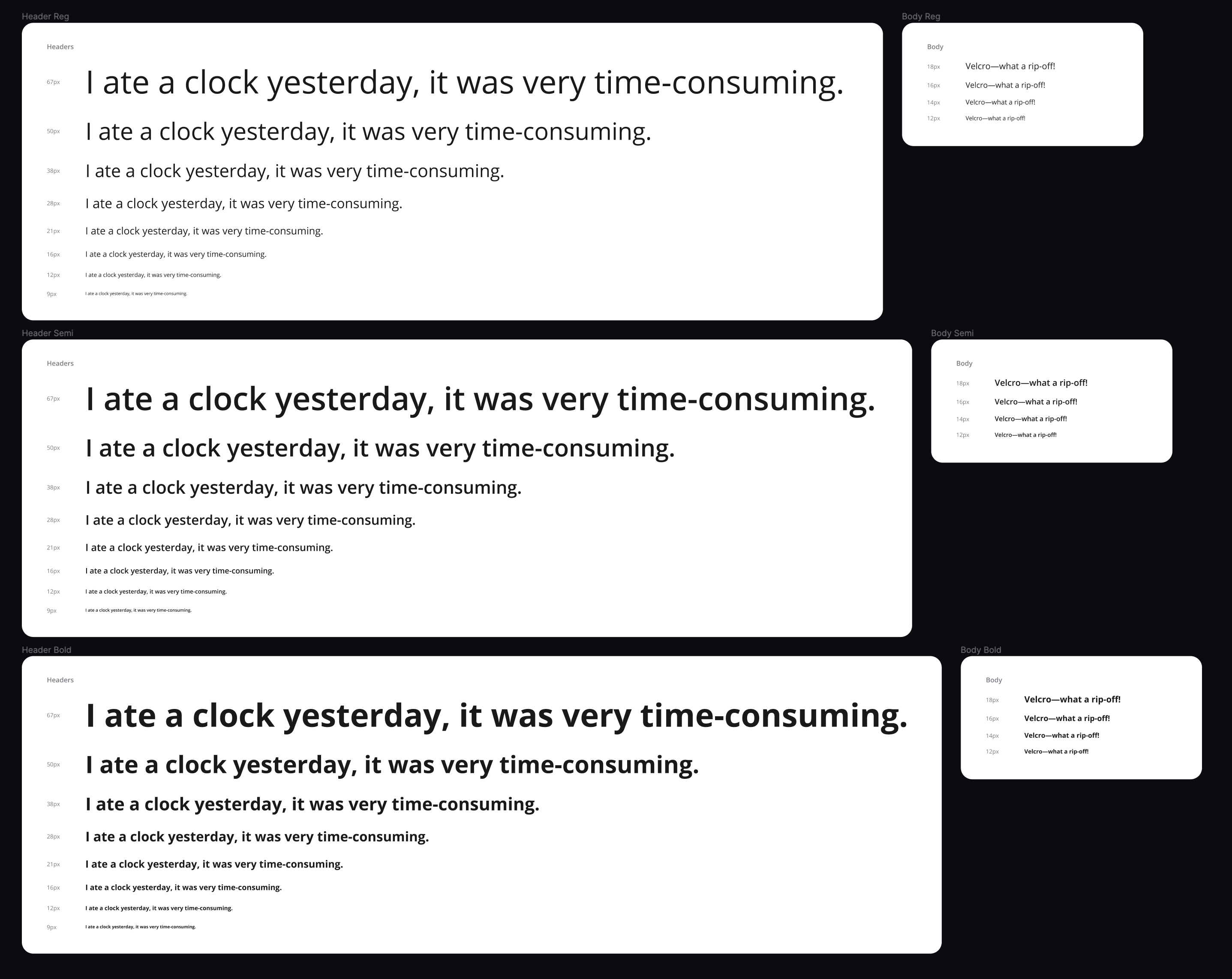
Usually I would neaten up my typography pages, and order them by “Use” (Headers and Body) and then into groups by size. Largest at the top, to smallest. But for simplicity, I wanted to keep them separate to see how to quickly create duplicates.
通常,我会整理我的排版页面,并按“使用”(标题和正文)排序,然后按大小分组。 顶部最大,最小。 但是为了简单起见,我想将它们分开,以了解如何快速创建重复项。
设置Figma样式 (Setting up Figma Styles)
The time has come to turn these random lines of type into a powerful tool within Figma (or your preferred tool).
现在是时候将这些类型的随机行转变为Figma中的强大工具(或您首选的工具)了。
First, we need to settle on a naming convention. This choice will impact how users will browse and interact with your fonts later down the line.
首先,我们需要确定命名约定。 这种选择将影响用户以后如何浏览字体并与之交互。
For example, we can group by weight first, and then size, resulting in something more like this -
例如,我们可以先按重量分组,然后按尺寸分组,结果是这样的:
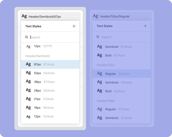
Or, we can group by size first, and then by weight. Meaning our Font Styles List will look something like this-
或者,我们可以先按大小分组,然后按重量分组。 意味着我们的字体样式列表将如下所示:
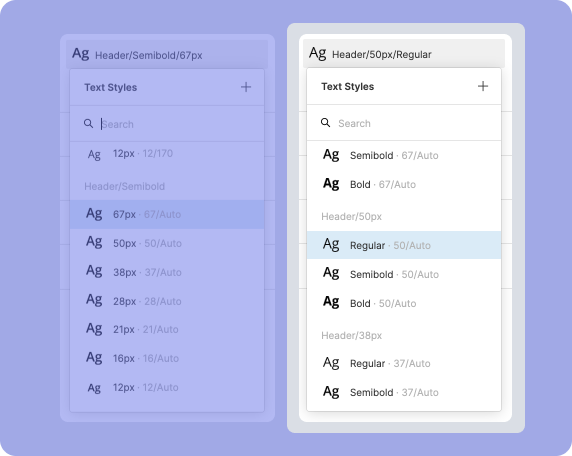
This choice is totally up to you. The one rule I stick to and suggest you do too, is to first group by their role. Meaning are they a header text, or a body text. This is important because, as you may have noticed when adding font settings, your body may have a more considerable line-height, and with that would likely not be used the same way as a header.
这种选择完全取决于您。 我坚持并建议您也遵循的一个规则是,首先按他们的角色分组。 意思是它们是标题文本还是正文文本。 这很重要,因为,正如您在添加字体设置时可能已经注意到的那样,您的身体的行高可能更高,并且行高可能与标题不同。
So, if you would like to group by weight, you would click the “plus” icon upon the font styles panel to create a new style, then name your new style something like “Header/16px/Bold”.
因此,如果您想按重量分组,则可以在字体样式面板上单击“加号”图标以创建新样式,然后将新样式命名为“ Header / 16px / Bold”。
If you wanted to group by size, it would instead be “Header/Bold/16px”. The 16px would be swapped for the size of your currently selected font.
如果要按大小分组,则改为“ Header / Bold / 16px”。 16像素将被替换为当前所选字体的大小。
But wait, there is an easier way than doing this one by one!
但是,等等,比一个接一个地做更简单!
There are some fantastic Figma Plugins to speed this process up. I would suggest seeing which one works best for your approach!
有一些很棒的Figma插件可以加快此过程。 我建议您看看哪种方法最适合您的方法!
管理与更新 (Managing & Updating)
That’s it; you have set up a robust and adaptable typography system within Figma!
而已; 您已经在Figma内建立了一个强大且适应性强的排版系统!
When using any text within your design file, make sure you attach a text style to it, otherwise when it comes time to update your fonts in a new project, you will be left with half updating and those that have no style, staying the same. So, be consistent with your text style usage!
在设计文件中使用任何文本时,请确保在其上附加文本样式,否则当需要在新项目中更新字体时,将剩下一半的更新,而没有样式的字体则保持不变。 因此,请与您的文字样式用法保持一致!
On that note, updating your type styles is easy; you just “edit” the styles you previously made. However, this is a long and tedious task. Instead, we rely again on some great Figma Plugins to speed this up!
关于这一点,更新您的字体样式很容易。 您只需“编辑”您以前制作的样式。 但是,这是一个漫长而乏味的任务。 相反,我们再次依靠一些出色的Figma插件来加快速度!
My go-to for the task of updating my Text Styles is Batch Styler. It lets you select all your fonts (or just the ones you want) and apply new fonts, line heights, letter spacing, weights, and anything else you need in one fell swoop.
我要更新文本样式的任务是Batch Styler 。 它使您可以选择所有字体(或只是想要的字体),并一口气应用新字体,行高,字母间距,粗细以及您需要的其他任何东西。
总结和后续步骤 (Wrapping Up and Next Steps)
Next post, we will cover our first steps into creating reusable components with the creation of buttons. But, not just simple buttons, we will explore the various ways to set up buttons, from fast but straightforward, to complex but consistent. Both have a time and place within any design system!
在下一篇文章中,我们将介绍通过创建按钮来创建可重用组件的第一步。 但是,不仅是简单的按钮,我们还将探索各种设置按钮的方法,从快速但简单的方法到复杂但一致的方法。 两者在任何设计系统中都有时间和地点!
I have made a Figma File for you to duplicate and use/follow along if you would rather that than create from scratch.
我制作了一个Figma文件供您复制和使用/遵循,如果您愿意而不是从头开始创建。
Want a design system without the hassle of creating ever single component yourself? Then check out simplekits, a Design System Kit made with all the core components you could need for any project.
想要一个没有自己创建单个组件麻烦的设计系统? 然后查看simplekits ,这是一个设计系统工具包,其中包含任何项目可能需要的所有核心组件。
Thanks for reading. Follow me on Medium and Twitter for tips, tricks and future updates! 👋
翻译自: https://blog.prototypr.io/creating-design-systems-part-two-typography-e0820311644
苹果系统影楼设计排版


 被折叠的 条评论
为什么被折叠?
被折叠的 条评论
为什么被折叠?
 到【灌水乐园】发言


