


色盲算法
I have seen this problem so much more than I used to. Maybe it’s because I am paying more attention, maybe the world’s care for color has been lessened. All I know is that color seems to be a vast mystery to many designers out there, and that’s pretty atrocious.
我比以往更多地看到了这个问题。 也许是因为我越来越关注,也许世界对色彩的关心已经减少了。 我所知道的是,对于许多设计师来说,颜色似乎是一个巨大的谜,而且那是残酷的。
Before we get started on my snarky ass talking about color, let’s get something put out there. I am partially colorblind. I have Red-Green Color Blindness, which is some combination of Protanomaly and Deuteranomaly. This essentially puts me in the 0.5% of women out there that have it. People with Red-Green Color Blindness typically can see those colors, only when we see reds and greens of similar value, they get very muddy and we can’t really tell the difference between them. If you want more information, www.color-blindness.com is a decent resource. That being said, I find it hilarious to see people’s reactions when I tell them that I am an artist/designer that is color blind. It’s even more fun when I tell them that I taught color theory for quite a few years, they always seem amazed when it’s really not that amazing. Once I explain everything in how I design as a partially color blind person, you’ll get why it’s not a big deal at all.
在我们开始谈论颜色之前,我们先来介绍一下。 我部分是色盲。 我有红绿色盲症,这是原发性和申明性的某种组合。 从本质上讲,这使我有0.5%的女性拥有它。 具有红绿色盲症的人通常可以看到这些颜色,只有当我们看到具有相似价值的红色和绿色时,它们才会变得非常浑浊,我们无法真正分辨出它们之间的区别。 如果您想了解更多信息, www.color-blindness.com是一个不错的资源。 话虽如此,当我告诉人们我是一个色盲的艺术家/设计师时,我很高兴看到人们的React。 当我告诉他们我教授色彩理论很多年时,这变得更加有趣,当它们并不那么令人惊奇时,他们总是感到惊讶。 一旦我解释了我如何设计为部分色盲的人,您将了解为什么它根本不是什么大问题。
We are currently living in a world where designers and products often think of color accessibility as the last thing anyone needs to worry about. Which frankly is rather asinine. Out of the many vision-based disabilities out there, it is the most common behind nearsightedness and farsightedness, it is the most under-reported, and it’s among the least likely to be corrected. Why so many designers out there do not simply check their usages of color, I don’t know. I like to think that we just lack the time to seriously confront it and audit our own work for these issues. For an industry that touts empathy as one of its biggest characteristics, they tend to lack it when considering color blindness, most even refusing to address it until a client specifically complains. Well just understanding the basic theory behind color and a color blind person’s perspective on a project should help very much.
当前,我们生活在一个设计师和产品经常将色彩可及性视为任何人都需要担心的最后一件事的世界。 坦率地说,这是愚蠢的。 在许多基于视觉的残障人士中,它是近视和远视背后最常见的,报告最多的,也是最不可能被纠正的。 我不知道为什么这么多设计师没有简单地检查他们对颜色的使用情况。 我想认为我们只是没有时间认真面对它,并就这些问题审核我们自己的工作。 对于一个吹捧同理心是其最大特征的行业,当考虑色盲时,他们往往会缺乏同情心,甚至在客户特别抱怨之前,他们甚至拒绝解决。 仅仅了解色彩背后的基本理论和色盲人对项目的看法应该会很有帮助。
First, when looking at color and how it pertains to a user’s experience with it, we need to understand basic terminology. We have hue, value, shade, and saturation when dealing with individual colors. When looking to compositions of colors, terms we need to pay attention to are contrast, chromatic, monochromatic, harmony, and all of the glorious multitudes of composition terms like primary, tertiary, and all that mess. Really we will be mostly looking to the terms for individual colors.
首先,在查看颜色及其与用户使用体验的关系时,我们需要了解基本术语。 处理各种颜色时,我们具有色相,值,阴影和饱和度。 在查找颜色组成时,我们需要注意的是对比度,色度,单色,和声以及所有丰富的组成术语,例如主色,第三色以及所有这些杂乱的名词。 确实,我们将主要关注各个颜色的术语。
休,我是说顺化! (Hugh, I mean Hue!)
Hue is the “color” you are essentially looking at. Blue is a hue, as is red, green, orange, etc…. Hues are the spectrum at which we operate, it is the base layer to this conversation. For me, hue is surprisingly the least important in regards to my color blindness. The use of hue in design is what gets us to harmony. Its only real purpose is to establish the color you are attempting to use. What is more important are the other terms we are about to go over, the first of which is value.
色相实际上就是您要看的“颜色”。 蓝色是一种色调,红色,绿色,橙色等也是如此。 色相是我们工作的频谱,它是此对话的基础。 对于我来说,就我的色盲而言,色相令人惊讶地是最不重要的。 在设计中使用色相是使我们和谐的原因。 其唯一的真实目的是确定您要使用的颜色。 更重要的是我们将要使用的其他术语,第一个是价值。
有价值的价值。 (Valuable Values.)
Value is what people like to call lightness. It is a leftover term from pigments, and was often used to explain how much white was mixed into the base color or hue. When talking about value in design, it often pertains to much more than the dilution of white into your pigment, it also deals with saturation in general, and luminosity. Luminosity isn’t one I listed above, mainly because everyone thinks it’s different and nobody uses it in conversations about color really. Value on the other hand, immensely important. When you combine the lightness and saturation of a hue together you essentially get a color-blind person’s nightmare. With the form I have, if the two hues are of the same value, the same lightness and saturation, I simply cannot tell the difference between the two. When designing for these situations, if you refuse to change your colors, adding little aids like patterns and symbols to a color object can help people like myself immensely. I generally will continue using an app that has this option built into it, whereas if they don’t I generally shop around for one that does, or one that designs the colors more inclusive to begin with. It’s not hard, and next up is shade.
价值是人们喜欢称之为轻度的东西。 它是颜料中的一个剩余术语,通常用于解释将多少白色混入基色或色相中。 在谈论设计价值时,它通常不仅仅涉及将白色稀释到颜料中,还涉及到饱和度和亮度。 亮度不是我上面列出的一种,主要是因为每个人都认为它与众不同,并且没有人真正在谈论颜色时使用它。 另一方面,价值非常重要。 当您将色调的明暗度和饱和度结合在一起时,您基本上会感到色盲者的噩梦。 使用我拥有的形式,如果两种色调的值相同,亮度和饱和度相同,我简直无法分辨两者之间的区别。 在针对这些情况进行设计时,如果您拒绝更改颜色,则在颜色对象上添加诸如图案和符号之类的小帮助可以极大地帮助像我这样的人。 我通常会继续使用内置有此选项的应用程序,但是如果他们不这样做,我通常会四处购物,或者选择一款设计色彩更广泛的产品。 这并不难,接下来就是阴影。

可疑... (Shadiness…)
No, it’s not when someone casts shade on you as an online nemesis, it is the amount of black pigment added to a hue. As with value, shade also inherently pertains to saturation, as diluting the hue with anything will affect saturation. Shade is also immensely important to understanding how a color-blind person sees the color you use in a design. As with value, if two colors are of the same shade, we simply can’t see the difference. One thing that helps that is something we call temperature. Temperature is another small-term you see sometimes, but is not immensely important. When talking about the color black, or rather the lack of light that is black, in pigment, we need to address temperature. Just go down to the craft store sometime and look at how many different tubes of black paint you can find. You’ve got Lamp Black, Ivory Black, Paynes Grey (it’s basically black), my favorite Mars Black (actually pretty grey), and so many more. The options are endless, and they range from being named by the person that created it, to the minerals used in its creation. These individual blacks all have a temperature. One of the reasons why Mars Black is my favorite, is because it’s temperature is warm. It probably has iron oxide pigment mixed into it, but a warm black doesn’t compete with dark purples and blues for me. I can differentiate the colours better based on the simple push to a different temperature of black. When you are looking into design for the digital space, taking a black from #000000 to adding some warmth in your hue strip, and bringing it up out of 100% shade to say 99%, can make all the difference to some of us. This also pertains to whatever is considered your black in design. If it lacks any hue, it will cause problems at some point.
不,不是当有人在网上向您投下阴影时,而是在色调中添加的黑色颜料。 与值一样,阴影也固有地与饱和有关,因为用任何东西稀释色调都会影响饱和度。 阴影对于理解色盲人如何看待您在设计中使用的颜色也非常重要。 与值一样,如果两种颜色具有相同的阴影,则根本看不到差异。 我们称之为温度的是一件事。 温度有时是您看到的另一个小术语,但并不是很重要。 当谈论颜料中的黑色,或者缺乏黑色时,我们需要解决温度问题。 只是有时要去Craft.io品店,看看有多少种黑色涂料可以找到。 您有Lamp Black,Ivory Black,Paynes Gray(基本上是黑色),我最喜欢的Mars Black(实际上是非常灰色)等等。 选项是无止境的,范围从创建它的人命名到创建它所使用的矿物。 这些单独的黑人都有温度。 火星布莱克之所以成为我最喜欢的原因之一,是因为它的温度是温暖的。 它可能混入了氧化铁颜料,但温暖的黑色对我来说并不能与深紫色和蓝色竞争。 通过简单地推入不同温度的黑色,我可以更好地区分颜色。 当您正在寻找数字空间的设计时,从#000000黑色到在色带中添加一些温暖,然后将其从100%的阴影中提高到99%,可以对我们中的所有人有所帮助。 这也与设计中被认为是黑色的东西有关。 如果没有任何色调,则会在某些时候引起问题。
饱和站。 (Saturation Station.)
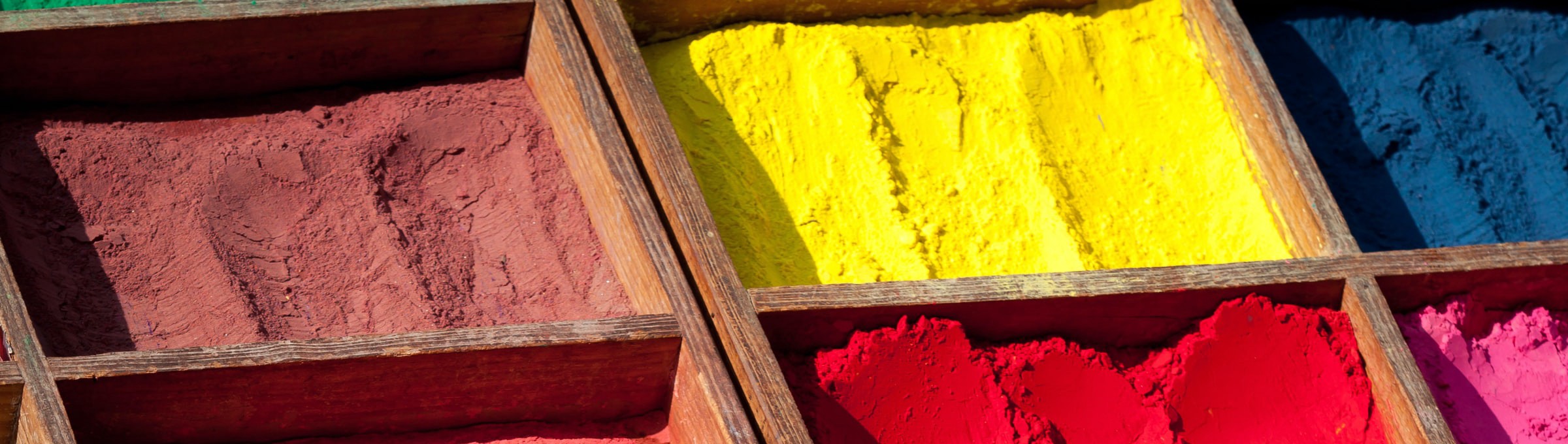
Aside from the air in the Southern US, saturation also pertains to the intensity of the pigment you are using. When you have your purest form of pigment, you are at your most saturated point. As that percentage of pigment drops, so does the color’s saturation. It’s not a big leap from thinking of lightening and darkening a hue, through dilution, as being effective to the saturation. Saturation is not a truly synonymous term for brightness either. Though brightness somewhat refers to saturation, richness also does as well. You can have a rich color that isn’t bright at all. When you are physically dealing with saturation in color, you are mixing pigments with other pigments, without the use of white or black. Part of the reason many paintings from the enlightenment are so astoundingly bright and rich is that they didn’t use white or black when mixing hues. Their black was, for one example, a really rich ultramarine mixed with another extremely rich color like iron oxide red, and the gods only know what else. Paints back then are always having traces of things we would consider odd, like maybe a proper Oxblood Red. You can probably figure out what was in that. With color blindness saturation is key in how it pertains to shade and value. If the color’s saturation is the same, its value is going to be similar or the same.
除了美国南部的空气,饱和度还与您所使用的颜料的强度有关。 当您拥有最纯净的颜料形式时,您将处于最饱和点。 随着颜料下降的百分比,颜色的饱和度也会下降。 从通过稀释变浅和变深色调到对饱和有效是一个很大的飞跃。 饱和度也不是亮度的真正同义词。 尽管亮度在某种程度上是指饱和度,但丰富度也是如此。 您可以拥有完全不明亮的丰富色彩。 当您实际处理色彩饱和度时,就是将颜料与其他颜料混合,而无需使用白色或黑色。 启蒙运动中许多画作如此明亮和丰富的部分原因是,它们在混合色调时没有使用白色或黑色。 例如,它们的黑色是一种真正丰富的群青,与另一种极其丰富的颜色(如氧化铁红)混合在一起,而众神只知道其他什么。 那时的油漆总是有我们会认为奇怪的东西的痕迹,例如适当的Oxblood Red。 您可能可以找出其中的含义。 对于色盲,饱和度是其与阴影和值之间关系的关键。 如果颜色的饱和度相同,则其值将相似或相同。
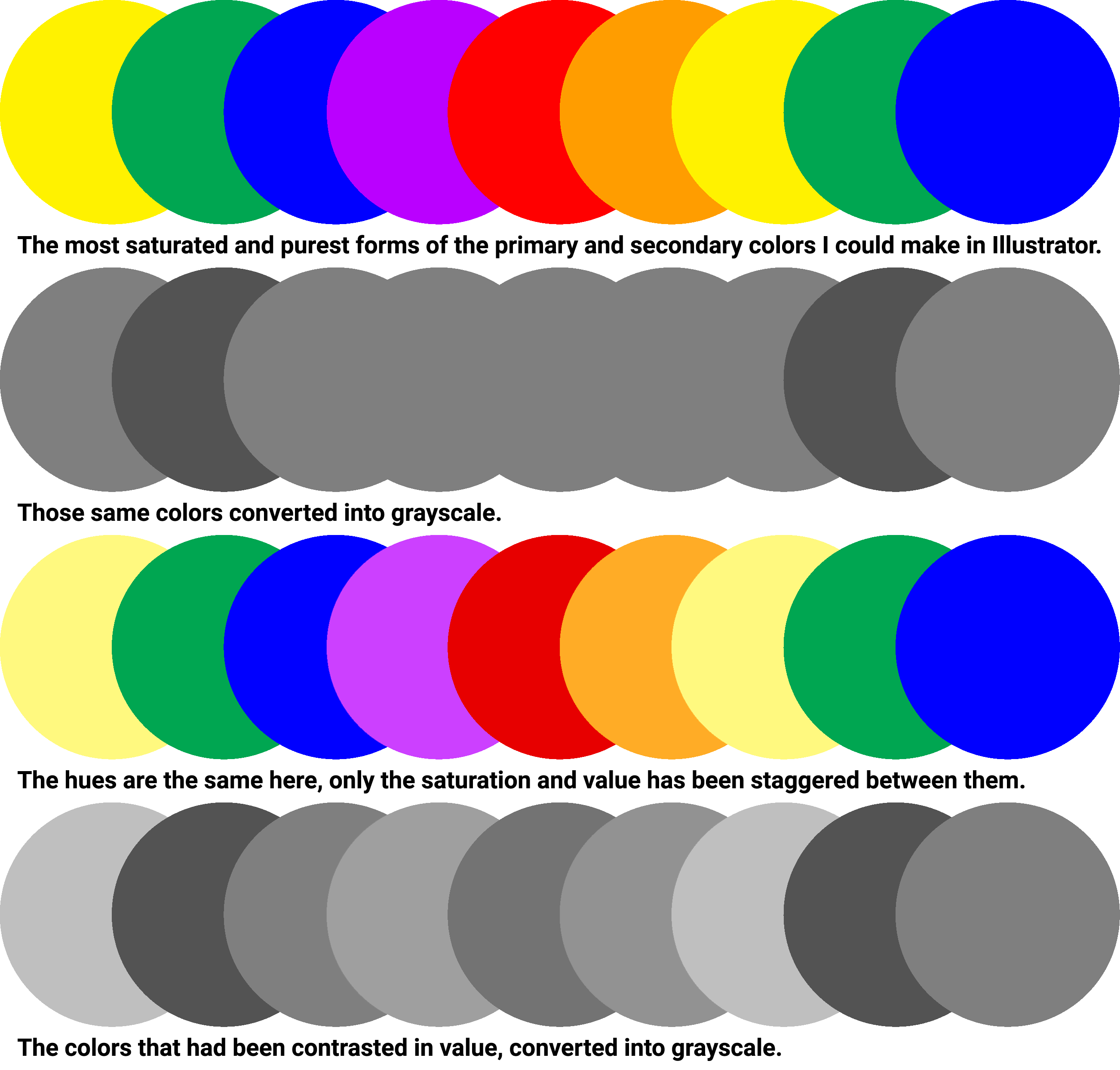
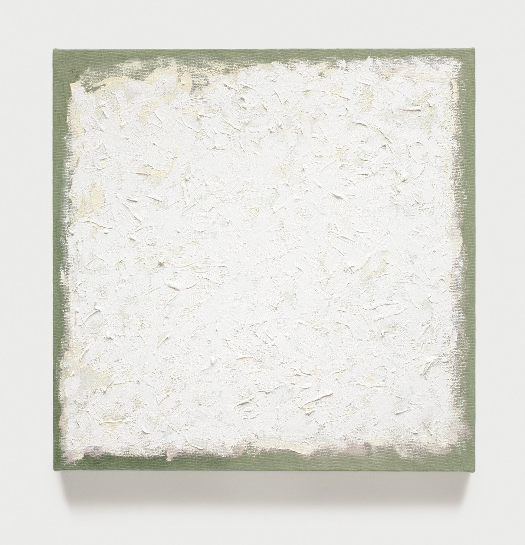
So Jennifer, what does all this equate to when talking about designing with color and color blindness? Well I will tell you, it has nothing to do with my students that used to chuck a green and red ball at me to see if I could see them or get hit in the face by them. It’s actually less fun. For people that are similarly disabled to me, we need to just make sure when we are working on designs that we pull our colors from different values and shades. If you aren’t sure if you are doing that well enough, there is a handy little test that’s easy enough to do for y’all normies out there. Convert the image or design to grayscale or a monochromatic (single hue) palette. This removes hue from the conversation. It essentially means you need to have enough contrast (the difference in shade or value) for anything to be differentiated. Without contrast, you essentially have a Robert Ryman painting (actually my favorite painter), or in an extreme, a single visual object when there might actually be hundreds in the design.
詹妮弗(Jennifer),当谈到色彩和色盲设计时,这一切意味着什么? 好吧,我会告诉你,这与我的学生无关,后者曾经向我扔一个绿色和红色的球,看看我能看见他们还是被他们打中。 实际上,这没那么有趣。 对于对我来说同样残障的人,我们只需要确保在进行设计时就可以从不同的值和阴影中提取颜色。 如果您不确定自己做得是否足够好,可以使用一种便捷的小测试来轻松完成所有规范。 将图像或设计转换为灰度或单色(单一色调)调色板。 这样可以消除对话中的色相。 从本质上讲,这意味着您需要具有足够的对比度(阴影或值的差异)才能区分任何事物。 没有对比,您实际上拥有一幅罗伯特·雷曼(Robert Ryman)的画(实际上是我最喜欢的画家),或者极端地,当设计中实际上可能有数百个时,它是一个视觉对象。
Pay attention to your values and shades to make a color blind person happy. When working on a palette, don’t just pay attention to hue, stagger your saturations between the hues. The more contrast you have in the palette from a high value to a low shade, the more accessible the design will be for us. And just one other thing, if you’re in doubt, and you haven’t succeeded in the grayscale test, ask your friendly neighborhood colorblind person if they can use your design. We can be very vocal about it, just don’t hurl it at our faces like my students did.
注意您的价值观和阴影,以使色盲人满意。 在调色板上工作时,不仅要注意色相,还要在色相之间错开饱和度。 从高值到低调的调色板中的对比度越多,则设计对我们越容易使用。 还有另一件事,如果您有疑问,并且您没有在灰度测试中取得成功,请询问您友好的邻里色盲人员是否可以使用您的设计。 我们可能对此非常直言不讳,只是不要像我的学生那样朝我们的脸投掷它。

翻译自: https://uxdesign.cc/a-colorblind-persons-guide-to-using-color-acb79e0d27a5
色盲算法


 3633
3633


 被折叠的 条评论
为什么被折叠?
被折叠的 条评论
为什么被折叠?
 到【灌水乐园】发言


