


Before I quit my job as a Data Analyst at a staffing firm and went back to school to learn Data Science, part of my job was to present KPI (key performance indicator) reports to the VP of Sales and President. These reports would encompass a huge amount of features and data (phone call data, LinkedIn Sales Navigator and Recruiter data, CRM activity data, and more) which was very hard to synthesize on one report.
在我离开人事公司的数据分析师职位并回到学校学习数据科学之前,我的部分工作是向销售副总裁兼总裁介绍KPI(关键绩效指标)报告。 这些报告将包含大量功能和数据(电话数据,LinkedIn Sales Navigator和Recruiter数据,CRM活动数据等),而这些数据很难在一个报告中进行综合。
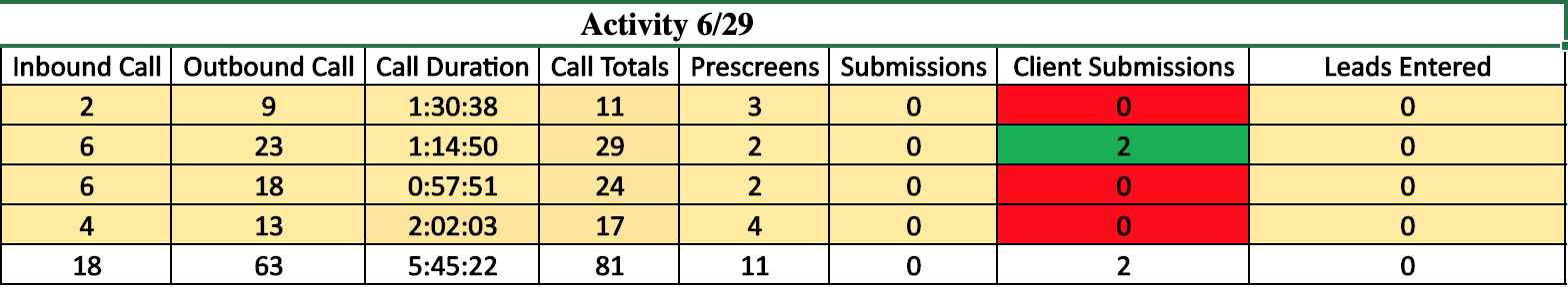
This was before I had any experience in Python, Matplotlib, or Seaborn, and I think that we can all agree that the visualization tools in Excel are lacking, to put it lightly. My solution was to build a grid of metrics data that, while impressive in the total amount of information available at a glance, did little to give an impression of the overall health of the business or individual employee’s success. Below is a sample with some dummy data to give you an example of what I sent out to my employer every morning.
这是在我没有使用Python,Matplotlib或Seaborn的任何经验之前,我认为我们都可以同意Excel中缺少可视化工具,因此请轻描淡写。 我的解决方案是建立一个指标数据网格,尽管一目了然的可用信息总量令人印象深刻,但却几乎没有给企业的整体健康状况或单个员工的成功印象。 下面是一个包含一些虚拟数据的示例,为您提供了我每天早上发送给雇主的示例。
Now more than ever, I wished I had access to the suite of tools that Matplotlib and Seaborn give to the user when creating visualizations. Not only would I be able to automate most of my job with Python, I could also have been creating easy-to-read visualizations that would have enhanced the insights discovered in our data. Below I have outlined some easy-to-follow steps to get the most out of the Matplotlib and Seaborn libraries while starting out on your Python Visualization Quest.
现在,我希望比以往任何时候都能够使用Matplotlib和Seaborn在创建可视化时提供给用户的工具套件。 我不仅可以使用Python自动化大部分工作,还可以创建易于阅读的可视化效果,从而增强我们在数据中发现的洞察力。 下面,我概述了一些易于遵循的步骤,可以在开始使用Python Visualization Quest时充分利用Matplotlib和Seaborn库。
安装软件包,导入库和设置选项 (Installing Packages, Importing Libraries, and Setting Options)
Like most Python libraries, installing and importing the necessary libraries is made very easy by using your terminal and Jupyter Notebooks. Matplotlib comes packaged with Anaconda, a must-have for any data scientist (instructions for installation can be found here. Seaborn is a library that complements the existing Matplotlib library and can be installed using the below conda command in your terminal.
与大多数Python库一样,通过使用终端和Jupyter Notebook,安装和导入必要的库变得非常容易。 Matplotlib随Anaconda打包在一起,Anaconda是任何数据科学家必备的工具(可在此处找到安装说明。Seaborn是一个对现有Matplotlib库进行补充的库,可以在终端中使用以下conda命令进行安装。
conda install -c anaconda seabornFrom here it is easy enough to import the libraries and set some key settings to ensure ease-of-use and readability. The %matplotlib inline magic function is important in that it tells your Jupyter Notebook frontend to display the visualizations underneath the code that builds it and to store the visualizations in the notebook itself. The sns.set_style() is method should also be set at the beginning of your notebook if you would like to keep the style of your visualizations consistent throughout the notebook. I like using the darkgrid style but there are a few other options to be found here if you like those better.
从这里可以轻松导入库并设置一些关键设置,以确保易用性和可读性。 %matplotlib内联魔术函数很重要,因为它告诉Jupyter Notebook前端在构建它的代码下显示可视化并将可视化存储在Notebook本身中。 如果您想在整个笔记本中保持可视化样式的一致性,也应该在笔记本的开头设置sns.set_style()方法。 我喜欢使用darkgrid样式,但是如果您更喜欢这些样式,可以在这里找到其他一些选择。
import pandas as pd
import matplotlib.pyplot as plt
%matplotlib inline
import seaborn as sns
sns.set_style('darkgrid')
Now let’s go step by step to create the graph shown at the top of this post. Let’s create a graph that shows the change over time of domestic and worldwide gross averages by release year.
现在,让我们一步一步地创建本文顶部显示的图形。 让我们创建一个图表,以显示发行年份的国内和全球总平均值随时间的变化。
选择要使用的图形类型 (Choose Which Type of Graph To Use)
Matplotlib and Seaborn come prepackaged with dozens of types of visualization out of the box that can be overwhelming in their complexity. However, just because the library gives you the option to build a complex multi-tiered visualization doesn’t mean that it will be the right visualization for the information you are trying to display. For my money, the key to engaging visualizations is to keep it simple and easy to read.
Matplotlib和Seaborn预先包装了数十种可视化类型,它们的复杂性可能不堪重负。 但是,仅仅因为库为您提供了构建复杂的多层可视化的选项,并不意味着它将成为您要显示的信息的正确可视化。 为了我的钱,参与可视化的关键是保持其简单易读 。
Trying to communicate too much information in one graph is a sure way to confuse your audience and give you a unnecessary headache. Think clearly about what you are trying to communicate with the visualization and which type of graph would get the point across the easiest. If it helps, think of yourself as a writer trying to communicate ideas in an essay or blog post (whoa, meta!) in the least amount of words.
试图在一张图中传达太多信息是一种确定的方法,可以使听众感到困惑,并给您带来不必要的麻烦。 仔细考虑您要与可视化进行通信的内容,以及哪种类型的图形最容易理解。 如果有帮助,请想像自己是一名作家,试图用最少的单词在文章或博客文章(whoa,meta!)中交流思想。
Brevity is the soul of wit — William Shakespeare
简洁是机智的灵魂—莎士比亚
In this case we are trying to communicate the change in two features over a span of twenty years. We could use two line graphs, but I think there is an advantage in clearly visualizing the gap in the two features. Since these two features are expressed on the same scale (Hundreds of Millions of Dollars (USD)), there might be some additional meaning to be mined by using a stacked bar graph instead. Let’s investigate.
在这种情况下,我们尝试在20年的时间内传达两个功能的变化。 我们可以使用两个折线图,但是我认为在清晰地看到两个特征之间的差距方面有一个优势。 由于这两个功能以相同的比例表示(亿美元),因此可能会使用堆叠条形图来挖掘一些其他含义。 让我们调查一下。
结构化数据以使可视化更加容易 (Structure Data to Make Visualizations Easier)
One of the first mistakes I made was to try to use the Matplotlib and Seaborn libraries on the unstructured data frame instead of doing some preprocessing in pandas. Preprocessing your data not only shows you step by step how your data is going to look once visualized, but makes it easier to write the seaborn code in the next step. Let’s load in some data to get started.
我犯的第一个错误是尝试在非结构化数据框架上使用Matplotlib和Seaborn库,而不是在熊猫中进行一些预处理。 预处理数据不仅一步一步地向您展示了数据可视化后的外观,而且使在下一步中编写原始代码更容易。 让我们加载一些数据以开始。
df = pd.read_csv('modeling_df.csv', index_col='Unnamed: 0')
df.head()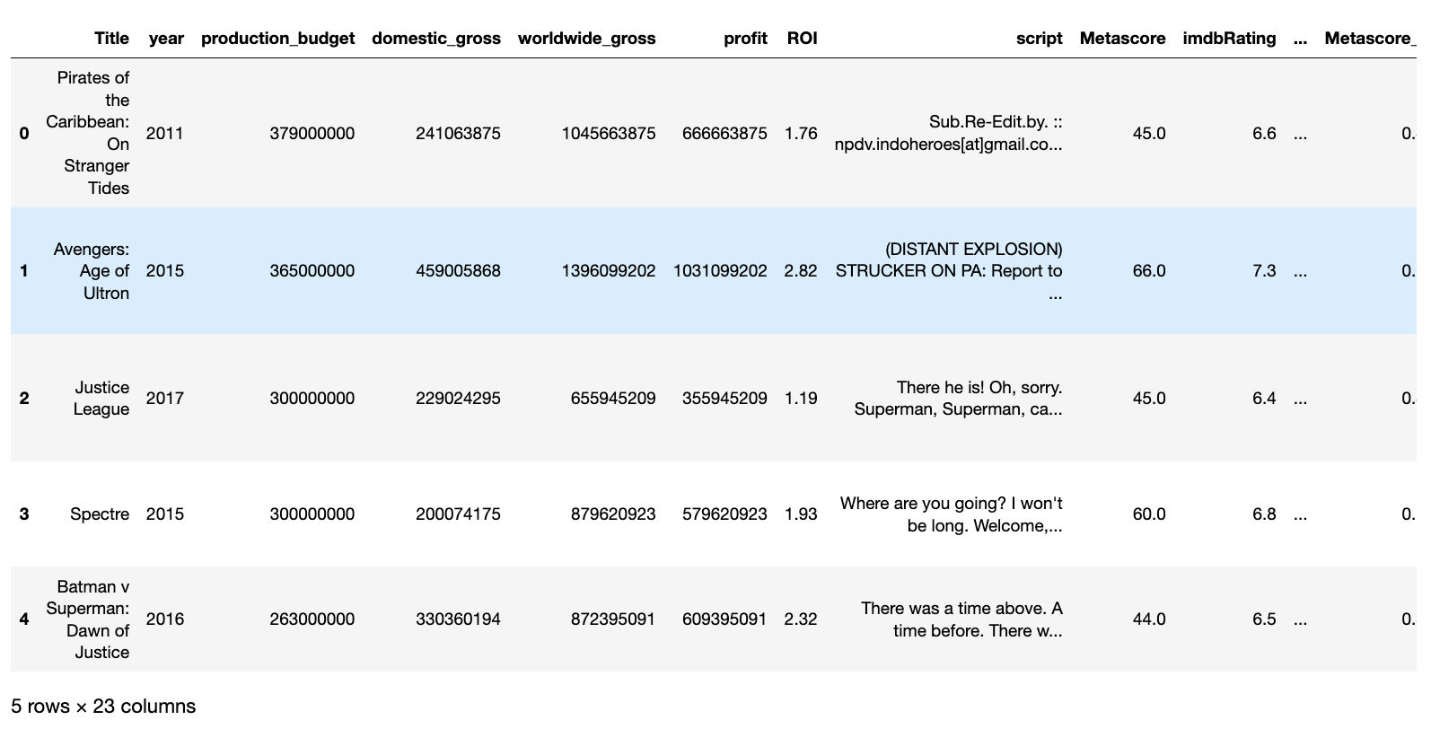
Since we are looking for average box office numbers by year, we can use the pd.groupby() to get our data in the right shape before graphing. We pass the column we would like to group by within the parenthesis and then chain another method to the end to indicate how we would like our numerical columns grouped. In this case, we want the average so we will pass the .mean() method to display our numerical values’ mean value.
由于我们要按年份查找平均票房数字,因此可以在绘制图形之前使用pd.groupby()将数据以正确的形状显示。 我们在圆括号内传递要分组的列,然后将另一种方法链接到末尾,以指示我们希望如何对数值列进行分组。 在这种情况下,我们需要平均值,因此我们将传递.mean()方法以显示数值的平均值。
df.groupby('year').mean()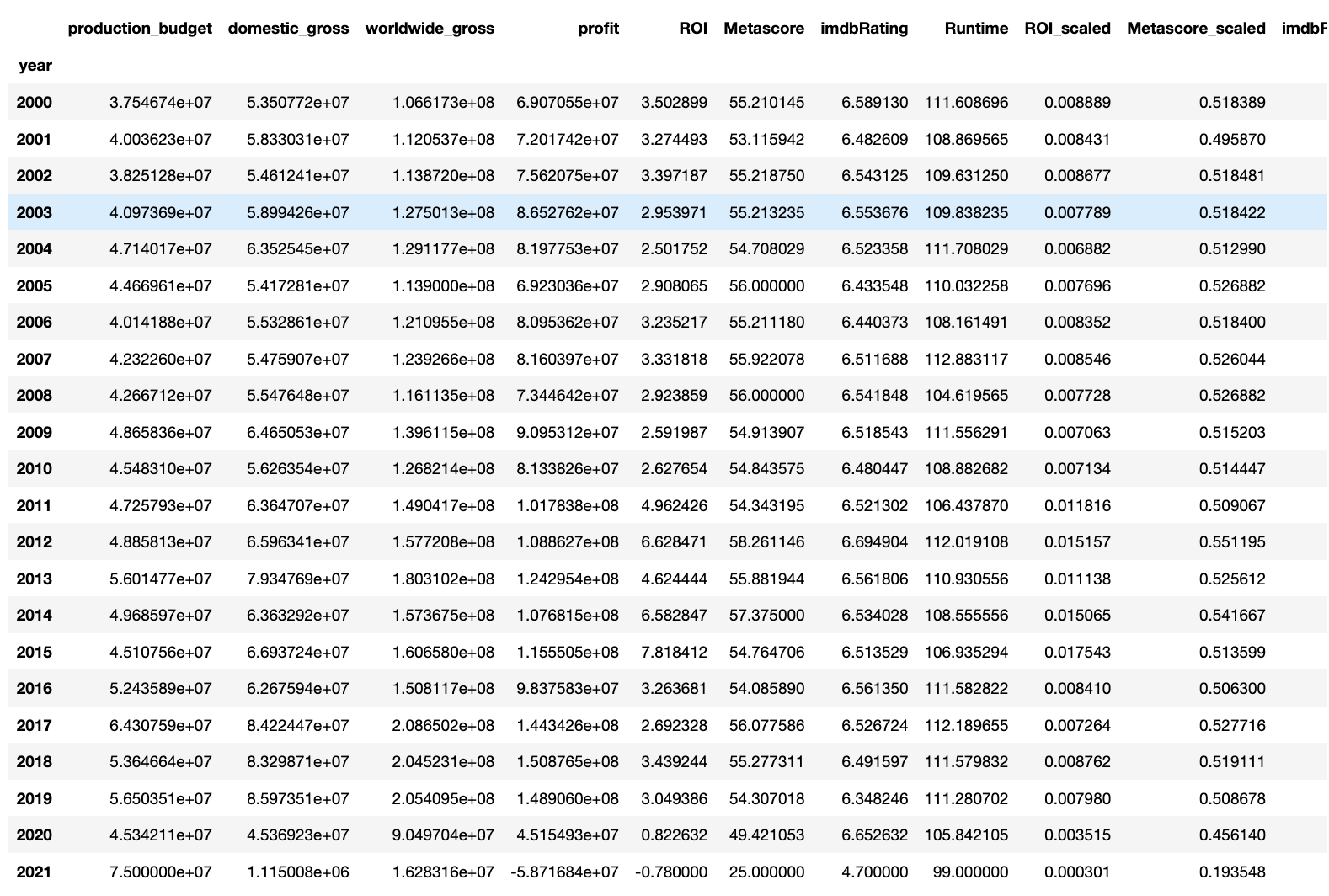
As of this post it is 2020, so let’s remove the rows for 2020 and 2021 since that data is most likely incomplete. We can do this by slicing the data frame and saving it to another variable. This new variable dataframe is what we will pass in our visualization code.
截至本文发布时间为2020年,所以我们删除2020年和2021年的行,因为该数据很可能是不完整的。 我们可以通过切片数据帧并将其保存到另一个变量来实现。 这个新的变量数据框就是我们将在可视化代码中传递的内容。
df_mean = df.groupby('year').mean()[:-2]
df_mean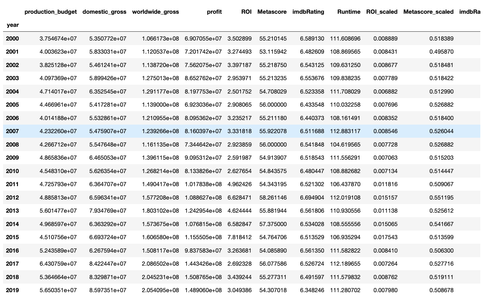
编写可视化代码 (Write Your Visualization’s Code)
When writing your visualization code make sure that it goes all in the same codeblock in your Jupyter Notebook. Things will break otherwise.
编写可视化代码时,请确保将其全部放入Jupyter Notebook的同一代码块中。 否则事情会破裂。
设置大小 (Setting Figsize)
The first step to building a good graph is to define the figsize parameter. This can be done by calling the plt.figure() method and passing in the figsize parameter with the proper aspect ratio. The below code will create a matplotlib figure that is 15 units wide and 5 units tall.
建立一个好的图形的第一步是定义figsize参数。 这可以通过调用plt.figure()方法并以适当的宽高比传入figsize参数来完成。 以下代码将创建一个matplotlib图形,其宽度为15个单位,高度为5个单位。
plt.figure(figsize = (15,5))绘制第一个条形图 (Plotting First Bar Graph)
The next thing to do is to call the sns.barplot() method and pass in the data and columns to plot. The below code will create a barplot inside the previously defined figure using the data frame we just created. It sets the x-values at the index of the data frame (which if you remember is the year) and the y-values is the average worldwide gross column. We will set the label to ‘World Wide Box Office Gross’ which will show up when we use a legend, and we will set the color to lightblue.
接下来要做的是调用sns.barplot()方法,并传入数据和列以进行绘图。 下面的代码将使用我们刚刚创建的数据框在先前定义的图形内创建一个条形图。 它将x值设置在数据框的索引处(如果您还记得的话,它是年份),而y值则是全球范围内的平均总列。 我们将标签设置为“ World Wide Box Office Gross”,当使用图例时会显示该标签,并将颜色设置为lightblue 。
sns.barplot(data = df_mean, x = df_mean.index, y = 'worldwide_gross', label = 'World Wide Box Office Gross', color = 'lightblue')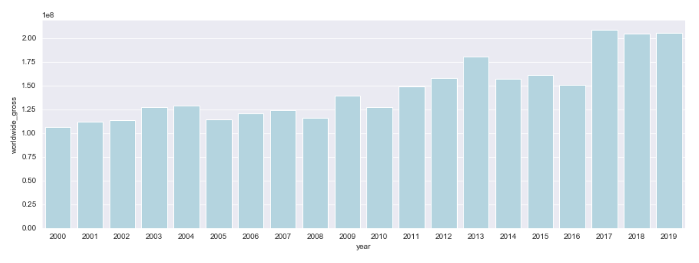
绘制第二个条形图 (Plotting Second Bar Graph)
Now let’s plot another sns.barplot() on the same figure, this time for domestic box office gross, and change the color so that you can see the difference between the two figures. The code will look pretty much the same except we are changing the y-value, label and the color.
现在,让我们在同一张图上绘制另一个sns.barplot() ,这次是针对国内票房,并更改颜色,以便您可以看到两个图之间的差异。 除了我们要更改y值,标签和颜色外,代码看起来几乎相同。
sns.barplot(data = df_mean, x = df_mean.index, y ='domestic_gross', label = 'Domestic Box Office Gross', color = 'lightgreen')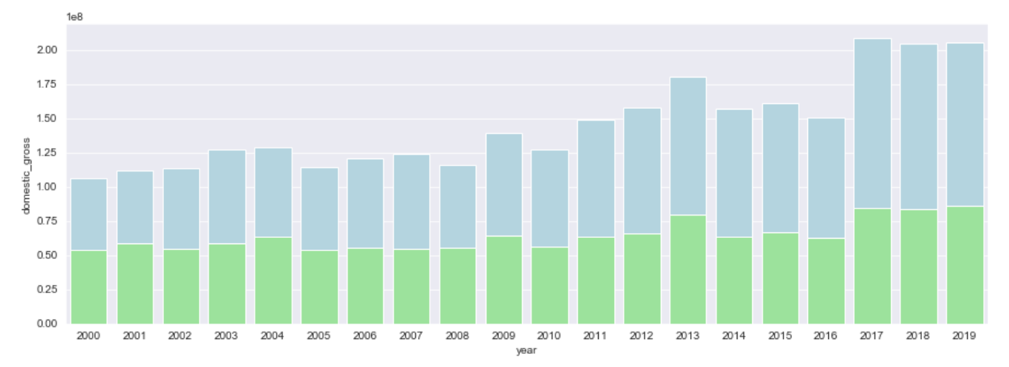
添加标题 (Adding a Title)
Our graph is looking pretty good so far, but it definitely can be improved from a readability standpoint. Let’s start by adding a title, so that our viewers will know what they are looking at. We do this by calling the plt.title() method and passing in the text and text size.
到目前为止,我们的图看起来还不错,但是从可读性的角度来看,绝对可以改进它。 让我们从添加标题开始,以便我们的观众知道他们在看什么。 我们通过调用plt.title()方法并传入文本和文本大小来实现。
plt.title('Box Office Gross Average by Year', size = 15)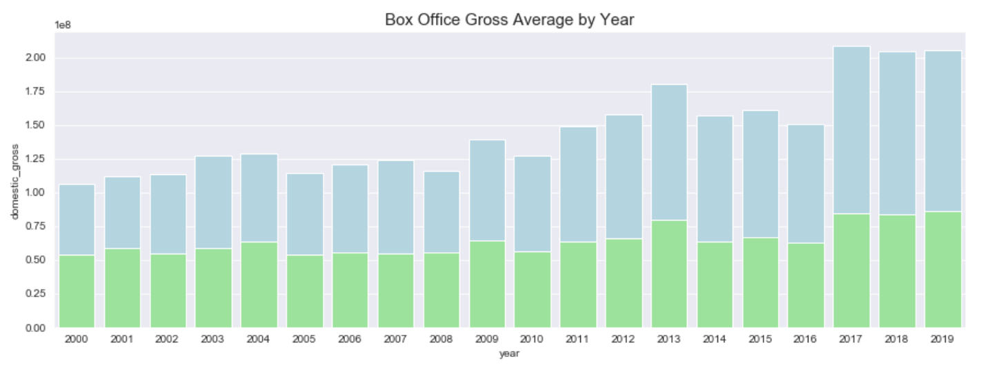
添加图例 (Adding a Legend)
Next let’s make sure our viewers know which bar color means what on our graph. We can do this by calling the plt.legend() method. You can pass the location of where you would like the legend to be or the size of the text, but if you leave it blank it will choose the best location and the default text size which, for our purposes, will work fine. Now we have a pretty good looking graph.
接下来,让我们确保观众知道哪种条形颜色意味着图形上的含义。 我们可以通过调用plt.legend()方法来实现。 您可以传递想要的图例所在的位置或文本的大小,但是如果将其保留为空白,它将选择最佳位置和默认的文本大小,对于我们来说,这将很好地工作。 现在我们有了一个漂亮的图形。
plt.legend()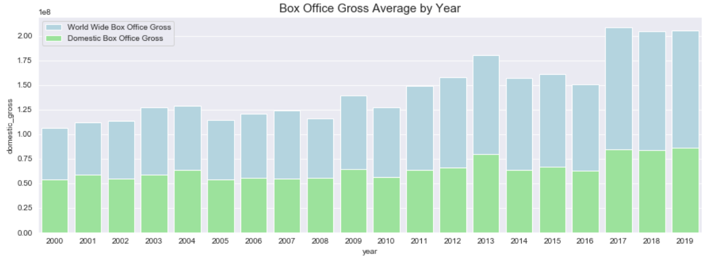
添加X标签和Y标签 (Adding X-Labels and Y-Labels)
We are almost there with a really great looking readable graph. However, the text labels on the x- and y-axis are not only kind of hard to read but, in the case of the y-label, completely mislabeled. Let’s change this by calling the plt.xlabel() and plt.ylabel() methods to manually set these values.
我们几乎在那里都有一个非常漂亮的可读图。 但是,x轴和y轴上的文本标签不仅难以阅读,而且在y标签的情况下,标签完全被误贴。 让我们通过调用plt.xlabel()和plt.ylabel()方法来手动设置这些值来更改此设置。
plt.ylabel('Box Office Sum in Hundreds of Millions (USD) ', size =12)
plt.xlabel('Year', size = 12)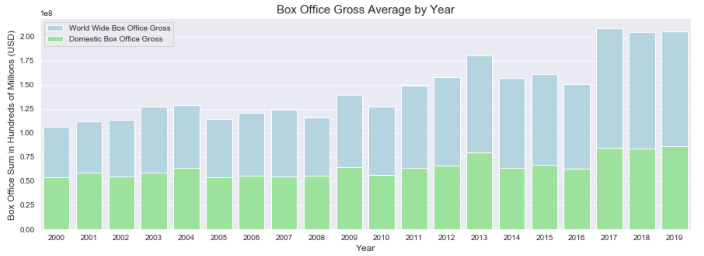
Remember to run all that code above in one codeblock or it won’t work properly. It should look like the below code.
请记住在一个代码块中运行以上所有代码,否则将无法正常工作。 它看起来应该像下面的代码。
plt.figure(figsize = (15,5))
sns.barplot(data = df_mean, x = df_mean.index, y = 'worldwide_gross', label = 'World Wide Box Office Gross', color = 'lightblue')
sns.barplot(data = df_mean, x = df_mean.index, y ='domestic_gross', label = 'Domestic Box Office Gross', color = 'lightgreen')
plt.title('Box Office Gross Average by Year', size = 15)
plt.legend()
plt.ylabel('Box Office Sum in Hundreds of Millions (USD) ', size =12)
plt.xlabel('Year', size = 12)
plt.show()
And there you have it. In only 12 steps and a few lines of code you have made a great looking graph that gets your points across in a clear and concise manner.
那里有。 仅用12个步骤和几行代码,您就制成了一个漂亮的图形,可以清晰,简洁地表达您的观点。


 被折叠的 条评论
为什么被折叠?
被折叠的 条评论
为什么被折叠?
 到【灌水乐园】发言


