


seaborn添加数据标签
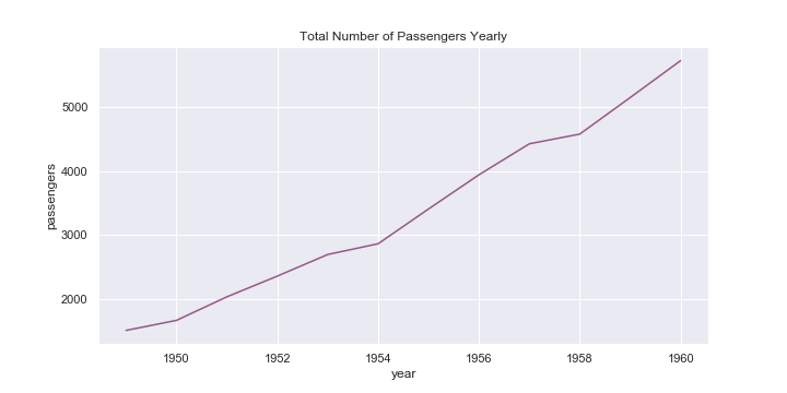
In the course of my data exploration adventures, I find myself looking at such plots (below), which is great for observing trend but it makes it difficult to make out where and what each data point is.
在进行数据探索的过程中,我发现自己正在查看此类图(如下),这对于观察趋势非常有用,但是很难确定每个数据点的位置和位置。
The purpose of this piece of writing is to provide a quick guide in labelling common data exploration seaborn graphs. All the code used can be found here.
本文的目的是提供一个快速指南,以标记常见的数据探索海洋图。 所有使用的代码都可以在这里找到。
建立 (Set-Up)
Seaborn’s flights dataset will be used for the purposes of demonstration.
Seaborn的航班数据集将用于演示。
import pandas as pd
import seaborn as sns
import matplotlib.pyplot as plt
%matplotlib inline# load dataset
flights = sns.load_dataset(‘flights’)
flights.head()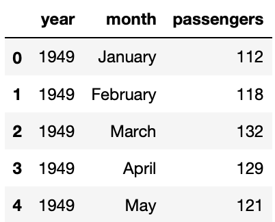
For increased ease and convenience in creating some plots, some additional data frames can be created.
为了增加创建某些绘图的便利性和便利性,可以创建一些其他数据框。
# set up flights by year dataframe
year_flights = flights.groupby(‘year’).sum().reset_index()
year_flights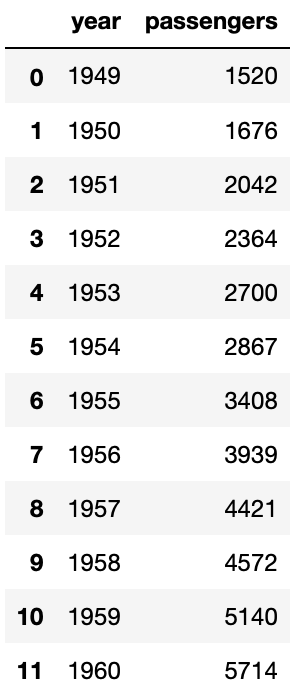
# set up average number of passengers by month dataframe
month_flights = flights.groupby(‘month’).agg({‘passengers’: ‘mean’}).reset_index()
month_flights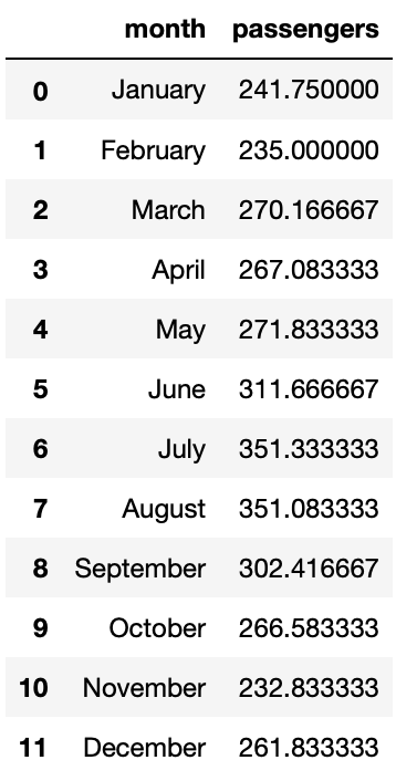
线图 (Line Plot)
Plotting a graph of passengers per year:
绘制每年的乘客图:
# plot line graph
sns.set(rc={‘figure.figsize’:(10,5)})
ax = sns.lineplot(x=’year’, y=’passengers’, data=year_flights, marker=’*’, color=’#965786')
ax.set(title=’Total Number of Passengers Yearly’)# label points on the plot
for x, y in zip(year_flights[‘year’], year_flights[‘passengers’]):
 # the position of the data label relative to the data point can be adjusted by adding/subtracting a value from the x &/ y coordinates
 plt.text(x = x, # x-coordinate position of data label
 y = y-150, # y-coordinate position of data label, adjusted to be 150 below the data point
 s = ‘{:.0f}’.format(y), # data label, formatted to ignore decimals
 color = ‘purple’) # set colour of line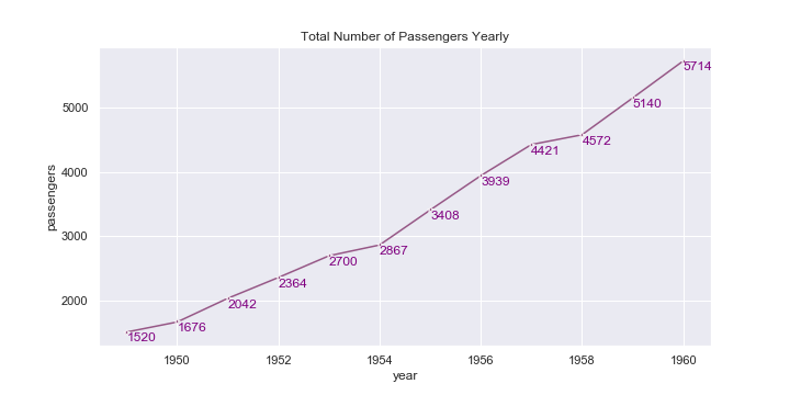
At times, it would be preferable for the data label to be more visible, which can be achieved by adding a background colour to the data labels:
有时,最好使数据标签更可见,这可以通过向数据标签添加背景色来实现:
# add set_backgroundcolor(‘color’) after plt.text(‘…’)
plt.text(x, y-150, ‘{:.0f}’.format(y), color=’white’).set_backgroundcolor(‘#965786’)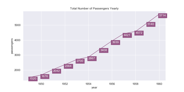
直方图 (Histogram)
Plotting a histogram of the frequency of passengers on each flight:
绘制每次航班上乘客频率的直方图:
# plot histogram
ax = sns.distplot(flights[‘passengers’], color=’#9d94ba’, bins=10, kde=False)
ax.set(title=’Distribution of Passengers’)# label each bar in histogram
for p in ax.patches:
 height = p.get_height() # get the height of each bar
 # adding text to each bar
 ax.text(x = p.get_x()+(p.get_width()/2), # x-coordinate position of data label, padded to be in the middle of the bar
 y = height+0.2, # y-coordinate position of data label, padded 0.2 above bar
 s = ‘{:.0f}’.format(height), # data label, formatted to ignore decimals
 ha = ‘center’) # sets horizontal alignment (ha) to center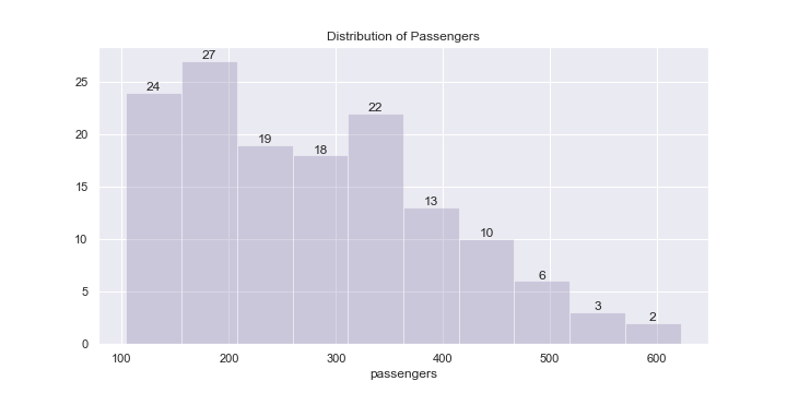
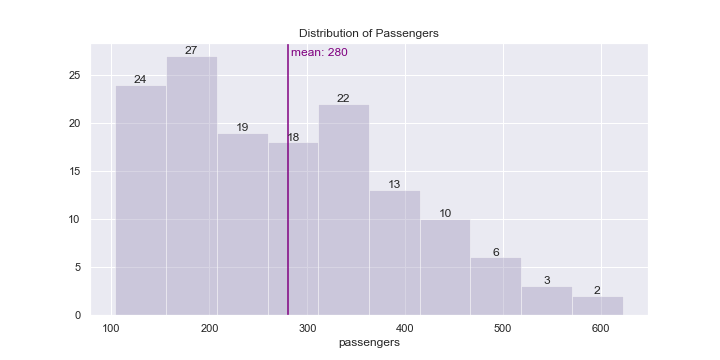
An additional information that might be beneficial to reflect in the graph as well is the mean line of the dataset:
可能也有益于在图中反映的其他信息是数据集的平均线:
# plot histogram
# …# adding a vertical line for the average passengers per flight
plt.axvline(flights[‘passengers’].mean(), color=’purple’, label=’mean’)# adding data label to mean line
plt.text(x = flights[‘passengers’].mean()+3, # x-coordinate position of data label, adjusted to be 3 right of the data point
 y = max([h.get_height() for h in ax.patches]), # y-coordinate position of data label, to take max height
 s = ‘mean: {:.0f}’.format(flights[‘passengers’].mean()), # data label
 color = ‘purple’) # colour of the vertical mean line# label each bar in histogram
# …
条形图 (Bar Plot)
Vertical Bar Plot
垂直条形图
Plotting the total number of passengers for each year:
绘制每年的乘客总数:
# plot vertical barplot
sns.set(rc={‘figure.figsize’:(10,5)})
ax = sns.barplot(x=’year’, y=’passengers’, data=year_flights)
ax.set(title=’Total Number of Passengers Yearly’) # title barplot# label each bar in barplot
for p in ax.patches:
 # get the height of each bar
 height = p.get_height()
 # adding text to each bar
 ax.text(x = p.get_x()+(p.get_width()/2), # x-coordinate position of data label, padded to be in the middle of the bar
 y = height+100, # y-coordinate position of data label, padded 100 above bar
 s = ‘{:.0f}’.format(height), # data label, formatted to ignore decimals
 ha = ‘center’) # sets horizontal alignment (ha) to center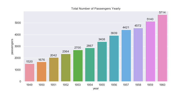
Horizontal Bar Plot
水平条形图
Plotting the average number of passengers on flights each month:
绘制每月航班的平均乘客数:
# plot horizontal barplot
sns.set(rc={‘figure.figsize’:(10,5)})
ax = sns.barplot(x=’passengers’, y=’month’, data=month_flights, orient=’h’)
ax.set(title=’Average Number of Flight Passengers Monthly’) # title barplot# label each bar in barplot
for p in ax.patches:
 height = p.get_height() # height of each horizontal bar is the same
 width = p.get_width() # width (average number of passengers)
 # adding text to each bar
 ax.text(x = width+3, # x-coordinate position of data label, padded 3 to right of bar
 y = p.get_y()+(height/2), # # y-coordinate position of data label, padded to be in the middle of the bar
 s = ‘{:.0f}’.format(width), # data label, formatted to ignore decimals
 va = ‘center’) # sets vertical alignment (va) to center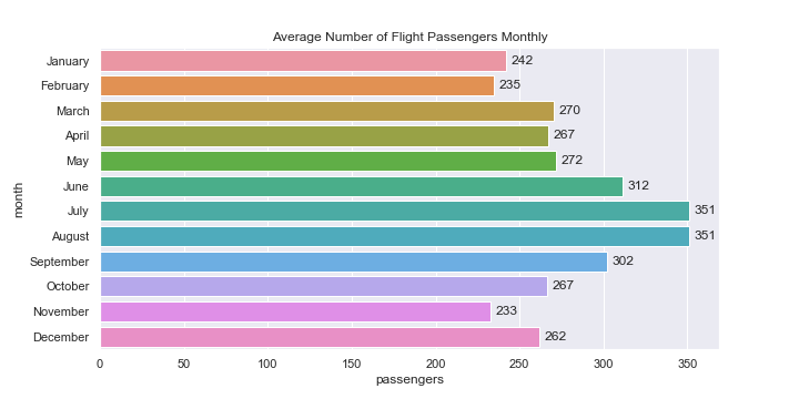
使用注意事项 (Notes on Usage)
It might be beneficial to add data labels to some plots (especially bar plots), it would be good to experiment and test out different configurations (such as using labels only for certain meaningful points, instead of labelling everything) and not overdo the labelling, especially if there are many points. A clean and informative graph is usually more preferable than a cluttered one.
将数据标签添加到某些图(尤其是条形图)可能是有益的,尝试并测试不同的配置(例如仅对某些有意义的点使用标签,而不是对所有内容进行标签),并且不要过度标注,特别是如果有很多要点的话。 通常,干净整洁的图表比混乱的图表更可取。
# only labelling some points on graph# plot line graph
sns.set(rc={‘figure.figsize’:(10,5)})
ax = sns.lineplot(x=’year’, y=’passengers’, data=year_flights, marker=’*’, color=’#965786')# title the plot
ax.set(title=’Total Number of Passengers Yearly’)mean = year_flights[‘passengers’].mean()# label points on the plot only if they are higher than the mean
for x, y in zip(year_flights[‘year’], year_flights[‘passengers’]):
 if y > mean:
 plt.text(x = x, # x-coordinate position of data label
 y = y-150, # y-coordinate position of data label, adjusted to be 150 below the data point
 s = ‘{:.0f}’.format(y), # data label, formatted to ignore decimals
 color = ‘purple’) # set colour of line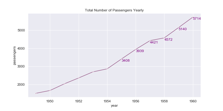
翻译自: https://medium.com/swlh/quick-guide-to-labelling-data-for-common-seaborn-plots-736e10bf14a9
seaborn添加数据标签


 1980
1980

 被折叠的 条评论
为什么被折叠?
被折叠的 条评论
为什么被折叠?
 到【灌水乐园】发言


