


生活总是不经意给你开个玩笑
In 1994, Vincent Connare, who had previously designed type at Apple and Agfa/Compugraphic, was working at Microsoft as a typographic engineer. While testing a trial version of Microsoft Bob—a program that simplified the navigation experience for novice desktop computer users—he noticed that something wasn’t meshing with the interface.
1994年,文森特·康纳雷,谁曾在苹果公司和爱克发/ Compugraphic,设计型在微软工作作为一个印刷工程师。 在测试Microsoft Bob的试用版时(该程序简化了新手台式计算机用户的导航体验),他注意到界面上并没有啮合。
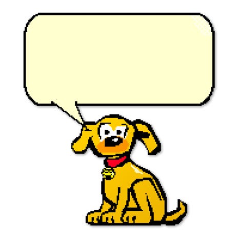
The program provided instruction in the form of informal conversation, accompanied by vibrant cartoon illustrations and presented in speech bubbles above tour guide Rover: An animated, tail-wagging dog. But all of Bob’s conversational advice was set in Times New Roman, a typeface that appeared too formal when paired with the simple, saturated background illustrations and kid-friendly mascot.
该程序以非正式对话的形式提供指导,并附有生动的卡通插图,并在导游Rover上方的泡泡中显示:动画的尾巴摆动的狗。 但是鲍勃的所有对话建议都是在《时代新罗马》中提出的,这种字体在与简单,饱满的背景插图和儿童友好的吉祥物搭配使用时显得过于正式。
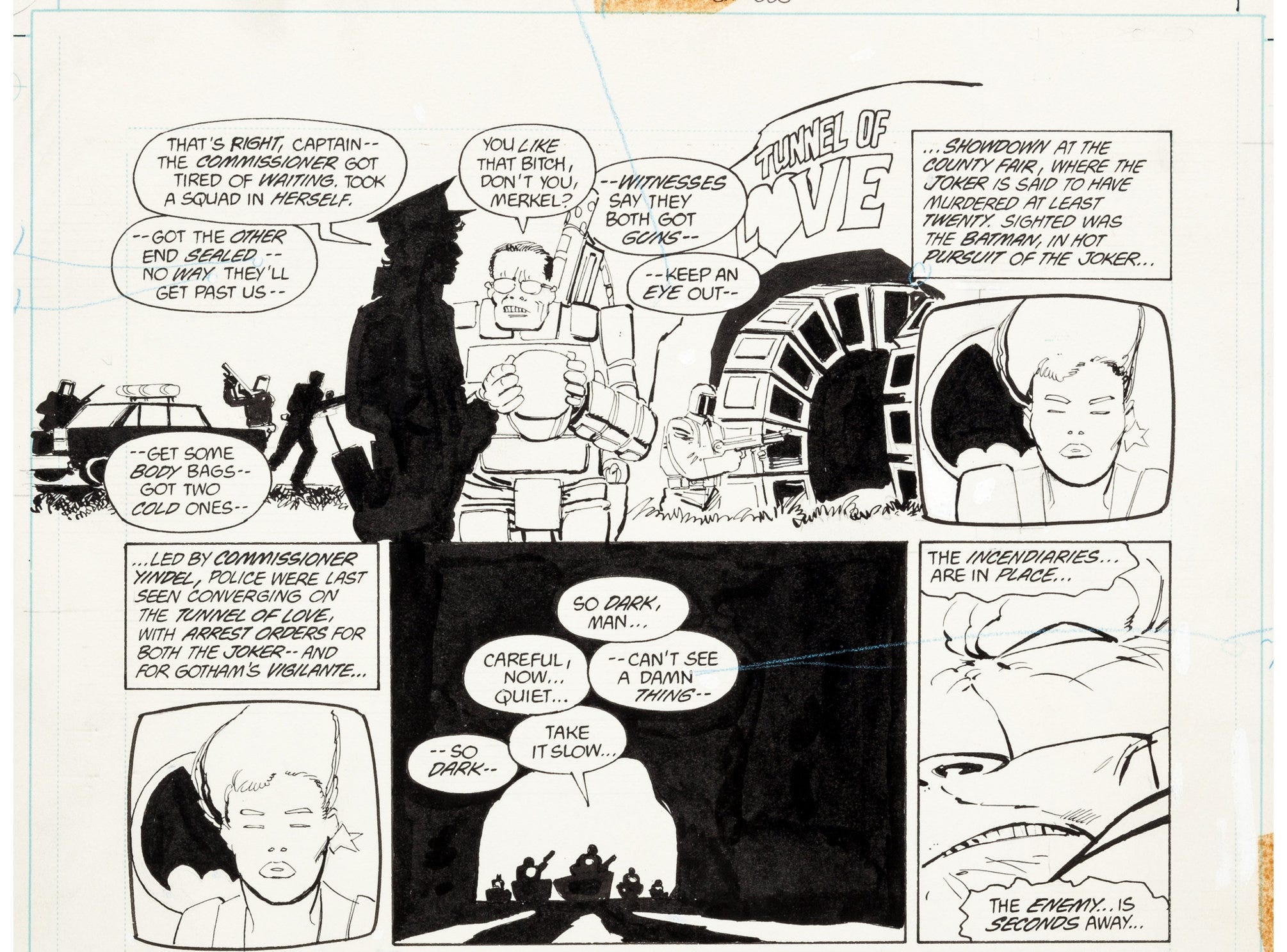
Connare happened to have a copy of Batman: The Dark Knight Returns by Frank Miller near his desk and, noticing how well the handwritten lettering paired with the imagery of the story, convinced Bob’s designers to let him take a crack at designing a more suitable font for the program.
康纳尔(Connare)碰巧在他的办公桌旁放着一本《 蝙蝠侠:黑暗骑士归来》 ,他注意到手写文字与故事的意象相吻合,并说服了鲍勃(Bob)的设计师让他努力设计更合适的字体该程序。
And the rest, as they say, was history.
正如他们所说,其余就是历史。
漫画起源 (Comic origins)
Comic Sans—or Comic Book as it was originally named—grew out of a specific need; a particular letterform design suited for a specific medium.
Comic Sans(或最初命名的Comic Book)出于特殊需要; 一种适用于特定介质的特殊字母设计 。
Connare recognized that comic books employed lettering that was hand-drawn to fit each individual box or bubble, providing both flexibility and variety. He drew each letter numerous times until satisfied that every glyph had it’s own unique shape and curve, while still functioning as a family.
Connare意识到漫画书采用手绘字体以适合每个单独的盒子或气泡,既灵活又多样化。 他多次绘制每个字母,直到对每个字形都具有自己独特的形状和曲线感到满意,同时仍然可以作为一个家庭使用。
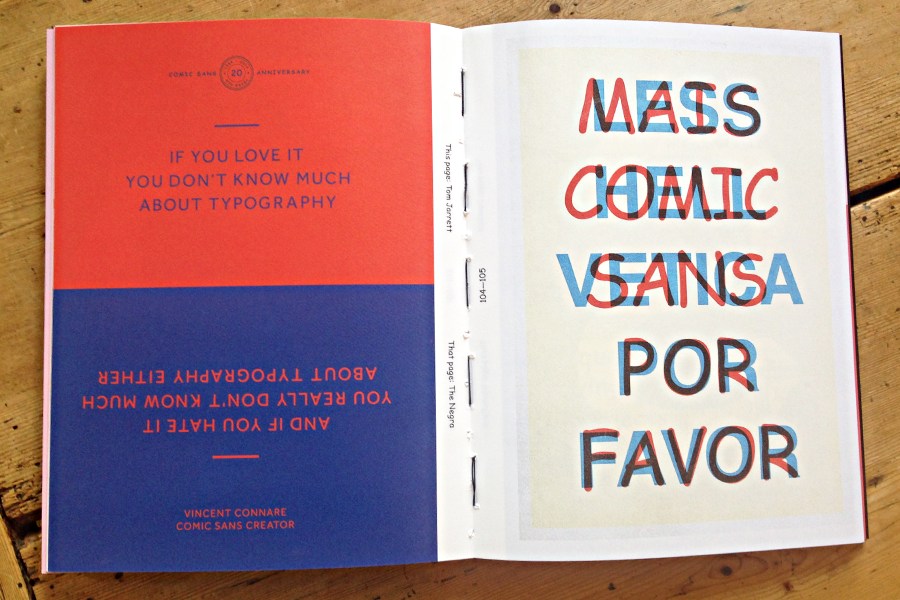
If you love Comic Sans, you don’t know much about typography. If you hate it, you really don’t know much about typography, either.
如果您喜欢Comic Sans,那么您对排版的了解也不多。 如果您讨厌它,那么您对排版真的也不是很了解。
Due to its form we classify it as both a sans serif and a casual script font, because the letters mimic handwritten characters that do not connect; but it’s not considered a typeface by most due to the lack of an italic or bold variant. Overall, Comic Sans is composed of rounded letters that would appear to have been drawn carefully in thick black marker by a child learning the alphabet. No sharp points are found in its letterforms. It’s the result of someone attempting to make a font out of alphabet soup.
由于其形式,我们将其分类为无衬线字体和休闲字体,因为这些字母模仿了没有连接的手写字符。 但由于缺少斜体或大胆的变体,因此在大多数情况下都不认为它是字体。 总体而言,Comic Sans由四舍五入的字母组成,看起来像是学习字母表的孩子用粗黑标记仔细绘制的。 在其字母形式中未发现任何尖点。 这是某人试图用字母汤制作字体的结果 。
Unfortunately, after finishing his one-off character set for Bob he was informed that all of the program’s type measurements—both font and speech bubble size—had been designed to Times New Roman. The program engineers weren’t interested in making any adjustments, and Comic Sans’ slightly larger size wouldn’t fit.
不幸的是,在为鲍勃(Bob)完成了一次性的字符集后,他被告知,该程序的所有类型度量(包括字体和语音气泡大小)都是为Times New Roman设计的。 程序工程师对进行任何调整都不感兴趣,而Comic Sans稍大的尺寸也不适合。
Microsoft Bob did not last long after release, but it wasn’t due to poor typography. Eventually it landed on PC World magazine’s 25 word tech products of all time, Time’s list of the 50 Worst Inventions, and was named the number one worst product of the decade by CNET.com.
微软的鲍勃(Bob)发行后并没有持续很长时间,但这并不是因为排版不好。 最终,它登上《 PC World 》杂志有史以来的25个词技术产品 ,被《 时代》杂志列为“ 50项最差发明” ,并被CNET.com评为十年来最差的产品 。
But Bob’s reception is nothing compared to the sheer hatred the design world shares for Comic Sans.
但是与设计界对Comic Sans的憎恨相比,鲍勃的接待算不上什么。
有趣与否,就在这里 (Funny or not, it’s here to stay)
How Comic Sans ended up as a supplementary font in Windows 95 is anyone’s guess, including Connare. “I got an email from [Microsoft] asking to use it. I didn’t answer right away and I didn’t say yes or no. I guess I said, ‘do whatever you want,’ meaning ‘if you’ve got nothing better to do with your time I really don’t care,’” said Connare in a 2004 interview.
包括Connare在内的任何人都猜测,Comic Sans如何最终成为Windows 95中的辅助字体。 “我从[Microsoft]收到一封电子邮件,要求使用它。 我没有立即回答,也没有说是或否。 我猜我说过,“随心所欲”,意思是“如果您的时间没有更好的事情,我真的不在乎,”康纳尔在2004年的一次采访中说。
But once it was available to everyone, they began to use it.
但是,一旦所有人都可以使用它,他们便开始使用它。
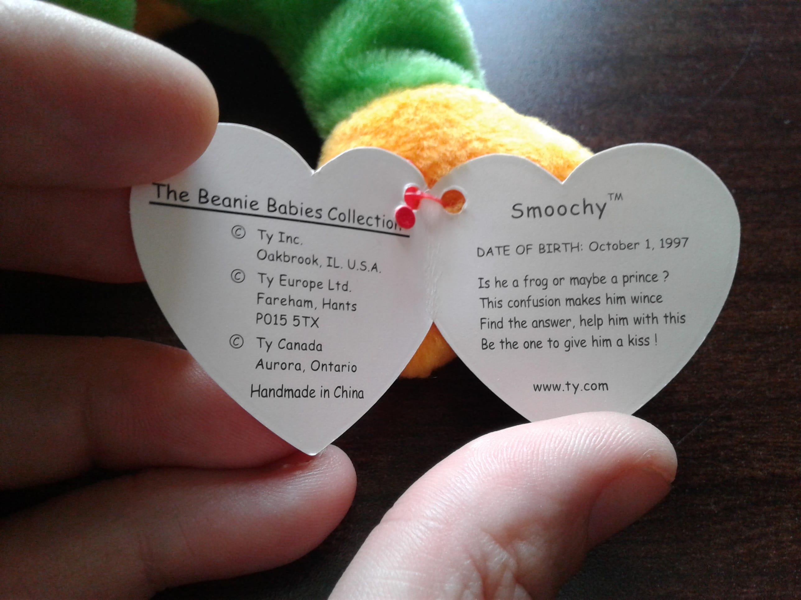
Comic Sans has infrequently appeared in suitable environments, such as the branding for Beanie Babies, The Sims, and various Disney products. But more often than not has shown up uninvited to the sides of ambulances, engraved on tombstones, describing illnesses in medical brochures, and even informing us through headlines of the Wall Street Journal.
Comic Sans很少出现在合适的环境中,例如Beanie Babies,The Sims和各种迪士尼产品的品牌。 但是,常常不请自来地出现在救护车的侧面,刻在墓碑上,在医疗手册中描述疾病,甚至通过《 华尔街日报》的头条告知我们。
“I’m not bad,” Comic Sans would say. “I’m just used that way.”
“我还不错,” Comic Sans说。 “我只是用那种方式。”
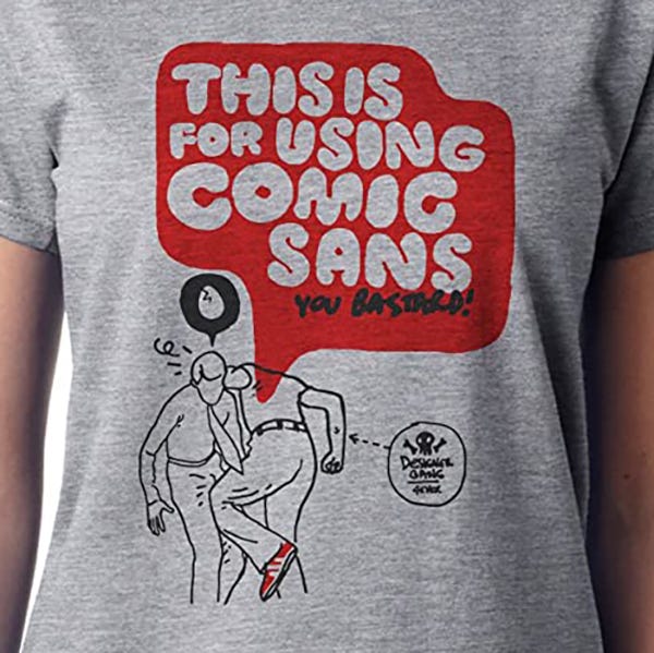
Due to frequent use—or abuse depending on your position—by novice designers and client requests, design snobs everywhere have come to hate this font above all else (even Papyrus). In 1999 husband and wife design team David and Holly Combs launched BanComicSans.com in response to an employer insisting they use it in a design project, and quite a movement grew from their efforts. Aside from anti-Comic Sans propaganda, they offered “Ban Comic Sans” merchandise such as T-shirts and coffee mugs, along with the following manifesto:
由于新手设计师和客户的要求频繁使用(或滥用,具体取决于您的位置),各地的设计势利人士都讨厌这种字体(甚至是Papyrus)。 1999年,夫妻设计团队David和Holly Combs发起了BanComicSans.com网站,以回应一位雇主坚持在设计项目中使用该应用程序的想法,并为此付出了很大的努力。 除了反漫画Sans的宣传外,他们还提供了“ Ban Comic Sans”商品,例如T恤和咖啡杯,以及以下宣言:
We understand font selection is a matter of personal preference and that many people may disagree with us. We believe in the sanctity of typography and that the traditions and established standards of this craft should be upheld throughout all time…Type’s very qualities and characteristics communicate to readers a meaning beyond mere syntax.
我们了解字体选择是个人喜好问题,许多人可能会不同意我们。 我们相信字体的神圣性,并始终坚持这种Craft.io的传统和既定标准……字体的极高品质和特性向读者传达的不仅仅是语法。
Even Connare is coy about the backlash Comic Sans has received. “If you love Comic Sans, you don’t know much about typography. If you hate it, you really don’t know much about typography, either.”
甚至Connare也对Comic Sans受到的强烈反对感到co。 “如果您喜欢Comic Sans,那么您对印刷术的了解就不多。 如果您讨厌它,那么您对排版真的也不是很了解。”
But the worst public bashing of the font likely took place in 2010 when Cleveland Cavaliers owner Dan Gilbert posted an open letter to fans criticizing LeBron Jame’s decision to leave the team. Gilbert’s very serious letter spoke of the disappointing, bitter exit and betrayal of fans: All set in Comic Sans.
但是最糟糕的公开抨击可能是在2010年,当时克利夫兰骑士队老板丹·吉尔伯特(Dan Gilbert)向球迷们公开致信,批评勒布朗·詹姆斯(LeBron Jame)决定离开车队。 吉尔伯特在一封非常严肃的信中谈到了粉丝们的失望,苦涩的出卖和背叛:全部都放在《漫画无头》中。
All anyone cared to discuss about the letter was his poor font choice, creating a resurgence in Comic Sans criticism that was trending on Twitter within 24 hours… ahead of LeBron James.
所有人都在乎讨论这封信的是他糟糕的字体选择,这使Comic Sans批评重新流行,并在Twitter上在24小时内流行起来……领先于勒布朗·詹姆斯。
It’s the result of someone attempting to make a font out of alphabet soup.
这是某人试图用字母汤制作字体的结果 。
In 2012, New York Times essayist Errol Morris conducted an experiment and found that Comic Sans, in comparison to five other available fonts, “makes readers slightly less likely to believe that a statement they are reading is true.” He wrote, “The conscious awareness of Comic Sans promotes—at least among some people—contempt and summary dismissal.”
2012年,《纽约时报》杂文作家埃罗尔·莫里斯(Errol Morris) 进行了一项实验 ,发现相较于其他五种可用字体,《漫画无头》(Comic Sans)“使读者不太可能相信他们正在阅读的陈述是真实的。” 他写道:“对Comic Sans的自觉意识至少在某些人中促进了蔑视和即兴罢免。”
Love it or hate it, it’s one of the most readily available fonts in the United States (likely, the world) and there’s no telling what fun and inappropriate uses people will come up with next.
喜欢它还是讨厌它,它是美国(可能是世界)上最容易使用的字体之一,并且没有告诉人们接下来会出现什么有趣和不当使用的字体。
Even the Combs’ attitude shifted in recent years. Today they run a Facebook group titled Use Comic Sans, and their manifesto has shifted to: “If you like Comic Sans, just use it. It’s there to be used and enjoyed.”
近年来,即使是梳子的态度也发生了变化。 今天,他们经营了一个名为Use Comic Sans的Facebook组,其宣言已转变为:“如果您喜欢Comic Sans,请使用它。 它在那里可以使用和享受。”
And after all the criticism, Connare still stands behind his creation; “People don’t know why it was made. If they did they would realize that it was what design is about: Designing for a product with an appropriate design.”
毕竟,在批评之后,康纳雷仍然支持他的创作。 “人们不知道为什么制造它。 如果他们做到了,他们将意识到这就是设计的意义:为具有适当设计的产品设计。”
The story of Comic Sans is your typical wrong place/wrong time tragedy. It was designed to fit the cartoon speech bubbles of a long-forgotten program, and never should have ended up in the pull-down menu of early Microsoft computers. We don’t necessarily hate it because it’s bad; we’re just sick of it. But no matter how you feel, we’re not likely going to see less of Comic Sans anytime soon.
Comic Sans的故事是您典型的错误地点/错误时间悲剧。 它旨在适应长期以来被遗忘的程序中的卡通气泡,并且永远不会出现在早期Microsoft计算机的下拉菜单中。 我们不一定讨厌它,因为它很糟糕。 我们只是受够了。 但是,无论您有什么感觉,我们都不太可能很快见到Comic Sans。
People don’t know why it was made. If they did they would realize that it was what design is about: Designing for a product with an appropriate design.
人们不知道为什么要制造它。 如果他们做到了,他们将意识到这就是设计的意义:为具有适当设计的产品设计。
翻译自: https://uxplanet.org/are-you-kidding-the-story-of-comic-sans-f9e00d41eba8
生活总是不经意给你开个玩笑


 被折叠的 条评论
为什么被折叠?
被折叠的 条评论
为什么被折叠?
 到【灌水乐园】发言


