


 Leonardo是一款由Adobe推出的开源工具,旨在帮助设计师和工程师创建可访问性优先的色彩主题。最新更新增强了创作自适应主题的能力,支持在npm模块和Web工具中构建基于对比度的调色板,每种输出颜色都基于其与共享背景的对比度。此外,引入了亮度和对比度滑块,允许用户个性化调整,以满足不同的视觉需求。
sap leonardo
Recently we launched Adobe’s open-source tool Leonardo with the goal of empowering designers and engineers to create accessible-first color palettes. Since then, we’ve been continuing to evolve Leonardo — the engine that drives the adaptive color theme for Adobe’s design system, Spectrum.
最近,我们启动了 Adobe的开源工具Leonardo ,其目标是使设计师和工程师能够创建可访问性优先的调色板 。 从那时起,我们一直在不断开发Leonardo,它是为Adobe设计系统Spectrum驱动自适应色彩主题的引擎。
This latest update is for authoring adaptive themes in both the npm module and the web tool. This means building out multiple contrast-based color palettes at once, and each output color being based on its contrast with a shared background.
此最新更新用于在npm模块和Web工具中 创作自适应主题 。 这意味着一次构建多个基于对比度的调色板,每种输出颜色都基于其与共享背景的对比度。
创建自适应主题 (Creating an adaptive theme)
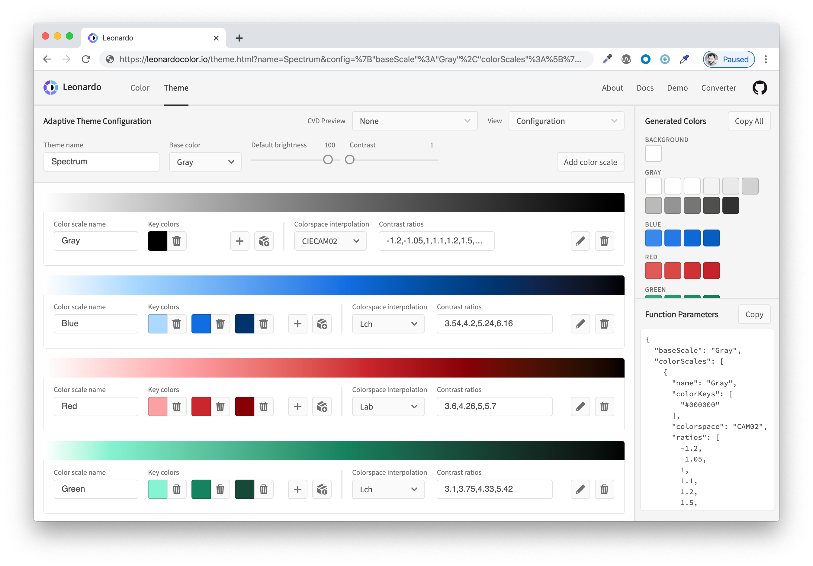
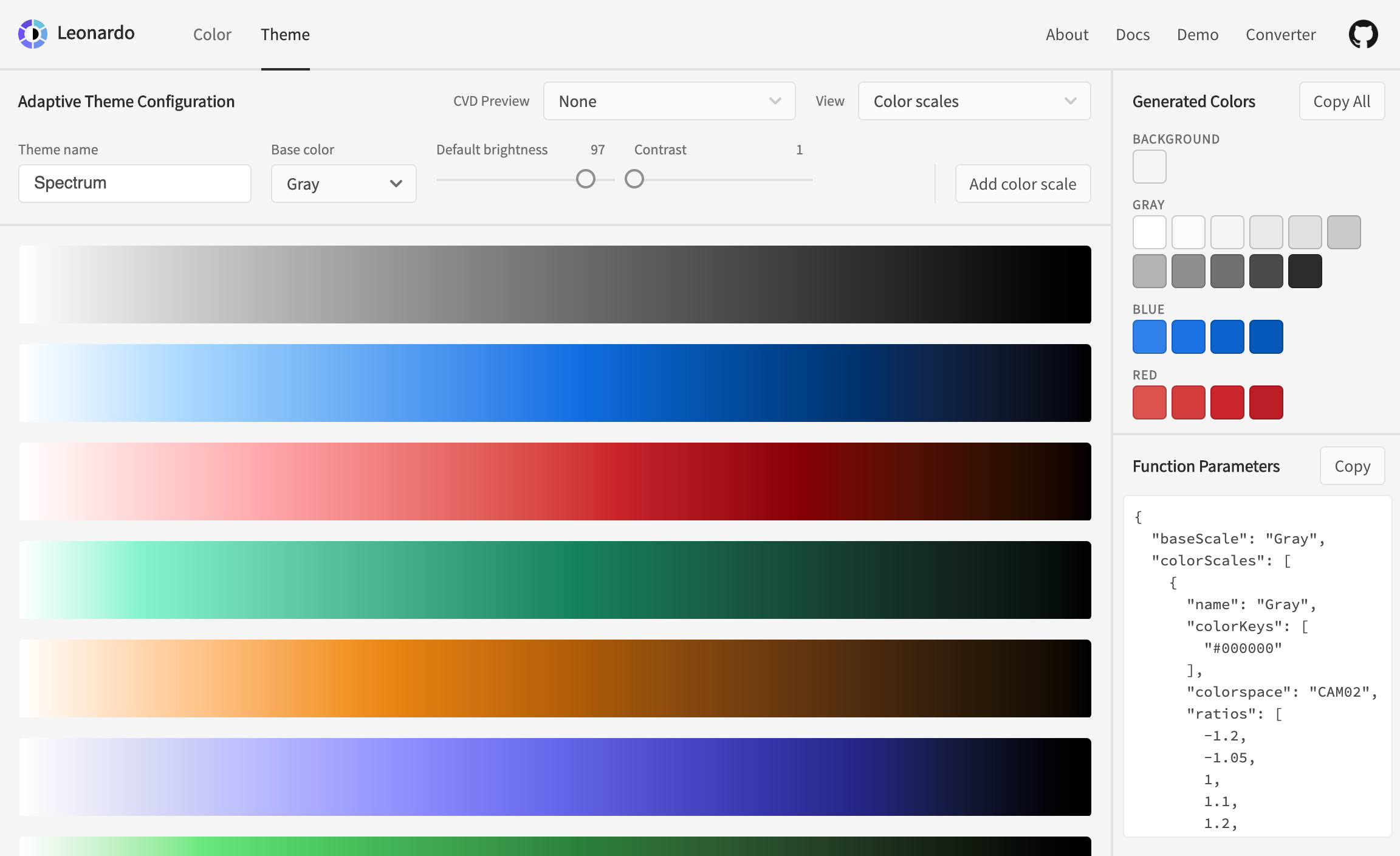
Start by visiting Leonardocolor.io/theme.html. You can give your theme a name, then add a color scale to your theme. By default, the first color that is added is named “Gray”, and is automatically selected for the base color (used for generating the background color).
首先访问Leonardocolor.io/theme.html 。 您可以给主题命名,然后为主题添加色标。 默认情况下,添加的第一种颜色称为“灰色”,并自动选择作为基础颜色 (用于生成背景色)。
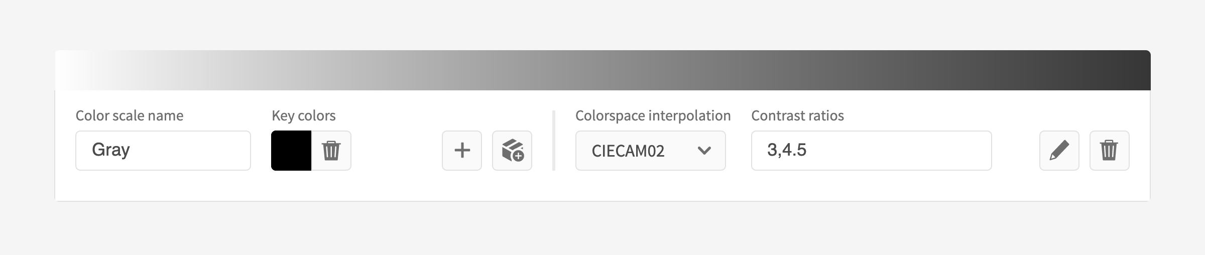
Each color scale that you add will populate the screen with a card for configuring your color. Each of these configurations are the same as what you find in the “Color” tab of Leonardo. The configurations of key colors, colorspace interpolation, contrast ratios, and the bulk import feature are already documented here if you are unfamiliar with how those work. It is worth noting that the contrast ratios in this view are a list of ratios in a single input, rather than multiple inputs per ratio.
您添加的每个色标都会在屏幕上填充一张用于配置颜色的卡片。 这些配置均与Leonardo的“颜色”选项卡中的配置相同 。 如果您不熟悉按键颜色,色彩空间插值,对比度和批量导入功能的配置,则这些内容已在此处记录 。 值得注意的是,此视图中的对比度是单个输入中的比率列表,而不是每个比率中的多个输入。
If you’re looking for a jumping-off point without building a theme from scratch, here are a few adaptive themes based on existing UI libraries:
如果您在寻找一个起点而不是从头开始构建主题的方法,那么以下是一些基于现有UI库的自适应主题:
Bootstrapper (based on Bootstrap )
Semantically (based on Semantic UI)
Some modifications have been made such as including accessible contrast ratio swatches for colors that did not already meet WCAG AA requirements. None of these adaptive themes are official or endorsed by the libraries they are based upon.
进行了一些修改,例如包括不符合WCAG AA要求的颜色的可访问对比度比色板。 这些自适应主题均未获得其官方图书馆的认可或认可。
Helpful tip: It’s recommended to use the “Color” tab for creating each of your color scales, since this view provides a more detail for a single color scale, including charts and 3d model for interpolation evaluation as well as both text and UI examples of the color for contextual preview of your generated colors. Click the edit button to open your color scale in a new tab.
有用的提示:建议使用“颜色”选项卡来创建每个色标,因为该视图提供了单个色标的更多细节,包括用于插值评估的图表和3d模型以及文本和UI示例用于生成的颜色的上下文预览的颜色。 单击编辑按钮以在新选项卡中打开色标。
亮度和对比度 (Brightness and contrast)
A few important additions to this UI are the configuration sliders for default brightness and contrast. There are a few different ways that these sliders can be used:
此UI的一些重要补充是用于默认亮度和对比度的配置滑块。 这些滑块的使用方式有几种:
Setting brightness values for specific themes:
设置特定主题的亮度值:
Setting brightness values for specific themes:eg. “Light” theme with brightness of 100, “Dark” theme with brightness of 20.
设置亮度值特定主题: 例如。 “ Light”主题的亮度为100,“ Dark”主题的亮度为20。
Setting contrast values for specific themes:
设置特定主题的对比度值:
Setting contrast values for specific themes:eg. “High contrast” theme with contrast value of 3.
设置对比度值的特定主题: 例如。 “高对比度”主题,对比度值为3。
Using brightness and contrast for defaults only and allowing users to edit these values within your product:
仅将亮度和对比度用作默认值,并允许用户在产品中编辑以下值 :
Using brightness and contrast for defaults only and allowing users to edit these values within your product:eg. Leaving brightness and contrast undefined will return your theme as a function such as
myTheme(brightness, contrast);使用亮度和对比度仅为默认值,并允许用户编辑您的产品中这些值 : 如。 保持未定义的亮度和对比度将使您的 主题 返回 诸如
myTheme(brightness, contrast);类 的函数myTheme(brightness, contrast);
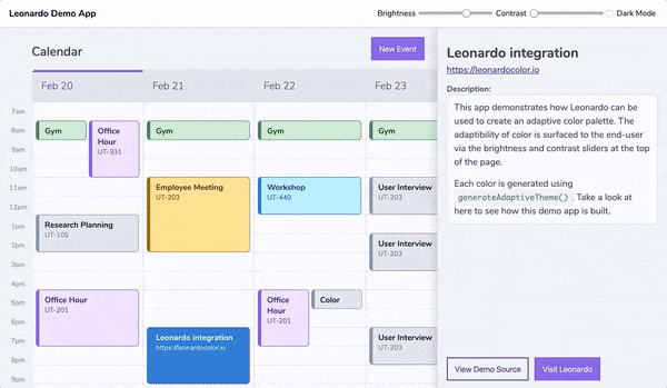
The beauty of using Leonardo in your web product is the ability to enable your end users to control the brightness and contrast of their experience. It’s important to note that impairments to vision are complex, and some of which are either purely environmental, or are exacerbated by environmental factors, leaving users with a need for personalization.
在您的Web产品中使用Leonardo的好处在于,它使您的最终用户能够控制其体验的亮度和对比度 。 重要的是要注意,视力障碍是复杂的,其中有些是纯环境的,或者是由于环境因素而加剧的,因此用户需要进行个性化设置。
In fact, the working update to WCAG’s contrast standards (Project Silver) mention personalization many times. At this point, the brightness and contrast sliders in Leonardo are a way to preview and audit your adaptive color system, as well as act as a tool to help you to define maximum contrast value and appropriate value ranges for your light and dark themes.
实际上, 对WCAG对比度标准 (银色项目)的工作更新多次提到了个性化 。 此时,Leonardo中的“亮度”和“对比度”滑块是预览和审核自适应色彩系统的一种方法,并且可以用作帮助您为明暗主题定义最大对比度值和适当值范围的工具。
How to do this:Let your engineers know your intent here, because this is an implementation-dependent topic. For engineers, you will define the theme as a variable without any brightness or contrast value passed through the configurations. This will return your theme as a function, which can be integrated with controls for your end users to regenerate the colors in real-time.
如何执行此操作:在这里让您的工程师知道您的意图,因为这是与实现相关的主题。 对于工程师,您将主题定义为变量, 而没有任何亮度或对比度值通过配置传递。 这将以功能返回您的主题 ,该主题可以与控件集成在一起,供最终用户实时重新生成颜色。
Helpful tip: Take a look at Leonardo’s demo app to see an adaptive color theme in action. In order to see how this is accomplished, you can take a look at the source code as well.
实用提示:查看Leonardo的演示应用程序,以了解实际中的自适应色彩主题。 为了了解如何完成此操作,您还可以查看源代码 。
主题输出 (Theme outputs)
For each color scale in your theme, the right panel will display your generated colors. You can copy individual colors by clicking the swatch, or you can copy all of the colors’ hex codes as a list by clicking the “Copy all” button.
对于主题中的每个色阶,右侧面板将显示您生成的颜色。 您可以通过单击色样来复制单个颜色,也可以通过单击“全部复制”按钮将所有颜色的十六进制代码复制为列表。

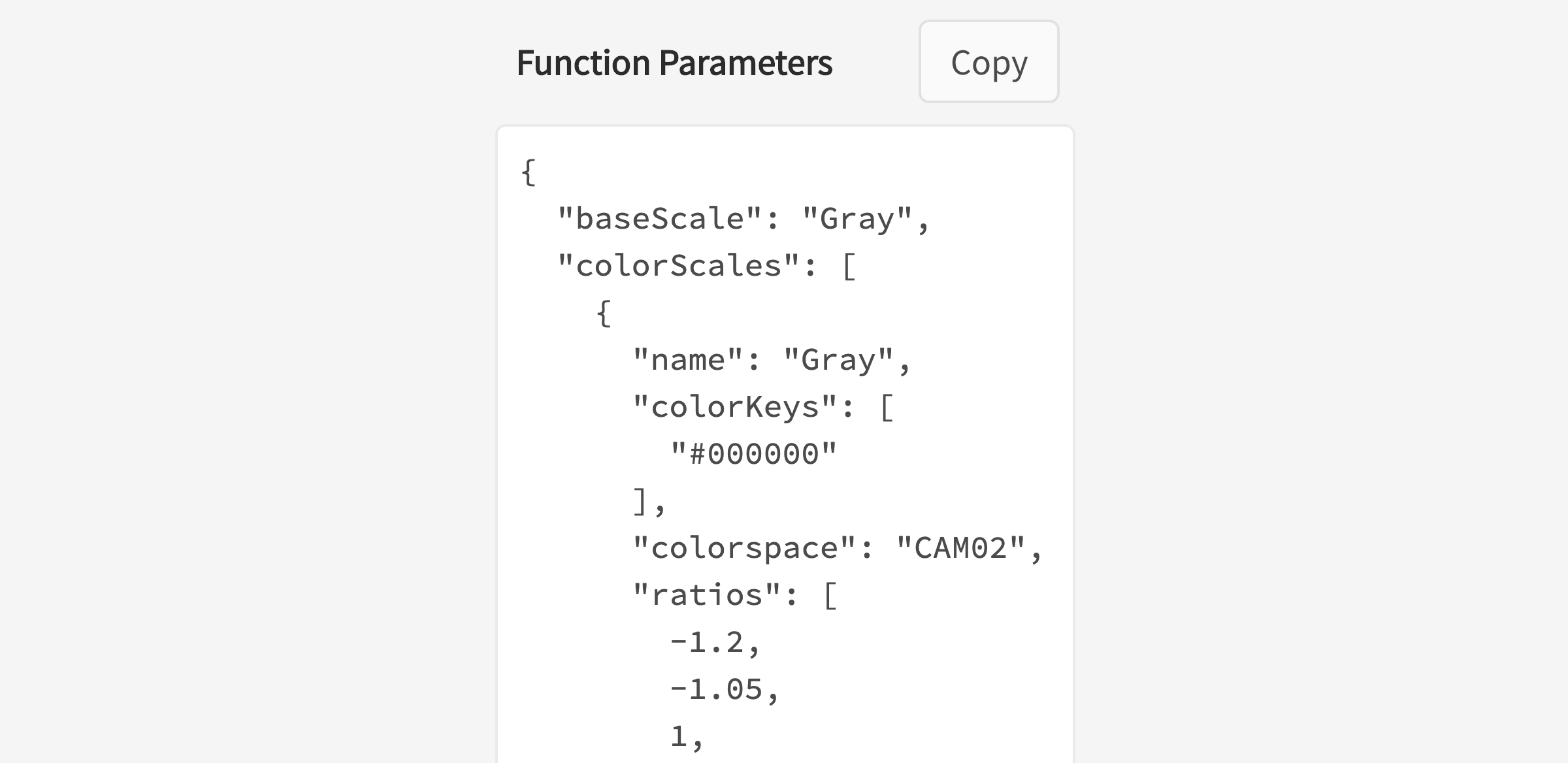
The right panel also outputs all of the unique configurations that you’ve created as parameters to pass through the Leonardo npm module. Each of these parameters are documented in Leonardo’s contrast-colors package readme. Engineers can click to copy these parameters and pass them directly through the generateAdaptiveTheme function to output the same colors seen in the web tool.
右面板还输出您创建的所有唯一配置作为参数,以通过Leonardo npm模块。 这些参数中的每一个都记录在Leonardo的对比色包自述文件中。 工程师可以单击以复制这些参数,然后直接将它们传递给generateAdaptiveTheme函数,以输出在Web工具中看到的相同颜色。
Just as with the previous version of the web tool, the URL is updated with the parameters of your theme configuration so that you can share your theme with your team members. This is helpful for both collaboration and for easier sharing of javascript parameters with your engineers.
与以前版本的Web工具一样, URL将使用主题配置的参数进行更新,以便您可以与团队成员共享主题。 这对于协作以及与工程师更轻松地共享javascript参数都很有帮助。

Don’t worry, though; URLs that you’re sharing for the previous version of Leonardo’s web app will continue to work as expected.
不过不要担心; 您为Leonardo的网络应用程序的先前版本共享的URL将继续按预期运行。
其他有用的功能 (Additional helpful features)
We’ve included a few extra features to help with the creation and auditing of an entire adaptive color palette in Leonardo.
我们提供了一些额外的功能,可帮助您在Leonardo中创建和审核整个自适应调色板。
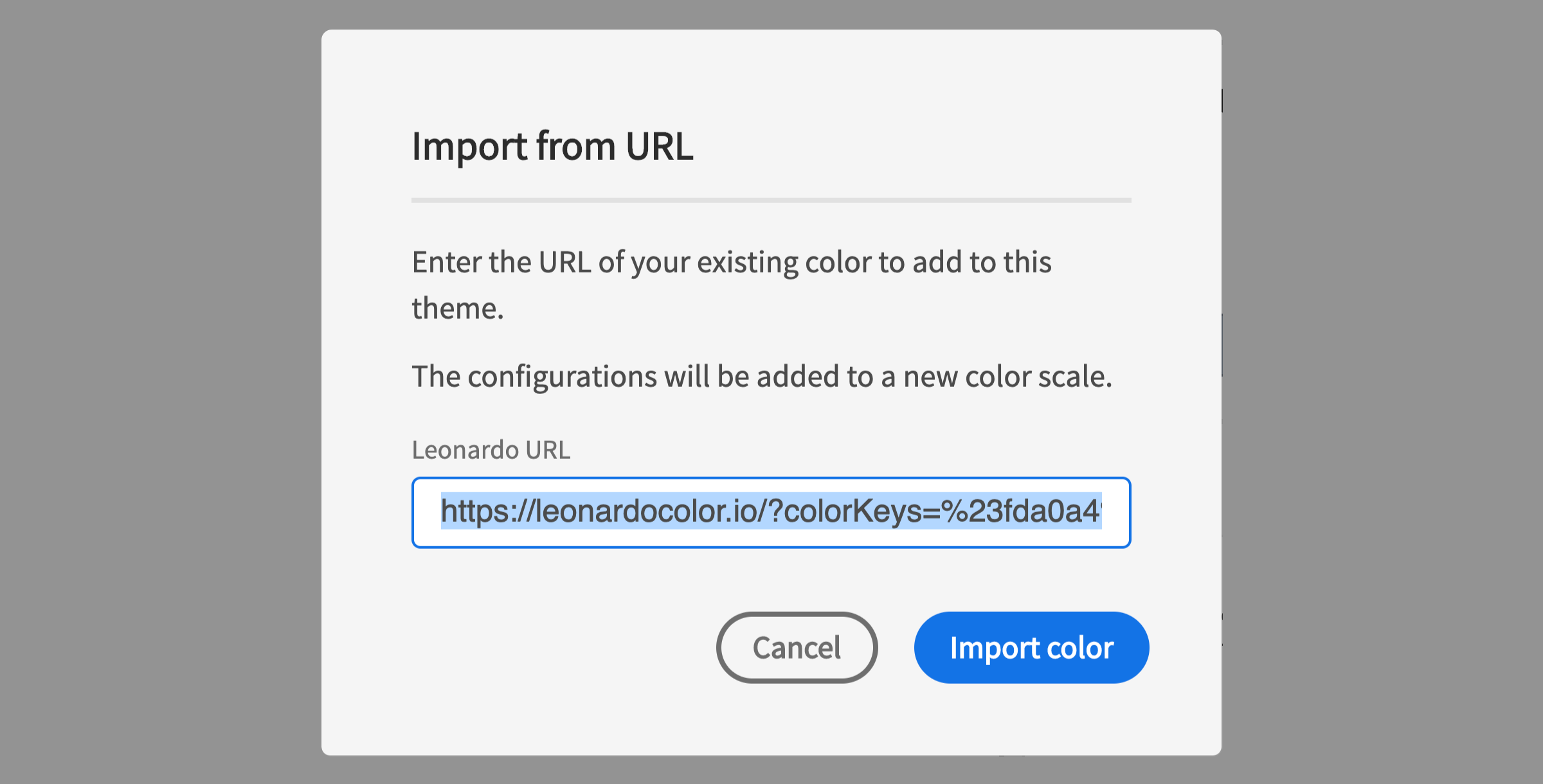
从网址导入 (Import from URL)
If you’ve already begun using Leonardo for the creation of your adaptive color palettes, this feature is a short-cut for keeping your existing work.
如果您已经开始使用Leonardo创建自适应调色板,则此功能是保留现有工作的捷径。
观看次数 (Views)
The default view for theme authoring is the configuration view. This displays the gradient of your color scale and all inputs for configuring each color scale. This is great for inputting values, but not so great for comparing color scales.
主题创作的默认视图是配置视图 。 这将显示色标的渐变以及用于配置每个色标的所有输入。 这对于输入值非常有用,但对于比较色标而言却不是那么好。
The color scales view hides your configurations and allows you to see each color scale gradient side-by-side. This is helpful in evaluating your color scales overall, such as seeing when one color may becomes more saturated than others as it gets lighter or darker.
色阶视图隐藏您的配置,并允许您并排查看每个色阶渐变。 这有助于整体评估色标,例如查看一种颜色何时变浅或变深。
The swatches view provides a larger view of your generated colors and places them on top of the background color for additional context. This view is particularly helpful with the next feature, color-vision-deficiency (CVD) previews.
色板视图提供了所生成颜色的更大视图,并将它们放在背景颜色之上以提供更多上下文。 此视图对于下一个功能(色差(CVD))预览特别有用。
CVD预览 (CVD Previews)
If you’re unfamiliar with this term, CVD stands for “color-vision-deficiency” — this is the appropriate and more accurate term for “color blindness”.
如果您不熟悉此术语,则CVD代表“色觉不足”-这是“色盲”的合适且更准确的术语。
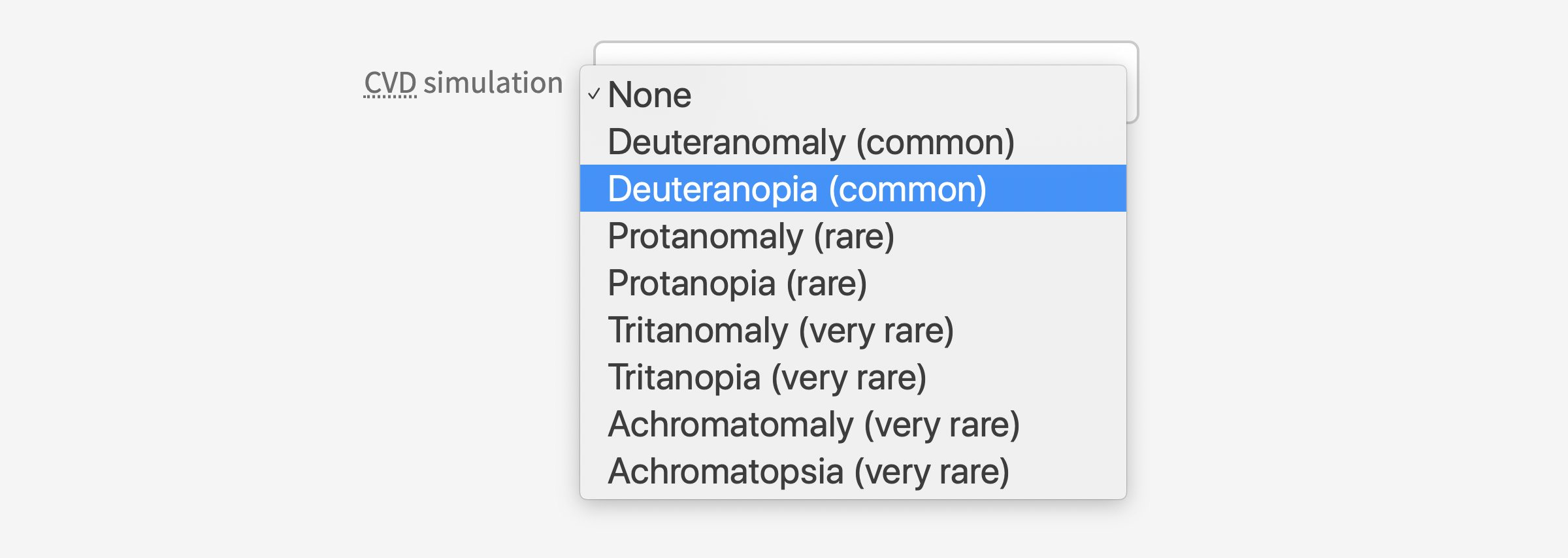
This set of options allows you to simulate what your theme looks like in a variety of color vision deficiencies. These include both types of red/green (protan & deutan), yellow/blue (tritan), and full color vision deficiencies (achromatic). I have a brief introduction to these in the article Colorimetry and the Cartography of Color, however for a deeper dive, see Color-Blindness.com.
这组选项使您可以模拟各种色觉缺陷中主题的外观。 这些包括红色/绿色(protan和deutan),黄色/蓝色(tritan)和全色视觉缺陷(消色差)两种类型。 我在“ 色度和颜色制图”一文中对此进行了简要介绍,但是要深入了解,请参阅Color-Blindness.com 。
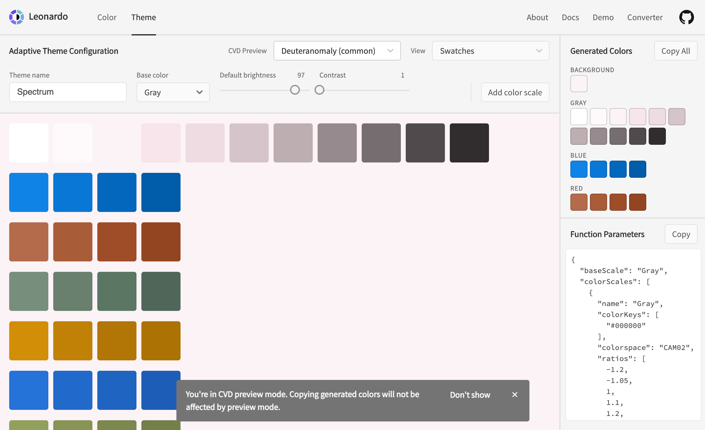
CVD simulations will not affect the color values when you copy output colors. This is to help ensure you don’t accidentally copy a simulated color value rather than the actual color output. These simulations are helpful in qualitatively evaluating the identifiability of each individual color of your theme for a wide range of color vision deficiencies.
复制输出颜色时, CVD模拟不会影响颜色值 。 这有助于确保您不会意外复制模拟的颜色值而不是实际的颜色输出。 这些模拟有助于定性评估主题的每种单独颜色的可识别性,以解决各种色觉缺陷。
This update helps you author and implement an adaptive color theme for your product, making personalization of color a reality for your end users.
此更新可帮助您创作和实现产品的自适应颜色主题,从而使颜色的个性化成为最终用户的现实。
We would love any feedback, and contributions to Leonardo to help us improve the tool for everyone. Pull requests are welcome!
我们希望收到您的任何反馈,并希望对Leonardo有所帮助,以帮助我们为所有人改进该工具。 拉请求是欢迎的!
To log any issues, bugs, improvement requests, and PRs, please visit the repository at: https://github.com/adobe/leonardo
要记录任何问题,错误,改进请求和PR,请访问以下资源库: https : //github.com/adobe/leonardo
Thank you 🎉
谢谢🎉
翻译自: https://uxdesign.cc/creating-contrast-based-themes-with-leonardo-32b6219a090f
sap leonardo


 3万+
3万+

 被折叠的 条评论
为什么被折叠?
被折叠的 条评论
为什么被折叠?
 到【灌水乐园】发言


