


色彩对比广告设计
I’m fairly confident (never assume) that I don’t need to explain why websites, apps and all digital tools should be accessible to all; it’s the right thing to do, and it’s the law.
我非常有信心(从未假设)不需要解释为什么所有人都可以访问网站,应用程序和所有数字工具; 这是正确的做法, 这是法律 。
And yet the most basic, easiest-to-fix thing in accessible web and digital design is the one thing designers keep forgetting about over and over and it drives me potty.
然而,在可访问的网络和数字设计中,最基本,最容易修复的事情是设计师一遍又一遍忘记的一件事,它驱使我如厕。
Why can’t we all just design with accessible colour contrasts?
为什么我们都不能只设计具有可访问的颜色对比的东西?

什么是可访问的颜色对比? (What is an accessible colour contrast?)
By accessible, I mean that the colour you are using and the background it is on should be a colour ratio of 4.5:1¹).
“可访问性”是指您所使用的颜色及其背景是4.5:1¹)。
According to W3C colour contrast guidelines under WCAG 2.0 (which has been around since 2008 so we really have no excuse), that’s the difference in colour between text and the background behind the text.
根据WCAG 2.0下的W3C颜色对比指南 (自2008年以来一直存在,因此我们没有任何借口),这就是文本和文本背景之间的颜色差异。

I would also highly recommend considering this for text-to-button-to-background contrast ratios as well as I’ve often seen these contrasts fall down where you least expect it.
我还强烈建议考虑使用文本到按钮与背景的对比度,而且我经常看到这些对比度下降到您最不期望的位置。
If you’re not sure, the easiest way to think about it is this — is this element that I am designing fundamental to the user’s understanding? I’d argue that if it’s a CTA you ever want someone to press, then yes.
如果您不确定,最简单的思考方式就是:我设计的这个元素是否对用户的理解至关重要? 我认为,如果这是CTA,则您希望有人按下,那么是的。
测试色彩对比 (Testing colour contrast)
You can test the colour contrasts in your design yourself. You really have no excuse. And it’s kind of fun.
您可以自己在设计中测试颜色对比。 你真的没有借口 这很有趣。
There are several tools available:
有几种可用的工具:
Web aim colour contrast checker— this is a simple web page where you input hex codes, hit a (highly accessible) button and voila! Pass or fail for AA or AAA. It also includes an assessment for Graphical Objects and User Interface Components.
网络目标色彩对比检查器 -这是一个简单的网页,您可以在其中输入十六进制代码,单击(高度可访问的)按钮,瞧! 通过或未通过AA或AAA。 它还包括对图形对象和用户界面组件的评估。
Sketch plugins — if you’re too lazy to open a browser, then there are a few different sketch plugins available. Here’s an example of the Stark plugin in action.
草图插件-如果您懒得打开浏览器,那么可以使用几种不同的草图插件。 这是运行中的Stark插件的示例。

You’ll notice that it has both colour contrast and colour blindness simulations. And yes, colour blindness is another thing we need to be thinking about, with 1 in 12 men and 1 in 200 women experiencing some kind of level of colour blindness.
您会注意到它同时具有颜色对比和色盲模拟。 是的, 色盲是我们需要考虑的另一件事,每12名男性中就有1名女性和200名女性中有1名女性经历某种程度的色盲。
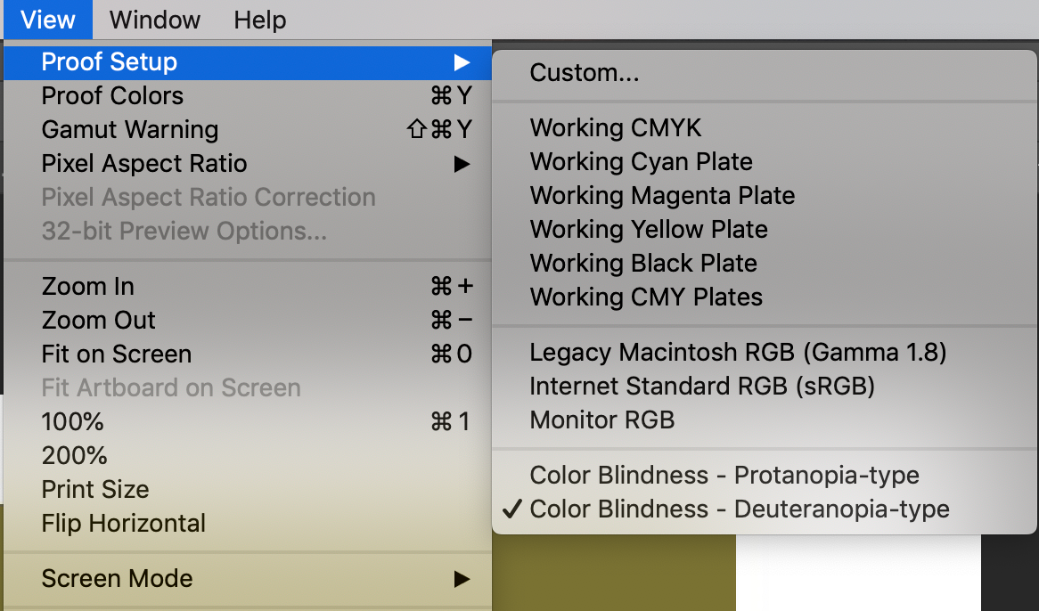
And if you’ve got any old school designers or devs who insist on using Photoshop… did you know that the tools for colour blindness are actually built in to the primary nav? Bet you didn’t.
而且,如果您有任何坚持使用Photoshop的老派设计师或开发人员……您知道色盲工具实际上是内置在主导航中的吗? 打赌你没有。
我们确实需要使用这些工具 (We really do need to use the tools)
The most interesting thing about colour contrast is that you really can’t detect it with the naked eye, even if you (think) you have perfect colour perception vision.
关于颜色对比度的最有趣的事情是,即使您(认为)您拥有完美的颜色感知视觉,您实际上也无法用肉眼检测到它。
Yes, it’s easy to see that the white on yellow above should get someone fired, however there are lots of combinations that aren’t as easy to test with the naked eye alone. You could easily assume (never assume) that the palette you are working with is accessible because you can see it.
是的,很容易看到上面的黄色会引起某人被炒鱿鱼,但是有很多组合用肉眼很难测试。 您可以轻松地假设(从未假设)正在使用的调色板是可访问的,因为您可以看到它。
Newsflash: you are not the user.
新闻快讯:您不是用户。
Let me show you two examples from real projects I’ve worked on, where I was saved by the tools.
让我向您展示我所从事的真实项目中的两个示例,这些示例将我保存在这些工具中。
案例1-这是可访问的 (Case #1 — This is accessible)

To my eye there was no way this was accessible. When I saw what the UI designer had selected, I had a mild heart attack. This was for a client who actually cared about meeting AA accessibility requirements (and not just in the “please don’t sue me” way).
在我看来,这是不可能的。 当我看到UI设计师选择的内容时,我患有轻微的心脏病。 这是针对真正关心满足AA可访问性要求的客户(而不只是以“请不要起诉我”的方式)。
So I fired up the Web Aim, and sure enough — everyone could breathe a sigh of relief.
因此,我启动了Web Aim,果然–每个人都可以松一口气。

案例2:无法访问 (Case #2— This is NOT accessible)
Some years ago I was emailed some design work with the classic line “the client asks if this is accessible” (go client!).
几年前,我收到了一封电子邮件,其中包含一些经典的设计作品“客户询问是否可以访问” (转到客户!)。

To me, the first thing that stood out was the white text on the orange background of the CTA.
对我而言,最引人注目的是CTA橙色背景上的白色文字。
But it turned out that arguably, if the text on the CTA counted as “large text” then the design team could sort of get away with it. (grumble).
但是事实证明,如果将CTA上的文字算作“大文字”,那么设计团队就可以摆脱它。 (叽)。

There was something bugging me however about the orange-on-green. It seemed really vibrant to me, which may or may not be due to my own visual impairment and accessibility needs (my team know not to show me anything in “dark mode”).
但是,关于橙绿色,有些困扰我。 对我来说,它似乎真的很充满活力,这可能是(也可能不是)由于我自己的视觉障碍和可访问性需求(我的团队知道在“黑暗模式”下什么也不给我看)。
So, as I had been sent a Photoshop file, I applied the built-in simulators (see above). And of course, orange/green is the same as red/green — as in red/green colour blindness.
因此,当我收到一个Photoshop文件时,就应用了内置模拟器(请参见上文)。 当然,橙色/绿色与红色/绿色相同-就像在红色/绿色色盲中一样 。


Clearly, if we had gone ahead with the orange CTA on the dark green background, there is a high risk that one in 12 male users would not have seen the CTA at all.
显然,如果我们继续使用深绿色背景上的橙色CTA,则很有可能会有十分之一的男性用户根本看不到CTA。
And we all know that the user doesn’t press what the user doesn’t see.
我们都知道用户不会按用户未看到的内容。
那么我们应该怎么做? (So what should we be doing?)
I strongly recommend the following approach:
我强烈建议采用以下方法:
Never assume — that any colour contrast is accessible or suitable for those with any level of colour blindness. Always test. Don’t expect someone else to have done it.
永远不要假设 -可以使用任何颜色对比或适合任何水平色盲的人们。 经常测试。 不要期望别人做过。
Educate — clients and visual design teams on accessibility requirements even at a basic palette choice level, at the beginning of every project. Brand colour schemes are rarely created with digital products and users in mind, and even the best UI designers I’ve worked with rarely know about these tools!
教育 -在每个项目开始时,即使在基本的调色板选择级别上,客户和视觉设计团队也要了解可访问性要求。 创建品牌配色方案时很少考虑数字产品和用户,即使是我与之合作过的最好的UI设计师也很少了解这些工具!
Document — although we now live in an agile, optimised, sprinty world of zero documentation, you really really need to write down accessibility guidelines or principles at the beginning of the project and share them with the team. And where appropriate, use email or slack or any other opportunity that you get to hammer it home. If you’re briefing wireframes to designers, write it down as a reminder. If the design team are “exploring” then stick post it notes all over the wall to highlight possible colour contrast risks.
文档 -尽管我们现在生活在一个零文档的敏捷,优化,冲刺的世界中,但您确实确实需要在项目开始时写下可访问性准则或原则,并与团队分享。 并在适当的地方使用电子邮件或闲置邮件或其他机会将其送回家。 如果要将线框简报给设计师,请写下来,以提醒您。 如果设计团队正在“探索”,则将其贴在墙上贴满所有笔记,以突出显示可能存在的颜色对比风险。
Check it yourself — you’ve got the tools already — stick your nose in, grab designs off the server or cloud and test them yourselves.
自己检查一下 -您已经拥有了工具-静下心来,从服务器或云中获取设计并进行自我测试。
Yes you might get known as the accessibility-obsessed designer, but really — do you want the alternative?
是的,您可能会成为痴迷于可访问性的设计师,但实际上-您是否想要替代方案?
Be moderately annoying until the rest of the team are finishing your sentences. With or without eye roll. They, and the stakeholder team (and the users!) will ultimately thank you for it.
在团队其他成员完成您的句子之前,请保持适度的烦恼。 有或没有眼球。 他们和利益相关者团队(以及用户!)最终将感谢您。
脚注 (Footnotes)
¹ 4.5:1 is AA accessible, for AAA according to WCAG 2.1 you need a ratio of 7:1
¹4.5:1可以访问AA, 对于WCAG 2.1中的AAA,您需要7:1的比例
翻译自: https://uxdesign.cc/why-we-all-need-to-be-using-colour-contrast-checkers-3bd9186c9487
色彩对比广告设计


 378
378

 被折叠的 条评论
为什么被折叠?
被折叠的 条评论
为什么被折叠?
 到【灌水乐园】发言


