


网页排版设计
重点 (Top highlight)
Web typography is at once simple and complex. At its core, it’s about how you arrange text so they’re pleasing and easy to read—yet there’s an endless number of ways to achieve an optimal reading experience.
Web排版既简单又复杂。 它的核心是关于如何排列文本,使它们令人愉悦且易于阅读-然而,有无数种方法可以实现最佳的阅读体验。
This is a practical guide to navigating the rabbit hole of web typography so that you can create optimal textual experiences on the web. It’s the kind of guide I wish I had when I started.
这是导航网络排版难题的实用指南 ,以便您可以在网络上创建最佳的文本体验。 这是我刚开始时希望得到的指导。
This is a long one. But this is the only article you need to get started—although you’re welcome to do a further reading because typography is just amazing.
这是一个很长的时间。 但这是您唯一需要入门的文章-尽管欢迎您进行进一步阅读,因为版式很棒。
网络排版的三位一体 (The Holy Trinity of Web Typography)
Let’s start with the basics. Web typography is made up of these three things:
让我们从基础开始。 Web版式由以下三部分组成:
Font size: what sizes will you use?
字体大小 :您将使用什么大小?
Line height: how much space between lines of text?
行高 :文本行之间有多少间距?
Line length: how wide will your blocks of text be?
行长 :您的文字块有多宽?

Your end goal is a good reading experience, and the holy trinity of web typography directly determines how pleasing your texts will be. Let me explain.
您的最终目标是获得良好的阅读体验,而网络排版的三位一体直接决定了您的文字的美观程度。 让我解释。
字体大小 (Font Size)
You want the text to be large enough for their level of importance. This means body text should be large enough to be readable but not too large that they take up too much space. Headings should be larger, but not too large that they appear comical. Captions and smaller text can be smaller but should remain readable.
您希望文本足够大以达到其重要性 。 这意味着正文应足够大以便可读,但又不能太大以至于占用过多空间。 标题应该较大,但不要太大 , 以免显得可笑。 标题和较小的文本可以较小,但应保持可读性。
When you design for the web, you’re designing for multiple device sizes. This complicates your choice of font sizes because what looks good on a laptop might be too large for a smartphone. We’ll address that later.
当您为网络设计时,您正在设计多种设备尺寸。 这会使您对字体大小的选择变得复杂,因为在笔记本电脑上看起来不错的东西对于智能手机而言可能太大了。 我们稍后再解决。
线高 (Line Height)
You want lines of text to be spaced apart just nice. Line height refers to the spacing between lines of text. When you read, your eyes move left to right (in most languages), and then dart back leftwards and downwards to the next line of text.
您希望文本行之间的间距很好 。 行高是指文本行之间的间距。 当您阅读时,您的眼睛从左到右移动(在大多数语言中),然后向左和向下Dart回到下一行文本。
Design your text to help this eye movement. If the spacing between lines of text is too large, your eyes need to make a large leap to the next line. This is tiring and increases the odds of you jumping to the wrong line. Conversely, if the spacing between lines is too small, the text would mush together and your eyes might jump back to the same line of text.
设计您的文字以帮助眼睛运动。 如果文本行之间的间距太大,则您的眼睛需要跳到下一行。 这很累,增加了您跳到错误路线的几率。 相反,如果行之间的间距太小,则文本会融合在一起,并且您的眼睛可能会跳回同一行文本。
线长 (Line Length)
You want the text to be wide enough but not too wide. Line length is a measure of how wide a block of text is. If your line length is too wide, your eyes need to travel a long distance to read each line; if it’s too narrow, your eyes need to make frequent hops to the next line. In both cases, reading becomes tiring.
您希望文本足够宽,但又不要太宽 。 行长是一个文本块的宽度的度量。 如果您的行长太宽,则您的眼睛需要走很长一段距离才能阅读每行; 如果太窄,您的眼睛需要经常跳到下一行。 在这两种情况下,阅读都会变得很累。
Let’s go through how you can create your own holy trinity of web typography with optimal font sizes, line heights, and line lengths for your web design project.
让我们研究如何为您的Web设计项目创建具有最佳字体大小,行高和行长的自己的Web排版三位一体。
使用类型比例来定义一组字体大小 (Use a Type Scale to Define a Set of Font Sizes)
什么是类型量表? (What’s a Type Scale?)
A type scale is a way to mathematically set the font sizes in your design, from body text up to heading 1 and down to captions. It’s the best way to choose a set of font sizes for your design.
一类 规模是一种方法, 数学设置在设计中的字体大小 ,从正文长达标题1降低到字幕。 这是为设计选择一组字体大小的最佳方法。
As its name suggests, a type scale works based on a scale factor (say, 1.25). The idea is that you start with a base font size and multiply it with the scale factor to get the font sizes of texts of higher hierarchy. Similarly, you divide the base font size with the scale factor to get texts of lower hierarchy.
顾名思义,类型比例是基于比例因子 (例如1.25 )工作的。 这个想法是,您从基本字体大小开始,然后将其乘以比例因子,以获得更高层次的文本的字体大小。 同样,将基本字体大小除以比例因子即可得到较低层次的文本。

为什么要使用类型刻度? (Why Should You Use a Type Scale?)
The practical reason: it takes arbitrariness out of your design. You don’t have to guess whether your caption text should really be 12px or 13px—you let mathematics take you there instead.
实际原因: 它消除了设计的任意性 。 您不必猜测标题文字是12px还是13px,而让数学带您去那里。
Beyond practicality, a type scale will produce texts that look harmonious because their sizes increase and decrease along a fixed scale. You’ll also avoid clashes between headings, where their sizes are too similar to tell them apart.
除了实用性之外,字体比例尺将产生看起来很和谐的文本,因为它们的大小沿固定比例尺增加或减小。 您还将避免标题之间的冲突,因为它们的大小过于相似,无法区分它们。
And finally, we designers are romantic creatures. The type scale is a concept rooted in geometry, history, and nature. Scales exist in almost all cultures—in architecture, music, and art—and the type scale is a continuation of humankind’s fascination with pattern and beauty. So for the love of culture, use a type scale.
最后,我们的设计师是浪漫的生物。 字体比例尺是一个植根于几何,历史和自然的概念。 规模几乎存在于建筑,音乐和艺术等所有文化中,字体规模是人类对图案和美的迷恋的延续。 因此,为了热爱文化,请使用类型标尺。
类型量表如何工作? (How Does a Type Scale Work?)
Essentially, you need to define two values:
本质上,您需要定义两个值:
A base font size.
基本字体大小 。
A scale factor. You’ll multiply and divide your base font size with this scale factor to produce a range of font sizes.
比例因子 。 您将使用该比例因子乘以基础字体大小并将其除以生成一系列字体大小。
如何选择基本字体大小 (How to Choose a Base Font Size)
You’ll need to choose a base font size for the most important text in your design. In most cases, that’s the body text, since you’ll use it most frequently.
您需要为设计中最重要的文本选择基本字体大小 。 在大多数情况下,这就是正文,因为您将最常使用它。
Choose a font size appropriate for your project. This is up to your judgment (as well as your client’s or product owner’s), but here are some factors to consider:
选择适合您项目的字体大小。 这取决于您(以及您的客户或产品所有者)的判断,但是以下是要考虑的一些因素:
- Think about the type of content your designs contain. Is it text-heavy? Media-heavy? 考虑一下您的设计包含的内容类型。 是大量文字吗? 大量媒体?
If your project is content-heavy (think Medium and Smashing Magazine), make sure your body text is large enough for comfortable reading.
如果您的项目内容繁重(请考虑使用Medium和Smashing Magazine ),请确保您的正文足够大,以便于阅读。
- If your project is dashboard-oriented, or you need to display information densely, consider using a smaller body font size (that is still readable). 如果您的项目是面向仪表板的,或者您需要密集显示信息,请考虑使用较小的主体字体大小(仍可读)。
The average body text has increased over the years. 16px is no longer large enough. Try 18px or larger.
这些年来,平均正文有所增加。 16px 不再足够大 。 尝试使用18px或更大的像素。
- Think about your typeface! Some typefaces appear larger than others at the same font size. 想想你的字体! 在相同的字体大小下,某些字体看起来比其他字体大。

如何选择比例因子 (How to Choose a Scale Factor)
The most commonly used type scales are inspired by musical scales and geometry. For instance:
最常用的类型音阶受到音乐音阶和几何形状的启发。 例如:
So, which one do you pick? I recommend two ways for you to figure out.
那么,您选择哪一个呢? 我建议您找出两种方法。
First, take the practical approach. Think about your extremes—if your project uses 6 heading levels, then a large type scale will result in a humongous heading 1. For instance, with a Golden Ratio type scale, a body text of 18px will result in heading 1 that’s a whopping 119px.
首先,采取实际的方法 。 想想你的极限,如果你的项目使用6个标题级别,再大的类型规模将导致一个巨大的标题1。例如,用黄金比例类型规模,18像素正文将导致标题1,这是一个惊人的119px 。
Next, take the romantic approach. Listen to your type scales. Google for music pieces that use the Major Second, Major Third, Perfect Fifth, and so on. Which of these sound like they represent your brand and purpose?
接下来,采取浪漫的态度 。 听您的类型秤。 Google适用于使用Major Second , Major Third , Perfect Fifth等等的音乐作品。 这些声音中的哪一个代表您的品牌和宗旨?

type-scale.com is a useful site for you to play around with your type scale. You can also use a prototyping app to test the font sizes in situ. Personally, I’ve found that type scales larger than Perfect Fourth (1.333) create headings that are too large. My favorite so far is the Major Third (1.25)—it provides enough distinction between headings, results in decently sized heading 1, and sounds nice musically.
type-scale.com是一个有用的网站,可让您使用字体比例尺。 您还可以使用原型制作应用程序来原位测试字体大小。 就个人而言,我发现类型比例大于完美四度(1.333)的标题将导致标题过大。 到目前为止,我最喜欢的是大三号(1.25),它在标题之间提供了足够的区分,使标题1的大小合适,并且听起来听起来不错。
类型比例和响应式网页设计[高级] (Type Scales and Responsive Web Design [Advanced])
Ok, let’s go further down into our rabbit hole of type scales. Often, you’ll find that a single type scale won’t cut it for your project. That’s because a type of scale that looks good on a large screen would look too big on a smartphone. So, what do we do?
好的,让我们进一步深入到类型刻度的兔子洞中。 通常,您会发现单一类型的比例尺不会为您的项目削减它。 那是因为一种在大屏幕上看起来不错的秤在智能手机上看起来太大了。 那么我们该怎么办?
The solution: a double-stranded type scale.
解决方案: 双链型秤 。
This basically means you’ll have two sets of type scales. This gives you more flexibility in your project to create a text that looks great on all screen sizes. There are many ways you can use two sets of type scales, but for simplicity I recommend you to use one type of scale for medium and large screens and the other for small screens.
这基本上意味着您将拥有两组类型刻度。 这使您在项目中具有更大的灵活性,可以创建在所有屏幕尺寸上都看起来不错的文本。 可以使用两种方式使用两种类型的刻度尺,但是为简单起见,我建议您对中型和大型屏幕使用一种类型的刻度尺,而对于小屏幕使用另一种类型的刻度尺。
How do you create a double-stranded type scale? Don’t worry, it’s simpler than it sounds. Remember how we created a type scale by choosing a base font size and a scale factor? To create a second type scale, you have to change either one of those two numbers:
如何创建双链型磅秤? 别担心,它比听起来简单。 还记得我们如何通过选择基本字体大小和比例因子来创建类型比例吗? 要创建第二个类型的规模,你必须改变无论是这两个数字中的一个:
You could choose a smaller base font size for small screens. E.g., 16px body text for small screens and 18px body text for larger screens.
您可以为小屏幕选择较小的基本字体大小 。 例如,小屏幕为16px正文文本,大屏幕为18px正文文本。
Or, you could choose a smaller scale factor for small screens. E.g., Minor Third (1.2) for small screens and Major Third (1.25) for larger screens.
或者,您可以为小屏幕选择较小的比例因子 。 例如,小屏幕为小三(1.2),大屏幕为大三(1.25)。


I prefer the first method because mathematics is simpler. When it comes to defining the font sizes in CSS, you only have to define two rem values for your body texts, rather than having to define two sets of heading size values.
我更喜欢第一种方法,因为数学更简单。 在CSS中定义字体大小时,您只需为正文文本定义两个rem值,而不必定义两组标题大小值。
(Side note: Can you change both the base font size and scale factor to create your second type scale? Well, yes, but that’s not ideal. The result wouldn’t retain much of the harmonic nature you’d want in your type scales.)
(旁注:可以 同时 更改 基本字体大小和比例因子以创建第二种比例尺吗?是的,但这并不理想。结果不会保留您想要的多种类型的谐波特性)
And that’s it! That’s all you need to know to practically create a set of optimal font sizes for your web typography project. Next up: line-height.
就是这样! 这就是为您的Web排版项目实际创建一组最佳字体大小所需的全部知识。 接下来:行高。
为您的类型比例尺设置正确的线高 (Set the Right Line Heights for Your Type Scale)
线高是多少? (What’s a Line Height?)
Line height defines the space above and below lines of text. You can define line-height in relative units (e.g., 1.5em, 1.5, 150%) or absolute units (e.g., 24px). A line-height of 1.5 on 16px text will result in a total height of 24px for each line of text (because 1.5*16px = 24px).
行高定义了文本行上方和下方的空间。 可以定义相对单位(例如,行高1.5em , 1.5 , 150%或绝对单位(例如, 24px )。 在16像素文本上的行高为1.5会导致每行文本的总高度为24像素(因为1.5 * 16像素= 24像素)。

For the love of efficiency, don’t define line-height in absolute units. That’s because whenever you change your font size, you’ll then have to redefine your line-height in the updated absolute unit. Always define line-height in relative units.
为了追求效率, 请不要 以绝对单位定义行高。 这是因为每当您更改字体大小时,都必须以更新的绝对单位重新定义行高。 始终以相对单位定义行高。
如何选择合适的线高 (How to Choose the Right Line Heights)
It depends. I know, this sounds awful in a practical guide, but the beauty of typography is that so much depends on your typeface and the context of your design.
这取决于。 我知道,在实用指南中听起来很糟糕,但是字体的美在于很大程度上取决于您的字体和设计的上下文。
Line height is subjective. Aim for something that looks right, rather than a platonic ideal of the “correct” line-height. Having said that, there are a couple of things to consider when choosing your line heights.
行高是主观的 。 瞄准看起来正确的东西 ,而不是“正确”线高的柏拉图式理想。 话虽如此,选择行高时需要考虑两点。
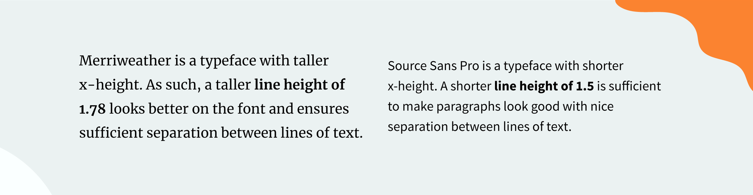
Choose your line-heights based on the typefaces you use. Fonts with taller x-height require taller line-height. That’s because the taller your font, the more separation you need between lines of text for optimal reading. You don’t want your text to mush together.
根据您使用的字体选择行高。 x高度较高的字体需要较高的行高。 这是因为字体越高,为了获得最佳阅读效果,文本行之间就需要更多的分隔。 您不希望文本混在一起。
Choose your line-heights based on your line lengths. The wider a block of text, the taller the line height should be. That’s because the wider your text, the more your eyes need to travel per line, so more space between lines will help your eyes jump to the next line easier. Conversely, the shorter your line length, the more jumps your eyes need to make—less space between lines will make the frequent hops easier.
根据行长选择行高。 文本块越宽,行高应该越高。 这是因为文本越宽,每行行进的眼睛越多,因此行与行之间的间距越大,越容易跳到下一行。 相反,线长越短,您的眼睛需要跳的越多-线之间的间距越小,频繁跳就越容易。

Choose your line-heights depending on whether the text is a heading. Headings should have less line-height than body text. That’s because you want your heading to be read as one block. Your body text, on the other hand, should be optimized for slow and steady consumption. Body text line heights can go beyond 1.7, but headings should have line heights around 1.2.
根据文本是否为标题选择行高。 标题的行高应小于正文。 这是因为您希望将标题作为一个整体读取 。 另一方面,应优化您的正文,以缓慢而稳定地消耗 。 正文文本的行高可以超过1.7 ,但标题的行高应在1.2左右。

线高和垂直节奏[高级] (Line Height and Vertical Rhythm [Advanced])
Ready to step deeper into the rabbit hole of line-heights? When you choose your line-heights, you have an opportunity to achieve a coveted state in typography known as vertical rhythm.
准备进一步深入线高的兔子洞了吗? 选择行高时,您就有机会在排版中获得令人垂涎的状态,即垂直节奏 。
In short, vertical rhythm is the idea that your designs will look more harmonic if the spaces between elements—texts, images, boxes, etc.—are consistent. We often achieve this by using a common denominator for spacings. For example, Material Design uses a 4dp grid so that elements consistently use multiples of 4 for sizes and spacings.
简而言之,垂直节奏是一种想法,如果元素(文本,图像,框等)之间的间距一致,则设计将看起来更加和谐。 我们通常通过使用公共分母来实现间距。 例如,“ 材料设计”使用4dp网格,以便元素始终使用4的倍数来表示大小和间距。

So how does this work in practice?
那么这在实践中如何工作?
First, try to find a line-height that gives you a nice number when you multiply it to your base font size. By a nice number, I mean a multiple of 4 or 8. For instance, if I have body text in 18px Source Sans Pro, a line-height of 1.33 gives me ~24px in total height with fairly nice spacing between lines of text. Or, if I use 18px Merriweather, a line-height of 1.78 gives me ~32px total height. Libre Franklin at 16px and line-height of 1.5 gives me 24px.
首先, 尝试找到一个行高,当将其乘以基本字体大小时,它会给您一个不错的数字 。 用一个不错的数字表示4或8的倍数。例如,如果我在18px Source Sans Pro中有正文,则行高1.33 会使我的总高度达到〜24px ,两行之间的间距相当不错。 或者,如果我使用18px的Merriweather,则行高1.78 会使我的总高度约为32px 。 Libre Franklin的像素为16px,行高为1.5时,我的像素为24px 。

Once you’ve got a nice number, you can use the common denominator throughout your project. For instance:
得到一个不错的数字后,就可以在整个项目中使用公分母。 例如:
- Size images in multiples of 8px (e.g., 40px for profile pictures). 将图片的尺寸设置为8像素的倍数(例如,个人资料图片为40像素)。
Line heights for headings can be tweaked so they produce total heights that also are multiples of 8px (this is extremely difficult to achieve and I don’t recommend it).
可以调整标题的行高,以便它们产生的总高度也是8px的倍数(这很难实现,我不建议这样做)。
- Spacings above and below headings, spacings between paragraphs of body text, spacings between text and images, etc., can all be multiples of 8px. 标题上方和下方的间距,正文文本各段之间的间距,文本和图像之间的间距等都可以是8px的倍数。
For practical purposes, vertical rhythm is ideal. Unless you’re a typography purist (and cheers if you are!), you shouldn’t spend too much time trying to achieve perfect vertical rhythm in your project. If you want to learn more about vertical rhythm, Zell has an amazing in-depth explainer.
出于实际目的, 垂直节奏是理想的 。 除非您是印刷术的纯粹主义者(如果愿意,请加油!),否则您不应该花费太多时间尝试在项目中实现完美的垂直节奏。 如果您想了解有关垂直节奏的更多信息,Zell提供了一个很棒的深度解释器 。
Next, let’s explore line lengths.
接下来,让我们探讨行长。
设置文本的正确行长 (Set the Right Line Lengths for Your Texts)
线长是多少? (What’s a Line Length?)
Line length is the width of a block of text. It’s usually defined by the average number of characters in a line of text.
行长是一块文本的宽度。 通常由一行文本中的平均字符数定义。
There are several suggested optimal ranges of line lengths, but you should be fine with anywhere between 45–75 characters per line. With this range of characters, your text will not be too wide (and thus tedious to read) or too narrow (and thus require frequent hops while reading).
建议使用 几种 最佳的行长范围,但是每行45-75个字符之间的任意值都可以。 在此字符范围内,您的文本不会太宽(因此难以阅读)或太窄(因此在阅读时需要经常跳)。

如何获得最佳的线长 (How to Achieve an Optimal Line Length)
The most practical way to create an optimal line length is to use your grid. To do so, set a max-width property to your texts to limit their length. This method is useful for medium and large screens.
创建最佳线长的最实用方法是使用网格 。 为此,请为文本设置max-width属性以限制其length 。 此方法对于中型和大型屏幕很有用。
Test to see how many columns of your grid will result in text that falls within the 45–75 character range. For example, perhaps a max-width equivalent to 8 columns in your 12-column desktop grid would achieve an optimal line length. Since the range of characters is pretty wide, there’s room for your personal judgment and the context of your design.
测试以查看网格中的多少列将导致文本在45–75个字符范围内。 例如,在12列桌面网格中,等效于8列的最大宽度可能会达到最佳的行长。 由于字符范围很广,因此您可以根据自己的判断和设计环境来进行选择。
线长和响应式网页设计 (Line Length and Responsive Web Design)
What happens on smaller screens such as smartphone displays? Forget small screens—what about medium screens in tablets, or when you resize the browser on a desktop device? Wouldn’t the narrower screens force your text to be narrower and thus break the perfect line length you’ve tried to achieve?
在较小的屏幕(如智能手机显示屏)上会发生什么? 忘记小屏幕-平板电脑中的屏幕呢,还是在台式设备上调整浏览器大小时呢? 较窄的屏幕会不会迫使您的文本变窄,从而破坏您尝试达到的完美行长?
Relax. The solution? You may ignore line length on smaller displays.
放松。 解决方案? 您可以 在较小的显示器上 忽略 行长。
Hear me out. Typography purists might pull their hair out over this, but it’s important to understand that you’re trying to create a great reading experience, and line length is just one part of the equation. When it comes to narrow screens, other design choices such as the font size and line-height become more crucial in determining the reading experience of your text.
听我说。 印刷术纯正者可能会为此付出努力,但重要的是要了解您正在尝试创造出色的阅读体验,并且行长只是等式的一部分 。 当涉及到窄屏时,其他设计选择(如字体大小和行高)对于确定文本的阅读体验至关重要。
Besides, if you’ve used a double-stranded type scale as I’ve suggested above, you’d likely end up with a comfortably smaller base font size on small screens. This would probably make your line length fall within the optimal 45–75 character range.
此外,如果您使用了我上面建议的双链字体,则最终在小屏幕上可能会得到舒适的基本字体大小。 这可能会使您的行长落在最佳45-75个字符范围内。

That’s it! You’ve now mastered the holy trinity of web typography. 🎉 Personally, I’ve found that the easiest way to design for web typography is to start with font sizes, move to line-heights, then end with line lengths. (That’s why I’ve introduced them in this sequence.)
而已! 您现在已经掌握了网络排版的三位一体。 🎉就个人而言,我发现最简单的Web排版设计方法是从字体大小开始,移至行高,然后以行长结束。 (这就是为什么我按此顺序介绍它们的原因。)
But wait, there’s more.
但是,等等,还有更多。
The holy trinity of font size, line height, and line length covers the fundamentals. There are a thousand other ways to enhance your web typography—and I thought I’d devote some time to discuss spacing because it’s such an easy way to improve your typography design.
字体大小,行高和行长的三位一体覆盖了基础知识。 还有一千种其他方法可以增强您的Web排版-我想我会花一些时间来讨论间距,因为这是一种改进排版设计的简便方法。
给您所需的文本空间 (Give Your Text Space it Needs)
字母间距 (Letter Spacing)
This one’s simple but powerful: reduce letter spacing for large text, increase letter spacing for small text. Both Google’s Material Design and Apple’s Human Interface Guidelines use this method to create great typographical experiences.
这个简单但功能强大: 减少大文本的字母间距,增加小文本的字母间距 。 Google的Material Design和Apple的Human Interface Guidelines都使用这种方法来创造出色的印刷体验。
The larger a font, the larger the gaps between letters. Thus, when you reduce letter spacing you’ll make headings look better. Typically, you’d use a negative letter-spacing value (e.g., -1.5px) to achieve this. The higher your heading level, the more you should tighten it.
字体越大,字母之间的间距越大。 因此,当减小字母间距时,会使标题看起来更好。 通常,您将使用负的字母间距值(例如-1.5px )来实现此目的。 航向水平越高,您应该越拧紧它。
The opposite is true for small text, for instance, captions. Since the text is small, you’d want to help users read by spacing the letters apart. This way, then they’re rendered on a screen, they don’t clump together to form an illegible mess.
小文本(例如标题)则相反。 由于文本很小,因此您希望通过将字母隔开来帮助用户阅读。 这样,然后将它们渲染在屏幕上,它们不会聚在一起形成难以辨认的混乱。

段落间距 (Paragraph Spacing)
How far apart should paragraphs of body text be? The rule of thumb is that the paragraphs of text should appear distinct from one another to signify a break in a paragraph, but not too far apart that they appear disjointed.
正文的段落应该相距多远? 经验法则是,文本的各段应该彼此不同以表示一个段的中断,但是相距不远,以使它们看起来不连贯。
As you can imagine, this is largely subjective and depends on the typeface you use. Taller fonts require larger paragraph spacing.
可以想象,这在很大程度上是主观的,取决于您使用的字体。 较高的字体需要较大的段落间距。

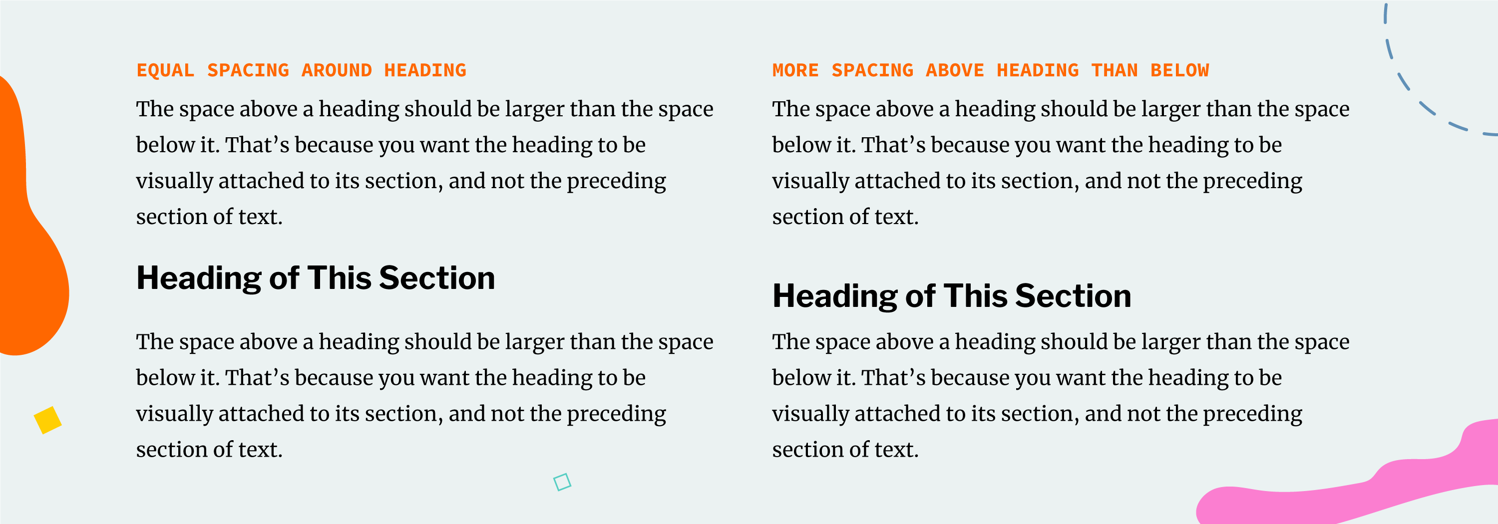
标题间距 (Heading Spacing)
The space above a heading should be larger than the space below it. That’s because you want the heading to be visually attached to its section, and not the preceding section of text. Furthermore, the larger the heading, the more space should appear around it.
标题上方的空间应大于标题下方的空间 。 这是因为您希望标题在视觉上附加到其部分,而不是文本的前面部分。 此外,标题越大,其周围应显示更多的空间。
准则只是准则 (Guidelines are Just Guidelines)
I hope this practical guide has not only been useful but has also sparked your love for typography. I think of it as my love letter to typography enthusiasts, web developers, and designers.
我希望该实用指南不仅有用,而且能激发您对版式的热爱。 我将其视为对印刷爱好者,Web开发人员和设计师的情书。
I thought I’d end with one last tip: sometimes you’ve just got to check the rules.
我以为我会以最后一条提示结束: 有时您只需要检查规则 。
Use the guidelines to guide your efforts, but feel free to break from them whenever it makes sense. Remember, the ultimate goal is to create a great reading experience. Don’t miss the forest for the trees!
使用准则来指导您的工作,但是只要有必要,就可以随时摆脱这些准则。 请记住,最终目标是创造出色的阅读体验。 不要错过树林的树木!
For instance, some designers would have you believe in the magical properties of the Golden Ratio. Personally, however, I’ve never been a huge fan of the ratio’s role in the design. And in typography, the Golden Ratio is too large to work in a type scale.
例如,有些设计师会让您相信 “黄金比例”的神奇 特性 。 但是,就我个人而言,我从来都不是比率在设计中的忠实拥护者。 而且在排版中,黄金分割比例太大,无法在字体比例下使用。
So I say: trust your eyes. Guidelines point you in the right direction, but you decide your own destination.
所以我说:相信你的眼睛。 指南会为您指明正确的方向,但您可以决定自己的目的地。
翻译自: https://medium.com/swlh/everything-you-need-to-know-about-designing-for-web-typography-69cec6ca8230
网页排版设计


 433
433

 被折叠的 条评论
为什么被折叠?
被折叠的 条评论
为什么被折叠?
 到【灌水乐园】发言


