adobe xd
重点 (Top highlight)
So, it seems as though our newest UI design trend for 2020 is going to be Neumorphism, aka Soft UI. What is it? It means using shadows and highlights to make shapes appear as though they are slightly extruded. It gets it’s name from a term called “skeumorphism.” Skeumorphism is a design style in which the goal is to make something as closely resemble it’s real life counterpart as possible. “Neumorphism” is a play on words, adding the word “new” to the beginning. This design style, I admit is pretty cool. It catches the eye and brings back some almost retro 3D styling to the more modern flat trend. Let me set something straight though: Neumorphism is not a replacement for flat design. Many of us remember the switch between ios6 and ios7. That switch is often used as the prime example between skeumorphic and flat design styles. Neumorphic design, though, proposes a far less drastic shift in design, but rather compliments flat design style. The combinations of these styles looks really nice, and it can really set your designs apart from the hoardes of flat UI’s out there.
S 0,就好像2020年我们最新的UI设计潮流将是Neumorphism,又名软UI。 它是什么? 这意味着使用阴影和高光使形状看起来好像稍微被挤压了。 它的名字来自“拟态”。 Skeumorphism是一种设计风格,其目的是使某些东西与现实生活中的东西尽可能相似。 “同态”是对单词的一种玩法,将“新”一词添加到开头。 我承认这种设计风格非常酷。 它引起了人们的注意,并将一些几乎复古的3D样式带回了更现代的扁平化趋势。 不过,让我直言不讳:神经同质不能替代平面设计。 我们许多人都记得ios6和ios7之间的切换。 该开关通常用作拟态和平面设计样式之间的主要示例。 不过,Neomorphic设计提出的设计远没有那么剧烈,而是补充了平面设计风格。 这些样式的组合看起来非常好,并且确实可以将您的设计与平面UI的ho杂区分开。
When I first started playing with this style, I was experimenting in Photoshop, and created the effect using the bevel/emboss layer style. But, as I wanted to start using it in my UI designs, I ran into a problem. How do I create that beveled look in Adobe XD without layer styling options? Turns out, the answer is pretty simple. I’m going to show you how to create a series of different button and border styles that you can replicate into your own designs! So, let’s get started.
当我第一次开始使用这种风格演奏时, 实验中 在Photoshop中,并使用斜角/浮雕图层样式创建效果。 但是,当我想在UI设计中开始使用它时,我遇到了一个问题。 如何在没有图层样式选项的情况下在Adobe XD中创建斜面外观? 事实证明,答案很简单。 我将向您展示如何创建一系列不同的按钮和边框样式,您可以将它们复制到自己的设计中! 因此,让我们开始吧。
We will start with a blank document. I just used the standard web page artboard size, 1920x1080, and then colored the background a dark blue (#2B3134).
我们将从空白文件开始。 我只使用了标准的网页画板尺寸1920x1080,然后将背景颜色涂成深蓝色(#2B3134)。

Now we want to create our first button. We can create a rectangle by hitting “R” on the keyboard. Just drag one out, and then resize it to 200 pixels wide by 80 pixels tall.
现在我们要创建第一个按钮。 我们可以通过点击键盘上的“ R”来创建一个矩形。 只需将其拖出,然后将其调整为200像素宽乘80像素高。
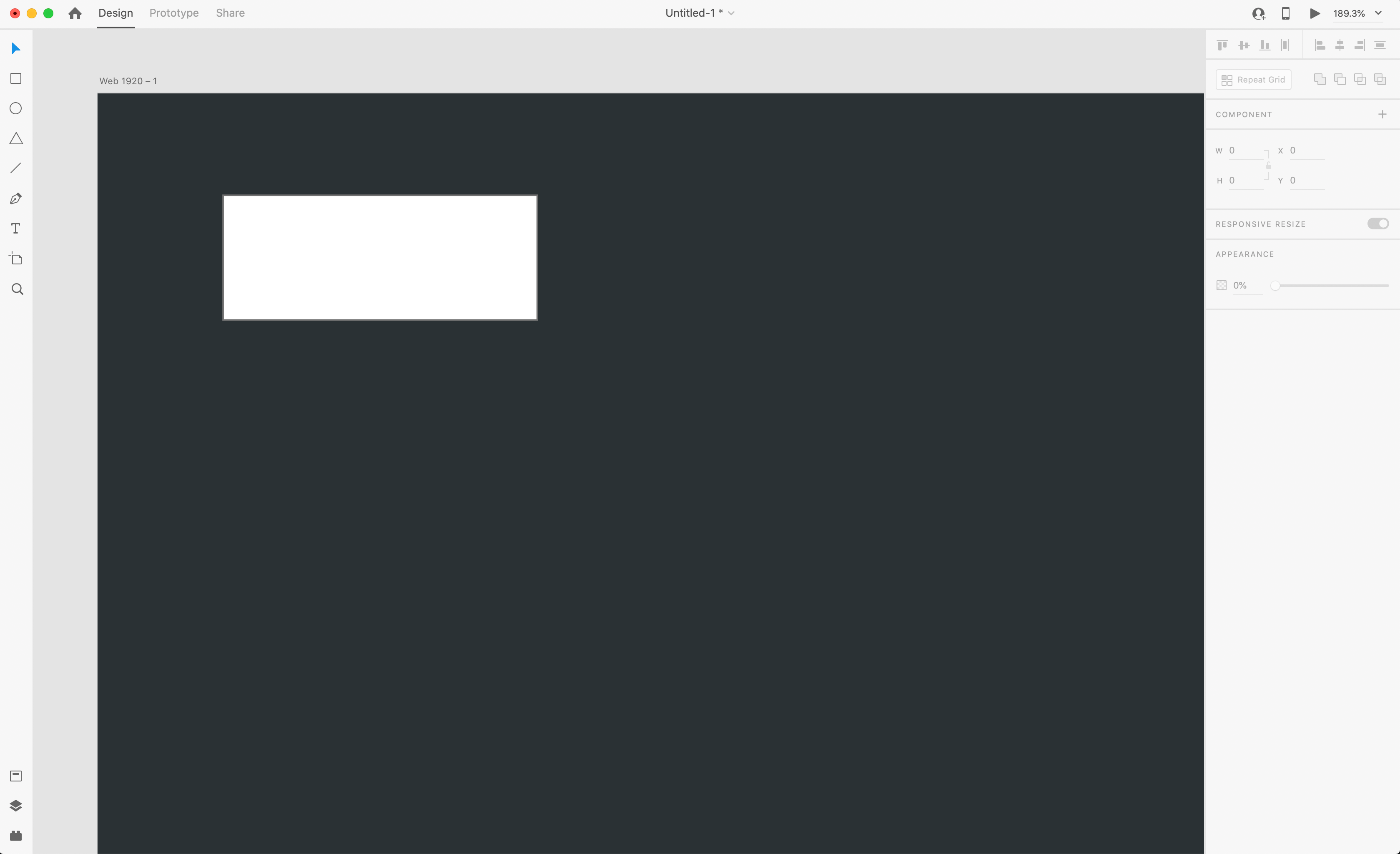
Now, to create our “soft UI” effect, we need the button to look 3D. How do we do that? Well, we simulate lighting. Imagine setting something on a table. Light casted over the table will “hightlight” one side of the object, and cast a “shadow” on the other side. We can replicate this in XD pretty easily. Let’s first make sure our box has a fill color identical to our background. This will make the button appear as if it’s just an extruded part of the background itself, which is what is popular now with the “soft UI” effect. Keep the rectangle selected.
现在,要创建“软UI”效果,我们需要该按钮以3D外观。 我们该怎么做? 好吧,我们模拟照明。 想象一下在桌上摆放一些东西。 投射在桌子上的光将“突出显示”对象的一侧,而在另一侧投射“阴影”。 我们可以很容易地在XD中复制它。 首先让我们确保盒子的填充颜色与背景相同。 这将使按钮看起来就像只是背景本身的突出部分一样,这就是现在流行的“软UI”效果。 保持选中矩形。
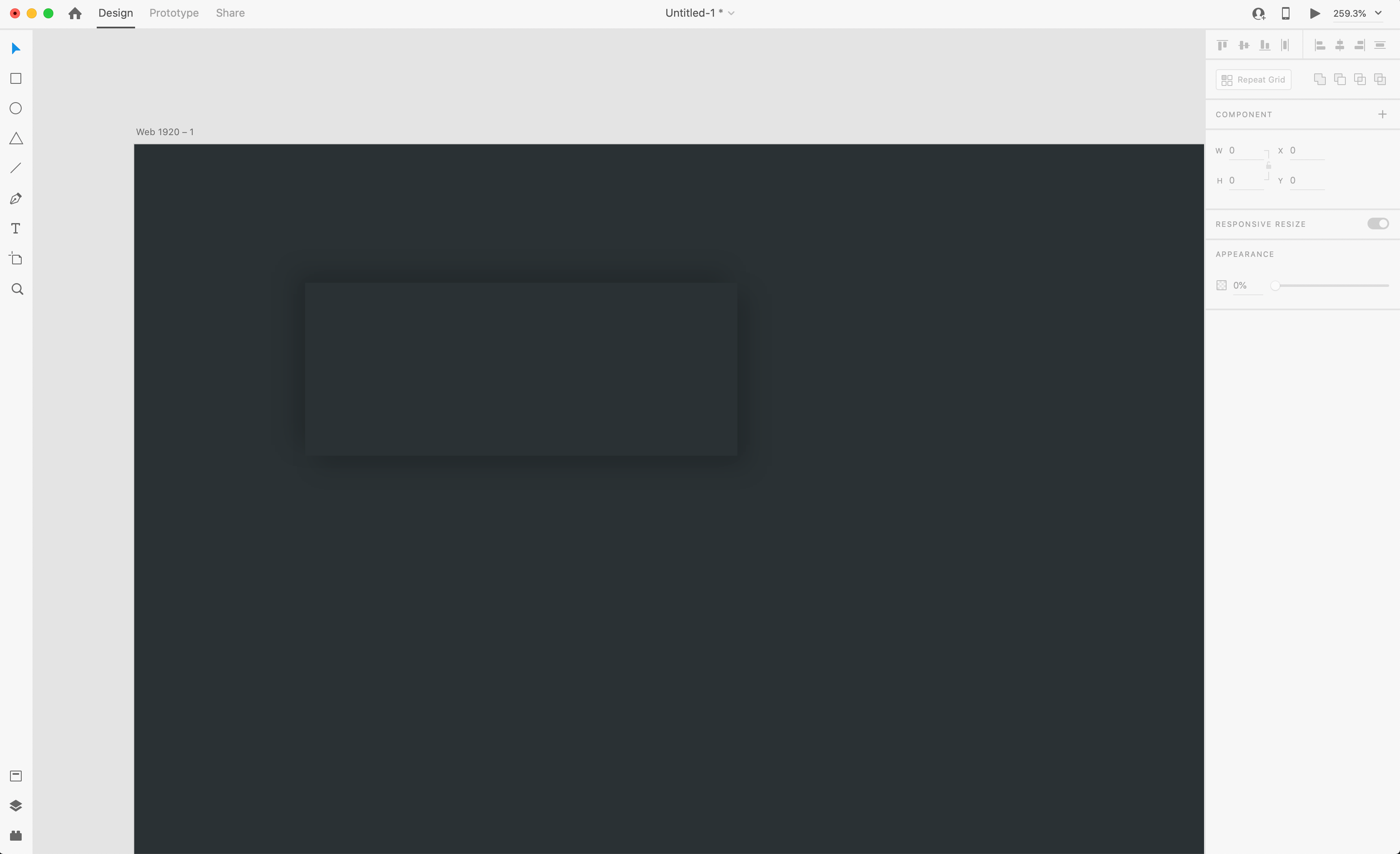
Now, we will start adding shadows and highlights. To start, let’s add a drop shadow. I used the settings below.
现在,我们将开始添加阴影和高光。 首先,让我们添加一个阴影。 我使用了以下设置。

X: 5
X:5
Y: 5
Y:5
Blur: 11
模糊:11
Shadow Opacity: 15%
阴影不透明度:15%
You should now have an effect like what you see in the image, just a soft shadow off the bottom right of our rectangle button. Now, to finish the effect we need a highlight opposite of the shadow to make it really appear 3D. To do that, hit CMD+C to copy the button, and then paste the button directly on top of itself with CMD+V. Now, on this second copy, we reverse the shadow to the other side by flipping our X and Y settings for the shadow to the negative like so:
现在,您应该具有类似于图像中看到的效果,只是矩形按钮右下角的柔和阴影。 现在,要完成效果,我们需要与阴影相对的高光才能使其真正呈现3D。 为此,请按CMD + C复制按钮,然后使用CMD + V将按钮直接粘贴在其顶部。 现在,在第二个副本中,我们将阴影的X和Y设置翻转为负值,从而将阴影反转到另一侧,如下所示:
X: -5
X:-5
Y: -5
Y:-5
Blur: 11
模糊:11
Shadow Opacity: 15%
阴影不透明度:15%
Almost there! But it needs to be a highlight, not a shadow. So let’s change the color of the shadow. I used #717171. This color is just light enough to create the illusion of a highlight without being too bright and looking unnatural. Our button is looking pretty good!
差不多了! 但这需要成为亮点,而不是阴影。 因此,让我们更改阴影的颜色。 我用#717171。 这种颜色足够浅,足以创建高光的幻觉,而又不会太亮且看起来不自然。 我们的按钮看起来不错!
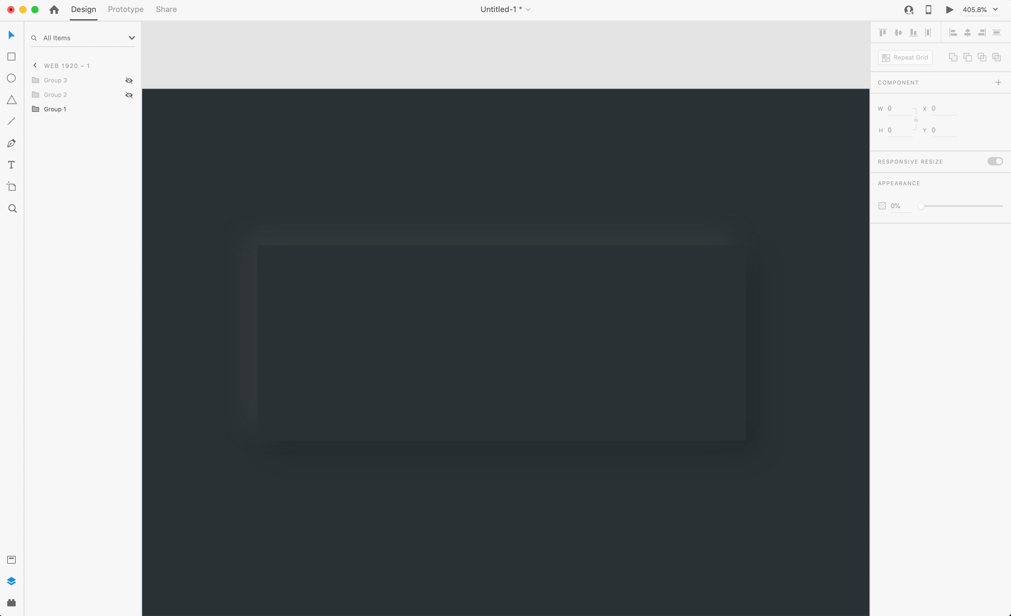
However, in my own experiments, I’ve noticed that the effect is less convincing with the sharp corners. So I prefer to add a little bit of a radius. To compare, go in your layer panel and select both rectangles you used to create the button, and group them. Then, copy that group directly below the first button so that we now have 2. On the second button, adjust both rectangles to have a corner radius of 20.
但是,在我自己的实验中,我注意到该效果对于尖锐的角点不太令人信服。 所以我更喜欢增加一点半径。 为了进行比较,请进入图层面板并选择用于创建按钮的两个矩形,然后将它们分组。 然后,将该组复制到第一个按钮的正下方,这样我们现在有了2。在第二个按钮上,将两个矩形的角半径调整为20。

In my opinion, this corner radius makes the overall effect much more convincing.
我认为,该拐角半径使整体效果更具说服力。
Now, with that technique, you can create whatever shapes you’d like and apple these shadows and highlights to create a “soft UI” effect. There’s one other cool effect we can do here, a border. To do this in XD though, we need to use a slightly different technique.
现在,使用该技术,您可以创建所需的任何形状,并绘制这些阴影和高光,以创建“软UI”效果。 我们可以在这里做一个很酷的效果,一个边框。 但是,要在XD中执行此操作,我们需要使用稍微不同的技术。
For the first step, create another rectangle the same size as before, 200x80. This time though, we need to turn off the fill color, and leave a 5px border, coloring the border the same as our background. Set the border to “outside”, and then apply a shadow.
第一步,创建另一个矩形,大小与以前相同,为200x80。 但是这次,我们需要关闭填充颜色,并保留5px边框,使边框的颜色与背景相同。 将边框设置为“外部”,然后应用阴影。
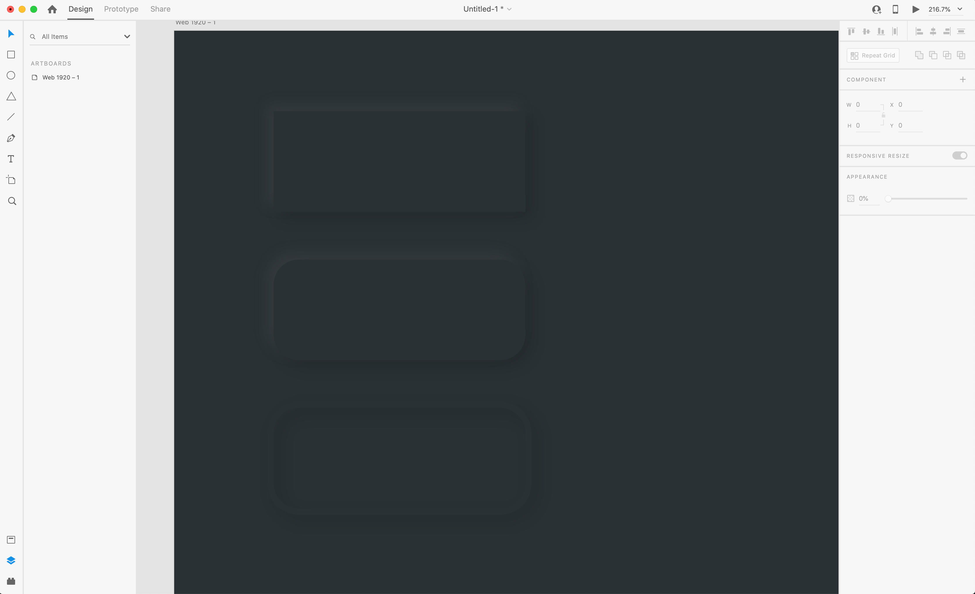
Looks pretty good already. The reason behind using an outside border rather than the standard or centered, is because the shadows will overlap one another if we do not use outside. So now that we have our shadow, copy and paste the bordered rectangle again, flip the shadow X and Y, and change the color to our highlight color, #717171.
看起来已经不错了。 使用外部边框而不是标准边框或居中边框的原因是,如果不使用外部边框,阴影将相互重叠。 现在我们有了阴影,再次复制并粘贴带边框的矩形,翻转阴影X和Y,然后将颜色更改为突出显示颜色#717171。

And there you have it! Experiment with different shapes and using borders around them to create interesting UI elements. Now, one last button type to show you!
在那里,您拥有了! 试用不同的形状,并使用它们周围的边框创建有趣的UI元素。 现在,最后一个按钮类型向您显示!
We can create a nice little round button with a simulated rounded top, rather than the flat raised top we are seeing on the buttons we already created. To get started, create a circle and apply the same “soft UI” effect we’ve been using on the other buttons.
我们可以创建一个带有模拟圆形顶部的漂亮的小圆形按钮,而不是在已经创建的按钮上看到的平顶顶部。 首先,创建一个圆圈并应用我们在其他按钮上一直使用的相同“软UI”效果。

Now to create our rounded top, it’s just as simple as applying a linear gradient. So, change the fill of the circle on the top to a linear gradient, and line it up with the direction of our other highlights and shadows.
现在创建圆形顶部,就像应用线性渐变一样简单。 因此,将顶部的圆填充更改为线性渐变,并将其与其他高光和阴影的方向对齐。
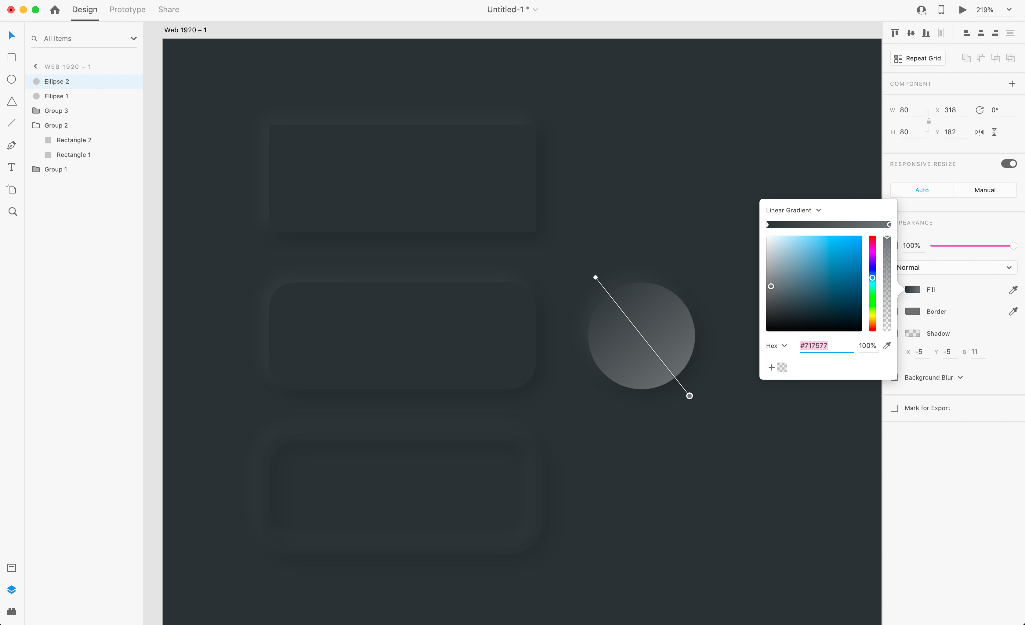
Now, change the colors of each side of the gradient. For the highlight side, use the color picker, and grab the color from the highlight we applied to the shadow, like I did below:
现在,更改渐变每一侧的颜色。 对于高光方面,请使用颜色选择器,然后像下面所做的那样从应用于阴影的高光中获取颜色:
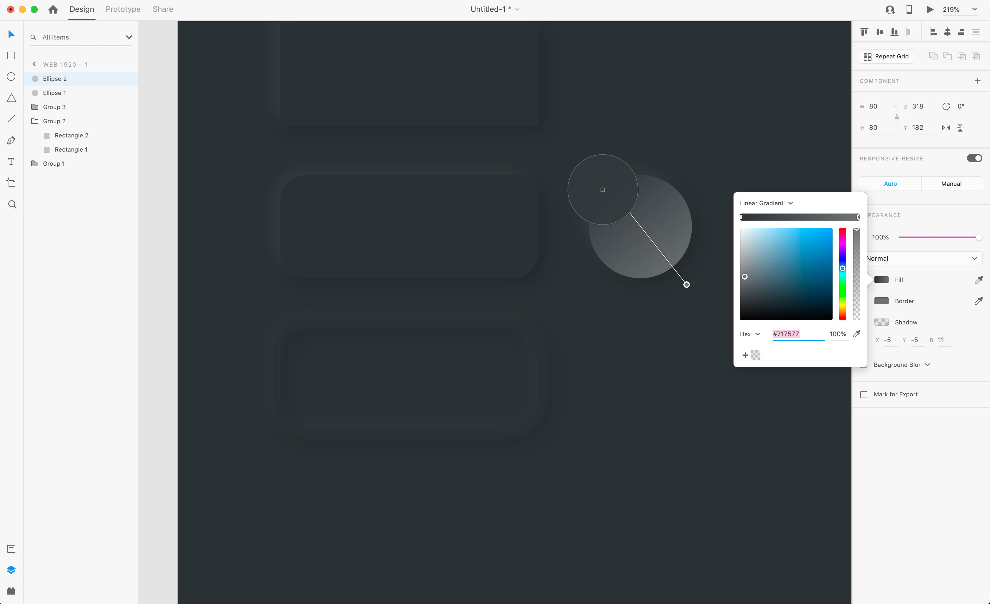
Then, do the same on the shadow side to get the final effect.
然后,在阴影侧执行相同操作以获得最终效果。
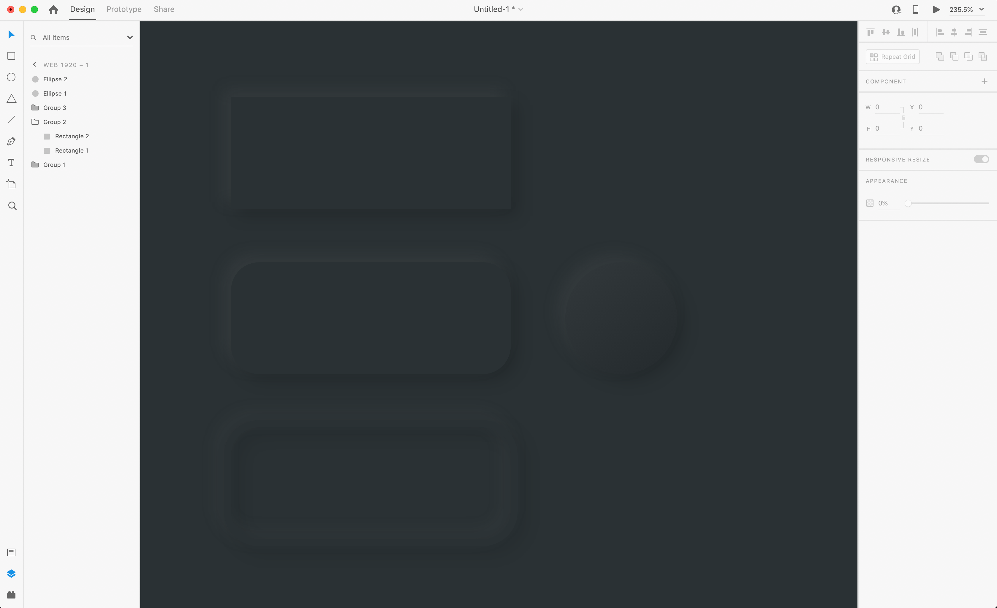
And that’s how you create a nice “soft UI” effect in Adobe XD with just a few simple steps! A word of caution though, try not to over use this effect in your UI and other designs, because it can really clutter things up. Play around with this effect and learn how to use, it’s getting popular already and clients may want to see it, and it’ll look great in your profile!
这就是您只需几个简单的步骤即可在Adobe XD中创建漂亮的“软UI”效果的方法! 请注意,不要在您的UI和其他设计中过度使用此效果,因为它确实会使事情变得混乱。 试一试这种效果并学习使用方法,它已经变得越来越流行,客户可能希望看到它,并且在您的个人资料中看起来很棒!

翻译自: https://uxdesign.cc/create-soft-ui-neumorphism-in-adobe-xd-bc08bb4cb79d
adobe xd


 3182
3182

 被折叠的 条评论
为什么被折叠?


