


ios 排版引擎
重点 (Top highlight)
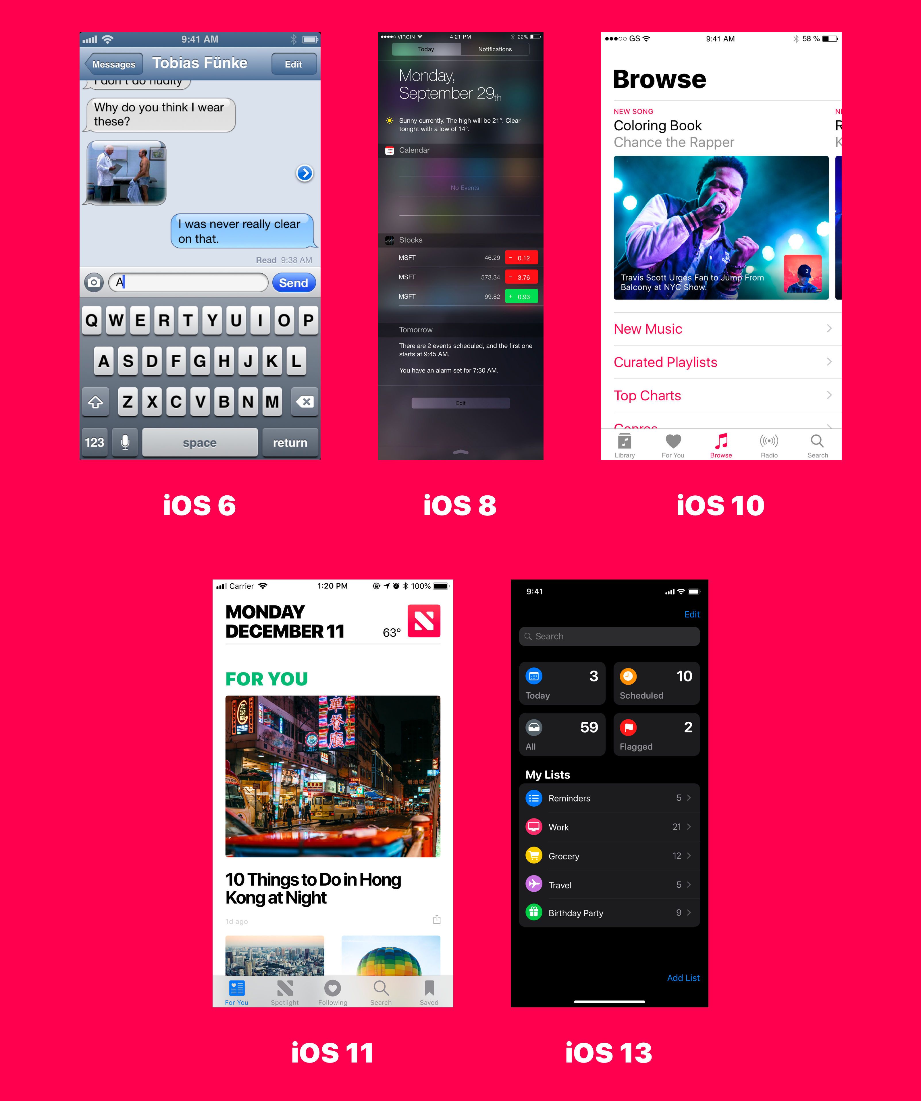
iOS has slowly gone back to its roots.
iOS已慢慢回归其根源。
We now see bold typography everywhere.
现在,我们到处都可以看到大胆的字体。
Titles are usually big and black.
标题通常既大又黑。
This only makes sense given the recent surge of larger devices such as the iPhone 11 and the iPad Pro.
考虑到最近诸如iPhone 11和iPad Pro等大型设备的大量涌现,这才有意义。
Another reason that we’re witnessing larger typefaces is accessibility. With billions of users tuning into their phones daily, designers are having to cater to masses of all ages.
我们看到较大字体的另一个原因是可访问性。 每天都有数十亿用户在使用手机,因此设计人员必须迎合各个年龄段的人群。
Accessibility empowers those with some form of visual disability to set large fonts for the apps that support it.
可访问性使具有某种形式的视觉障碍的人能够为支持它的应用设置大字体。
After the release of iOS 11, which is when iOS started transitioning to its roots, users have started expecting features like accessibility by default.
在iOS 11发行后(即iOS开始过渡到其根源)之后,默认情况下,用户开始期望诸如可访问性之类的功能。
排版基础 (Typography Basics)
Before diving into typography for iOS, it’s essential to learn the art and history of typography if you want to achieve the best results.
在进入iOS版式之前,如果您想获得最佳效果,那么必须学习版式的艺术和历史。
The reason for learning typography basics is that if you’re aware of the different elements that affect your typeface and something doesn’t look right, you’ll know exactly what might be causing the issue.
学习印刷术基础知识的原因是,如果您知道影响字体的不同元素,并且看起来有些不正确,那么您将确切地知道可能是造成此问题的原因。
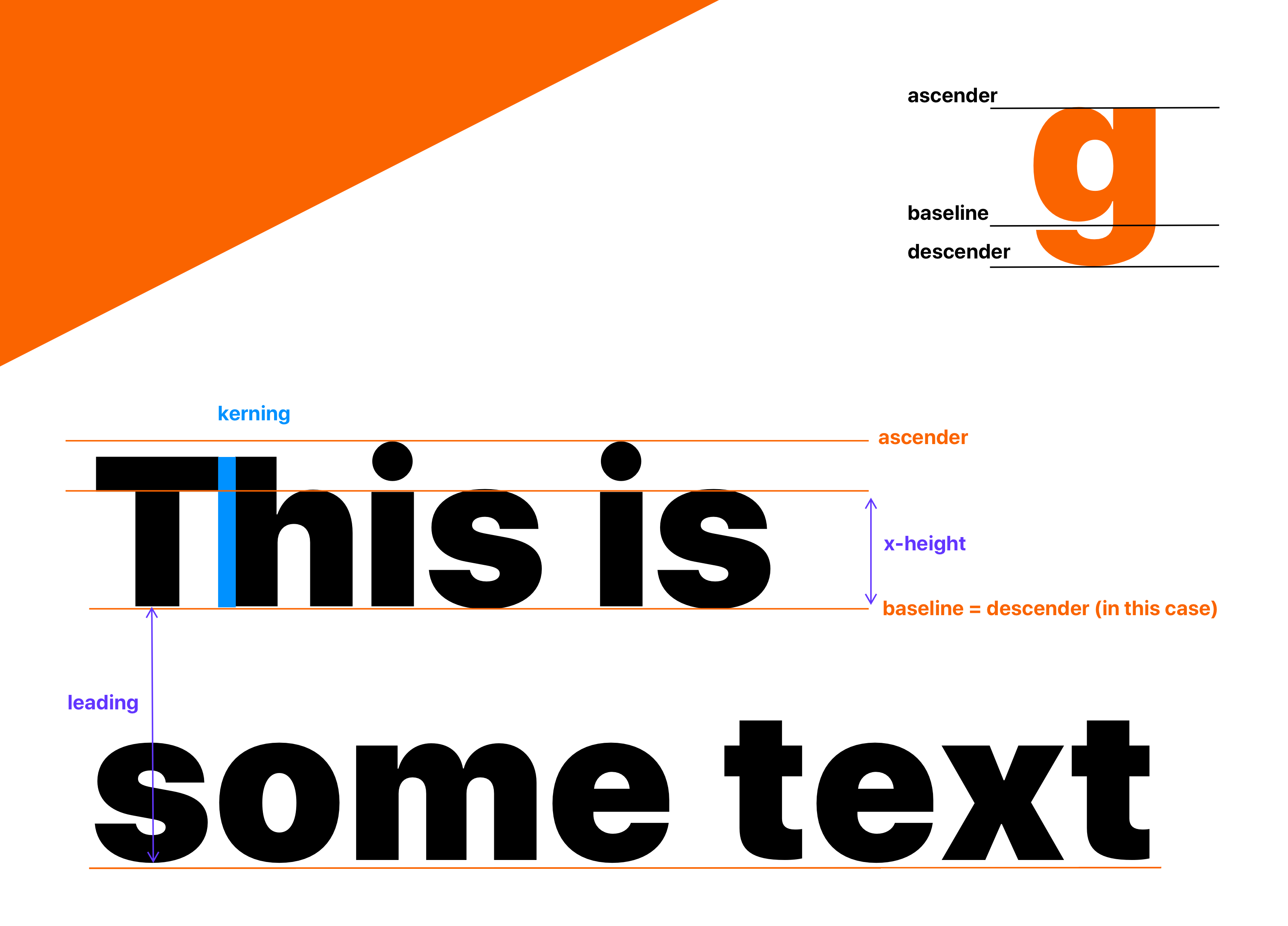
Designers should be familiar with the terms highlighted above. Here’s a great resource by freeCodeCamp if you want to learn more about the anatomy of letterforms.
设计人员应熟悉上面突出显示的术语。 如果您想了解有关字母形式的更多信息,这是freeCodeCamp的重要资源 。
“Type is a beautiful group of letters, not a group of beautiful letters.”
“ Type是一组漂亮的字母,而不是一组漂亮的字母。”
— Matthew Carter
—马修·卡特(Matthew Carter)
提示1:知道何时使用Sans和Serif (Tip #1: Know when to use Sans and Serif)
A Serif typeface is one that has the small projecting featured, called “serifs,” at the end of strokes.
衬线字体是在笔画结束时具有小的突出特征的字体,称为“ serifs”。
A Sans typeface, on the other hand, doesn’t have the “serifs,” hence the term preceding it, “sans.” By the way, in French, “sans” translates to “without.”
另一方面, Sans字体没有“ serif”,因此其前面的术语为“ sans”。 顺便说一句,在法语中,“ sans”翻译为“ without”。
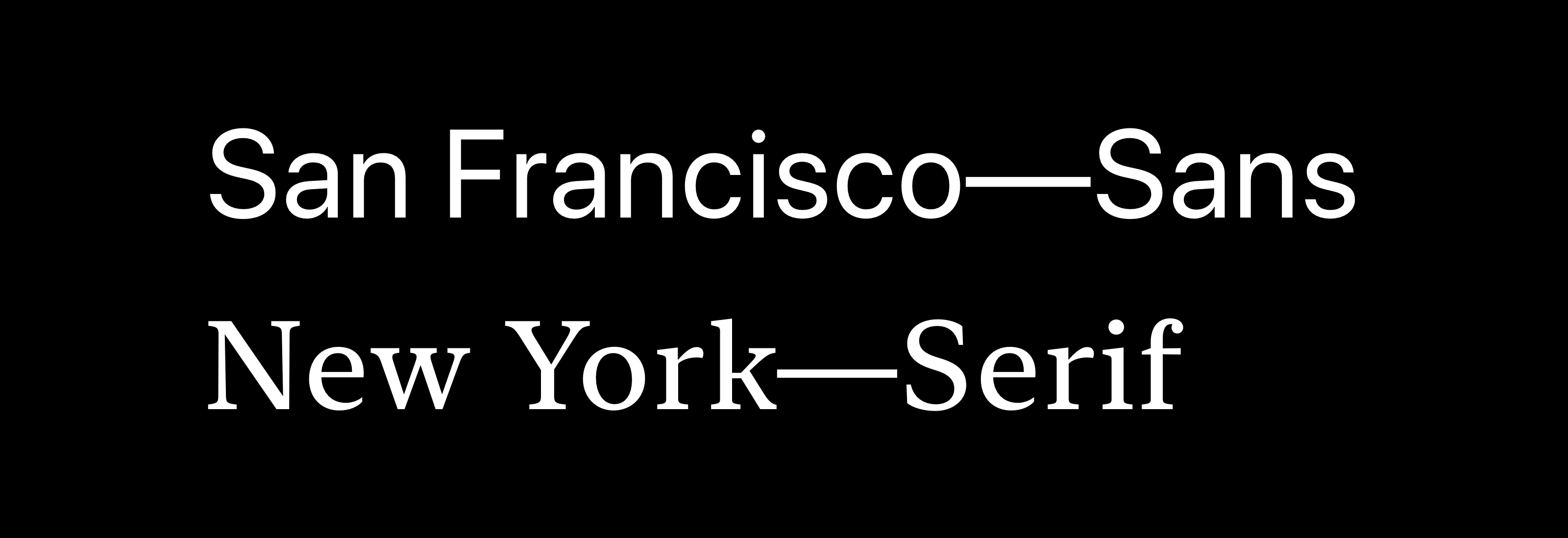
The Sans typefaces, which are the more popular option nowadays, are more neutral and utilitarian. You’ll notice a lot of modern apps using these typefaces.
Sans字体是当今最受欢迎的字体,它更加中性和实用。 您会注意到许多使用这些字体的现代应用程序。
The downside of Sans fonts is that they’re more generic, so it doesn’t allow your designs to stand out much. Also, since there are millions of Sans fonts out there, you need to pick carefully.
Sans字体的缺点是它们比较通用,因此不能使您的设计脱颖而出。 另外,由于那里有数百万种Sans字体,因此需要仔细选择。
The Serif typefaces are generally used in apps and websites that encourage storytelling like Medium and The New York Times since they offer a lot of charm.
Serif字体通常用于鼓励讲故事的应用程序和网站,例如Medium和The New York Times,因为它们具有很多魅力。
I feel that it’s crucial to go back to our roots when it comes to design. This is why I encourage others to adopt Serif for apps and websites intended for heavy reading.
我认为,在设计时,必须扎根我们的根基。 这就是为什么我鼓励其他人为需要大量阅读的应用和网站采用Serif的原因。
提示2:在考虑可读性的前提下进行调整 (Tip #2: Align with readability in mind)
There are different ways to enforce structure since elements are properly aligned only when they feel aligned to the designer.
有不同的方式来实施的结构,因为只有当他们觉得对齐设计元素都正确对齐。
Typically, you should align the text to match the direction of the language that you’re using for your content.
通常,您应该使文本对齐以匹配内容所用语言的方向。
As a result, for most languages including English, you should align the vast majority of your text to the left.
因此,对于包括英语在内的大多数语言,您应该将绝大多数文本向左对齐。
When in doubt, align left.
如有疑问,请向左对齐。
When the text is aligned to the left, especially on mobile devices, it also creates a straight left edge.
当文本向左对齐时(尤其是在移动设备上),它还会创建一个笔直的左边缘。
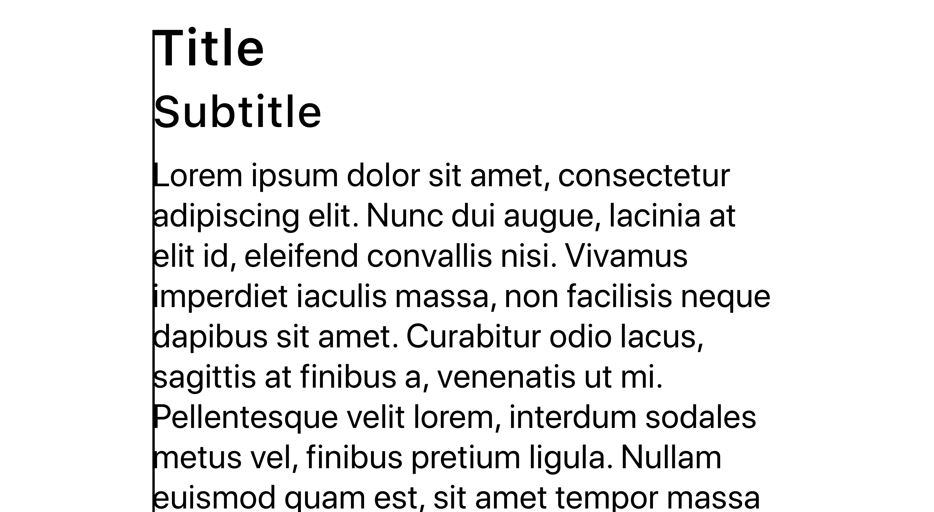
This gives your design a better structure and enables readers to scan each line by simply shifting focus to the left edge.
这样可以为您的设计提供更好的结构,并使读者只需将焦点移到左边缘即可扫描每条线。
It’s also easily scannable since the reader’s eyes don’t need to find the starting point of each line.
由于读者的眼睛不需要找到每一行的起点,因此它也很容易被扫描。
When the lines are spaced too tightly, it’s easy for readers to finish reading a line and jump back to the left edge, only to be unsure which line comes next.
当行之间的间距太紧时,读者很容易完成读取一行并跳回到左边缘的过程,只是不确定下一行是哪一行。
This is when other alignment options can home handy. For instance, you can center-align headlines or short, independent blocks of text.
这是其他对齐选项可以方便使用的时候。 例如,您可以将标题或短而独立的文本块居中对齐。
If something is longer than three or four lines, it’ll almost always look better when aligned to the left.
如果某行长于三或四行,则在向左对齐时几乎总是看起来更好。
提示3:选择权重很大的字体 (Tip #3: Pick fonts that have a lot of weights)
Generally, a minimum of three to four font-weights would constitute a typeface.
通常,至少三到四个字体粗细会构成一个字体。
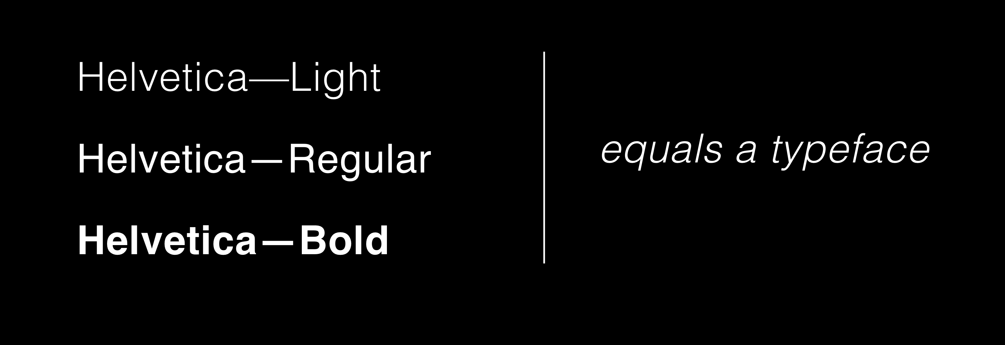
But, it’s usually a good idea to pick fonts that have more than five to seven weights.
但是,通常最好选择重量超过五到七个的字体。
While this isn’t always true, the number of font-weights associated with a particular font can often indicate the level of care and effort designers spent on curating the typeface.
尽管并非总是如此,但与特定字体相关联的字体粗细数量通常可以指示设计者在整理字体时所花费的精力和精力。
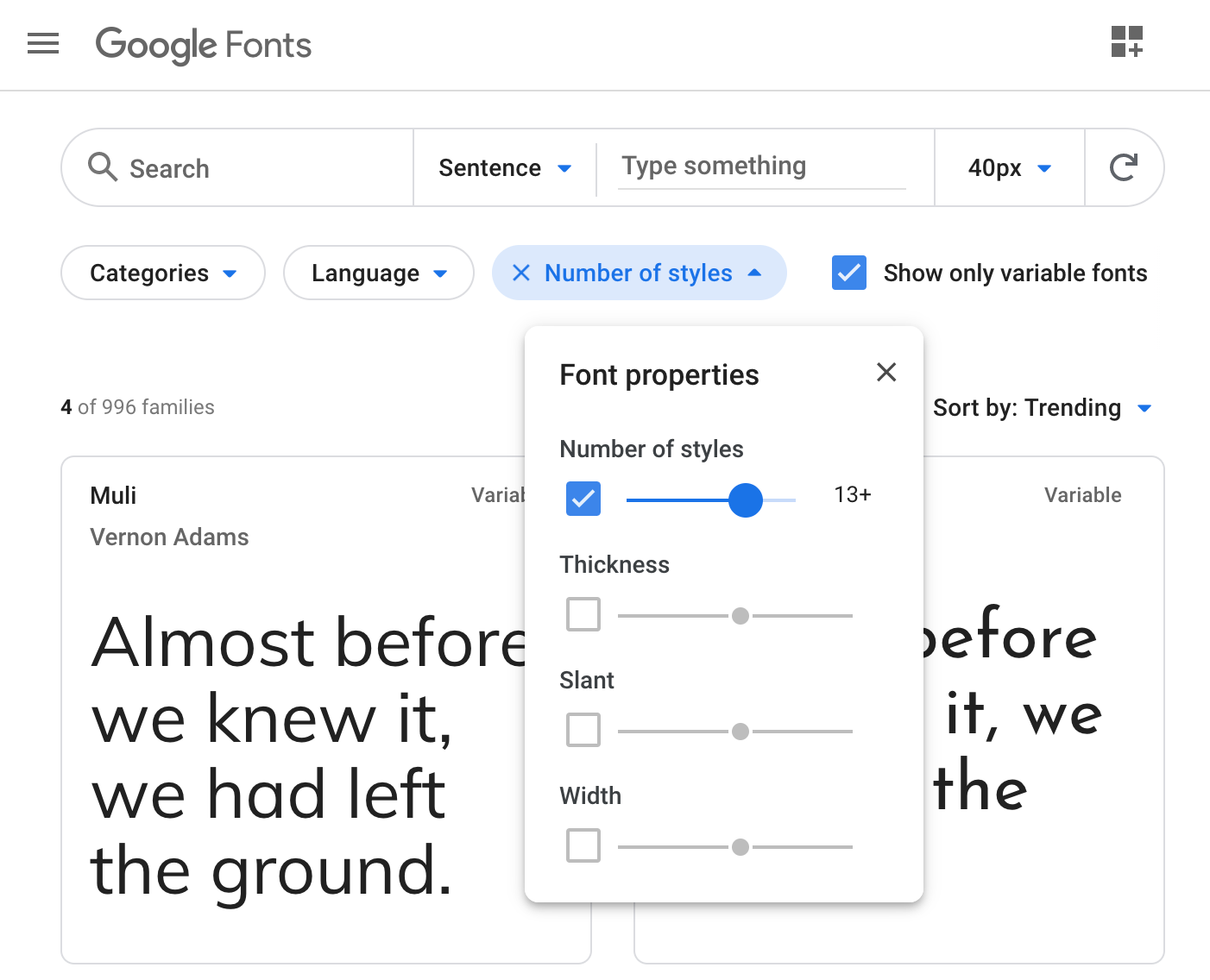
Font directories such as Google Fonts let you filter by the number of styles, which is a combination of the available weights and their italic variations.
字体目录(例如Google字体)可让您按样式数进行过滤,样式数是可用粗细及其斜体变体的组合。
A great way to drill down your options is to crank up the filter to 10+ (since you need to account for italics).
向下钻取选项的一种好方法是将过滤器提高到10+ (因为您需要考虑斜体)。
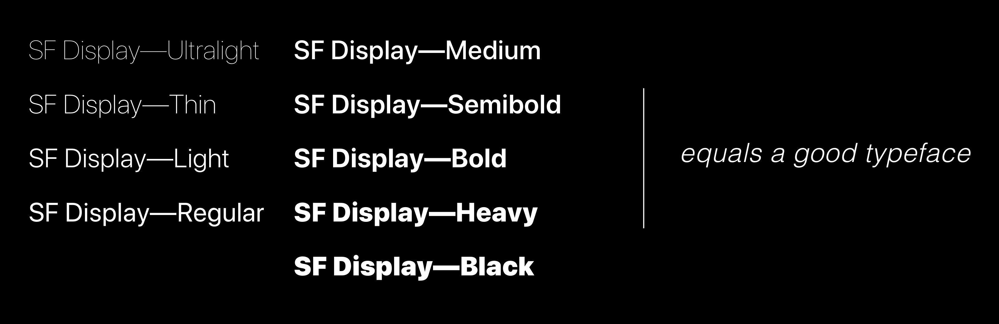
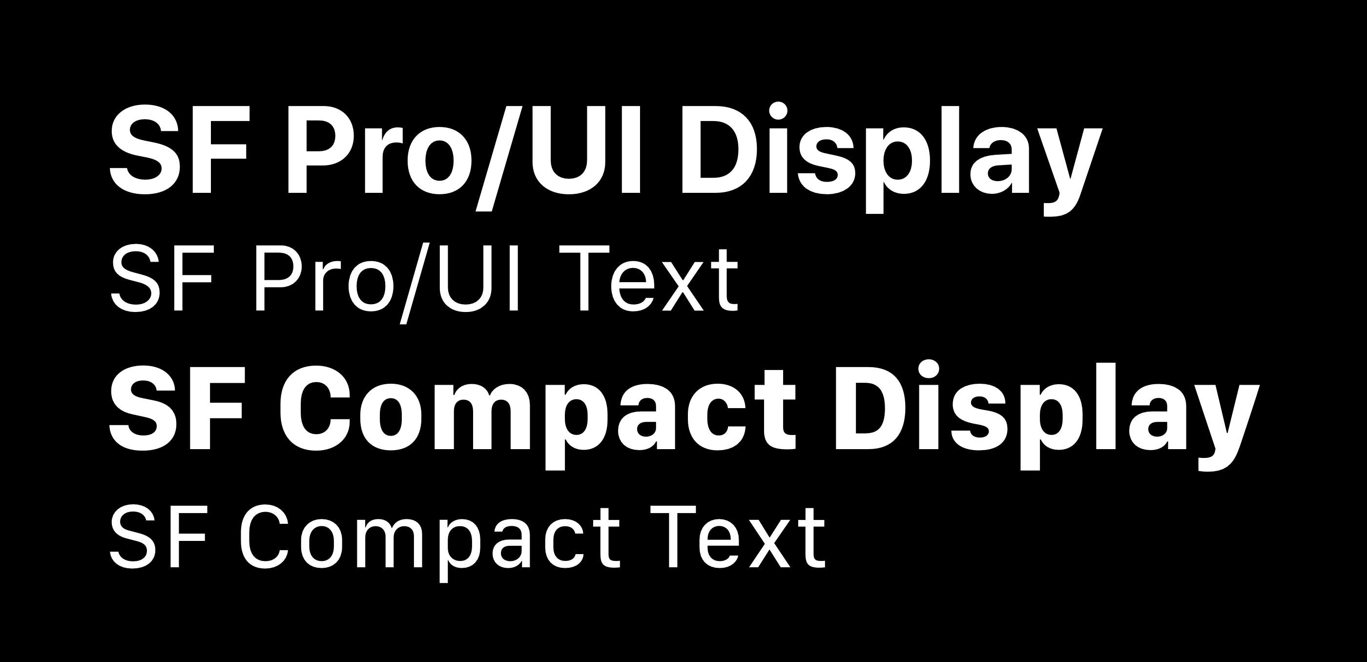
In addition to the usual suspects — Regular and Bold — modern fonts like SF have extra font weights. For instance, SF Display is packed with Ultralight, Thin, Light, Medium, Semibold, Heavy, and Black.
除了常见的可疑字符( 常规和粗体)外 ,像SF这样的现代字体也具有额外的字体粗细。 例如,SF Display装有Ultralight , Thin , Light , Medium , Semibold , Heavy和Black 。
When thinking in terms of iOS design, here are some general guidelines:
考虑iOS设计时,以下是一些一般准则:
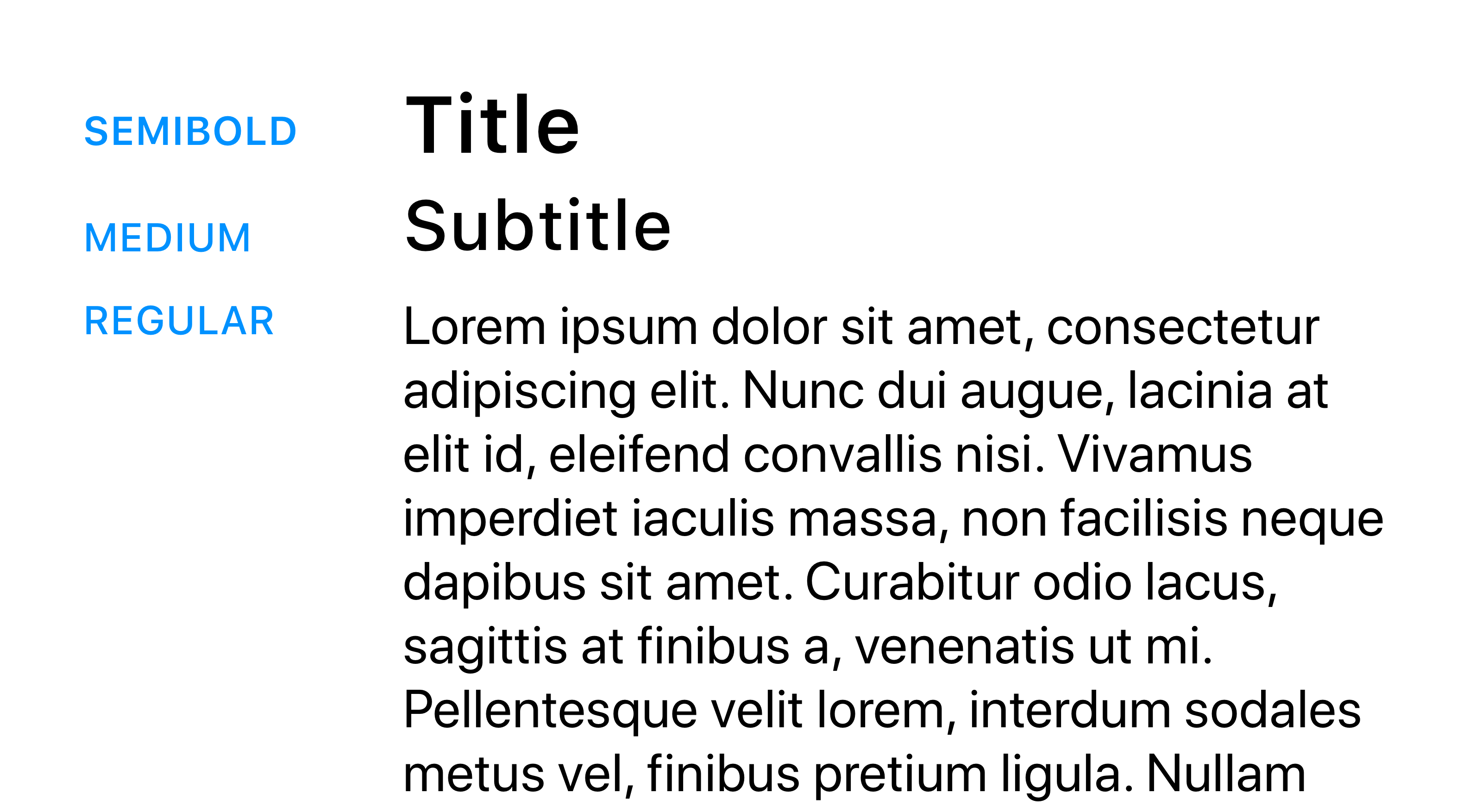
11–19pt: SF Pro/UI Text (Regular)
11–19pt : SF Pro / UI文本(常规)
20–34pt: SF Pro/UI Display (Medium)
20–34pt : SF Pro / UI显示(中)
34pt or more: SF Pro/UI Display (Bold)
34pt以上 : SF Pro / UI显示(粗体)
You’re also free to use lighter weights such as Ultralight or Thin but only do so if you’re pretty comfortable with typography. It’s usually best to stick to the guidelines.
您还可以自由使用较轻的重量,例如Ultralight或Thin,但只有在您对排版感到非常满意的情况下才可以使用。 通常最好遵循准则。
When in doubt, however, incrementally skip a weight to re-enforce proper structure.
但是,如果有疑问,请逐渐跳过重物以加强适当的结构。
提示4:选择具有较宽字母间距的正文字体 (Tip #4: Pick body fonts that have a wide letter-spacing)
Usually, the fonts in the body have greater letter-spacing since they’re much smaller than the titles and need to be clean and comfortable to scan.
通常,正文中的字体具有更大的字母间距,因为它们比标题小得多,并且需要干净舒适地进行扫描。
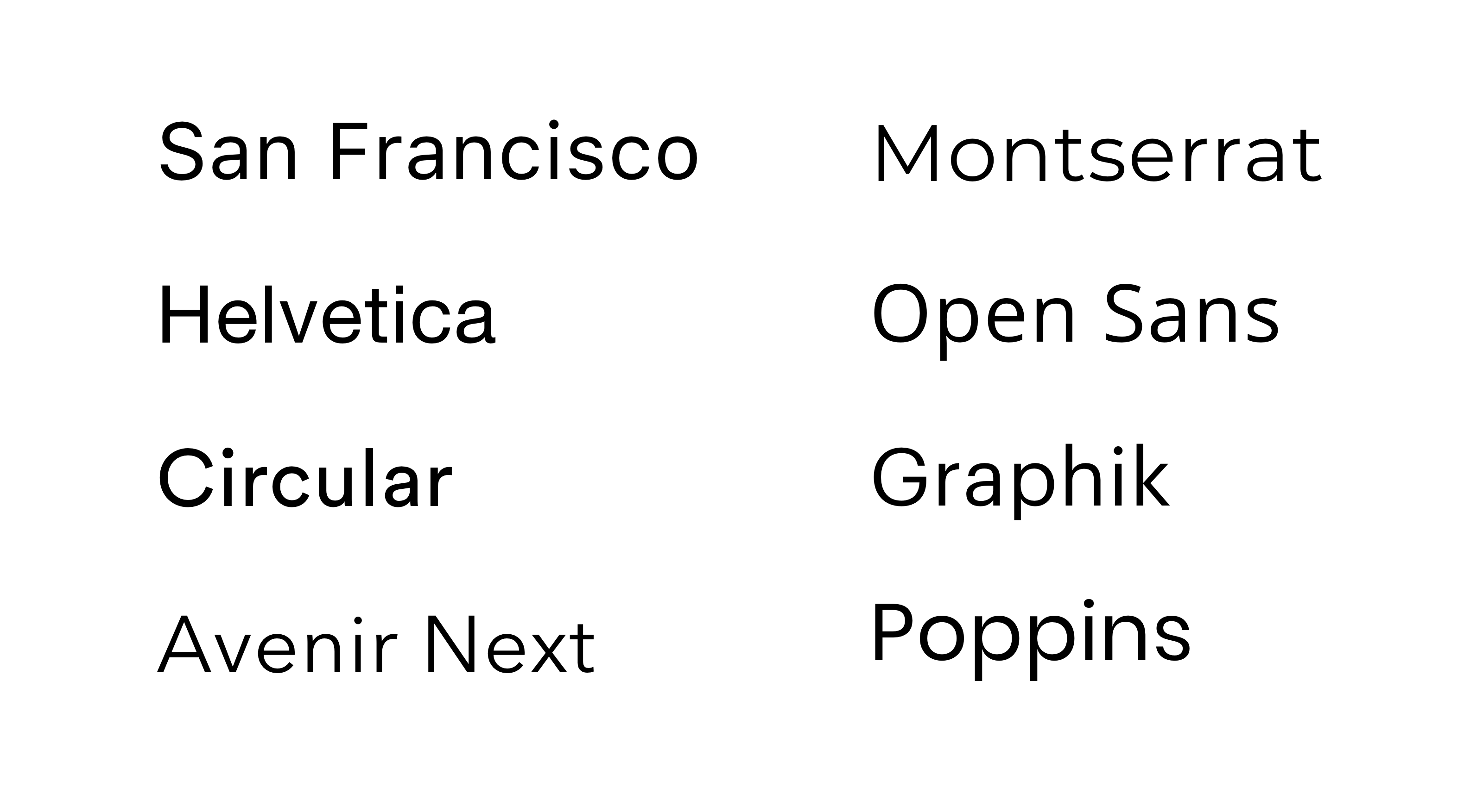
As a result, options like San Francisco, Helvetica Neue, Open Sans, Graphik, Montserrat, Circular, and Avenir Next are some of my favorites.
因此,诸如San Francisco , Helvetica Neue , Open Sans , Graphik , Montserrat , Circular和Avenir Next之类的选项是我的最爱。
Most of these are available for free on Google Fonts. Proxima Nova is another great option that’s available for free on Typekit (with a Creative Cloud account).
其中大多数都可以在Google字体上免费获得。 Proxima Nova是另一个很棒的选择,可以在Typekit (带有Creative Cloud帐户)上免费使用。
The interface below uses Poppins.
下面的界面使用Poppins 。
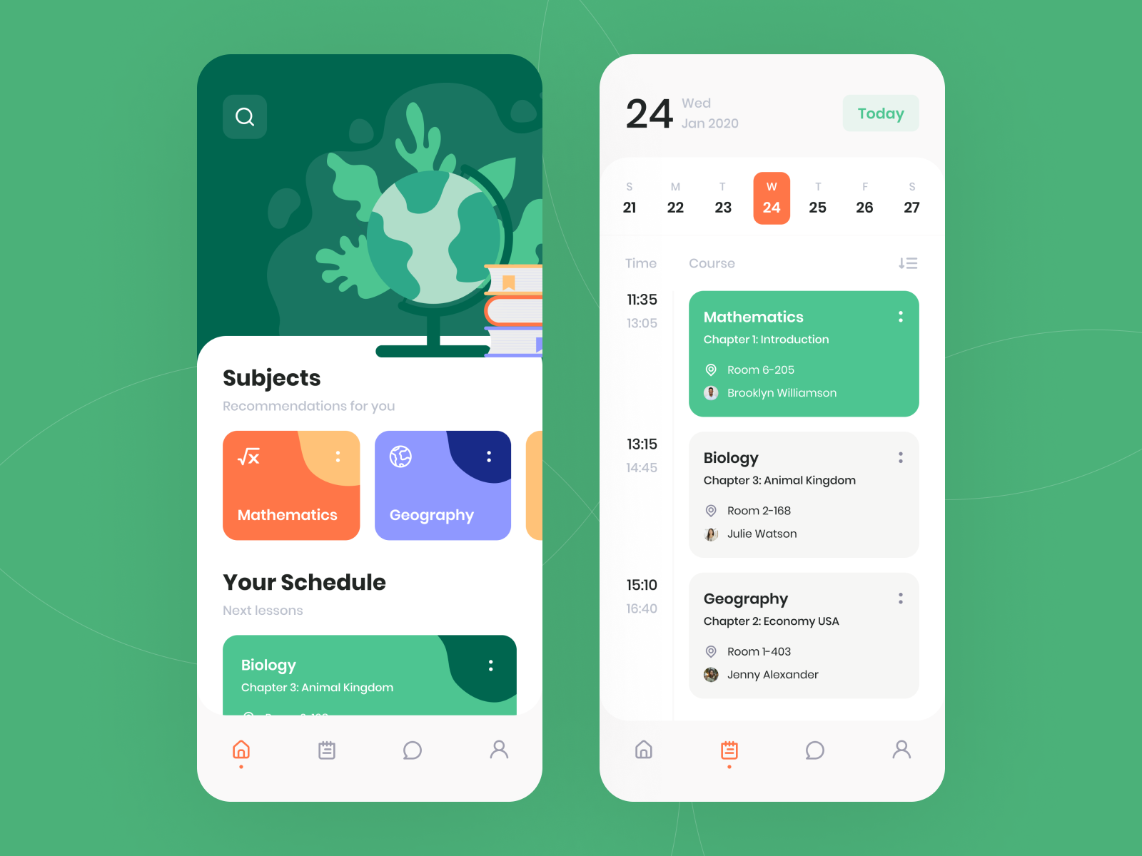
Artists design a font family with an intended purpose. A family such as Poppins has been designed to be notably legible, even at small sizes.
艺术家设计具有预期目的的字体系列。 Poppins之类的产品家族即使在体积很小的情况下,也易于辨认。
We should keep this in mind when picking fonts for our apps. Apple surely does.
在为我们的应用选择字体时,我们应该牢记这一点。 苹果肯定会。
SF Pro/UI Display has tight letter-spacing as opposed to SF Pro/UI Text, which has a wide letter-spacing. iOS automatically adjusts the tracking value and renders Display or Text depending on the font size to ensure the best possible reading experience.
SF Pro / UI Display具有较紧的字母间距,而SF Pro / UI Text具有较宽的字母间距。 iOS会根据字体大小自动调整跟踪值并呈现“ 显示”或“ 文本 ”,以确保最佳的阅读体验。
Here’s an exercise for you. Can you guess which fonts Apple uses for the body and the header texts?
这是给你的练习。 您能猜出Apple用于正文和标题文本的字体吗?
We’ll take a look at that in the next section.
我们将在下一部分中对此进行研究。
提示5:iPhone,Ipad和Apple Watch的字体大小至少应为11pt (Tip #5: The font size should be at least 11pt for the iPhone, Ipad, and Apple Watch)
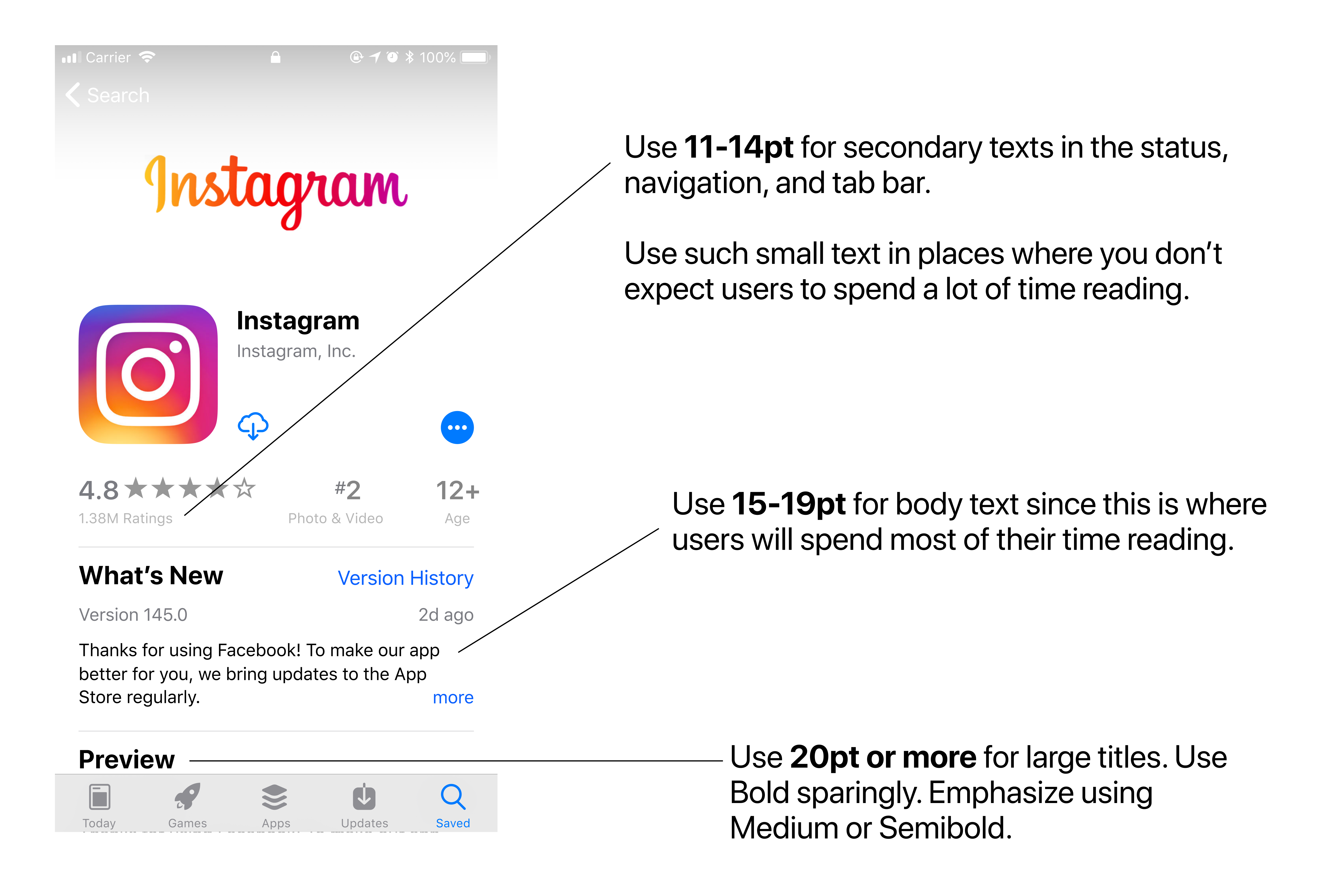
Although the font size should be a minimum of 11pt, the recommended size for the body text is 15–19pt.
尽管字体大小至少应为11pt ,但正文的建议大小为15–19pt 。
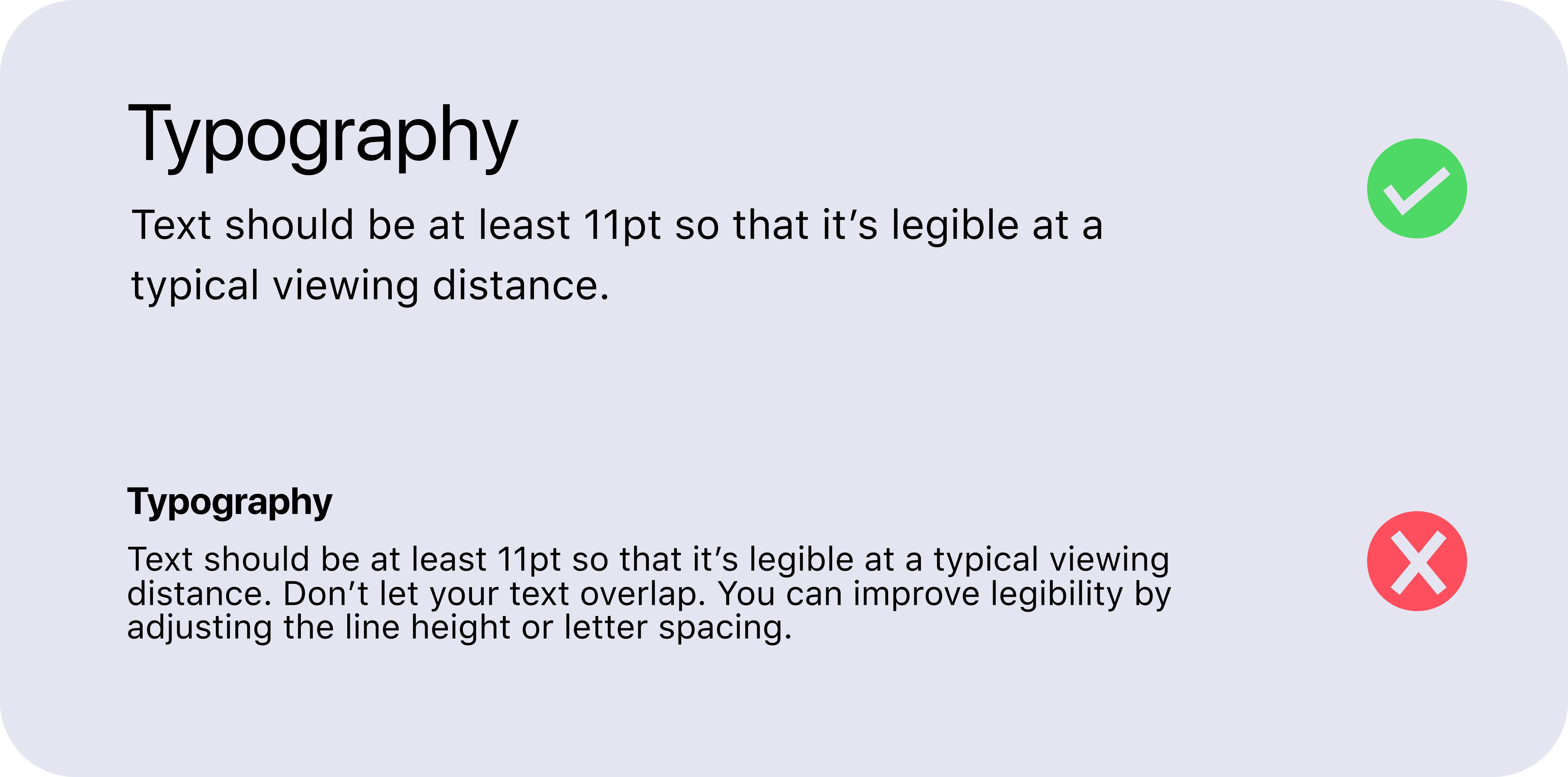
Make sure that your text doesn’t go under 10pt since a lot of users might find the content unreadable.
确保您的文字不低于10pt,因为许多用户可能会觉得内容不可读。
If you’re using the San Francisco typeface, iOS will automatically adjust the tracking value and render Display or Text depending on the font size. Apple does this to ensure that the text is always easy to process.
如果您使用的是San Francisco字体,iOS将自动调整跟踪值并根据字体大小呈现“ 显示”或“ 文本” 。 Apple这样做是为了确保文本始终易于处理。
If your font size is at least 20pt, you should use the SF Pro/UI Display typeface. Otherwise, you should use the SF Pro/UI Text typeface.
如果字体大小至少为20pt ,则应使用SF Pro / UI Display字体。 否则,您应该使用SF Pro / UI文本字体 。
Currently, you can only apply these values in Photoshop, but here’s a great Sketch plugin to quickly apply the correct values. This plugin will adjust the character spacing on text layers using the SF UI Text/Display fonts to what it would be when used in the actual app.
目前,您只能在Photoshop中应用这些值,但是这里有一个很棒的Sketch插件,可以快速应用正确的值。 此插件将使用SF UI文本/显示字体将文本层上的字符间距调整为在实际应用中使用时的字符间距。
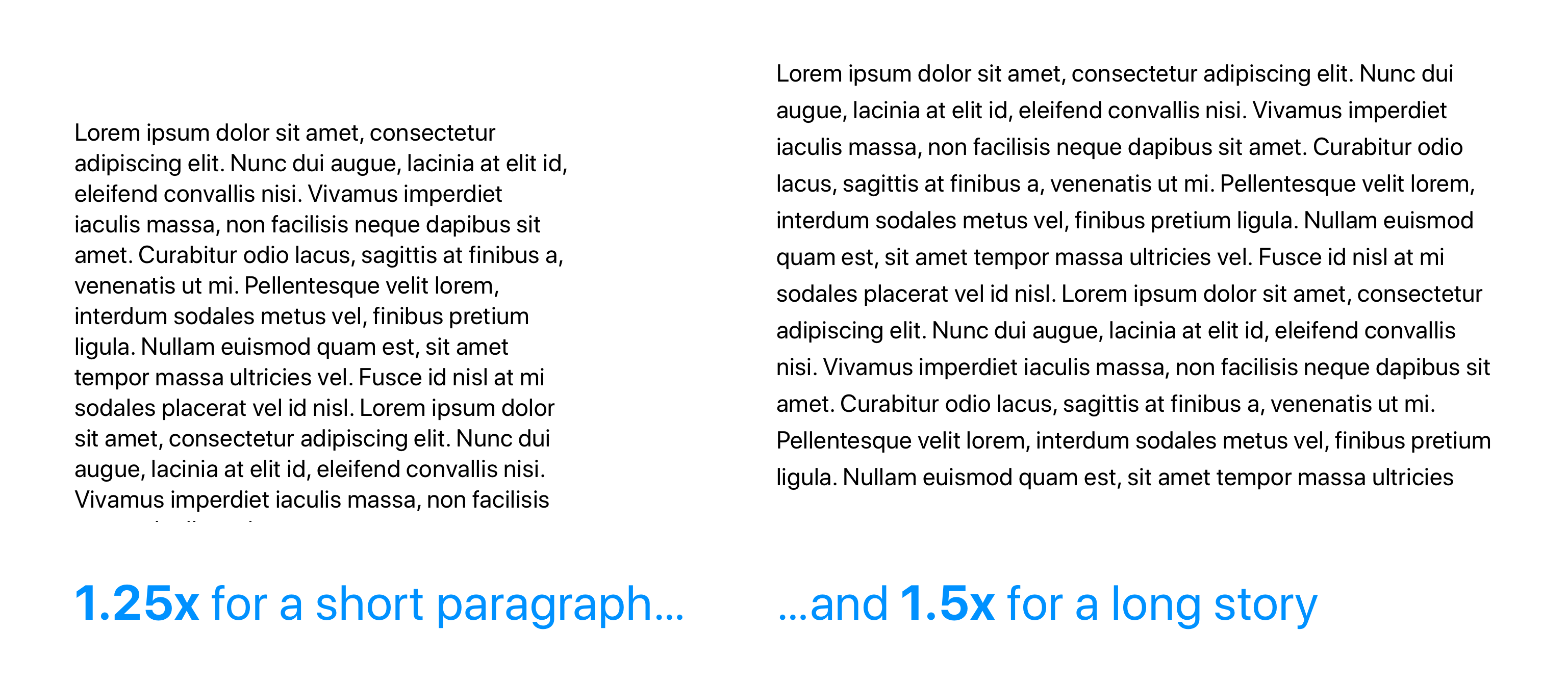
提示6:注意行高 (Tip #6: Pay attention to the line-height)
Have you ever accidentally read the same line of text twice, or accidentally skipped a line?
您是否曾经不小心阅读同一行文本两次,还是不小心跳过了一行?
The line-height plays an important role in that it makes it easy for the reader to find the next line when the text wraps.
行高起着重要的作用,因为它使读者在文本换行时可以轻松找到下一行。
If the line-height is either too little or too much, the reader won’t be able to quickly jump to the next line while retaining context.
如果行高过小或过高,读者将无法在保留上下文的情况下快速跳至下一行。
The line-height should typically lie between 120% and 145% of the font size. However, this is still a little generic and not a one size fits all solution.
行高通常应在字体大小的 120%到145%之间。 但是,这仍然有点通用,并且不是一个适合所有解决方案的尺寸。
It’s usually best to have a line-height of 125% for a short paragraph and 150% for a long story.
通常最好将行高设置为 短款的125% 和 长话大说150% 。
Choosing the “right” line-height is a complicated task and warrants a separate discussion. It’s more than just picking one value that works across the board.
选择“正确”的行高是一项复杂的任务,需要进行单独的讨论。 这不仅仅是选择一个全面适用的价值。
In general, think about increasing the number of words by 10x, and gauge how frustrating it could potentially get for users to read the text. Then, adjust the line-height accordingly.
通常,请考虑将单词数量增加10倍 ,并评估用户阅读文本可能带来的挫败感。 然后,相应地调整行高。
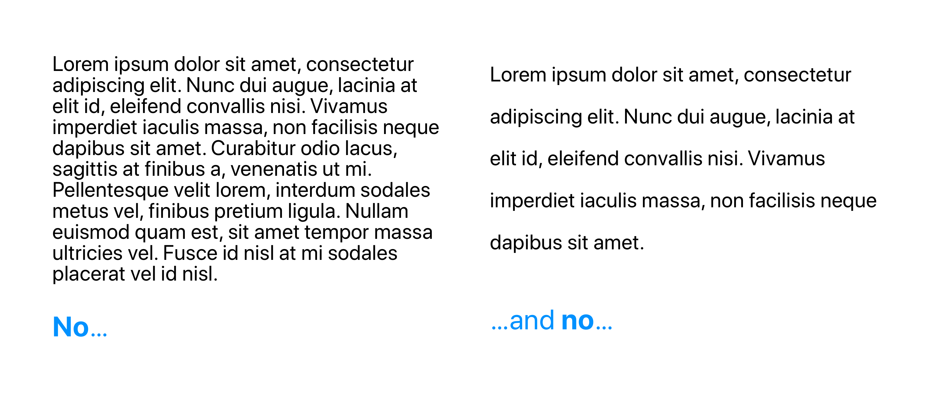
提示7:每行40至70个字符 (Tip #7: Use between 40 and 70 characters per line)
When you’re styling paragraphs, you might occasionally make the mistake of fitting the text to your layout. This can go against creating the best reading experience.
在设置段落样式时,有时可能会犯一些错误,使文本适合您的布局。 这可能与创造最佳阅读体验背道而驰。
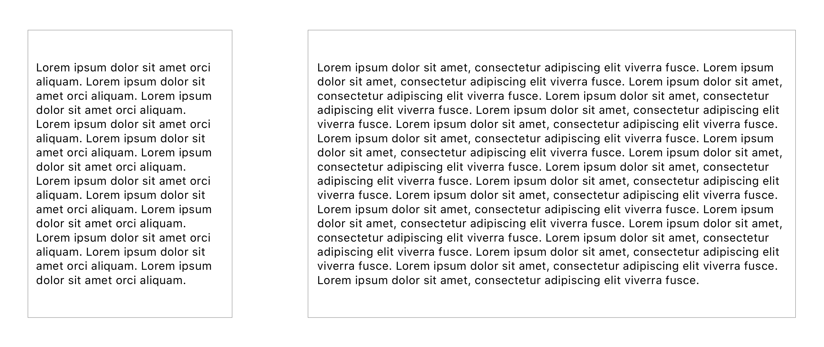
When your text is too wide, readers can have trouble focusing. An overwhelming amount of text per line distracts the user and doesn’t get the message across.
如果文字太宽,读者可能会难以集中精力。 每行大量的文本分散了用户的注意力,并且无法传达信息。
For better readability, it’s recommended that you have between 40 and 70 characters per line. This makes the jump to a new line more exciting and can even effectively immerse the user in your content.
为了提高可读性,建议每行 40至70个 字符 。 这使跳转到新的一行更加令人兴奋,甚至可以有效地使用户沉浸在您的内容中。
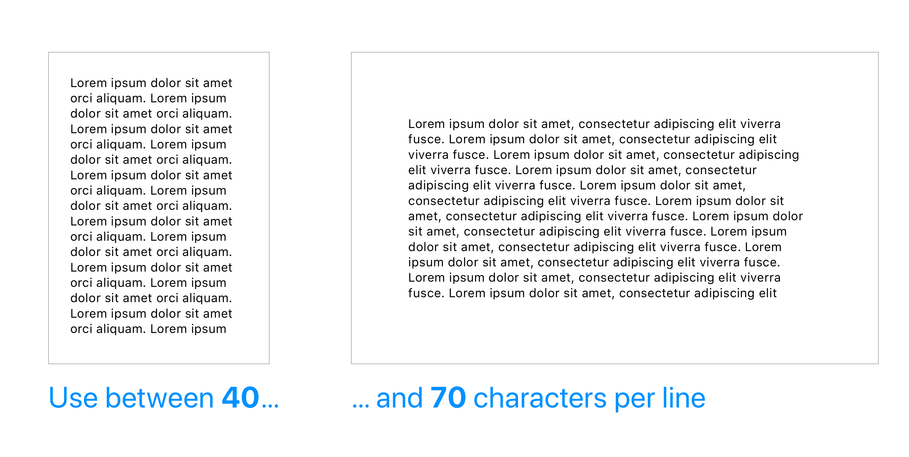
Going wider could work, so do it at your own risk. Stick to the 40–70 range if you want to play it safe.
扩大范围可能会奏效,因此后果自负。 如果要安全播放,请坚持40-70的范围。
The text content will generally make up the majority of your design, which is why designers spend a lot of their time focusing on readability first. Unless you’re a typography aficionado, you’ll want something clean and simple at first, something that’s not necessarily original.
吨他的文字内容通常会弥补你的大部分设计,这就是为什么设计人员花费了大量的时间专注于可读性首。 除非您是印刷爱好者,否则一开始您会想要干净整洁的东西,而这些东西不一定是原创的。
Good typography makes us want to read, so it’s best to focus on its utility.
好的排版使我们想阅读,因此最好将重点放在其实用性上。
Apple recommends San Francisco as the latest default font since they designed it for legibility. If you have the latest version of iOS installed, you’ll notice San Francisco in all your built-in apps.
Apple推荐San Francisco作为最新的默认字体,因为它们是为便于阅读而设计的。 如果您安装了最新版本的iOS,则会在所有内置应用程序中看到San Francisco。
If you want to learn more about how the San Francisco typeface affects the iOS design landscape, check out this video.
如果您想了解有关San Francisco字体如何影响iOS设计环境的更多信息,请观看此视频 。
Once you start to pay close attention to the typography on well-designed products, it won’t be long before you’ll feel comfortable utilizing different typefaces in creative ways!
一旦您开始密切关注精心设计的产品的字体,不久之后您便会以创意方式使用不同的字体而感到自在!
翻译自: https://uxdesign.cc/a-five-minute-guide-to-better-typography-for-ios-4e3c2715ceb4
ios 排版引擎


 扫一扫
扫一扫


 1231
1231

 被折叠的 条评论
为什么被折叠?
被折叠的 条评论
为什么被折叠?
 到【灌水乐园】发言


