插画软件
重点 (Top highlight)
Colour is one of the most powerful elements in visual storytelling. It influences advertisements, storytelling, illustrations, and all other aspects of visual communication.
颜色是视觉叙事中最强大的元素之一。 它会影响广告,讲故事,插图以及视觉传达的所有其他方面。
It’s a fact that the way we perceive colours, is based on our cultural code, society, knowledge, and the environment we grew up in. Colour itself is just an action and an interaction registered in our minds.
事实是,我们对颜色的感知基于我们的文化规范,社会,知识和我们所处的环境。颜色本身只是一种行为和一种交互作用,已在我们的脑海中记录下来。
色彩的力量 (The power of colour)
We associate the colour red with danger, green with peace and nature, blue with medicine, and black depicts darkness. The story doesn’t end with these basic connections and meanings though; there is still a lot more to think about.
我们将红色与危险相关联,将绿色与和平与自然相关联,将蓝色与医学相关联,而黑色则代表了黑暗。 故事并没有以这些基本的联系和意义结尾。 还有更多的事情要考虑。
When choosing the colours for your brand, the ones that will represent you, your business, and the message you want to send, it is important to make the right choices. Get it wrong, and you might deliver a message that is inconsistent with your intentions.
在为您的品牌选择颜色时,代表您,您的业务和您要发送的信息的颜色,正确选择至关重要。 弄错了,您可能会传达与您的意图不符的信息。
For illustrators and product designers, it is important to know what the challenges are, to enable you to achieve the best results and effectively communicate your message to your audience.
对于插画家和产品设计师来说,了解挑战是很重要的,以使您能够获得最佳效果并有效地将信息传达给听众。

个人经历和文化规范 (Personal experiences and cultural code)
Colours have a variety of references in Western culture. Members of different cultural groups will interpret them in their own — and sometimes even opposite — way. Colours are essentially disorganised and non-universal semantic codes.
颜色在西方文化中有多种参考。 不同文化群体的成员将以自己的方式(有时甚至相反)来解释它们。 颜色本质上是杂乱无章且不通用的语义代码。
It is important to appreciate how the meaning of colours can vary in different cultures and for different potential audiences. Doing so helps you to understand the potential recipient, and avoid mistakes when picking up the colour palette. Finally, it helps your images convey the right message.
重要的是要理解颜色的含义在不同的文化中以及对于不同的潜在受众如何变化。 这样做可以帮助您了解潜在的接收者,并避免拾起调色板时出错。 最后,它可以帮助您的图像传达正确的信息。
Remember everyone sees colours in their own unique way. Just think about the colour red. You imagine it with a particular hue and intensity — this is a reflection of your life experience. Your basic red may be darker and more saturated than my basic red. We don’t all see it the same way. The client’s niche may be associated with medicine, but at the same time, they may be bored with blue.
记住每个人都以自己独特的方式看到颜色。 只要考虑一下红色。 您可以想象它具有特定的色调和强度-这是您生活经历的反映。 您的基本红色可能比我的基本红色更暗且更饱和。 我们并非以相同的方式看待它。 服务对象的利基可能与药物有关,但与此同时,他们可能对蓝色感到无聊。
Find the best solution and consider not only cultural code, but also the client’s personal experiences.
找到最佳解决方案,不仅要考虑文化准则,还要考虑客户的个人经历。

You might like or dislike some combinations, and have a different opinion about single colours. If you are an illustrator, you probably have your favourite palette, your own preferences followed by aversions. Your client, even if they are not an artist, also has a favourite palette and has personal feelings about it. Try to figure out what they like, and mix it up with cultural code and the specifics of the product. That’s the recipe for creating a perfect colour palette for the project.
您可能喜欢或不喜欢某些组合,并对单色有不同的看法。 如果您是插画家,那么您可能拥有自己喜欢的调色板,您自己的喜好以及厌恶感。 您的客户,即使他们不是艺术家,也有自己喜欢的调色板,并对它有个人感觉。 尝试弄清他们喜欢什么,然后将其与文化规范和产品详细信息混在一起。 这就是为项目创建完美调色板的秘诀。
亮面或暗面 (Light side or dark side)
A white or light background seems to be a safer choice than a dark one, whereas dark colours are usually associated with professionalism and technology. A bright background works well with areas like pharmaceuticals, medicine, and education — it makes us feel safe. Dark background colours are suitable when we have subjects like antivirus and security software in mind. Black also portrays leadership and authority. It’s tricky!
白色或浅色背景似乎比深色背景更安全,而深色通常与专业技术相关。 明亮的背景可以在制药,医学和教育等领域使用,这使我们感到安全。 当我们考虑到防病毒和安全软件等主题时,适合使用深色背景色。 布莱克还描绘了领导力和权威。 这很棘手!
Keep your eyes open and make your decisions wisely.
睁大眼睛,明智地做出决定。
蓝色 (Blue)
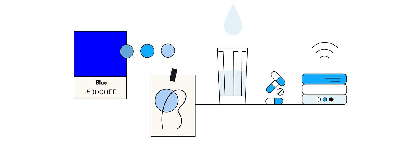
Blue conveys significance, importance, and confidence. It’s also associated with intelligence, stability, and unity. Currently, this colour is used frequently to illustrate Blockchain technology topics. You need to be careful when choosing the right tone though. Too much blue can be perceived as conservative and adds a melancholic vibe, or it might bore the audience. Different tones of blue carry different meanings, e.g. dark blue is elegant, International Klein Blue is modern, fresh and dynamic, while light blue is associated with trust, honesty, and inspiration.
蓝色传达了意义,重要性和信心。 它还与智能,稳定性和统一性相关。 当前,此颜色经常用于说明区块链技术主题。 选择正确的音色时需要小心。 太多的蓝色可能被认为是保守的,增加了忧郁感,否则可能会让听众感到厌烦。 蓝色的不同色调具有不同的含义,例如深蓝色代表优雅,International Klein Blue代表现代,清新和动态,而浅蓝色则与信任,诚实和灵感相关。

红 (Red)
Red is a highly visible and noticeable colour; it’s intense, eye-catching, and has the ability to focus attention fast. This colour represents power, courage, excitement, energy, love, and hell. Red has a huge impact on the viewer. It helps to catch attention (ever notice red buttons in movies?), it sets the mood (think Valentine’s Day illustrations), but too much red can affect the audience in an undesirable way. It can cause elevated blood pressure, increased respiratory rates, and enhanced metabolism. On the positive side, it encourages higher levels of energy and increased confidence. It is pretty rare to see a brand book where red is the dominating colour; it’s usually used as a complementary colour.
红色是一种高度可见且引人注目的颜色。 强烈,引人注目,并具有快速吸引注意力的能力。 这种颜色代表着力量,勇气,兴奋,能量,爱和地狱。 红色对观看者有巨大的影响。 它有助于引起注意(是否注意到电影中的红色按钮?),设置了心情(想想情人节插图),但是过多的红色会以不希望的方式影响观众。 它可以引起血压升高,呼吸频率增加和新陈代谢增强。 从积极的方面来看,它鼓励更高水平的精力和增强的信心。 很少见到品牌书中红色是主要颜色。 通常用作补充色。
紫色 (Purple)
Purple combines the calm stability of blue and the fierce energy of red. Purple is associated with royalty, luxury, and ambition. It also represents extravagance, creativity, wisdom, mystery, and magic. This colour has a variety of effects on the mind and body, including uplifting spirits, calming the mind and nerves, and encouraging imagination and creativity. Different shades, tints, and hues of purple carry different meanings. Light purple hues represent feminine energy and delicacy, as well as romantic and nostalgic feelings. Dark hues evoke feelings of gloom, sadness, and frustration. Bright purple hues suggest richness and royalty.
紫色结合了蓝色的沉稳稳定性和红色的强烈能量。 紫色与皇室,奢华和野心相关。 它还代表着奢侈,创造力,智慧,神秘感和魔力。 这种颜色会对身心产生多种影响,包括振奋精神,使身心平静,并激发想象力和创造力。 紫色的不同阴影,色调和色调具有不同的含义。 淡紫色的色调代表着女性的能量和精致,以及浪漫和怀旧的感觉。 深色调唤起了忧郁,悲伤和沮丧的感觉。 明亮的紫色调暗示着丰富和皇室。
绿色 (Green)
Green is acknowledged as the most relaxing colour for the human eye. It dominates in nature. Green is often associated with growth, harmony, safety, and the environment. Green is also traditionally associated with money, finances, banking, ambition, greed, jealousy, and Wall Street. This colour is often used to indicate safety in the advertising of drugs and medical products. Green is directly related to nature and energy, so it is also commonly used to represent and promote “green” and bio-products. Different shades, tints, and hues of green have different meanings. For example, dark green represents greed, ambition, and wealth, while yellow-green signifies sickness, jealousy, and cowardice. Olive green is the traditional colour of peace.
绿色被认为是人眼最放松的颜色。 它在自然界占主导地位。 绿色通常与增长,和谐,安全和环境相关。 传统上,绿色也与金钱,金融,银行,野心,贪婪,嫉妒和华尔街有关。 此颜色通常用于表示药品和医疗产品广告中的安全性。 绿色与自然和能源直接相关,因此也常用于代表和推广“绿色”和生物产品。 绿色的不同阴影,色调和色调具有不同的含义。 例如,深绿色代表贪婪,野心和财富,而黄绿色代表疾病,嫉妒和怯ward。 橄榄绿色是和平的传统色彩。

绿松石 (Turquoise)
Turquoise is a mix of blue and green and has calming attributes. It is seen as refreshing and is associated with sophistication, energy, creativity, emotional balance, friendship, love, joy, intuition, and loyalty. It’s really fresh, but remember to avoid combining it with other “sweet” colours, like pink. Don’t put it alongside light violet to avoid making everything look too candy-like. If you mix this colour with dark hues, you will achieve a very professional, modern look. Darker shades of turquoise, such as teal, have a more sophisticated feel.
绿松石是蓝色和绿色的混合物,具有镇定的属性。 它被视为令人耳目一新,并与成熟,活力,创造力,情感平衡,友谊,爱,喜悦,直觉和忠诚相关。 它确实很新鲜,但请记住避免与其他“甜”色(例如粉红色)结合使用。 不要将其放在浅紫色旁边,以免使一切看起来都像糖果一样。 如果将此颜色与深色调混合使用,将获得非常专业的现代外观。 较深的绿松石色(例如蓝绿色)具有更精致的感觉。
粉 (Pink)
Pink is a variation of red. You already know that red evokes aggression and inspires action, however pink works differently. Both red and pink represent love. Intense pink is used to communicate playfulness, while light pink is used to communicate tenderness. Light pink is associated with nice things like romance, femininity, babies, bubble gum, and sweetness. Intense pink, like magenta, is associated with emotional balance. It contains the passion, power, and energy of red, and promotes compassion, kindness, and cooperation.
粉色是红色的变体。 您已经知道红色引发侵略并激发行动,而粉红色则有所不同。 红色和粉红色都代表爱。 强烈的粉红色用于传达欢乐,而浅粉红色用于传达柔情。 淡粉色与浪漫,女性气质,婴儿,泡泡糖和甜味等美好事物相关。 强烈的粉红色(如洋红色)与情绪平衡有关。 它包含红色的激情,力量和能量,并促进同情心,友善与合作。

上下文中的色彩和和谐 (Colours in context and harmony)
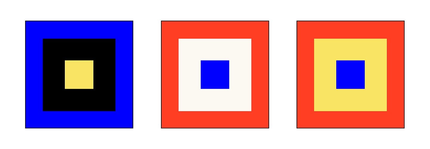
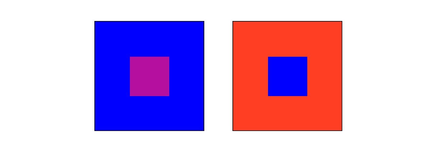
Every colour is seen in relation to another. When you see at least two colours together, each of them has a profound effect on the other.
每种颜色都与另一种颜色有关。 当您同时看到至少两种颜色时,每种颜色都会对彼此产生深远的影响。
The study of colour interactions helps us to understand and predict how colours can influence their surroundings.
对颜色相互作用的研究有助于我们理解和预测颜色如何影响周围环境。
色相对比 (Hue contrasts)
Contrast of hue happens when a colour is separated and outlined by black or white lines. White lines both weaken and soften the power and at the same time make the colours around them seem darker. A black line strengthens the colour, but also makes colours around the lines seem lighter.
当颜色由黑线或白线分隔并勾勒出轮廓时,就会发生色相对比。 白线既削弱和软化了力量,同时又使周围的颜色看起来更暗。 黑色线条增强了颜色,但也使线条周围的颜色看起来更浅。

浓淡对比 (Light-dark contrasts)
Light-dark contrast puts together light and dark hues. The strongest expressions of light and dark are white and black.
浓淡对比将浅色调和深色调组合在一起。 明亮和黑暗的最强烈表现是白色和黑色。

冷暖对比 (Cold-warm contrasts)
Cold colours are: blue, green, and purple. Warm colours are: red, orange, and yellow. Yellow is the lightest and violet is the darkest hue. These two hues have the strongest light-dark contrast. Hues can either be cold or warm according to the warmer or colder tones they are contrasted with.
冷色是:蓝色,绿色和紫色。 暖色是:红色,橙色和黄色。 黄色是最浅的颜色,紫色是最暗的颜色。 这两种色调具有最强的明暗对比。 根据与之形成对比的色调,冷色调可以是冷色调或暖色调。

互补对比 (Complementary Contrast)
Complementary Contrast refers to the contrast between opposite colours. Complementary colours are those that are directly opposite each other on the colour wheel. Red-orange/blue-green is a complementary pair, as well as the extreme of cold-warm contrast. Red and green are complementary, and the two saturated colours have the same brilliance.
互补对比度是指相反颜色之间的对比度。 互补色是指在色轮上彼此相对的颜色。 红橙色/蓝绿色是互补的对,也是冷暖对比的极致。 红色和绿色是互补的,并且两种饱和颜色具有相同的亮度。

和谐 (Harmony)
Harmony can be defined as a pleasing arrangement of parts, whether it be music, poetry, colour, or even an ice cream sundae. In visual experiences, harmony is pleasing to the eye. It engages the viewer and creates an inner sense of order; a balance in the visual experience. When something is not harmonious, it’s either boring or chaotic. At one end of the spectrum is a visual experience that is so bland that the viewer is not engaged. The human brain will reject under-stimulating information. At the other end, is a visual experience that is so overdone, and so chaotic that the viewer can’t stand to look at it.
和谐可以定义为令人愉悦的零件排列,无论是音乐,诗歌,色彩还是冰淇淋圣代。 在视觉体验中,和谐令人赏心悦目。 它吸引了观众并创造了一种内在的秩序感; 视觉体验的平衡。 当某些东西不和谐时,它要么无聊,要么混乱。 光谱的一端是一种视觉体验,这种视觉体验太冷淡,以至于观众无法参与其中。 人脑将拒绝刺激不足的信息。 在另一端,是一种过分的视觉体验,而且如此混乱以至于观众无法忍受观看。
The human brain rejects what it cannot organise or understand. Colour harmony delivers visual interest and a sense of order.
人脑拒绝它无法组织或理解的东西。 色彩和谐带来视觉趣味和秩序感。
Using proper contrast and complementary colours in the right proportions enables illustrators to control the impression on the audience. How do you avoid a melancholic vibe? Use blue and then warm it up. Use green in your illustration. After adding other colours, its impact is changed. Keeping all of these tricks in mind will help you to improve your communication with your audience.
以正确的比例使用适当的对比度和互补色可以使插图画家控制观众的印象。 您如何避免忧郁感? 使用蓝色,然后将其加热。 在插图中使用绿色。 添加其他颜色后,其影响会改变。 牢记所有这些技巧将有助于您改善与观众的交流。
It is essential to understand how colours affect the viewer. If this topic is important to you, I highly recommend reading the following two books:
必须了解颜色如何影响观看者。 如果这个主题对您很重要,我强烈建议您阅读以下两本书:
Picture This: How Pictures Work — Molly Bang
想象一下:图片是如何工作的 -莫莉·邦(Molly Bang)
Interaction of Color — Josef Albers
色彩的互动 -约瑟夫·阿尔伯斯
参考: (Reference:)
Picture This: How Pictures Work — Molly Bang
想象一下:图片是如何工作的-莫莉·邦(Molly Bang)
Interaction of Color — Josef Albers
色彩的互动-约瑟夫·阿尔伯斯
Originally published at https://www.netguru.com.
最初发布在 https://www.netguru.com 。
翻译自: https://medium.com/@agnieszka.koniuszek/illustrators-eye-interaction-of-colours-72474f3cabd8
插画软件


 1万+
1万+

 被折叠的 条评论
为什么被折叠?


