


颜色不变理论
In my first story ‘User Experience is …’ I promised that …
在我的第一个故事“ 用户体验是…… ”中,我保证……
over the course of a few stories, I’ll try and cover a few of the sciences we draw upon in our art as a creative community to create engaging experiences.
在一些故事的过程中,我将尝试涵盖一些我们在艺术中所汲取的科学知识,这些知识可以作为一个创造性的社区来创造引人入胜的体验。
Colour theory is simply a system that is used to organise, mix and combine colours. With roughly 16.8 million colours available, choosing the right colour and wider colour scheme is a challenge, since the possibilities are endless!
颜色理论只是一个用于组织,混合和组合颜色的系统。 可用的颜色大约有1680万种,因此选择正确的颜色和较宽的配色方案是一项挑战,因为可能性无穷无尽!

Colour is an extremely strong tool that can solve many design challenges. Colours can draw attention to the right parts of the design when used logically, along with some skill and intuition. Since colour plays such a major role in shaping the aesthetics and usability of digital products, changing a single colour can change a user’s perception of the same design.
颜色是一种非常强大的工具,可以解决许多设计难题。 当逻辑上使用颜色时,颜色可以吸引人们注意设计的正确部分,以及一些技巧和直觉。 由于颜色在塑造数字产品的美观和可用性方面起着重要作用,因此更改单一颜色可以改变用户对同一设计的感知。
整理1680万种颜色 (Organising 16.8 million colours)
The most simplistic way to start to organise colours is whether they are perceived psychologically as either ‘warm’ or ‘cool’.
开始组织颜色最简单的方法是在心理上将它们视为“温暖”还是“凉爽”。
暖色 (Warm colours)

Warm colours are those that are intrinsically vivid or bold. This group of colours generally lie between red and yellow, also including brown and tan colours.
暖色是本质上生动或大胆的颜色。 这组颜色通常介于红色和黄色之间,还包括棕色和棕褐色。
Warm colours generate a feeling of warmth. For example, fire or volcanoes, burning between the red and yellow spectrums. Sometimes these colours induce a feeling of aggression and are considered bold colours.
温暖的色彩产生温暖的感觉。 例如,在红色和黄色光谱之间燃烧的火或火山。 有时这些颜色会引起侵略感,因此被认为是大胆的颜色。
冷色调 (Cool colours)

On the other side of the colour wheel, are colours that are considered cool. Cool colours are inherently calm or soothing.
在色轮的另一侧,是被认为很酷的颜色。 凉爽的色彩本质上是沉着或舒缓的。
Cool colours are considered between blue, purple and green, as well as neutral white and grey colours. These colours are often associated with water or winter climates. Cool colours aren’t as overwhelming compared to their warm counterparts.
冷色被视为介于蓝色,紫色和绿色之间,以及中性白色和灰色。 这些颜色通常与水或冬季气候有关。 与暖色相比,冷色并没有压倒性的优势。
Since these colours recede in space, it’s usually a good idea to use them to style secondary or tertiary elements. This technique allows users to focus on the primary content, when using warm colours.
由于这些颜色在空间中逐渐消失,因此通常最好使用它们来设置第二或第三元素的样式。 使用暖色时,此技术使用户可以专注于主要内容。
配色方案的使用 (The use of colour schemes)
Colours schemes enabled the harmonised use of colours to create more elegant designs. This is where the colour wheel comes in handy because we can use it to calibrate the colours that could go well together.
配色方案可以统一使用颜色来创建更优雅的设计。 这是色轮派上用场的地方,因为我们可以使用它来校准可以很好地搭配使用的颜色。

Colours that are selected, can make or break a design. Since colours have such a notable impact on the design, organising colour options helps to make better decisions.
选择的颜色可以设计或破坏设计。 由于颜色对设计有如此显着的影响,因此组织颜色选项有助于做出更好的决策。
There are 4 key colour schemes that enable the harmonised use of colours:
有4种关键的配色方案可以实现颜色的统一使用:
- Monochromatic 单色
- Complementary 补充
- Triadic 三联体
- Analogous 类似的
Each scheme works differently and can be used, depending on what type of colour scheme in a design.
每种方案的工作方式不同,可以使用,具体取决于设计中哪种颜色方案。
单色方案 (Monochromatic schemes)

A monochromatic colour scheme is the most basic colour scheme, utilising a single colour along with varying shades and tints.
单色配色方案是最基本的配色方案,它利用一种单色以及不同的阴影和色调。
Colours within the monochromatic palette are derived from a base colour. In the example above its the lime green in the centre. Although colours feel similar, the higher contrasts of the darker and lighter shades break up the monotony. These higher contrasting colours can be used to increase the contrast if text is placed over the top of them.
单色调色板中的颜色是从基色派生的。 在上面的示例中,其中心为柠檬绿。 尽管颜色感觉相似,但深色和浅色阴影的较高对比度会破坏单调。 如果将文本放在文本上方,则可以使用这些较高对比度的颜色来增加对比度。
Monochromatic colour schemes provide an organised impression when applied to a project or product. By using a single colour, elements in our layout can provide an immediate sense of harmony.
单色配色方案应用于项目或产品时可提供有组织的印象。 通过使用单一颜色,我们布局中的元素可以立即提供和谐感。
Monochromatic or analogous colours can often be used as interaction colours, showing slightly different shades or colours when an element is selected, active, hovered over, tapped, disabled, or passive within a design.
单色或类似颜色通常可以用作交互颜色,当在设计中选择某个元素,对其进行激活,将其悬停在其上,轻击,禁用或被动时,它们会显示出略有不同的阴影或颜色。
配套方案 (Complementary schemes)

A complementary colour scheme utilises colours opposite from each other on the colour wheel. For instance, if we were to select green as our main colour, it would create maximum contrast and intensity with magenta.
互补色方案利用色轮上彼此相反的颜色。 例如,如果我们选择绿色作为我们的主要颜色,它将以品红色创建最大的对比度和强度。
Complementary colour schemes are generally more prevalent in logos and uniforms. The LA Lakers’ jersey, features the a purple typographic logo on a yellow background. The Sainsbury’s uniform features the orange Sainsbury’s typographic logo on a plum background.
互补的配色方案通常在徽标和制服中更为普遍。 洛杉矶湖人队的球衣在黄色背景上具有紫色的印刷徽标。 塞恩斯伯里的制服在李子背景上具有橙色塞恩斯伯里的印刷徽标。
三合会计划 (Triadic Schemes)
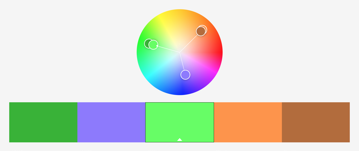
A triadic colour scheme, consists of three colours that are equidistant from one another on the colour wheel.
三色配色方案由色轮上彼此等距的三种颜色组成。
Triadic schemes can provide supplemental pops of colour while allowing for some flexibility in the range of colours.
三合一方案可以提供补充色泽,同时在颜色范围内提供一定的灵活性。
类似方案 (Analogous schemes)

An analogous colour schemes uses three or more colours that are adjacent to one another in the colour wheel.
类似的配色方案使用在色轮中彼此相邻的三种或更多种颜色。
In general, there’s one dominant hue that’s coupled with an auxiliary second colour and a third colour to accent the palette. Analogous designs tend to create a gratifying and calming display. For example, we can use the colour blue as the dominant hue along with teal and green to create soothing visuals.
通常,一种主要色相与辅助第二种颜色和第三种颜色相结合,以突出调色板。 类似的设计趋向于产生令人满意的和平静的显示。 例如,我们可以使用蓝色作为主色调,同时使用蓝绿色和绿色来创建舒缓的视觉效果。
It’s important to note that since analogous colour schemes fall in line with one another, they usually yield a low-contrast experience, which can hurt accessibility.
重要的是要注意,由于类似的配色方案彼此一致,因此它们通常会产生低对比度的体验,这可能会损害可访问性。
Therefore, we should avoid analogous schemes for content that requires a user’s immediate attention. Instead, we can use them to create backgrounds that don’t compete with our products’ main content.
因此,对于应引起用户立即注意的内容,我们应避免采用类似的方案。 取而代之的是,我们可以使用它们来创建与产品的主要内容不竞争的背景。
色彩心理学 (Color psychology)
The colour can determine the “feel” of the product. Each colour is associated with a particular meaning (both positive and negative) and has a different context, which is why colour psychology can help impact how people perceive a design. Choosing the “right” colours, can communicate the emotion of a products or services.
颜色可以决定产品的“感觉”。 每种颜色都有特定的含义(正面和负面),并且具有不同的上下文,这就是为什么颜色心理学可以帮助影响人们对设计的看法的原因。 选择“正确”的颜色,可以传达产品或服务的情感。
When using colour psychology, colour associations varies throughout different cultures around the world. For instance the colour red has different meanings:
使用色彩心理学时,色彩关联在世界各地的不同文化中都不同。 例如,红色具有不同的含义:
- Love in western cultures 热爱西方文化
- Prosperity in eastern cultures 东方文化的繁荣
- Power in Indian cultures 印度文化中的力量
- Danger in middle eastern cultures 中东文化中的危险

Colours can significantly affect how others perceive a product, service or design. Choosing the right colour palette affects how easy a product is to use, how a service is perceived and how accessible a design is. Within a multicultural society which colours we choose and how we decide on these colour schemes can ultimately affect how others we see, feel and think about a product or service.
颜色会严重影响其他人对产品,服务或设计的看法。 选择正确的调色板会影响产品的易用性,服务的感知方式以及设计的可访问性。 在一个多元文化的社会中,我们选择哪种颜色以及我们如何决定这些颜色方案最终会影响其他人对产品或服务的看法,感觉和想法。
Looking at colour theory, has taken me back to looking back at the guiding principals and theories that make up the basics of UX. By way of an intro to the basics of UX, I’m going to look at 7 UX laws that are so good, that people actually put their names to them!
回顾色彩理论,使我重新回顾了构成UX基础知识的指导原则和理论。 作为UX基础知识的介绍,我将研究7种非常好的UX法则,以至于人们实际上将自己的名字加了进去 !
Written as part of the ‘User Experience is …’ series.
作为“ 用户体验是…… ”系列的 一部分撰写 。
颜色不变理论


 606
606


 被折叠的 条评论
为什么被折叠?
被折叠的 条评论
为什么被折叠?
 到【灌水乐园】发言


