


python 样本 可视化
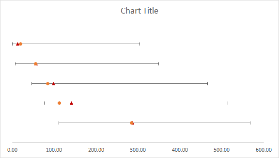
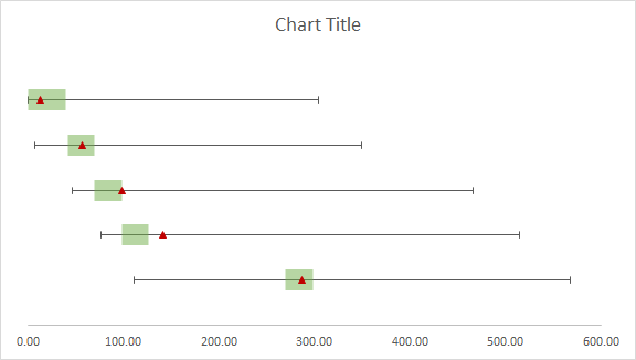
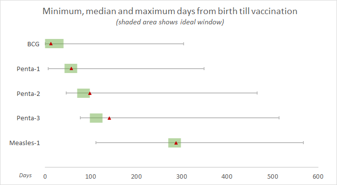
What’s in this article: A step-by-step guide for creating a chart that shows normal range overlaid on mean, min and max values for multiple series of data. In other words, an Actual vs Target chart. By the end of this tutorial, you will be able to produce something like this in MS-Excel:
本文内容 :创建图表的逐步指南,该图表显示覆盖多个数据系列的平均值,最小值和最大值的正常范围。 换句话说,是实际与目标图表。 在本教程结束时,您将能够在MS-Excel中产生以下内容:
The above visualization is from one of my research publications examining the timeliness of vaccination in children. We show the range of days since birth, over which children are receiving a certain vaccine. Overlaid on this, we also show the ideal time window for that vaccine in the same chart. This facilitates comparison of how good or bad the timing is for various vaccines.
以上可视化来自我的一项研究出版物,该出版物研究了儿童接种疫苗的及时性 。 我们显示了从出生到现在的天数,在那几天孩子接受某种疫苗。 在此基础上,我们还在同一图表中显示了该疫苗的理想时间窗口。 这有助于比较各种疫苗的时机好坏。
Overlaying the normal or ideal range for a quantitative variable on top of actual results is a common method of visualizing such comparisons. To achieve this in Excel charts, we rely on creating separate data series for the normal range windows and actual results. To achieve decent results however, we need to abuse the tools Excel offers; we represent data using scatter plots, instead of bar charts. If you wish to practice on your own, the completed tutorial file is available here.
在实际结果之上叠加定量变量的正常或理想范围是可视化此类比较的常用方法。 为了在Excel图表中实现此目的,我们依靠为正常范围窗口和实际结果创建单独的数据系列。 但是,为了获得可观的结果,我们需要滥用 Excel提供的工具。 我们使用散点图而非条形图表示数据。 如果您想自己练习, 可以在此处获得完整的教程文件。
步骤1:使数据成形 (Step 1: Get the data into shape)
There are three series of data needed to create the chart: the actual results you want to show, the values representing normal ranges to be overlaid, and third, a series to place labels on y-axis. Let me explain each one by one.
创建图表需要三个系列的数据 :要显示的实际结果,代表要覆盖的正常范围的值,以及第三个系列,用于在y轴上放置标签。 让我一一解释。
Series 1: the actual results you need to show
系列1:您需要显示的实际结果
There are 6 columns in this series. The first three are:
本系列共有6栏。 前三个是:
Minimum, Median and Maximum number of days since birth when the children in the sample received a certain vaccination. For example, for BCG vaccine in the data I collected, these values were 0, 13 and 304 days respectively. The medians will be plotted as x-values values in the scatter plot later.
样本中的孩子接受一定疫苗接种后的最小 , 中位数和最大天数。 例如,对于我收集的数据中的BCG疫苗,这些值分别为0、13和304天。 中位数将在以后的散点图中绘制为x值。
The next one is a y-value column:
下一个是y值列:
y-value: this contains the y-values for each of the x-values. These are manually created and not coming from data. As we create the scatter plot, you will see that these values are simply used to spread the x-values vertically across y-axis.
y值 :包含每个x值的y值。 这些是手动创建的,并非来自数据。 在创建散点图时,您将看到这些值仅用于将x值沿y轴垂直分布。
Besides these, two more columns are needed:
除此之外,还需要两列:
err_neg = median — minimum
err_neg =中位数-最小值
err_pos = maximum — median
err_pos =最大值—中位数
These above two columns calculate numbers that will be used to create error bars of appropriate length on either side of the median value. Your data table should look something like this now:
上面这两列计算的数字将用于在中值的任一侧创建适当长度的误差线。 您的数据表现在应如下所示:

You may find the placement of columns in the above table a bit weird. I did this just so creating scatter plot is a bit easier later, the sequence of columns really doesn’t matter as long as the formulas for positive and negative errors are working correctly.
您可能会发现上表中的列位置有些奇怪。 我这样做是为了让以后创建散点图变得容易一些,只要正负误差的公式正常工作,列的顺序就无关紧要了。
Series 2: the normal range windows you need to show
系列2:您需要显示的正常范围窗口
The process for shaping this series is exactly the same as for the first series, with two differences:
塑造该系列的过程与第一个系列完全相同,但有两个区别:
- The minimum and maximum values in this series represent the minimum and maximum limit of whatever the normal range is for a given category. For instance, the min and max of normal/appropriate days since birth within which the child should receive a BCG vaccine are 0 and 40 days. 此系列中的最小值和最大值表示给定类别的正常范围的最小和最大限制。 例如,从出生之日起儿童应接种BCG疫苗的正常/适当天数的最小值和最大值是0天和40天。
The ‘median’ of the normal range in this case is a calculated value that we can get by this formula: =MEDIAN(min, max).
在这种情况下,正常范围的“中位数”是我们可以通过以下公式得出的计算值: = MEDIAN(min,max) 。
The data table for this series should look like this:
该系列的数据表应如下所示:

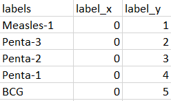
Series 3: the category labels to place on y-axis
系列3:要放置在y轴上的类别标签
We could simply use the y-axis provided by the chart itself, but I found it quite annoying and difficult to get the labels placed correctly at the right distance, and without the y-axis line itself showing. Therefore, I used another data series to plot labels just like data points. This gives us a lot more control over where we want the labels to appear. In this series, I have created columns for x and y-values for each category. The screenshot below should help you prepare this series:
我们可以简单地使用图表本身提供的y轴,但是我发现这很烦人,并且很难正确地将标签正确地放置在正确的距离上,并且没有显示y轴线。 因此,我使用了另一个数据系列来像数据点一样绘制标签。 这使我们可以更好地控制标签的显示位置。 在本系列中,我为每个类别的x和y值创建了列。 以下屏幕截图将帮助您准备本系列:
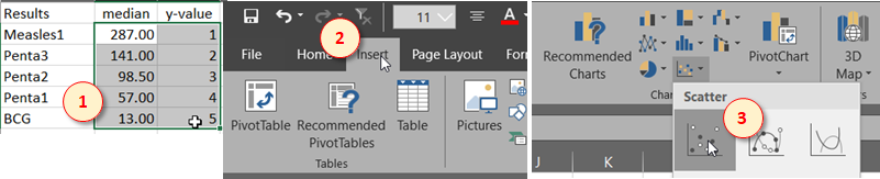
步骤2:建立散点图 (Step 2: Create the scatter plot)
To create the first scatter plot that will serve as the base for everything else to be added later, start by selecting the median and y-value columns of the first series (Results) created earlier. Then find the “Insert” tab in the ribbon menu, and select the first type of “Scatter plot”.
要创建第一个散点图,以用作以后添加其他所有内容的基础,请选择前面创建的第一个系列(结果)的中值和y值列开始。 然后在功能区菜单中找到“插入”选项卡,然后选择第一种“散点图”。
This should give the following bare-bones scatter plot. It’s important to get the axes correct here. If you’ve done things right, the data points should make sense against the x-axis values shown below.
这应该给出以下基本散点图。 在这里使轴正确很重要。 如果操作正确,则数据点应与下面显示的x轴值相对应。

Pro-tip: If you are unsure which column is being take as x or y values in a scatter plot, you can check by right-clicking the chart, choosing “Select Data” and then click on “Edit” button for the series in question. This will show you which range is select as x-values and which one as y-values.
提示:如果您不确定散点图中哪一列作为x或y值,可以右键单击图表,选择“选择数据”,然后单击“编辑”按钮题。 这将向您显示选择哪个范围作为x值,选择哪个范围作为y值。
Now let’s clear up some chart junk to give us some breathing room. Remove the y-axis and both vertical and horizontal grid lines by clicking each and pressing “Delete”.
现在,让我们清除一些图表垃圾,为我们提供一些喘息的空间。 通过单击每一个并按“删除”,删除y轴以及垂直和水平网格线。
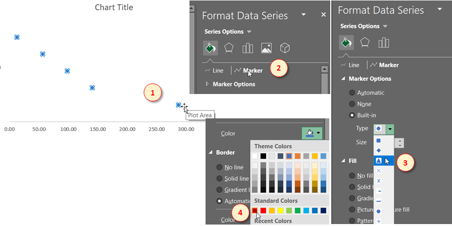
Now we’ll convert the data point markers from the rounded shape to an upward pointing triangle. Double-click on any of the data points to select the whole series. This should open up the formatting toolbar if it’s not already open. Find the Line & Marker settings, and choose the triangle shape from built-in options for Marker Options. Apply the “Dark Red” fill color (or whatever you prefer) to the marker in the same toolbar, and apply the same color to the border of marker as well.
现在,我们将数据点标记从圆形转换为向上的三角形。 双击任何数据点以选择整个序列。 如果尚未打开格式工具栏,则应将其打开。 找到“线条和标记”设置,然后从“标记选项”的内置选项中选择三角形。 将“深红色”填充色(或您喜欢的颜色)应用于同一工具栏中的标记,并将相同的颜色应用于标记的边框。
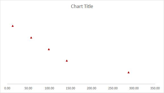
Now you should have nice pointed markers like this:
现在,您应该具有如下所示的漂亮的尖头标记:
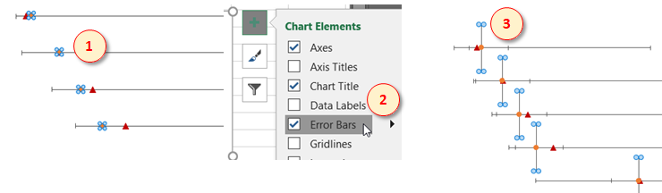
Now to add the bars representing minimum and maximum values around the median, we will employ error-bars. Click the “Add chart element” button near the top of chart (or from the Ribbon menu), and click “Error Bars” to add both horizontal and vertical error bars to the data points. Then click the vertical error bars and press “Delete” to leave only the horizontal ones.
现在,要添加代表中间值附近的最小值和最大值的条形,我们将使用误差条形。 单击图表顶部附近的“添加图表元素”按钮(或从功能区菜单),然后单击“错误栏”以将水平和垂直错误栏添加到数据点。 然后单击垂直误差线,然后按“删除”仅保留水平误差线。
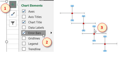
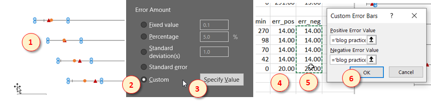
Click the horizontal error bars now, and in the properties toolbar, choose the “Custom” option for Error Amount. Then click the “Specify Value” button. This opens a dialogue box asking for data range for positive and negative error amounts. For positive errors, click and drag over the err_pos values of Series 1, and then do the same for negative errors using err_neg values as shown below. Now click OK.
现在单击水平误差线,然后在属性工具栏中,为“误差量”选择“自定义”选项。 然后单击“指定值”按钮。 这将打开一个对话框,询问正误差量和负误差量的数据范围。 对于正错误,请单击并拖动系列1的err_pos值,然后使用err_neg值对负错误执行相同的操作,如下所示。 现在单击确定。
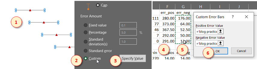
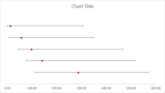
You should see error bars with appropriate lengths now:
您现在应该可以看到具有适当长度的错误栏:
步骤3:将第二个系列添加到散点图 (Step 3: Add the second series to scatter plot)
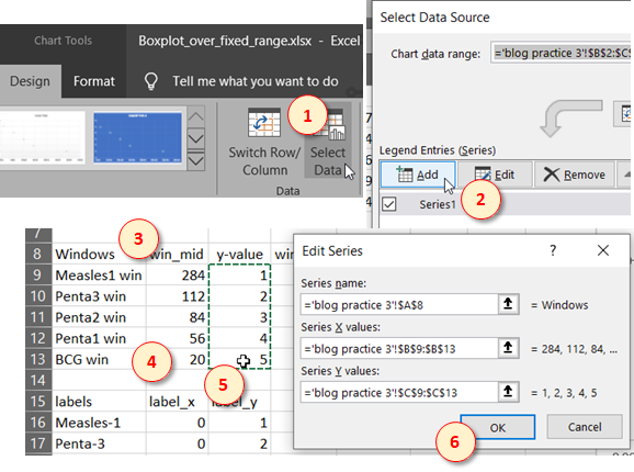
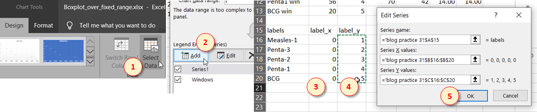
Now it’s time to add the second series representing normal windows. With the chart selected, click on “Select Data” in the Chart Tools menu. Then click “Add” in the data source dialogue box to add a new series of data. In the next dialogue box that shows up, add the x and y values of this new series by click-dragging over the range of values under win_mid and y-value columns for the second series (see below). You may also add a series name from cell A8 but it won’t show anywhere later. Now click OK, and OK again.
现在是时候添加第二个代表普通窗口的系列了。 选择图表后,在“图表工具”菜单中单击“选择数据”。 然后在数据源对话框中单击“添加”以添加一系列新数据。 在出现的下一个对话框中,单击并拖动第二个系列的win_mid和y-value列下的值范围,以添加此新系列的x和y值(请参见下文)。 您也可以在单元格A8中添加系列名称,但以后不会显示。 现在,单击“确定”,然后再次单击“确定”。
The new series should show up as points representing mid of the normal range windows:
新系列应显示为代表正常范围窗口中间的点:
Eventually, we won’t need the data points but we’ll leave them for ease of selection temporarily. For this series, we will again employ error bars to create a normal range window. The process for adding error bars is exactly the same as we did for the earlier series. Start by selecting the data points of new series, then go “Add chart element” button and click on “Error Bars” option to add error bars. Then select the vertical ones and delete them.
最终,我们不需要数据点,但会暂时保留它们以便于选择。 对于本系列,我们将再次使用误差线创建一个正常范围窗口。 添加误差线的过程与我们先前系列中的过程完全相同。 首先选择新系列的数据点,然后单击“添加图表元素”按钮,然后单击“错误栏”选项以添加错误栏。 然后选择垂直的并删除它们。
Now select the horizontal error bars, and choose the “Custom” option for Error Amount in the properties toolbar. Then click “Specify Value” to open the values range input box. For the positive errors, drag over the values for err_pos in the second series data, and for the negative errors, use the values under err_neg. Then click OK.
现在,选择水平误差线,然后在属性工具栏中为“误差量”选择“自定义”选项。 然后单击“指定值”以打开值范围输入框。 对于正误差,将其拖入第二个系列数据中的err_pos的值,对于负误差,使用err_neg下的值。 然后单击确定。
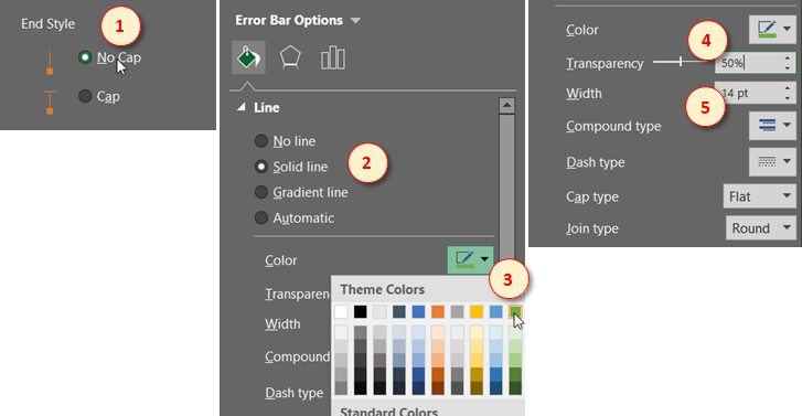
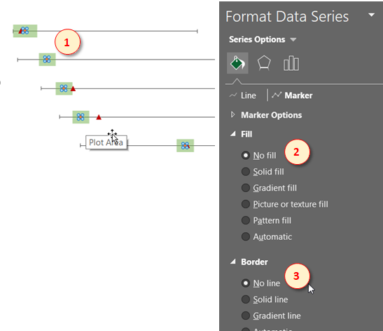
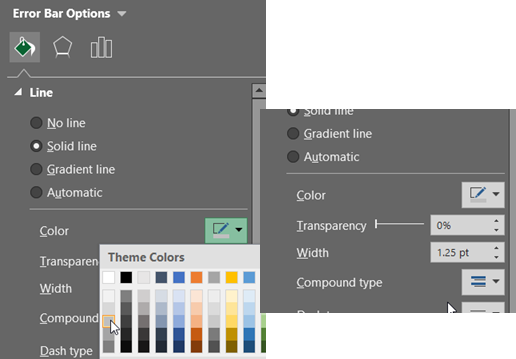
With the error bars still selected, choose the “No Cap” End Style in Error Bar Options. In Fill & Lines tab, choose the “Solid line” option and apply the green color shown. Then change Transparency to 50% and Width to 14 pt.
在仍然选择误差线的情况下,在误差线选项中选择“无上限”结束样式。 在“填充和线条”选项卡中,选择“实线”选项,然后应用显示的绿色。 然后将“透明度”更改为50%,将“宽度”更改为14 pt。
Finally, to make the data points in the middle disappear, click any of the data points to select them. Then choose the “No fill” and “No line” options in the Series options.
最后,要使中间的数据点消失,请单击任意数据点以将其选中。 然后在“系列”选项中选择“无填充”和“无行”选项。
Now you should have something like this:
现在,您应该具有以下内容:
步骤4:建立标签系列 (Step 4: Create label series)
Now we’ll add the third and final series to show labels for each category in the chart. Generally, the process is the same as for the second series, except here we are not using any error bars and will add the labels from data.
现在,我们将添加第三个也是最后一个系列,以显示图表中每个类别的标签。 通常,该过程与第二个系列的过程相同,除了这里我们不使用任何误差线,而是将从数据中添加标签。
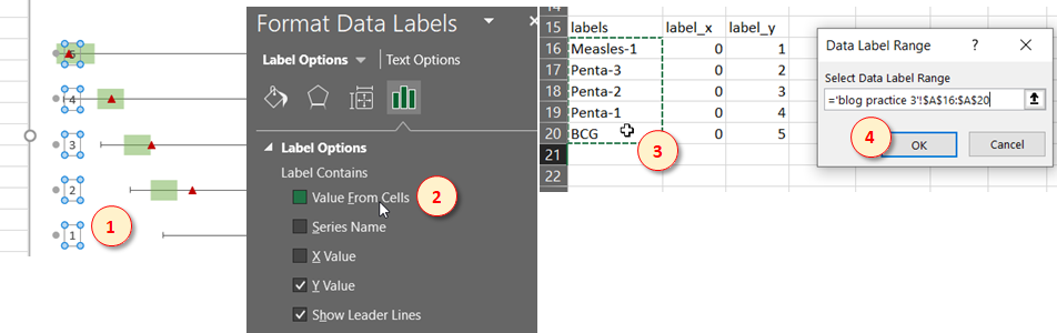
With the chart selected, click on “Select Data” in the Chart Tools menu to open up the series dialogue box. Here, click “Add” to add a new series. In the range input box that opens up next, add the appropriate ranges by click-dragging over the values under label_x and label_y columns for the third series in the spreadsheet (see image below). Then click OK, and OK again.
选择图表后,在“图表工具”菜单中单击“选择数据”以打开系列对话框。 在这里,单击“添加”以添加新系列。 在接下来打开的范围输入框中,通过单击并拖动电子表格中第三个系列的label_x和label_y列下的值来添加适当的范围(请参见下图)。 然后单击“确定”,然后再次单击“确定”。
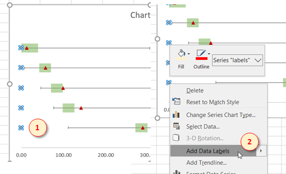
You will see the new series only as tiny dots at the point, along the left border of the chart. Right-click any of these dots and click “Add Data Labels” from the menu to add labels.
您会在图表的左边框处的该点处看到的只是小点的新系列。 右键单击这些点中的任何一个,然后从菜单中单击“添加数据标签”以添加标签。
The labels don’t show anything meaningful yet, so let’s fix that. Click any of the data labels to select all of them. Then find the “Label Options” in the properties toolbar and click on “Value From Cells”. This opens a range input box. Now click-drag over the names of all categories under the labels column of the third series in the spreadsheet, to add this range. Click OK.
标签还没有显示任何有意义的内容,所以让我们对其进行修复。 单击任何数据标签以选择所有它们。 然后在属性工具栏中找到“标签选项”,然后单击“来自单元格的值”。 这将打开一个范围输入框。 现在,在电子表格的第三个系列的标签列下,单击并拖动所有类别的名称,以添加此范围。 单击确定。
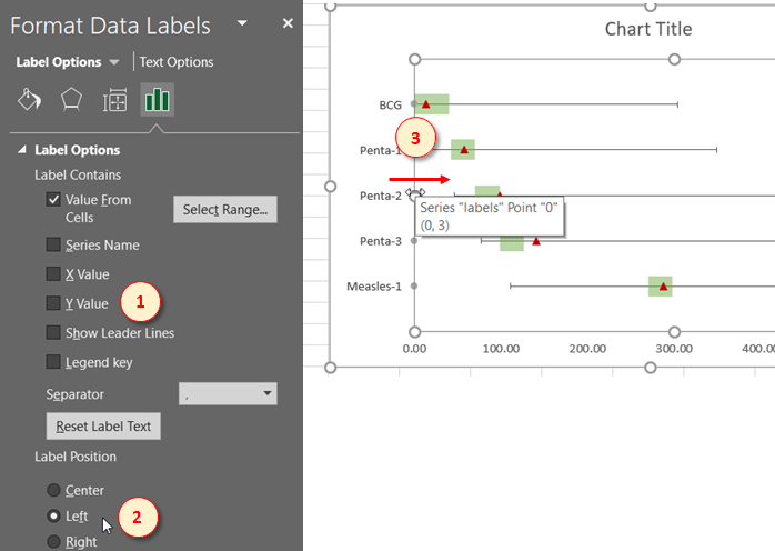
To clean it up, uncheck the “Y Value” and “Show Leader Lines” options in the Label Options, and choose “Left” as Label Position. To make space for the labels, click on the central chart area and drag the left border of this rectangle towards the right (See image below).
要清理它,请取消选中“标签选项”中的“ Y值”和“显示引线”选项,然后选择“左”作为标签位置。 要为标签留出空间,请单击中央图表区域,然后向右拖动该矩形的左边框(请参见下图)。
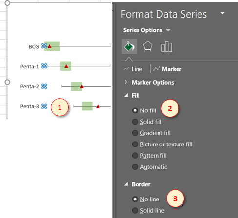
Finally, to remove the point markers, click any data point of the label series, and then select “No fill” and “No line” options for the marker in Series Options.
最后,要删除点标记,请单击标签系列的任何数据点,然后在“系列选项”中为标记选择“无填充”和“无线”选项。
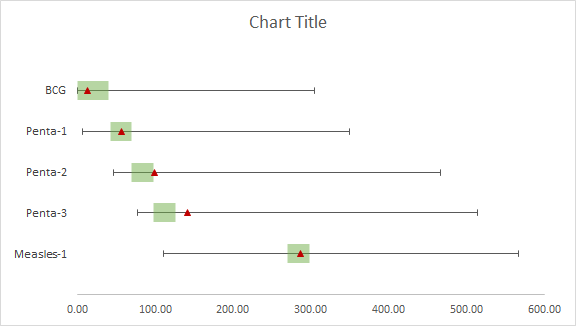
At this point, the chart is technically complete, except for a few tweaks:
至此,该图表在技术上已经完成,但有一些调整:
步骤5:简化和美化 (Step 5: Simplify & Beautify)
In this last step, we will make a few final touches to make the chart look more professional and polished.
在最后一步中,我们将作最后的修改,以使图表看起来更加专业和精致。
- Get rid of the decimal figures on x-axis: 摆脱x轴上的小数位数:
- Add a meaningful chart title: 添加有意义的图表标题:
- Make the min/max bars thicker and less black: 使最小/最大条形更粗,减少黑色:
- Add the horizontal axis title and name it “Days”. 添加水平轴标题并将其命名为“天”。
- Finally Make the fonts slightly larger to make the text readable. 最后,将字体稍大一些以使文本可读。
Congratulations! Now you have your final chart ready:
恭喜你! 现在您已准备好最终图表:
I personally like to do gray-scale charts, and here’s a gray-scale version for some more inspiration:
我个人喜欢绘制灰度图表,这是一个灰度版本,可提供更多启发:

python 样本 可视化


 821
821


 被折叠的 条评论
为什么被折叠?
被折叠的 条评论
为什么被折叠?
 到【灌水乐园】发言


