


react 模式
Adding support for dark and light themes in mobile applications can enhance the user experience by a manifold. From YouTube to Whatsapp, Instagram, Telegram, or Slack, many famous apps have extended the dark mode support to their platforms. And even if you prefer to remain in the light, one can easily leverage the dark mode support for various users in a few easy steps. Since the YouTube app looks a lot better in dark mode, let us implement dark mode by building a very basic clone of the app wherein we will mainly focus on toggling between dark and light themes.
在移动应用程序中添加对深色和浅色主题的支持可以通过多种方式增强用户体验。 从YouTube到Whatsapp,Instagram,Telegram或Slack,许多著名的应用程序都将暗模式支持扩展到其平台。 即使您希望保持光线充足,也可以通过几个简单的步骤轻松地为各种用户利用暗模式支持。 由于YouTube应用在暗模式下看起来要好得多,因此让我们通过构建应用的非常基本的克隆来实现暗模式,在该模式下,我们主要关注于在暗主题和亮主题之间切换。
The basic UI skeleton for the app, before we move ahead would look like as follows:
在继续之前,该应用程序的基本UI框架如下所示:
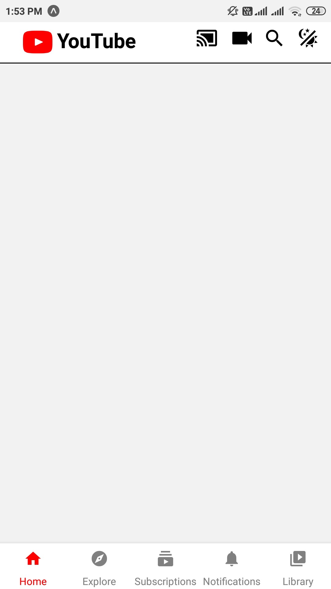
We have a custom header with the YouTube logo and some other icons, one of which (the theme toggling icon) will do our magic. A simple bottom tag navigator is also present similar to the app, with the active tab highlighted with red color. You can find the UI starter code required for this project here
我们有一个带有YouTube徽标和其他图标的自定义标头,其中一个(主题切换图标)将起到神奇的作用。 类似于应用程序,还提供了一个简单的底部标签导航器,活动选项卡用红色突出显示。 您可以在此处找到该项目所需的UI入门代码
A dark mode version of the app would look like :
该应用程序的暗模式版本如下所示:
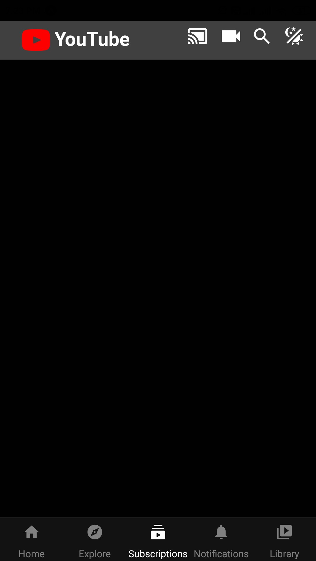
Notice how the icon color changes to white and the active tab is also shown in white in contrast to red as in the light mode.
请注意,在灯光模式下,图标颜色如何变为白色,并且活动选项卡也以白色显示,而红色显示为红色。
We can implement dark mode via a couple of options such as react-navigation, styled-components, or the react-native-appearance. In this particular app, we will be using Themes under React Navigation. You can find the documentation here.
我们可以通过几个选项来实现暗模式,例如react-navigation , styled-components或react-native-appearance 。 在这个特定的应用程序中,我们将在React Navigation下使用Themes 。 您可以在此处找到文档。
We are provided with DefaultTheme and DarkTheme built in to React Navigation as well as an option of customizing these themes. In your App.js or wherever the entry point of your app is import the following:
我们提供了内置于React Navigation中的DefaultTheme和DarkTheme以及自定义这些主题的选项。 在您的App.js或应用程序的入口点中,导入以下内容:
import {DefaultTheme,DarkTheme} from '@react-navigation/native'We can wrap the entry point of the app with the themes:
我们可以使用主题包装应用程序的入口点:
<NavigationContainer theme={DarkTheme}>
      <Stack.Navigator headerMode="none">
      <Stack.Screen name="home" component={Home} />
      </Stack.Navigator>
</NavigationContainer>
However, this alone will have no effect on our custom components like the header or the bottom navigator. We can customize them by changing the theme prop dynamically.
但是,仅此一项就不会影响我们的自定义组件(例如标题或底部导航器)。 我们可以通过动态更改主题道具来自定义它们。
We customize both our themes: DarkTheme and the DefaultTheme as new JS objects in our App.js. In the DarkTheme we would like the icons and active icon to be white in color and the header background color to be gray. Similarily in the DefaultTheme we would like the icons to be black and the active icon to be red. The header's background would be white. Thus we add these colors to the colors property for both of our themes.
我们定制了我们的主题:DarkTheme和DefaultTheme新的JS在我们App.js对象。 在DarkTheme中,我们希望图标和活动图标为白色,标题背景为灰色。 类似地,在DefaultTheme中,我们希望图标为黑色,活动图标为红色。 标头的背景为白色。 因此,我们将这些颜色添加到两个主题的colors属性中。
const myDarkTheme={
  ...DarkTheme,
  colors:{
    ...DarkTheme.colors,
    headerColor:"#404040",
    iconColor:"white",
    activeTabColor:"white"
  }
}
const myDefaultTheme={
  ...DefaultTheme,
  colors:{
    ...DefaultTheme.colors,
    headerColor:"white",
    iconColor:"black",
    activeTabColor:"red"
  }
}
To use our customized themes in components rendered inside the navigation container (such as other screens like Search, Explore, Notifications, or your custom header), we can use the hook: useTheme. Import the hook in your component as follows:
要在导航容器内部呈现的组件中使用我们的自定义主题(例如,其他屏幕,如“搜索”,“探索”,“通知”或您的自定义标题),我们可以使用钩子: useTheme 。 如下所示将钩子导入组件中:
import {useTheme} from '@react-navigation/native'The hook returns the theme object, whose property can now be accessed and used in our components.
该钩子返回主题对象,该主题对象的属性现在可以在我们的组件中访问和使用。
So in our custom header get the theme object from the hook as follows:
因此,在我们的自定义标头中,从挂钩中获取主题对象,如下所示:
export default function Header(){
    const {colors}=useTheme()
    /* your logic goes here */
}
Now we defined header color and icon colors in our customized themes in App.js. These properties can be accessed as colors.headerColor and colors.iconColor as follows:
现在,我们在App.js中的自定义主题中定义了标题颜色和图标颜色。 这些属性可以按如下方式作为colors.headerColor和colors.iconColor访问:
export default function Header(){
    const {colors}=useTheme()
    return (
      <View style={[styles.header,{backgroundColor:colors.headerColor}]}>
        <View style={{flexDirection:'row',margin:5}}>
            <Entypo
            name="youtube"
            size={32}
            color="red"
            style={{marginLeft:20}}/>
            <Text style={[styles.headerText,
              {color:colors.iconColor}]}>YouTube</Text>
        /* Rest of the icons go here */
        </View>
}
The view with the header style has been given a background color as specified by the theme. The logo text “YouTube” too will have a font color as specified by the theme. For the other icons in our header, a similar process can be followed where the icons will have a color specified by colors.iconColor
具有标题样式的视图已赋予主题指定的背景颜色。 徽标文本“ YouTube”也将具有主题指定的字体颜色。 对于标题中的其他图标,可以遵循类似的过程,其中图标将具有由colors.iconColor指定的颜色。
We can also customize the icon colors and text colors in the bottom tab navigator.
我们还可以在底部标签导航器中自定义图标颜色和文本颜色。
<Tabs.Navigator
    screenOptions={({ route }) => ({
      //accessing the icon colors from tabBarOptions
      tabBarIcon: ({ color }) => {
        let iconName;
        //determining which icon to be used for each tab
        if (route.name === 'Home') {
          iconName = 'home';
        } else if (route.name === 'Explore') {
          iconName = 'explore';
        }else if(route.name === 'Subscriptions'){
          iconName = 'subscriptions'
        }
        else if(route.name === 'Notifications'){
          iconName = 'notifications'
        }
        else if(route.name === 'Library'){
          iconName = 'video-library'
        }
        //returning icons for each tab with the specified color
        return <MaterialIcons name={iconName} size={20}
          color={color} />;
      },
    })}
    tabBarOptions={{
      //specifying the active tab color from our colors object returned from useTheme hook
      activeTintColor:colors.activeTabColor,
      inactiveTintColor: 'gray',
    }}>
And that’s it! Using a similar process you can customize other screens in your app as well. For example, you might want to change the text color as white when in dark mode and to black when in light mode. And it will be exactly similar to what we have done till now.
就是这样! 使用类似的过程,您还可以自定义应用程序中的其他屏幕。 例如,您可能希望将文本颜色在黑暗模式下更改为白色,而在明亮模式下更改为黑色。 这将与我们迄今为止所做的完全相似。
Now the only thing left it to toggle between the modes. Right now whatever theme the NavigationContainer is using, the corresponding customized theme is being used across the app. From our original UI mockup, we have a button in the header (our theme icon) which will help us toggle between the themes. Since we need to use this theme value across various screens in the app we will have to make use of Redux.
现在唯一剩下的就是在模式之间切换。 现在,无论NavigationContainer使用什么主题,都在整个应用程序中使用相应的自定义主题。 在原始的UI样机中,标题中有一个按钮(我们的主题图标),这将帮助我们在主题之间进行切换。 由于我们需要在应用程序的各个屏幕上使用此主题值,因此我们将不得不使用Redux 。
Create a folder for our reducers in the src directory, inside which create a reducer file themeReducer.js and declare as follows:
在src目录中为我们的reducer创建一个文件夹,在其中创建一个reducer文件themeReducer.js并声明如下:
const initialState=false
export const themeReducer=(state=initialState,action)=>{
    switch(action.type){
        case 'toggle_theme':
            return action.payload
        default:
            return state
    }
}
Let’s use this reducer by creating a store folder store in src directory, under which create a file Index.js
让我们通过在src目录中创建一个store文件夹store来使用此reducer,在该目录下创建一个Index.js文件
import { createStore, combineReducers } from "redux";
import { themeReducer } from "../reducers/themeReducer";
const store=createStore(
    combineReducers({
          myDarkMode:themeReducer
    })
)
export default store
This is the central state of all our data.
这是我们所有数据的中心状态。
Use this in App.js as follows:
在App.js中按如下所示使用它:
import store from './src/store'
/* all your themes and logic goes here */
export default ()=>{
  return(
     // make the redux store available to the Navigation Component
     <Provider store={store}>
     <Navigation/>
     </Provider>
  )
}
export function Navigation(){
  //useSelector is the hook to access redux store's state, access whether dark mode is enabled or not
  let currentTheme=useSelector(state=>{
    return state.myDarkMode
  })
  return(
    <Provider store={store}>
    // if the current theme is enabled, use the customized dark theme else the default theme
    <NavigationContainer theme={currentTheme?myDarkTheme:myDefaultTheme}>
      <Stack.Navigator headerMode="none">
      <Stack.Screen name="home" component={Home} />
      </Stack.Navigator>
    </NavigationContainer>
    </Provider>
  )
}
That is how we access the current theme and share it across various screens. Now the last thing left is to modify the redux state i.e. enable toggling.
这就是我们访问当前主题并在各个屏幕上共享它的方式。 现在剩下的最后一件事是修改redux状态,即启用切换。
For this, inside the header.js file, use the hooks useDispatch and useSelector as follows:
为此,header.js文件中,使用钩useDispatch和useSelector如下:
import { useSelector, useDispatch } from 'react-redux';
export default function Header(){
    // accessing the current theme
    const dispatch=useDispatch()
    const currentTheme=useSelector(state=>{
        return state.myDarkMode
    })
/* your logic goes here */
   // the icon which has to toggle the theme, in the onPress handler call the toggle_theme action type and the payload to be the opposite of the current theme i.e. if the current theme is dark mode (value true) make it false ( which is default theme).
   <MaterialCommunityIcons
            name="theme-light-dark"
            size={24}
            color={mycolor}
            onPress=
 {()=>dispatch({type:'add_theme',payload:!currentTheme})}/>
And that's it! We have successfully implemented the support of toggling between dark and light modes in our react native app!
就是这样! 我们已经在React Native应用中成功实现了在黑暗和明亮模式之间切换的支持!
Find the complete code here.
在此处找到完整的代码。
Apart from React Navigation, here’s another read for implementing dark mode using react-native-appearance.
除了阵营导航,这里的另一个读取执行使用React,本机外观暗模式。
For more such interesting concepts and food for your tech driven curiosity visit SmartScribs.
有关更多此类有趣的概念和美食的信息,请访问SmartScribs 。
翻译自: https://medium.com/tech-iiitg/join-the-dark-side-implementing-dark-mode-in-react-native-49b0a32e57f7
react 模式


 1393
1393


 被折叠的 条评论
为什么被折叠?
被折叠的 条评论
为什么被折叠?
 到【灌水乐园】发言


