


react 设置样式
This article highlights how to set up Light and Dark Mode in React application with SCSS modules.
本文重点介绍如何在带有SCSS模块的React应用程序中设置明暗模式。
In my personal opinion, I feel the presentation should be controlled only by the stylesheets and we must not add additional overhead in the React components (JS/JSX) to handle the theme changes.Also, it will be better to configure the theme in the root component (Mostly App.js/App.tsx in react’s case)
以我个人的观点,我认为演示文稿应该仅由样式表控制,并且我们绝不能在React组件(JS / JSX)中增加额外的开销来处理主题更改。此外,在主题中配置主题会更好根组件(在React的情况下,大多数是App.js / App.tsx)
Let’s create a react application using create-react-app with TypeScript configured.
让我们使用配置了TypeScript的create-react-app创建一个react应用程序。
npx create-react-app my-app-name --template typescriptTypescript is optional here. Feel free to create react application with normal JavaScript.
打字稿在这里是可选的。 随时使用常规JavaScript创建react应用程序。
Next, Let’s install SCSS in our project using npm install node-sass. Convert the existing .css files into .scss files and change any imports to use .scss.
接下来,让我们使用npm install node-sass在我们的项目中安装SCSS。 将现有的.css文件转换为。 scss文件并更改要使用的任何导入。 scss。
SCSS is again optional here. We could achieve theme styling using normal CSS as well.
SCSS在这里还是可选的。 我们也可以使用普通CSS来实现主题样式。
Creating a Theme Stylesheet
创建主题样式表
Create a styles folder within src and create a file called theme.scss
在src中创建一个样式文件夹,并创建一个名为theme.scss的文件
Now let’s define two class selectors for light and dark mode respectively with CSS Variables.
现在,我们分别使用CSS变量为亮和暗模式定义两个类选择器。
.light {
    --theme-color: #A80000;
    --theme-page-background: #FFF;
    --theme-page-text: #111;
}


.dark {
    --theme-color: #0000A8;
    --theme-page-background: #111;
    --theme-page-text: #FFF;
}
Here we have defined the colour variations for light and dark modes (Theme Color, Theme Page Background and Theme Text Color).We could also move the colours (#000, #FFF etc) to a partial _variables.scss file for better readability and maintainability.
在这里我们定义了明暗模式的颜色变化(主题颜色,主题页面背景和主题文本颜色),还可以将颜色(#000,#FFF等)移动到部分_ variable.scss文件中以提高可读性和可维护性。
2. Import theme.scss into our App.tsx.
2.将theme.scss导入到我们的App.tsx中。
import React from 'react';
import './styles/theme.scss';
import './App.scss';


function App() {
  return (
    <div className='App'>
      <h1>Hello World</h1>
    </div>
  );
}


export default App;
Next, let’s add a state variable “theme” to hold the current application mode (Line #7). Let’s also refer the state variable in the className (Line #10).
接下来,让我们添加一个状态变量“ theme”以保持当前的应用程序模式(第7行) 。 我们还要在className中引用状态变量(第10行)。
import React, { useState } from 'react';
import './styles/theme.scss';
import './App.scss';


function App() {


  const [theme, setTheme] = useState('light');


  return (
    <div className={`App ${theme}`}>
      <h1>Hello World</h1>
    </div >
  );
}


export default App;
Add styles for<div className = {`App ${theme}`}> in App.scss using the theme variables. Depending on the selected theme, the background and color properties will get updated in runtime.
使用主题变量在App.scss中为<div className = {`App $ {theme}`}}>添加样式。 根据所选主题, 背景和颜色属性将在运行时更新。
.App {
  background: var(--theme-page-background);
  color: var(--theme-page-text);
}
Feel free to add additional stylings as shown below.
随意添加其他样式,如下所示。
.App {
height: 100vh;
display: flex;
flex-direction: column;
justify-content: center;
align-items: center;
background: var(--theme-page-background);
color: var(--theme-page-text);
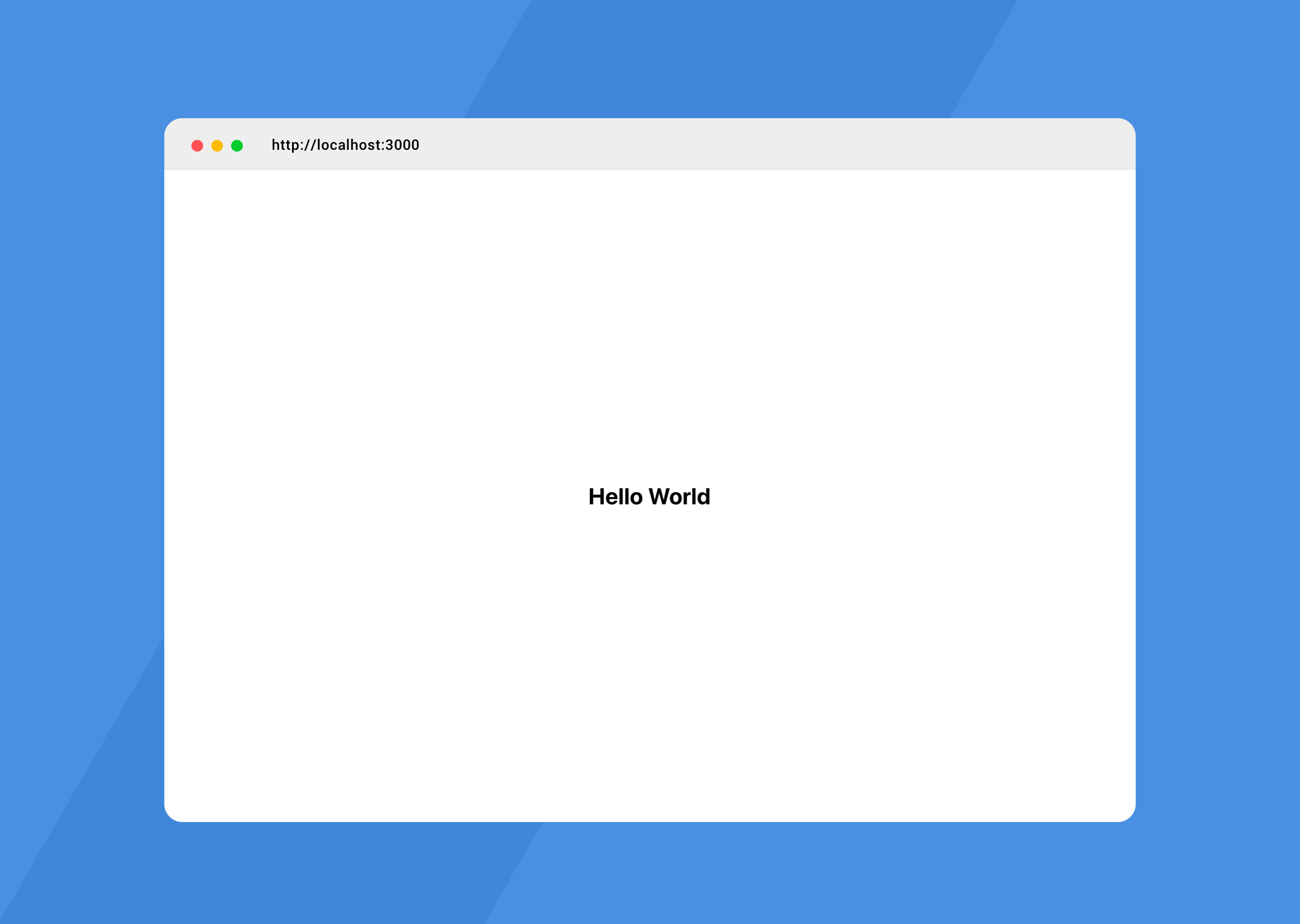
}Let’s start the application with the command npm start and view it in the browser.
让我们使用命令npm start启动应用程序,然后在浏览器中查看它。
Try changing the state variable to dark and check the output.
尝试将状态变量更改为暗,然后检查输出。
const [theme, setTheme] = useState('dark');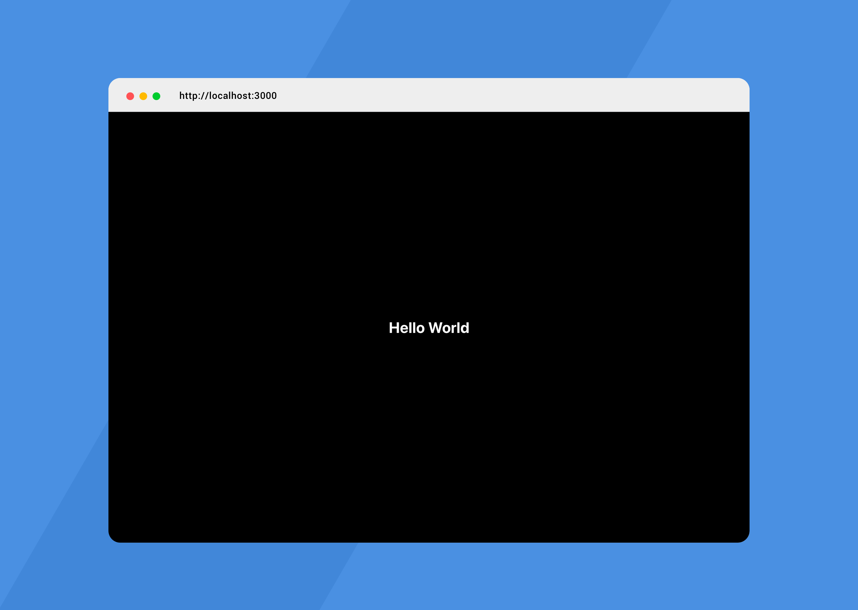
So Simple? In reality, we could associate a click action to toggle between light and dark mode. We could maintain the theme in a Context as well.
很简单? 实际上,我们可以关联单击动作以在明暗模式之间切换。 我们也可以在上下文中维护主题。
You can play around with the application here https://codesandbox.io/s/switching-between-light-and-dark-mode-5hf9w
您可以在此处试用该应用程序https://codesandbox.io/s/switching-between-light-and-dark-mode-5hf9w
Extending Theme to Components
将主题扩展到组件
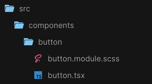
For instance, let’s create a Button Component. 1. Create a folder called components inside the src folder.2. Create another folder called button inside components and create two file — button.tsx and button.module.scss.
例如,让我们创建一个按钮组件。 1.在src文件夹中创建一个名为components的文件夹。 2.在组件内部创建另一个名为button的文件夹,并创建两个文件-button.tsx和button.module.scss。
Add the following code to button.tsx.
将以下代码添加到button.tsx 。
import styles from './button.module.scss';
import React from 'react';


export const Button = (props: any) => {
    const { label, onClick } = props;


    return (
        <button onClick={onClick} className={styles.button}>
            {label}
        </button>
    );
};
Now, let’s add some button styles. Observe how the background-color is provided. It is referred from the theme variable. So when the light mode is on, the button color will be #A80000 (red) and when we switch to dark mode, it will appear in #A80000 (blue).
现在,让我们添加一些按钮样式。 观察如何提供背景色。 从主题变量引用。 因此,当打开亮模式时,按钮颜色将为#A80000 ( 红色 ),而当我们切换到暗模式时,按钮颜色将显示为#A80000 ( 蓝色 )。
button {
    height: 2.5rem;
    padding: 0.625rem 1rem;
    border: 0;
    background-color: var(--theme-color);
    color: #FFF;
    cursor: pointer;
}


/*
* We could also refer color: #FFF from a theme variable
* Leaving it to #FFF here as both my theme colors, I want my button text color to be #FFF
*/
Similarly, we could have mode specific colors in theme.scss and use it across all pages and components.
同样,我们可以在theme.scss中使用特定于模式的颜色,并在所有页面和组件中使用它。
Did you notice that button.tsx has no logic wrt. dark and light mode? The entire theming is taken care by the stylesheet.
您是否注意到button.tsx没有逻辑字迹 。 暗和亮模式? 整个主题由样式表负责。
Let’s include the Button in our App.tsx and view the output in light and dark mode.
让我们在App.tsx中包含Button并在明暗模式下查看输出。
import React, { useState } from 'react';
import './styles/theme.scss';
import './App.scss';
import { Button } from './components/button/button';


function App() {


  const [theme, setTheme] = useState('light');


  return (
    <div className={`App ${theme}`}>
      <h1>Hello World</h1>
      <Button label="Click Me" />
    </div >
  );
}


export default App;
Download Starter
下载入门
Checkout this repository for the base react application with theme configuration. Download it and run “npm i” to install all node-modules.https://github.com/nijin-vinodan/react-starter-templates/tree/master/examples/starter-react-dark-light-mode
在此存储库中签出具有主题配置的基本react应用程序。 下载它并运行“ npm i ”以安装所有节点模块。 https://github.com/nijin-vinodan/react-starter-templates/tree/master/examples/starter-react-dark-light-mode
react 设置样式


 211
211

 被折叠的 条评论
为什么被折叠?
被折叠的 条评论
为什么被折叠?
 到【灌水乐园】发言


