


前端svg字体图标使用
In this article we will compare usage of Google's Material Design Icons, as font and SVG. And we will also see how we can use SVG sprites in an Angular application.
在本文中,我们将比较 Google的Material Design Icons (字体和SVG)的 用法 。 我们还将看到如何在Angular应用程序中使用SVG精灵。
材质图标 (Material Icons)
Material Icons are Google's official icon pack. They are carefully designed following Material Design Guidelines. It's one of the most widely used icon sets for both, web and mobile applications. It has got around 40k+ ⭐️ on github.
材质图标是Google的官方图标包。 它们是按照《 材料设计指南》精心设计的。 它是Web和移动应用程序中使用最广泛的图标集之一。 在github上大约有40k +⭐️。
The easiest way to include the material icons is to use material icon font. All the material icons are packaged into a single font.
包含材料图标的最简单方法是使用材料图标字体。 所有的材料图标都打包为一种字体。
You just need to add single line of HTML:
您只需要添加一行HTML:
<link href="https://fonts.googleapis.com/icon?family=Material+Icons" rel="stylesheet">And then you can use them easily, See below example:
然后,您可以轻松使用它们,请参见以下示例:
<i class="material-icons">face</i>To further style them, check this official guide.
要进一步设计样式,请查看此官方指南 。
The material icons are also provided as SVGs that are suitable for web projects. Individual icons are downloadable from the material icons library.
素材图标也以SVG的形式提供,适用于Web项目。 单个图标可从材料图标库下载。
For Angular, we can also use @angular/material's icon component, with some additional setup. To summarize, below are the steps which will be needed:
对于Angular,我们还可以使用@angular/material的icon组件 ,并进行一些附加设置。 总结一下,下面是需要执行的步骤:
Add
@angular/materialby runningng add @angular/material添加
@angular/material通过运行ng add @angular/materialImport
MatIconModule导入
MatIconModule- Create svg file for the icon under assets 在素材资源下为图标创建svg文件
- Register the same svg file for it's corresponding icon. For example, you can do below in a component: 为相同的图标注册相同的svg文件。 例如,您可以在下面的组件中执行以下操作:
...
constructor(iconRegistry: MatIconRegistry, sanitizer: DomSanitizer) {
    iconRegistry.addSvgIcon(
        'thumbs-up',
        sanitizer.bypassSecurityTrustResourceUrl('assets/img/examples/thumbup-icon.svg'));
}
...
and then use it in HTML:
然后在HTML中使用它:
<mat-icon svgIcon="thumbs-up" aria-hidden="false" aria-label="Example thumbs up SVG icon"></mat-icon>Now, 🔁 repeat steps 3 and 4 for all your icons.
现在,🔁对所有图标重复步骤3和4。
字体与SVG (Font vs SVG)
There are multiple aspects when it comes to selection. We are going to look at the most important ones only:
选择涉及多个方面。 我们将只看最重要的那些:
- Bundle size 捆束尺寸
- Performance 性能
📦捆束尺寸 (📦 Bundle size)
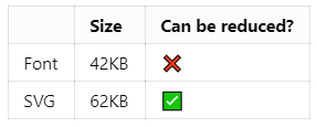
Clearly, font file is winner when it comes to bundle size. But, SVG file size can be reduced considerably by compiling only the icons you need into a single SVG file with symbol sprites. We will look into it later on.
显然,字体大小是捆绑软件的赢家。 但是,通过仅将需要的图标编译到带有符号精灵的单个SVG文件中,可以大大减小SVG文件的大小。 稍后我们将对其进行研究。
🎭表现 (🎭 Performance)
Now let's see which one looks better in browser, we will use standard sizes suggested by Google Material Design in sizing, i.e. 18px, 24px, 36px and 48px.
现在让我们看看哪一个看起来更好的浏览器,我们将使用由谷歌材料设计建议标准尺寸的大小 ,即18px , 24px , 36px和48px 。
As you can see, they both look almost same for 24px, 36px and 48px. Let's try by reducing the size to 18px:
如您所见,对于24px , 36px和48px ,它们看起来几乎相同。 让我们尝试将大小减小到18px :
Ok, as you can see for 18px, font loses its consistency around circular edges while svg still looks good. But, it totally depends on which icons you're using. For instance, look at below:
好的,如您所见,对于18px ,字体在圆形边缘周围失去了一致性,而svg仍然看起来不错。 但是,这完全取决于您使用的图标。 例如,看下面:
done_all and swap_horiz don't have round edges, that's why they look fine in font, too.
done_all和swap_horiz没有圆角,这就是为什么它们的字体也很好的原因。
💻 Code for above preview samples is available here.
above 此处 提供上述预览示例的代码 。
🏆选择什么 (🏆 What to choose)
As you saw, except for some cases, font and svg, both perform well in browsers. But we can improve the bundle size of svg, by compiling only the icons we need in a single file. Let's see how we can do it in Angular.
如您所见,除了某些情况外,字体和svg在浏览器中均表现良好。 但是,通过仅在单个文件中编译所需的图标,我们可以提高svg的捆绑包大小。 让我们看看如何在Angular中做到这一点。
⛳在Angular中使用材质图标SVG符号精灵 (⛳ Using material icon SVG symbol sprites in Angular)
First of all, compiling single file with svg symbol sprite is not related to Angular or any other web framework. It's an opinionated way of achieving cost and performance effective solution to use material icons in your web application. You can read more about it here.
首先,使用svg符号sprite编译单个文件与Angular或任何其他Web框架无关。 这是一种实现成本和性能有效的解决方案的自以为是的方法,可以在Web应用程序中使用材质图标。 您可以在此处了解更多信息。

Setup️设置 (🛠️ Setup)
Go to your favorite 📁 directory and open-up the 👨💻 terminal.
转到您最喜欢的📁目录并打开👨💻终端。
npm i -g @angular-clinpm i -g @angular-cling new material-svg-sprites --minimal --interactive=falseng new material-svg-sprites --minimal --interactive=false- Go to 😴 sleep for sometime and wake-up once above command is done 🏃 running 进入😴睡眠一段时间,完成上述命令后🏃唤醒wake运行
cd material-svg-spritescd material-svg-sprites
Cool. Let's move on to next part.
凉。 让我们继续下一部分。
Co️编码 (⚔️ Coding)
1. Create <app-icon> component
1.创建 <app-icon> 组件
Open-up another terminal at the project directory and:
在项目目录中打开另一个终端,然后:
ng g c icon --inlineStyle --inlineTemplate=false👉 Ideally, you should create such components in a shared module. For more, head out to official docs.
👉理想情况下,您应该在共享模块中创建此类组件。 有关更多信息,请访问 官方文档 。
2. Modify icon component class
2.修改图标组件类
Let's add 2 @Input s to our component:
让我们在组件中添加2个@Input :
// src\app\icon\icon.component.ts
import { Component, Input, OnInit } from "@angular/core";
@Component({
  selector: "app-icon",
  templateUrl: "./icon.component.html",
  styles: [],
})
export class IconComponent implements OnInit {
  @Input() size = 24; // 👈 added
  @Input() name = 'face'; // 👈 added
  constructor() {}
  ngOnInit(): void {}
}
So, size is going to be responsible for size (height and width), of-course 😅. And name represents name of the icon, by default we will show face, cz it looks nice 😊.
因此, size将决定路线😅的尺寸(高度和宽度)。 name代表图标的名称,默认情况下,我们将显示face ,cz看起来不错nice。
3. Modify icon component template
3.修改图标组件模板
<!-- src\app\icon\icon.component.html -->
<svg [ngStyle]="{ height: size + 'px', width: size + 'px' }">
  <use [attr.href]="'assets/icons/sprites.svg#' + name"></use>
</svg>
Let's see what's going on here...
让我们看看这里发生了什么...
[ngStyle]- we are going to use@Input() sizehere to give fixed height and width to our svg[ngStyle]-我们将在此处使用@Input() size为svg提供固定的高度和宽度<use>- this element takes nodes from within the SVG document, and duplicates them somewhere else. As you can see in itshref, we are giving location of the icon which are going to use.<use>-此元素从SVG文档中获取节点,并将其复制到其他位置。 如您在href所见,我们给出了将要使用的图标的位置。
From this, you might have understood that sprites.svg is going to be our single file with svg symbol sprites. Let's get into that.
由此,您可能已经了解到sprites.svg将成为带有svg符号sprites的单个文件。 让我们开始吧。
4. Create 📄 sprites.svg
4.创建📄sprites.svg
Now, we are not directly going to create sprites file, we are going to automate the flow. To summarize we are going to do below:
现在,我们不会直接创建精灵文件,而是将流程自动化。 总结一下,我们将在下面做:
Download SVG files for the icons which we need from material icons library. We will keep them at 📁 src/icons/svg.
从材质图标库中下载我们需要的图标的SVG文件。 我们将它们保留在src / icons / svg中 。
Read them and convert them into
<symbol>阅读它们并将其转换为
<symbol>Combine all
<symbol>to one single file, i.e. 📄 sprites.svg under directory将所有
<symbol>合并为一个文件,即目录下的📄sprites.svgRepeat steps 2 and 3 whenever any new icon is added under 📁 src/icons/svg
每当在src / icons / svg下添加任何新图标时,请重复步骤2和3。
To automate above flow, we will use gulp. You do not need to have detailed understanding of gulp, just remember that it's a toolkit to automate and enhance our workflow.
为了使流程自动化,我们将使用gulp 。 您不需要对gulp有所了解,只需记住这是一个自动化和增强我们的工作流程的工具包。
4.1 📄 gulpfile.js
4.1📄gulpfile.js
Let's install some devDependencies first:
让我们先安装一些devDependencies:
npm i -D gulp gulp-svgstore gulp-svgmin path gulp-rename gulp-run-commandNow create 📄 gulpfile.js:
现在创建📄gulpfile.js :
// gulpfile.js
const gulp = require("gulp");
const svgstore = require("gulp-svgstore");
const svgmin = require("gulp-svgmin");
const rename = require("gulp-rename");
const run = require("gulp-run-command").default;
gulp.task("svg-sprite", () => {
  return gulp
    .src("src/icons/svg/*.svg")
    .pipe(
      svgmin(() => {
        return {
          plugins: [
            {
              removeViewBox: false,
            },
            {
              removeDimensions: true,
            },
          ],
        };
      })
    )
    .pipe(svgstore())
    .pipe(rename({ basename: "sprites" }))
    .pipe(gulp.dest("src/assets/icons"));
});
gulp.task("ng-serve", run("ng serve -o"));
gulp.task("ng-build", run("ng build --prod"));
gulp.task("watch", () =>
  gulp.watch(["src/icons/svg/*.svg"], gulp.series("svg-sprite"))
);
gulp.task(
  "default",
  gulp.series("svg-sprite", gulp.parallel("ng-serve", "watch"))
);
gulp.task("build", gulp.series("svg-sprite", "ng-build"));
Without much details, below is the flow of default task gulp:
没有太多的细节,下面是默认任务的流程:
Read all
.svgfiles from 📁 src/icons/svg. This is the folder where we will download all of our icon svg files.从📁src / icons / svg中读取所有
.svg文件。 这是我们将下载所有图标svg文件的文件夹。Minify them by keeping
viewBoxand removing dimensions. Thanks to gulp-svgmin通过保留
viewBox并删除尺寸来viewBox尺寸。 感谢gulp-svgminCompile all of it in
<symbol>and merge them into single svg file. With this, it should also keepidof<symbol>same as filename, which will be useful in our<app-icon>component template's<use>tag'shrefattribute. Credit goes to gulp-svgstore在
<symbol>编译所有文件,然后将它们合并为单个svg文件。 这样,它还应该使<symbol>id与文件名相同,这将在我们的<app-icon>组件模板的<use>标记的href属性中有用。 归功于gulp-svgstoreRename the result file to 📄 sprites.svg using gulp-rename
使用gulp -rename将结果文件重命名为📄sprites.svg
And put that file at 📁 src/assets/icons
并将该文件放在src / assets / icons
Start Angular app by running command
ng serve -o通过运行命令
ng serve -o启动Angular应用Keep watching for svg files under 📁 src/icons/svg, if changed repeat steps 1, 2, 3, 4, 5.
继续查看📁src / icons / svg下的svg文件,如果更改,请重复步骤1、2、3、4、5。
There is also one more task called build, which does the same thing as above, except it doesn't keep watching svg files and instead of ng serve, it runs ng build --prod.
还有一个名为build任务,它与上述功能相同,只是它不一直监视svg文件,并且它执行ng build --prod而不是ng serve 。
5. npm scripts
5. npm 脚本
As we have created 📄 gulpfile.js in such a way that it handles running of Angular project, too, we can simply have below script in our 📄 package.json to run it:
当我们以处理Angular项目运行的方式创建📄gulpfile.js时 ,我们只需在📄package.json中包含以下脚本即可运行它:
// package.json
...
"scripts": {
    "ng": "ng",
    "start": "gulp", // 👈 modified
    "build": "gulp build", // 👈 modified
    "test": "ng test",
    "lint": "ng lint",
    "e2e": "ng e2e"
  },
...
Now, we can simply run npm start and npm run build to run the project in watch mode and build it respectively.
现在,我们只需运行npm start和npm run build即可在监视模式下运行项目并分别构建它。
6. Icon SVGs
6.图标SVG
Download face icon's svg file from here or you can goto material icons library, find and download face icon's svg file.
从此处下载face图标的svg文件,或者您可以转到材质图标库 ,查找并下载face图标的svg文件。
Once it's downloaded, rename it to , so that when it gets compiled, id of <symbol> is face. Don't forget to keep it under 📁 src/icons/svg.
下载后,将其重命名为,以便在编译时, <symbol> id为face 。 不要忘记将其保存在src / icons / svg下 。
7. <app-root> component
7. <app-root> 组件
We're almost done. Let's add reference to <app-icon> component in <app-root>. Simply have below in your template:
我们快完成了。 让我们在<app-root>添加对<app-icon>组件的引用。 只需在模板中包含以下内容:
<app-icon></app-icon>And 🎉 voila!!! You should see face icon's svg in your browser.
和🎉瞧!!! 您应该在浏览器中看到人face图标的svg。
Also try by giving different sizes, like below, it should work fine:
也可以尝试提供不同的大小,如下所示,它应该可以正常工作:
<app-icon size="48"></app-icon>With above, we done with all the setup and coding. Now, to use any other icon, for example icon, simply download it from material icons library, rename it to some memorable general keyword, put it under 📁 src/icons/svg. And use it like below:
通过上面的步骤,我们完成了所有的设置和编码。 现在,要使用其他任何图标,例如图标,只需从材质图标库下载它,将其重命名为一些令人难忘的常规关键字,然后将其放在src / icons / svg下即可 。 并如下所示使用它:
<app-icon name="done_all" size="36"></app-icon>Great 👍!!! If you're with me up-to this, consider I am continuously 👏👏👏 clapping for you.
很棒👍! 如果您支持我,请考虑我一直在为您鼓掌。

8.进阶 (8. Advanced)
This is some advanced changes which we will be doing for better alignment and size when icon is placed inline with text, this is totally optional.
这是一些高级更改,当图标与文本对齐放置时,我们将进行更好的对齐和调整大小,这完全是可选的。
8.1 <app-root> template changes
8.1 <app-root> 模板更改
First, let's see how it looks inline with text. For that, simply change <app-root> template:
首先,让我们看一下它与文本的内联外观。 为此,只需更改<app-root>模板:
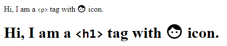
<p>
Hi, I am a <code><p></code> tag with
<app-icon size="18"></app-icon> icon.
</p>
<h1>
Hi, I am a <code><h1></code> tag with
<app-icon size="36"></app-icon> icon.
</h1>I have kept icon sizes at 1.125 multiplier with font size. So by default, in chrome, <p> and <h1> tags have 16px and 32px font size, so that will become 18px and 36px for icon size. You can choose your multiplier, but 1.125 works for me.
我将图标大小与字体大小保持在1.125乘数 。 因此,默认情况下,在chrome中, <p>和<h1>标签的字体大小为16px和32px ,因此图标大小将分别为18px和36px 。 您可以选择乘数,但1.125适用于我。
Let's look at output:
让我们看一下输出:
As you can see, we need to really work on alignment. Let's do that.
如您所见,我们需要真正进行对齐。 来做吧。
8.2 <app-icon> component and template changes
8.2 <app-icon> 组件和模板更改
Modify <app-icon> component like below:
修改<app-icon>组件,如下所示:
// src\app\icon\icon.component.ts
...
export class IconComponent implements OnInit {
 private readonly SIZE_MULTIPLIER = 1.125; // 👈 you can change this as per your need
  _size = 24;
  _top = 0;
  @Input() name = "face";
  @Input()
  set size(size: "inherit" | number) {
    if (size === "inherit") {
      const parentElement = this.elRef.nativeElement.parentElement;
      this._size = Math.ceil(
        parseFloat(
          window.getComputedStyle(parentElement).getPropertyValue("font-size")
        ) * this.SIZE_MULTIPLIER
      );
      this._top = -(this._size / Math.ceil(14.22 * this.SIZE_MULTIPLIER));
    } else if (isNaN(size)) {
      throw new Error('size must be a number or "inherit"');
    } else {
      this._size = size;
    }
  }
  constructor(private elRef: ElementRef) {}
  ...
}<!-- src\app\icon\icon.component.html -->
<svg
  [ngStyle]="{
    height: _size + 'px',
    width: _size + 'px',
    top: _top + 'px'
  }"
  style="display: inline-block; vertical-align: top; position: relative;"
>
  <use [attr.href]="'assets/icons/sprites.svg#' + name"></use>
</svg>
To summarize, below is what we did:
总结一下,下面是我们所做的:
Instead of directly setting
size, we introduced a property_sizeand usedsetter. So based on@Input() size,_sizewill be calculated.我们没有直接设置
size,而是引入了_size属性并使用了setter。 因此,基于@Input() size,将计算_size。_top- this will help us to align icon properly._top这将帮助我们正确对齐图标。_sizesetter - now, we are also acceptinginheritas value. If user has providesinheritas value for@Input() size, we are getting icon'sparentElement'sfont-sizeusingwindow.getComputedStyle. And we are multiplying it with our multiplier, i.e.SIZE_MULTIPLIER = 1.125. Lastly,_topis also calculated. Everything is simple maths, you can play around and make changes as per your need._size现在,我们也接受inherit作为值。 如果用户提供了@Input() size值作为inherit值,则使用window.getComputedStyle获取图标的parentElement的font-size。 然后将其乘以乘数,即SIZE_MULTIPLIER = 1.125。 最后,还要计算_top。 一切都是简单的数学,您可以根据需要进行操作并进行更改。template - we have made some style changes so that it looks proper. Now, these style changes are really an opinionated way. You can select your own way, maybe make
<svg>'s styleposition: absolute;top: 50%;height: <HEIGHT>;margin-top: -<HEIGHT/2>and wrap it inside an element withposition: relative. You can read more aboutvertical-alignat MDN Docs.模板-我们进行了一些样式更改,以使其看起来正确。 现在,这些样式更改确实是一种自以为是的方式。 您可以选择自己的方式,也许将
<svg>的样式position: absolute;top: 50%;height: <HEIGHT>;margin-top: -<HEIGHT/2>并将其包装在具有position: relative的元素内。 您可以在MDN Docs上了解有关vertical-align更多信息。
👉 You can try to have
fill-colorset based on parent element and/or input.👉您可以尝试 根据父元素和/或输入设置
fill-color。
Now, let's look at the output in browser again:
现在,让我们再次查看浏览器中的输出:
Alright, now it looks good.
好吧,现在看起来不错。
💻 Code for Angular application is present at github shhdharmen/material-svg-sprites
github shhdharmen / material-svg-sprites中 提供了Angular应用程序的代码
☑️结论 (☑️ Conclusion)
- We learned what Google Material Design Icons are 我们了解了什么是Google物料设计图标
- We also saw 2 ways of adding icons: Font and SVG 我们还看到了两种添加图标的方法:字体和SVG
- We saw how we can create single svg sprite file of symbols using gulp in an Angular application 我们看到了如何在Angular应用程序中使用gulp创建单个svg sprite符号文件
- And at last, we also took a look at how we can align the icon for inline text 最后,我们还研究了如何对齐内联文本的图标
🙏谢谢你 (🙏 Thank you)
You guys have been great readers. I really appreciate that you've taken some time to read this article. Let me know your thoughts and feedbacks in the comments section.
你们一直是很棒的读者。 非常感谢您花了一些时间阅读本文。 在评论部分让我知道您的想法和反馈。
You can follow me on 🐦 twitter @shhdharmen. Don't be shy even just say hi 👋!
您可以在🐦twitter @shhdharmen上关注我。 不要害羞,甚至打个招呼👋!
And yes, always believe in yourself.
是的,永远相信自己。
This article was originally published on blog.shhdharmen.me.
本文最初发布在 blog.shhdharmen.me上 。
前端svg字体图标使用


 686
686


 被折叠的 条评论
为什么被折叠?
被折叠的 条评论
为什么被折叠?
 到【灌水乐园】发言


