


 本文介绍了5款适用于非设计师的Figma工具,这些工具能帮助您的侧项目在设计上表现出色。通过使用这些工具,即使没有专业设计背景,也能提升项目的视觉效果。
figma设计
I had recently joined my husband’s side project, Clippit app, as a junior product manager. He had been developing the app for the better part of three years with a friend who is a senior product manager and designer. They offered that I join the product team to get some experience in the role, and I gladly accepted.
我最近加入了丈夫的副项目Clippit app ,担任初级产品经理。 他与一位资深产品经理和设计师的朋友一起开发该应用程序已有三年的大部分时间。 他们提出让我加入产品团队以获取有关该角色的经验,我很高兴接受了。
When working on a side project, there are a lot of things we need to do on our own — development, product, design, marketing — which means even more things to learn on our own. And when creating new features and product offerings, we also need to know how to design them for others to use.
在进行辅助项目时,我们需要自己做很多事情-开发,产品,设计,营销-这意味着我们需要自己学习更多的东西。 在创建新功能和产品时,我们还需要知道如何设计它们以供他人使用。
As someone without any background in design, I looked for a free design tool that would be easy enough to learn and also robust enough to make designs look professional and polished. Enter Figma.
作为一个没有任何设计背景的人,我寻找了一个免费的设计工具,该工具既易于学习,又具有足够的健壮性,可以使设计看起来专业而优美。 输入Figma 。
If you’re not super familiar with Figma, it is a free design tool for digital projects. You can download it as a desktop application or work on designs directly from your browser — and it saves all of your work to the cloud automatically. Figma also lets you work with other team members on the same file — you can see their work in real-time from your own screen and leave comments right in the design itself. Pretty cool, right?
如果您对Figma不太熟悉,它是用于数字项目的免费设计工具。 您可以将其下载为桌面应用程序,也可以直接从浏览器中进行设计-它将所有工作自动保存到云中。 Figma还允许您与其他团队成员共同处理同一文件-您可以在自己的屏幕上实时查看他们的工作,并在设计本身中保留评论。 很酷吧?
After taking a Udemy course and reading quite a few tutorials, I decided to share the 5 tools I felt made my venture into design easier and of course, much nicer to look at:
在学习了Udemy的课程并阅读了很多教程之后,我决定分享5种工具,我认为这5种工具使我更容易进入设计领域,当然,要看的也要好得多:
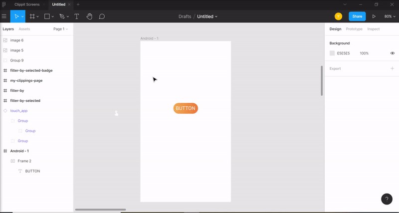
镜框 (Frames)
Before starting to paint, one needs a canvas. In Figma, those are called ‘Frames’.
在开始绘画之前,需要一块画布。 在Figma中,这些被称为“框架”。
Frames are a pretty basic tool — they are a container for us to put our designs in — however, Figma took this basic tool up a notch. Instead of trying to find the exact size of a device for a frame, Figma has preset sizes for a variety of devices. This enables us to scale the design for the right device size, and easily showcase our work within the device frame to increase immersiveness in the product experience.
框架是一个非常基本的工具-它们是我们进行设计的容器-但是,Figma将此基本工具提高了一个档次。 Figma预先设置了适用于各种设备的尺寸,而不是尝试查找帧中设备的确切尺寸。 这使我们能够按合适的设备尺寸缩放设计,并轻松地在设备框架内展示我们的工作,以增加对产品体验的沉浸感。
This feature is especially easy and helpful, so give those presets a try.
此功能特别简单实用,请尝试使用这些预设。
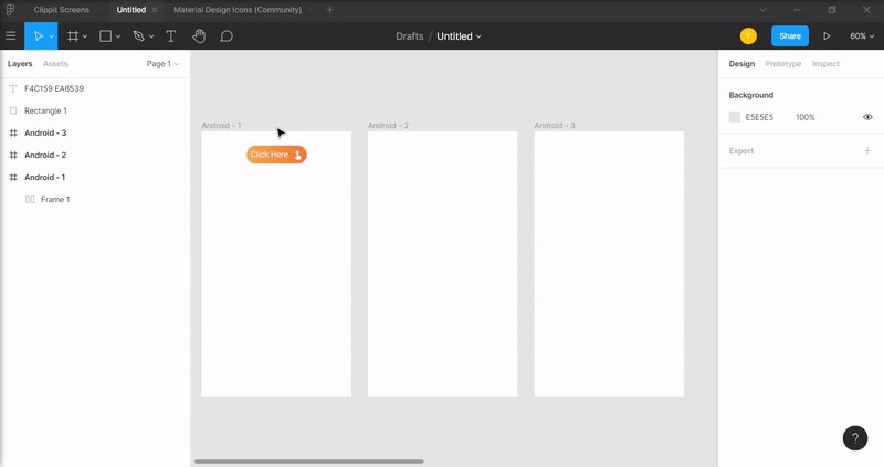
自动布局(Auto layout)
A big part of digital products is buttons. Buttons are controls that allow users to send information to the product itself. They help users complete tasks like creating an account or completing an order, so any screen that requires an action from the user will probably contain buttons. But how to actually design a great looking button? It sounds too simple to even ask, but for a design newbie like me it was a legitimate question.
数字产品的很大一部分是按钮。 按钮是允许用户向产品本身发送信息的控件。 它们可以帮助用户完成创建帐户或完成订单之类的任务,因此需要用户执行操作的任何屏幕都可能包含按钮。 但是,如何实际设计美观的按钮呢? 听起来甚至问起来都太简单了,但是对于像我这样的设计新手来说,这是一个合理的问题。
Auto layout helps you do just that — it takes a text and adds a rectangular frame around it — that frame expands and contracts in response to the text size, which means no need to constantly resize and recenter everything while you’re still making changes — it’s done automatically. With the added ability to design that frame however you like, you can have one of the biggest design elements of your project looking great with very little effort.
自动布局可以帮助您做到这一点-它需要一个文本并在其周围添加一个矩形框架-该框架会根据文本大小进行扩展和收缩,这意味着您在进行更改时无需不断调整大小并更新所有内容-它是自动完成的。 借助随心所欲设计该框架的附加功能,您可以轻松完成项目中最大的设计元素之一,使其看起来很棒。
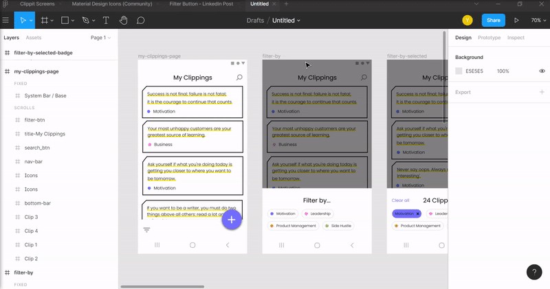
社区UI套件(Community UI kits)
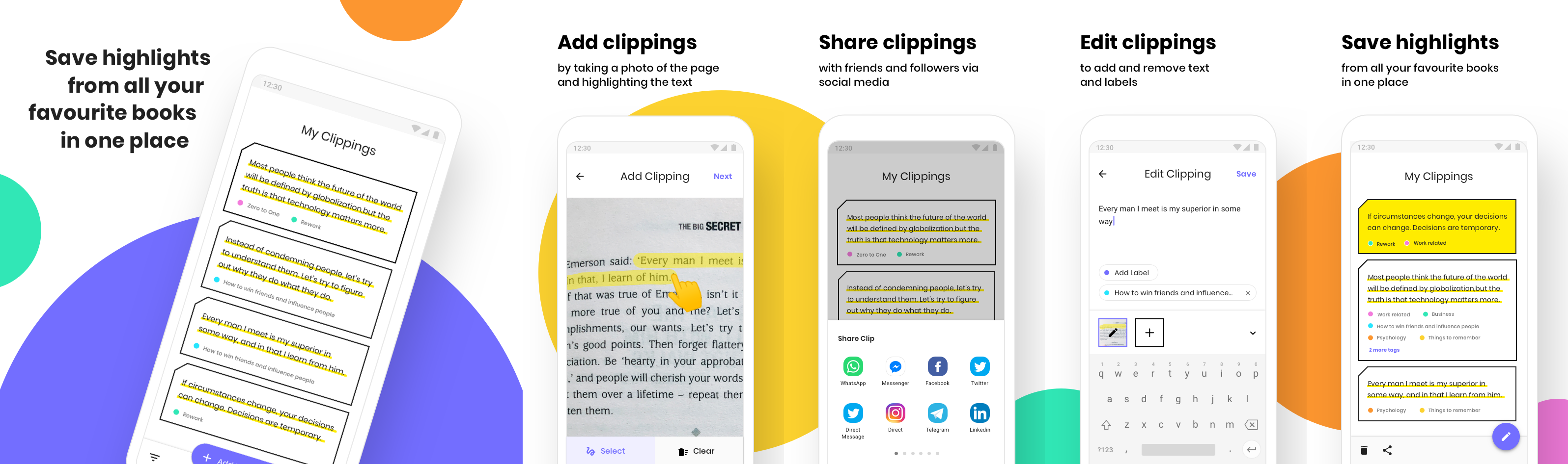
Thankfully, non-designers don’t actually have to design everything from scratch. Figma’s community tab has some very helpful resources, from icon packs to OS design elements. Those are especially important if you’re just getting started, since following design patterns users are already familiar with will make it easier for them to interact with your product. For example, Clippit app relies heavily on Google’s Material Design guidelines. We use their icons, design components and overall best practices — that way our app looks and behaves exactly how users expect it to.
幸运的是,非设计人员实际上不必从头开始设计所有内容。 Figma的社区选项卡具有一些非常有用的资源,从图标包到OS设计元素。 如果您刚刚入门,那么这些特别重要,因为用户已经熟悉以下设计模式,这将使他们与您的产品进行交互变得更加容易。 例如,Clippit应用程序严重依赖于Google的材料设计指南。 我们使用他们的图标,设计组件和整体最佳做法-这样,我们的应用将按照用户的预期外观和行为。
If you didn’t find exactly what you were looking for, there are also great sites like FigmaCrush where you can find templates and UI kits.
如果找不到您想要的东西,还有像FigmaCrush这样的不错的网站,您可以在其中找到模板和UI套件。
组件(Components)
When designing a website or an app, some visual elements are bound to repeat themselves from screen to screen to keep the overall design consistent. Design cohesiveness has a lot of pros — it keeps the user focused on the actions he’s taking rather than trying to figure out where he is in the app and what he should be doing, resulting in higher conversion rates and user satisfaction.
在设计网站或应用程序时,必然会在屏幕之间重复某些视觉元素,以保持整体设计的一致性。 设计的凝聚力有很多优点-它使用户专注于他要执行的操作,而不是试图弄清楚他在应用程序中的位置以及应该做什么,从而提高了转换率和用户满意度。
Continuing the example of buttons, we would want all of our buttons to have the same look and feel across our project. But what if we chose to change the color of all of those buttons?
继续按钮的示例,我们希望所有按钮在整个项目中都具有相同的外观。 但是,如果我们选择更改所有这些按钮的颜色怎么办?
That’s where the ‘components’ feature comes in. Components allow us to design one element, turn it into a main component, and then duplicate it across our entire project. Any change we make to that main component will immediately change any additional duplicates we create.
这就是“组件”功能的所在。组件使我们能够设计一个元素,将其变成主要组件,然后在整个项目中复制它。 我们对该主要组件所做的任何更改都会立即更改我们创建的所有其他重复项。
For example, if we have 100 duplicated buttons in a single design and decide to change how those buttons look, we can simply right-click the button in the frame we are currently editing, select ‘Go To Main Component’ and we will return to the original component we created. The changes we make to that original component will also change across the entire design, instead of changing all of the buttons one by one. Talk about a time saver, right?
例如,如果我们在一个设计中有100个重复的按钮并决定更改这些按钮的外观,则只需在当前正在编辑的框架中右键单击该按钮,然后选择“转到主组件”,然后我们将返回到我们创建的原始组件。 我们对原始组件所做的更改也将在整个设计中发生变化,而不是一一更改所有按钮。 说说节省时间吧?
And don’t worry — if you just want to make a specific change in one screen, changing that duplicate won’t affect any of the others. That way you can design multiple elements in your project in one cohesive style, and make changes quickly and easily when needed.
不用担心-如果您只想在一个屏幕上进行特定更改,则更改该副本不会影响其他任何屏幕。 这样,您可以采用一种统一的样式设计项目中的多个元素,并在需要时快速轻松地进行更改。
原型制作工具(Prototyping tool)
When collaborating on a big project with lots of functionalities, you want to make sure you’re not forgetting anything important. I’ve found the prototype tool to be especially helpful with that. The prototype tool lets us connect the dots (literally) between different elements in our screens and create the paths users take when navigating through the app. For example, we can link the menu button to the menu screen to realistically show what the user will see when he clicks that button. We can also link every option in the menu to the screen the user will see if he decides to click a specific option.
在具有许多功能的大型项目上进行协作时,您要确保您不会忘记任何重要的内容。 我发现原型工具对此特别有用。 原型工具使我们可以将屏幕上不同元素之间的点(字面上)连接起来,并创建用户在浏览应用程序时所采用的路径。 例如,我们可以将菜单按钮链接到菜单屏幕,以真实地显示用户单击该按钮时将看到的内容。 我们还可以将菜单中的每个选项链接到用户决定是否单击特定选项时将看到的屏幕。
We can then ‘play’ the entire flow and experience of our product just like it would look like on a real device. This tool helped me find missing functionalities and surface issues I didn’t initially think of (‘Wait, how is the user supposed to leave this screen?’). It’s a must-use tool for anyone looking to release a finished product for users.
然后,我们可以像在真实设备上一样“播放”产品的全部流程和体验。 这个工具帮助我找到了我最初没有想到的功能缺失和表面问题(“等等,用户应该如何离开此屏幕?”)。 对于希望为用户发布最终产品的任何人来说,它都是必备工具。
Figma is a very powerful tool and there is a lot to learn about it. I’ve found that the features mentioned in this post have made an impact on how easy it was for a non-designer like me to get going and create something great in a short amount of time. I hope these tools help you as well with your side projects and encourage you to release your ideas into the world.
Figma是一个非常强大的工具,有很多东西要学习。 我发现这篇文章中提到的功能影响了像我这样的非设计人员在短时间内创建出色作品的难易程度。 我希望这些工具对您的辅助项目也有帮助,并鼓励您将您的想法发布给全世界。

翻译自: https://uxdesign.cc/5-figma-tools-for-non-designers-to-make-your-side-projects-shine-730da71e5b00
figma设计


 扫一扫
扫一扫
 1343
1343

 被折叠的 条评论
为什么被折叠?
被折叠的 条评论
为什么被折叠?
 到【灌水乐园】发言


