


Step by step process and code we use to create shot charts for our daily NBA recaps for Instagram.
我们使用逐步的过程和代码为Instagram每日NBA回顾创建投篮图表。
Our blog is on Instagram @FastBreakStats.
我们的博客在Instagram @FastBreakStats上。
什么是NBA流程图? (What is an NBA shotchart?)
A shotchart used in the NBA is a type of visualization that allows coaches and players to realize strong and weak points of a players’ game–shooting in particular. They allow coaches to get an idea of how effective a player’s offense is at getting players shots in a certain area. With a little bit of frequency analytics, coaches can devise plays based on where players are making the most shots, which can allow players to be more effectively utilized in a game.
NBA中使用的快照图是一种可视化类型,可以使教练和球员意识到球员比赛中的强项和弱项,尤其是射击比赛。 它们使教练可以了解球员的进攻在某一区域投篮有多有效。 借助少量的频率分析,教练可以根据球员出手最多的位置来设计比赛,这可以使球员在比赛中得到更有效的利用。
A shotchart is contains two components or layers. The first layer (which goes on the bottom) is a picture of a drawing of the basketball court (typically, half court). On top of the court is a scatterplot of the shot locations. Once these two overlap, we can visually see those shots as dots over a basketball half court. Once this is done, the shot chart is complete; however, you can choose to get a little more technical and make the plot more interesting by messing with the colors to indicate different aspects of the shot and player.
挂图包含两个组件或层。 第一层(位于底部)是篮球场(通常是半场)的图纸。 球场顶部是散布射击位置的散点图。 一旦这两个重叠,我们就可以在篮球半场上从视觉上将这些镜头看成点。 一旦完成,击球图就完成了; 但是,您可以选择一些技巧,并通过弄乱颜色来指示投篮和球员的不同方面,使剧情更加有趣。
更加详细地使用了流程图? (More in-depth use of the shotchart?)
Defense:In addition to being able to understand our own offense, a shot chart can be used to find an opposing players’ sweet spots. This information is priceless in the hands of a coach who has the right defensive players.
防守:除了能够理解我们自己的进攻外,击球图表还可以用来寻找对方球员的最佳位置。 这些信息在拥有正确防守球员的教练的手中是无价的。
You can easily answer questions such as who’s the most effective midrange shooter, where does an opponent get the most shots off, where teams need to work to deny the ball to certain players?
您可以轻松地回答一些问题,例如谁是最有效的中距离射手,对手从哪里得到最多的射门,球队需要在哪些地方拒绝向某些球员传球?
Player Development:While a shot chart is meant to be used to highlight strengths, it also pinpoints some of the holes in a player’s game. You see the same amount of bad and good from a shot chart, and this can be a point of emphasis and learning during player development.
球员发展:虽然射门图表可以用来突出优势,但它也可以指出球员游戏中的一些漏洞。 您可以从投篮图中看到同样多的坏处和好处,这可能是玩家发展过程中需要重点强调和学习的地方。
Zones:With the court split into zones, coaches and teams are better able to understand the needs they have for their current team. With zones, shooting locations provide a reason for zone defenses or offenses against certain superstar players.
区域:通过将法院划分为区域,教练和团队可以更好地了解他们对当前团队的需求。 对于区域,射击位置提供了针对某些超级巨星玩家进行区域防御或进攻的理由。
A big piece to team decision making and understanding which players should be added to a team may even come directly from a shot chart.
团队决策和了解应将哪些球员添加到团队中的重要工作甚至可能直接来自于击球图。
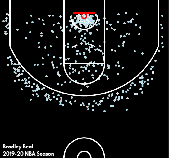
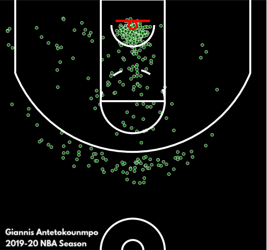
Should the Bucks pursue a player like Bradley Beal, who can knock down three pointers and complement an inside player like Giannis? Take a look at comparing the two star players’ shot charts for the 2019–20 NBA season.
雄鹿是否应该追求像布拉德利·比尔这样的球员,他可以击倒三个指针并补充像吉安尼斯这样的内线球员? 看看比较这两位球星在2019-20赛季的射门图表。
All of the data is made available in the NBA API, so all of this information is readily available to all teams, players, coaches.
所有数据都可以在NBA API中获得,因此所有团队,球员,教练都可以轻松获得所有这些信息。
制作图表: (Making the shotchart:)
Data Source: NBA APIThe NBA’s API (application programming interface) provides a whole variety of data and player information. This data is a result of some of the newest technology with player tracking and information management, which provides a great backing for how information is collected by the NBA and teams. For example, Second Spectrum is the official player movement tracking provider for the NBA (and also many other leagues). Services provided by Second Spectrum tracks player movement, miles per game, halfcourt spread for teams.
资料来源:NBA API NBA的API(应用程序编程接口)提供了各种各样的数据和球员信息。 这些数据是采用球员跟踪和信息管理的一些最新技术得出的,这为NBA和球队收集信息的方式提供了良好的支持。 例如,Second Spectrum是NBA(以及许多其他联赛)的官方球员运动跟踪提供商。 Second Spectrum提供的服务可跟踪球员的移动情况,每场比赛的英里数,团队的半场传播。
The NBA API provides shotchartdetail within ShotChartDetail that will return a DataFrame with the X and Y coordinates of all the shots taken by a player you are requesting. These X and Y coordinates can be plotted in a scatter plot, which when overlaid on a court will result in your final shot chart. Be careful to make sure that your court size is drawn to the correct dimensions, or else the scatterplot and court frame of reference may differ.
NBA API在ShotChartDetail中提供Shotchartdetail,它将返回一个DataFrame,其中包含您所请求的球员所拍摄的所有镜头的X和Y坐标。 这些X和Y坐标可以绘制在散点图中,当叠加在球场上时,将生成最终的击球图。 请注意确保将您的法庭尺寸绘制为正确的尺寸,否则散布图和法庭参考系可能会有所不同。
from nba_api.stats.static import players
player_dict = players.get_players()from nba_api.stats.static import teams
teams = teams.get_teams()from nba_api.stats.static import teams
teams = teams.get_teams()from nba_api.stats.endpoints import shotchartdetail
Python and Seaborn:The tools used to make the visualizations include Pandas, Seaborn, Matplotlib, all of which are Python libraries.
Python和Seaborn :用于进行可视化的工具包括Pandas,Seaborn,Matplotlib,它们都是Python库。
Pandas allows for the dataframe manipulation, which is the most crucial part in the process to gather and clean the data to be used.
熊猫允许对数据框进行操作,这是收集和清理要使用的数据的过程中最关键的部分。
Seaborn and Matplotlib are the fundamental Python visualization libraries. Seaborn is used to create the visualizations, whereas Matplotlib is used to edit certain aspects–such as the axes, title, fonts, dimensions the visualization.
Seaborn和Matplotlib是基本的Python可视化库。 Seaborn用于创建可视化,而Matplotlib用于编辑某些方面,例如轴,标题,字体,可视化的尺寸。
import numpy as np
import pandas as pd
import seaborn as sns
import matplotlib.pyplot as plt
import matplotlib.font_manager as fm
from matplotlib.patches import Circle, Rectangle, Arc, ConnectionPatch
步骤1:收集数据 (Step 1: Gathering the Data)
The first step is to make use of the NBA API to gather the relevant data you want to use. This can be done through the NBA API itself, by simply entering in the “player_id” and “team_id” for whatever player you are looking for.
第一步是利用NBA API收集要使用的相关数据。 这可以通过NBA API本身完成,只需为您要寻找的任何球员输入“ player_id”和“ team_id”。
shot_detail = shotchartdetail.ShotChartDetail(player_id=p_id,
team_id=t_id, context_measure_simple = 'FGA',
season_type_all_star='Playoffs')
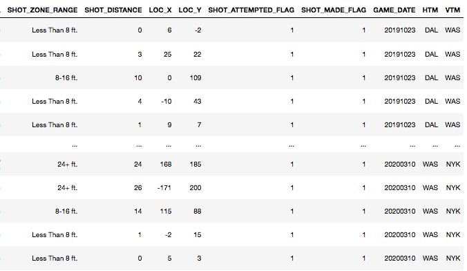
shot_df = shot_detail.get_data_frames()[0]Here, getting the shot_df is enough to continue forward with the shot chart. Parameters such as context_measure_simple and season-type_all_star are useful in getting the shots that you want, whether that be regular season, playoffs, all star games.
在这里,获取shot_df足以继续前进击球图。 诸如context_measure_simple和season-type_all_star之类的参数对于获取所需的投篮很有用,无论是常规赛,季后赛还是全明星赛。
Here’s what the dataframe looks like:
数据框如下所示:
步骤2:绘制球场 (Step 2: Drawing the court)
Next step in the process is drawing the half court in the NBA.
该过程的下一步是吸引NBA半场。
We have used code provided by Bradley Fay. The way he has done this is by scratch. Writing in the code for eerie small aspects of the court, such as a three point line, free throw line, arcs for the inner court and restriction area etc.
我们使用了Bradley Fay提供的代码。 他这样做的方式是从头开始的。 在代码中写出法院的阴暗面,例如三分线,罚球线,内场弧线和禁区等。
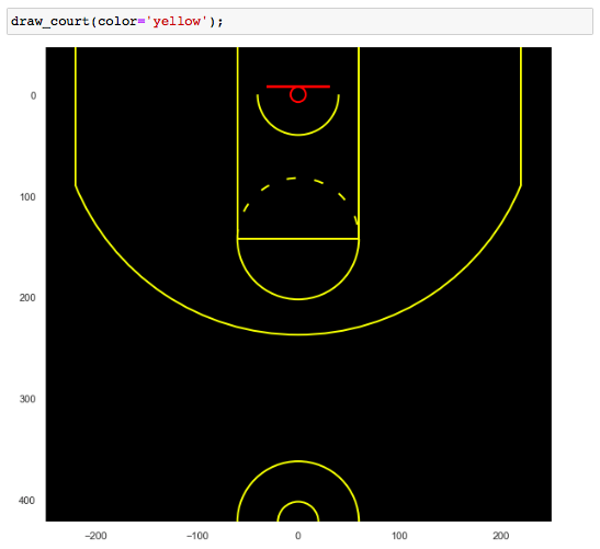
We edited out the areas of the court that we are not interested in including for our visualizations. We have also implemented parameters within the code that will draw a line and background to our colors specifications.
我们编辑了我们不希望看到的法院区域,包括可视化区域。 我们还在代码中实现了参数,这些参数将为我们的颜色规范绘制线条和背景。
The full code for drawing out the court as provided can be found here: Bradley Fay GitHub.
可以在此处找到提供法院判决的完整代码: Bradley Fay GitHub 。
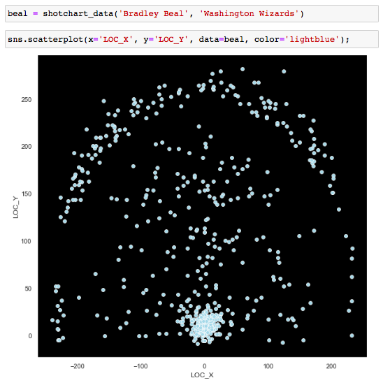
步骤3:分散镜头 (Step 3: Scatter the shots)
This is the meat of the entire visualization. The shots are the final and most important piece of the shotchard. This is a simple sns.scatterplot:
这是整个可视化的基础。 镜头是流程图的最后也是最重要的部分。 这是一个简单的sns.scatterplot:
sns.scatterplot(x='LOC_X', y='LOC_Y', data=beal, color='lightblue');Looking at the data frame above, there are two features that will determine the coordinate of the shot in the 2 dimensional court. Simply plotting X_loc and Y_loc from the dataframe as provided by the NBA API will lay the shots out and return an orientation that looks really familiar!
查看上面的数据框,有两个功能可以确定2维球场中镜头的坐标。 只需按照NBA API提供的数据帧来绘制X_loc和Y_loc,就可以布局镜头并返回看起来非常熟悉的方向!
步骤3:对地块进行分层 (Step 3: Layering the plots)
In this final step, you will layer the two plots together.
在这最后一步中,您将把两个图叠加在一起。
This step is where the most freedom with deciding on a plot comes into play. Here you can determine aspects of the plot that are most important to you–color, size, shape etc.
这是决定情节的最大自由发挥作用的地方。 在这里,您可以确定对您而言最重要的部分,例如颜色,大小,形状等。
For our plot layering process, we first set the style and figure size for our plot. We have actually made the dimensions of our visualization to be the same ratio as the actual half-court in the NBA. Our face color here is black, which makes the background of the plot black. We cut out the axes labels, since they don’t mean much, so we leave those as white.
对于图的分层过程,我们首先设置图的样式和图形大小。 实际上,我们使可视化的尺寸与NBA中实际半场的比例相同。 我们的脸部颜色为黑色,这使情节的背景变黑。 我们切掉了轴标签,因为它们的意义不大,所以我们将其保留为白色。
First we write in the code for our scatterplot of the shots using Seaborn. Following that line of code, we simply draw the course and save the figure locally if everything looks right. The parameter save is an important one to make sure we save just if everything looks right on a first go.
首先,我们使用Seaborn为镜头的散点图编写代码。 遵循那行代码,如果一切正常,我们只需绘制过程并将图形保存在本地。 参数save是一个重要的参数,它可以确保即使一开始一切都看起来正确,我们也可以保存。
def drawchart(df, dotcolor, save, fname, color='white', lw=4,
axes_color='black', facecolor='white'):sns.set(rc={'figure.figsize':(5*2, 4.7*2),
'axes.facecolor':axes_color, 'figure.facecolor':facecolor})sns.set_style({'axes.grid' : False})sns.scatterplot(x='LOC_X', y='LOC_Y', data=df, color=dotcolor)draw_court(color=color, lw=lw)if save == True:
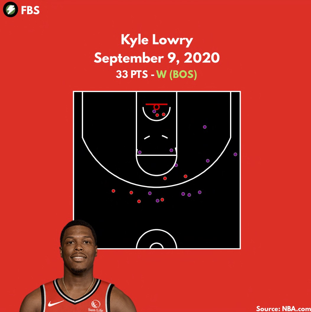
plt.savefig(fname)发布和分享 (Posting and sharing)
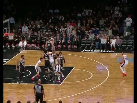
We love creating blog posts and daily recaps using the work we do. Everyday, in our NBA recaps, we feature a shotchart of the player who scores the most points. The process for that in terms of code is a bit more complex, as we restrict the data to a single game and we include all field goals. The red field dots are misses and the alternate color (usually the color of the team) are the makes.
我们喜欢使用所做的工作来创建博客文章和每日回顾。 每天,在NBA回顾中,我们都会列出得分最高的球员的快照。 就代码而言,此过程要复杂一些,因为我们将数据限制在一个游戏中,并且包括所有射门得分。 红色的区域点表示未命中,而其他颜色(通常是团队的颜色)是标记。
Here’s a look at the daily shot chart we share with our blog followers daily:
这是我们每天与博客关注者分享的每日镜头图表:
撰写人: (Written by:)
翻译自: https://medium.com/@fastbreakstatistics/creating-the-nba-shotchart-using-python-5c595374d905


 被折叠的 条评论
为什么被折叠?
被折叠的 条评论
为什么被折叠?
 到【灌水乐园】发言


