


android ui设计
If you are just getting started with UI Design, you may have these questions in mind:
如果您刚刚开始使用UI Design,可能会想到以下问题:
What should be the size of my screen when I am designing for iOS, Android, or Web?
当我为iOS,Android或Web设计时,屏幕的大小应该是多少?
What icon size should I use?
我应该使用什么图标大小?
What are DP and PT and what is their relationship with Pixel (Px)?
什么是DP和PT?它们与Pixel(Px)的关系是什么?
Why my design looks inconsistent and unbalanced!
为什么我的设计看起来不一致且不平衡!
Well, you are not alone. Every new designer goes through these confusions. When new UI Designers tell me to give feedback on their design, inappropriate dimensions and lack of white space are the most common problems I see. Other problems include poor use of color and bad Typography. But that will be a separate discussion of its own.
那么,你并不孤单。 每个新设计师都会经历这些困惑。 当新的UI设计师告诉我有关其设计的反馈时,不正确的尺寸和缺少空白是我看到的最常见问题。 其他问题包括颜色使用不当和版式不佳。 但这将是一个单独的讨论。
In this article, I will discuss how to get started with the basics of the measurements. It’s going to be a bit long! So please bear with me.
在本文中,我将讨论如何开始进行测量的基础知识。 它会有点长! 所以,请忍受我。
首先,我需要知道什么是DP / Pt / Px? (First Thing First — Do I need to know what DP/Pt/Px is?)
The answer is Yes, but not necessary to understand this discussion.
答案是肯定的,但对于理解此讨论不是必需的。
Different platforms have different measurement units. Pt (Point) in iOS, DP/DIP (Density-Independent Pixel) in Android, and Px (Pixel) in the Web platform. But those days are gone and 2020 is a great time to be a UI Designer because you don’t need to memorize them all. You just need to know your numbers! When you hand-off your design to the developers, most of the time they will know whether to use DP, Pt, or Px. Again, as a beginner, you just need to know your numbers and enter them in your favorite design tool (Please don’t use Photoshop for UI Design. I beg you!). Eventually, you will learn what those units mean.
不同的平台具有不同的测量单位。 iOS中的Pt (点),Android中的DP / DIP (密度独立像素)和Web平台中的Px (像素)。 但是那些日子已经一去不复返了,2020年是成为UI设计师的好时机,因为您不需要全部记住它们。 您只需要知道您的电话号码即可! 当您将设计移交给开发人员时,大多数时候他们会知道是使用DP,Pt还是Px。 再次,作为一个初学者,您只需要知道您的编号并将其输入到您喜欢的设计工具中(请不要将Photoshop用于UI设计。求求您!) 。 最终,您将了解这些单元的含义。
屏幕尺寸-我的Artboard尺寸应该是多少? (Screen Dimensions — What Should Be My Artboard Size?)
Now, what is the platform you are designing for? Android, iOS, or Desktop? Depending on the platform, target the most widely used and possibly the smallest screen size.
现在,您要设计的平台是什么? Android,iOS或台式机? 根据平台,针对最广泛使用并且可能最小的屏幕尺寸。

From the chart above, you can see that 360x640 is the most widely used Mobile Screen Resolution. That’s because Android is the dominant Mobile OS in the world and all (early) Android Devices with 16:9 aspect ratio have 360x640 dp screens. And between iPhone 5 and iPhone X, every regular iPhone Model had a screen resolution of 375x667 pt.
从上面的图表中,您可以看到360x640是使用最广泛的移动屏幕分辨率。 这是因为Android是全球主要的移动操作系统,并且所有(早期)宽高比为16:9的Android设备都具有360x640 dp屏幕。 在iPhone 5和iPhone X之间,每个普通的iPhone型号的屏幕分辨率均为375x667 pt。
I recommend designing at 360x640 for Android and 375x667 for iOS. Unless you want to showcase your design in a modern and trendy Device Mockup, for example, iPhone 11 Pro or Samsung Galaxy S10+, or your target userbase has a different screen size.
我建议在Android上以360x640设计,在iOS上以375x667设计。 除非您想在现代时尚的设备模型中展示您的设计,例如iPhone 11 Pro或Samsung Galaxy S10 +,否则您的目标用户群的屏幕尺寸会有所不同。
On the other hand, 1366x768 is still the most dominant screen resolution for Desktop. So I recommend targeting this screen size when designing for Desktop.
另一方面, 1366x768仍然是台式机最主要的屏幕分辨率。 因此,我建议在为台式机进行设计时将此屏幕尺寸定位为目标。
Are we done with screen dimen… I mean your artboard sizes? Let’s move on.
屏幕尺寸完成了吗?我是说您的画板尺寸是多少? 让我们继续前进。
Android UI指标 (Android UI Metrics)
Have you ever heard of 8 Point Grid? If not, read this 👇 article by Vitsky:
您听说过8点网格吗? 如果没有,请阅读这篇👇的文章Vitsky :
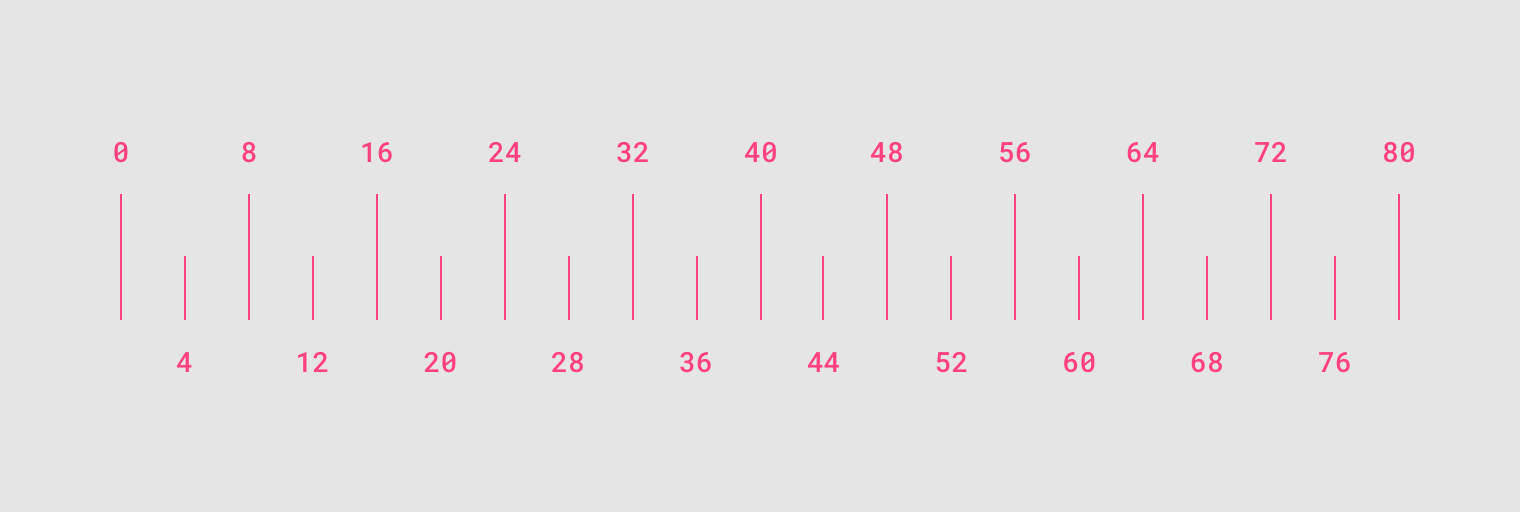
Now that you know what 8pt Grid is and why it’s important, let’s break down the Android UI Components.
现在您已经知道8pt Grid是什么以及为什么它很重要,接下来让我们分解一下Android UI组件。
组成部分 (The Components)
An Android App UI screen usually consists of 4 parts:
Android App UI屏幕通常包含4个部分:
- Status Bar 状态栏
- App Bar应用栏
- Content Area内容区
- Bottom Navigation Bar底部导航栏
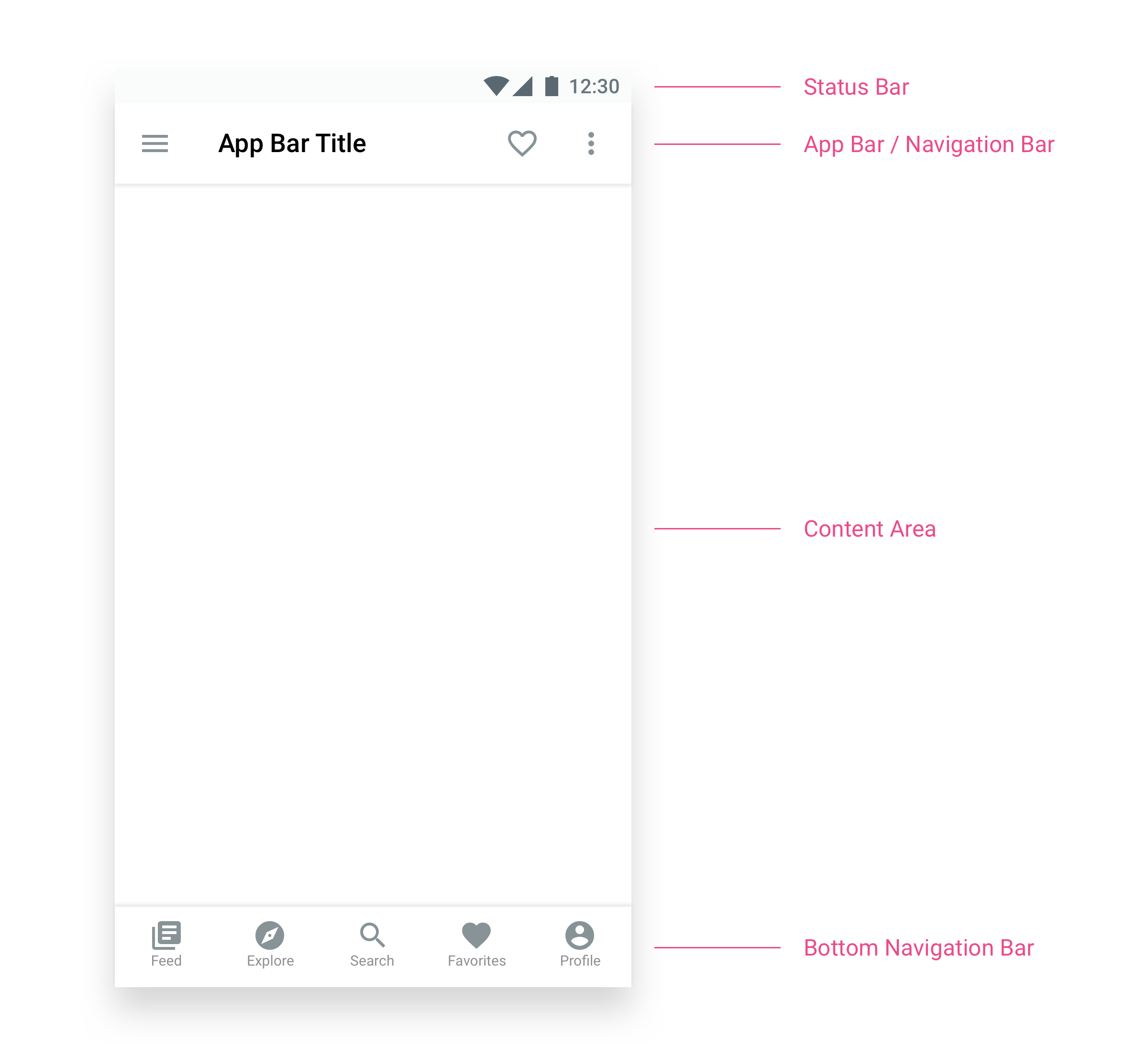
We will discuss the App Bar and Bottom Navigation Bar in detail. The Content Area is where you put the main contents. For example, text, images, illustrations, videos, etc. We will briefly talk about buttons, spacing, and margins as well.
我们将详细讨论应用程序栏和底部导航栏。 内容区域是放置主要内容的地方。 例如,文本,图像,插图,视频等。我们还将简要讨论按钮,间距和边距。
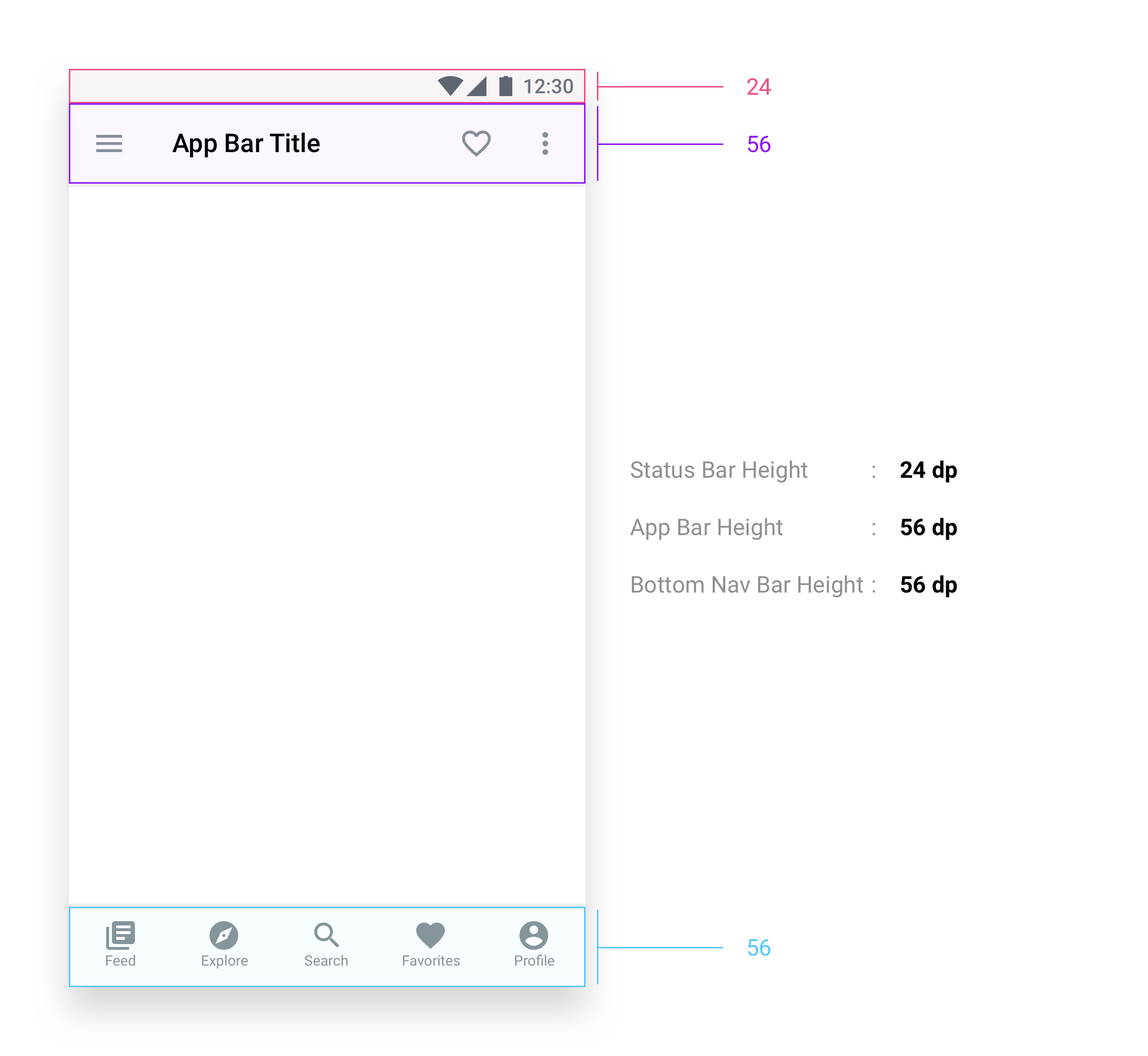
应用栏 (App Bar)
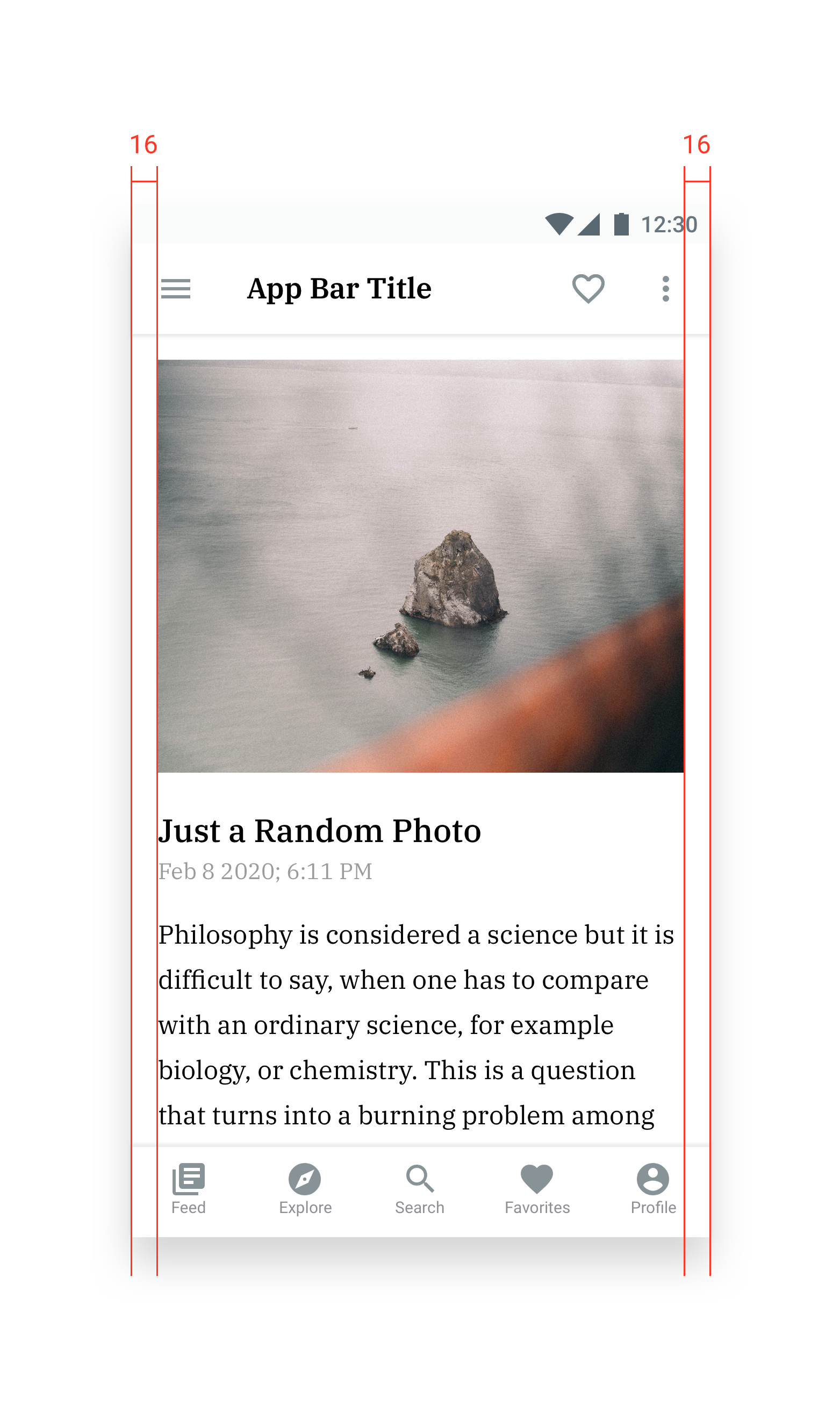
The App Bar usually consists of a title and some icons. If we break it down, it looks like this:
应用栏通常由标题和一些图标组成。 如果我们分解它,它看起来像这样:

底部导航栏(Bottom Navigation Bar)
So… we are done with the App Bar. Let’s have a look at the Bottom Navigation Bar.
如此……我们完成了应用栏。 让我们看一下底部导航栏。
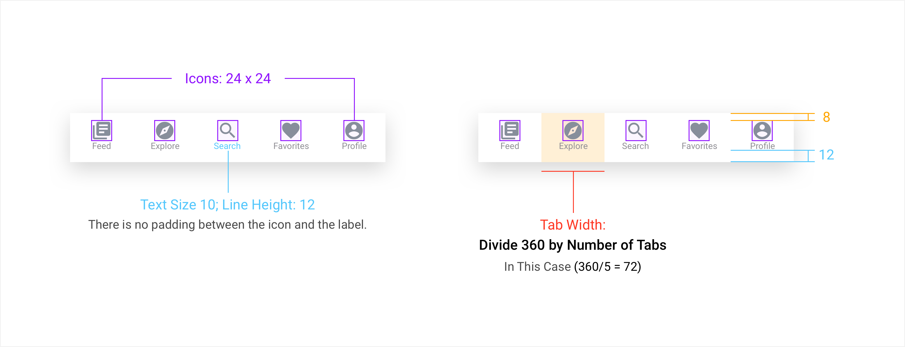
The Bottom Navigation bar can have 2–5 tabs. Do NOT use more than 5 tabs. Oh, Facebook uses 6? They do not use Icon Labels either, so they can accommodate more than 5 tabs. And Icons without Labels are known as Ghost Icons. As a designer, you would know what every icon means but your average users won’t. So always use Labels with Navigation Icons.
底部导航栏可以有2–5个选项卡。 不要使用超过5个标签。 哦,Facebook使用6? 他们也不使用图标标签,因此可以容纳5个以上的标签。 没有标签的图标称为“鬼图标”。 作为设计师,您会知道每个图标的含义,但您的普通用户却不会。 因此,请始终使用带有导航图标的标签。
边距和边距 (Edges & Margins)
Probably you already noticed that 16dp is the standard value for the left and right margin. Sometimes people use 8 and sometimes 24. But in most cases, less than 16 is not recommended.
可能您已经注意到16dp是左右边距的标准值。 有时人们使用8,有时使用24。但是在大多数情况下,建议不要使用少于16。
However, when you are placing text/image contents inside a card, you can get away with 8dp margins without making the UI look busy but you need to make sure that you are leaving at least a 12dp margin between the contents inside the card and the edges of it. As a beginner, just leave 16 dp on both sides. You will learn to utilize spaces better as you gain more experience.
但是,当您将文本/图像内容放入卡中时,可以避免使用8dp的边距,而不会使UI看起来很忙,但是您需要确保在卡中的内容和标签之间留出至少12dp的边距。它的边缘。 作为初学者,两边都留16 dp。 随着经验的积累,您将学会更好地利用空间。
纽扣 (Buttons)
When using buttons, make them 48dp high. Google Material Design Guidelines recommend that any tappable area should be at least 48x48 dp. Less than that will reduce the accuracy of the tap. When using 2 buttons side by side, keep at least a 16 dp gap between them.
使用按钮时,使其高48dp。 Google物料设计指南建议,任何可触碰区域都应至少为48x48 dp。 小于此值将降低抽头的精度。 并排使用两个按钮时,两个按钮之间至少要留有16 dp的间隙。

However, you can use smaller or larger buttons depending on your project but make sure there are no other tappable UI Elements in the 48 dp radius. I do not recommend using any button less than 32 dp high. And that 32 dp button should not be your Primary Action Button. For Primary Action Buttons, keep them between 40–56 dp.
但是,您可以根据项目使用较小或较大的按钮,但请确保在48 dp半径内没有其他可点击的UI元素。 我不建议使用任何低于32 dp高的按钮。 并且该32 dp按钮不应是您的主要操作按钮。 对于主要操作按钮,请将其保持在40–56 dp之间。
In a 48 dp high button, the labels look best at 14–16, when using Capitalized labels, you can make them 12. But less than that is not recommended.
在高48 dp的按钮中,标签在14–16时看起来最好,当使用大写标签时,您可以将它们设置为12。但是不建议使用低于此值的标签。
基本不要 (The Basic DON’Ts)
- DO NOT stretch an icon. Never do that, please! 请勿拉伸图标。 请不要这样做!
- DO NOT stretch a Text Layer (I am talking to you, PS and AI users 😉 ) 不要拉伸文本层(我正在与您交谈,PS和AI用户😉)
- DO NOT drag and scale a group of layers. In most cases, it will give you broken pixels, and probably you won’t even notice. But your developers will. 请勿拖动和缩放一组图层。 在大多数情况下,它会给您损坏的像素,甚至您可能根本不会注意到。 但是您的开发人员会的。
- DO NOT use broken pixels. For example 44.23, 39.97. Round them to full pixels. And again, follow the 8dp Scale. 请勿使用损坏的像素。 例如44.23、39.97。 将它们四舍五入为完整像素。 再次,遵循8dp比例尺。
DO NOT use multiple styles for different instances of the same UI Element. Use Symbols / Components as much as possible. It will save you a lot of time.
To learn some Typography stuff, head over to this article by Dorjan Vulaj:
要学习一些印刷术知识,请转到Dorjan Vulaj的这篇文章:
我们涵盖了基础知识吗? (Did We Cover The Basics?)
I think we did. There are some other small things that I’d love to cover in this article but that would require some more time. And I have been procrastinating on this for a while now. 😀 However, if you have any questions, let me know in the comments. I will try to cover the iOS Platform in another article.
我想我们做到了。 我还希望在本文中介绍其他一些小事情,但这需要更多时间。 我已经拖延了一段时间了。 😀但是,如果您有任何疑问,请在评论中告诉我。 我将在另一篇文章中尝试介绍iOS平台。
android ui设计


 3349
3349


 被折叠的 条评论
为什么被折叠?
被折叠的 条评论
为什么被折叠?
 到【灌水乐园】发言


