


介绍 (Intro)
Bottom navigation has skyrocketed in popularity in the last few years. It came out as an alternative to the not so popular anymore hamburger menus or navigation drawers. Implementing it using Flutter is easy if we want to show the bottom bar only when displaying one of the initial pages, i.e., those directly exposed on the menu.
在过去的几年中, 底部导航的人气直线上升。 它取代了现在不再流行的汉堡菜单或导航抽屉 。 如果仅在显示初始页面之一(即那些直接显示在菜单上的页面)时才显示底部栏,则使用Flutter轻松实现它。
But that’s not how the cool kids are doing it. Apps like Youtube and Instagram, allows navigation to happen inside tabs, keeping the bottom menu visible for you to shift between them at any time. It also manages separate “navigation stacks” for each, so that they won’t interfere with one another, and allowing you to continue from where you left when you switch back.
但这不是好孩子做的方式。 诸如Youtube和Instagram之类的应用程序允许在选项卡内进行导航,使底部菜单可见,以便您随时在它们之间切换。 它还为每个管理单独的“导航堆栈”,以使它们不会相互干扰,并允许您从切换回的位置继续。
In this article, we’ll cover how you can achieve the same. By the end of it, you’ll have a complete understanding of how this works by building a solution that goes incrementally from what you saw in the gif above, to a top-notch solution that even adapts to the device’s platform. I divided that goal into three manageable tasks that we must solve to conquer it. I hope you enjoy it.
在本文中,我们将介绍如何实现相同的目标。 到最后,您将通过构建一个解决方案来全面了解它的工作原理,该解决方案从上面gif中看到的内容逐步发展到一种甚至可以适应设备平台的一流解决方案。 我将该目标分为三个必须克服的可管理任务,以解决该问题。 我希望你喜欢它。
README.md 😉
README.md😉
I’ll use the terms screen and page interchangeably.
我将交替使用术语屏幕和页面 。
I’ll use the word flow when referring to a collection of related pages.
在指代相关页面的集合时,我将使用流程一词。
Menu and bar will also be used interchangeably.
菜单和栏也可以互换使用。
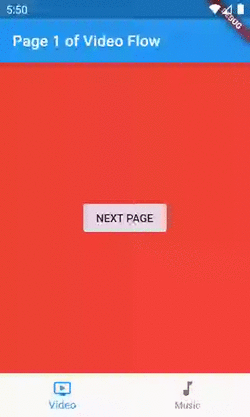
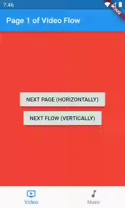
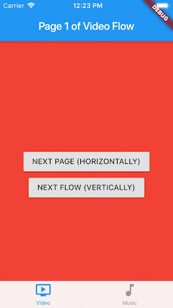
The code sample is available on GitHub, and I’ll reference the branch name whenever useful. You can find the code for the first image at
simple-nav-home-only.该代码示例可在GitHub上获得 ,并且在有用时将引用分支名称。 您可以在
simple-nav-home-only找到第一张图像的代码。
第一项任务 (First Task)
Showing the bottom menu in other pages besides the initials.
除首字母缩写外,在其他页面中显示底部菜单。
People often refer to this pattern as Instagram-like navigation. It goes like this: instead of one page, we’ll have a stack of pages per tab, enabling us to keep the bar visible while the user navigates inside it.
人们通常将此模式称为类似于Instagram导航 。 它是这样的:代替一个页面 ,我们每个选项卡将有一堆页面 ,使我们能够在用户在其中导航时使条形保持可见。
If we want to present another flow of our app, one that isn’t on the bottom menu, like an authentication flow or merely a fullscreen dialog, we still can/should, but then the bar won’t remain visible.
如果我们要展示应用程序的另一种流程,即不在身份验证流程或仅是全屏对话框之类的底部菜单,我们仍然可以/应该这样做,但是该栏不会保持可见。
In summary, for each new page we want to show we have two possibilities:
总之,对于每个新页面,我们都希望显示出两种可能性:
1.Push it inside our current inner stack, i.e., navigating deeper into our flow — horizontal navigation.
1.将其放入我们当前的内部堆栈中,即,更深入地导航到我们的流程中- 水平导航 。
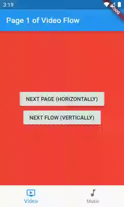
2.Push it to our outer/top-level stack, i.e., presenting it as another flow — vertical navigation.
2.将其推送到我们的外部/顶层堆栈,即,将其呈现为另一种流程- 垂直导航 。
This concept is very familiar to those with an iOS background, as it is standardized over there.
对于具有iOS背景的人来说,这个概念非常熟悉,因为它在那里被标准化了。
Solution: Having one Navigator widget per tab.
解决方案: 每个选项卡 具有一个 Navigator 小部件。
By default, inside our MaterialApp/CupertinoApp, we're already given a stack to push and pop our pages widgets, but one isn't enough anymore.
默认情况下,在MaterialApp / CupertinoApp内部,我们已经有了堆栈来推送和弹出页面小部件,但是现在已经不够了。
Since in Flutter “everything is a widget”, we need one that is capable of managing its separate stack of pages, so that each of our flows can have one of these. For that purpose, we have the Navigator widget:
因为在Flutter中“一切都是小部件” ,所以我们需要一个能够管理其单独的页面堆栈的控件 ,以便我们的每个流程都可以拥有其中的一个。 为此,我们有Navigator小部件:
A widget that manages a set of child widgets with a stack discipline.
用堆栈规则管理一组子窗口小部件的窗口小部件。
Sounds great, right? If we wrap each flow with one of these, what’s left for us when navigating, is choosing if we want to push the new screen in the current/inner Navigator, for navigating horizontally, or in the MaterialApp/CupertinoApp's one, for vertical navigation.
听起来不错,对吗? 如果我们用其中一种包装每个流,那么导航时剩下的就是选择是否要在当前/内部Navigator推送新屏幕(用于水平导航),还是在MaterialApp / CupertinoApp的屏幕中推送用于垂直的屏幕导航。
谈话很便宜。 给我看代码。” (“Talk is cheap. Show me the code.”)
class HomeScreen extends StatefulWidget {
  @override
  _HomeScreenState createState() => _HomeScreenState();
}


class _HomeScreenState extends State<HomeScreen> {
  int _currentBarIndex = 0;

  // AppFlow is just a class I created for holding information
  // about our app's flows.
  final List<AppFlow> appFlows = [
    AppFlow(
      title: 'Video',
      iconData: Icons.ondemand_video,
      mainColor: Colors.red,
      navigatorKey: GlobalKey<NavigatorState>(),
    ),
    AppFlow(
      title: 'Music',
      iconData: Icons.music_note,
      mainColor: Colors.green,
      navigatorKey: GlobalKey<NavigatorState>(),
    )
  ];


  @override
  Widget build(BuildContext context) {
    final currentFlow = appFlows[_currentBarIndex];
    // We're preventing the root navigator from popping and closing the app
    // when the back button is pressed and the inner navigator can handle it.
    // That occurs when the inner has more than one page on its stack.
    // You can comment the onWillPop callback and watch "the bug".
    return WillPopScope(
      onWillPop: () async =>
          !await currentFlow.navigatorKey.currentState.maybePop(),
      child: Scaffold(
        body: Navigator(
          // The key in necessary for two reasons:
          // 1 - For the framework to understand that we're replacing the
          // navigator even though its type and location in the tree is
          // the same. For this isolate purpose a simple ValueKey would fit.
          // 2 - Being able to access the Navigator's state inside the onWillPop
          // callback and for emptying its stack when a tab is re-selected.
          // That is why a GlobalKey is needed instead of a simple ValueKey.
          key: currentFlow.navigatorKey,
          // Since this isn't the purpose of this sample, we're not using named
          // routes. Because of that, the onGenerateRoute callback will be
          // called only for the initial route.
          onGenerateRoute: (settings) => MaterialPageRoute(
            settings: settings,
            builder: (context) => IndexedPage(
              index: 1,
              containingFlowTitle: currentFlow.title,
              backgroundColor: currentFlow.mainColor,
            ),
          ),
        ),
        bottomNavigationBar: BottomNavigationBar(
          currentIndex: _currentBarIndex,
          items: appFlows
              .map(
                (flow) => BottomNavigationBarItem(
                  title: Text(flow.title),
                  icon: Icon(flow.iconData),
                ),
              )
              .toList(),
          onTap: (newIndex) => setState(
            () {
              if (_currentBarIndex != newIndex) {
                _currentBarIndex = newIndex;
              } else {
                // If the user is re-selecting the tab, the common
                // behavior is to empty the stack.
                currentFlow.navigatorKey.currentState
                    .popUntil((route) => route.isFirst);
              }
            },
          ),
        ),
      ),
    );
  }
}
This class is our entry point, the widget I’m giving to the MaterialApp's home property. It's called Screen, not Page, to avoid confusion. Conceptually, this one displays pages inside it rather than being one.
此类是我们的切入点,我将其提供给MaterialApp的home属性。 为了避免混淆,将其称为屏幕,而不是页面。 从概念上讲,这个显示器里面的网页,而不是一个。
The code for the IndexedPage widget is straightforward and adds nothing to our guide. It's just a column with two buttons, but you can see it here or by checking out the simple-nav-loosing-state branch. The only part worth mentioning is that when we're navigating vertically, we should pass true to the rootNavigator parameter of the Navigator.of method.
IndexedPage小部件的代码很简单,没有为我们的指南添加任何内容。 它只是一个带有两个按钮的列,但是您可以在此处查看或通过查看simple-nav-loosing-state分支来查看。 唯一值得一提的是,当我们垂直导航时,应将true传递给Navigator.of方法的rootNavigator参数。
Navigator.of(context, rootNavigator: isVerticalNavigation).push(...);第二项任务 (Second Task)
Maintaining state across tab switches.
保持选项卡开关之间的状态。
Our code has a problem now. When we’re navigating through a flow, switch to another, and then come back to the previous, it will be showing its first page again. If this was a real-world app, for example, the user might be filling a form, and wouldn’t be happy to lose it.
我们的代码现在有问题。 当我们浏览一个流程时,切换到另一个,然后回到上一个,它将再次显示其第一页。 例如,如果这是一个真实世界的应用程序,则用户可能正在填写表单,并且不愿意丢失它。
Solution: Keeping both tab’s Navigators in the widget tree.
解决方案:将两个选项卡的 Navigator 都保留 在小部件树中。
Instead of recreating our flows each time the selected tab changes, this time we want to hold them. We can accomplish that by keeping all in the widget tree, while only displaying one. Here comes the IndexedStack widget:
这次我们要保留它们,而不是每次选择的选项卡更改时都重新创建流。 我们可以通过将所有内容保留在小部件树中而仅显示一个来完成此操作。 这是IndexedStack小部件:
A Stack that shows a single child from a list of children. The displayed child is the one with the given index.
一个堆栈,显示一个孩子列表中的一个孩子。 显示的子项是具有给定索引的子项。
Kudos to Hans Muller on doing the excellent job of walking us through that.
汉斯·穆勒 ( Hans Muller) 出色地完成了我们的工作 ,对此表示敬意。
Here’s the diff from our previous version of the HomeScreen:
这是与之前版本的HomeScreen的区别:
child: Scaffold(
-        body: Navigator(
-          // The key in necessary for two reasons:
-          // 1 - For the framework to understand that we're replacing the
-          // navigator even though its type and location in the tree is
-          // the same. For this isolate purpose a simple ValueKey would fit.
-          // 2 - Being able to access the Navigator's state inside the onWillPop
-          // callback and for emptying its stack when a tab is re-selected.
-          // That is why a GlobalKey is needed instead of a simple ValueKey.
-          key: currentFlow.navigatorKey,
-          // Since this isn't the purpose of this sample, we're not using named
-          // routes. Because of that, the onGenerateRoute callback will be
-          // called only for the initial route.
-          onGenerateRoute: (settings) => MaterialPageRoute(
-            settings: settings,
-            builder: (context) => IndexedPage(
-              index: 1,
-              containingFlowTitle: currentFlow.title,
-              backgroundColor: currentFlow.mainColor,
-            ),
-          ),
+        body: IndexedStack(
+          index: _currentBarIndex,
+          children: appFlows
+              .map(
+                _buildIndexedPageFlow,
+              )
+              .toList(),
         ),
         bottomNavigationBar: BottomNavigationBar(
           currentIndex: _currentBarIndex,
           items: appFlows
               .map(
                 (flow) => BottomNavigationBarItem(
                   title: Text(flow.title),
                   icon: Icon(flow.iconData),
                 ),
               )
               .toList(),
           onTap: (newIndex) => setState(
             () {
               if (_currentBarIndex != newIndex) {
                 _currentBarIndex = newIndex;
               } else {
                 // If the user is re-selecting the tab, the common
                 // behavior is to empty the stack.
                 currentFlow.navigatorKey.currentState
                     .popUntil((route) => route.isFirst);
               }
             },
           ),
         ),
       ),
     );
   }
+
+  // The best practice here would be to extract this to another Widget,
+  // however, moving it to a separate class would only harm the
+  // readability of our guide.
+  Widget _buildIndexedPageFlow(AppFlow appFlow) => Navigator(
+        // The key enables us to access the Navigator's state inside the
+        // onWillPop callback and for emptying its stack when a tab is
+        // re-selected. That is why a GlobalKey is needed instead of
+        // a simpler ValueKey.
+        key: appFlow.navigatorKey,
+        // Since this isn't the purpose of this sample, we're not using named
+        // routes. Because of that, the onGenerateRoute callback will be
+        // called only for the initial route.
+        onGenerateRoute: (settings) => MaterialPageRoute(
+          settings: settings,
+          builder: (context) => IndexedPage(
+            index: 1,
+            containingFlowTitle: appFlow.title,
+            backgroundColor: appFlow.mainColor,
+          ),
+        ),
+      );
 }
That’s enough for preventing our stack of pages from being emptied each time we switch tabs. You can find this version at the stateful_nav_material branch.
这足以防止每次切换标签时清空我们的页面堆栈。 您可以在stateful_nav_material分支中找到此版本。
第三项任务 (Third Task)
Make it look like iOS’ and Android’s native bottom navigation components.
使它看起来像iOS和Android的本机底部导航组件。
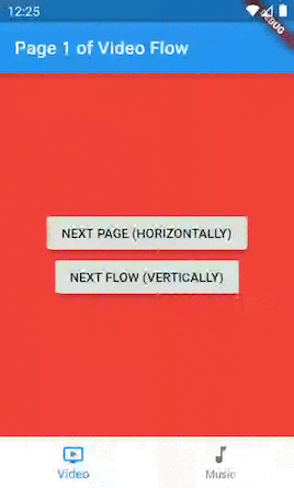
I took both screenshots from the final version of our app. Notice that on the Cupertino’s, there is no splash effect on selection, the icons are bigger and the titles smaller. Of course, that’s only a concern if you want your app to look exactly like the natives.
我从应用程序的最终版本中截取了两个屏幕截图。 请注意,在Cupertino上,选择没有飞溅效果,图标较大,标题较小。 当然,如果您希望自己的应用看起来与本地人完全一样,那只是一个问题。
Solution: Building a platform-aware widget.
解决方案:构建一个平台感知的小部件。
We use the term platform-aware, or simply adaptive, when referring to widgets that render differently depending on the device’s platform.
当指代根据设备平台呈现不同外观的小部件时,我们使用术语“ 平台感知 ”或“ 自适应” 。
The good news is that the equivalent Cupertino's widgets for what we’ve done so far, already handles by default tasks one and two for us.
好消息是,到目前为止,我们所做的等效的Cupertino窗口小部件已经默认为我们处理了任务一和任务二。
If we were to close our eyes to the third task, we would have two paths to follow:
如果我们对第三项任务不予理we,我们将有两条路可走:
- Use our current implementation on both platforms, the downside being that it looks like Android’s native component. 在两个平台上都使用我们当前的实现,缺点是它看起来像Android的本机组件。
Use the
CupertinoTabScaffoldwidget on both platforms, the downside being that now it looks like the iOS' native component.在两个平台上都使用
CupertinoTabScaffold小部件,缺点是现在看起来像iOS的本机组件。
But, as the great developers that we all are, we won’t ignore the third task. I promised you a top-notch solution, and that’s what you’ll get. 😎
但是,作为我们所有人都是伟大的开发人员,我们不会忽略第三个任务。 我向您保证了一流的解决方案,这就是您所得到的。 😎
逐步适应 (Step-by-step on becoming adaptive)
1.In our IndexedPage, we’re pushing routes using the MaterialPageRoute class. Let’s make it more professional by using a CupertinoPageRoute when we’re on iOS:
1.在IndexedPage ,我们使用MaterialPageRoute IndexedPage路由。 在iOS上使用CupertinoPageRoute ,让它变得更加专业:
void _pushPage(BuildContext context, bool isHorizontalNavigation) {
    // If it's not horizontal navigation,
    // we should use the rootNavigator.
    Navigator.of(context, rootNavigator: !isHorizontalNavigation).push(
-      MaterialPageRoute(
+      _buildAdaptivePageRoute(
        builder: (context) => IndexedPage(
          // If it's a new flow, the displayed index should be 1 again.
          index: isHorizontalNavigation ? index + 1 : 1,
          // If it's a new flow, we'll randomize its color.
          backgroundColor: isHorizontalNavigation
              ? backgroundColor
              : Colors.primaries[Random().nextInt(Colors.primaries.length)],
          // If it's starting a new flow let's just call it 'New.'
          containingFlowTitle:
              isHorizontalNavigation ? containingFlowTitle : 'New',
        ),
        fullscreenDialog: !isHorizontalNavigation,
      ),
    );
  }
+
+  PageRoute<T> _buildAdaptivePageRoute<T>(
+          {@required WidgetBuilder builder, bool fullscreenDialog = false}) =>
+      Platform.isAndroid
+          ? MaterialPageRoute(
+              builder: builder,
+              fullscreenDialog: fullscreenDialog,
+            )
+          : CupertinoPageRoute(
+              builder: builder,
+              fullscreenDialog: fullscreenDialog,
+            );
That will handle the different transition animations between platforms for us.
这将为我们处理平台之间的不同过渡动画。
2.Fortunately, both the Material’s solution we built and the Cupertino’s widgets composition for achieving the same (we’ll get there) uses the same BottomNavigationBarItem class for representing the tabs, a GlobalKey for its inner navigators, and both needs a builder for the initial page of each flow. So, I’ve created a wrapper class in a separate file for these dependencies:
2幸运的是,我们构建的Material解决方案和Cupertino的实现相同(我们将到达那里)的小部件组成都使用相同的BottomNavigationBarItem类来表示选项卡,使用GlobalKey作为其内部导航器,并且都需要一个构建器用于每个流程的初始页。 因此,我为这些依赖关系在单独的文件中创建了一个包装器类:
class BottomNavigationTab {
  const BottomNavigationTab({
    @required this.bottomNavigationBarItem,
    @required this.navigatorKey,
    @required this.initialPageBuilder,
  })  : assert(bottomNavigationBarItem != null),
        assert(navigatorKey != null),
        assert(initialPageBuilder != null);


  final BottomNavigationBarItem bottomNavigationBarItem;
  final GlobalKey<NavigatorState> navigatorKey;
  final WidgetBuilder initialPageBuilder;
}
3.Let’s move our Material’s specific code out of the HomeScreen and into another widget called MaterialBottomNavigationScaffold. Notice that it knows nothing about the domain of our app (music and videos).
3.让我们将Material的特定代码移出HomeScreen ,移到另一个名为MaterialBottomNavigationScaffold小部件中。 请注意,它对我们的应用程序域(音乐和视频)一无所知。
class MaterialBottomNavigationScaffold extends StatelessWidget {
  const MaterialBottomNavigationScaffold({
    @required this.navigationBarItems,
    @required this.onItemSelected,
    @required this.selectedIndex,
    Key key,
  })  : assert(navigationBarItems != null),
        assert(onItemSelected != null),
        assert(selectedIndex != null),
        super(key: key);


  /// List of the tabs to be displayed with their respective navigator's keys.
  final List<BottomNavigationTab> navigationBarItems;


  /// Called when a tab selection occurs.
  final ValueChanged<int> onItemSelected;


  final int selectedIndex;


  @override
  Widget build(BuildContext context) => Scaffold(
        // The IndexedStack is what allows us to retain state across tab
        // switches by keeping our views in the widget tree while only showing
        // the selected one.
        body: IndexedStack(
          index: selectedIndex,
          children: navigationBarItems
              .map(
                (barItem) => _buildPageFlow(context, barItem),
              )
              .toList(),
        ),
        bottomNavigationBar: BottomNavigationBar(
          currentIndex: selectedIndex,
          items: navigationBarItems
              .map(
                (item) => item.bottomNavigationBarItem,
              )
              .toList(),
          onTap: onItemSelected,
        ),
      );


  // The best practice here would be to extract this to another Widget,
  // however, moving it to a separate class would only harm the
  // readability of our guide.
  Widget _buildPageFlow(BuildContext context, BottomNavigationTab barItem) =>
      Navigator(
        // The key enables us to access the Navigator's state inside the
        // onWillPop callback and for emptying its stack when a tab is
        // re-selected. That is why a GlobalKey is needed instead of
        // a simpler ValueKey.
        key: barItem.navigatorKey,
        // Since this isn't the purpose of this sample, we're not using named
        // routes. Because of that, the onGenerateRoute callback will be
        // called only for the initial route.
        onGenerateRoute: (settings) => MaterialPageRoute(
          settings: settings,
          builder: barItem.initialPageBuilder,
        ),
      );
}
4.Create the Cupertino’s analogous to our recently created MaterialBottomNavigationScaffold. These are all classes brought to us by the Cupertino library, and since it already handles by default tasks one and two for us, the code is self-explanatory.
4.创建Cupertino ,类似于我们最近创建的MaterialBottomNavigationScaffold 。 这些都是Cupertino库提供给我们的所有类,并且由于它已经默认为我们处理了第一和第二个任务,因此代码是不言自明的。
class CupertinoBottomNavigationScaffold extends StatelessWidget {
  const CupertinoBottomNavigationScaffold({
    @required this.navigationBarItems,
    @required this.onItemSelected,
    @required this.selectedIndex,
    Key key,
  })  : assert(navigationBarItems != null),
        assert(onItemSelected != null),
        assert(selectedIndex != null),
        super(key: key);


  /// List of the tabs to be displayed with their respective navigator's keys.
  final List<BottomNavigationTab> navigationBarItems;


  /// Called when a tab selection occurs.
  final ValueChanged<int> onItemSelected;


  final int selectedIndex;


  @override
  Widget build(BuildContext context) => CupertinoTabScaffold(
        // As we're managing the selected index outside, there's no need
        // to make this Widget stateful. We just need pass the selectedIndex to
        // the controller every time the widget is rebuilt.
        controller: CupertinoTabController(initialIndex: selectedIndex),
        tabBar: CupertinoTabBar(
          items: navigationBarItems
              .map(
                (item) => item.bottomNavigationBarItem,
              )
              .toList(),
          onTap: onItemSelected,
        ),
        tabBuilder: (context, index) {
          final barItem = navigationBarItems[index];
          return CupertinoTabView(
            navigatorKey: barItem.navigatorKey,
            onGenerateRoute: (settings) => CupertinoPageRoute(
              settings: settings,
              builder: barItem.initialPageBuilder,
            ),
          );
        },
      );
}
5.Create a Scaffold class that chooses between our Material’s and Cupertino’s and also implements the common behavior to both.
5,创建一个Scaffold类,在我们的Material和Cupertino之间进行选择,并同时实现这两种行为。
class AdaptiveBottomNavigationScaffold extends StatefulWidget {
  const AdaptiveBottomNavigationScaffold({
    @required this.navigationBarItems,
    Key key,
  })  : assert(navigationBarItems != null),
        super(key: key);


  /// List of the tabs to be displayed with their respective navigator's keys.
  final List<BottomNavigationTab> navigationBarItems;


  @override
  _AdaptiveBottomNavigationScaffoldState createState() =>
      _AdaptiveBottomNavigationScaffoldState();
}


class _AdaptiveBottomNavigationScaffoldState
    extends State<AdaptiveBottomNavigationScaffold> {
  int _currentlySelectedIndex = 0;


  @override
  Widget build(BuildContext context) => WillPopScope(
        // We're preventing the root navigator from popping and closing the app
        // when the back button is pressed and the inner navigator can handle
        // it. That occurs when the inner has more than one page on its stack.
        // You can comment the onWillPop callback and watch "the bug".
        onWillPop: () async => !await widget
            .navigationBarItems[_currentlySelectedIndex]
            .navigatorKey
            .currentState
            .maybePop(),
        child: Platform.isAndroid
            ? _buildMaterial(context)
            : _buildCupertino(context),
      );


  Widget _buildCupertino(BuildContext context) =>
      CupertinoBottomNavigationScaffold(
        navigationBarItems: widget.navigationBarItems,
        onItemSelected: onTabSelected,
        selectedIndex: _currentlySelectedIndex,
      );


  Widget _buildMaterial(BuildContext context) =>
      MaterialBottomNavigationScaffold(
        navigationBarItems: widget.navigationBarItems,
        onItemSelected: onTabSelected,
        selectedIndex: _currentlySelectedIndex,
      );


  /// Called when a tab selection occurs.
  void onTabSelected(int newIndex) {
    if (_currentlySelectedIndex == newIndex) {
      // If the user is re-selecting the tab, the common
      // behavior is to empty the stack.
      widget.navigationBarItems[newIndex].navigatorKey.currentState
          .popUntil((route) => route.isFirst);
    }


    // If we're running on iOS there's no need to rebuild the Widget to reflect
    // the tab change.
    if (Platform.isAndroid) {
      setState(() {
        _currentlySelectedIndex = newIndex;
      });
    } else {
      _currentlySelectedIndex = newIndex;
    }
  }
}
6.Change the HomeScreen to use our newly born AdaptiveBottomNavigationScaffold and keep only our domain specifics.
6.Change的HomeScreen使用我们的新生AdaptiveBottomNavigationScaffold只保留我们的领域细节。
class HomeScreen extends StatefulWidget {
  @override
  _HomeScreenState createState() => _HomeScreenState();
}


class _HomeScreenState extends State<HomeScreen> {
  final List<AppFlow> appFlows = [
    AppFlow(
      title: 'Video',
      iconData: Icons.ondemand_video,
      mainColor: Colors.red,
      navigatorKey: GlobalKey<NavigatorState>(),
    ),
    AppFlow(
      title: 'Music',
      iconData: Icons.music_note,
      mainColor: Colors.green,
      navigatorKey: GlobalKey<NavigatorState>(),
    )
  ];


  @override
  Widget build(BuildContext context) => AdaptiveBottomNavigationScaffold(
        navigationBarItems: appFlows
            .map(
              (flow) => BottomNavigationTab(
                  bottomNavigationBarItem: BottomNavigationBarItem(
                    title: Text(flow.title),
                    icon: Icon(flow.iconData),
                  ),
                  navigatorKey: flow.navigatorKey,
                  initialPageBuilder: (context) => IndexedPage(
                        index: 1,
                        backgroundColor: flow.mainColor,
                        containingFlowTitle: flow.title,
                      )),
            )
            .toList(),
      );
}
And you’re done! This complete version is available at the adaptive-stateful-nav branch.
大功告成! 该完整版本可在adaptive-stateful-nav分支中获得。
Notice that although we made our bottom navigation bar and route transition animations look different on each platform, our IndexedPage doesn't. That's why we still have this Material feel on our buttons and app bars, but let's leave this for another article.
请注意,尽管我们使底部导航栏和路线过渡动画在每个平台上看起来都不同,但IndexedPage却没有。 这就是为什么我们在按钮和应用栏上仍然具有这种“ Material感的原因,但是让我们将其留给另一篇文章。
回顾 (Recap)
We started with the simplest possible solution, where the bottom menu was visible only when showing the initial pages, then solved that by having multiple Navigators. Next, we identified that we were losing state, so we used an IndexedStack for helping us with that. Last but not least, we gave it different looks on each platform by building Material's and Cupertino's versions and choosing between them based on the platform we're currently running. It may seem like a lot, but now you have a full-fledged solution to use in every production project you need to.
我们从最简单的解决方案开始,该解决方案仅在显示初始页面时才显示底部菜单,然后通过使用多个Navigator解决此问题。 接下来,我们确定我们正在丢失状态,因此我们使用IndexedStack来帮助我们实现这一目标。 最后但并非最不重要的一点是,我们通过构建Material版本和Cupertino版本,并根据我们当前正在运行的平台在它们之间进行选择,在每个平台上赋予了不同的外观。 看起来可能很多,但现在您可以在所需的每个生产项目中使用完善的解决方案。
奖金 (Bonus)
Check out the master branch to see how I added cross-fade transitions and lazy widget building to MaterialBottomNavigationScaffold as taught by Hans Muller's article.
请查看master分支,以按照Hans Muller的文章所讲授的那样,如何向MaterialBottomNavigationScaffold添加淡入淡出过渡和惰性窗口小部件构建。
There is no need to apply those to CupertinoBottomNavigationScaffold, since the lazy building is how it already works and the animation is a recommendation of the Material Design's specification.
无需将其应用于CupertinoBottomNavigationScaffold ,因为惰性建筑已经可以正常工作,并且动画是Material Design规范的推荐。
If you want to see this bottom navigation structure applied to a real-world scenario with named routes, check out the article below.
如果要查看此底部导航结构应用于具有命名路线的实际场景,请查看以下文章。
翻译自: https://medium.com/swlh/bottom-navigate-like-the-pros-in-flutter-8a48bdd5fed4


 扫一扫
扫一扫
 2178
2178

 被折叠的 条评论
为什么被折叠?
被折叠的 条评论
为什么被折叠?
 到【灌水乐园】发言


