


android 显示大屏幕
For many people, Android is synonymous with smartphones, unsurprising considering that over 2.5 billion users run Android on smartphone devices. However, Android devices now come in many different shapes, sizes, and form factors: from wearables and fitness devices to cars, laptops, and TVs.
对于许多人来说,Android是智能手机的代名词,考虑到超过25亿用户在智能手机设备上运行Android,这不足为奇。 但是,Android设备现在具有许多不同的形状,大小和外形:从可穿戴设备和健身设备到汽车,笔记本电脑和电视。
In this article, we’re looking at how to build great experiences for the larger display devices: tablets, foldables, laptops, and desktop devices. We are going to cover:
在本文中,我们正在研究如何为较大的显示设备(平板电脑,可折叠设备,笔记本电脑和台式机设备)构建出色的体验。 我们将介绍:
- UI and UX considerations UI和UX注意事项
- App continuity 应用连续性
- Multi-window environments 多窗口环境
- Multi-display environments 多显示器环境
- Testing 测试中
范式转变 (A paradigm shift)
When it comes to readying your app for bigger screens it isn’t just the screen size you need to consider. Larger screen form factors affect the way people use your app, how they interact with the UI, and the focus they give your apps.
在为更大的屏幕准备您的应用程序时,您不仅需要考虑屏幕尺寸。 屏幕尺寸较大会影响人们使用您的应用程序的方式,与UI的交互方式以及他们对应用程序的关注程度。
People use a smartphone for quick actions, usually while on the move, in portrait mode, interacting with the UI through touch. Smartphone users rarely hook up a second screen, keyboard, and mouse to their phone.
人们通常在移动时以肖像模式使用智能手机进行快速操作,并通过触摸与UI进行交互。 智能手机用户很少将第二个屏幕,键盘和鼠标连接到手机。
The tablet form factor is not as mobile: we don’t see people running around cities on their tablets. Users generally do more complex actions on tablets, spend more time in an app, and commonly work in landscape. However, UI interaction remains touch focused.
平板电脑的外形不那么移动:我们看不到人们在平板电脑上到处跑。 用户通常在平板电脑上执行更复杂的操作,在应用程序中花费更多的时间,并且通常在横向模式下工作。 但是,UI交互仍以触摸为重点。
Spanning both of these interaction paradigms are foldable devices. While you will largely apply the learnings from smartphone and tablet form factors, foldable bring the challenge of extreme aspect ratios, from 21-to-9 when folded to nearly 1-to-1 when unfolded.
跨越这两个交互范例的都是可折叠设备。 尽管您将大量应用从智能手机和平板电脑外形尺寸中获得的经验,但可折叠带来了极高的长宽比挑战,折叠时从21到9到展开时几乎从1到1。
In desktop environments we have the largest screens, users interacting with apps for longer, focused on achieving specific tasks. It is also, keyboard and trackpad first. Some devices don’t have touch screens, so many of the assumptions about how people interact with a UI are no longer valid. This environment is landscape first. Users also have expectations from other desktop environments, particularly the ability to use multiple windows where apps can be resized at will to take on almost any orientation or aspect ratio.
在桌面环境中,我们拥有最大的屏幕,用户与应用程序互动的时间更长,专注于完成特定任务。 同样,键盘和触控板也是第一位。 有些设备没有触摸屏,因此关于人们如何与UI交互的许多假设不再有效。 此环境首先是景观。 用户还对其他桌面环境抱有期望,特别是能够使用多个窗口,在这些窗口中可以随意调整应用程序的大小,以适应几乎任何方向或宽高比。
So, compared to it’s smartphone version, as you think about how to handle different screen sizes and aspect ratios, you will need to consider new layouts and navigation patterns, and the resources to support them.
因此,与智能手机版本相比,考虑如何处理不同的屏幕尺寸和宽高比时,您需要考虑新的布局和导航模式,以及支持它们的资源。
UX和UI注意事项 (UX and UI considerations)
处理不同的宽高比 (Handle diverse aspect ratios)
On devices where your app takes up the entire screen, large-screen form factors mean you need to allow for aspect ratios of 1 to 1 all the way to 21 by 9. On desktop form factors users may apply even more extreme aspect ratios. Take a communication app, users may place it in a tall, narrow window at the edge of the screen so they can view and respond to messages while working with another app that occupies the rest of the screen.
在您的应用占据整个屏幕的设备上,大屏幕尺寸意味着您需要将宽高比从1到1一直到21 x9。在台式机尺寸上,用户可能会应用甚至更高的宽高比。 以通信应用程序为例,用户可以将其放置在屏幕边缘的一个狭窄的高大窗口中,以便他们可以在与另一个占用屏幕其余部分的应用程序一起查看和响应消息。
There is no magic bullet to addressing this diversity of aspect ratios, you will need to test and support these as best as possible.
解决宽高比的多样性没有万能的法宝,您将需要尽可能地对其进行测试和支持。
However, if your app’s content is unsuitable for certain aspect ratios use the minAspectRatio flag, introduced in Android 10, or the maxAspectRatio flag to constrain your app within workable aspect ratios.
但是,如果您的应用内容不适合某些长宽比,请使用Android 10中引入的minAspectRatio标志或maxAspectRatio标志将您的应用限制在可行的长宽比内。
导航模式 (Navigation patterns)
Navigation patterns can break when you start supporting a variety of different devices. For example, take bottom navigation, here in a simple photo viewer app.
当您开始支持各种不同的设备时,导航模式可能会中断。 例如,在一个简单的照片查看器应用程序中进行底部导航。
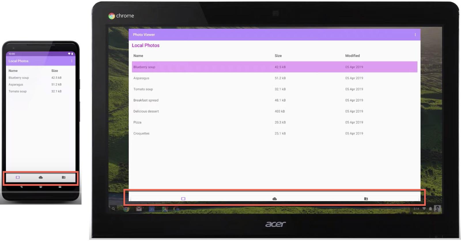
This navigation works well on smartphones. It’s easy to tell where the touch targets are, where one item ends and the other begins. However, when running on a desktop environment, with a wide display, it becomes hard to figure out where items end and what is actionable.
此导航在智能手机上效果很好。 很容易分辨出触摸目标在哪里,一个项目在哪里结束而另一个项目在哪里开始。 但是,在宽屏的桌面环境中运行时,很难确定项目的结束位置和可操作的内容。
For large-screen, a better approach is to place options on the left side of the screen. If somebody is using your app on a tablet, this position places the options close to where their hand holds the device, making selection more convenient.
对于大屏幕,更好的方法是将选项放在屏幕的左侧。 如果有人在平板电脑上使用您的应用程序,则此位置会将选项放置在他们手握设备的位置附近,从而使选择更加方便。
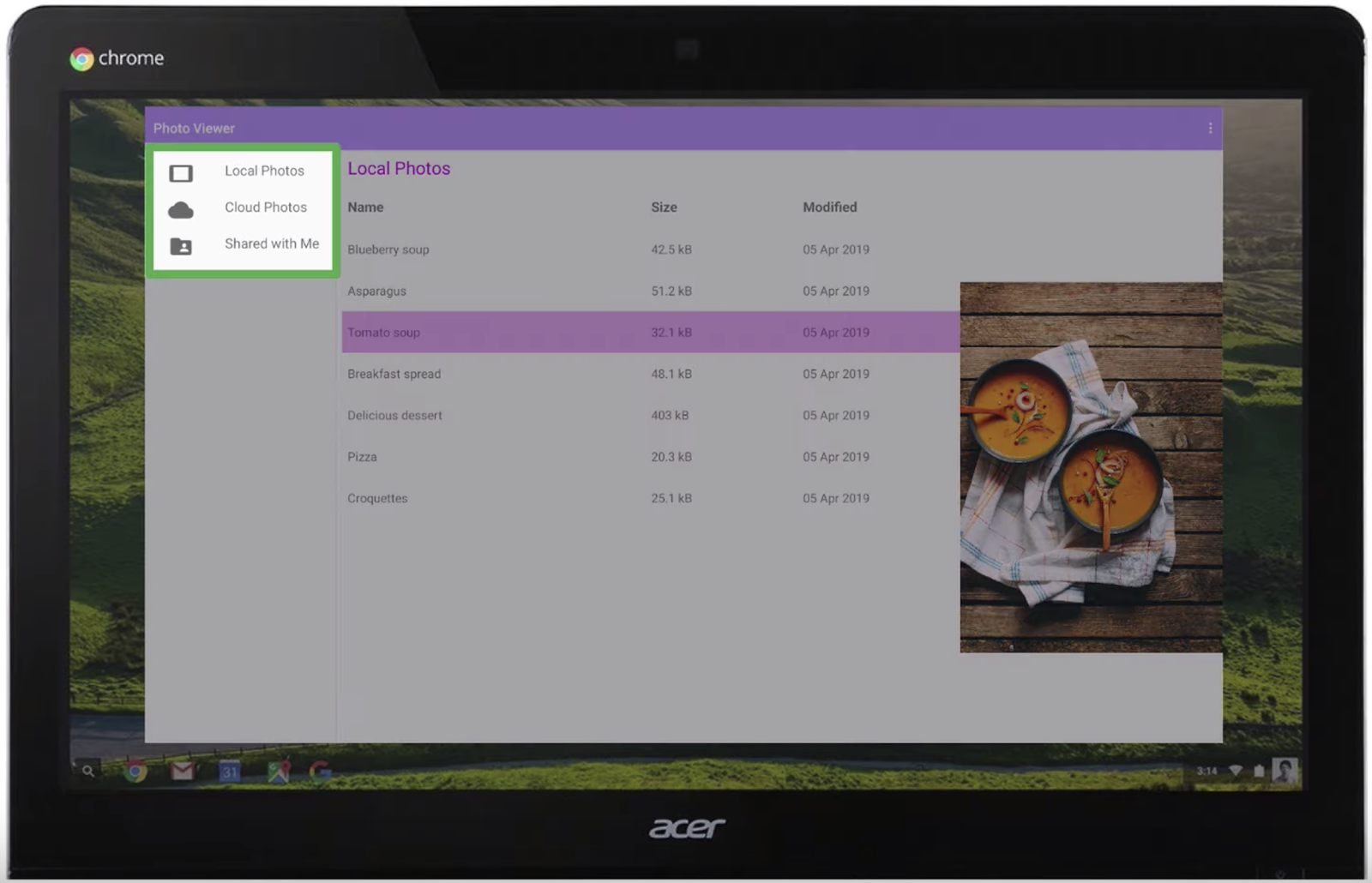
Left-side navigation is also a paradigm people are used to from web pages.
左侧导航也是人们习惯于从网页上浏览的范例。
版面 (Layouts)
The photo viewer example shows that when you simply reuse a smartphone layout on wide screens, lists of items leave a lot of whitespace. Making better use of the space doesn’t mean applying a master-detail pattern and adding in as much content on the screen as possible. You should think about ways to surface more information or make tasks more efficient.
照片查看器示例显示,当您在宽屏上简单地重复使用智能手机布局时,项目列表会留下很多空白。 更好地利用空间并不意味着应用主从模式并在屏幕上添加尽可能多的内容。 您应该考虑增加信息或使任务更有效率的方法。
For example, option items in an overflow menu could be pulled out. So, instead of having to make three taps to edit, people can select that option directly now that there’s room to place it there.
例如,溢出菜单中的选项可能会被拉出。 因此,由于有足够的空间可以放置它,因此人们不必直接三按即可进行编辑。
Larger screens also make it possible to deliver more immersive experiences. For example, in a media-viewing or productivity app, there are many more ways to keep people engaged. It’s worth noting though, there is no one-size-fits-all solution to using this extra space.
更大的屏幕还可以提供更身临其境的体验。 例如,在媒体查看或生产力应用程序中,还有许多其他方法可以使人们参与其中。 但是,值得注意的是,没有一种千篇一律的解决方案来使用此额外空间。
Meanwhile, it’s worth checking out the Material Studies for inspiration. The Material design team have created design studies for several products with complete design mockups.
同时,值得查阅材料研究的灵感。 材料设计团队已经使用完整的设计模型为几种产品创建了设计研究。
One of the studies is Reply, an email client created with designed goals of clarity, legibility, intuition, and ease of use while projecting friendliness and competence for its brand.
其中一项研究是Reply, 这是一个电子邮件客户端 ,旨在创建清晰,易读,直观,易于使用的电子邮件客户端 ,同时为其品牌设计友好性和竞争力。
In this study, the message content is not changed significantly between the various screen sizes. However, navigation changes from a bottom nav in the smartphone layout to a nav drawer on larger screens, which pops out by default on the largest screens.
在这项研究中,消息内容在各种屏幕尺寸之间没有显着变化。 但是,导航从智能手机布局中的底部导航更改为大屏幕上的导航抽屉,默认情况下,导航抽屉会在最大屏幕上弹出。
This example shows how the extra space on larger screens doesn’t need to be overloaded with additional information, but that whitespace can be used to make content easier to read.
此示例说明了如何在较大屏幕上的多余空间不需要附加其他信息,而可以使用空白使内容更易于阅读。
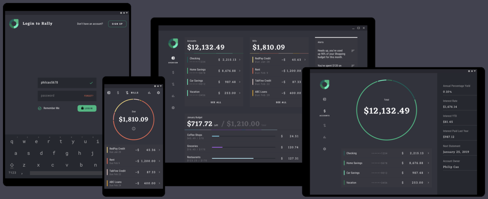
Another study is Rally, a finance app, that is designed to show as much information as possible so users can quickly see what they need to make decisions about their finances, then get out and get on with their life.
另一项研究是金融应用程序Rally ,该应用程序旨在显示尽可能多的信息,以便用户可以快速了解自己做出财务决策所需的内容,然后下手并继续生活。
输入模式 (Input patterns)
As form factors move towards the desktop, it becomes less likely that touch is the input medium used. Input could be through a stylus or mouse and keyboard. Therefore, you need to consider how to bring some of the input paradigms you see on desktop platforms to your app.
随着外形向台式机发展,触摸成为使用的输入介质的可能性越来越小。 输入可以通过手写笔或鼠标和键盘进行。 因此,您需要考虑如何将桌面平台上看到的一些输入范例带入您的应用程序。
For example, consider handling right-click (context) actions, which you do by setting a contextClickListener and mapping long-press behavior to right clicks.
例如,考虑处理右键单击(上下文)操作,您可以通过设置contextClickListener并将长按行为映射到右键单击来进行操作。
Another useful technique to help show people that things are actionable are hover actions. For example, you can change colors or elevation when hovering over action items using setOnHoverListener like this:
悬停动作是另一种有用的技术,可帮助人们向人们展示事物是可操作的。 例如,您可以使用setOnHoverListener将鼠标悬停在操作项上时更改颜色或高程,如下所示:
yourView.setOnHoverListener{ view, motionEvent ->
  when (motionEvent.actionMasked) {
    MotionEvent.ACTION_HOVER_ENTER -> {
      // UI change to highlight item
    }
    MotionEvent.ACTION_HOVER_EXIT -> {
      // Undo highlight
    }
  }
}
Or update the mouse pointer, for example to change it to a hand icon to indicate a grab or select function. This is a simple one-line implementation:
或更新鼠标指针,例如将其更改为手形图标以指示抓取或选择功能。 这是一个简单的单行实现:
yourView.setOnHoverListener { view, motionEvent ->
 // Change to the hand icon that users expect when
 // hovering over something actionable
 View.pointerIcon =
   PointerIcon.getSystemIcon(context, PointerIcon.TYPE_HAND)
 false
}
应用连续性 (App continuity)
App continuity is the capability of an app to seamlessly restore the user state when it receives a configuration change, for example, making sure it is in the same edit position in text or playback location in a video.
应用程序连续性是应用程序在收到配置更改时无缝恢复用户状态的功能,例如,确保它在文本中的相同编辑位置或视频中的播放位置。
In smartphones the main case, rotation, is generally context-based, such as switching to landscape to view a video. On larger screen devices, with their support for multi-window, the focus for app continuity becomes the need to redraw and re-layout your app with minimal jank. In this animation, the Play Store app goes from a smaller window with a bottom nav to a large window with left-side nav.
在智能手机中,旋转通常是基于上下文的,例如切换到风景以观看视频。 在大屏幕设备上,由于它们支持多窗口,因此应用程序连续性的重点变成了以最小的刺痛重新绘制和重新布局应用程序的需求。 在此动画中,Play商店应用从具有底部导航的较小窗口变为具有左侧导航的大窗口。
To achieve a smooth transition make sure your onCreate and lifecycle methods can be cycled quickly. To do this, ensure you’re not performing network operations or large memory reads on those methods. In addition, these types of task performed on those methods often cause crashes, making for a bad user experience.
为了实现平稳过渡,请确保可以快速循环使用onCreate和生命周期方法。 为此,请确保您没有执行网络操作或对这些方法进行大内存读取。 此外,在这些方法上执行的这些类型的任务通常会导致崩溃,从而带来不良的用户体验。
The resizeableActivity flag is a manifest flag introduced to indicate whether an app supports multi-window and multi-display environments. Although, setting this to false does not mean that your activity never needs to resize. For example, on a foldable, if somebody unfolds the device you have to handle configuration changes correctly and make sure that you’re restoring the correct state.
resizeableActivity标志是引入的清单标志,用于指示应用程序是否支持多窗口和多显示环境。 虽然将其设置为false并不意味着您的活动永远不需要调整大小。 例如,在可折叠设备上,如果有人展开设备,则必须正确处理配置更改,并确保要恢复正确的状态。
But, if you have an activity that is set so it cannot be resized and its orientation is locked the new compat mode in Android 10 help guarantees that your app won’t get a configuration change when a device is unfolded.
但是,如果您设置的活动无法调整大小且其方向已锁定,则Android 10中的新兼容模式可确保在设备展开时您的应用不会更改配置。
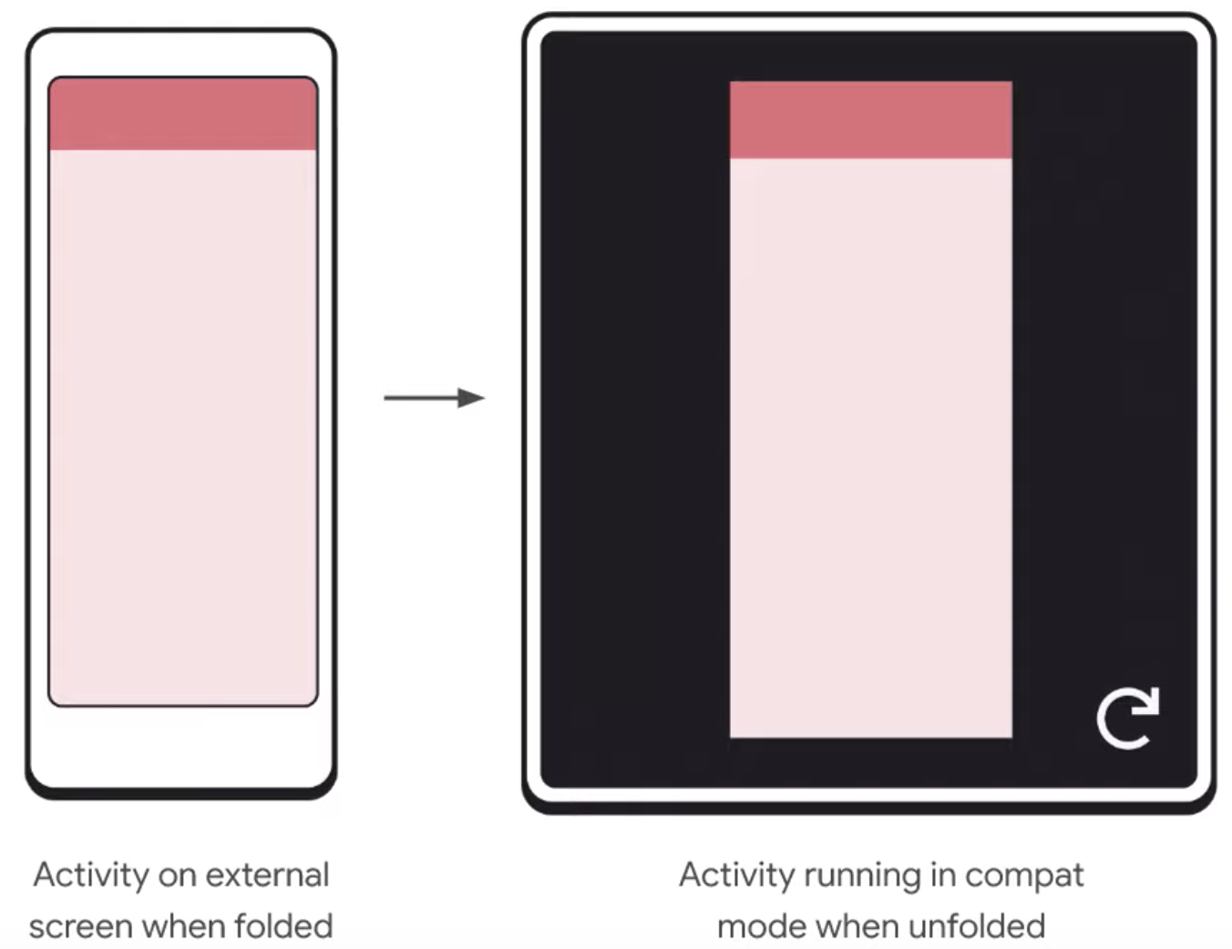
In compat mode, in the bottom-right corner, there is an activity or application restart button for the user to restart the app. This button enables your app to get the new global config and draw on the available screen.
在兼容模式下,右下角有一个活动或应用程序重新启动按钮,供用户重新启动应用程序。 通过此按钮,您的应用可以获取新的全局配置并在可用屏幕上绘制。
处理配置更改 (Handling configuration changes)
When a device is unfolded, apps get configuration changes for smallestScreenSize, screenSize, and screenLayout. If you’re not handling this yourself, you should use onSaveInstanceState and ViewModels to store your data and the user state as the configuration changes.
展开设备后,应用程序会更改MinimumScreenSize,screenSize和screenLayout的配置。 如果您自己不处理此问题,则应使用onSaveInstanceState和ViewModels在配置更改时存储数据和用户状态。
If you are handling it yourself in your manifest, you’ll get a callback for handleConfigChange and can swap out layouts or resources.
如果您自己在清单中处理它,则将获得handleConfigChange的回调,并且可以换出布局或资源。
For the best experience, you should declare resizeableActivity to be true in your manifest. And, it’s recommended that you let the OS handle as many of these configuration changes as possible, given the number of edge cases where you may miss something, such as swapping out resources for different display densities.
为了获得最佳体验,您应该在清单中声明resizeableActivity为true。 并且,建议您考虑到可能遗漏某些情况的极端情况(例如为不同的显示密度交换资源),让操作系统处理尽可能多的这些配置更改。
多窗口 (Multi-window)
多次恢复 (Multi-resumed)
On devices with large displays, people want to use apps side-by-side in a multi-window environment. Android 10 introduces an important change for managing this type of environment: multi-resumed.
在具有大显示屏的设备上,人们希望在多窗口环境中并排使用应用程序。 Android 10引入了一项重要的更改来管理这种类型的环境:多恢复。
Prior to Android 10, in a multi-window environment, only one of the visible activities is in the RESUMED state. This can be confusing for the user, as there is no visual indication of which activity is RESUMED.
在Android 10之前的版本中,在多窗口环境中,只有可见活动之一处于RESUMED状态。 这可能会使用户感到困惑,因为没有视觉指示表明恢复了哪个活动。
With multi-resumed, all the visible activities are in the RESUMED state. However, apps can still end up in a PAUSED state where, for example, a transparent activity is on top of the activity or the activity is not focusable, such as in a picture-in-picture.
使用多次恢复时,所有可见活动都处于恢复状态。 但是,应用程序仍可能最终处于“暂停”状态,例如,透明活动位于该活动之上,或者该活动不可聚焦(例如画中画)。
This change has been made in a way that minimizes the alterations you need to make: in most cases there should be no changes required to your app to work in multi-resumed. However, you may need to make changes for resources that can only handle exclusive access.
进行此更改的方式可以最大程度地减少您需要进行的更改:在大多数情况下,您的应用无需进行任何更改即可多次恢复工作。 但是,您可能需要对只能处理独占访问的资源进行更改。
For example, if there are three activities wanting to make use of the camera, only one can access the camera. In this case you need to handle the onDisconnect callback from the camera and listen for camera availability. Note that setting resizeActivity to false won’t guarantee access to these resources because you can have a floating activity on top of your activity or secondary display with an activity that wants to use the camera.
例如,如果有三个活动要使用摄像机,则只有一个可以访问摄像机。 在这种情况下,您需要处理摄像机的onDisconnect回调并监听摄像机的可用性。 请注意,将resizeActivity设置为false不能保证对这些资源的访问,因为您可以在活动或辅助显示的顶部放置一个浮动活动,而该活动要使用相机。
Android 10 introduces a new callback, onTopResumedActivityChanged, where the activity is notified when it’s the “top” resumed one.
Android 10引入了一个新的回调onTopResumedActivityChanged ,该活动在“顶部”恢复活动时得到通知。
protected void onTopResumedActivityChanged(boolean topResumed) {
  if (topResumed) {
    // Top Resumed activity
    // Can be a signal to re-acquire exclusive resources
  } else {
    // No longer the top resumed activity
  }
}
This translates to the RESUMED state for Android 9 and earlier.
这会转换为Android 9及更低版本的RESUMED状态。
拖放式 (Drag-and-drop)
Drag-n-drop is not a new feature in Android, but it’s something that makes a lot of sense when working in a multi-window environment. Especially for productivity applications, users want to use drag-n-drop for text and images.
拖放不是Android中的新功能,但是在多窗口环境中工作时,这很有用。 特别是对于生产力应用程序,用户希望对文本和图像使用拖放功能。
As adding drag-n-drop can be involved, we recommend that you check out the Android Developer guide, where you can find comprehensive documentation and some great code examples.
由于可能需要添加拖放功能,因此我们建议您查阅Android开发者指南,在其中可以找到全面的文档和一些出色的代码示例 。
了解更多 (Find out more)
We have covered a lot of ground in this article and reviewed most of the key things you need to be doing to get your app working on larger screens. Find out more about foldables on this guide or building apps for ChromeOS on the Apps for Chrome OS guide.
我们在本文中介绍了很多内容,并回顾了使应用程序在更大的屏幕上运行所需的大多数关键操作。 在此指南中找到有关可折叠设备的更多信息,或在Apps for Chrome OS指南中为ChromeOS构建应用程序。
For further insights, tune into the Apps, Games, and Insights podcast episode Building for larger screens and better game experience featuring insights from game developer Gameloft.
若要获得更多见解,请收听“ 应用程序,游戏和见解”播客插曲集“ 构建”以获得更大的屏幕和更好的游戏体验 包含游戏开发商Gameloft的见解。
android 显示大屏幕


 2526
2526

 被折叠的 条评论
为什么被折叠?
被折叠的 条评论
为什么被折叠?
 到【灌水乐园】发言


