


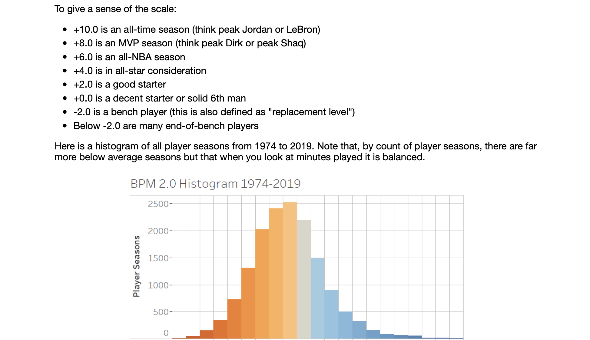
 这篇博客介绍了如何利用scikit-learn库进行线性回归学习,结合NBA体育数据,展示了数据科学在体育领域的应用。通过实例详细解析了从数据获取到模型建立的全过程。
scikit 线性回归
Data science enables many pretty amazing tasks for its practitioners, and changed our lives in many ways from small to big. When a business predicts demand for a product, when a company identifies fraudulent transactions online or when a streaming service recommends what to watch, data science is often the oil that enables these innovations.
数据科学为其从业人员实现了许多惊人的任务,并从小到大从许多方面改变了我们的生活。 当企业预测对产品的需求时,当公司在线识别欺诈性交易时,或者当流媒体服务推荐观看内容时,数据科学通常是推动这些创新的动力。
These types of data science innovations are based on regression analysis, which is to say that they are about understanding relationships between input variables and output variables.
这些类型的数据科学创新基于回归分析,也就是说,它们是关于理解输入变量和输出变量之间的关系的。
Along with classification analysis, regression is one of two fundamental types of data problems, and learning how it works and how to perform them form significant part of data analysis and data science.
与分类分析一起,回归是数据问题的两种基本类型之一,而学习它如何工作以及如何执行它们构成了数据分析和数据科学的重要组成部分。
So, I would like to show in this article how regression analysis can be used to identify patterns in the data and for predictive purposes. To start with, let’s start here with simple, linear regression techniques and see what they can teach us.
因此,我想在本文中展示如何将回归分析用于识别数据中的模式并用于预测目的。 首先,让我们从简单的线性回归技术开始,看看它们可以教给我们什么。
We will build a simple model to predict a descriptive statistic for NBA players called Box-Plus-Minus (BPM).
我们将建立一个简单的模型来预测NBA球员的描述性统计数据,即Box-Plus-Minus(BPM) 。
BPM is designed to measure a player’s contribution, and it is based on the player’s statistics, position, and the team’s performance.
BPM旨在衡量球员的贡献,它基于球员的统计数据,位置和球队的表现。
In this, we will build this model based on each players’ individual statistics only. So the model will have to not only estimate how the BPM is correlated to the individual statistics, but also how the individual statistics relate to collective team performance which is not included here.
在此,我们将仅基于每个玩家的个人统计数据来构建此模型。 因此,该模型不仅必须估计BPM如何与个人统计数据相关,而且还必须估算个人统计数据与集体团队绩效的相关性(此处未包括)。
Lastly, after we have built a model we will look at which data points form outliers / high-error points, and discuss what that might mean in the context of this model.
最后,在建立模型后,我们将研究哪些数据点构成异常值/高误差点,并讨论在此模型的背景下可能意味着什么。
制备 (Preparation)
To follow along, install a few packages — numpy, pandas, sklearn (scikit-learn), and also plotly and streamlit. Install each (in your virtual environment) with a simple pip install [PACKAGE_NAME].
沿着沿,安装了几包- numpy , pandas , sklearn (scikit学习),也plotly和streamlit 。 通过简单的pip install [PACKAGE_NAME]安装每个组件(在您的虚拟环境中)。
The code for this article is on my GitHub repo here (as data_predict_bpm.py), so you can download/copy/fork away to your heart’s content.
本文的代码位于我的GitHub存储库中(如data_predict_bpm.py ),因此您可以下载/复制/分叉到您的内心。
Oh, this a part of a set of data science / data analysis articles that I am writing about using NBA data. It’ll all go to that repo, so keep your eyes peeled! (Here’s an earlier article I did about visualising datasets for data exploration)
哦,这是我正在撰写的有关使用NBA数据的一组数据科学/数据分析文章的一部分。 一切都会去那个仓库,所以要睁大眼睛! (这是我之前撰写的有关可视化数据集以进行数据探索的文章)
If you are following along, import the key libraries with:
如果您遵循以下步骤,请使用以下命令导入密钥库:
import numpy as np
import pandas as pd
import sklearn
import plotly.express as px
import streamlit as st
And we are ready to go.
我们已经准备好出发了。
建立玩家模型-从汤到坚果 (Building player models — from soup to nuts)
数据预处理(Data pre-processing)
Most data science projects begin with unglamorous tasks like project scoping, data collection and data cleaning. Fortunately, the dataset that we are using will let us bypass all of that.
大多数数据科学项目都是从模糊的任务开始的,例如项目范围界定,数据收集和数据清理。 幸运的是,我们正在使用的数据集将使我们绕过所有这些。
Still, it doesn’t quite alleviate us from all responsibilities for pre-processing.
不过,这并不能完全减轻我们承担所有预处理责任。
In preprocessing, as at every step, we need to keep in mind what we are trying to achieve. In this case, we are building a model to predict BPM using player statistics.
在预处理中,就像在每个步骤中一样,我们需要牢记我们要实现的目标。 在这种情况下,我们正在建立一个使用玩家统计数据预测BPM的模型。
Since BPM is a “rate” statistic, it makes sense to be using stats that relate to per-game statistics. So let’s load the per-game statistic dataset (player_per_game.csv) and inspect it. (For an article on exploring this dataset with an interactive web app, check out my article here.)
由于BPM是“费率”统计数据,因此使用与每场比赛统计数据相关的统计数据是有意义的。 因此,让我们加载每个游戏的统计数据集( player_per_game.csv )并进行检查。 (有关通过交互式Web应用程序探索此数据集的文章,请在此处查看我的文章。)
Looking at the data we see that a few players have outlier statistics. Here is one example, plotting players’ shooting accuracies on two-pointers against those on three-pointers.
查看数据,我们发现一些参与者有异常的统计数据。 这是一个例子,将玩家在两分球上的射击准确性与在三分球上的射击准确性作图。
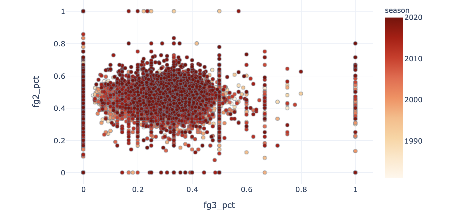
You will notice groupings of dots in straight vertical or horizontal lines in this chart. These are artefacts of small sample sizes — leading to percentages like 0%, 60% or 100%(!) accuracies. One player is shooting 100% from 3, and 80% overall. These data points are unlikely to be representative of the players’ actual ability, and will likely contaminate any model that we build.
您会在此图表中注意到垂直或水平直线上的点分组。 这些是小样本的伪像,导致准确度为0%,60%或100%(!)之类的百分比。 一位玩家的三分命中率是100%,总体是80%。 这些数据点不太可能代表玩家的实际能力,并且可能会污染我们构建的任何模型。
So let’s filter out these players. How should we do so? We could obviously filter out players with certain accuracies, but that isn’t a root problem —it’s a symptom, not the cause. The cause is the small sample size for certain players.
因此,让我们过滤掉这些播放器。 我们应该怎么做? 我们显然可以筛选出具有某些准确性的玩家,但这不是根本问题-这是一种症状,而不是原因。 原因是某些玩家的样本量较小。
Given that, let’s use a statistic representative of the opportunities each player has had to generate these statistics, meaning by overall minutes played.
鉴于此,让我们使用统计数据代表每个球员必须产生这些统计数据的机会,即按总上场时间进行。
A distribution of minutes played looks like this:
播放的分钟数分布如下所示:
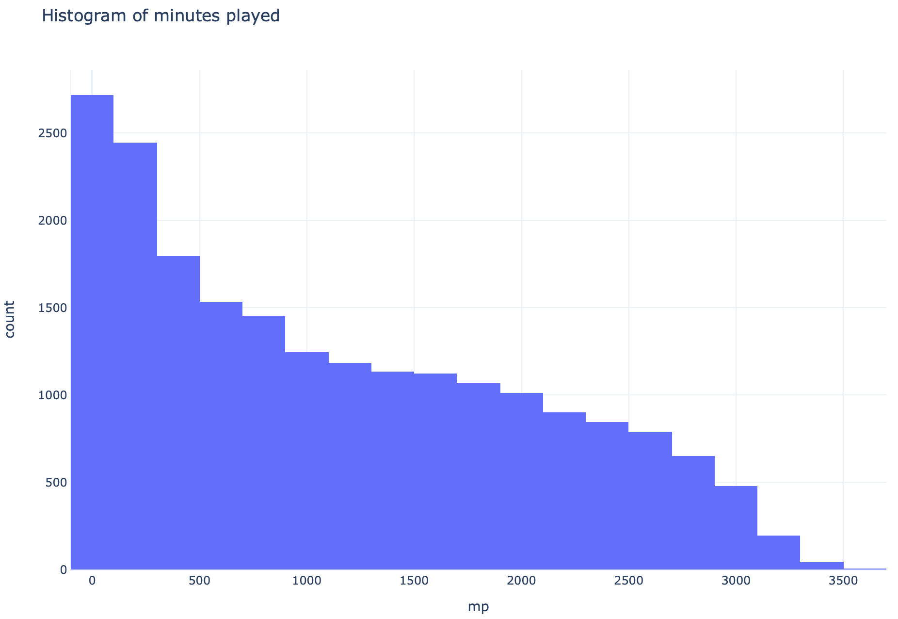
So let’s filter the dataframe by minutes played, for a minimum of 500 minutes.
因此,让我们根据播放的分钟数过滤数据帧,至少持续500分钟。
df = df[df["mp"] > 500]The data should now look much “cleaner”. Take a look for yourself.
数据现在看起来“干净”得多了。 看看自己。
And since we are building a linear regression model, let’s keep things simple by keeping only a few continuous variables.
并且由于我们正在建立线性回归模型,因此我们仅保留几个连续变量就可以使事情变得简单。
cont_var_cols = ['g', 'mp_per_g', 'fg_per_g', 'fga_per_g', 'fg3_per_g', 'fg3a_per_g', 'fg2_per_g', 'fg2a_per_g', 'efg_pct', 'ft_per_g', 'fta_per_g', 'orb_per_g', 'drb_per_g', 'trb_per_g', 'ast_per_g', 'stl_per_g', 'blk_per_g', 'tov_per_g', 'pf_per_g', 'pts_per_g', 'mp']
cont_df = df[cont_var_cols]
Putting everything to date together (with a little bit of Streamlit added in for live visualisation), we get:
将所有最新信息放在一起(并添加了一些Streamlit以进行实时可视化),我们得到:
import pandas as pd
import numpy as np
import plotly.express as px
import streamlit as st
from sklearn import model_selection
from sklearn import preprocessing
from sklearn import linear_model
from sklearn import svm
from sklearn import metrics


df = pd.read_csv("data/predict_stat.csv", index_col=0).reset_index(drop=True)
st.title("Simple Linear Regression")


# ========================================
# Prelim data viz
# ========================================
st.header("Data exploration")


# Plot minutes played
hist_fig = px.histogram(df, x="mp", nbins=30, title="Histogram of minutes played", template="plotly_white")
st.write(hist_fig)


# Filter out small samples
df = df[df["mp"] > 500].reset_index(drop=True)


st.subheader("Correlations")
corr_x = st.selectbox("Correlation - X variable", options=df.columns, index=df.columns.get_loc("pts_per_g"))
corr_y = st.selectbox("Correlation - Y variable", options=["bpm", "per"], index=0)
corr_col = st.radio("Correlation - color variable", options=["age", "season"], index=1)
fig = px.scatter(df, x=corr_x, y=corr_y, title=f"Correlation between {corr_x} & {corr_y}",
                 template="plotly_white", render_mode='webgl',
                 color=corr_col, hover_data=['name', 'pos', 'age', 'season'], color_continuous_scale=px.colors.sequential.OrRd)
fig.update_traces(mode="markers", marker={"line": {"width": 0.4, "color": "slategrey"}})
st.write(fig)


# ========================================
# Preprocessing
# ========================================
# Only keep relevant features
cont_var_cols = ['g', 'mp_per_g', 'fg_per_g', 'fga_per_g', 'fg3_per_g', 'fg3a_per_g', 'fg2_per_g', 'fg2a_per_g', 'efg_pct', 'ft_per_g', 'fta_per_g',
                 'orb_per_g', 'drb_per_g', 'trb_per_g', 'ast_per_g', 'stl_per_g', 'blk_per_g', 'tov_per_g', 'pf_per_g', 'pts_per_g', 'mp']
cont_df = df[cont_var_cols]数据探索(Data exploration)
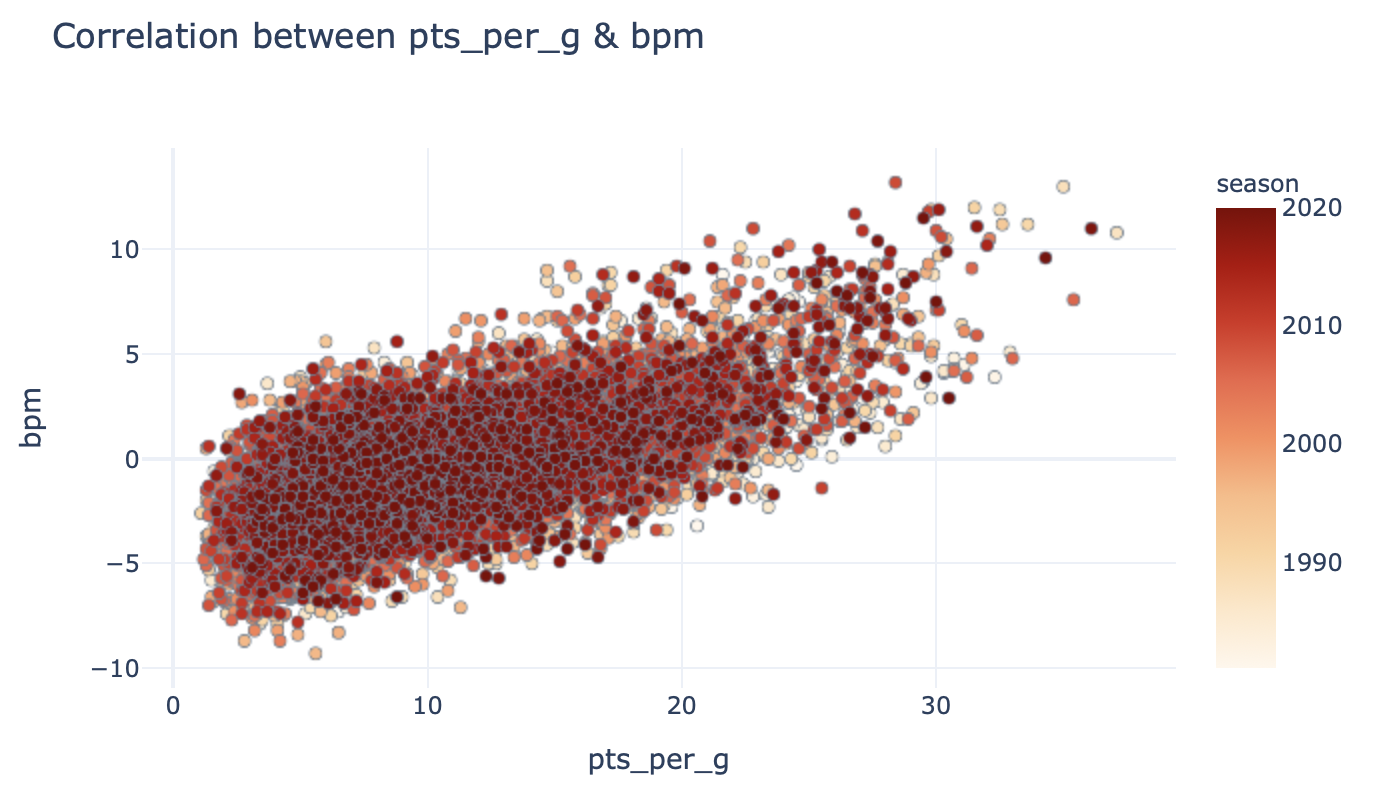
Let’s pause for a second to check the correlation between various input variables and the target variable (BPM).
让我们暂停一下以检查各种输入变量和目标变量(BPM)之间的相关性。
First of all, between points per game & BPM:
首先,每场点数与BPM之间:
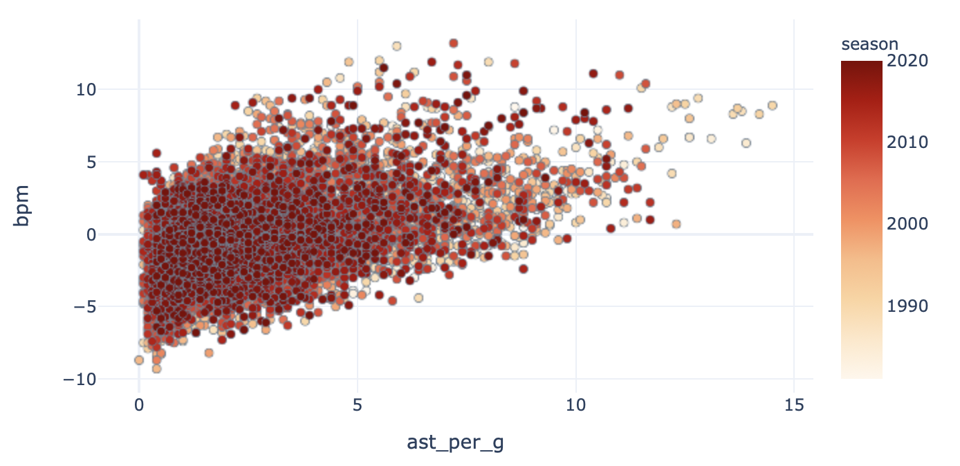
What about assists per game?
那场比赛的助攻呢?
Now, not all stats are going to be correlated with the target — take a look at the next statistic:
现在,并非所有统计信息都将与目标相关联-请查看下一个统计信息:
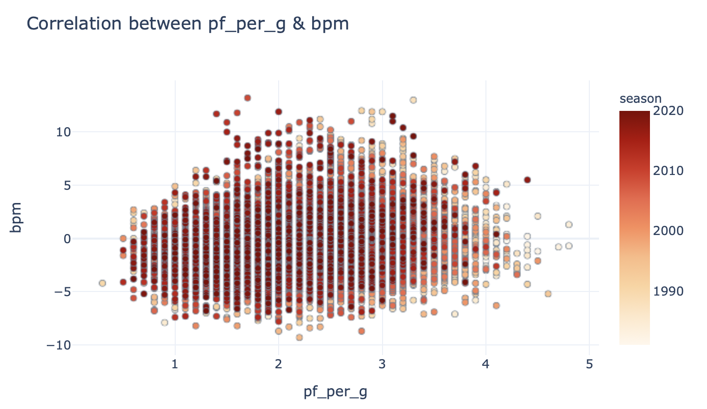
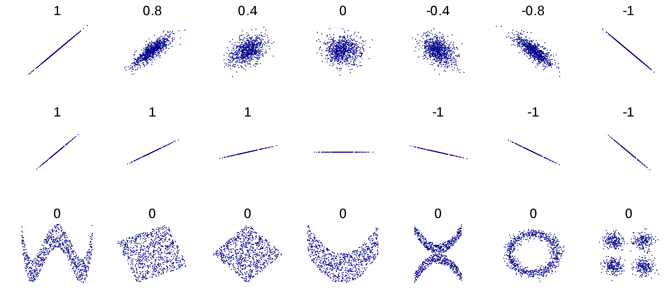
This looks like a classic non-correlated relationship! Don’t take my word for it — take a look at this textbook example:
这看起来像是经典的不相关关系! 不要相信我-看看这个教科书的例子:
And that makes intuitive sense, right? Why should the average number of personal fouls a player commits have anything to do with their ability, except maybe how much time they spend on the floor? Even then, it would be a pretty weak correlation I would think.
这很直观,对吧? 为什么球员犯下的平均个人犯规次数与他们的能力无关,除非他们在场上花费多少时间? 即使那样,我认为这仍然是一个非常弱的相关性。
Next up, we’ll take a look at the scale of individual features. We can visualise the data columns’ minimum, mean, maximum and standard deviations like so:
接下来,我们将看看各个功能的规模。 我们可以像这样可视化数据列的最小,均值,最大和标准偏差:
feat_desc = cont_df.describe()[cont_var_cols].transpose().reset_index().rename({'index': "var"}, axis=1)
feat_fig = px.bar(feat_desc[['var', 'mean', 'std']].melt(id_vars=['var']), x="var", y="value", color="variable", barmode="group")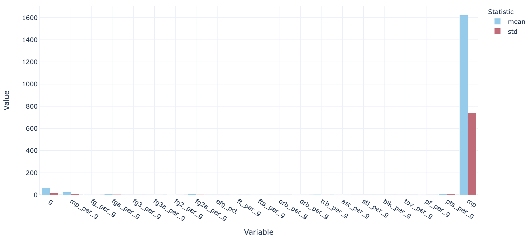
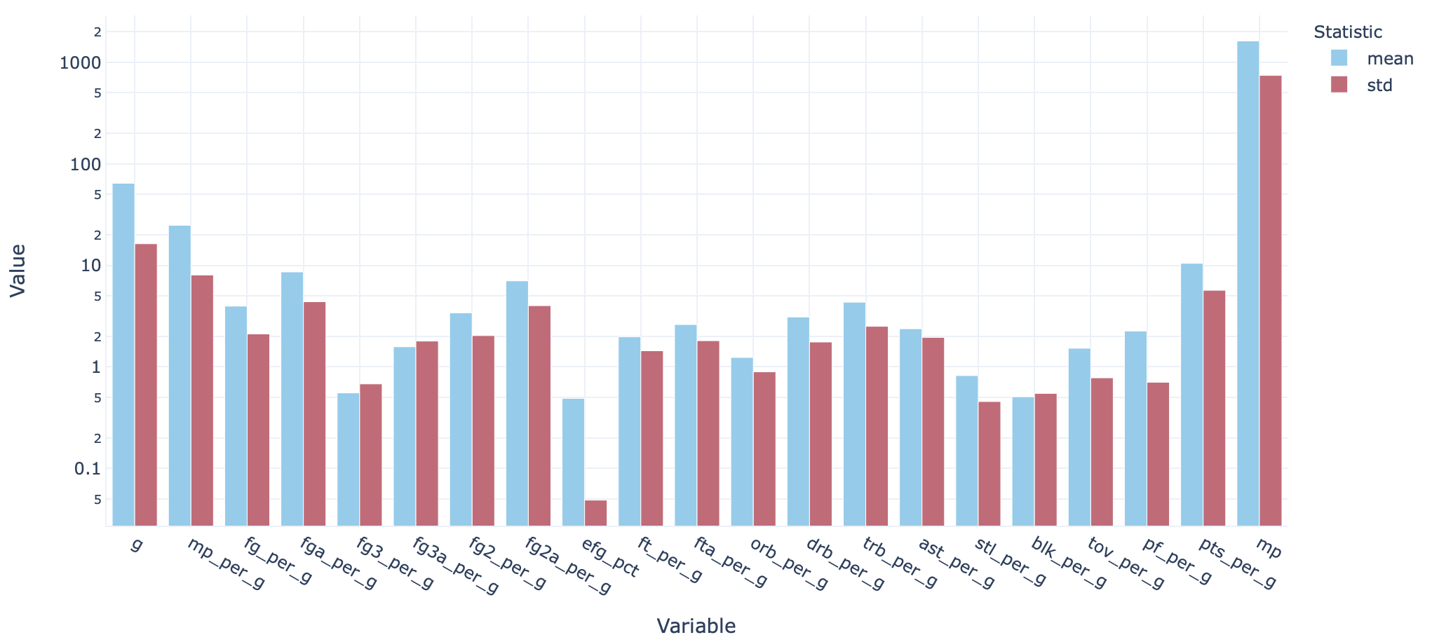
There’s quite a significant range here. This could lead to some variables unduly impacting the model over others, so it’s generally good practice to scale each input variable.
这里有很大的范围。 这可能会导致某些变量对模型的影响超过其他变量,因此通常习惯对每个输入变量进行缩放。
So let’s normalise the data. Scikit-learn has a module preprocessing.StandardScaler() which basically makes this a one-step process. Instantiate a scaler like so:
因此,让我们标准化数据。 Scikit-learn有一个模块preprocessing.StandardScaler() ,这基本上使它成为一个一步的过程。 像这样实例化一个scaler :
from sklearn import preprocessing
scaler = preprocessing.StandardScaler().fit(cont_df)
And the data can be scaled as:
数据可以缩放为:
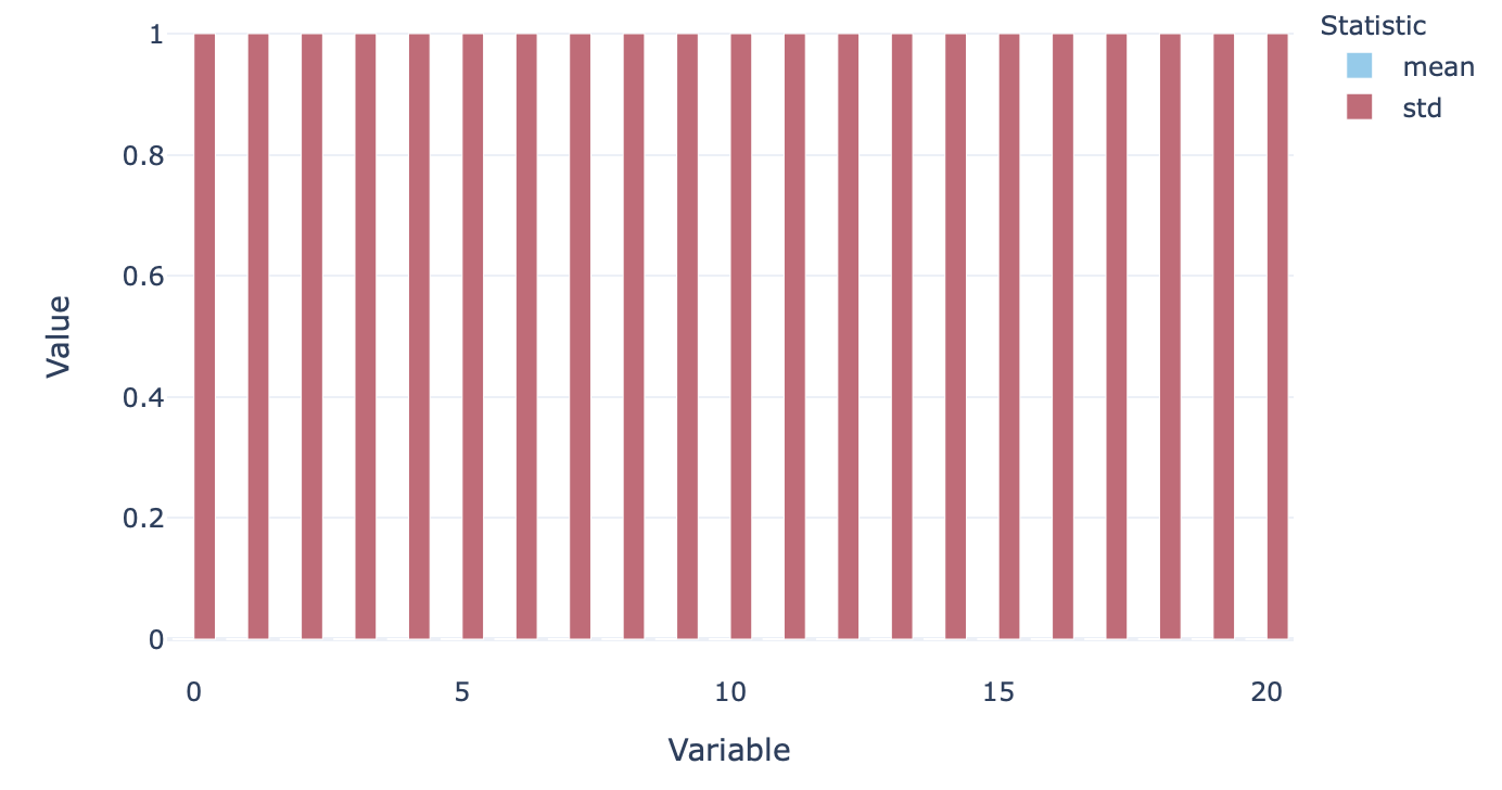
X = scaler.transform(cont_df)To make sure that the scaling has worked, we can plot the scaled variables again, resulting in this extremely boring graph!
为了确保缩放有效,我们可以再次绘制缩放后的变量,从而生成非常无聊的图形!
Now we are (finally) ready to start building some models.
现在,我们(终于)准备开始构建一些模型。
建立我的模型 (Build me a model)
As the first step, we split the data into two sets — a training set and a test set. let’s keep it simple and use a 80/20 rule for now. The input variables can be split like so:
第一步,我们将数据分为两组-训练组和测试组。 让我们保持简单,现在使用80/20规则。 输入变量可以像这样拆分:
X_train, X_test = model_selection.train_test_split(X, train_size=0.8, random_state=42, shuffle=True)And the target variable like so:
目标变量如下所示:
Y = df["bpm"].values
Y_train, Y_test = model_selection.train_test_split(Y, train_size=0.8, random_state=42, shuffle=True)
Now that we are here, the magic of scikit-learn is that actually applying a particular algorithm is ridiculously easy.
现在我们到了,scikit-learn的魔力在于,实际上应用特定算法非常容易。
For a Stochastic Gradient Descent regressor, build a model as such:
对于随机梯度下降回归器,建立这样的模型:
mdl = linear_model.SGDRegressor(loss="squared_loss", penalty="l2", max_iter=1000)
mdl.fit(X_train, Y_train)
and then produce predictions with:
然后产生以下预测:
Y_test_hat = mdl.predict(X_test)And we can compare the prediction with ground truths (actual Y values) like so:
我们可以将预测与基本事实(实际Y值)进行比较,如下所示:
test_out = pd.DataFrame([Y_test_hat, Y_test], index=["Prediction", "Actual"]).transpose()
val_fig = px.scatter(test_out, x="Prediction", y="Actual", title="Stochastic Gradient Descent model prediction of BPM vs ground truths")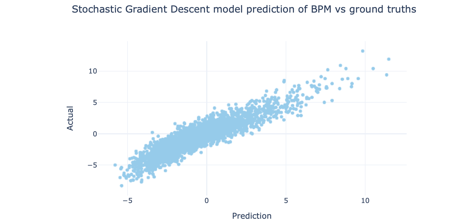
It’s not a bad result. What were our errors? Let’s calculate it as a MSE (mean square error), which once again is a one-line calculation with sklearn:
这不是一个坏结果。 我们有什么错误? 让我们将其计算为MSE(均方误差),这也是sklearn的单行计算:
from sklearn import metrics
mse = metrics.mean_squared_error(Y_test, Y_test_hat)
Using Stochastic Gradient Descent regressor, the MSE value is: 1.19.
使用随机梯度下降回归器,MSE值为:1.19。
Is that the best we can do? Possibly, but probably not. There are many, many algorithms to try. The Scikit-learn documentation helpfully provides this guide to linear models which might be worth reading or at least provides a handy reference. They also provide this map to help choose an estimator (not just linear models, but they are there)
那是我们能做的最好的吗? 可能,但可能不会。 有很多很多算法可以尝试。 Scikit-learn文档有助于为线性模型提供此指南,可能值得阅读或至少提供了方便的参考。 他们还提供了此地图以帮助选择估计量(不仅是线性模型,而且它们在那里)
For now, let’s just try a few different regressors to see how they perform:
现在,让我们尝试一些不同的回归器,看看它们的表现如何:
Try a Ridge regression model:
尝试使用Ridge回归模型:
mdl = linear_model.Ridge(alpha=.5)
mdl.fit(X_train, Y_train)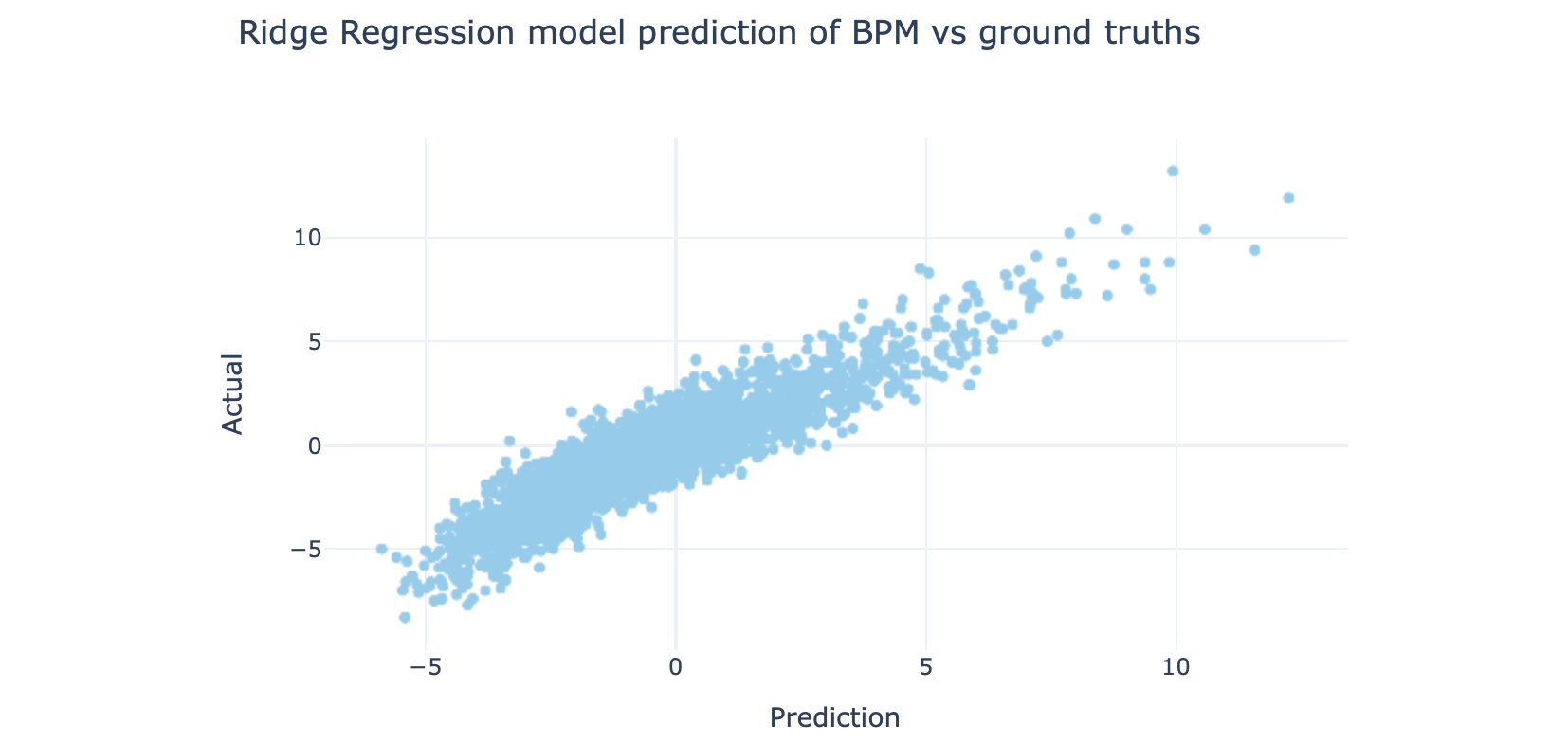
Support vector regression model:
支持向量回归模型:
mdl = svm.SVR(kernel='rbf', degree=3)
mdl.fit(X_train, Y_train)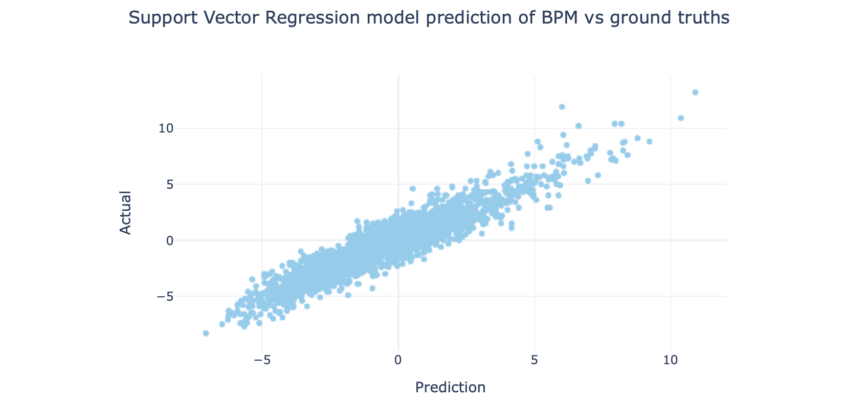
You can see that they all behave slightly differently.
您会看到它们的行为略有不同。
The MSE values are:
MSE值为:
- Stochastic Gradient Descent: 1.19 随机梯度下降:1.19
- Ridge Regression: 1.17 岭回归:1.17
- Support Vector Regression: 0.9 支持向量回归:0.9
And the code put together looks like this:
和放在一起的代码如下所示:
import pandas as pd
import numpy as np
import plotly.express as px
import streamlit as st
from sklearn import model_selection
from sklearn import preprocessing
from sklearn import linear_model
from sklearn import svm
from sklearn import metrics


df = pd.read_csv("data/predict_stat.csv", index_col=0).reset_index(drop=True)
st.title("Simple Linear Regression")


# ========================================
# Prelim data viz
# ========================================
st.header("Data exploration")


# Plot minutes played
hist_fig = px.histogram(df, x="mp", nbins=30, title="Histogram of minutes played", template="plotly_white")
st.write(hist_fig)


# Filter out small samples
df = df[df["mp"] > 500].reset_index(drop=True)


st.subheader("Correlations")
corr_x = st.selectbox("Correlation - X variable", options=df.columns, index=df.columns.get_loc("pts_per_g"))
corr_y = st.selectbox("Correlation - Y variable", options=["bpm", "per"], index=0)
corr_col = st.radio("Correlation - color variable", options=["age", "season"], index=1)
fig = px.scatter(df, x=corr_x, y=corr_y, title=f"Correlation between {corr_x} & {corr_y}",
                 template="plotly_white", render_mode='webgl',
                 color=corr_col, hover_data=['name', 'pos', 'age', 'season'], color_continuous_scale=px.colors.sequential.OrRd)
fig.update_traces(mode="markers", marker={"line": {"width": 0.4, "color": "slategrey"}})
st.write(fig)


# ========================================
# Preprocessing
# ========================================
# Only keep relevant features
cont_var_cols = ['g', 'mp_per_g', 'fg_per_g', 'fga_per_g', 'fg3_per_g', 'fg3a_per_g', 'fg2_per_g', 'fg2a_per_g', 'efg_pct', 'ft_per_g', 'fta_per_g',
                 'orb_per_g', 'drb_per_g', 'trb_per_g', 'ast_per_g', 'stl_per_g', 'blk_per_g', 'tov_per_g', 'pf_per_g', 'pts_per_g', 'mp']
cont_df = df[cont_var_cols]


# Plot mean & st. dev of various features
st.header("Feature scaling")
st.subheader("What does the current scale look like?")
feat_desc = cont_df.describe()[cont_var_cols].transpose().reset_index().rename({'index': "var"}, axis=1)
feat_fig = px.bar(feat_desc[['var', 'mean', 'std']].melt(id_vars=['var']), x="var", y="value", color="variable", barmode="group", template="plotly_white",
                  labels={"var": "Variable", "value": "Value", "variable": "Statistic"}, color_discrete_sequence=px.colors.qualitative.Safe)
st.write(feat_fig)
st.subheader("Now in log scale")
feat_fig = px.bar(feat_desc[['var', 'mean', 'std']].melt(id_vars=['var']), x="var", y="value", color="variable", barmode="group", template="plotly_white",
                  labels={"var": "Variable", "value": "Value", "variable": "Statistic"}, color_discrete_sequence=px.colors.qualitative.Safe, log_y=True)
st.write(feat_fig)
st.write("Wow, that's quite a significant discrepancy - let's scale these to a mean of zero and a standard deviation of 1")


# Scale the features
scaler = preprocessing.StandardScaler().fit(cont_df)
X = scaler.transform(cont_df)
# Prove that mean = 0, st deviation = 1
feat_desc = pd.DataFrame(X).describe().transpose().reset_index().rename({'index': "var"}, axis=1)
feat_fig = px.bar(feat_desc[['var', 'mean', 'std']].melt(id_vars=['var']), x="var", y="value", color="variable", barmode="group", template="plotly_white",
                  labels={"var": "Variable", "value": "Value", "variable": "Statistic"}, color_discrete_sequence=px.colors.qualitative.Safe)
st.write(feat_fig)


# Split date into train/test set
X_train, X_test = model_selection.train_test_split(X, train_size=0.8, random_state=42, shuffle=True)


y_stat = st.selectbox("Select Y value to predict:", ["bpm", "per"], index=0)
Y = df[y_stat].values
Y_train, Y_test = model_selection.train_test_split(Y, train_size=0.8, random_state=42, shuffle=True)


# ========================================
# Build models
# ========================================


mdl_names = {
    "Stochastic Gradient Descent": "sdg", "Ridge Regression": "ridge",
    "Support Vector Regression": "svr",
}
reg_name = st.selectbox("Choose regressor model", list(mdl_names.keys()), index=0)
reg = mdl_names[reg_name]


if reg == 'sdg':
    mdl = linear_model.SGDRegressor(loss="squared_loss", penalty="l2", max_iter=1000)
    mdl.fit(X_train, Y_train)
elif reg == 'ridge':
    mdl = linear_model.Ridge(alpha=.5)
    mdl.fit(X_train, Y_train)
elif reg == 'svr':
    mdl = svm.SVR(kernel='rbf', degree=3)
    mdl.fit(X_train, Y_train)


# Test prediction
Y_test_hat = mdl.predict(X_test)
test_out = pd.DataFrame([Y_test_hat, Y_test], index=["Prediction", "Actual"]).transpose()
_, df_test = model_selection.train_test_split(df, train_size=0.8, random_state=42, shuffle=True)
test_out = test_out.assign(player=df_test["name"].values)
test_out = test_out.assign(season=df_test["season"].values)
val_fig = px.scatter(test_out, x="Prediction", y="Actual", title=f"{reg_name} model prediction of {y_stat.upper()} vs ground truths", template="plotly_white",
                     color_discrete_sequence=px.colors.qualitative.Safe, hover_data=["player", "season"]
                     )
st.write(val_fig)


st.header("Evaluations")
st.subheader("Errors")
mse = metrics.mean_squared_error(Y_test, Y_test_hat)
st.write(f"Mean square error with {reg_name}: {round(mse, 2)}")
In our simple test, support vector regression has performed the best for this set. This of course doesn’t mean much — I haven’t done any hyperparameter tuning, only used a relatively small dataset, and used one test/train set split. But hopefully it’s enough to get the general idea.
在我们的简单测试中,支持向量回归在该组中表现最佳。 当然,这并不意味着太多-我没有做任何超参数调整,只使用了相对较小的数据集,并使用了一个测试/训练集拆分。 但是希望这足以使人们了解总体思路。
So that’s the basics of building linear regression model with Python — if you were relatively new to machine learning, and came off thinking that it was easier than you thought it was — I agree. These days, implementing machine learning algorithms are easy.
因此,这就是使用Python构建线性回归模型的基础-如果您是机器学习的新手,并且突然想到它比您想象的要容易-我同意。 如今,实现机器学习算法很容易。
This is true for even more complicated methodologies such as deep learning also, as we will see later. The key for me, as in any other field of technology, is in problem formulation. So I encourage you to dive in and see what else you can do.
对于更复杂的方法,例如深度学习,也是如此,我们将在后面看到。 与其他任何技术领域一样,对我来说,关键在于问题的制定。 因此,我鼓励您潜入水中,看看还能做什么。
额外的讨论-这里的错误是什么意思吗? (Bonus discussion — does the error here mean anything?)
Often, an error between ground truths and the model don’t mean a whole lot, other than — this is the amount of difference between the model and real life samples. But sometimes, the error might be systemic, and even indicative of something inherent about the model or the output variable.
通常,基本事实与模型之间的误差并不意味着很多,除了-这是模型与实际样本之间的差异量。 但是有时,错误可能是系统性的,甚至表明模型或输出变量固有的某些错误。
In our case, recall that the BPM was a statistic that related to team performance, whereas the models were derived solely from individual performances.
在我们的案例中,请记住,BPM是与团队绩效相关的统计数据,而模型仅来自个人绩效。
So, I wonder if the differences between the predictions (based on individual stats only) and the actual BPM numbers would identify players who has additional value to the team, but doesn’t show up on the stats.
因此,我想知道预测(仅基于单个统计数据)与实际BPM数据之间的差异是否可以识别对团队具有附加价值但未显示在统计数据上的球员。
This is the result. Here, I only show the top players (with BPM values of 6 or higher), and broken the result down further by players’ positions and era.
这就是结果。 在这里,我仅显示排名靠前的球员(BPM值为6或更高),并按球员的位置和时代进一步细分结果。
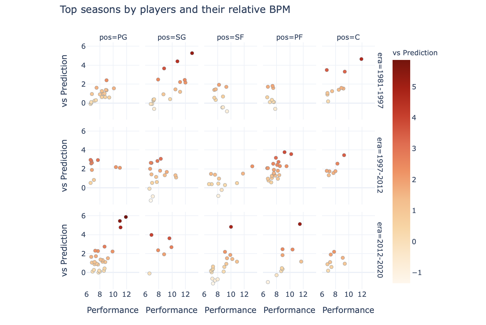
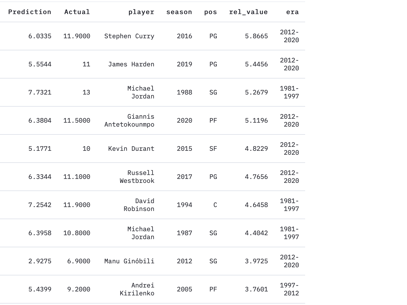
The top seasons by finding whose BPMs most overperformed the model are:
通过查找谁的BPM表现最出色的模型来确定最高的季节是:
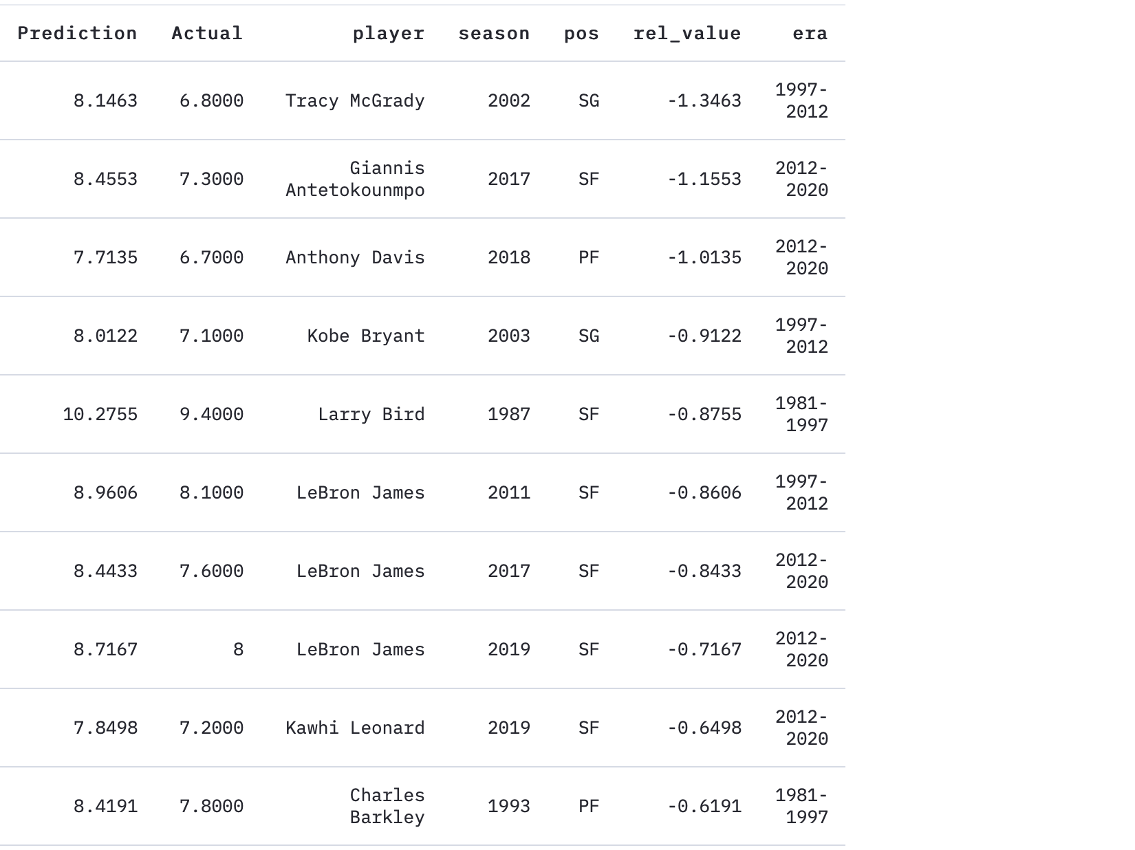
And conversely, these are the players whose actual BPMs are much lower than the prediction.
相反,这些球员的实际BPM远低于预期。
My hypothesis is that the players with higher “relative value” stat tend to be players who either made their teammates better (e.g. Steph Curry due to his gravity, or Michael Jordan for being Michael Jordan), but another explanation might be that it is indicative of those blessed with great teammates (e.g. Manu in 2012).
我的假设是,具有较高“相对价值”数据的球员倾向于是使他们的队友变得更好的球员(例如,由于斯蒂芬·库里的重力而闻名,或者因为迈克尔·乔丹成为迈克尔·乔丹),但是另一种解释可能是它具有指示性那些拥有出色队友的人(例如2012年的Manu)。
Interestingly, LeBron James appears three times on the list for underperforming against his predicted BPM figures — make of that what you will. I will note that the 2017 Cavs was somehow only the 2-seed in a weak Eastern conference, the 2011 Heat was the first year of the Heatles before they really jelled together as a unit, and the 2019 Lakers was more or less a small dumpster fire of a team around LeBron.
有趣的是,勒布朗·詹姆斯由于不如预期的BPM数据而在排行榜上排名第三-随您所愿。 我会注意到,2017年骑士队在某种程度上来说只是东部弱势会议中的2粒种子,2011年热火队是热火队的第一年,当时他们真正团结成一个整体,而2019年湖人队或多或少是一个小型垃圾箱勒布朗周围一支球队的火力。
Anyway, enough about the basketball side of things — I’ll probably write about that another time. I just wanted to highlight that errors can mean more than just differences between a model and the ground truth.
无论如何,关于篮球方面的事情已经足够了–我可能会再写一次。 我只是想强调一点,错误不仅意味着模型与实际情况之间的差异。
That’s it for today. I hope that was interesting. I will follow up with some other machine learning examples, some with deep learning / neural network models as well, which would be really exciting for me.
今天就这样。 我希望那很有趣。 我将继续介绍其他一些机器学习示例,其中还包括深度学习/神经网络模型,这对我来说真的很令人兴奋。
ICYMI, here is an earlier article that I did on exploring datasets with Plotly and Streamlit:
ICYMI,这是我之前使用Plotly和Streamlit探索数据集时所做的较早的文章:
And before you go — if you liked this, say hi / follow on twitter, or follow here for updates.
而在您出发之前-如果您愿意,请打个招呼/跟随twitte r,或按照此处进行更新。
You might be also interested in:
您可能也会对以下内容感兴趣:
scikit 线性回归


 4万+
4万+

 被折叠的 条评论
为什么被折叠?
被折叠的 条评论
为什么被折叠?
 到【灌水乐园】发言


