


苹果人机交互指南
重点 (Top highlight)
I’ve been developing an IOS app for the past few months and have been constantly referring to Apple’s Human Interface Design Guidelines. I would consider it a must-read for any aspiring or current UI/UX designer.
在过去的几个月中,我一直在开发IOS应用程序,并一直在参考Apple的人机界面设计指南 。 对于任何有抱负的或当前的UI / UX设计师,我都会认为它是必读的。
It’s surprisingly approachable and easy to understand. It isn’t written with overly technical jargon and gets straight to the meat and potatoes of designing an interface for IOS.
这是令人惊奇地易于接近且易于理解的。 它不是用过分的技术术语写的,而是直接针对为IOS设计接口的内容。
This is a list of the most noteworthy takeaways from the design standards laid out in the guide.
这是指南中列出的最引人注目的设计标准清单。
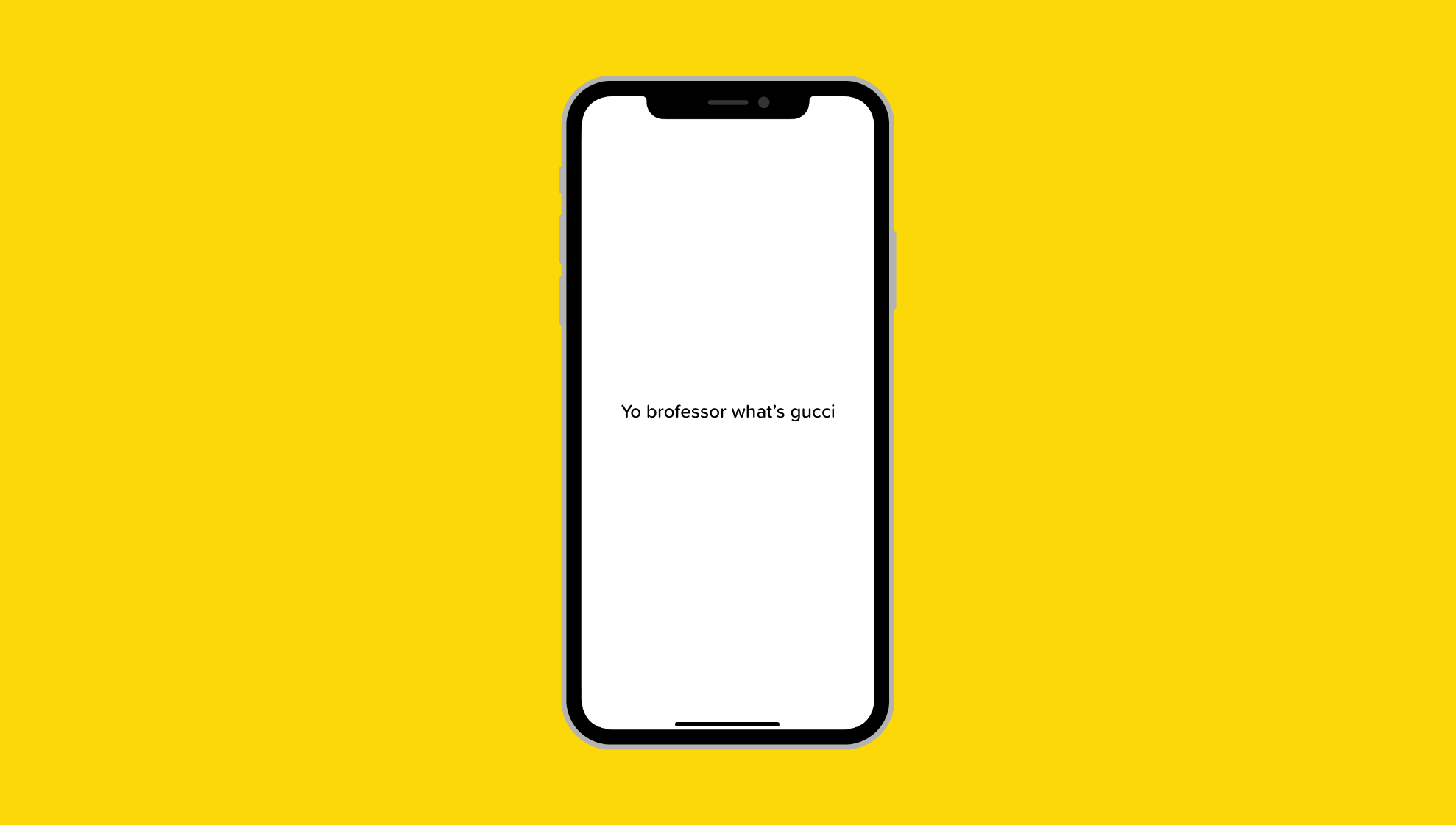
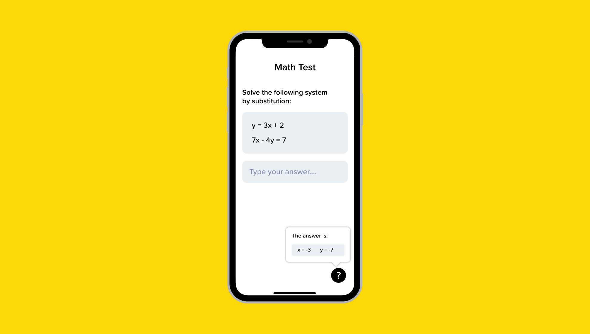
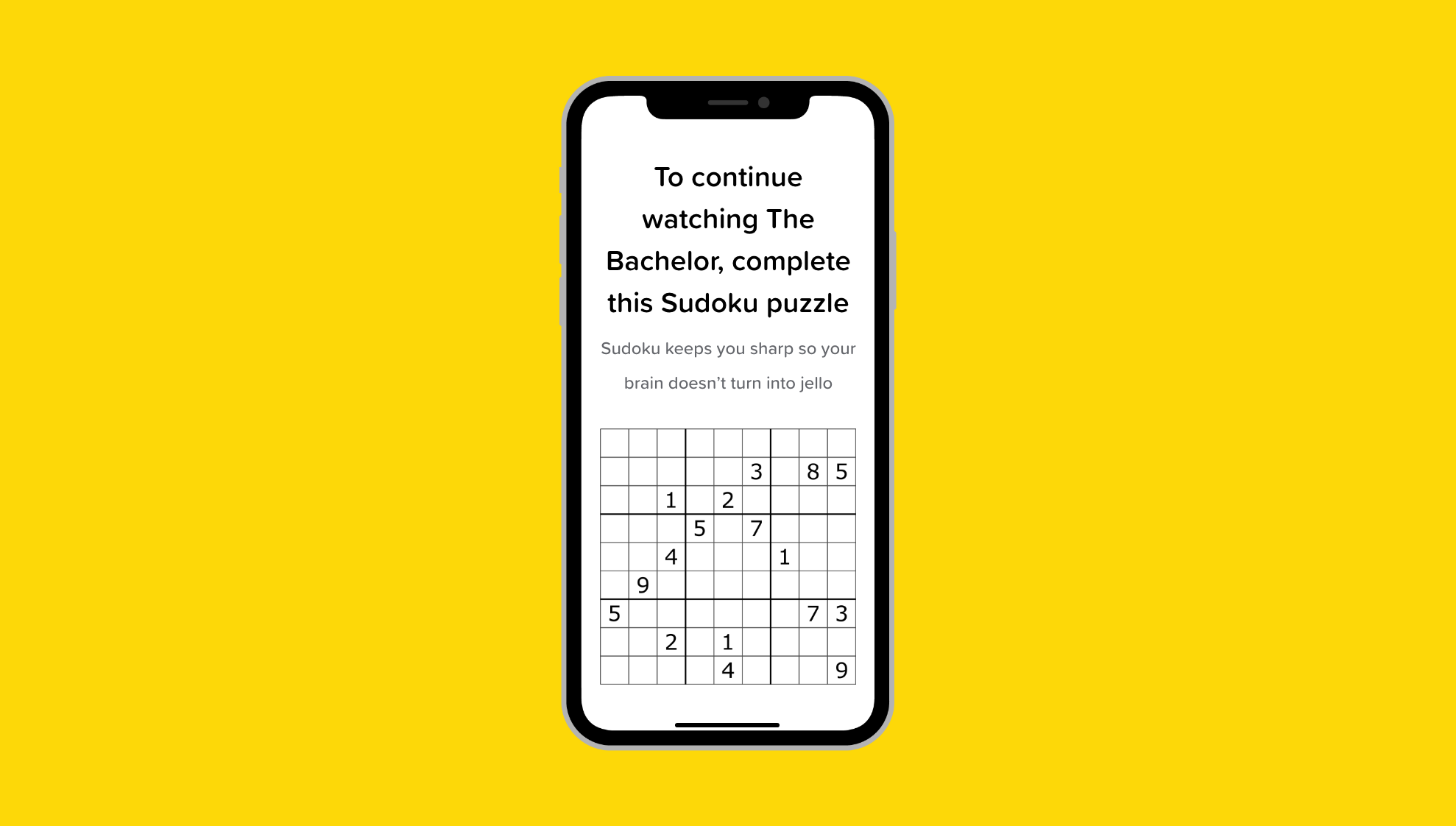
I know most people just scroll through these articles and don’t actually read them so the images are purely here for comic relief — enjoy.
我知道大多数人只是浏览这些文章,而实际上并没有阅读它们,因此图像纯粹是在这里为漫画提供救济-尽情享受。
1.在各种光照条件下测试应用的配色方案 (1. Test your app’s color scheme under a variety of lighting conditions)
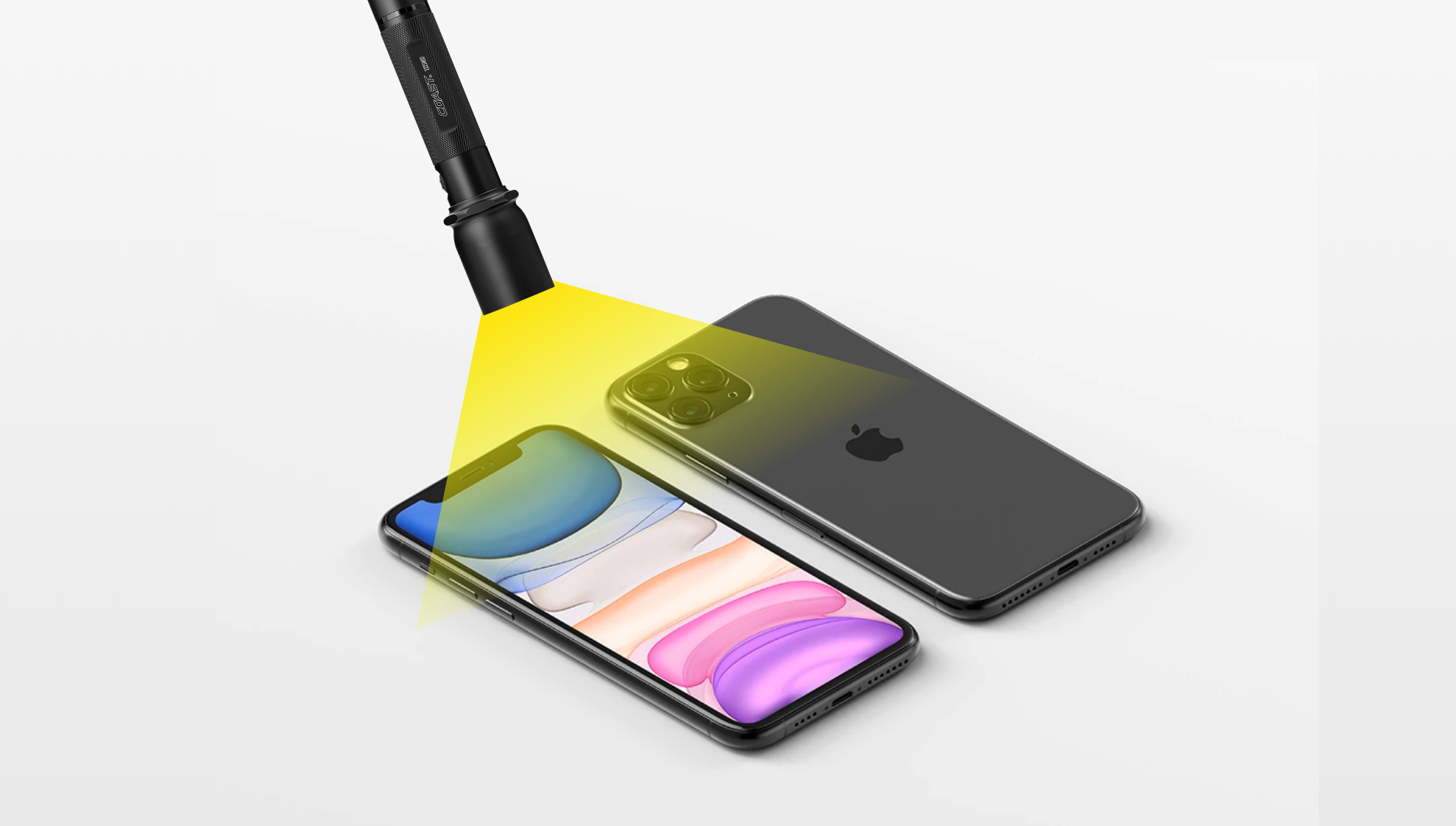
“Lighting varies significantly both indoors and outdoors, based on room ambiance, time of day, the weather, and more. Colors you see on your computer won’t always look the same when your app is used in the real world. Always preview your app under multiple lighting conditions, including outdoors on a sunny day, to see how colors appear. If necessary, adjust colors to provide the best possible viewing experience in the majority of use cases.” — Apple Color Guidelines
根据室内环境,一天中的时间,天气等,照明在室内和室外的变化很大。 当您的应用程序在现实世界中使用时,您在计算机上看到的颜色并不总是相同。 始终在多种光照条件下(包括晴天在户外)预览应用程序,以查看颜色的显示方式。 如有必要,调整颜色以在大多数使用情况下提供最佳的观看体验。” — Apple颜色准则
A perfect example of this is the sleep cycle app. The app has a calming dark display making it easy on the eyes and perfect for someone setting the alarm before going to bed.
睡眠周期应用程序就是一个很好的例子。 该应用程序具有令人放松的深色显示屏,使您的眼睛轻松自如,非常适合在睡觉前设置闹钟的人。
In addition to color, I’d like to add that there are various contextual factors that influence a user’s behavior when interacting with an interface. Consider where the user is when using our app, how much time they have, and what their emotional state is.
除了颜色之外,我还要补充一点,当与界面进行交互时,还有各种上下文因素会影响用户的行为。 考虑用户在使用我们的应用程序时所处的位置,他们有多少时间以及他们的情绪状态。
You can see good and bad examples of this everywhere. Navigation apps have minimal reading or touching required, Kindle’s have no glare when reading outside, note-taking apps are available offline, and so on.
您到处都能看到好的和不好的例子。 导航应用程序所需的阅读或触摸操作最少,Kindle在户外阅读时不会刺眼,笔记应用程序可离线使用,等等。
If our app is meant to be used while jogging, then some constraints and considerations need to be taken into account in the design.
如果要在慢跑时使用我们的应用程序,则在设计中需要考虑一些约束和注意事项。
Shopify has a great article about designing with the user’s context in mind that I recommend for anyone interested in diving deeper into this topic.
Shopify上有一篇很棒的文章,它考虑了用户的上下文 ,我向有兴趣深入研究此主题的任何人推荐。
2.尽可能延迟登录 (2. Delay sign-in as long as possible)
“People often abandon apps when they’re forced to sign in before doing anything useful. Give them a chance to fall in love with your app before making a commitment to it. In a shopping app, let people browse your merchandise immediately upon launch, and require sign-in only when they’re ready to make a purchase. In a media-streaming app, let people explore your content and see what you have to offer before signing in to play something.” — Apple Authentication Guidelines
“人们在做任何有用的事情之前被迫登录时经常会放弃应用程序。 在做出承诺之前,让他们有机会爱上您的应用。 在购物应用程序中,人们可以在发布后立即浏览您的商品,并且仅在准备购买时才需要登录。 在媒体流应用中,让人们浏览您的内容并查看您所提供的内容,然后再登录以播放某些内容。” — 苹果认证准则
Apple urges us to re-assess the entrance experience to our app. If possible, remove sign-in and sign-up altogether.
苹果公司敦促我们重新评估应用程序的入口体验。 如果可能,请完全删除登录和注册。
Unfortunately, the app I’m designing right now doesn’t allow me to completely remove sign-in. But I’ve moved the sign-up screen to the end of onboarding so the user can at least get a feel for the type of experience they can expect after they sign up.
不幸的是,我现在正在设计的应用程序不允许我完全删除登录。 但是我已经将注册屏幕移到了注册结束时,以便用户至少可以体会到他们在注册后可以期望的体验类型。
It’s also a good idea to introduce a variety of sign up options to make signing in seamless. The app I’m working on right now supports Password Autofill, Facebook login, Google login, Sign in with Apple, and default email + password.
引入各种注册选项以使无缝登录也是一个好主意。 我正在使用的应用程序现在支持密码自动填充 ,Facebook登录,Google登录,使用Apple登录以及默认的电子邮件和密码。
3.符合人们在“设置”中选择的外观模式 (3. Comply with the appearance mode people choose in Settings)
“If you offer an app-specific appearance mode option, you create more work for people because they have to adjust more than one setting. Worse, they may think your app is broken because it doesn’t respond to their systemwide appearance choice.” — Apple Dark Mode Guidelines
“如果提供特定于应用程序的外观模式选项,则会为人们创建更多工作,因为他们必须调整多个设置。 更糟糕的是,他们可能认为您的应用已损坏,因为它无法响应他们在系统范围内的外观选择。” — 苹果暗模式指南
4.尽快显示内容 (4. Show content as soon as possible)

Not to be confused with the splash screen, the launch screen is the screen that introduces the elements on the page. Design a launch screen that’s nearly identical to the first screen of your app.
不要与启动屏幕混淆,启动屏幕是用于介绍页面元素的屏幕。 设计一个与您的应用程序的第一个屏幕几乎相同的启动屏幕。
“If you include elements that look different when the app finishes launching, people can experience an unpleasant flash between the launch screen and the first screen of the app. Also, make sure that your launch screen matches the device’s current appearance mode; for guidance, see Dark Mode.” — Launch Screen Guidelines
“如果您添加的元素在应用程序完成启动时看起来不同,那么人们会在应用程序的启动屏幕和第一个屏幕之间体验到不愉快的闪烁。 另外,请确保您的启动屏幕与设备的当前外观模式匹配; 有关指导,请参阅黑暗模式 。” — 启动屏幕准则
“Don’t make people wait for content to load before seeing the screen they’re expecting. Show the screen immediately, and use placeholder text, graphics, or animations to identify where content isn’t available yet. Replace these placeholder elements as the content loads. Whenever possible, preload upcoming content in the background, such as while an animation is playing or the user is navigating a level or menu.” — Apple Loading Guidelines
“不要让人们在观看内容之前等待内容加载。 立即显示屏幕,并使用占位符文本,图形或动画来标识尚不可用的内容。 在内容加载时替换这些占位符元素。 只要有可能,就在后台预加载即将到来的内容,例如在播放动画或用户导航级别或菜单时。” — Apple加载准则
5.利用系统提供的文本,填充,字形和分隔符颜色 (5. Take advantage of the system-provided colors for text, fills, glyphs, and separators)
“iOS offers a range of system colors that automatically adapt to vibrancy and changes in accessibility settings like Increase Contrast and Reduce Transparency. The system colors look great individually and in combination, on both light and dark backgrounds, and in both light and dark modes.”
“ iOS提供了一系列系统颜色,这些颜色可以自动适应鲜艳度和可访问性设置的更改,例如增加对比度和降低透明度。 在浅色和深色背景以及浅色和深色模式下,系统颜色都可以单独使用或组合使用。
“Don’t hard-code system color values in your app. The color values provided are intended for reference during your app design process. The actual color values may fluctuate from release to release, based on a variety of environmental variables. Always use the API to apply system colors; for developer guidance, see UIColor.” — Apple Color Guidelines
“不要在您的应用中硬编码系统颜色值。 提供的颜色值仅供您在应用程序设计过程中参考。 实际的颜色值可能会根据各种环境变量而在释放之间波动。 始终使用API来应用系统颜色; 有关开发人员的指导,请参见UIColor 。” — Apple颜色准则
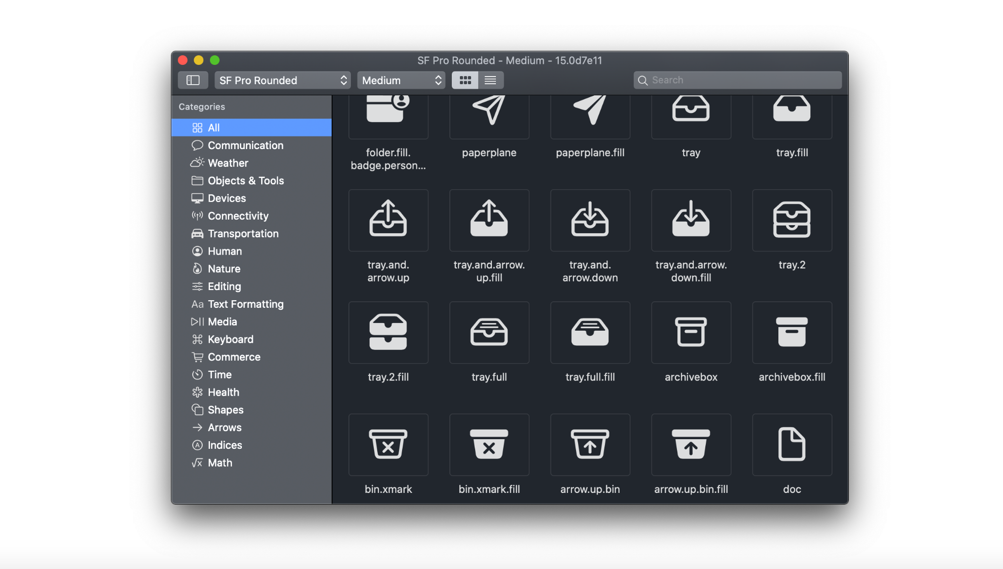
“SF Symbols provides a set of over 1,500 consistent, highly configurable symbols you can use in your app. Apple-designed SF Symbols to integrate seamlessly with the San Francisco system font, so the symbols automatically ensure optical vertical alignment with text for all weights and sizes. You can use SF Symbols in apps running in iOS 13 and later, watchOS 6 and later, and tvOS 13 and later.” — Apple SF Symbols
“ SF Symbols提供了一组1,500多个一致的,高度可配置的符号,您可以在应用程序中使用它们。 苹果设计的SF Symbols可与San Francisco系统字体无缝集成,因此,对于所有重量和大小,这些符号都能自动确保与文本的光学垂直对齐。 您可以在iOS 13和更高版本,watchOS 6和更高版本以及tvOS 13和更高版本中运行的应用程序中使用SF符号。” — Apple SF符号
If you’d like to learn how SF Symbols can be used, here’s a video.
如果您想学习如何使用SF符号,请观看以下视频。
6.使用熟悉的,易于理解的单词和短语 (6. Use familiar, understandable words and phrases)
“Technology can be intimidating. Avoid acronyms and technical jargon that people might not understand. Use what you know about your audience to determine whether certain words or phrases are appropriate. In general, apps that appeal to everyone should steer clear of highly technical language. Such language may be appropriate in apps that target a more advanced or technical crowd.”
“技术可能令人生畏。 避免使用人们可能不理解的首字母缩写词和技术术语。 使用对受众的了解来确定某些单词或短语是否合适。 通常,吸引所有人的应用程序应避免使用技术含量高的语言。 这种语言可能适合针对更高级或技术人群的应用。”
“Strive for an informal, friendly tone. An informal, approachable style echoes the way you speak with people over lunch. Use contractions occasionally, and you and your to address the user directly.” — Apple Terminology Guidelines
“争取非正式,友好的语气。 非正式,平易近人的风格呼应您午餐时与人交谈的方式。 偶尔使用收缩, 您和您可以直接与用户联系。” — Apple术语准则
The most important thing here is to know your audience. If your app is being developed for the average Joe then avoid jargon. If it’s for a highly specialized group of architects then you may approach this differently.
这里最重要的是要了解您的听众。 如果您的应用是针对普通的Joe开发的,那么请避免使用行话。 如果是针对高度专业化的建筑师团队,那么您可能会采取不同的方法。
7.预计需要帮助 (7. Anticipate the need for help)
“Proactively look for times when people might be stuck. A game, for example, could casually show useful tips when paused or when a character isn’t advancing. Let people replay tutorials in case they miss something the first time.” — Apple App Architecture Guidelines
“主动寻找人们可能被困住的时间。 例如,游戏在暂停或角色前进时会随意显示有用的提示。 如果人们第一次错过某些内容,可以让他们重播教程。” — Apple App体系结构准则
Adding quick tips, customer service chat, chatbots, FAQ, a help center, and so on will create a fail-safe for users who may get confused.
添加快速提示,客户服务聊天,聊天机器人,常见问题,帮助中心等,将为可能感到困惑的用户创建故障保护。
In the app I’m creating, I have a few instances where I include help icons to educate the user on what the actions mean. This keeps my interface clean but also provides an option to learn more if needed.
在我创建的应用程序中,有一些实例包含帮助图标,以教育用户有关操作的含义。 这样可以使我的界面保持整洁,但如果需要,还可以提供一个选项以了解更多信息。
8.必要时帮助人们避免信息丢失 (8. When necessary, help people avoid information loss)
“Regardless of whether people use a dismiss gesture or a button to close the view, if the action could result in the loss of user-generated content, present an action sheet that explains the situation and gives people ways to resolve it.” — Apple Modality Guidelines
“无论人们是使用解雇手势还是按钮来关闭视图,如果该操作可能导致用户生成的内容丢失,请出示说明情况并提供解决方法的操作表。” — 苹果模式指南
“Instill confidence that work is always preserved unless canceled or deleted. In general, don’t make people explicitly save files. Instead, save changes automatically at regular intervals, when opening and closing files, and when switching to another app. In some cases, such as while editing an existing file, save and cancel options may still make sense for the sake of confirming when the edits are actually captured.” — Apple File Handling Guidelines
“让人们放心,除非取消或删除工作,否则始终可以保留工作。 通常,不要让人们明确地保存文件。 相反,在打开和关闭文件以及切换到另一个应用程序时,应定期自动保存更改。 在某些情况下,例如在编辑现有文件时,为了确认何时真正捕获到编辑内容,保存和取消选项可能仍然有意义。” — Apple文件处理准则
9.通常,请使用标准手势 (9. As a general rule, use standard gestures)
“People are familiar with the standard gestures and don’t appreciate being forced to learn different ways to do the same thing. In games and other immersive apps, custom gestures can be a fun part of the experience. In other apps, it’s best to use standard gestures so extra effort isn’t needed to discover or remember them.” — Apple Gesture Guidelines
人们熟悉标准手势,不喜欢被迫学习不同的方法来做同样的事情。 在游戏和其他身临其境的应用中,自定义手势可能是体验中有趣的一部分。 在其他应用程序中,最好使用标准手势,因此无需费力去发现或记住它们。” — Apple手势指南
10.不要在通知中包含敏感,个人或机密信息 (10. Don’t include sensitive, personal, or confidential information in a notification)
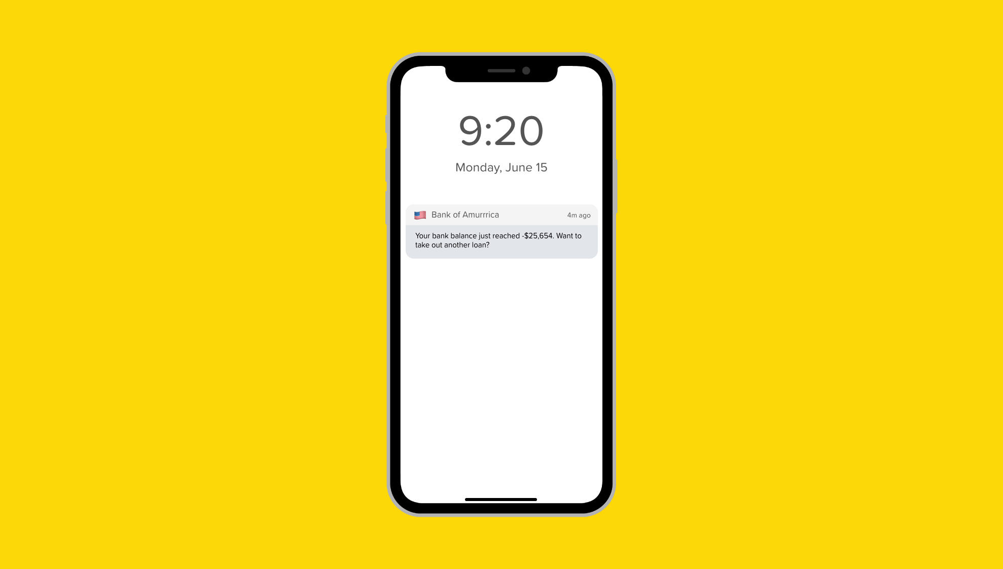
“You can’t predict what people will be doing when they receive a notification, so it’s essential to avoid including private information that could display on the device screen.” — Apple Notification Guidelines
“您无法预测人们在收到通知时会做什么,因此必须避免包含可能在设备屏幕上显示的私人信息。” — Apple通知准则

👋 Let’s be friends! Follow me on Twitter and Dribbble and connect with me on LinkedIn. Don’t forget to follow me here on Medium as well for more design-related content.
be 让我们成为朋友! 在Twitter和Dribbble上关注我,并在LinkedIn上与我联系。 别忘了在Medium上关注我,以获取更多与设计相关的内容。
More articles from me…
我的其他文章...
翻译自: https://uxdesign.cc/10-insights-from-apples-human-interface-design-guidelines-176ab7d505ae
苹果人机交互指南


 1346
1346


 被折叠的 条评论
为什么被折叠?
被折叠的 条评论
为什么被折叠?
 到【灌水乐园】发言


