


ux设计中的各种地图
Last year I got to work on an app that was ultimately going to be deployed globally in every market and every language including RTL (Right-to-Left) languages — with a specific focus on Arabic.
去年,我开始致力于开发一个应用程序,该应用程序最终将在全球所有市场和每种语言(包括RTL(从右至左)语言)中进行部署-重点是阿拉伯语。
I have to admit this one was new for me, so I did some research, did some design, and learned some things. With a background in linguistics, this was fascinating for me.
我必须承认这对我来说是新手,所以我做了一些研究,做了一些设计,并且学到了一些东西。 具有语言学背景,这让我着迷。
Addition: I’m adding updates to this post as I’m having further conversations and learning even more new things!
另外: 我正在与这篇文章添加更新,因为我正在与更多的对话并学习更多新事物!
Arabic presents some unique design challenges for UX, UI and copy, which meant we had to design for Arabic from the beginning, even though we were initially user testing with English-speaking audiences and launching our first MVP in LTR language markets.
阿拉伯语对UX,UI和复制提出了一些独特的设计挑战,这意味着我们必须从一开始就为阿拉伯语进行设计,即使我们最初是针对说英语的受众进行用户测试并在LTR语言市场推出我们的第一个MVP。
使用阿拉伯语进行界面设计的主要挑战 (Key challenges for interface design using Arabic)

定向流和镜像 (Directional flow & mirroring)
The “rule everyone knows” (never assume) is that you simply flip or mirror the interface — job done! Er no, it’s a bit harder than that. Sorry, hard things are hard.
“每个人都知道的规则”(从不假设)是您只需翻转或镜像界面即可 ! 不,这比这难一点。 对不起,困难的事情很难。
From my understanding, RTL script is not just a different visual pattern, it is also a mindset or perception change. Rather than simply knocking out UI components and flipping them round, we need to think differently and in a more holistic way.
根据我的理解,RTL脚本不仅是一种不同的视觉模式,而且还是一种思维方式或观念上的改变。 我们不仅要淘汰UI组件并将它们翻转,还需要以一种更全面的方式进行思考。
时间和进度 (Time and progression)
Take the example of time. The sense of task progression is reversed. The linear representation of time is reversed. Whereas LTR text readers perceive things like loading bars and sliders as left-to-right, those now need to work the other way.
以时间为例。 任务进度的感觉是相反的。 时间的线性表示是相反的。 LTR文本阅读器将加载条和滑块之类的内容从左到右视为感知,而现在,它们需要以其他方式工作。
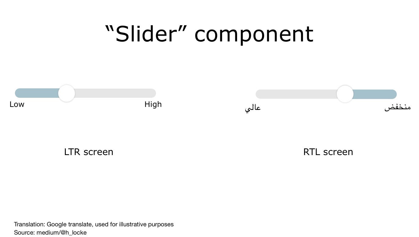
However — if you just flipped everything in your UI you’d get it wrong. There are exceptions:
但是,如果您只是翻转了UI中的所有内容,那肯定会出错。 也有例外:
- Clocks still turn “clockwise” 时钟仍然“顺时针”旋转
- Icons such as coffee cups still have handles to the right. (note also, majority of users are still right-handed) 咖啡杯之类的图标仍然在右侧具有手柄。 (另请注意,大多数用户仍是惯用右手的人)

处理RTL文本 (Handling RTL text)
As I mentioned for UI components, with RTL languages, your text flows, well, right to left. Users’ visual scanning behaviour is also reversed, including the use of F-Patterns.
正如我在UI组件中提到的那样,使用RTL语言,您的文本从右到左流动。 用户的视觉扫描行为也被颠倒, 包括使用F模式 。
Icons and check boxes related to text therefore sit to the right of the copy, however the tick itself remains as a LTR graphic.
因此,与文本相关的图标和复选框位于副本的右侧,但是刻度线本身仍保留为LTR图形。

号码 (Numbers)
Numbers appearing in RTL interfaces generally still run LTR. As an example the year 2018 is still written 2018. However, if the sense you are trying to communicate is a period of time (2018–2020) then that text runs in line with the RTL mindset — (2020–2018).
RTL接口中出现的数字通常仍在运行LTR 。 例如,2018年仍是2018年。但是,如果您要传达的含义是一段时间(2018-2020),则该文本与RTL思维定式(2020-2018)一致。
The exception for this is LTR text appearing in a RTL interface such as a phone number, which always appears LTR even in a RTL interface design.
例外情况是LTR文本出现在RTL界面(例如电话号码)中,即使在RTL界面设计中也始终显示LTR。

符号和图标: (Symbols and icons:)
As mentioned above, icons that communicate directionality are reversed, however icons that do not, are not. This includes universal icons such as camera, or home.
如上所述,传达方向性的图标是相反的,但是没有传达的图标则没有。 这包括通用图标,例如相机或家。

Note: a backslash within an icon is not reversed. Similarly, neither are brand icons or recognised trademarks.
注意:图标中的反斜杠不会反向。 同样,品牌图标或公认商标也不是。
语言特点: (Characteristics of the language:)
复印长度 (Length of copy)
The first thing to know is that English to Arabic does not translate 1:1. If you’ve ever worked with German translation before this won’t surprise you, however it’s much more complex than German.
首先要知道的是,英语到阿拉伯语不会翻译为1:1。 如果您曾经使用过德语翻译,这不会令您感到惊讶,但是它比德语复杂得多。
Some words from English will be translated into longer phrases as they are descriptive of the sense or concept being described. You’re going to need flexibility in your UI to allow for this.
某些来自英语的单词将被翻译成更长的短语,因为它们描述了所描述的意义或概念。 您将需要UI的灵活性来实现这一点。

Also, where letters appear in a sentence change its meaning, so you cannot simply chop longer words or sentences at the line break and expect it to mean the same. This can easily happen if you get copy translated professionally but then just “run it in” to your design.
另外,句子中出现字母的地方会改变其含义,因此, 您不能简单地在换行符处切掉较长的单词或句子并期望其含义相同。 如果您对译文进行专业翻译,然后将其“运行”到您的设计中,则很容易发生这种情况。
The best approach here would be to have an initial professional native translation, then have a UX writer and UI designer working with the translator to implement the successful design.
最好的方法是进行最初的专业本机翻译,然后让UX编写器和UI设计器与翻译一起工作以实现成功的设计。
字型 (Fonts)
Arabic is more visually complex compared to some other languages, making use of dots and diacritics (small symbols representing vowels) and also takes up more horizontal space than roman text. Because of this, when translating from English to Arabic, we’re going to need a bigger font than you do when you translate to languages which are also in roman text, to ensure legibility.
与其他一些语言相比,阿拉伯语在视觉上更复杂,它使用点和变音符号(表示元音的小符号),并且比罗Maven本占用更多的水平空间。 因此,从英语翻译为阿拉伯语时,与要翻译成罗Maven本的语言相比,我们需要更大的字体以确保可读性。

Humans eyes have the same problems with vision, ageing and accessibility — whatever language you speak. We need to design accordingly whatever language we are using.
无论您说什么语言,人眼在视觉,衰老和可及性方面都存在同样的问题。 我们需要相应地设计所使用的语言。
The recommended font to use for Arabic interfaces is Google’s Noto Font. It’s free to download, has 75+ font families available. So, no more tofu.
推荐用于阿拉伯语界面的字体是Google的Noto Font 。 它是免费下载的,提供75种以上的字体系列。 因此, 不再有豆腐了 。

阿拉伯语到英语内容之旅 (Arabic to English content journeys)
There is a lot of content on the internet, and for complex reasons, a lot of it is in English.
互联网上有很多内容,由于复杂的原因,很多内容都是英文的。
There is a disproportionate amount of content in English or non-Arabic content compared to the number of Arabic speakers online.
与在线讲阿拉伯语的人数相比,英语或非阿拉伯语内容的数量不成比例 。
Therefore, whatever you are designing in Arabic, if you are linking out to other content, the user could land on an English content website, so consideration of multi-lingual user journeys is important.
因此,无论您使用阿拉伯语进行的设计是什么,如果您链接到其他内容,则用户都可以登陆英语内容网站,因此考虑多种语言的用户旅程至关重要。
Equally, if content is not available for your experience in Arabic, it may be better to include English content rather than none, if it increases the chance of user comprehension. Either way, your interface needs to support both languages.
同样,如果您无法用阿拉伯语获得内容,那么最好增加英文内容而不是不包含英文内容,否则会增加用户理解的机会。 无论哪种方式,您的界面都需要支持两种语言。
Addition: I’ve since had conversations with UI designers working in Arabic who are designing nav layouts in LTR with RTL text, mostly due to some users being more used to LTR layouts. Jakob’s Law in action.
另外: 从那以后,我与阿拉伯语的UI设计师进行了交谈,这些设计师正在使用RTL文本在LTR中设计导航布局,这主要是由于一些用户更习惯于LTR布局。 雅各布定律在起作用 。
不是“一刀切” (Not ‘one size fits all’)
Another complexity when considering translation is that Arabic is not a single language or a single country. There are linguistic and cultural differences and challenges.
考虑翻译时的另一个复杂性是阿拉伯语不是一种语言或单个国家。 在语言和文化上存在差异和挑战。
It would be easy to make an arbitrary rule, like “just use Modern Standard Arabic” (MSA) however, if you are targeting one specific arabic-speaking user group, then using a version of Arabic that can be adequately understood, but comes across as overly formal, might not resonate. It would be better to understand your audience (yes, research) and make a decision based on evidence rather than assumption.
容易制定一个任意规则,例如“ 仅使用现代标准阿拉伯语”(MSA),但是,如果您要针对一个特定的讲阿拉伯语的用户群,则使用可以充分理解但会遇到的阿拉伯语版本过于正式,可能不会引起共鸣。 了解您的听众(是,进行研究)并根据证据而不是假设做出决定会更好。
相信 (Trust)
According to Arabic UX agency IstiZada, “Arabs tend to be much more risk averse than many other cultures around the world”. If this is the case for your users, as with any other trust-sensitive market, then additional work needs to be done on defining what trust looks like — across the experience and through both design and copy.
根据阿拉伯用户体验机构IstiZada的说法, “与世界上许多其他文化相比 , 阿拉伯人更倾向于规避风险” 。 如果您的用户是这种情况,那么就像在任何其他信任敏感的市场中一样,则需要在定义整个体验过程中以及通过设计和复制来完成定义信任外观的其他工作。
What can you do to the overall IA and task flow to ensure clarity, transparency and trust of your product or service?
您如何对整个IA和任务流进行处理,以确保产品或服务的清晰度,透明度和信任度?
As always, aim to understand your actual users’ needs, rather than apply broad brush rules. Do primary research.
与往常一样,旨在了解您实际用户的需求,而不是应用广泛的画笔规则。 做基础研究。
永远不要假设 (Never assume)
I think we can conclude that designing interfaces for Arabic language and audiences as a Westerner requires care and attention, however in reality this is only the care and attention we should be giving to understanding the needs of all of our users.
我认为我们可以得出结论,为西方人设计阿拉伯语和受众界面需要关注和关注,但是实际上,这只是我们应该了解所有用户需求的关注和关注。
- Who are our users? 我们的用户是谁?
- What are their mental models of this product or service? 他们对这种产品或服务的思维模式是什么?
- How can we understand them better? 我们如何才能更好地理解它们?
- Does this design meet their needs? 这种设计是否满足他们的需求?
- How can it flex for a range of user needs? 如何适应各种用户需求?
- How can we make this culturally relevant and appropriate? 我们如何才能使其在文化上相关并恰当?
- How can we make this interface accessible? 我们如何使该界面可访问?
Clearly, all of the above can be achieved by conducting appropriate primary research — generative and evaluative, by engaging expert stakeholders (local market, industry and translation consultants) and by following W3C standards.
显然,可以通过进行适当的基础研究(生成性和评估性),吸引专家利益相关者(本地市场,行业和翻译顾问)并遵循W3C标准,来实现上述所有目标。
Just like we should be doing for every experience we design.
就像我们应该为我们设计的每种体验所做的一样。
翻译自: https://blog.prototypr.io/working-with-arabic-in-ux-2c74383fc463
ux设计中的各种地图


 3179
3179

 被折叠的 条评论
为什么被折叠?
被折叠的 条评论
为什么被折叠?
 到【灌水乐园】发言


