


sketch放入app组件
首先定义您的网格 (Start by defining your grid)
Sketch has 2 built-in layout features — Layout and Grid. In most cases, layout is a great way to organize content on a typical website utilizing a 12 column grid. However for this exercise we will be designing a more dynamic layout with various components.
Sketch具有2个内置的布局功能-布局和网格。 在大多数情况下,布局是一种利用12列网格在典型网站上组织内容的好方法。 但是,对于本练习,我们将设计一个具有各种组件的动态布局。
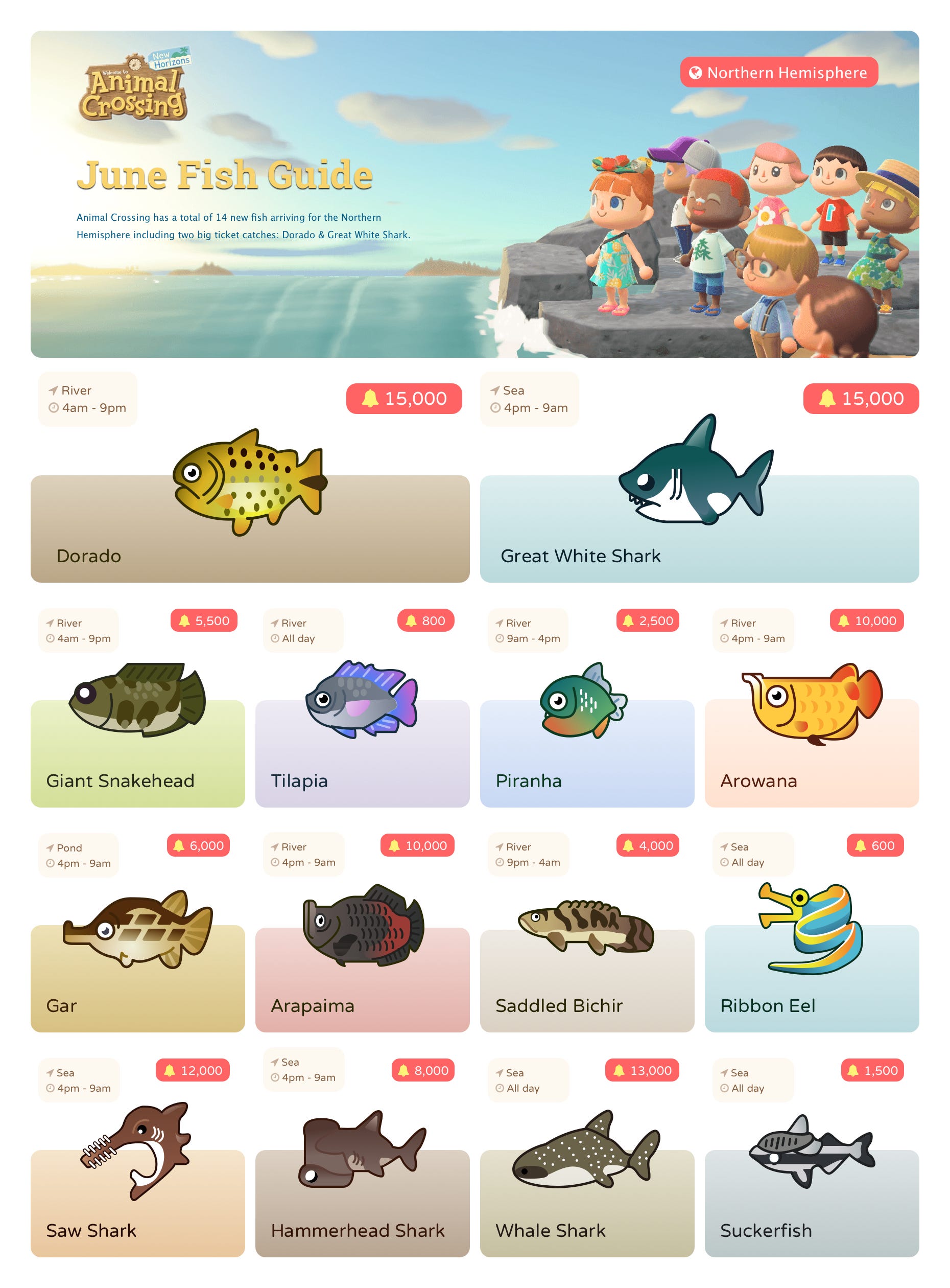
The subject matter for this project will be based on Nintendo’s Animal Crossing: New Horizons. Each month a new set of fish becomes available. What we will be designing is a visual representation of this highlighting the most valuable, their location & time as well as the value of each fish.
该项目的主题将基于任天堂的《动物穿越:新视野》。 每个月都会有一套新的鱼。 我们将要设计的是视觉呈现,突出最有价值的东西,它们的位置和时间以及每条鱼的价值。
There are 14 new fish being added (2 of which are of a higher value). Our grid should be divisible by 4 and 2.
添加了14条新鱼(其中2条价值较高)。 我们的网格应被4和2整除。

思维流畅 (Think fluid)
The artboard and grid block size isn’t entirely relevant because the layouts should flow easily based on screen size. However to make it easy to design, I will be creating an artboard that is 1760px by 2860px. This means that our grid block size is 220px by 220px.
画板和网格块的大小并不完全相关,因为布局应根据屏幕大小轻松流动。 但是,为了简化设计,我将创建一个1760px x 2860px的画板。 这意味着我们的网格块大小为220px x 220px。
移动优先,台式机优先 (Mobile-first… and also desktop first)
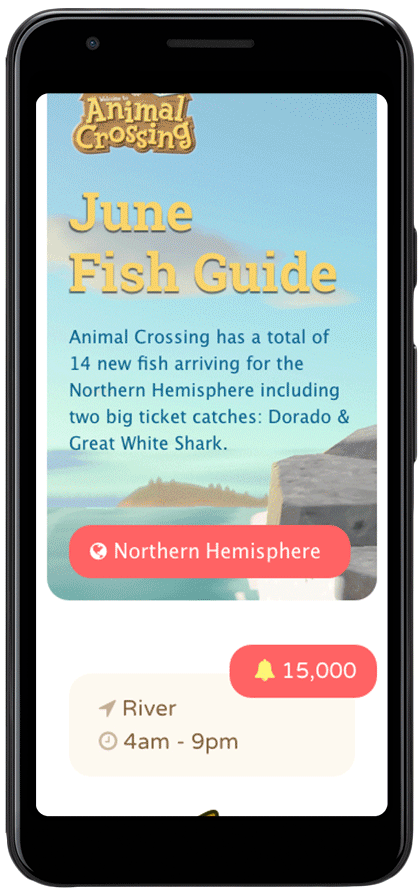
Mobile-first has been a big term used over the past few years. In short it means to design for mobile users first because, odds are most people use their phones as their primary device when browsing the internet. This doesn’t mean that we should ignore desktop. So we will be designing for desktop first but will keep in mind how we want things to flow when they end up on a mobile device. Since we will have 2 variations for displaying our fish (featured fish taking up a 4x2 space and general fish taking ups a 2x2 space) we can reuse these components when adapting our content.
在过去的几年中,“移动优先”一直是一个重要术语。 简而言之,这意味着首先要为移动用户设计,因为大多数人浏览互联网时都以手机为主要设备。 这并不意味着我们应该忽略桌面。 因此,我们将首先针对台式机进行设计,但请记住,当事情最终出现在移动设备上时,我们希望它们如何流动。 由于我们将有2种变体来显示鱼(功能鱼占4x2的空间,普通鱼占2x2的空间),因此我们可以在调整内容时重用这些组件。

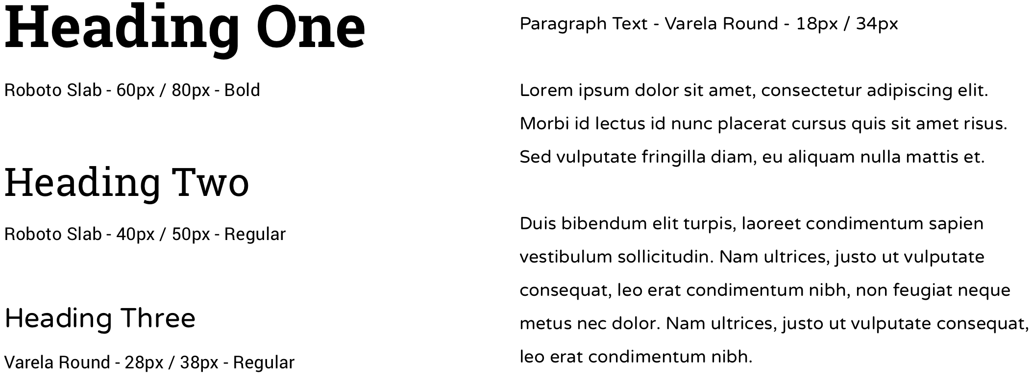
创建视觉资产 (Creating your visual assets)
When creating the components of your design, keep some kind of hierarchy to the content. Also make sure to create re-usable items. This will not only reduce the overall weight of the project, but it will also help to create a cohesive message. Start with a baseline for your heading 1 then work your way down.
在创建设计的组件时,请对内容保持某种层次。 另外,请确保创建可重复使用的项目。 这不仅将减轻项目的总体负担,而且还将有助于创建凝聚力的信息。 从标题1的基线开始,然后逐步下降。
利用CSS属性 (Utilize CSS properties)
One of the most undervalued aspects of designing in Sketch is that it limits you to only work with available CSS attributes. This significantly increases the possibility that your final designs are able to be programmed.
Sketch中设计最被低估的方面之一是它限制了您只能使用可用CSS属性。 这大大增加了最终设计能够被编程的可能性。
Sketch also allows you to grab usable CSS from components that you have created, Things like CSS gradients (not necessarily hard to program but are tedious to code), can be easily copied and pasted into your stylesheet.
Sketch还允许您从已创建的组件中获取可用CSS,诸如CSS渐变之类的东西(不一定很难编程,但代码繁琐)却可以轻松地复制并粘贴到样式表中。
SVG和FontAwesome (SVGs & FontAwesome)
If at all possible create your illustrations or icons as vectors and output as an SVG file. I created my illustrations in Adobe Illustrator, then imported them into Sketch — keeping them in a vector format. This will ensure that your content will retain its quality no matter what the device. SVGs are also often much smaller than JPGs or PNGs.
尽可能将插图或图标创建为矢量,并输出为SVG文件。 我在Adobe Illustrator中创建了插图,然后将其导入到Sketch中-使其保持矢量格式。 这将确保无论使用哪种设备,您的内容都将保持其质量。 SVG通常也比JPG或PNG小得多。
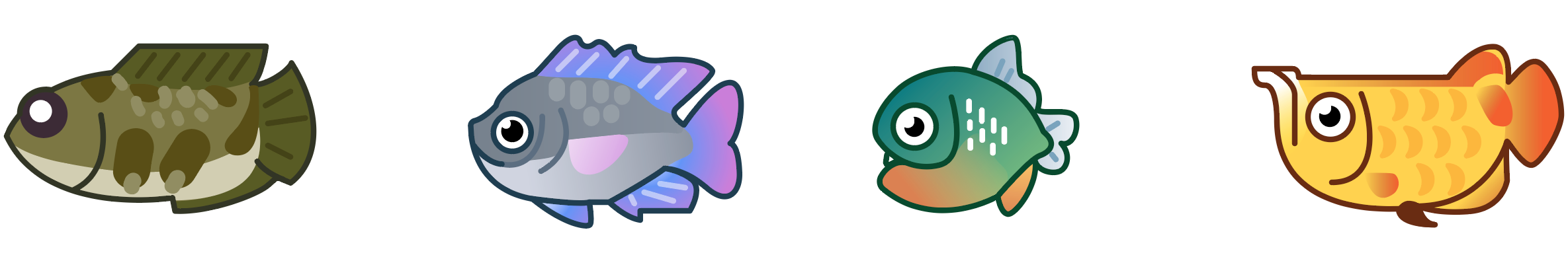
Another great tool for gathering assets for your design that is both light-weight and scalable is FontAwesome — The internet’s most popular icon set and toolkit. Simply download FontAwesome to your computer and install it like any other font. Once installed visit their icon page and search for the icons you want to use. When you find the right icon, you can copy it to your artboard then return to Sketch to paste it in your text field with the FontAwesome font selected.
轻巧且可扩展的另一种为您的设计收集资产的出色工具是FontAwesome -Internet上最受欢迎的图标集和工具包。 只需将FontAwesome下载到您的计算机上,然后像安装其他任何字体一样安装它。 安装完成后,请访问其图标页面并搜索要使用的图标。 找到正确的图标后,可以将其复制到画板上,然后返回“草图”以将其粘贴到文本字段中,并选择FontAwesome字体。

动态背景图片 (Dynamic background images)
We have already established that you must create fluid designs. This becomes challenging when working with busy bitmap images. Luckily there is a CSS attribute that helps make background images adapt with ease. When appending a background image, there is a property known as “background-size”. One of the values of background size is “cover”. What this does is fit your image to the allocated area by scaling and cropping the top and bottom of the image as the viewport changes in size. So when choosing your background image be sure to have some extra room all around the main focal point so if it does get cropped your main point of interest is protected.
我们已经确定您必须创建流畅的设计。 当处理繁忙的位图图像时,这变得具有挑战性。 幸运的是,有一个CSS属性可以帮助轻松地适应背景图像。 附加背景图像时,有一个称为“ background-size”的属性。 背景大小的值之一是“ cover”。 这是通过在视口尺寸改变时缩放和裁剪图像的顶部和底部,使图像适合分配的区域。 因此,在选择背景图像时,请确保在主要焦点周围有一些额外的空间,这样,如果确实被裁剪,您的主要兴趣点就会受到保护。

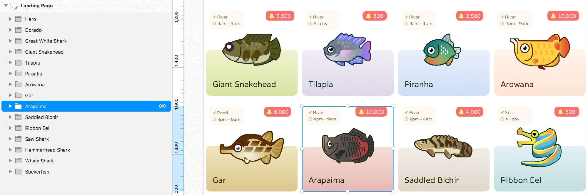
组装设计 (Assembling the design)

As you can see, the completed design works within the grid that we established in step one. Once your initial wireframe is established, then you can apply styles — colours, icons, images etc. As noted earlier, try and use as many CSS techniques as possible to ensure that your design is possible and that it can be developed in an efficient way.
如您所见,完成的设计在第一步中建立的网格内工作。 一旦建立了初始线框,便可以应用样式-颜色,图标,图像等。如前所述,请尝试并使用尽可能多CSS技术,以确保您的设计成为可能,并可以有效地进行开发。
Because our layout is fluid, the columns and row heights are based on the content inside. We use padding to keep enough white space around each object. In Sketch if you hold the “Option” key and mouse over the space between objects it will show you the space in pixels between each item. This allows us to keep consistent spacing which would be converted to padding or margins when being programmed.
因为我们的布局是流畅的,所以列和行的高度基于内部的内容。 我们使用填充来在每个对象周围保留足够的空白。 在Sketch中,如果按住“ Option”键并在对象之间的空间上移动鼠标,它将为您显示每个项目之间的空间(以像素为单位)。 这使我们可以保持一致的间距,该间距在编程时会转换为填充或边距。
Keep your files clean. Make sure to group your items and create symbols for recurring items like, lists, highlights and callouts.
保持文件干净。 确保将项目分组并为重复项目(例如列表,突出显示和标注)创建符号。
让我们开始编码 (Let’s get coding)
HTML (HTML)
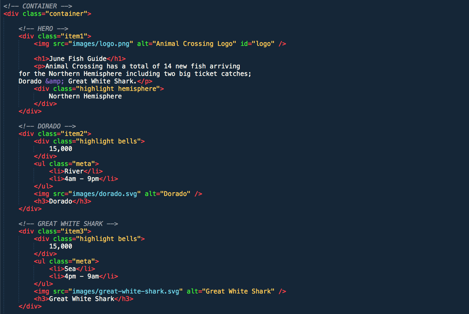
Start with your HTML. Build out the overall structure and hierarchy of your content. When creating the nested grid items, there are two ways we can target them with CSS. The easiest route would be to give each container (div) a unique class name — for example “hero”. This will make things easier to reference when we write the CSS. Alternatively if we want to keep the HTML clean, or if the HTML is automatically output in a loop (like an app built with React which could loop through data in a JSON file), we can target inner divs using pseudo-classes.
从您HTML开始。 建立内容的整体结构和层次结构。 创建嵌套网格项时,有两种方法可以使用CSS定位它们。 最简单的方法是为每个容器(div)赋予唯一的类名,例如“ hero”。 这将使我们在编写CSS时更容易参考。 另外,如果我们想保持HTML的整洁,或者HTML是自动循环输出的(例如使用React构建的应用程序,可以循环遍历JSON文件中的数据),则可以使用伪类来定位内部div。
CSS (CSS)
There are a ton of property options to be used with CSS grid, but to keeps things simple and to keep the focus on design, we will only be utilizing the “grid-template-areas” property.
CSS网格可以使用大量的属性选项,但是为了使事情变得简单并专注于设计,我们将仅使用“ grid-template-areas”属性。
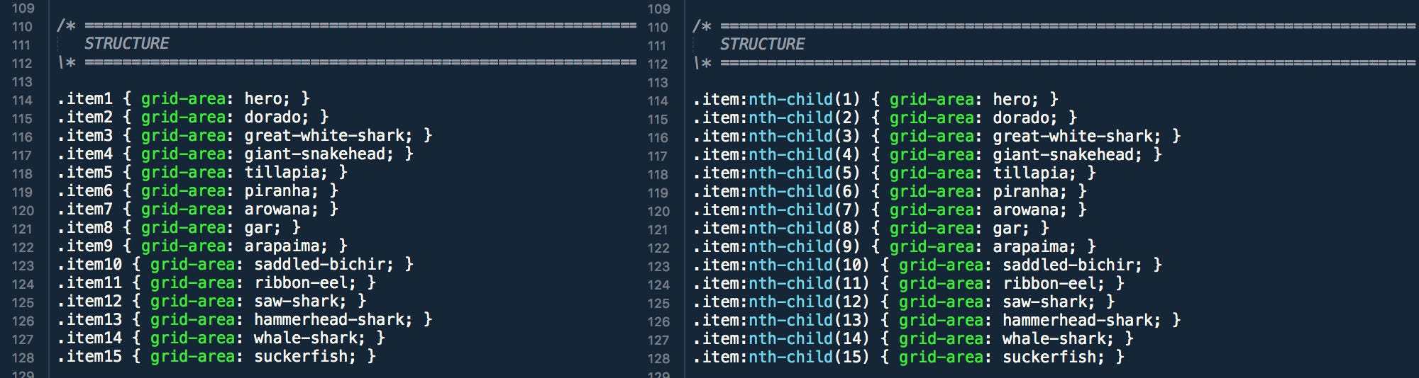
Most of the heavy lifting when building our grid is going to be handled by the container. But before we get there we need to define our grid items. The best part about this is that we can give them easy to remember names (see image above).
建造网格时,大部分繁重的工作将由集装箱来处理。 但是在到达那里之前,我们需要定义网格项。 最好的部分是,我们可以给他们起易于记忆的名称(请参见上图)。
Once the names are established and associated with a container we write out the HTML.
一旦名称被建立并与容器相关联,我们就写出HTML。

使事物响应(自适应) (Making things responsive (Adaptive))
Often the term “responsive” is used when talking about the conversion of a desktop site to devices with smaller screens — the layouts respond to the screen size. In reality when done properly, the layouts we should be creating are “adaptive” layouts. We don’t want the content to just get shuffled around aimlessly for smaller screen sizes, we want the content to be oriented in a way that is optimized for the best user experience.
在谈论将桌面站点转换为具有较小屏幕的设备时,通常使用术语“响应式”-布局响应屏幕尺寸。 实际上,只要正确完成,我们应该创建的布局就是“自适应”布局。 我们不希望内容只是为了较小的屏幕大小而漫无目的地打乱,我们希望内容以优化的方式进行定向,以实现最佳的用户体验。
Luckily, CSS Grid makes this incredibly simple. The “grid-template-areas” property allows us to build out our grid by referencing our grid-area names as cells in the grid.
幸运的是,CSS Grid使这一操作变得非常简单。 “网格模板区域”属性使我们可以通过将网格区域名称引用为网格中的单元格来构建网格。

Lines 131–133 set up our grid. We first set the container to be displayed as a “grid”. Line 132 sets up our columns. What the code translates to are 8 equal columns. “1fr” indicates “one fraction” of the entire width (so in short, 8 equal fractions). Line 133 sets up our rows using the same method as noted above.
第131–133行建立了我们的网格。 我们首先将容器设置为显示为“网格”。 132行设置了我们的列。 代码转换为8个相等的列。 “ 1fr”表示整个宽度的“一个分数”(因此,简而言之,是8个相等的分数)。 第133行使用与上述相同的方法设置行。
Using the grid area names defined in our stylesheet, we work row by row as seen above. On line 135, 136 & 137 we see “hero” taking up 8 cells across and 3 cells down. On lines 138 & 139 we see “dorado” taking up the first 4 cells in the fourth and fifth row while “great-white-shark” takes up the last 4 cells in the same row.
使用样式表中定义的网格区域名称,我们如上所述逐行工作。 在第135、136和137行,我们看到“英雄”占据了8个单元格,向下占据了3个单元格。 在第138和139行,我们看到“ dorado”占据了第四行和第五行的前4个单元格,而“ great-white-shark”占据了同一行的最后4个单元格。
When making the layout adaptive, we simply need to use a media query to target the screen size, then adjust the values of our “grid-template-areas” property.
在使布局自适应时,我们只需要使用媒体查询来确定屏幕尺寸,然后调整“网格模板区域”属性的值即可。

最终产品 (The Final Product)
The final product is a light-weight easily adaptable layout to enhance the overall user experience.
最终产品是轻巧且易于适应的布局,以增强整体用户体验。
The best approach to designing layouts to be programmed with CSS Grid is to take things one step at a time always anticipating how objects should react across multiple devices.
设计要使用CSS Grid进行编程的布局的最佳方法是每次只一步一步地始终预期对象在多个设备之间的React。
While this guide doesn’t provide extensive information around CSS programming as a whole, I hope that the information provided helps designers to get a better understanding of the relationship between code and design.
尽管本指南并未提供有关CSS编程的全面信息,但我希望所提供的信息有助于设计人员更好地理解代码与设计之间的关系。
翻译自: https://uxdesign.cc/designing-for-css-grid-using-sketch-app-41807be1802e
sketch放入app组件


 207
207


 被折叠的 条评论
为什么被折叠?
被折叠的 条评论
为什么被折叠?
 到【灌水乐园】发言


