


Modern-day design principles for logos are simple. Minimise unnecessary text, use clean lines and simple imagery, and use colour to convey meaning — think Nike, Starbucks or Apple. For a long time, major football clubs have favoured traditional crest or shield-based designs. Until now. The football emblem landscape is changing and club designs are catching up with their corporate counterparts.
徽标的现代设计原理很简单。 尽量减少不必要的文字,使用简洁的线条和简单的图像,并使用颜色来传达含义-例如耐克,星巴克或苹果。 长期以来,大型足球俱乐部一直偏爱传统的波峰或盾牌设计。 到现在。 足球会徽的格局正在发生变化,俱乐部的设计也赶上了公司的竞争对手。
Traditionally, when a football club formed they would adopt their town or city’s crest, usually a complex design of various symbols and colours. Liverpool city’s coat of arms, adopted by Liverpool Football Club in 1892, features the Roman and Greek gods, Neptune and Triton, as well as two Liver birds and a Latin phrase.
传统上,当足球俱乐部成立时,他们会采用城镇或城市的徽章,通常是各种符号和颜色的复杂设计。 利物浦市的徽章是由利物浦足球俱乐部于1892年采用的 ,具有罗马和希腊神海王星和特里顿,以及两只利物浦鸟和一个拉丁词。
Clubs adapted their emblems over time, adding mottos, images of footballs and icons representing events from the club’s history. The addition of flames to Liverpool’s logo in 1993 commemorated the victims of the Hillsborough disaster.
俱乐部会随着时间的推移调整其标志,增加标语,足球图像和代表俱乐部历史事件的图标。 1993年,利物浦徽标上增加了火焰,以纪念希尔斯伯勒灾难的受害者。

In the Post-War era, clubs made efforts to modernise their emblems in line with the growth of the International Typographic Style. This design movement standardised colour and typefaces and, most importantly for football, advocated for the “banishment of ornament”. The 80s and 90s saw a revival of traditional crest-style emblems, promoting nostalgia as well as reinforcing pride in a club’s history, and the fans’ attachment to it.
在战后时代,俱乐部根据国际印刷风格的发展,努力使标志现代化。 这种设计运动标准化了颜色和字体,对于足球而言,最重要的是提倡“ 放逐装饰品 ”。 80年代和90年代见证了传统波峰风格标志的复兴,促进了怀旧之情,并增强了对俱乐部历史以及球迷们的依恋的自豪感。
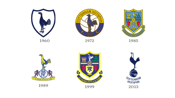
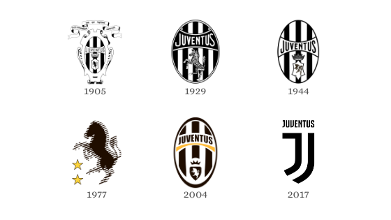
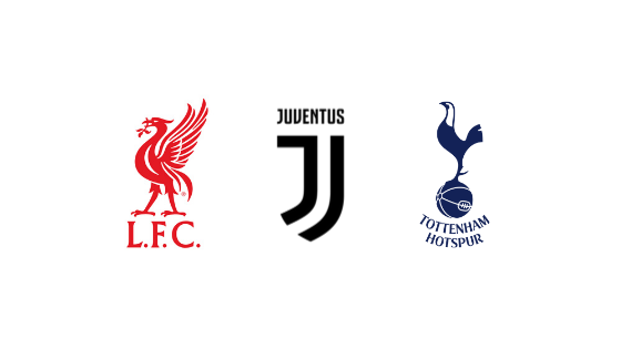
In the last decade, we have once again seen a simplification of club emblems. Consider Liverpool, Tottenham and Juventus’ most recent logos. Gone are the colourful crests with complex patterns and intricate designs. We see clean lines, minimal text and colour, as well as simplified iconography, creating a modern, stylised club identity.
在过去的十年中,我们再次看到了俱乐部标志的简化。 考虑一下利物浦,热刺和尤文图斯的最新徽标。 具有复杂图案和复杂设计的彩色波峰已经一去不复返了。 我们看到简洁的线条,最少的文字和颜色以及简化的图像,从而营造出现代风格的俱乐部形象。
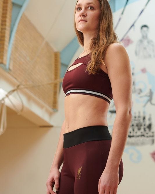
This stylised identity can also boost commercial revenue. The explosion of athleisure in recent years has significantly increased the expectations of fans for the stash being produced by clubs. These sleek logos meet the increasing pressure to produce premium, stylish kit for fans who will wear their kit to the gym, out to brunch and everything in between.
这种风格化的身份也可以增加商业收入。 近年来,运动休闲的爆炸式增长极大地提高了球迷对俱乐部产生的藏匿球的期望。 这些光滑的徽标满足了越来越高的压力,要求制作高质量, 时尚的套装给球迷,他们会将他们的装备带到体育馆,享用早午餐以及介于两者之间的所有物品。
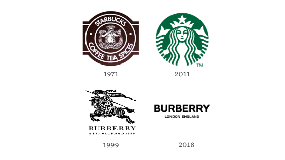
In this way, clubs are following the trend set by many international corporations. The Starbucks logo has gradually shifted from a detailed, fuzzy drawing of a mermaid to the iconographic, digitized and vividly coloured illustration we recognise today. Burberry held off until 2018 when the fashion house made the first change to its logo in more than two decades. The dramatic transition from their iconic knight to a simple, text-based logo shows that change and modernisation will follow for the company itself.
这样,俱乐部就遵循了许多国际公司设定的趋势。 星巴克的标志已逐渐从美人鱼的详细模糊绘画转变为我们今天所认识的标志性,数字化和生动彩色的插图。 Burberry一直待到2018年,直到时装屋对其标志进行了二十多年的首次变更。 从标志性的骑士到简单的基于文本的徽标的巨大转变表明,公司本身将随之发生变化和现代化。
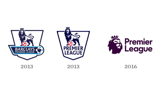
In 2016/17, the English Premier League (EPL) also redeveloped their logo. At the beginning of the season, the league moved away from having title sponsors which lifted the design constraints created by having to include another brand’s logo. The EPL took the opportunity to modernise and the result is striking, streamlined, and enhanced for digital and broadcast formats. The shape of the lion’s head alludes to the shape of a football, removing the need to integrate the extra element into the design. Modern viewers accustomed to the world of emojis may identify with the simplified lion more than the 2013 illustration. Additionally, the logo is now a unified colour; the EPL’s traditional blue has given way to a stylish purple, forging a neutral identity for the league that appeals to all, since no Premier League side plays in purple.
在2016/17赛季,英超(EPL)也重新设计了徽标。 在赛季开始之初,联盟不再拥有冠名赞助商,这消除了由于必须包含另一个品牌的徽标而造成的设计限制。 EPL借此机会进行了现代化改造,其结果对于数字和广播格式而言引人注目,精简并得到了增强。 狮子头的形状暗示了足球的形状,无需将多余的元素整合到设计中。 习惯表情符号世界的现代观众可能会比2013年的插图更容易识别狮子。 此外,徽标现在是统一的颜色。 EPL的传统蓝色已被时尚的紫色所取代,因为没有英超联赛球队采用紫色打法,所以该联盟为所有人建立了中立的身份。
Not all redesigns have been well received. Juventus released a statement when they launched the new logo, stating that it “represents the very essence of Juventus: the distinctive stripes of the play[ing] jersey, the Scudetto shape and the iconic J for Juventus. The black and white stripes are the defining trait of the new visual identity and can be adapted to fit any setting”. However, the loss of the charging bull and the crown, key motifs of Juventus’ identity, was a bone of contention amongst fans who believed it was “too corporate and anonymous”. This should be a lesson for other clubs wishing to modernise their brand — don’t lose your identity.
并非所有重新设计都广受好评。 尤文图斯在发布新徽标时发表了一份声明,称其“ 代表尤文图斯的精髓:运动衫的独特条纹,意甲形状和尤文图斯的标志性J”。 黑白条纹是新视觉标识的定义特征,可以进行调整以适合任何设置 ”。 然而,失去公牛和王冠,这是尤文图斯身份的关键主题,是那些认为这是“ 过于公司化和匿名性 ”的球迷们争执的话题。 对于其他希望实现品牌现代化的俱乐部来说,这应该是一个教训-不要失去您的身份。
This being said, football clubs are having to adapt their identities for an increasingly international audience. Research conducted by Nielsen Sports for the EPL highlights that during the 2018/19 season, Chinese audiences increased by 6% from the previous season, whilst viewing records were set in the US. International players also impact a team’s audience. Tottenham, who signed South Korean player Son Heung-Min in 2015, attracted high numbers of South Korean viewers and Liverpool, whose starting line up includes Dutch stars Gini Wijnaldum and Virgil van Dijk, saw a record number of viewers in the Netherlands.
话虽这么说,足球俱乐部必须适应越来越多的国际观众的身份。 Nielsen Sports为EPL进行的研究强调,在2018/19赛季中, 中国观众人数比上一赛季增长了6% ,而美国观众的观看记录也创下了纪录 。 国际球员也会影响球队的观众。 托特纳姆热刺队在2015年与韩国籍球员孙兴民签约,吸引了大批韩国观众,而利物浦的首发阵容包括荷兰球星吉尼·维纳尔杜姆和维吉尔·范·迪克, 在荷兰的观众人数创下了纪录 。
An international club identity needs to appeal to a global audience, and this comes with risks. To a Chinese audience, for example, the colour yellow poses an interesting dilemma. When used in the context of media, the colour yellow (黄, huáng) conveys something pornographic. Red, on the other hand, signifies luck, joy, celebration and is believed to ward off evil. Simple, clean logos are a logical solution to counter these risks. As just over 62% of players in the Premier League are not home-grown, international fanbases are lucrative markets for EPL clubs.
国际俱乐部的身份需要吸引全球观众,这会带来风险。 例如,对于中国观众来说,黄色是一个有趣的难题。 在媒体环境中使用时,黄色(黄,huáng)传达出色情的色彩。 另一方面,红色表示幸运,喜庆和庆祝活动,并且被认为可以避开邪恶。 简单,干净的徽标是应对这些风险的合理解决方案。 由于英超联赛中只有超过62%的球员不是本土球员 ,因此国际球迷基础是EPL俱乐部利润丰厚的市场。
The best logos are simple. You can immediately recognise and understand them. Modern football clubs are corporations and over the coming years, an increasing number of clubs will simplify and internationalise their brands in the race to secure a lucrative share of the global market.
最好的徽标很简单。 您可以立即识别并理解它们。 现代足球俱乐部是公司,在未来几年,越来越多的俱乐部将在比赛中简化和国际化他们的品牌,以确保在全球市场中获得丰厚的份额。
翻译自: https://uxdesign.cc/the-simplification-of-football-emblems-5cf24a151d44


 3万+
3万+

 被折叠的 条评论
为什么被折叠?
被折叠的 条评论
为什么被折叠?
 到【灌水乐园】发言


