


我在黑暗中看到你眼中的月光
(Originally published on https://web.dev/prefers-color-scheme/.)
(最初发布于https://web.dev/prefers-color-scheme/ 。)
介绍 (Introduction)
📚 I have done a lot of background research on the history and theory of dark mode, if you are only interested in working with dark mode, feel free to skip the introduction.
📚我已经对暗模式的历史和理论进行了很多背景研究,如果您只对使用暗模式感兴趣,请随时跳过介绍 。
黑暗模式之前的黑暗模式 (Dark mode before Dark Mode)
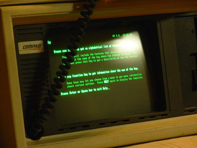
We have gone full circle with dark mode. In the dawn of personal computing, dark mode wasn’t a matter of choice, but a matter of fact: Monochrome CRT computer monitors worked by firing electron beams on a phosphorescent screen and the phosphor used in early CRTs was green. Because text was displayed in green and the rest of the screen was black, these models were often referred to as green screens.
我们在黑暗模式下走了一个完整的圈。 在个人计算的曙光中,暗模式不是选择问题,而是事实:单色CRT计算机显示器通过在磷光屏上发射电子束来工作,而早期CRT中使用的磷光是绿色的。 由于文本显示为绿色,而屏幕的其余部分为黑色,因此这些型号通常称为绿色屏幕 。
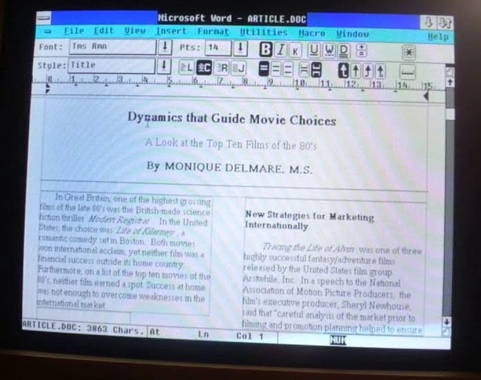
The subsequently introduced Color CRTs displayed multiple colors through the use of red, green, and blue phosphors. They created white by activating all three phosphors simultaneously. With the advent of more sophisticated WYSIWYG desktop publishing, the idea of making the virtual document resemble a physical sheet of paper became popular.
随后推出的彩色CRT通过使用红色,绿色和蓝色磷光体显示多种颜色。 他们通过同时激活所有三种荧光粉来产生白色。 随着更先进的所见即所得桌面发布的出现,使虚拟文档类似于物理纸的想法变得流行。
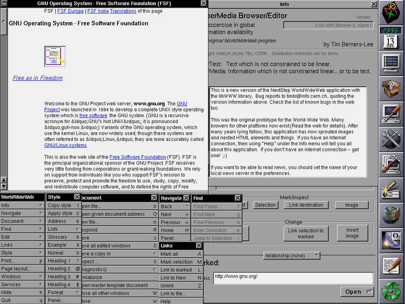
This is where dark-on-white as a design trend started, and this trend was carried over to the early document-based web. The first ever browser, WorldWideWeb (remember,CSS wasn’t even invented yet), displayed webpages this way. Fun fact: the second ever browser, Line Mode Browser — a terminal-based browser — was green on dark. These days, web pages and web apps are typically designed with dark text on a light background, a baseline assumption that is also hard-coded in user agent stylesheets, including Chrome’s.
这是从深色开始作为设计趋势的起点,并且这种趋势被延续到了早期的基于文档的Web中 。 第一个浏览器WorldWideWeb (记住CSS尚未发明 ) 以这种方式显示网页 。 有趣的事实:有史以来第二个浏览器, 行模式浏览器 (基于终端的浏览器)在黑暗中呈绿色。 如今,网页和Web应用程序通常在浅色背景上使用深色文字进行设计,这是一个基线假设,该假设也已硬编码在用户代理样式表中,包括Chrome浏览器 。

The days of CRTs are long over. Content consumption and creation has shifted to mobile devices that use backlit LCD or energy-saving AMOLED screens. Smaller and more transportable computers, tablets, and smartphones led to new usage patterns. Leisure tasks like web browsing, coding for fun, and high-end gaming frequently happen after-hours in dim environments. People even enjoy their devices in their beds at night-time. The more people use their devices in the dark, the more the idea of going back to the roots of light-on-dark becomes popular.
CRT的时代已经过去了。 内容的消费和创作已经转移到使用背光LCD或节能AMOLED屏幕的移动设备。 体积更小,更便于携带的计算机,平板电脑和智能手机带来了新的使用方式。 在昏暗的环境中,下班后经常发生诸如浏览网页,娱乐性编码和高端游戏之类的休闲任务。 人们甚至在夜间都喜欢躺在床上的设备。 在黑暗中使用设备的人越多,回到黑暗中的根源的想法就越受欢迎。
为什么选择暗模式 (Why dark mode)
出于审美原因的黑暗模式 (Dark mode for aesthetic reasons)
When people get asked why they like or want dark mode, the most popular response is that “it’s easier on the eyes,”followed by “it’s elegant and beautiful.” Apple in their Dark Mode developer documentation explicitly writes: “The choice of whether to enable a light or dark appearance is an aesthetic one for most users, and might not relate to ambient lighting conditions.”
当人们被问到为什么喜欢或想要黑暗模式时 ,最受欢迎的回答是“它在眼睛上更容易”,然后是“它优雅而美丽”。 苹果公司在其黑暗模式开发人员文档中明确写道: “对于大多数用户而言,选择启用浅色还是深色外观是一种美感,并且可能与环境照明条件无关。”
👩🔬 Read up more on user research regarding why people want dark mode and how they use it.
user阅读有关用户研究的更多内容,以了解人们为什么想要暗模式以及如何使用暗模式 。
暗模式作为辅助工具 (Dark mode as an accessibility tool)
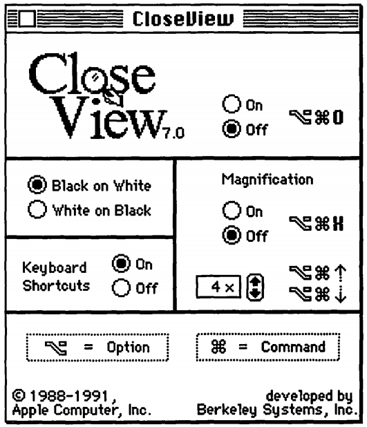
There are also people who actually need dark mode and use it as another accessibility tool, for example, users with low vision. The earliest occurrence of such an accessibility tool I could find is System 7’s CloseView feature, which had a toggle for Black on White and White on Black. While System 7 supported color, the default user interface was still black-and-white.
还有一些人实际上需要暗模式并将其用作另一种可访问性工具,例如视力不佳的用户。 我可以找到的最早出现的这种可访问性工具是System 7的CloseView功能,该功能具有“白底黑字”和“ 白底黑字”的切换功能。 尽管System 7支持颜色,但默认的用户界面仍为黑白。
These inversion-based implementations demonstrated their weaknesses once color was introduced. User research by Szpiro et al. on how people with low vision access computing devices showed that all interviewed users disliked inverted images, but that many preferred light text on a dark background. Apple accommodates for this user preference with a feature called Smart Invert, which reverses the colors on the display, except for images, media, and some apps that use dark color styles.
一旦引入了颜色,这些基于反转的实现就证明了它们的弱点。 Szpiro 等人的用户研究。 关于低视力访问计算设备的人们的看法表明,所有受访用户都不喜欢倒置的图像,但是许多人更喜欢深色背景上的浅色文字。 Apple通过称为Smart Invert的功能来适应这种用户偏好,该功能可以反转显示屏上的颜色,但图像,媒体和某些使用深色样式的应用除外。
A special form of low vision is Computer Vision Syndrome, also known as Digital Eye Strain, which is defined as “the combination of eye and vision problems associated with the use of computers (including desktop, laptop, and tablets) and other electronic displays (e.g. smartphones and electronic reading devices).” It has been proposed that the use of electronic devices by adolescents, particularly at night time, leads to an increased risk of shorter sleep duration, longer sleep-onset latency, and increased sleep deficiency. Additionally, exposure to blue light has been widely reported to be involved in the regulation of circadian rhythm and the sleep cycle, and irregular light environments may lead to sleep deprivation, possibly affecting mood and task performance, according to research by Rosenfield. To limit these negative effects, reducing blue light by adjusting the display color temperature through features like iOS’ Night Shift or Android’s Night Light can help, as well as avoiding bright lights or irregular lights in general through dark themes or dark modes.
低视力的一种特殊形式是计算机视觉综合症,也称为“数字眼疲劳”,其定义为“与使用计算机(包括台式机,笔记本电脑和平板电脑)和其他电子显示器(例如智能手机和电子阅读设备)。” 已经提出 ,青少年,特别是在夜间使用电子设备,会导致睡眠时间缩短,睡眠开始潜伏期延长和睡眠不足的风险增加。 此外, 据 罗森菲尔德(Rosenfield)的研究 ,据报道 ,暴露于蓝光与昼夜节律和睡眠周期的调节有关,不规则的光照环境可能导致睡眠不足,从而可能影响情绪和工作表现。 为了限制这些负面影响,通过iOS的Night Shift或Android的Night Night之类的功能来调节显示器的色温来减少蓝光可以起到帮助作用,并且通常可以通过深色主题或深色模式避免明亮或不规则的灯光。
在AMOLED屏幕上节省暗模式 (Dark mode power savings on AMOLED screens)
Finally, dark mode is known to save a lot of energy on AMOLED screens. Android case studies that focused on popular Google apps like YouTube have shown that the power savings can be up to 60%. The video below has more details on these case studies and the power savings per app.
最后,已知暗模式可在AMOLED屏幕上节省大量能量。 针对YouTube等热门Google应用的Android案例研究表明,节电效果可高达60%。 以下视频详细介绍了这些案例研究以及每个应用的节能功能。
在操作系统中激活暗模式 (Activating dark mode in the operating system)
Now that I have covered the background of why dark mode is such a big deal for many users, let’s review how you can support it.
现在,我已经介绍了为什么暗模式对许多用户如此重要的背景,让我们回顾一下如何支持它。
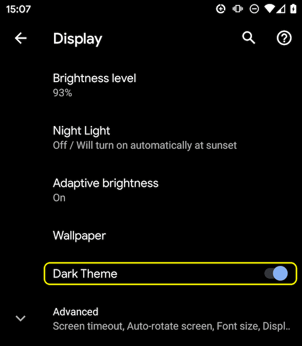
Operating systems that support a dark mode or dark theme typically have an option to activate it somewhere in the settings. On macOS X, it’s in the system preference’s General section and called Appearance (screenshot), and on Windows 10, it’s in the Colors section and called Choose your color (screenshot). For Android Q, you can find it under Display as a Dark Theme toggle switch (screenshot), and on iOS 13, you can change the Appearance in the Display & Brightness section of the settings (screenshot).
支持深色模式或深色主题的操作系统通常可以在设置中的某个位置激活它。 在macOS X上,它位于系统偏好设置的“ 常规”部分中,称为“ 外观” ( 屏幕截图 );在Windows 10上,它位于“ 颜色”部分中,名为“选择颜色” ( 屏幕截图 )。 对于Android Q,您可以在“ 显示为深色主题”切换开关( 屏幕截图 )下找到它,而在iOS 13上,可以在设置的“ 显示与亮度”部分( 屏幕截图 )中更改外观 。
prefers-color-scheme媒体查询 (The prefers-color-scheme media query)
One last bit of theory before I get going. Media queries allow authors to test and query values or features of the user agent or display device, independent of the document being rendered. They are used in the CSS @media rule to conditionally apply styles to a document, and in various other contexts and languages, such as HTML and JavaScript. Media Queries Level 5 introduces so-called user preference media features, that is, a way for sites to detect the user's preferred way to display content.
在我开始之前的最后一点理论。 媒体查询使作者可以独立于要呈现的文档来测试和查询用户代理或显示设备的值或功能。 它们在CSS @media规则中用于有条件地将样式应用于文档以及各种其他上下文和语言,例如HTML和JavaScript。 媒体查询级别5引入了所谓的用户首选项媒体功能,即站点检测用户偏爱的显示内容的方式。
☝️ An established user preference media feature is
prefers-reduced-motionthat lets you detect the desire for less motion on a page. I have written aboutprefers-reduced-motionbefore.established️建立的用户首选项媒体功能是“
prefers-reduced-motion,使您可以检测到页面上希望减少运动的愿望。 我以前写过关于“prefers-reduced-motion。
The prefers-color-scheme media feature is used to detect if the user has requested the page to use a light or dark color theme. It works with the following values:
prefers-color-scheme媒体功能用于检测用户是否已请求页面使用浅色或深色主题。 它适用于以下值:
no-preference: Indicates that the user has made no preference known to the system. This keyword value evaluates asfalsein the boolean context.no-preference:指示用户不知道系统的任何首选项。 在布尔上下文中,此关键字值的值为false。light: Indicates that the user has notified the system that they prefer a page that has a light theme (dark text on light background).light:表明用户已通知系统,他们希望页面具有浅色主题(浅色背景上的深色文本)。dark: Indicates that the user has notified the system that they prefer a page that has a dark theme (light text on dark background).dark:表示用户已通知系统他们偏爱具有深色主题的页面(深色背景上的浅色文本)。
支持暗模式 (Supporting dark mode)
找出浏览器是否支持暗模式 (Finding out if dark mode is supported by the browser)
As dark mode is reported through a media query, you can easily check if the current browser supports dark mode by checking if the media query prefers-color-schemematches at all. Note how I don't include any value, but purely check if the media query alone matches.
由于通过媒体查询报告了暗模式,因此您可以通过检查媒体查询是否完全prefers-color-scheme匹配来轻松检查当前浏览器是否支持暗模式。 请注意,我不包含任何值,而只是检查媒体查询是否匹配。
if (window.matchMedia('(prefers-color-scheme)').media !== 'not all') {
  console.log('🎉 Dark mode is supported');
}
At the time of writing, prefers-color-scheme is supported on both desktop and mobile (where available) by Chrome and Edge as of version 76, Firefox as of version 67, and Safari as of version 12.1 on macOS and as of version 13 on iOS. For all other browsers, you can check the Can I use support tables.
在撰写本文时,Chrome和Edge自版本76起支持Firefox和台式机(自版本67起)的Firefox,自macOS和版本13起(版本12.1)的Safari在台式机和移动设备(如果有)上均支持prefers-color-scheme在iOS上。 对于所有其他浏览器,您可以检查可以使用支持表 。
There is a custom element
<dark-mode-toggle>available that adds dark mode support to older browsers. I write about it further down in this article.有一个自定义元素
<dark-mode-toggle>可用于向较旧的浏览器添加暗模式支持。 我将在本文的下半部分对此进行介绍 。
实践中的暗模式 (Dark mode in practice)
Let’s finally see how supporting dark mode looks like in practice. Just like with the Highlander, with dark mode there can be only one: dark or light, but never both! Why do I mention this? Because this fact should have an impact on the loading strategy. Please don’t force users to download CSS in the critical rendering path that is for a mode they don’t currently use. To optimize load speed, I have therefore split my CSS for the example app that shows the following recommendations in practice into three parts in order to defer non-critical CSS:
最后,让我们看看在实践中如何支持深色模式。 就像使用Highlander一样 ,在黑暗模式下,只能有一个 :黑暗或明亮,但不能同时存在! 我为什么要提这个? 因为这个事实应该会对加载策略产生影响。 请不要强迫用户在关键渲染路径中下载CSS,这是他们当前不使用的模式。 因此,为了优化加载速度,我将示例应用程序CSS拆分为三个部分,以便在实践中显示以下建议,以延迟非关键CSS :
style.cssthat contains generic rules that are used universally on the site.style.css,其中包含在网站上普遍使用的通用规则。dark.cssthat contains only the rules needed for dark mode.dark.css,仅包含黑暗模式所需的规则。light.cssthat contains only the rules needed for light mode.light.css仅包含灯光模式所需的规则。
加载策略 (Loading strategy)
The two latter ones, light.css and dark.css, are loaded conditionally with a <link media> query. Initially, not all browsers will support prefers-color-scheme(detectable using the pattern above), which I deal with dynamically by loading the default light.css file via a conditionally inserted <link rel="stylesheet">element in a minuscule inline script (light is an arbitrary choice, I could also have made dark the default fallback experience). To avoid a flash of unstyled content, I hide the content of the page until light.css has loaded.
后面两个, light.css和dark.css ,有条件地通过<link media>查询加载。 最初, 并不是所有的浏览器都支持 prefers-color-scheme (可以使用上述模式检测到),我通过在有条件的内联中有条件插入的<link rel="stylesheet">元素加载默认的light.css文件来动态处理脚本(浅色是任意选择,我也可以将深色作为默认的后备体验)。 为了避免显示未样式化的内容 ,我将页面的内容隐藏起来,直到light.css加载light.css 。
<script>
  // If `prefers-color-scheme` is not supported, fall back to light mode.
  // In this case, light.css will be downloaded with `highest` priority.
  if (window.matchMedia('(prefers-color-scheme)').media === 'not all') {
    document.documentElement.style.display = 'none';
    document.head.insertAdjacentHTML(
        'beforeend',
        '<link rel="stylesheet" href="/light.css" onload="document.documentElement.style.display = ``">'
    );
  }
</script>
<!--
  Conditionally either load the light or the dark stylesheet. The matching file
  will be downloaded with `highest`, the non-matching file with `lowest`
  priority. If the browser doesn't support `prefers-color-scheme`, the media
  query is unknown and the files are downloaded with `lowest` priority (but
  above I already force `highest` priority for my default light experience).
-->
<link rel="stylesheet" href="/dark.css" media="(prefers-color-scheme: dark)">
<link rel="stylesheet" href="/light.css" media="(prefers-color-scheme: no-preference), (prefers-color-scheme: light)">
<!-- The main stylesheet -->
<link rel="stylesheet" href="/style.css">
样式表架构 (Stylesheet architecture)
I make maximum use of CSS variables, this allows my generic style.css to be, well, generic, and all the light or dark mode customization happens in the two other files dark.css and light.css. Below you can see an excerpt of the actual styles, but it should suffice to convey the overall idea. I declare two variables, --color and --background-color that essentially create a dark-on-light and a light-on-dark baseline theme.
我最大限度地利用了CSS变量 ,这使我的通用style.css成为通用的,所有亮或暗模式自定义都发生在另外两个文件dark.css和light.css 。 在下面可以看到实际样式的摘录,但足以传达总体思想。 我声明了两个变量--color和--background-color ,它们实际上创建了暗上和暗上基线主题。
/* light.css: 👉 dark-on-light */
:root {
  --color: rgb(5, 5, 5);
  --background-color: rgb(250, 250, 250);
}/* dark.css: 👉 light-on-dark */
:root {
  --color: rgb(250, 250, 250);
  --background-color: rgb(5, 5, 5);
}
In my style.css, I then use these variables in the body { … } rule. As they are defined on the :root CSS pseudo-class—a selector that in HTML represents the <html> element and is identical to the selector html, except that its specificity is higher—they cascade down, which serves me for declaring global CSS variables.
然后,在我的style.css ,在body { … }规则中使用这些变量。 正如它们在:root CSS伪类上定义的那样-一个选择器,在HTML中代表<html>元素,并且与选择器html相同,只是它的特殊性更高-它们级联向下,这有助于我声明全局CSS变量。
/* style.css */
:root {
  color-scheme: light dark;
}body {
  color: var(--color);
  background-color: var(--background-color);
}
In the code sample above, you will probably have noticed a property color-scheme with the space-separated value light dark.
在上面的代码示例中,您可能会注意到一个属性color-scheme其中的空格分隔值为light dark 。
Warning: The
color-schemeproperty is still in development and it might not work as advertised, full support in Chrome will come later this year.警告:
color-scheme属性仍在开发中 ,可能无法像广告中所述正常工作,Chrome将于今年晚些时候全面支持。
This tells the browser which color themes my app supports and allows it to activate special variants of the user agent stylesheet, which is useful to, for example, let the browser render form fields with a dark background and light text, adjust the scrollbars, or to enable a theme-aware highlight color. The exact details of color-scheme are specified in CSS Color Adjustment Module Level 1.
这会告诉浏览器我的应用支持哪种颜色主题,并允许它激活用户代理样式表的特殊变体,例如,这对于使浏览器呈现深色背景和浅色文本的表单字段,调整滚动条或启用主题感知突出显示颜色。 color-scheme的确切详细信息在CSS颜色调整模块级别1中指定。
🌒 Read up more on what
color-schemeactually does.🌒了解更多的关于什么
color-scheme实际执行 。
Everything else is then just a matter of defining CSS variables for things that matter on my site. Semantically organizing styles helps a lot when working with dark mode. For example, rather than --highlight-yellow, consider calling the variable --accent-color, as "yellow" may actually not be yellow in dark mode or vice versa. Below is an example of some more variables that I use in my example.
然后,其他所有事情都只是为我的网站上重要的事情定义CSS变量。 在黑暗模式下工作时,语义上组织样式很有帮助。 例如,可以考虑调用变量--accent-color而不是--highlight-yellow ,因为在黑暗模式下“ yellow”实际上可能不是黄色,反之亦然。 以下是在示例中使用的一些其他变量的示例。
/* dark.css */
:root {
  --color: rgb(250, 250, 250);
  --background-color: rgb(5, 5, 5);
  --link-color: rgb(0, 188, 212);
  --main-headline-color: rgb(233, 30, 99);
  --accent-background-color: rgb(0, 188, 212);
  --accent-color: rgb(5, 5, 5);
}/* light.css */
:root {
  --color: rgb(5, 5, 5);
  --background-color: rgb(250, 250, 250);
  --link-color: rgb(0, 0, 238);
  --main-headline-color: rgb(0, 0, 192);
  --accent-background-color: rgb(0, 0, 238);
  --accent-color: rgb(250, 250, 250);
}
完整的例子 (Full example)
In the following Glitch embed, you can see the complete example that puts the concepts from above into practice. Try toggling dark mode in your particular operating system’s settings and see how the page reacts.
在下面的Glitch嵌入中,您可以看到将以上概念付诸实践的完整示例。 尝试在特定操作系统的设置中切换暗模式,然后查看页面的React。
加载影响 (Loading impact)
When you play with this example, you can see why I load my dark.css and light.css via media queries. Try toggling dark mode and reload the page: the particular currently non-matching stylesheets are still loaded, but with the lowest priority, so that they never compete with resources that are needed by the site right now.
当您处理此示例时,您可以看到为什么我通过媒体查询加载dark.css和light.css原因。 尝试切换暗模式并重新加载页面:特定的当前不匹配的样式表仍会被加载,但是优先级最低,因此它们永远不会与网站当前所需的资源竞争。
😲 Read up more on why browsers download stylesheets with non-matching media queries.
😲阅读更多有关为何浏览器下载带有不匹配媒体查询的样式表的信息 。

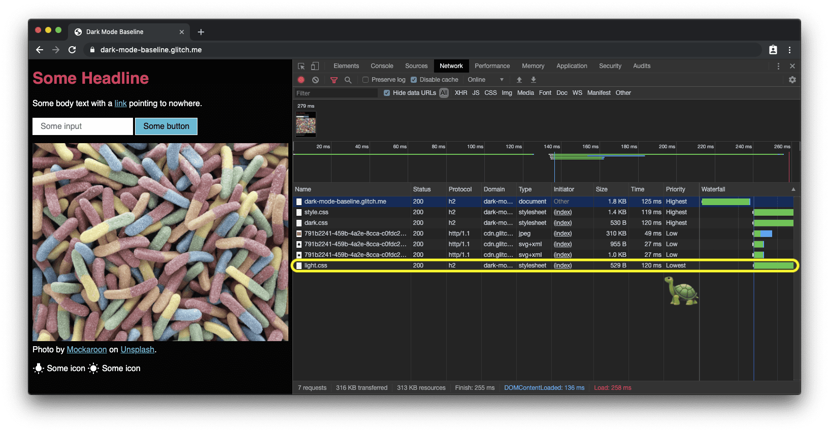
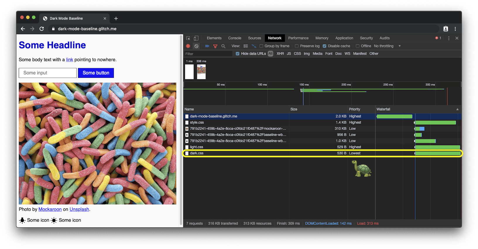
prefers-color-scheme loads the dark mode CSS with lowest priority.
prefers-color-scheme的浏览器上,网站处于默认的浅色模式时,将以最低优先级加载深色模式CSS。
对暗模式更改做出React (Reacting on dark mode changes)
Like any other media query change, dark mode changes can be subscribed to via JavaScript. You can use this to, for example, dynamically change the favicon of a page or change the <meta name="theme-color"> that determines the color of the URL bar in Chrome. The full example above shows this in action, in order to see the theme color and favicon changes, open the demo in a separate tab.
与其他媒体查询更改一样,可以通过JavaScript订阅暗模式更改。 您可以使用它来例如动态更改页面的图标或更改确定Chrome中URL栏颜色的<meta name="theme-color"> 。 上面的完整示例通过实际操作展示了这一点,为了查看主题颜色和图标图标的变化,请在单独的选项卡中打开演示 。
const darkModeMediaQuery = window.matchMedia('(prefers-color-scheme: dark)');
  darkModeMediaQuery.addListener((e) => {
    const darkModeOn = e.matches;
    console.log(`Dark mode is ${darkModeOn ? '🌒 on' : '☀️ off'}.`);
  });
暗模式最佳实践 (Dark mode best practices)
避免纯白色 (Avoid pure white)
A small detail you may have noticed is that I don’t use pure white. Instead, to prevent glowing and bleeding against the surrounding dark content, I choose a slightly darker white. Something like rgb(250, 250, 250) works well.
您可能已经注意到的一个小细节是我不使用纯白色。 相反,为了防止因周围的深色内容发光和渗色,我选择了稍深的白色。 像rgb(250, 250, 250) 250,250,250)这样的东西效果很好。
重新使摄影图像变色和变暗 (Re-colorize and darken photographic images)
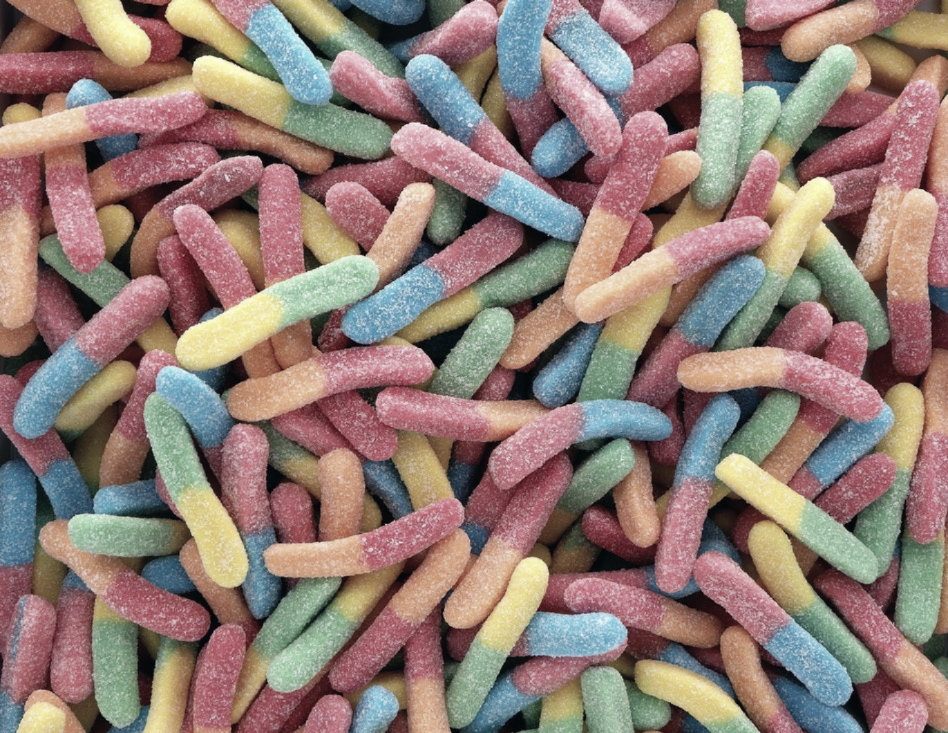
If you compare the two screenshots below, you will notice that not only the core theme has changed from dark-on-light to light-on-dark, but that also the hero image looks slightly different. My user research has shown that the majority of the surveyed people prefer slightly less vibrant and brilliant images when dark mode is active. I refer to this as re-colorization.
如果你比较下面两张截图,你会发现,不仅是核心主题已经改变,从黑暗的光到光的黑暗 ,但也主人公图像看起来略有不同。 我的用户研究表明,当启用暗模式时,大多数被调查的人更喜欢活力和明亮度稍差的图像。 我将其称为重新着色 。

Re-colorization can be achieved through a CSS filter on my images. I use a CSS selector that matches all images that don’t have .svg in their URL, the idea being that I can give vector graphics (icons) a different re-colorization treatment than my images (photos), more about this in the next paragraph. Note how I again use a CSS variable, so I can later on flexibly change my filter.
可以通过我的图像上CSS过滤器实现重新着色。 我使用一个CSS选择器来匹配所有URL中没有.svg图像,其想法是我可以给矢量图形(图标)一种不同于我的图像(照片)的重新着色处理,有关更多信息,请参见下一段 。 注意如何再次使用CSS变量 ,以便以后可以灵活更改过滤器。
🎨 Read up more on user research regarding re-colorization preferences with dark mode.
dark阅读更多有关暗模式下重新着色首选项的用户研究 。
As re-colorization is only needed in dark mode, that is, when dark.css is active, there are no corresponding rules in light.css.
作为重新着色只需要在黑暗模式,即,当dark.css是积极的,也有在没有相应的规则light.css 。
/* dark.css */
--image-filter: grayscale(50%);img:not([src*=".svg"]) {
  filter: var(--image-filter);
}
使用JavaScript自定义暗模式的重新着色强度 (Customizing dark mode re-colorization intensities with JavaScript)
Not everyone is the same and people have different dark mode needs. By sticking to the re-colorization method described above, I can easily make the grayscale intensity a user preference that I can change via JavaScript, and by setting a value of 0%, I can also disable re-colorization completely. Note that document.documentElementprovides a reference to the root element of the document, that is, the same element I can reference with the :rootCSS pseudo-class.
并非每个人都是一样的,人们对黑暗模式的需求也不同。 通过坚持上述的重新着色方法,我可以轻松地将灰度强度设置为可以通过JavaScript更改的用户偏好,并且通过将值设置为0% ,我还可以完全禁用重新着色。 请注意, document.documentElement提供了对document.documentElement根元素的引用,即,我可以使用:root CSS伪类引用的元素相同。
const filter = 'grayscale(70%)';
document.documentElement.style.setProperty('--image-filter', value);
反转矢量图形和图标 (Invert vector graphics and icons)
For vector graphics — that in my case are used as icons that I reference via <img> elements—I use a different re-colorization method. While research has shown that people don't like inversion for photos, it does work very well for most icons. Again I use CSS variables to determine the inversion amount in the regular and in the :hover state.
对于矢量图形(在本例中用作通过<img>元素引用的图标),我使用了不同的重新着色方法。 尽管研究表明人们不喜欢照片的倒置,但对于大多数图标来说,倒置效果确实很好。 同样,我使用CSS变量来确定常规和:hover状态下的反转量。
Note how again I only invert icons in dark.css but not in light.css, and how :hover gets a different inversion intensity in the two cases to make the icon appear slightly darker or slightly brighter, dependent on the mode the user has selected.
请注意,我如何再次仅在dark.css反转图标,而不是在light.css反转图标,以及:hover在两种情况下如何获得不同的反转强度,以使图标显得更暗或更亮,具体取决于用户选择的模式。
/* dark.css */
--icon-filter: invert(100%);
--icon-filter_hover: invert(40%);img[src*=".svg"] {
  filter: var(--icon-filter);
}/* light.css */
--icon-filter_hover: invert(60%);/* style.css */
img[src*=".svg"]:hover {
  filter: var(--icon-filter_hover);
} 将currentColor用于内联SVG (Use currentColor for inline SVGs)
For inline SVG images, instead of using inversion filters, you can leverage the currentColor CSS keyword that represents the value of an element's color property. This lets you use the color value on properties that do not receive it by default. Conveniently, if currentColor is used as the value of the SVG fill or strokeattributes, it instead takes its value from the inherited value of the color property. Even better: this also works for <svg><use href="…"></svg>, so you can have separate resources and currentColor will still be applied in context. Please note that this only works for inline or <use href="…"> SVGs, but not SVGs that are referenced as the src of an image or somehow via CSS. You can see this applied in the demo below.
对于嵌入式 SVG图像,您可以使用currentColor CSS关键字来表示元素的color属性的值,而不必使用反转滤镜 。 这使您可以在默认情况下不接收color属性上使用color值。 方便地,如果将currentColor用作SVG fill 或 stroke 属性的值,则它将从color属性的继承值中获取其值。 更好的是:这也适用于<svg><use href="…"></svg> ,因此您可以拥有单独的资源,并且currentColor仍将应用在上下文中。 请注意,这仅适用于内联或<use href="…"> SVG,但不适用于被称为图像src或通过CSS引用的SVG。 您可以在下面的演示中看到这一点。
<!-- Some inline SVG -->
<svg xmlns="http://www.w3.org/2000/svg"
    stroke="currentColor"
>
  […]
</svg>
模式之间的平滑过渡 (Smooth transitions between modes)
Switching from dark mode to light mode or vice versa can be smoothed thanks to the fact that both color and background-color are animatable CSS properties. Creating the animation is as easy as declaring two transitions for the two properties. The example below illustrates the overall idea, you can experience it live in thedemo.
由于color和background-color都是可动画CSS属性 ,因此可以平滑地从暗模式切换到亮模式,反之亦然。 创建动画就像声明两个属性的两个transition一样容易。 下面的示例说明了总体思路,您可以在演示中现场体验它。
body {
  --duration: 0.5s;
   --timing: ease;  color: var(--color);
  background-color: var(--background-color);  transition:
    color var(--duration) var(--timing),
    background-color var(--duration) var(--timing);
}
黑暗模式下的美术指导 (Art direction with dark mode)
While for loading performance reasons in general I recommend to exclusively work with prefers-color-scheme in the media attribute of <link> elements (rather than inline in stylesheets), there are situations where you actually may want to work with prefers-color-scheme directly inline in your HTML code. Art direction is such a situation. On the web, art direction deals with the overall visual appearance of a page and how it communicates visually, stimulates moods, contrasts features, and psychologically appeals to a target audience.
虽然通常出于加载性能的原因,我建议在<link>元素的media属性中(而不是在样式表中以内联方式)仅与prefers-color-scheme一起使用,但在某些情况下,您实际上可能希望使用prefers-color-scheme直接内联到您HTML代码中。 艺术指导就是这种情况。 在网络上,艺术指导处理页面的整体视觉外观,以及页面如何在视觉上进行沟通,激发情绪,对比功能并在心理上吸引目标受众。
With dark mode, it’s up to the judgment of the designer to decide what is the best image at a particular mode and whether re-colorization of images is maybe not good enough. If used with the <picture> element, the <source> of the image to be shown can be made dependent on the media attribute. In the example below, I show the Western hemisphere for dark mode, and the Eastern hemisphere for light mode or when no preference is given, defaulting to the Eastern hemisphere in all other cases. This is of course purely for illustrative purposes. Toggle dark mode on your device to see the difference.
在暗模式下,取决于设计者的判断,以决定在特定模式下什么是最佳图像,以及图像的重新着色是否可能不够好。 如果与<picture>元素一起使用,则可以根据media属性使要显示的图像的<source> 。 在下面的示例中,我显示了暗模式下的西半球,而亮模式下或没有给出优先级时的东半球,在所有其他情况下默认为东半球。 当然,这纯粹是出于说明目的。 在您的设备上切换暗模式即可查看区别。
<picture>
  <source srcset="western.webp" media="(prefers-color-scheme: dark)">
  <source srcset="eastern.webp" media="(prefers-color-scheme: light), (prefers-color-scheme: no-preference)">
  <img src="eastern.webp">
</picture>
暗模式,但添加退出 (Dark mode, but add an opt-out)
As mentioned in the why dark mode section above, dark mode is an aesthetic choice for most users. In consequence, some users may actually like to have their operating system UI in dark, but still prefer to see their webpages the way they are used to seeing them. A great pattern is to initially adhere to the signal the browser sends through prefers-color-scheme, but to then optionally allow users to override their system-level setting.
如上面的“ 为何选择暗模式”部分所述,暗模式是大多数用户的美学选择。 因此,某些用户可能实际上希望将其操作系统UI设置为黑暗,但仍希望以习惯于查看它们的方式来查看其网页。 一个很好的模式是最初遵循浏览器通过prefers-color-scheme发送的信号,然后有选择地允许用户覆盖其系统级设置。
<dark-mode-toggle>自定义元素 (The <dark-mode-toggle> custom element)
You can of course create the code for this yourself, but you can also just use a ready-made custom element (web component) that I have created right for this purpose. It’s called <dark-mode-toggle> and it adds a toggle (dark mode: on/off) or a theme switcher (theme: light/dark) to your page that you can fully customize. The demo below shows the element in action (oh, and I have also 🤫 silently snuck it in all of the other examples above).
您当然可以自己为此创建代码,但是也可以仅使用我为此目的而创建的现成的自定义元素(Web组件)。 它称为<dark-mode-toggle> ,它为您的页面添加了可以完全自定义的切换按钮(暗模式:开/关)或主题切换器(主题:亮/暗)。 下面的演示展示了正在运行的元素(哦,在上面的所有其他 示例中 ,我还默默地隐藏了该元素)。
<dark-mode-toggle
    legend="Theme Switcher"
    appearance="switch"
    dark="Dark"
    light="Light"
    remember="Remember this"
></dark-mode-toggle>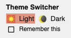
<dark-mode-toggle> in light mode.
<dark-mode-toggle> 。

<dark-mode-toggle> in dark mode.
<dark-mode-toggle> 。
Try clicking or tapping the dark mode controls in the upper right corner in the demo below. If you check the checkbox in the third and the fourth control, see how your mode selection is remembered even when you reload the page. This allows your visitors to keep their operating system in dark mode, but enjoy your site in light mode or vice versa.
尝试单击或点击下面演示中右上角的黑暗模式控件。 如果选中第三个和第四个控件中的复选框,则即使重新加载页面,也将了解如何记住模式选择。 这样,您的访问者可以将其操作系统保持在暗模式下,而在光模式下则可以欣赏您的网站,反之亦然。
结论 (Conclusions)
Working with and supporting dark mode is fun and opens up new design avenues. For some of your visitors it can be the difference between not being able to handle your site and being a happy user. There are some pitfalls and careful testing is definitely required, but dark mode is definitely a great opportunity for you to show that you care about all of your users. The best practices mentioned in this post and helpers like the <dark-mode-toggle> custom element should make you confident in your ability to create an amazing dark mode experience. Let me know on Twitterwhat you create and if this post was useful or also suggestions for improving it. Thanks for reading! 🌒
使用并支持黑暗模式很有趣,并且开辟了新的设计途径。 对于您的某些访问者而言,可能是无法处理您的网站与成为满意的用户之间的区别。 有一些陷阱,绝对需要仔细测试,但是暗模式绝对是您展示自己关心所有用户的绝佳机会。 这篇文章中提到的最佳实践以及<dark-mode-toggle>自定义元素之类的帮助程序应该使您对创建惊人的黑暗模式体验的能力充满信心。 让我在Twitter上知道您创建的内容以及该帖子是否有用,或者还有改进建议。 谢谢阅读! 🌒
相关链接 (Related links)
Resources for the prefers-color-scheme media query:
prefers-color-scheme媒体查询的资源:
Resources for the color-scheme meta tag and CSS property:
color-scheme元标记和CSS属性的资源:
General dark mode links:
常规暗模式链接:
Background research articles for this post:
这篇文章的背景研究文章:
致谢 (Acknowledgements)
The prefers-color-scheme media feature, the color-scheme CSS property, and the related meta tag are the implementation work of 👏 Rune Lillesveen. Rune is also a co-editor of the CSS Color Adjustment Module Level 1spec. I would like to 🙏 thank Lukasz Zbylut, Rowan Merewood, Chirag Desai, and Rob Dodson for their thorough reviews of this article. The loading strategy is the brainchild of Jake Archibald. Emilio Cobos Álvarez has pointed me to the correct prefers-color-schemedetection method. The tip with referenced SVGs and currentColor came from Timothy Hatcher. Finally, I am thankful to the many anonymous participants of the various user studies that have helped shape the recommendations in this article. Hero image by Nathan Anderson.
prefers-color-scheme媒体功能, color-scheme CSS属性以及相关的meta标签是👏Rune Lillesveen的实现工作。 符文也是CSS颜色调整模块1级规范的共同编辑。 我要感谢Lukasz Zbylut , Rowan Merewood , Chirag Desai和Rob Dodson对本文的详尽评论。 加载策略是Jake Archibald的创意。 Emilio CobosÁlvarez向我指出了正确的prefers-color-scheme检测方法。 引用了SVG和currentColor的技巧来自Timothy Hatcher 。 最后,我感谢各种用户研究的许多匿名参与者,这些参与者帮助塑造了本文中的建议。 内森·安德森 ( Nathan Anderson)的英雄形象。
进一步阅读 (Further Reading)
翻译自: https://medium.com/dev-channel/hello-darkness-my-old-friend-48a97ab4379a
我在黑暗中看到你眼中的月光


 206
206


 被折叠的 条评论
为什么被折叠?
被折叠的 条评论
为什么被折叠?
 到【灌水乐园】发言


