


设计类的五个原则
重点 (Top highlight)
There are many heuristics and principles for creating good content. Some are created from a UX perspective, others from a content marketing point of view. They range from very long to very concise ones. I reviewed a large handful of these resources (listed at the end of the article) to distill them to something that could be used to create quality content in government and non-profit sectors.
创建好的内容有很多启发式和原则。 有些是从UX角度创建的,有些是从内容营销的角度创建的。 它们的范围从非常长到非常简洁。 我回顾了其中的大部分资源(在文章末尾列出),以将它们提炼成可用于在政府和非营利部门中创建高质量内容的内容。
These principles or lenses are meant to help public sector employees who are starting out in content design or those already practicing in this area and looking for a framework to help explain their work to others. These principles can be used as part of initial content assessments to help identify where problems and pitfalls are and during the content creation process.
这些原则或观点旨在帮助开始从事内容设计工作或已在该领域进行实践并寻求框架以帮助他人解释其工作的公共部门员工。 这些原则可以用作初始内容评估的一部分,以帮助确定问题和陷阱在哪里以及在内容创建过程中。
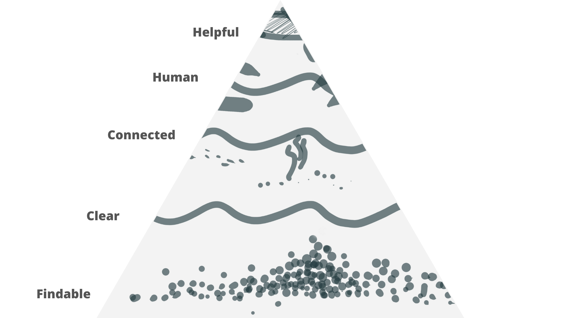
To better ground these principles, it is helpful to see content design as an ecosystem with 5 layers, each one building on top of the other. It begins with content that is findable and culminates with content that is helpful.
为了更好地理解这些原则,将内容设计视为具有5个层的生态系统是很有帮助的,每个层都在另一层之上。 它始于可找到的内容,最后是有用的内容。
Without being findable, clear, connected, and human, content cannot be truly helpful.
没有可被发现,清晰,联系和人类的内容,就无法真正起到帮助作用。
While there is value in seeing these principles as a pyramid, it is also important to understand that they are often interrelated. So an issue with content could be happening simultaneously at multiple layers of the pyramid.
尽管将这些原理视为金字塔很有价值,但了解它们通常是相互关联的也很重要。 因此,内容的问题可能同时在金字塔的多个层发生。
Below, I will define each one of the principles, tell you why they are important, provide one or more examples of when they aren’t followed (with one example of success) from public and private sector content, and share some strategies for how to implement these principles.
下面,我将定义每项原则,告诉您它们为何如此重要,提供一个或多个示例,说明何时未从公共和私营部门的内容中遵循它们(以及成功的一个例子),并分享一些有关如何实施这些原则。
Note about examples.
注意有关示例。
Examples are presented in a variety of ways, ranging from personal reflections to fictional stories, with frequent invitations for you to reflect.
实例以多种方式呈现,从个人反思到虚构故事,并经常邀请您反思。
While I may not have all the context needed to make assessments about the quality of the examples shared, I do so fully acknowledging my limited perspective for the purpose of learning and making the abstract principles more real. And if someone reading this finds an example of content they worked on, I hope they will take it as an opportunity to reflect rather than as an unproductive criticism.
尽管我可能没有足够的上下文来评估所共享示例的质量,但我完全承认我有限的观点,目的是学习和使抽象原理更加真实。 而且,如果有人读到这篇文章找到了他们所研究的内容的一个例子,我希望他们会以此为契机来反思而不是无用的批评。
可查找的内容 (Findable content)

Findable content is designed in a way that allows users to find content through navigation and search.
可查找内容的设计方式允许用户通过导航和搜索来查找内容。
为什么这很重要 (Why is this important)
This is the first and most basic principle of content because if users can’t find the content, it doesn’t matter how good it is.
这是内容的第一个也是最基本的原则,因为如果用户找不到内容,则内容的好坏并不重要。
例 (Example)
Even though findability seems to point to a digital format, it equally applies to other content media, including print.
尽管可发现性似乎指向数字格式,但它同样适用于其他内容媒体,包括印刷。
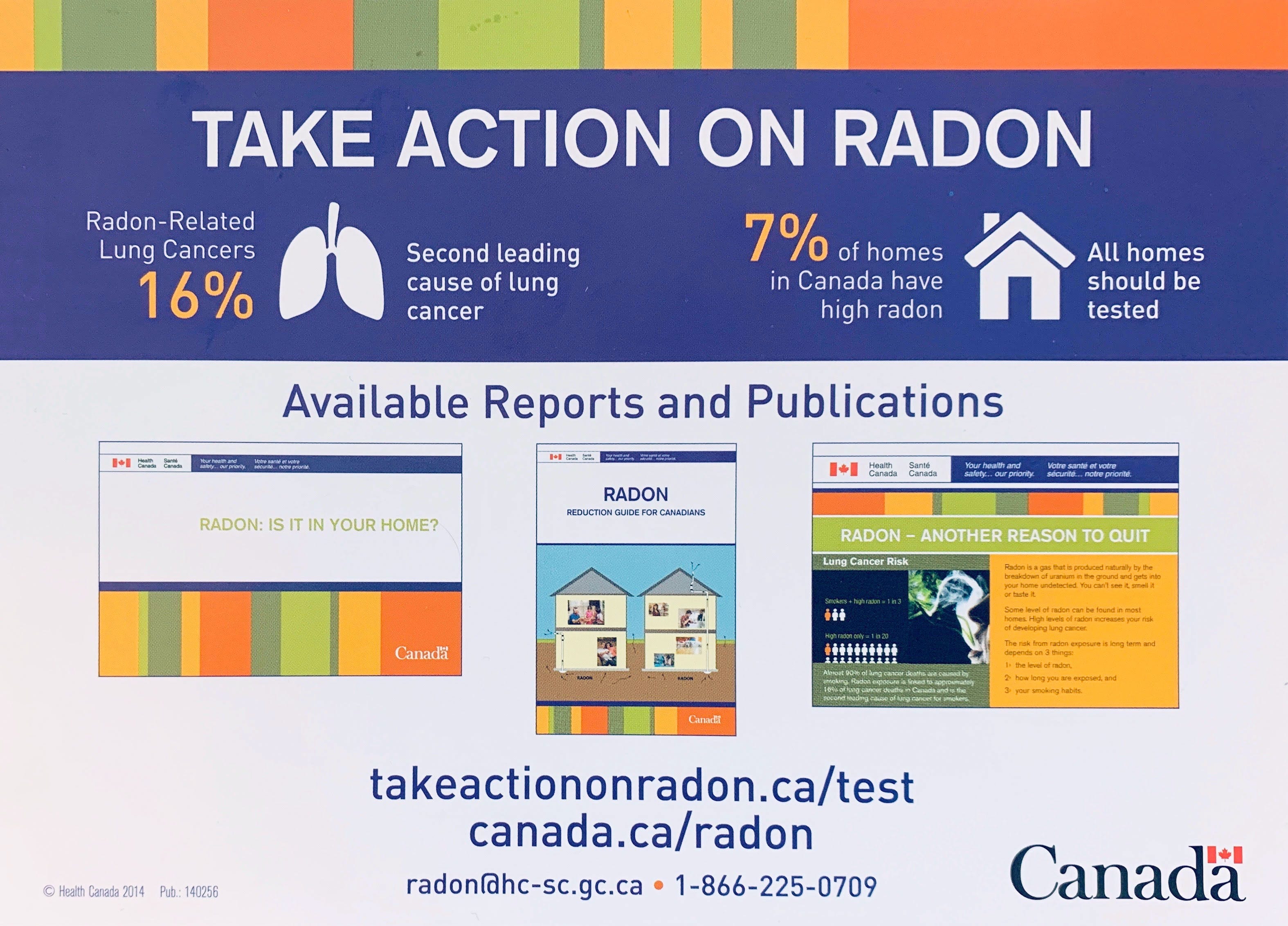
Mary got this card from Health Canada in the mail, when she moved into her new place. It tells her to ‘take action on radon’. She does not know much about radon, so she reads what it says: “Radon-related lung cancers are at 16%, 7% of homes in Canada have high radon. All homes should be tested.” Mary looks at the images — both images of ‘homes’ look like standalone houses. Mary lives in Montreal in an apartment of a newly built mid-rise building, not a house. She wonders if this applies to her. She has many questions:
玛丽搬到新家时,是从加拿大卫生部寄来的这张卡。 它告诉她“对ra采取行动”。 她对ra不太了解,因此她读了上面写的内容:“与don有关的肺癌占16%,加拿大有7%的房屋have高。 所有房屋都应进行测试。” 玛丽看着这些图像-“房屋”的两个图像看起来都像是独立的房屋。 玛丽住在蒙特利尔,是一栋新建的中层建筑的公寓,而不是房屋。 她想知道这是否适用于她。 她有很多问题:
- Does radon only affect dwellings that are low to the ground? ra只会影响地上低的住宅吗?
- Is there a difference between the building foundation of a house and an apartment building or an office building that makes radon less of a problem? 房屋的建筑物基础和公寓建筑物或办公楼之间是否有区别,使得ra的问题减少了?
- What about new buildings, are there checks in place to manage radon exposure? 那么关于新建筑物,是否有检查管理to暴露的检查?
Depending on these answers, this flyer may or may not apply to Mary’s situation. However, Mary cannot find the answer to her question, due to a combination of the following:
根据这些答案,此传单可能适用于玛丽的情况,也可能不适用于玛丽的情况。 但是,由于以下原因, 玛丽无法找到问题的答案 :
- Not enough information 信息不足
- Not the right information 没有正确的信息
- Not sure if it is the right information 不确定是否正确的信息
- Cannot understand the information 无法理解信息
What could have made this better for Mary?
有什么可以使玛丽变得更好呢?
A simple visual cue of a tall, multi-unit building and the words “buildings” not just “homes”, could have given her more confidence to know this is relevant to her situation.
一个身材高大,多单元建筑的简单视觉提示字,“建筑”,而不仅仅是“家”,可以给她更多的信心,要知道这是有关她的情况。
Tiny changes can have a huge impact!
微小的变化会产生巨大的影响!
如何使内容可查找 (How to make content findable)
Understand the subject domain
了解主题领域
- Find out why something cannot be found 找出为什么找不到东西
- Find users’ keywords 查找用户的关键字
- Befriend structure 朋友结构
- Make it accessible 使其可访问
Think about the subject domain (topic) surrounding an issue and consider how users may approach searching for information related to such a topic. Connect user intent to the topic. Some topics cover multiple subject domains and it is important to understand these to make sense of contexts where someone would look for this information. For instance, in the example about radon, a number of subject domains could be involved such as health and safety, moving, building a new home.
考虑问题的主题领域(主题),并考虑用户如何处理与该主题相关的信息。 将用户意图连接到主题。 一些主题涵盖了多个主题领域,了解这些主题以使人们了解需要这些信息的上下文很重要。 例如,在有关ra的示例中,可能涉及许多主题领域,例如健康和安全,搬家,盖新房。
Findability is a concept that is often misunderstood and thought of as a merely ‘technical’ piece of content optimization or search engine optimization (SEO). It’s important to note that to help people find relevant information, it is not only essential to create multiple meaningful paths to it but even more so, it is important to understand why people cannot find something. There are a number of different reasons why someone might not be able to “find” information they are looking for including:
可发现性是一个经常被误解的概念,并且被认为只是内容优化或搜索引擎优化(SEO)的“技术”部分。 重要的是要注意,要帮助人们找到相关的信息,不仅必须为其创建多个有意义的路径,而且更重要的是,了解人们为什么找不到某些东西非常重要 。 导致某人无法“查找”他们正在寻找的信息的原因有多种,其中包括:
- Too much information 过多的信息
- Not enough information 信息不足
- Not the right information 没有正确的信息
- Not sure if it is the right information 不确定是否正确的信息
- Cannot understand the information 无法理解信息
You also need to find keywords people would actually use to locate information related to this topic. You can do this through desk and user research, competitive analysis, and keyword research. Google the terms you are working with and look for synonyms. Use Google Trends to explore keyword popularity.
您还需要找到人们实际用来查找与该主题相关的信息的关键字。 您可以通过案头和用户研究,竞争分析和关键字研究来做到这一点。 谷歌您正在使用的术语,并寻找同义词。 使用Google趋势来探索关键字的受欢迎程度。
The structure of content pages is built around good headings and metadata. Use accurate and meaningful headings to help people navigate and scan the content. Ensure that title and page description metadata are relevant and can be understood out of context when displayed as a list of links on a search results page.
内容页面的结构围绕良好的标题和元数据构建。 使用准确而有意义的标题来帮助人们浏览和扫描内容。 确保标题和页面描述元数据相关,并且在显示为搜索结果页面上的链接列表时,可以在上下文中理解。
Accessible content improves discoverability. Make sure links have clear and meaningful link text, images have appropriate alt text that also reflects user keywords, and your videos or other rich content have alternative formats.
可访问的内容提高了可发现性。 确保链接具有清晰且有意义的链接文本,图像具有适当的替代文本(也可以反映用户关键字),并且您的视频或其他丰富内容具有其他格式。
清除内容 (Clear content)

Clear content is designed with clear purpose and does not leave users with questions.
清晰的内容具有明确的目的,不会给用户带来任何疑问。
为什么这很重要 (Why is this important)
Clarity gives users the confidence to proceed.
清晰度使用户有信心继续前进。
And conversely, lack of clarity becomes a roadblock that ends up costing organizations lots of money and it manifests itself in high call centre volumes or users’ reliance on third-party services to help them do something (immigration support, tax professionals, etc). These third-party services in turn need to be supported by the organizations in question, which results in more expenses.
相反,缺乏明确性会成为一个障碍,最终使组织付出大量金钱,并且在呼叫中心数量庞大或用户依赖第三方服务来帮助他们做某事(移民支持,税务专业人员等)时表现出来。 这些第三方服务又需要相关组织的支持,这会导致更多费用。
例子 (Examples)
Example 1
例子1
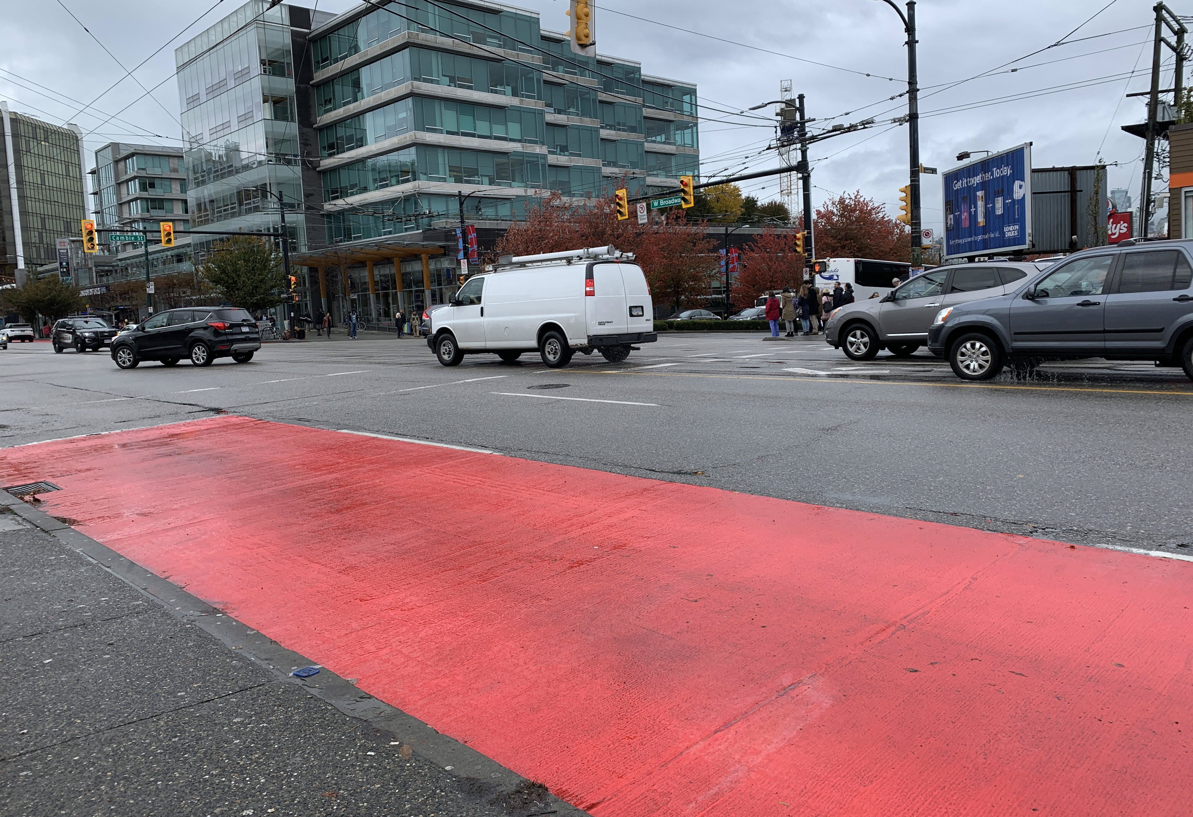
What do you think this red line means?
您认为这条红线是什么意思?
Lowri, a Vancouver resident who frequently uses public transit, though it was a rather aggressive design choice to better designate high-density bus stops and to quickly help travelers find where to go to catch the bus. According to the local bus authority in Vancouver however, red zones will be installed at key bus stops to remind drivers the areas “aren’t for cars”.
温哥华居民Lowri经常使用公共交通,尽管这是一个比较激进的设计选择,可以更好地指定高密度公交车站并Swift帮助旅行者找到去哪里坐公交车。 然而,根据温哥华地方公交局的说法,关键的公交车站将设置红色区域,以提醒驾驶员“不适合汽车行驶”的区域 。
Why use this example?
为什么使用这个例子?
Content is what we communicate through design.
内容是我们通过设计交流的内容。
In this case, communication through the design of this lane has likely failed for many people. The colour of the lane was the content (yes, content is not just text and visuals are part of content design if they are meant to communicate something — and they should), the medium of communication and the message which left many folks in the city confused:
在这种情况下,许多人可能无法通过该通道的设计进行通信。 车道的颜色就是内容(是的, 内容不只是文字,如果视觉传达内容是视觉设计的一部分,视觉也是内容设计的一部分,并且应该传播),传播的媒介和信息使城市中的许多人留了下来。困惑 :
Massive assumption being made here (that everyone would understand that red paint = don’t park here). Personally, as a driver, I found the meaning of the red paint ambiguous and would have preferred a clearer message. It’s also not consistent with other well known road signage indicating no stopping (ie. diagonal stripes, etc).
在这里做出了巨大的假设(每个人都会理解红色油漆=不要在这里停放)。 就个人而言,作为驾驶员,我发现红色油漆的含义含糊不清,并且希望有一个更清晰的信息。 它也与其他没有停止的路标(即斜条纹等) 不一致 。
Some said it was “visually overwhelming”. Others pointed out that “from a drivers point it is a huge distraction.”
有人说这“在视觉上是压倒性的 ”。 其他人指出,“从驾驶员的角度来看,这是一个极大的干扰 。”
Example 2
例子2
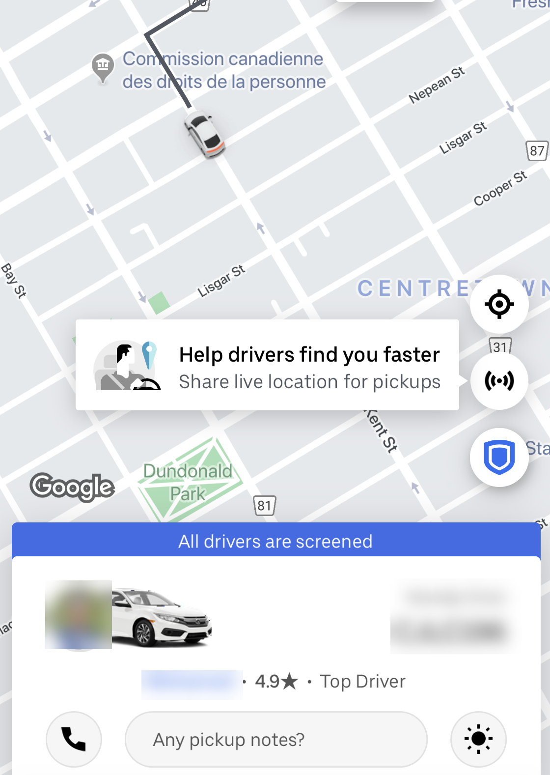
If you’ve taken a ride with Uber, have you noticed how the app tells you that “All drivers are screened” ? What do you think it means?
如果您乘坐Uber,您是否注意到该应用程序如何告诉您“所有驾驶员都受到了筛查”? 您认为这意味着什么?
- Are the drivers being screened for availability? 是否在筛选驱动程序的可用性?
I suppose they are screened (cleared) for security, yet this may not be obvious to everyone. The use of this popup and its prominence also makes me wonder about its intention. Is it meant to instill confidence in the rider?
我想对它们进行了筛选(清除)以确保安全,但这可能并不是每个人都知道的。 使用此弹出式窗口及其突出之处,也使我对它的意图感到疑惑。 是要在骑手身上树立信心吗?
Would you want to have information flashing at you before you get on a plane that it is safe to fly in it? Would it make you feel more or less secure?
您是否想让信息闪烁,然后再乘上安全飞行的飞机? 它会让您感到多少安全吗?
If all drivers are screened, then why does Uber need to tell the rider this?
如果对所有驾驶员进行了筛查,那么Uber为什么需要告诉车手呢?
- Is it better left unsaid? 最好不说了吗?
- Are these the right words? 这些话对吗?
- Is this the right placement for this information? 这是此信息的合适位置吗?
- Should this information be available in a way that helps the rider make a decision before they choose a driver or even before they input their trip destination? 是否应该以帮助骑手在选择驾驶员之前或甚至在输入旅行目的地之前做出决定的方式提供此信息?
Example 3
例子3
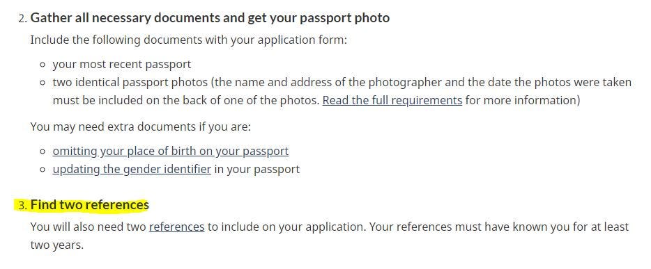
On the page from the Canadian government about “How to renew your passport”, the user is asked to gather all the necessary documents and ‘Find two references’.
在加拿大政府关于“如何更新护照”的页面上,要求用户收集所有必要的文件并“查找两个参考文献”。
Can the use of jargon prevent people from understanding what they are being asked to do?
使用行话是否可以阻止人们理解他们被要求做什么?
Sure, many anglophones probably know what a ‘reference’ is. Like a work reference. But for many people, English is not their first language and this word is unclear from a plain language perspective. The word ‘reference’ gives no indication that it is actually referring to people who know you well, such as friends or neighbours, and can confirm your identity. It is especially confusing if we look at the standalone hyperlink name: Could ‘references’ mean ‘reference resources’ for how to get a passport?
当然,许多英语使用者可能知道什么是“参考”。 像工作参考。 但是对于许多人来说,英语不是他们的第一语言,从简单的语言角度来看,这个词还不清楚。 “推荐人”一词并未表示它实际上是指很了解您的人,例如朋友或邻居,并且可以确认您的身份。 如果我们看一下独立的超链接名称,那就特别令人困惑:“引用”是指如何获得护照的“引用资源”吗?
Imagine if someone is using Google Translate (and I am sure many people are, as Goole Translate interpreted 143 billion words daily back in 2018) to understand this page, would they know what ‘references’ mean?
想象一下,如果有人在使用Google Translate(而且我敢肯定,很多人都在使用Gool Translate解释了2018年每天1,430亿个单词的意思 ),他们会知道“引用”是什么意思吗?
如何使内容清晰 (How to make content clear)
- Understand users 了解用户
Write in plain language
用简单的语言写
- Aim for concision, prioritize understanding 力求简洁,优先理解
Understanding who you write for is not optional, it is the only way to create responsible and clear content. You need lots of curiosity and just enough research.
了解您的写作对象不是可选的,这是创建负责任且清晰的内容的唯一方法。 您需要好奇心和足够的研究 。
Plain language does not dumb things down, it makes information accessible to all.
朴素的语言不会使事情变得愚蠢,它使所有人都可以访问信息。
With regards to the point about aiming for concision yet prioritizing understanding, while it is always good to aim to keep things short, you never want to do it at the expense of clarity and understanding. So comprehension should be your key measure of success, not a readability score.
关于着眼于简洁而优先考虑的观点,尽管总是尽量简短,但您绝不希望以清楚和理解为代价。 因此,理解力应该是您成功的关键指标,而不是可读性得分。
When assessing if something is clear, remember to zoom in and look at individual elements like headings and links, as well as zoom out to check how the entire page of content and entire service function as a whole, with coherent purpose.
在评估内容是否清晰时,请记住放大并查看标题和链接等单个元素,并缩小以检查整个页面内容和整个服务的整体目的是否一致。
关联内容 (Connected content)

Connected content is designed in a way that integrates all related pieces into a comprehensive whole that is maintained over time.
连接内容的设计方式是将所有相关部分集成为一个随时间推移得以维护的综合整体。
From personal experience, this is the most challenging principle to make happen. In its absence, it becomes a roadblock for the higher-level capacity of content to be human and helpful and for the organizations to be able to meet their business objectives.
从个人经验来看,这是最有挑战性的原则。 在缺少它的情况下,它成为更高层次的内容能力变得人性化和有用以及组织能够实现其业务目标的障碍。
为什么这很重要 (Why is this important)
Connected content reduces users’ cognitive burden, creates sustainable solutions, and improves findability.
连接的内容减轻了用户的认知负担,创建了可持续的解决方案,并提高了可发现性。
From a business perspective, it creates huge cost reductions and an amazing return on investment in content maintenance costs alone. It also enables organizations to accomplish their business goals more efficiently by removing duplicate and competing sources of information and getting users to the right information faster.
从业务的角度来看, 仅凭此内容维护成本 ,它就可以大幅降低成本并获得惊人的投资回报。 它 还可以通过消除重复的和竞争的信息源并使用户更快地获得正确的信息,使组织更有效地实现其业务目标。
例子 (Examples)
Example 1
例子1

As an information professional I know that often when people search for one thing, they may actually be looking for an antonym (the opposite).
作为一名信息专业人士,我知道人们经常在搜索一件事时实际上会在寻找反义词(反义词)。
So, for example, if I am looking for information on what house plants are safe, I might look for ‘safe house plants’ but I might also look for ‘toxic house plants’, as the opposite would give me an indication of what to avoid.
因此,例如,如果我要寻找有关哪些室内植物是安全的信息,我可能会寻找“安全室内植物”,但我也可能会寻找“有毒室内植物 ”,因为相反的情况会提示我避免。
Similarly, for those looking for ‘climate change’ they may actually want to know what is being done to be more sustainable, how are we reducing greenhouse gas emissions, what are we doing to reduce the use of plastic, how are we conserving electricity, etc.
同样,对于那些寻求“气候变化”的人来说,他们实际上可能想知道正在做些什么以提高可持续性,我们如何减少温室气体排放,我们正在做什么以减少塑料的使用,我们如何节约电力,等等
There is likely a user and a business benefit in combining and interconnecting ‘Climate change’ and ‘Sustainability’ topics.
结合并互连“气候变化”和“可持续性”主题可能会给用户和企业带来好处。
Example 2
例子2
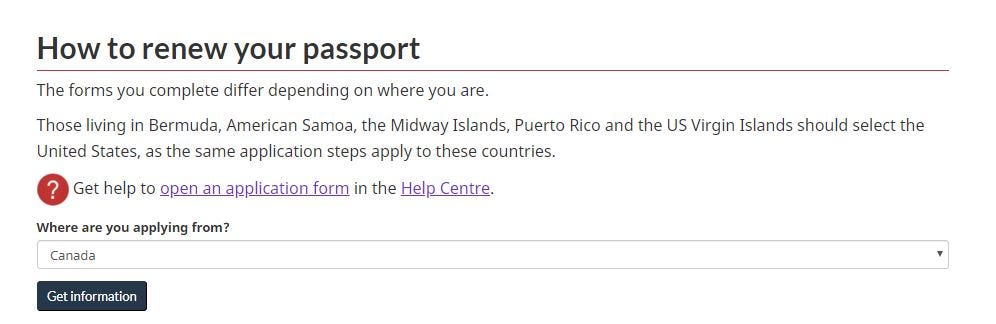
‘’How to renew your passport page’ on Canada.ca tells a person that they can get help to open an application in the Help Centre, before giving them any instructions about how to renew the passport itself. Does this make sense?
” Canada.ca上的“如何更新护照页面”告诉人们,在向他们提供有关如何更新护照本身的任何说明之前,他们可以在帮助中心打开应用程序。 这有意义吗?
Is it logical for a person to get information about opening an application form before getting any other preliminary instructions such as eligibility requirements that make up the bulk of the actual page?
在获得任何其他初步指示(例如构成实际页面大部分的资格要求)之前,获得一个有关打开申请表的信息是否合乎逻辑?
Providing an option to open an application at the ‘entrance’ to the page could effectively misdirect someone and create a very disjointed and error-prone experience. For example, further down on this page, it states that if someone wants to renew their child’s passport, they need to do something else. What if the person arrives on this page, wanting to renew their child’s passport, clicks on “open an application form” up at the top? How would they know they are missing important information? Would they be wasting time applying for the wrong thing? What if this is a particularly stressful time for them and the passport renewal for the child is urgent — maybe they want to take their child to see a grandparent who has been hospitalized in another country?
提供在页面“入口”处打开应用程序的选项可以有效地误导某人,并创建非常脱节且易于出错的体验。 例如,在此页面的下方,它指出如果某人想要续签孩子的护照,则需要做其他事情。 如果该人到达此页面想要更新其孩子的护照,然后单击顶部的“打开申请表”怎么办? 他们怎么知道他们缺少重要信息? 他们会浪费时间申请错误的东西吗? 如果这对他们来说是一个特别压力的时刻,并且为孩子续签护照很紧急-也许他们想带孩子去看在另一个国家住院的祖父母?
What’s worse is when a person clicks on the “open an application” form link, they end up on an FAQ page about Applying for a passport, rather than being taken to the actual ‘application form’ they may have expected, based on the link name. The question and answer page is yet another place that provides instructions on “How to renew your passport” or get a passport.
更糟糕的是,当一个人单击“打开申请”表格链接时,他们最终进入有关申请护照的常见问题页面 ,而不是被带到他们可能期望的实际“申请表格”上名称。 问答页面是另一个提供有关“如何更新护照”或获取护照的说明的地方。
This disconnect places a huge cognitive burden on a user, requiring them to sift through multiple places with same, similar or different information, wondering if any of it is comprehensive (since these 2 places of content on the topic might indicate that there are other sources of information on this topic that they have not yet discovered). This experience can create lots of distress for the user. The help alert at the top of the page is unclear, misleading, and interferes with a potentially friction-less and logical flow of the page.
这种脱节给用户带来了巨大的认知负担,要求他们在具有相同,相似或不同信息的多个位置进行筛选,想知道其中是否有全面的信息(因为该主题上的这两个位置可能表明还有其他来源他们尚未发现的有关此主题的信息)。 这种体验会给用户带来很多困扰。 页面顶部的帮助警报不清晰,具有误导性,并干扰了页面的潜在无摩擦和逻辑流动。
如何连接内容 (How to connect content)
To create connected content you need to look up, outward, sideways and you need a content strategy. But before you do any of this, you need to shift your mental model to ‘less is more’, realizing that too much-disconnected content on the same topic is a barrier to users and your business.
要创建连接的内容,您需要向上,向外,侧向查找,并且需要一种内容策略。 但是在执行任何上述操作之前,您需要将思维模式转变为“少即是多”,这是因为意识到同一主题上内容过多的内容是用户和您的业务的障碍。
As part of your strategy, you need to know answers to the following questions:
作为策略的一部分,您需要知道以下问题的答案:
- What content is already out there on the topic, who created it, what is missing? 该主题上已有哪些内容,是谁创建的,缺少什么?
- What are all the pieces of content? 全部内容是什么?
- Where are these pieces? 这些碎片在哪里?
- Who are your partners to link up all these pieces? 您是谁的伙伴将所有这些环节链接在一起?
- What is the logical flow of these pieces? 这些片段的逻辑流程是什么?
- How do you ensure these pieces are kept up-to-date? 您如何确保这些作品保持最新状态?
The idea really is to do an environmental scan, to understand what you already have, see what people in other areas of your organization are doing, find out what others outside of your organization are doing.
真正的想法是进行环境扫描,了解您已经拥有的东西,查看组织中其他部门的人员在做什么, 找出组织中其他人员的工作 。
You need to do this analysis with the following in mind:
您需要牢记以下几点来进行此分析:
- Is there duplicated content out there? 那里有重复的内容吗?
- Is there competing or contradictory information? 是否存在竞争或矛盾的信息?
- What is happening on other channels? 在其他渠道上发生了什么?
- Is the information interlinked? 信息是否相互关联?
- Is this content relevant, sustainable, and is it being maintained? 该内容是否相关,可持续且是否得到维护?
Is there value in investing into making this content flexible and reusable (content modeling)?
投资使该内容具有灵活性和可重用性( 内容建模 )是否有价值?
Remember, most of the time, you are not the only source of information on any given topic. And even if you are the ‘authoritative’ source of information on the topic (by the simple virtue that you are a government organization),
请记住,大多数时候,您不是有关任何给定主题的唯一信息来源。 即使您是该主题的“权威”信息源(简单来说,您是政府组织),
realize that people look for advice on many government processes and services outside of its system. They go to discussion boards, to third party professionals, to friends and others on the internet.
意识到人们在其系统之外寻求有关许多政府程序和服务的意见。 他们会去讨论板,第三方专业人士,朋友以及互联网上的其他人。
Government content is just part of the bigger content ecosystem on any topic. A humble perspective on where government information stands in relation to other information on the same topic can be very sobering and can help the public sector deliver better services to people.
政府内容只是任何主题上更大内容生态系统的一部分。 对政府信息相对于同一主题的其他信息所处位置的卑微看法可能会令人发醒,并可以帮助公共部门为人们提供更好的服务。
人为内容 (Human content)

Human content is designed with empathy to respect the varied human conditions and states.
设计人类内容时要善解人意,以尊重各种人类状况和状态。
为什么这很重要 (Why is this important)
It is important to create human content because it is the right and ethical thing to do.
创造人的内容很重要, 因为这是正确和符合道德的事情 。
Technology that respects human effort is functional, convenient, and reliable. It is thoughtful and accommodating; not arrogant or demanding. It understands that you might be distracted or differently-abled. It respects the limited time you have on this planet.
尊重人类努力的技术是实用,方便且可靠的。 体贴而又包容; 不自大或苛刻。 它了解您可能会分心或能力不同。 它尊重您在这个星球上有限的时间。
From an accessibility and inclusion perspective people are in a hurry, stressed, multi-tasking, some have low literacy, or suffer various impairments whether permanent or temporary. Content design needs to consider different knowledge, skills, experience, physical attributes, mental states, and technological access and literacy of humans who will engage with the information they produce.
从可访问性和包容性的角度来看,人们急忙,压力大,任务多,有些人的素养低或永久或暂时遭受各种损害。 内容设计需要考虑将要使用其产生的信息的人类的不同知识,技能,经验,身体属性,精神状态以及技术获取和素养。
例子 (Examples)
Example 1
例子1
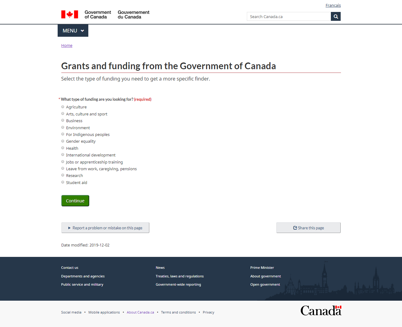
Carlos is an artist and he is looking for funding related to Culture and Environment. His work is research-based, so he could be looking for funding related to the Research category as well. Why can’t he see all the finding options and filter out the ones he does not want to see? The required field is forcing him to make an artificial selection that does not reflect his situation and it will take him many separate attempts to see all the results that he needs. He wonders who is providing information about these grants (there are no breadcrumbs). He is surprised that Canada Council for the Arts grants are not listed when he selects “Arts, culture and sport” grants; he does not understand what types of grants are included and what the scope is. To add to his confusion, he also finds another page with a very different search interface and somewhat different information.
Carlos是一位艺术家,他正在寻找与文化和环境有关的资金。 他的工作是基于研究的,因此他可能也在寻找与“研究”类别相关的资金。 他为什么看不到所有发现选项并过滤掉不想看到的选项? 必填字段迫使他做出不反映自己情况的人为选择,这将需要他进行多次单独尝试才能看到他需要的所有结果。 他想知道谁在提供有关这些补助的信息(没有面包屑)。 当他选择“艺术,文化和体育”补助金时,加拿大艺术理事会的补助金未列入名单令他感到惊讶。 他不了解包括哪些类型的赠款以及范围是什么。 更令人困惑的是,他还发现了另一个页面,该页面的搜索界面和信息有所不同。
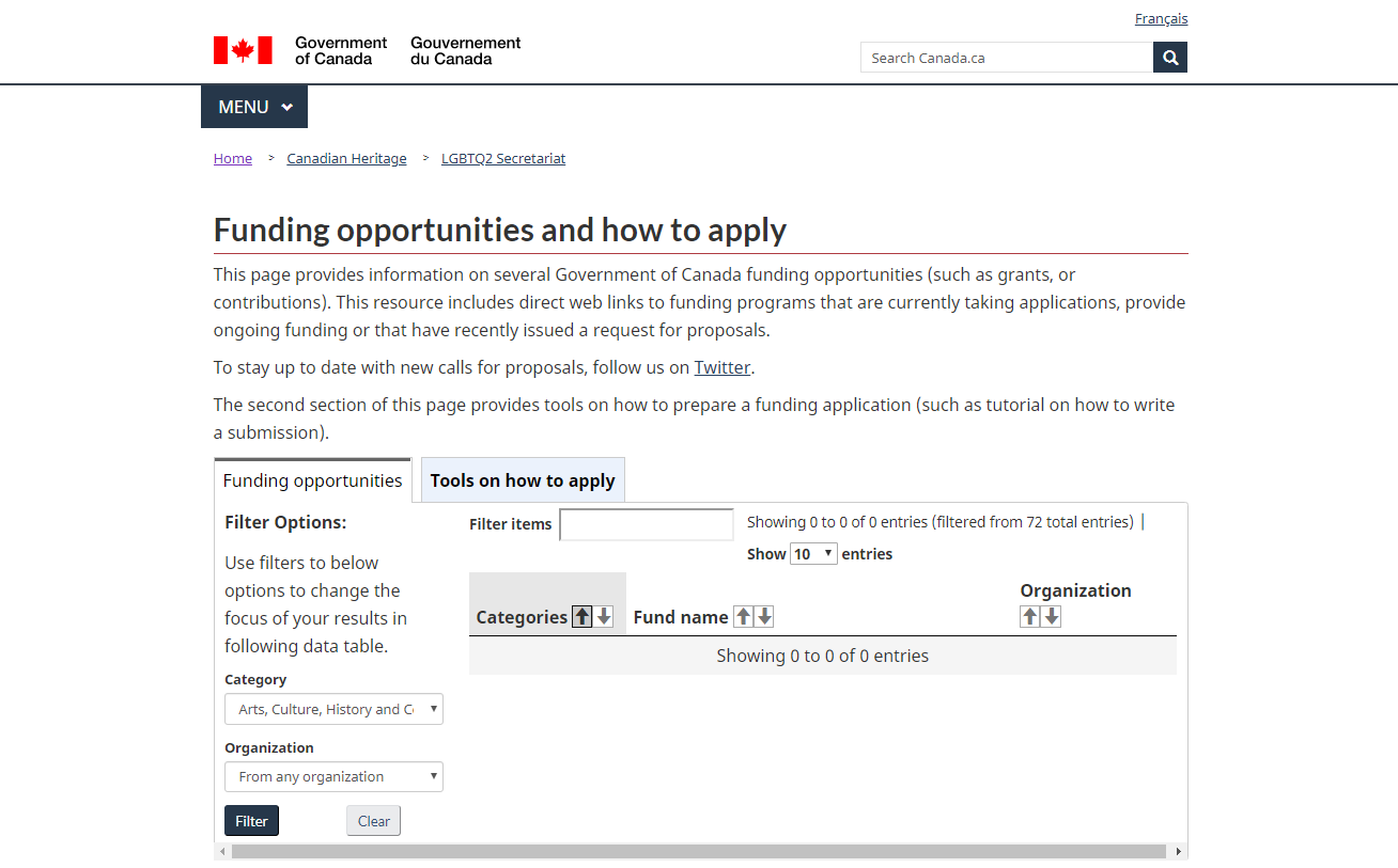
This page includes other grants not listed on the first page. Carlos is frustrated, as he cannot trust that any of these pages include comprehensive information. For professional artists, grants are often one of the main sources of income. Getting a grant is hard enough, so Carlos was hoping that the government would make it easy to at least find grants to apply for.
此页面包括首页上未列出的其他赠款。 卡洛斯(Carlos)感到沮丧,因为他不相信这些页面中的任何页面都包含全面的信息。 对于专业艺术家来说,赠款通常是主要的收入来源之一。 获得补助金已经足够困难,因此卡洛斯(Carlos)希望政府能够至少轻松地找到要申请的补助金。
Example 2
例子2
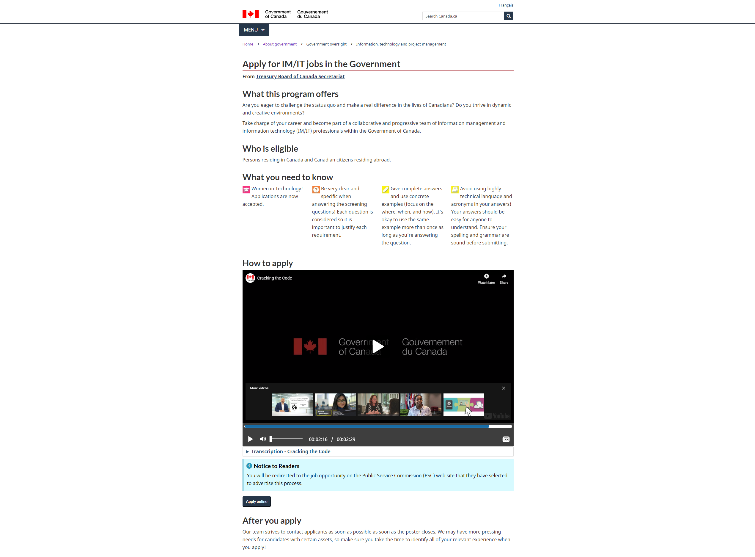
Leo stumbled upon “Apply for IM/IT jobs” page while looking for a job. They have just graduated with a computer science major and are anxious about getting a job, as they have bills to pay. Leo was very happy to find this opportunity, but when they clicked on ‘Apply online’, they were taken to the “Women in technology” process application page. They were confused. Nowhere in the title of the page did it say this was an initiative for women only. Was this a mistake? They went back, looked at the page in more detail, saw some mention of women there too, finding it really confusing and deceptive. Leo was not sure if they could apply for this job, as they self-identified as non-binary. This whole experience left them feeling vulnerable and stressed at the time when they were already experiencing many challenges in life.
里奥在寻找工作时偶然发现“申请IM / IT工作”页面。 他们刚刚获得计算机科学专业的学位,并渴望找到工作,因为他们要付账单。 Leo很高兴找到这个机会,但是当他们单击“在线申请”时,他们被带到“技术领域的女性”过程申请页面。 他们感到困惑。 在页面标题中没有任何地方说这只是针对女性的倡议。 这是一个错误吗? 他们回过头来,更详细地查看了该页面,也看到那里的一些女人,发现它确实令人困惑和具有欺骗性。 狮子座不确定自己是否可以申请这份工作,因为他们自认是非二进制的。 当他们已经经历了生活中的许多挑战时,这整个经历使他们感到脆弱和压力。
如何制作人性化的内容 (How to make content that is human)
- Understand users’ environment 了解用户的环境
- Design with inclusivity and accessibility 包容性和可访问性的设计
- Design for worst case scenario 针对最坏情况的设计
- Guide the user through the process 引导用户完成整个过程
- Eliminate distractions 消除干扰
Do you really understand what kind of people your information is meant for? Are they in a precarious state and balancing multiple hardships?
您真的了解您的信息适用于什么样的人? 他们是否处于不稳定状态并平衡多重困难?
- Is the content you create considerate and thoughtful? 您创建的内容是否体贴周到?
Does it respect the diversity of human situations and needs?
它是否尊重人类处境和需求的多样性 ?
Is the content inclusive of different cultures, levels of privilege, genders and sexual expressions?
内容是否包括不同的文化,特权级别, 性别和性表达 ?
- Is it designed for differently-abled, hurried, tired, those who are mourning or in distress? 它是为能力不同,匆忙,疲倦,哀悼或遇难者设计的吗?
- Does the content guide the user in a caring way, instead of leaving them hanging not knowing where to go next? 内容是否以贴心的方式指导用户,而不是让他们不知下一步该怎么走?
Does it remove disruptions such as visual clutter or unwanted marketing materials and “respect the reader’s limited time and attention?”
它会消除视觉混乱或不必要的营销材料等干扰,并“尊重读者有限的时间和注意力吗?”
有用的内容 (Helpful content)

Helpful content is designed in a way that allows users to get something done now.
有用内容的设计方式使用户可以立即完成工作。
为什么这很重要 (Why is this important)
Users fulfilling their needs = Government fulfilling its operational needs.
用户满足其需求=政府满足其运营需求。
And since government’s purpose is to serve people, the government needs to make things as simple as possible, especially when services are based on self-reporting, like tax systems for example. As one of the UK government’s design principles states: “Do the hard work to make it simple.”
而且由于政府的宗旨是为人民服务,因此政府需要使事情变得尽可能简单,尤其是当服务以自我报告为基础时,例如税收制度。 正如英国政府的一项设计原则所指出的那样: “ 努力工作以使其变得简单 。”
例 (Example)
I shared many unhelpful examples to illustrate earlier principles, so here is one that is actually helpful.
我分享了许多无用的示例来说明较早的原理,因此这里有个实际的帮助。

Even a ‘Contact us’ page can and should be thoughtfully designed. There are plenty of places where A List Apart could have placed a ‘mail to’ link: at the very top, at the end of “Please email us about” paragraph or, as they did, at the end of “You don’t need to email us about” paragraph.
甚至“联系我们”页面都可以并且应该经过精心设计。 在很多地方,“ A List Apart”都可以放置“邮件到”链接:在最顶部,“请给我们发送电子邮件”一段末尾,或者像在“您不告诉我们”末尾那样需要给我们发送电子邮件”段落。
Why is it better to put the ‘mail to’ link at the very end?
为什么最好在最后放置“邮件到”链接?
A List Apart did the work to think about what they will respond to and what they won’t reply to. They made it clear and transparent. They showed me that they respect my time and don’t want me to send them something that they will simply ignore. As a user, I feel informed and cared for. Having all the information I need, I can then make a choice about whether to send an email or not.
List Apart所做的工作是思考他们将如何回应以及他们不会回应的事情。 他们使其变得清晰透明。 他们告诉我他们尊重我的时间,不希望我向他们发送一些他们会忽略的东西。 作为用户,我感到有见识和关心。 有了我需要的所有信息之后,我就可以选择是否发送电子邮件。
如何使内容有用 (How to make content helpful)
- Be accountable 负责
- Focus on task 专注于任务
- Don’t just give answers, ensure resolution 不要只是给出答案,要确保解决方案
- Assess for impact 评估影响
Accountability takes on many forms. You need to establish success metrics and get agreement and sign off on these. Create a content maintenance plan. Follow up with the stakeholders involved.
问责制有多种形式。 您需要建立成功指标并达成协议并在这些指标上签字。 创建内容维护计划。 跟进相关的利益相关者。
Your work on content does not end when content is ‘live’. It’s a relationship.
当内容为“实时”时,您对内容的工作不会结束。 这是一种关系。
To focus on tasks, use user stories or journey maps or whatever research you have at hand to understand and prioritize action.
要专注于任务,请使用用户故事或旅程图或您手头上的任何研究来理解和确定操作的优先级。
Often, an answer to a question does not help someone resolve the problem or complete a task. This is why call centre agents, librarians, anyone working with people are always asked to probe for the real need. Static content cannot probe to better understand, so it is the designers’ responsibility to ensure that they have done their due diligence in research and testing to truly understand what will leave a person satisfied with a service they came to use.
通常,对问题的答案并不能帮助某人解决问题或完成任务。 这就是为什么总是要求呼叫中心代理,图书馆员以及与他人一起工作的任何人来探究真正的需求 。 静态内容无法探究以便更好地理解,因此设计师有责任确保他们在研究和测试中进行了尽职调查,以真正了解使人们对使用的服务感到满意的情况。
Don’t just use analytics to measure outputs, focus instead on outcomes. Numbers can mean lots of things, interpreting them correctly requires combining quantitative and qualitative data.
不要只使用分析来衡量输出,而要关注结果。 数字可能意味着很多事情,正确地解释它们需要结合定量和定性数据。
Designing for humans, and especially in the context of the public sector, means that our designs have real-world implications and impact people’s lives, so be thoughtful, be kind, be human! Be helpful!
为人类设计,尤其是在公共部门的环境中,意味着我们的设计具有现实意义,并影响着人们的生活 ,因此要体贴,友善,成为人类! 有帮助!
资源资源 (Resources)
评估内容清单 (Checklist for assessing content)
To help you quickly assess content using these lenses, I created a Content design heuristic checklist with questions to guide you through every lens.
为了帮助您使用这些镜头快速评估内容,我创建了一个内容设计启发式清单,其中包含一些问题,以指导您全面了解每个镜头。
其他内容启发式和原则 (Other content heuristics and principles)
A simple content strategy checklist for your website redesign project
翻译自: https://uxdesign.cc/principles-of-good-content-design-4c55622c9919
设计类的五个原则


 221
221

 被折叠的 条评论
为什么被折叠?
被折叠的 条评论
为什么被折叠?
 到【灌水乐园】发言


