


同态加法
重点 (Top highlight)
When neumorphism was predicted to be one of the top 2020 UI design trends, I wanted to give it a shot. Having said that, I wanted to explore a type that had not gone overboard, neumorphism in Dark Mode.
当neumorphism预计为顶部2020的UI设计趋势之一,我想给它一个镜头。 话虽如此,我想探索一种在黑暗模式下不会过分进化的类型。
为什么选择Spotify? (Why Spotify?)
Well while looking around for inspiration, I stopped at Spotify mainly because
在寻找灵感的同时,我之所以停在Spotify上,主要是因为
- Spotify has a user base of around 286M, a product also used by a lot of designers, increasing the probability of its reach. Spotify的用户群约为286M,许多设计师也使用该产品,从而增加了其普及的可能性。
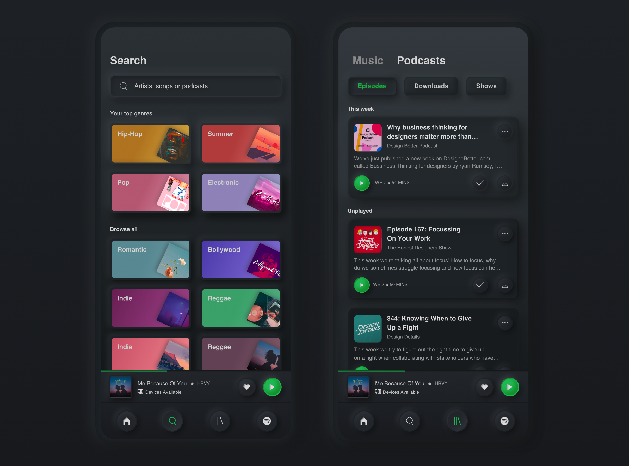
- Spotify has all the widgets right from cards, chips, lists, sliders to text fields, which makes it tricky to design for this style, considering hierarchy of elements. Spotify拥有从卡片,筹码,列表,滑块到文本字段的所有小部件,考虑到元素的层次结构,很难为这种样式设计样式。
Spotify’s architecture is pretty straightforward in terms of defining key user flows and key screens making it the perfect use case for Neumorphism. (Since we all know by now that iIt’s not a style for all products)
就定义关键用户流和关键屏幕而言,Spotify的体系结构非常简单,使其成为Neumorphism的完美用例。 (因为到目前为止我们都知道iIt并不是所有产品的风格)
“同质是简单的话” (“Neumorphism is in simple words”)
It’s a minimal, soft UI with two core principles:
这是一个最小的, 柔软的用户界面,具有两个核心原则 :
- It uses highlights and shadows to define the shapes of objects on the screen. 它使用高光和阴影来定义屏幕上对象的形状。
- Contrast is generally reduced; full white or black aren’t used, which is what allows the highlights and shadows to stand out. 对比度通常会降低; 不使用全白或全黑,这是使高光和阴影脱颖而出的原因。
让我们开始! (Let’s Begin!)
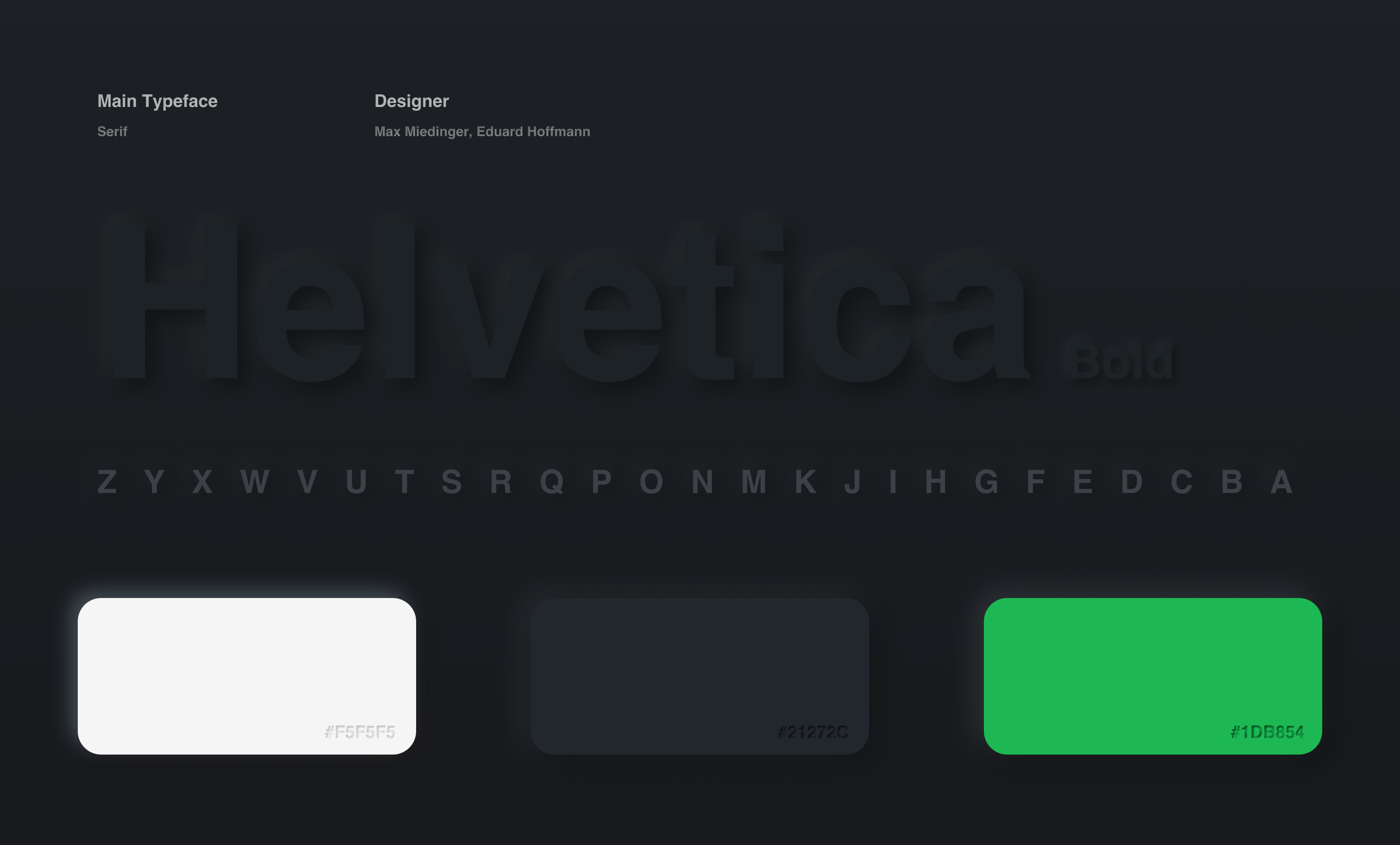
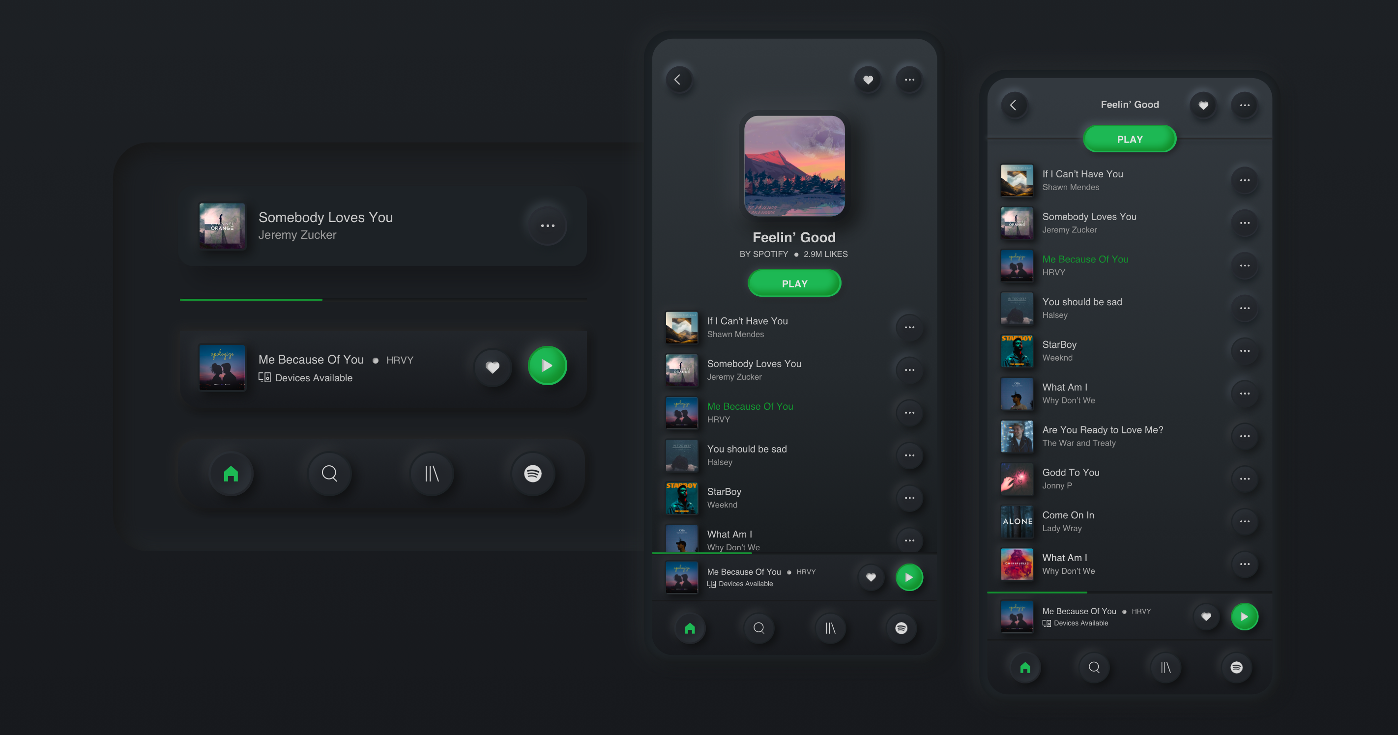
The first decision taken was to keep the colour palette, fonts and structure of the app pretty similar to what it is. If you look at the Splash and Login screen you will realise, I aimed at preserving the ways these elements already work by mixing it with other styles. In this way we can use Neumorphism so it’s not overwhelmingly “soft extruded plastic” everywhere, to complement already usable designs in non-invasive ways.
做出的第一个决定是保持应用程序的调色板,字体和结构与外观非常相似。 如果您看到“启动和登录”屏幕,就会发现, 我的目标是 通过将其与其他样式混合来 保留这些元素已经起作用 的方式。 通过这种方式,我们可以使用Neumorphism,从而不会在任何地方都压倒性地“软挤出塑料”,以非侵入性方式补充已经可用的设计。
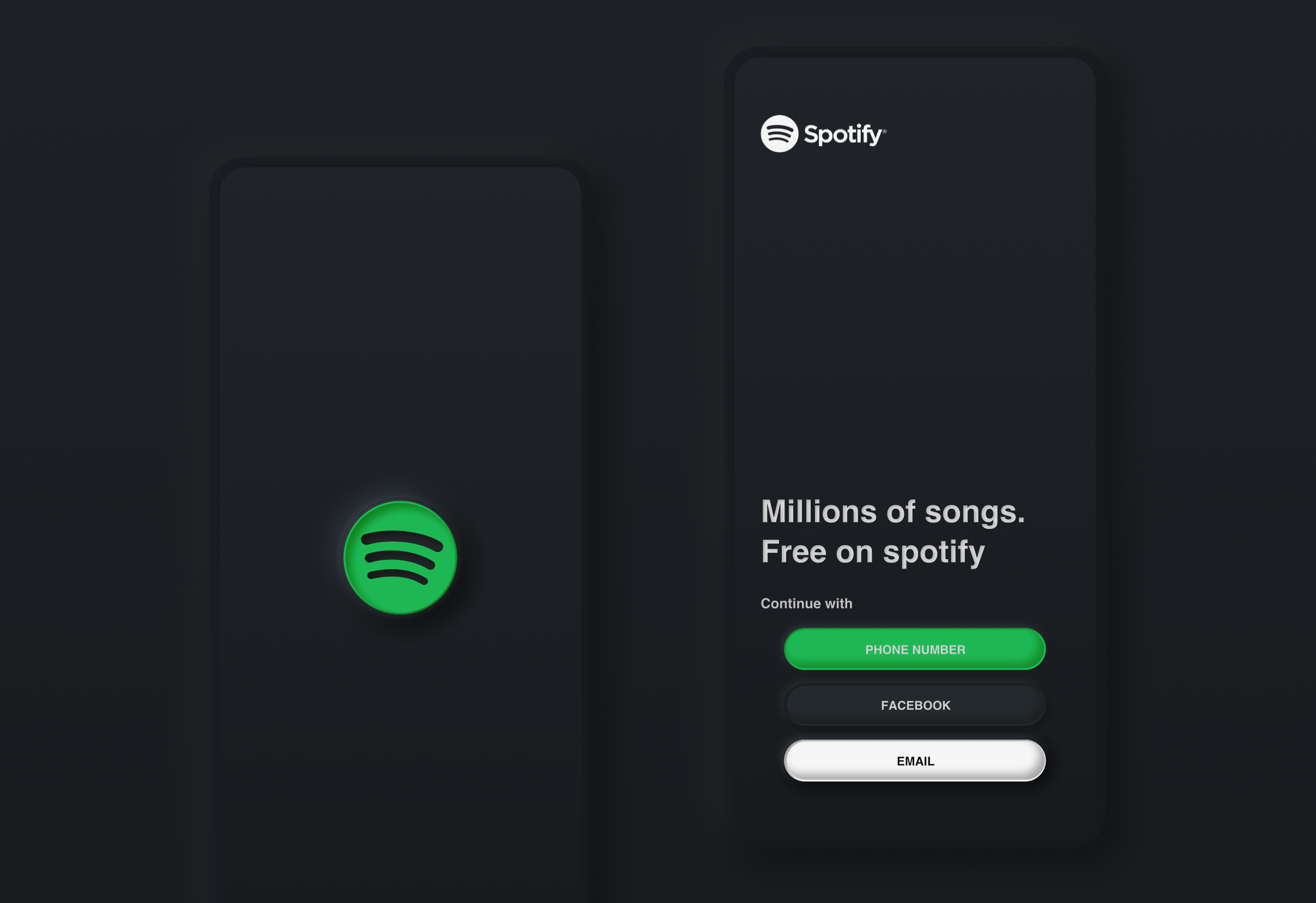
On the splash screen around the Spotify logo, I introduced a lip/overlay to it, like on real buttons which has a slightly lifted edge all around. This gives the logo a more defined edge, while not taking away from the neumorphic charm. On the other hand, the logo is indented.
在围绕Spotify徽标的启动屏幕上,我向其引入了一个唇部/覆盖层,就像在真正的按钮 上四周略微抬起边缘一样。 这使徽标具有更清晰的边缘,同时又不影响其外观。 另一方面,徽标是缩进的。
The way to do this is simple. You need to give a light and dark inner shadow to the outer layer along with drop shadow.
这样做的方法很简单。 您需要给外层提供明暗的内部阴影以及阴影。
Here are the values I used for the outer layer
这是我用于外层的值
shadow 1: (color.dark, blur 10, x: -6, y: -6)
阴影1:(color.dark,blur 10,x:-6,y:-6)
shadow 2: (color.light, blur 10, x: 6, y: 6)
阴影2:(color.light,blur 10,x:6,y:6)
and flipped the shadows for the inner layer(Spotify logo), exchanging the light and dark X and Y values;
并翻转内层的阴影(Spotify徽标), 交换明暗X和Y值 ;
shadow 1: (color.dark, blur 10, x: 6, y: 6)
阴影1:(color.dark,blur 10,x:6,y:6)
shadow 2: (color.light, blur 10, x: -6, y: -6)
阴影2:(color.light,blur 10,x:-6,y:-6)
Coming to the Login screen, I felt we shouldn’t overdo it but keep it simple which is why only the buttons are made neumorphic while the rest of the screen is left as is. When you design a button with an important CTA, you often consider and take note on the contrast ratio to make it stand out, as well as easily legible. Keeping the fact intact, I kept the buttons as is. The only thing that’s added is angles and a variety of soft shadows. The same technique is applied even for the buttons but instead of giving them an indented look, I made them extrude giving equal importance to all 3 login entry points. Here are the values I used for button outer layer
进入“登录”屏幕,我觉得我们不应该过度使用它,而要保持简单 ,这就是为什么只有按钮变成了同形的原因,而屏幕的其余部分则保持不变 。 当设计带有重要CTA的按钮时,您通常会考虑并注意对比度,以使其突出并易于辨认。 保持事实不变,我将按钮保持原样。 唯一添加的是角度和各种柔和阴影。 甚至对按钮都应用了相同的技术,但是我没有给它们缩进的外观,而是让它们进行拉伸,使其对所有3个登录入口点都具有同等的重要性。 这是我用于按钮外层的值
shadow 1: (color.dark, blur 10, x: 6, y: 6)
阴影1:(color.dark,blur 10,x:6,y:6)
shadow 2: (color.light, blur 10, x: -6, y: -6)
阴影2:(color.light,blur 10,x:-6,y:-6)
and flipped the shadows for the inner layer, exchanging the light and dark X and Y values;
翻转内层的阴影,交换明暗X和Y值;
shadow 1: (color.dark, blur 10, x: -6, y: -6)
阴影1:(color.dark,blur 10,x:-6,y:-6)
shadow 2: (color.light, blur 10, x: 6, y: 6)
阴影2:(color.light,blur 10,x:6,y:6)
一点实验! (A Little Experimentation!)
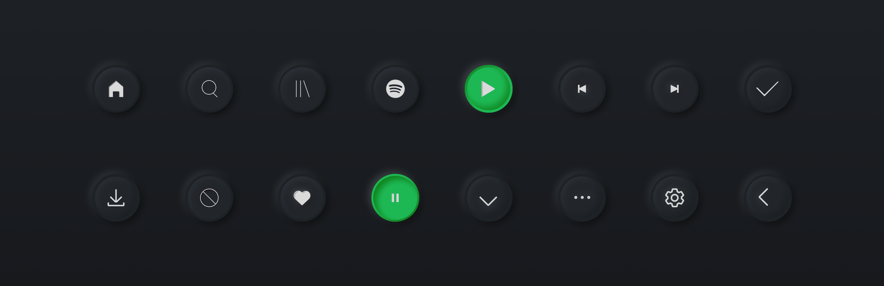
I thought this is a great opportunity to experiment with this trend, though keeping in mind that all the important elements on the screen should have high enough contrast. I tried to create a smooth bump-like effect for all the actionable icons on the screen along with the bottom nav icons, to give them more prominence. Along with this ‘pillow’ effect, I tried out three changes to help the buttons stand out a little more.
我认为这是尝试这种趋势的绝佳机会,尽管要记住屏幕上的所有重要元素都应具有足够高的对比度。 我尝试为屏幕上的所有可操作图标以及底部的导航图标创建一个平滑的凹凸样效果 ,以使它们更加突出。 除了这种“枕头”效果外,我还尝试了三种更改以帮助按钮更突出。
even though it goes against the low-contrast principle of neumorphic design, I still ditched the grey icon and went with white instead, so that it really stands out.
即使它违背了亚态设计的低对比度原理, 我还是放弃了灰色图标,而改用白色 ,这样它才真正脱颖而出。
added an overlay to the pressed/indented state for the button, not only does it look more like a physical button being pressed flat but it also helps distinguish its pressed state from its unpressed state.
在按钮的按下/缩进状态中添加了一个覆盖层,它不仅看起来更像是物理按下的按钮,而且还有助于区分其按下状态和未按下状态。
added an overlay to the unpressed state, just to help mark that it’s a button.
将叠加层添加到未按下状态,只是为了帮助标记它是一个按钮。
Another issue is what to show when the button is pressed.
另一个问题是按下按钮时显示什么。
The indented effect may not be enough on its own and may leave users wondering which state is active or inactive. I think this is when we could change the colour or icon (or both) in use to ensure the user knows something is now active.
仅靠缩进效果可能不足,并且可能使用户怀疑哪个状态是活动或不活动。 我认为这是我们可以更改使用的颜色或图标(或两者)以确保用户知道某些东西现在处于活动状态的时候。
Hence, for selected tabs, I changed the color of the icon giving it enough contrast against the unpressed states.
因此,对于选定的选项卡,我更改了图标的颜色,使其与未按下状态有足够的对比度 。
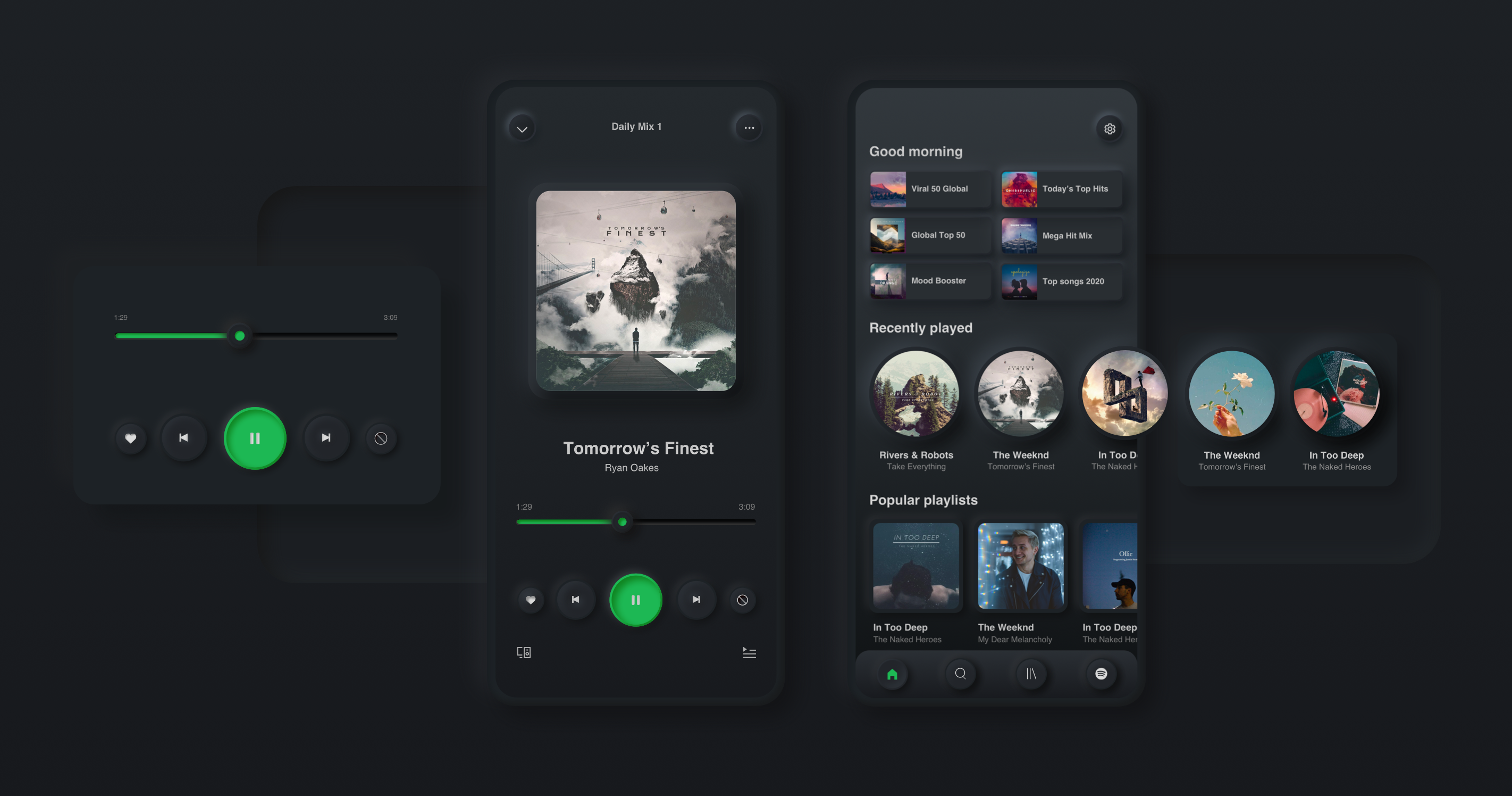
The same rule of thought has been applied to all the other screens. For the Music Player, the central card, controls and sliders are made neumorphic. The central card is extruded from the background while the images have been given absolutely no effects making its presence very subtle since its already the largest element on the screen. All the controls are given the same pillow effect while the only difference is the Play button is unpressed and Pause button is pressed and the color is different since that’s essentially the most important action interns of the visual hierarchy.
相同的思想规则已应用于所有其他屏幕。 对于音乐播放器,中央卡,控件和滑杆已变成中性。 中央卡从背景中挤出,而图像完全没有效果,因为它已经是屏幕上最大的元素,所以它的存在非常微妙。 所有控件都具有相同的枕头效果,唯一的区别是未按下“播放”按钮和“暂停”按钮,并且颜色不同,因为这实际上是视觉层次结构中最重要的动作实习生。
All cards are extruded from the background with low contrast since they are not really that important if we do the right hierarchy through typography, proximity and contrast with the important elements.
所有卡片都是从背景中以低对比度挤出的,因为如果我们通过排版,接近度和与重要元素的对比度来进行正确的层次划分,它们并不是那么重要 。
To make my life more difficult I made the background in gradient. The challenge with having a gradient background for Neumorphism is that you have to keep changing the material of the cards depending on its position on the screen to match the background. The base color keeps changing as we go down the screen which means the light and the dark shadow colours change as well.
为了使我的生活更加困难,我将背景设置为渐变。 具有用于“同态”的渐变背景的挑战是,您必须根据其在屏幕上的位置来不断更改卡片的材质以匹配背景。 当我们沿着屏幕向下移动时,基础颜色会不断变化,这意味着浅色和深色阴影的颜色也会发生变化。
Another key point to remember is that the values of X and Y increases or decreases depending on the size of the element you’re assigning shadows to.
要记住的另一个关键点是,X和Y的值根据要为其分配阴影的元素的大小而增加或减少。
The hierarchies between images, icons and fonts need to be clear and the spacings well defined. Like for the Playlists, I could make the cells neumorphic cards but that would take away all the attention which is unnecessary here. I have not introduced neumorphic style for any text elements as well.
图像,图标和字体之间的层次结构必须清楚,间距应明确定义。 像播放列表一样,我可以使单元格变成神经质卡,但是这样可以消除所有注意力,而这在这里是不必要的。 我也没有为任何文本元素介绍过神经变形样式。
To solve the accessibility issues, you need to strike a proper balance between the elements you’re making neumorphic.
要解决可访问性问题,您需要在使神经变形的元素之间取得适当的平衡。
学问 (Learnings)
With Neumorphism, where most of the elements float and stand out, competing with one another on a single screen, you need to keep the other elements subtle so its not harder for the user to perceive the design hierarchy and focal point, retaining the significant effect on the user’s decision-making process, as well as their thought process.
使用Neumorphism,其中大多数元素浮动并脱颖而出,在单个屏幕上彼此竞争,因此您需要保持其他元素的微妙性,这样用户就不难理解设计层次和焦点,从而保持了显着效果关于用户的决策过程以及他们的思考过程。
Every product that applies Neumorphism could have their own rule of UI stages depending on the product’s function and requirements.
每个应用Neumorphism的产品都可以根据其功能和要求有自己的UI阶段规则。
“As a designer, you need to ensure standard accessibility needs are met.”
“作为设计师,您需要确保满足标准的可访问性需求。”
翻译自: https://uxdesign.cc/spotify-in-neumorphism-2d1009d7477c
同态加法


 1万+
1万+


 被折叠的 条评论
为什么被折叠?
被折叠的 条评论
为什么被折叠?
 到【灌水乐园】发言


