


代码实现照片素描
In 2018 I started the process of consistently creating and posting my code sketches online. These are small animations I make with code and post on instagram. Through these sketches I tried to visually express my ideas using color, animation, and interaction. Through time, I wanted to refine my own interaction style, color use, and general aesthetic preferences. I tried to create on a weekly basis but wasn’t strict about it.
在2018年,我开始了一致地在线创建和发布代码草图的过程。 这些是我用代码制作的小动画,并发布在instagram上 。 通过这些草图,我尝试使用颜色,动画和交互方式直观地表达自己的想法。 随着时间的流逝,我想完善自己的交互风格,颜色使用以及一般的审美偏好。 我尝试每周创建一次,但并不严格。
I was inspired by the School of Poetic Computation, Zach Lieberman, and Dan Shiffman’s creative use of interactive code to push my own boundaries and continue learning. Huge thank you to Ian Vonseggern for helping me understand a lot of the underlying mechanics of the built in p5.js functions.
扎克·里伯曼(Zach Lieberman)诗意计算学院和丹·希夫曼(Dan Shiffman)创造性地使用交互式代码来突破自己的界限并继续学习,这给我带来了启发。 非常感谢Ian Vonseggern帮助我理解了内置p5.js函数的许多底层机制。
I thought I’d show what I sketched last year and talk about my process.
我以为我会展示我去年的素描并谈论我的过程。
问责制 (Accountability)
I started this instagram account to keep myself accountable. I’ve tried many times to learn coding languages over the years but have struggled to keep inspired. I could only stare at lines of code for so long before I lost sense of my starting motivation. This time around however, processing & p5.js had a fast enough execution cycle to let me see what I was building while I was building it. The cycle between writing code and seeing output was wonderfully short.
我启动了这个instagram帐户以确保自己负责。 多年来,我已经尝试了很多次学习编码语言,但是一直努力保持灵感。 我只能盯着代码行这么长时间,直到我对开始的动机失去了知觉。 但是这一次,processing&p5.js具有足够快的执行周期,可以让我看到自己正在构建的内容。 编写代码和查看输出之间的周期非常短。
I set a timebox of a few hours per sketch. I tried not to put weight on what I created, but whether or not the idea conveyed a sense of emotion. That mindset helped me feel comfortable iterating on ideas through several sessions.
我为每个草图设置了几个小时的时间框。 我尝试不对自己创作的作品施加任何压力,但是这个想法是否传达了一种情感感。 这种心态使我在数次会议中反复讨论想法时感到很自在。

灵感 (Inspiration)
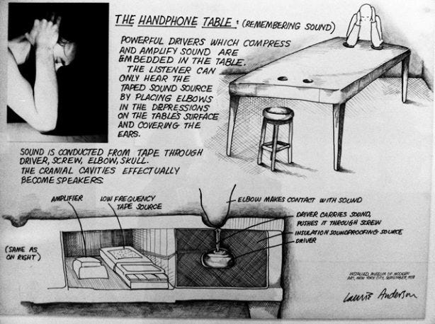
Having a collection of images is really helpful to inspire ideas. I spent a lot of time looking at high fashion runway shows (Alexander McQueen), streetwear (New York Sunshine), album covers (Nirvana), flower arrangements (Freakebana), 3d sculptures (David Smith), and architectural structures (Philip Johnson’s The Glass House). More examples: Serge’s daily poster series, Laurie Anderson’s Handphone Table, Spider-man: Into the Spiderverse movie color scheme, Sam Gilliam’s exhibition at Dia:Beacon and the Whitney’s Programmed Rules, Codes, and Choreographies in Art exhibit.
收集图像确实有助于激发思想。 我花了很多时间看时装秀 (Alexander McQueen), 街头服饰 (New York Sunshine), 专辑封面 (Nirvana), 插花 (Freakebana), 3d雕塑 (David Smith)和建筑结构 (Philip Johnson's The玻璃屋)。 更多示例:Serge的每日海报系列 ,Laurie Anderson的Handphone Table ,蜘蛛侠:进入Spiderverse 电影配色方案 ,Sam Gilliam在Dia:Beacon的展览以及Whitney的Programmed Rules,Codes和Choreographies in Art展览。
Throughout the past year, I learned that I gravitated toward creating works with opposing pastel colors. Tobias van Schneider’s color tool helped inspire color combinations that worked.
在过去的一年中,我了解到我偏向于创作具有相反柔和色彩的作品。 Tobias van Schneider的色彩工具有助于激发有效的色彩组合。
处理 (Process)
My process is pretty lo fi. I use a combination of notepaper, Sublime Text, Quicktime, iMovie, and my iPhone.
我的过程很不错。 我使用了便条纸,Sublime Text,Quicktime,iMovie和我的iPhone。
- draw out a rough physical sketch of my idea 勾勒出我的主意
- fork an old sketches or google functions to figure out execution methods 派生旧草图或Google函数找出执行方法
- figure out limitations in the libraries and iterate through different ways to create the idea 找出库中的限制,并通过不同的方式迭代以创建想法
- grab a screen recording with Quicktime, usually several cycles of the animation 使用Quicktime抓取屏幕录像,通常是动画的几个周期
- trim the video using Quicktime 使用Quicktime修剪视频
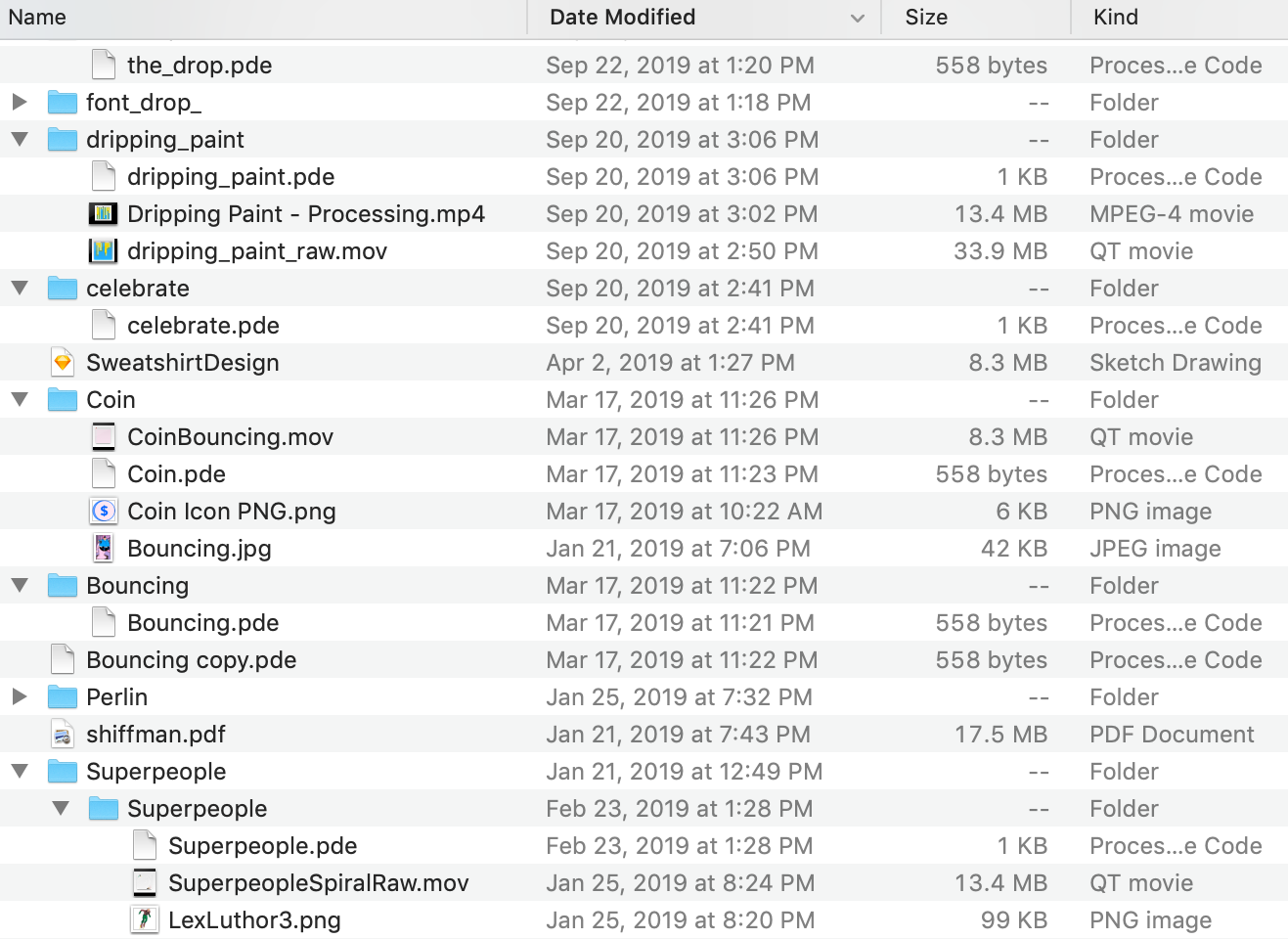
- load the .mov file into iMovie to set the white border and thumbnail image 将.mov文件加载到iMovie中以设置白色边框和缩略图
- airdrop the file to my phone 将文件空投到我的手机上
- upload to instagram 上传到Instagram
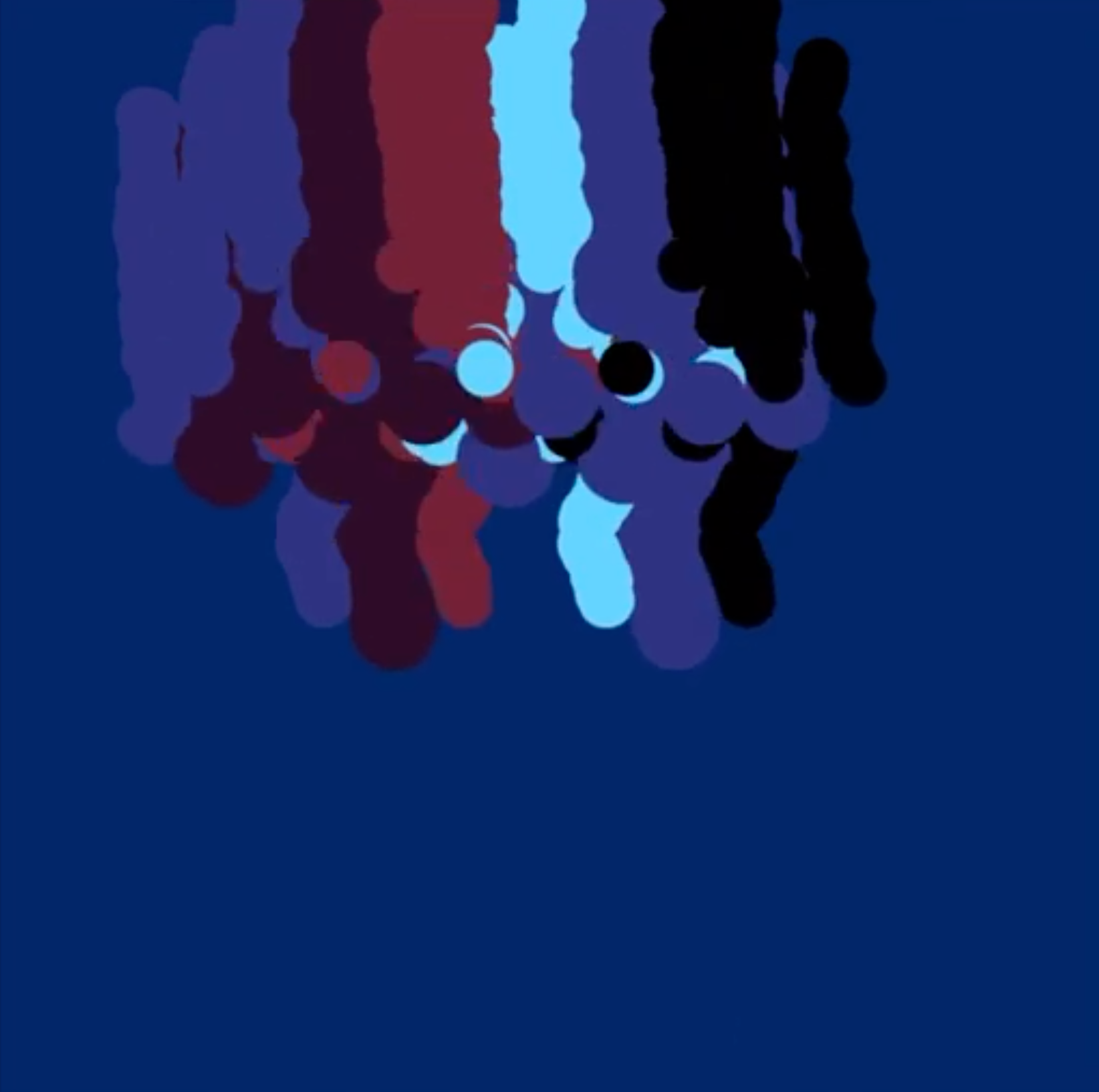
运动轨迹 (Movement Trail)
My initial sketches were around the movement trail — what visual artifacts can I create to simulate movement?
我最初的草图是围绕运动轨迹的-我可以创建哪些视觉伪像来模拟运动?
I started with this because one of the core components of the Processing language is its draw() function. This draw() function continuously gets called and executes the lines of code contained in its block until the sketch is terminated. By default the draw() function gets executed as many as 60 times per second, but another function, frameRate(), can control how many frames actually get displayed.
我之所以开始,是因为处理语言的核心组件之一是它的draw()函数。 不断调用此draw()函数并执行其块中包含的代码行,直到草图终止。 默认情况下,draw()函数每秒执行多达60次,但是另一个函数frameRate()可以控制实际显示多少帧。
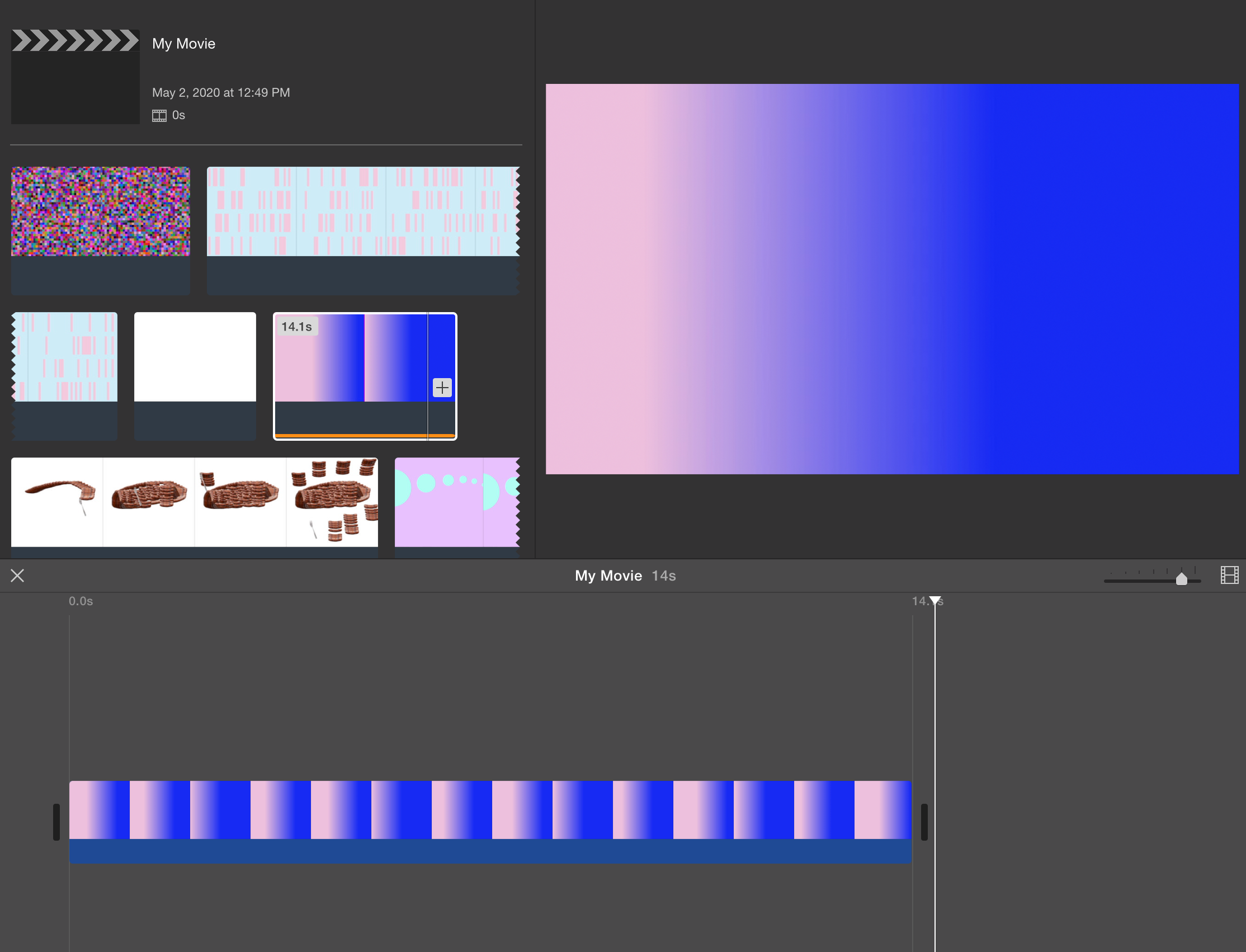
This allowed interesting layering. My first sketch used a two dimensional random walk with an image of Drake.
这允许有趣的分层。 我的第一个草图使用带有Drake图像的二维随机游动。
Since the draw() function continuously re-draws the image, I updated the image location in each execution cycle and changed the background alpha value to be redrawn with 80% opacity, allowing a bit of the old image to peek through. This allowed for a trace of the old image to suggest movement. The layering added a nice effect of simulated fading. Drake’s smiling face wobbling around the screen was really fun to watch.
由于draw()函数不断重绘图像,因此我在每个执行周期中更新了图像位置,并更改了要以80%不透明度重绘的背景alpha值,从而使一些旧图像可以窥视。 这样就可以看到旧图像的痕迹,以暗示运动。 分层效果增加了模拟褪色效果。 Drake的笑脸在屏幕上摇晃,看着真的很有趣。
One of the things I really liked about this effect is its ability to show movement even in a still image. So much of interactive art needs time to pass in order to showcase itself; this does not.
我最喜欢这种效果的一件事是它即使在静止图像中也能显示运动。 因此,很多互动艺术都需要时间才能展示出来。 这不是。
移动线 (Moving Lines)
I walked into Sam Gilliam’s exhibit at Dia:Beacon last year and immediately loved how he took a property intrinsic to fabric — draping — and used applied color to make it an exuberant draping.
去年,我走进了Sam Gilliam在Dia:Beacon的展览中,立即爱上了他如何利用织物固有的特性-悬垂性-并使用颜色使它成为旺盛的悬垂性。

I loved the upbeat relaxed feeling Gilliam’s “Double Merged” evoked. This immediately made me think, “How could I translate this feeling into a sketch using lines and colors?”
我喜欢吉利安(Gilliam)引发的“双重融合”的轻松愉悦的感觉。 这立刻让我想到:“我该如何使用线条和颜色将这种感觉转换为草图?”
To capture this feeling, I looked at simultaneous movement in both the x and y directions vs color movement in the HSB spectrum. I tried color movement combined with x-axis movement. I played with large y-axis movements interspersed with small x-axis movements. I really enjoyed this exploration.
为了捕捉这种感觉,我研究了x和y方向上同时运动与HSB光谱中颜色运动的关系。 我尝试了将色彩移动与x轴移动结合使用。 我在较大的y轴运动和较小的x轴运动之间进行游戏。 我真的很喜欢这种探索。
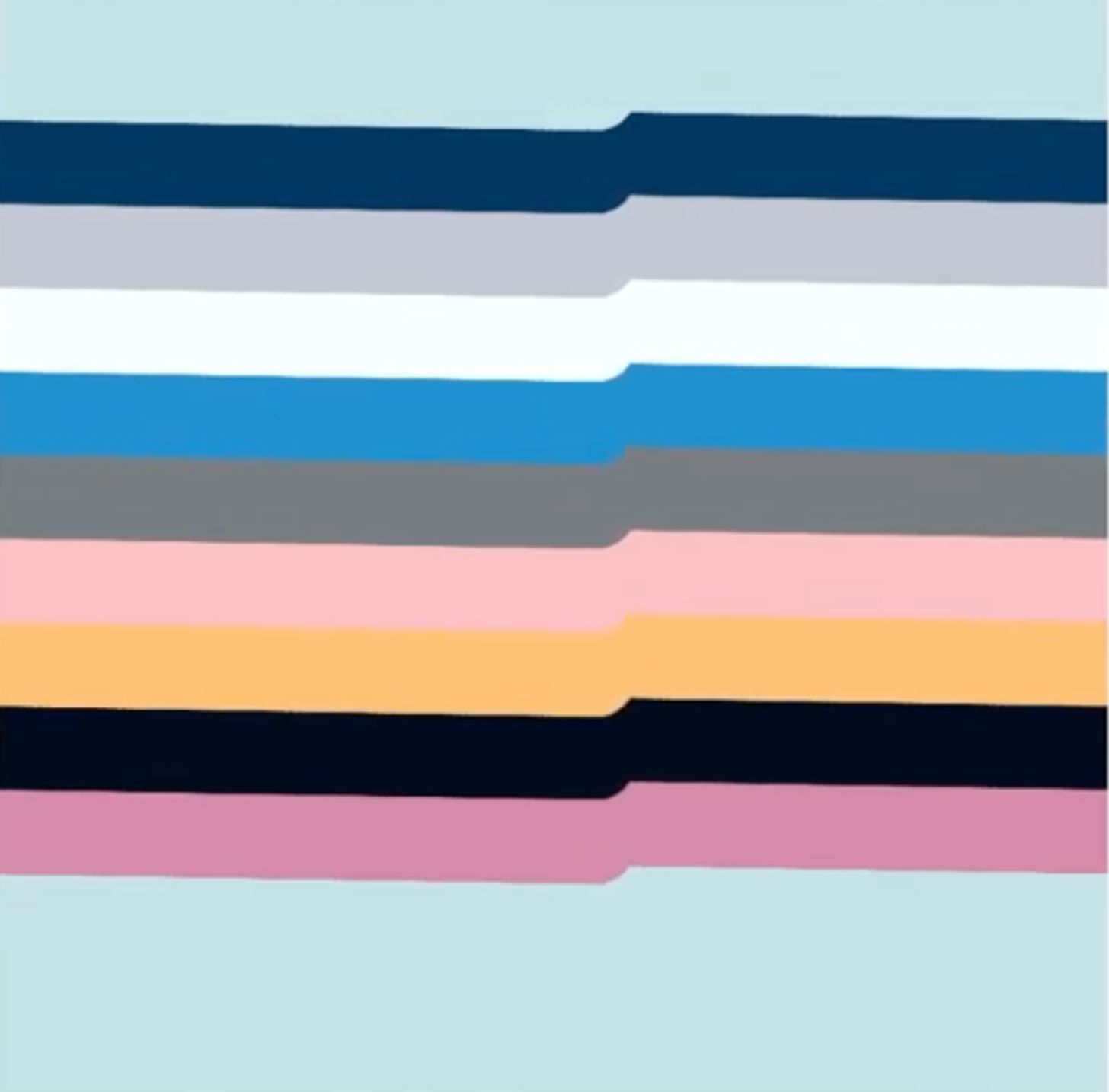
I learned that while gentle movement was important for a relaxing feeling, color was the most important factor in conveying exuberance. Even if my ball of color was only moving along a straight line, as long as the pulsing gradient was pleasing, the sketch was exuberant and happy.
我了解到,轻柔的运动对于放松感很重要,而色彩则是传递活力的最重要因素。 即使我的彩球只是沿直线移动,只要脉动的渐变令人愉悦,草图还是充满活力和快乐的。
鼠标互动 (Mouse Interaction)
I’ve always been fascinated by the idea of a responsive environment. I love the idea of physical structures that compress or expand based on the changing number of occupants, glass that changes color based on the intensity of the sun, or structures that physically contort to adapt to its environmental stimuli.
我一直对响应式环境的想法着迷。 我喜欢这样一种构想:根据乘员人数的变化而压缩或膨胀的物理结构,根据太阳的强度而变色的玻璃,或者物理扭曲以适应其环境刺激的结构。
None of this is currently realistic in the built world, but the digital world is limitless. I started by looking at mouse x sketch interactions — what does it look like when certain items in a sketch follow my changing movement?
目前,在构建环境中这一切都不是现实的,但是数字世界是无限的。 我从观察鼠标x草图的交互开始-当草图中的某些项目跟随我不断变化的运动时会是什么样?
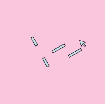

These sketches generally involved at least one static point of rotation and then elements that moved based on mouse interaction. When I was first playing with this concept, I wanted some point in the sketch to be static so that the moving parts were distinct.
这些草图通常涉及至少一个静态旋转点,然后涉及基于鼠标交互作用而移动的元素。 当我第一次玩这个概念时,我希望草图中的某个点是静态的,以使运动的零件与众不同。
I also played with showing the cursor as its own object on the screen. What I love about interactivity — controlling the image with my own movements — doesn’t translate well to passive viewing environments like instagram. When I record it, I know I’m dynamically controlling the page and the page elements are responding in kind, but when this is translated to instagram, it just looks like the elements are randomly moving around. Adding a clear cursor image kind of helps with that, but I think there can be better solutions in the future.
我还玩过在屏幕上将光标显示为自己的对象。 我喜欢互动性-用自己的动作控制图像-不能很好地转化为instagram等被动观看环境。 当我记录它时,我知道我正在动态地控制页面,并且页面元素都以实物为响应,但是当将其翻译为instagram时,看起来元素只是在随机移动。 添加清晰的光标图像可以帮助您,但是我认为将来会有更好的解决方案。
渐变色 (Gradients)
After many hours experimenting with different color schemes for the different sketches, I realized I gravitated toward a certain pastel color palette. I liked complementary colors that felt soothing. I like how I felt a sense of calm happiness looking at soothing pastel colors.
在为不同的草图尝试了不同的配色方案许多小时后,我意识到我倾向于使用某种柔和的调色板。 我喜欢让人舒缓的补色。 我喜欢看着柔和的柔和色彩带来的平静幸福感。
Funny enough, I started seeing beautiful gradients everywhere — in posters and sweatshirts and beer labels and in grocery stores.
有趣的是,我开始在各处看到美丽的渐变色-在海报,运动衫,啤酒标签和杂货店中。
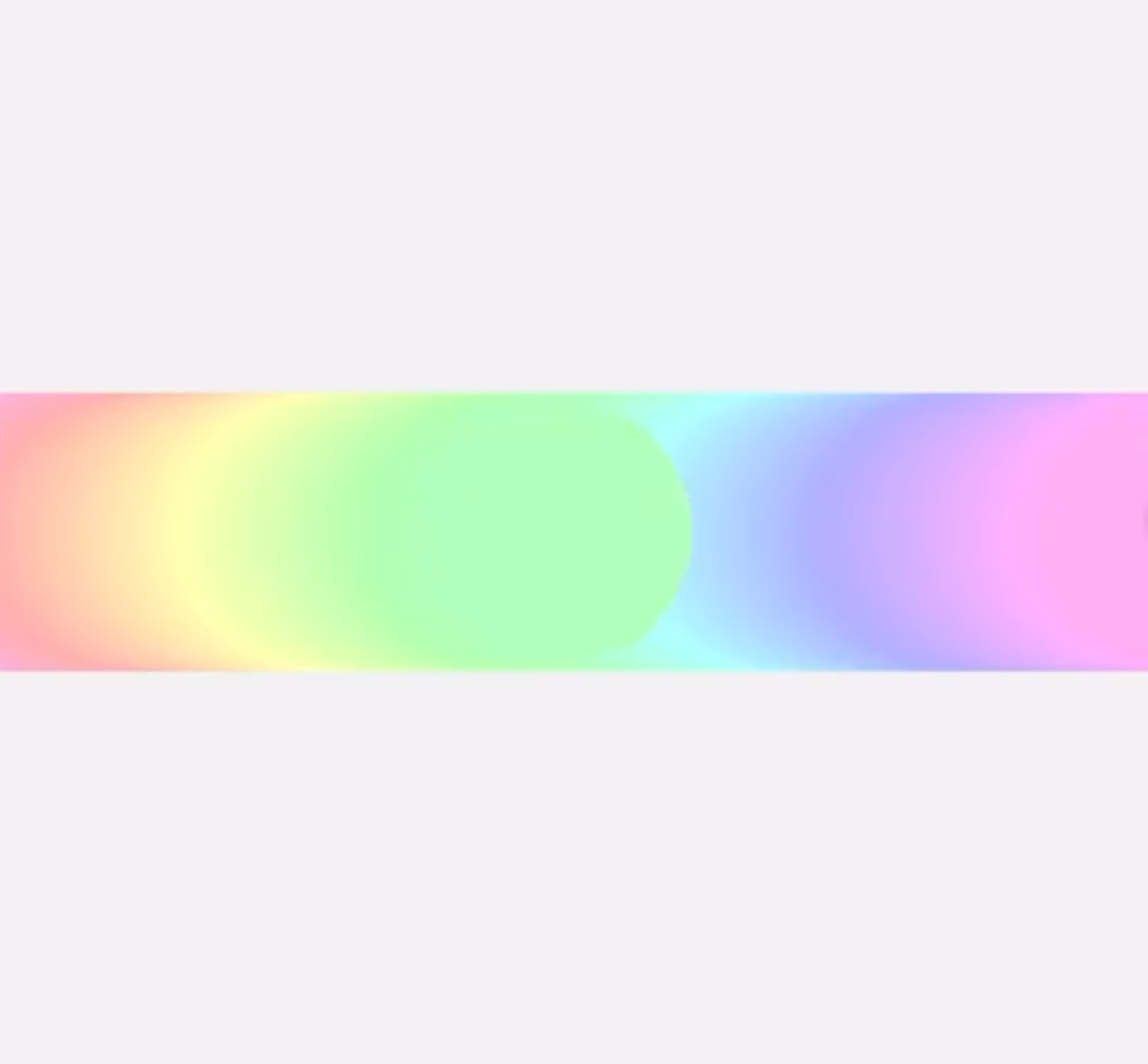
I got inspired from all the color pairings and wanted to recreate the soothing feeling through my sketches. I started playing around with many different types of gradients. One of the combinations I explored involved the pink color blending into the blue color, but “pushing” the blue color aside to add more and more pink to the sketch.
我从所有的色彩搭配中得到了启发,并希望通过我的草图重现舒缓的感觉。 我开始尝试许多不同类型的渐变。 我探索的一种组合涉及将粉红色混入蓝色,但是将“蓝色”推到一边以向草图中添加越来越多的粉红色。
I loved the pulsing feel of a brightness overtaking the sketch, one line at a time.
我喜欢亮度超过草图的脉冲感,一次超过一行。

My favorite gradient sketch was inspired by snowfall. This was done during the only New York snowstorm in winter of 2019. Through this sketch, I wanted to show the calming feeling of watching a whiteout from your apartment room window.
我最喜欢的渐变草图是受降雪启发的。 这是在2019年冬季发生的唯一纽约暴风雪中完成的。通过此草图,我想表现出从公寓房间窗户观看停电的平静感觉。
Having this sketch blend into the white background of the instagram app was a happy accident, and allowed for the total snowfall feeling to be amplified.
将此草图融合到instagram应用程序的白色背景中是一件很不幸的事,并且使总的降雪感得以放大。

作为运动放置 (Placement as movement)
I saw Gerhard Richter’s 4,900 Colors at some point in 2019. I usually get inspired by looking at art and this was no exception. However, the question that popped into my mind this time was “so….this seems like I can recreate this myself…?”
我在2019年的某个时候看过格哈德·里希特(Gerhard Richter)的4,900色 。我通常会受到艺术创作的启发,这也不例外。 但是,这次浮现在脑海中的问题是“所以……。看来我可以自己重建这个……?”
If this is an art piece about generating colors randomly via a computer algorithm, if I have a computer and an understanding of how the random() function worked, I thought could probably figure it out. So I did!
如果这是关于通过计算机算法随机生成颜色的艺术品,如果我有一台计算机并且对random()函数的工作方式有所了解,那么我认为可能可以解决。 所以我做了!
First I worked on imitating the piece. I knew that this was a series of colored squares in the x and y direction but I quickly got stuck trying to figure out how to nest the squares inside each other. When I mentioned this to Ian, he showed me that simply putting the random fill inside of two for() loops solved that problem.
首先,我致力于模仿作品。 我知道这是在x和y方向上的一系列彩色正方形,但我很快陷入困境,试图找出如何将正方形相互嵌套。 当我向Ian提及这一点时,他向我展示了将随机填充放入两个for()循环中就可以解决该问题。
I then played with the shapes of the fill and the fill colors. I found it quite interesting that by simply reducing the number of colors to two, what was happening in the sketches grew much clearer.
然后,我玩了填充的形状和填充颜色。 我发现非常有趣的是,只需将颜色数量减少为两种,草图中发生的事情就变得更加清晰。
反思与2020 (Reflection & 2020)
It was quite fun to write code and quickly create a visual output. I loved understanding how the different functions worked and getting comfortable enough with coding to figure out how to translate random ideas into reality.
编写代码并快速创建视觉输出非常有趣。 我喜欢理解不同功能的工作原理,并且对编码足够熟悉,可以弄清楚如何将随机想法转化为现实。
Some thoughts:
一些想法:
- I often started with sketches that were visually overcomplicated and then pared them down after the initial draft. Over time, I learned that sketches needed a focal point to be interesting. There needed to be a clear visual reason the sketch existed. That simplicity could be shown by a lot of white space or a sparing use of color. 我经常从视觉上过于复杂的草图开始,然后在初稿后将其缩减。 随着时间的推移,我了解到草图需要一个有趣的焦点。 草图必须有清晰的视觉原因。 这种简单性可以通过大量的空白或少量使用颜色来体现。
- While it was very fun to start with the fundamentals of writing code to produce sketches, I wanted to have a quicker way of translating ideas from my mind onto the screen. 虽然从编写代码以生成草图的基础开始很有趣,但我希望有一种更快的方法将想法从我的思想转换到屏幕上。
With rapid execution in mind, I started following more visual artists on Instagram and found a common hashtag amongst those artists: #touchdesigner. I googled it and instantly became very excited to try it out.
考虑到快速执行,我开始在Instagram上关注更多视觉艺术家,并在这些艺术家中发现了一个共同的标签:#touchdesigner。 我在Google上搜索了一下,立即感到非常兴奋,可以尝试一下。
As found in Wikipedia:
如Wikipedia中所述:
TouchDesigner is a node based visual programming language for real time interactive multimedia content, developed by the Toronto-based company Derivative. It’s been used by artists, programmers, creative coders, software designers, and performers to create performances, installations, and fixed media works.
TouchDesigner是一种基于节点的可视化编程语言,用于实时交互式多媒体内容,由多伦多公司Derivative开发。 艺术家,程序员,创意编码人员,软件设计师和表演者已使用它来创建表演,装置和固定媒体作品。
I think this is the next step of my sketches. Time to try it out!
我认为这是我的素描的下一步。 是时候尝试一下!
Thanks for reading~
谢谢阅读〜
代码实现照片素描


 1202
1202


 被折叠的 条评论
为什么被折叠?
被折叠的 条评论
为什么被折叠?
 到【灌水乐园】发言


