


小程序卡片叠层切换卡片
重点 (Top highlight)
介绍 (Intro)
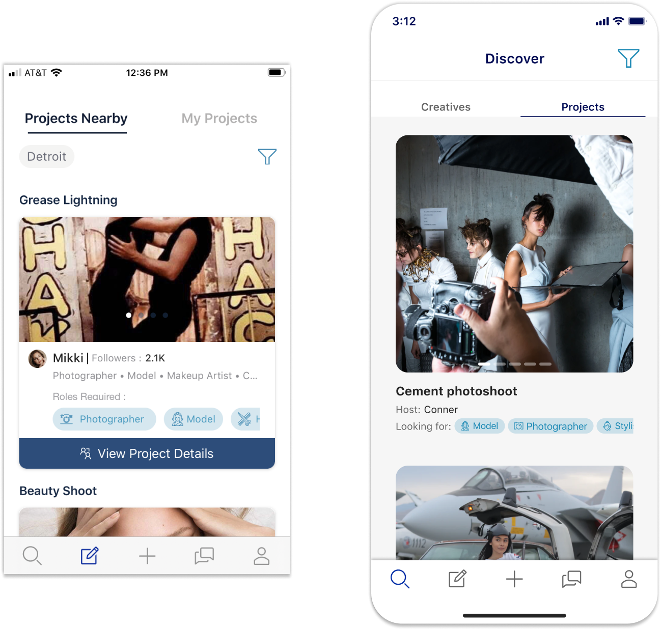
I was recently tasked to redesign the results of the following filters:
我最近受命重新设计以下过滤器的结果:
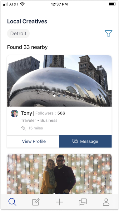
- Filtered results for users (creatives) 用户的筛选结果(创意)
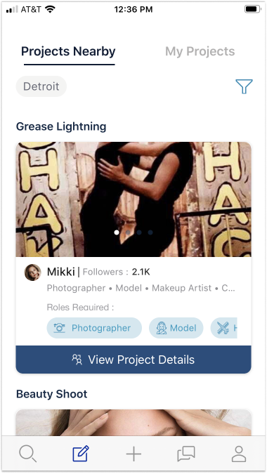
2. Filtered results for projects
2.项目的筛选结果
These certainly looked like cards to me (as opposed to list items), but before declaring that this was the best path forward I decided to do a little research.
对于我来说,这些当然看起来像是卡片 (而不是列表项),但是在宣布这是前进的最佳途径之前,我决定进行一些研究。
研究 (Research)
Turns out the most documentation will say that lists, not cards, are the best way to show searched/filtered results.
事实证明, 大多数文档会说列表(而不是卡片)是显示搜索/过滤结果的最佳方法。
But the more digging I did the more I saw how cards and lists were becoming one of the same, and can both be used when displaying results on a page.
但是我做得越深入,我越能看到卡片和列表如何成为同一个卡片 ,并且在页面上显示结果时都可以使用。
进化 (The evolution)
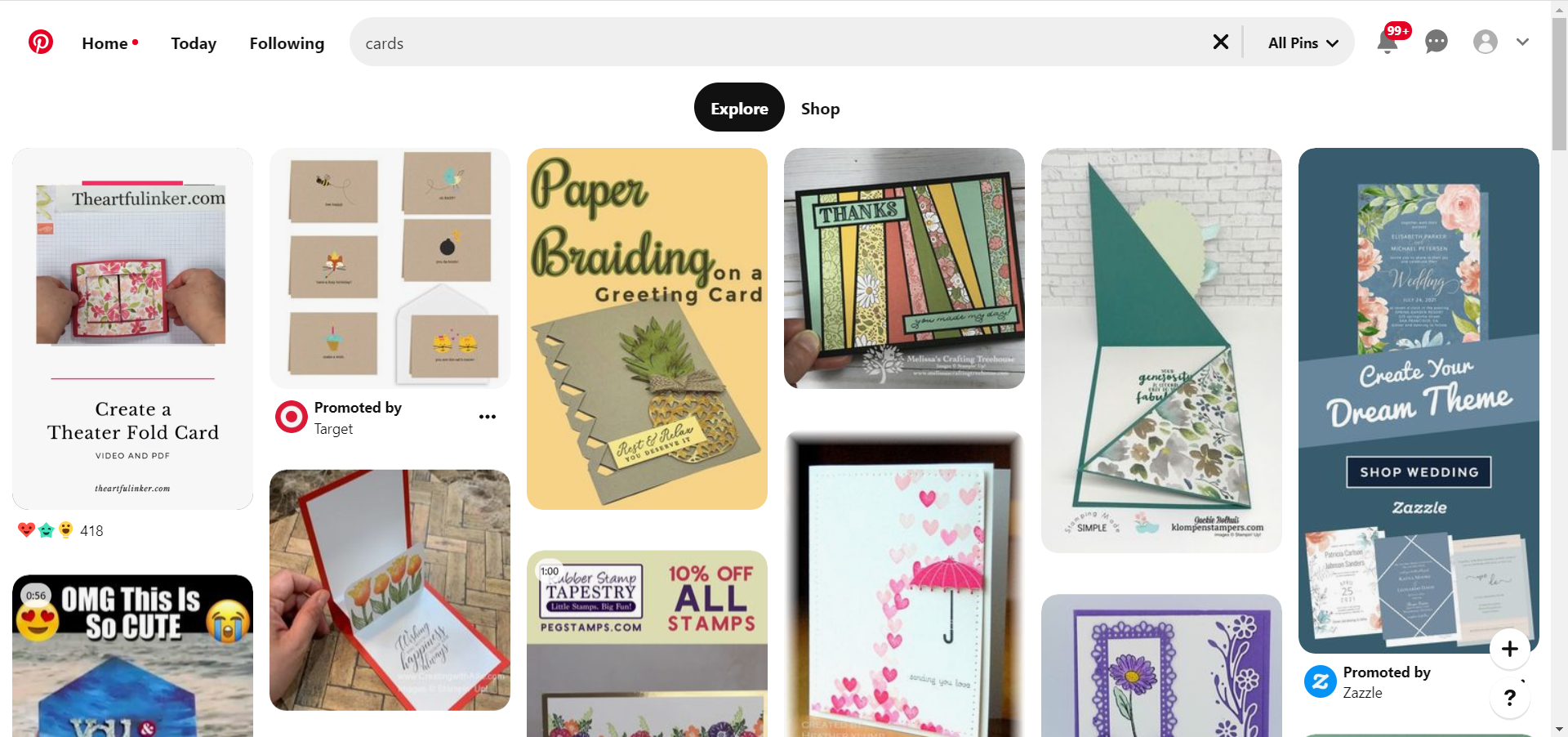
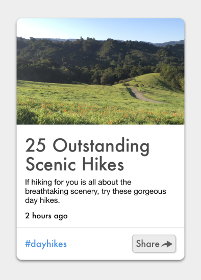
Cards became mainstream when Pinterest started leveraging them in a collage-like format.
当Pinterest开始以类似拼贴的格式使用卡片时,卡片就成为了主流。
As its skeuomorphic name indicates, these containers initially had the dimensions and depth of playing cards. In fact, in 2016 the Nielson Norman Group defined cards as:
顾名思义,这些容器最初具有纸牌的尺寸和深度。 实际上,尼尔森·诺曼集团(Nielson Norman Group)在2016年将卡片定义为:
A UI design pattern that groups related information in a flexible-size container visually resembling a playing card.
一种UI设计模式,将相关信息分组在一个看起来像扑克牌的灵活大小的容器中。
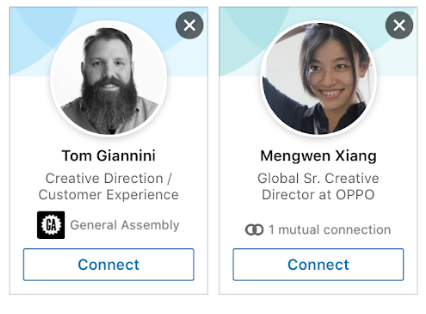
Yet, the cards quickly transformed into new, non-card shapes.
但是,卡片很快就变成了新的非卡片形状。
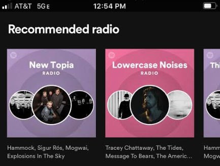
While others lost their shadow:
当其他人失去了阴影时:
And then came border-less cards
然后是无边界卡
As time went on people did not need the card analogy to understand what cards were and how to interact with them
随着时间的流逝,人们不需要用卡类比来了解什么是卡以及如何与之交互
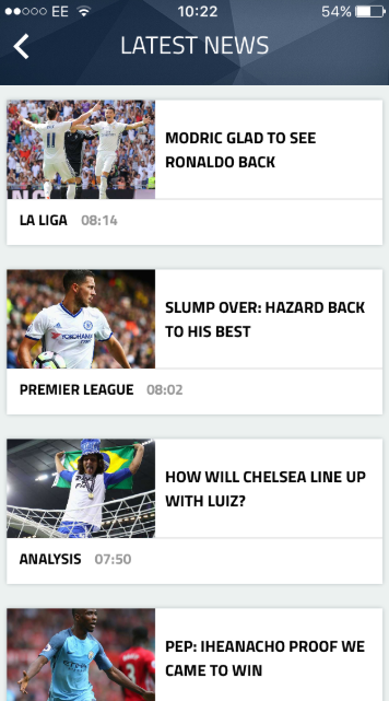
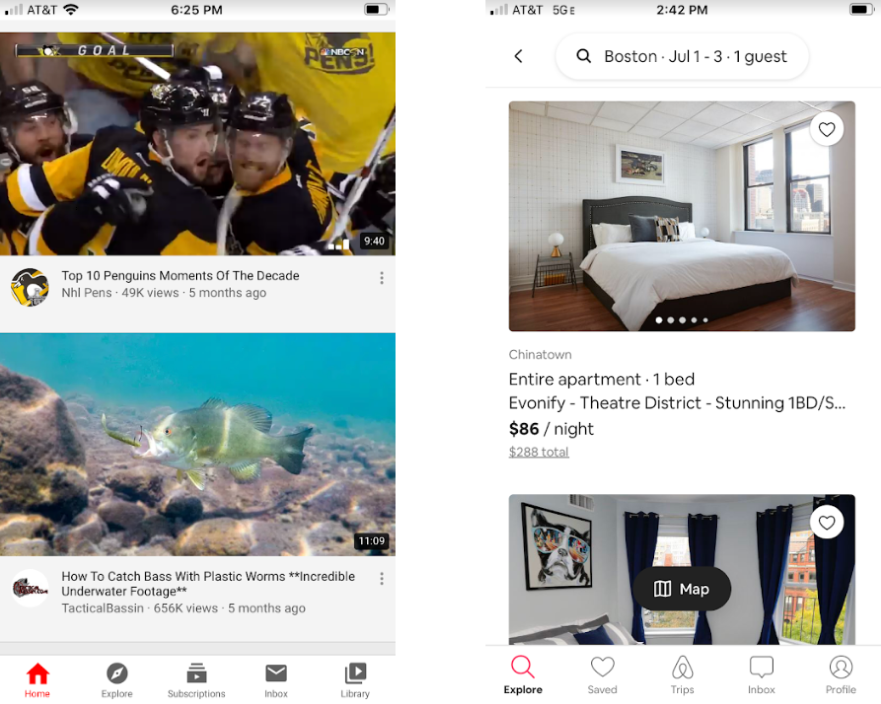
So at this point, what are the differences of cards and lists? Well, as alluded to previously, cards have been known for “browsing” since they have usually contained photos, while lists are text-heavy and are great for “searching”. Let’s take Medium as an example:
那么,此时, 卡片和列表有什么区别? 那么,作为前面提到的, 卡已经知道了“浏览”,因为他们通常包含照片,而列表是文字为主的和是伟大的“搜索”。 让我们以Medium为例:
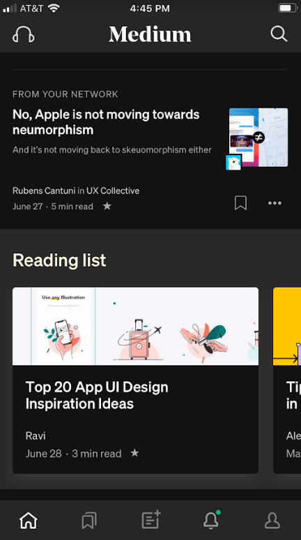
In the mobile app, users can scroll through Your Daily Read and are first presented with list items. As they continue to scroll (and you can argue are now in a browsing mentality) they are presented with cards. If a user does a manual search they are presented with only list items.
在移动应用程序中,用户可以滚动浏览“每日阅读” ,并首先显示列表项。 当他们继续滚动时(您可以说现在处于浏览状态),他们会看到卡片 。 如果用户进行手动搜索,则仅显示列表项。
*These cards are actually a list of archived items, but I am focusing more on the user’s mentality if they are this far down the page
*这些卡片实际上是已归档项目的列表,但是如果它们在页面下方,我将重点放在用户的心态上
The only difference between Medium’s list items and cards is really just the size of the picture.
中号列表项和卡片之间的唯一区别实际上只是图片的大小 。
当前状态 (Current state)
So it appears that the current definition of a card is something like this:
这样看来, 卡片的当前定义是这样的:
A UI design pattern that groups related information in a significantly-sized container, fostering a browser’s mentality and allowing only a few results to be seen at a time.
一种UI设计模式,它将相关信息分组到一个很大的容器中,从而培养了浏览器的思维方式,并且一次只能看到一些结果。
From a visual perspective, a card is a large list. From a use case perspective, a card excels when user’s are in a curious or amendable state.
从视觉上看,一张卡片是一个很大的清单 。 从用例的角度来看,当用户处于好奇或可修改状态时, 卡片会表现出色。
卡还是清单? (Card or List?)
The question is not, “should I leverage a card design or list design?”. You should ask:
问题不是,“我应该利用卡片设计还是列表设计?”。 您应该问:
- how much visual weight do I want each component to have? 我希望每个组件有多少视觉重量?
what mindset are my users in at this point of their experience?
我的用户目前的心态是什么?
Depending on these answers you may have something that looks very much like a prototypical card/list, or you may have some happy medium.
根据这些答案,您可能会拥有非常像原型卡 / 列表的东西 ,或者可能拥有一些快乐的媒介。
回到重新设计 (Back to the Redesign)
I learned that my users were not explicitly searching, they were just filtering by their area and more browsing for interesting projects / creatives.
我了解到,我的用户没有明确搜索,他们只是按所在区域进行过滤,而是浏览更多有趣的项目/广告。
More importantly, the results of user research said people did not mind scrolling through content, and liked to see larger photos without having to drill down. This led me to the following designs:
更重要的是,用户研究的结果表明,人们不介意滚动浏览内容,并且喜欢看更大的照片而不必进行深入研究。 这导致我进行以下设计:
推理设计 (Designs with reasoning)
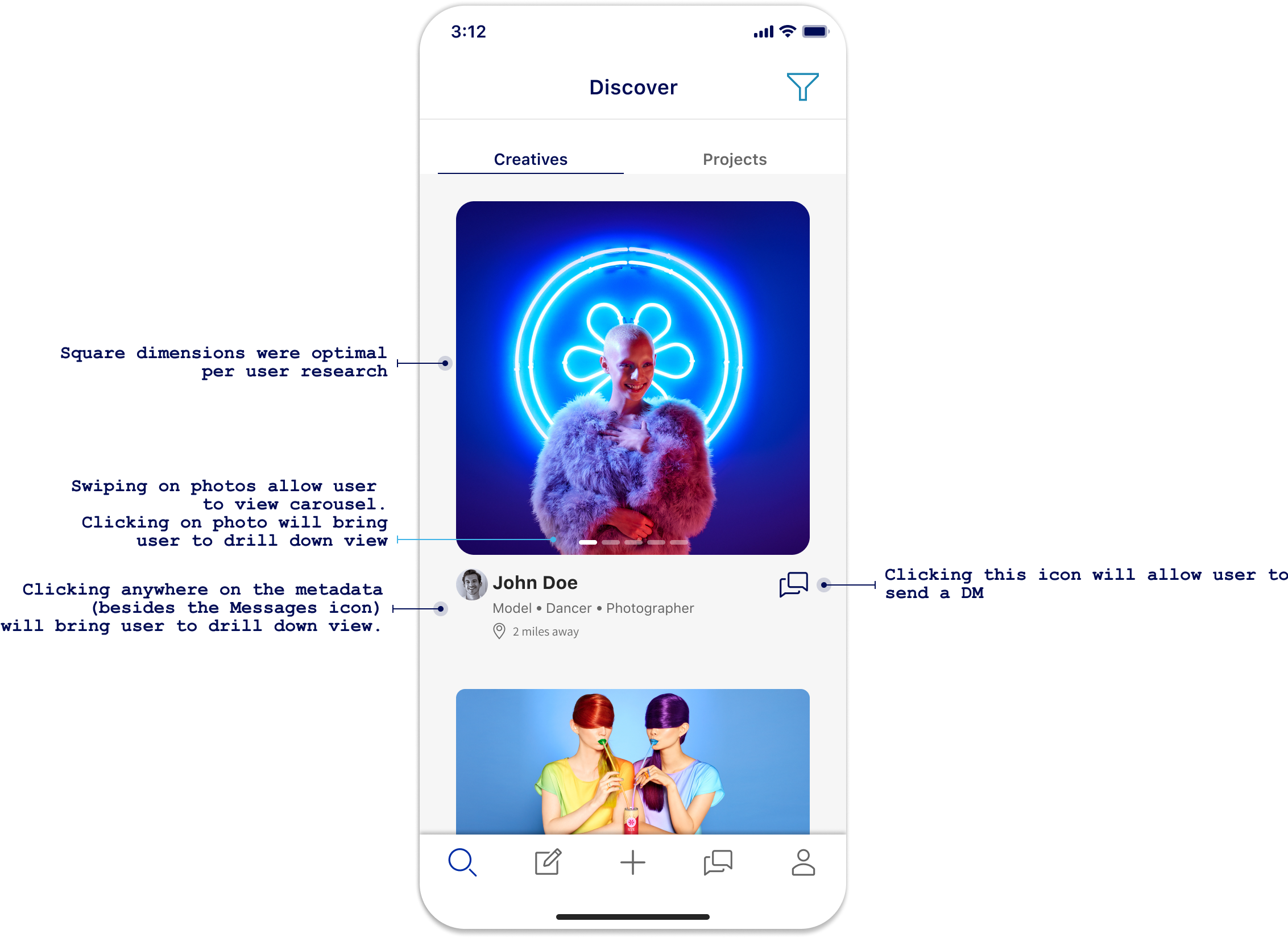
Like Instagram, photos dominate the user’s decision to click on a result, thus the size of the images. White space separates where to click for the drill down view vs DMing the user. Years user evolution and learning have gotten us to the point where this design not only works, but does it with a simplistic style.
像Instagram一样,照片在用户决定点击结果的决定中占主导地位,从而决定了图像的大小。 空格分隔了向下钻取视图和DM用户的单击位置。 多年的用户发展和学习使我们达到了这种设计不仅有效而且简单的风格。
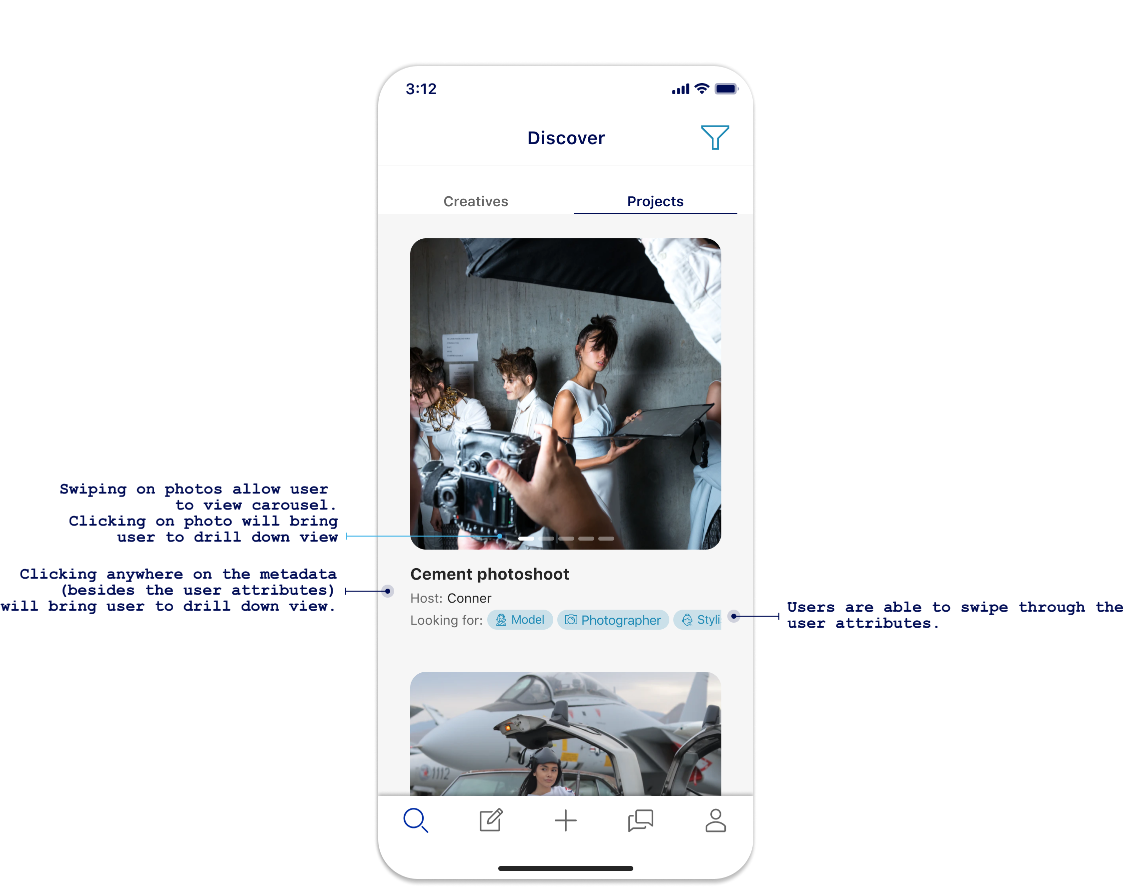
Similar to the design above, user can click (tap) on any part of the result for the drill down view while swiping on the photo or user attributes will trigger the appropriate carousels. This had led to more engagement as every part of the result is intractable, compared to the original designs that had users guessing what was clickable and what was not.
与上面的设计类似,用户可以在浏览照片的任何部分上单击(点击),同时在照片上滑动,否则用户属性将触发适当的轮播。 与原始设计相比,这导致了更多的参与,因为结果的每个部分都是难以捉摸的,而原始设计使用户只能猜测可点击的内容和不可点击的内容。
设计比较 (Design comparison)
验证方式 (Validation)
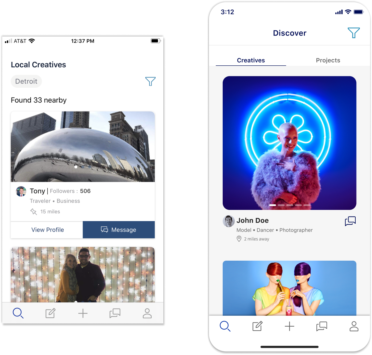
Since I work for a small company, validating the designs (more than just a few user tests) comes down to seeing if any other apps are doing the same thing. Turns out more than a few look very similar 😏
由于我在一家小公司工作,因此对设计进行验证(不仅仅是几个用户测试)归结为查看是否有其他应用程序在做同样的事情。 事实证明,很多看起来非常相似😏
That’s it! Would be happy to hear from people on what they think about these designs 😎
而已! 很高兴听到人们对这些设计的看法😎
*The app I redesigned is called Connective, the super-awesome app where creatives can connect. Download the app here.
*我重新设计的应用程序称为Connective ,这是一款超棒的应用程序,可以在其中连接广告素材。 在此处下载该应用程序。
翻译自: https://blog.prototypr.io/where-are-we-now-with-cards-vs-lists-7bd293ae1da0
小程序卡片叠层切换卡片


 592
592


 被折叠的 条评论
为什么被折叠?
被折叠的 条评论
为什么被折叠?
 到【灌水乐园】发言


