


苹果风格ui
重点 (Top highlight)
Apple announced some pretty wild updates at WWDC 2020 today.
苹果今天在WWDC 2020上宣布了一些相当疯狂的更新。
But technology aside, let’s focus on how their UI has changed. It went through the first bitmap representations, through Aqua, more modern styles and now all comes together in a completely new, consistent design language.
除了技术之外,让我们集中讨论其UI的变化。 它经历了第一个位图表示,Aqua,更现代的样式,现在都以一种全新的,一致的设计语言融合在一起。

The changes in both the mobile and desktop operating systems signifies which design style currently works best. Until we get morphing displays, soft UI is here to stay. There are similarities between what Apple showed today and what Microsoft developed in its Fluent UI design.
移动和台式机操作系统中的更改表示当前最有效的设计风格。 在获得变形显示之前,将保留软UI。 苹果今天展示的内容与微软在Fluent UI设计中开发的内容之间存在相似之处。
It’s funny to think that over a decade ago Apple mocked Windows Vista for copying their ideas (quite rightfully) when now they merge the Microsoft way into their products.
有趣的是,十年前苹果嘲笑Windows Vista复制了他们的想法(很正确),而现在他们将Microsoft方式合并到了产品中。
So here’s the list:
所以这是清单:

(更多)圆角 ((more) Rounded corners)
Some of the newer users may not remember this, but while Apple was always leaning toward rounded corners.
一些较新的用户可能不记得了这一点,但是在Apple始终偏向圆角时。
They got progressively more rounded along the way.
他们在此过程中逐渐变得更加全面。
The initial iPhone OS had rather square looking toggles and panels. But we all know that our primal conditioning still has sharp corners paradigm as “teeth”. That makes them more frightening and less friendly.
最初的iPhone OS具有相当方形的开关和面板。 但是我们都知道,我们的原始条件仍然具有作为“牙齿”的尖角范式。 这使他们更加恐惧和不友好。
So Apple refined the toggles slowly towards a more rounded version we know and love now.
因此,Apple逐渐将切换开关细化为我们现在知道和喜欢的更全面的版本。

But they didn’t stop there and also modified the corner radius of the icons. Now a similar style of icons is also coming to Mac OS.
但是他们并没有止步于此,还修改了图标的角半径。 现在,Mac OS也出现了类似样式的图标。

The windows, panels and action sheets are a little bit more rounded as well. Most of that change started with the iPhone X, which had a very rounded display. That led to having action sheet tops rounded as well to match.
窗口,面板和操作表也更圆一些。 大部分变化始于iPhone X,它的显示屏非常圆润。 这导致操作表顶部也要四舍五入。
Rounded corners are here to stay.
圆角在这里停留。

透明度和背景模糊 (Transparency and Background Blur)
Transparency and background blur got popular when the infamous iOS 7 came out. Most people hated the new look of ultra minimalism combined with super-thin fonts.
当臭名昭著的iOS 7发布时,透明度和背景模糊变得很流行。 大多数人讨厌超极简主义和超薄字体的结合。
But most people also liked the background blur effect a lot. Now background blurs are getting more prominent both in the sidebar (a few Mac OS versions ago) and even in tooltips.
但是大多数人也非常喜欢背景模糊效果。 现在,背景模糊在侧边栏(一些Mac OS之前的版本)甚至工具提示中都变得更加突出。
In many cases the background blur — especially under the sidebar — can show that this part of the window is “connected” to the entire OS by allowing parts of the background to show through.
在许多情况下,背景模糊(尤其是在侧边栏下方)可以通过允许部分背景显示出来来表明窗口的这一部分“连接”到整个操作系统。
Microsoft is using a very similar, layer-based approach using transparency.
微软正在使用一种非常相似的基于层的透明性方法。

The layering uses the same well-known concept of having a lighter surface closer to the user, while subsequent, lower levels of the stack get a little bit darker. That shows hierarchy even without the translucent effect.
分层使用相同的众所周知的概念,即使更浅的表面更靠近用户,而随后,较低级别的堆栈会稍微变暗。 即使没有半透明的效果,也显示出等级。
Personally I’m not too sure about this option, I believe a solid color would make it clearer, but I understand the desire to “connect” with the layers underneath.
我个人对此选项不太确定,我相信纯色会使它更清晰,但我理解与下面的图层“连接”的愿望。
统一符号(多种) (Unified symbols (sort of))
I believe this change is going to be gradual. Apple wanted to keep enough iof the “realism” in Mac OS icon style, while bringing them even closer to the mobile OS.
我相信这种变化将是渐进的。 苹果希望在Mac OS图标风格中保持足够的“真实感”,同时使其更接近于移动OS。
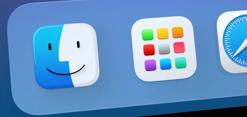
Here’s how the finder icon has changed so far:
到目前为止,查找器图标的更改方式如下:

The icon is definitely simplified, and it’s lost it’s rectangular shape becoming uniform with the rest of the heavily rounded squares. The smile is thinner for some reason (it’ll likely change) but the angle of it is also different to make it even more friendly.
该图标绝对经过简化,并且丢失了矩形形状,其余的圆角正方形变得均匀了。 由于某种原因,微笑会变得更稀疏(可能会改变),但微笑的角度也会有所不同,以使其更加友好。
The Mac OS toolbar icons are also becoming more uniform with typical iOS / iPad OS icons. The icon style is once again rounded, friendly and open. The strokes are thick enough to be easy to understand and icons don’t have any unnecessary decorations.
Mac OS工具栏图标也变得与典型的iOS / iPad OS图标更加一致。 图标样式再次变得圆润,友好和开放。 笔触足够厚,易于理解,并且图标没有任何不必要的装饰。

拟态? (Skeuomorphism?)
Mac OS has been one of the last bastions of Skeuomorphic elements. Well now they’re being merged into a new-skeuomorphism and combined with modern, flat surfaces. It gives the OS that modern new look, but also keeps it grounded with it’s own style.
Mac OS已经成为拟态元素的最后堡垒之一。 现在,它们已被合并为新的拟同构词,并与现代的平坦表面相结合。 它为OS赋予了现代的新外观,同时还使其以自己的风格为基础。
It’s likely a middle-ground before a more minimal redesign comes along. After all we like what we believe is familiar, so a radical change could’ve been received like iOS 7 was.
在进行更少量的重新设计之前,这可能是中间立场。 毕竟,我们喜欢我们认为熟悉的东西,因此可以像iOS 7一样收到根本性的改变。

其他 (Others)
Previous Mac OS versions also brought Dark Mode and San Francisco (font) from the mobile OS. Now Apple Design system is very close to being consistent across all their platforms.
先前的Mac OS版本还从移动OS中引入了Dark Mode和San Francisco(字体)。 现在,Apple Design系统几乎可以在所有平台上保持一致。
San Francisco is a modern, sans-serif typeface that proves once again that simple is great.
旧金山是一种现代的无衬线字体,再次证明简单是一件很了不起的事情。
This whole redesign also proves, that a company with millions of users is likely pushing the UI in the general direction that works.
整个重新设计还证明,拥有数百万用户的公司很可能将UI推向可行的总体方向 。
Things like rounded corners, soft shadows and delicate gradients are here to stay.
圆角,柔和阴影和微妙的渐变之类的东西都将保留下来。

Sure, a product designed to work for “all humans” will need to follow the most common-ground friendly guidelines. That doesn’t mean we should use those same rules in everything we do.
当然,旨在为“所有人”工作的产品将需要遵循最常见的地面友好准则。 这并不意味着我们在所有操作中都应使用相同的规则。
If you’re making a highly specialised, niche product, you can still use sharp corners, fully opaque layers and so on.
如果您要生产高度专业化的利基产品,则仍可以使用尖角,完全不透明的图层等。
But I don’t believe Apple didn’t do their homework. They surely did extensive research on what most people like, and it happens to be the trend that’s been gaining momentum for a while now: Modern, Soft-UI.
但是我不相信苹果没有做功课。 他们肯定对大多数人喜欢的东西进行了广泛的研究,而恰恰是这种趋势已经流行了一段时间: 现代的Soft-UI。
Check out our 📕 Designing User Interfaces book. You can get 50 pages for free 👉 here. You can also watch some of my 🍒 YouTube design, or check out my agency :-)
查看我们的📕 设计用户界面一书。 您可以在这里免费获得50页 👉 。 您也可以观看我的某些YouTube设计 ,或查看我的代理商 :-)
翻译自: https://uxdesign.cc/how-apple-makes-soft-ui-the-future-9f3ac69eea6f
苹果风格ui


 996
996

 被折叠的 条评论
为什么被折叠?
被折叠的 条评论
为什么被折叠?
 到【灌水乐园】发言


