


ios macos
重点 (Top highlight)
With the introduction of iOS 14 and macOS Big Sur, we are the witness of the next big thing in UI Design. Changes are not so revolutionary like in iOS 7 years before, but they undoubtedly present the trend UI Designers will follow in the future…
随着iOS 14和macOS Big Sur的推出,我们见证了UI设计中的下一个重大事件。 改变并不像7年前的iOS那样具有革命性,但无疑,它们呈现了UI设计人员未来将遵循的趋势…
…and it won’t be Neuomorphism. 😉
……这不会是神经同质 。 😉
平面设计不再是趋势 (Flat Design is No Longer A Trend)
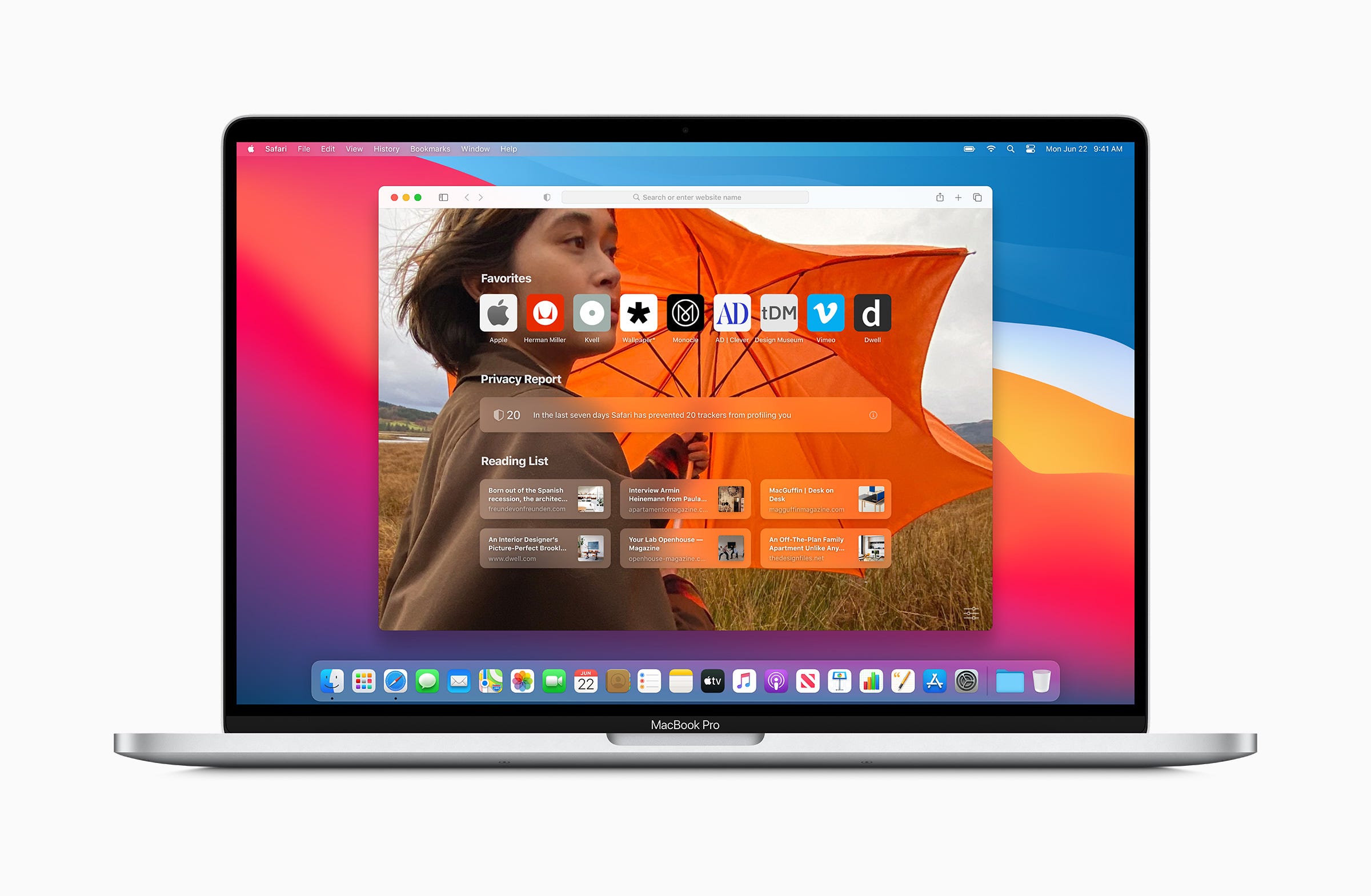
Let’s make it clear — minimalistic does not mean flat. Some people tend to use these terms as one thing. New Apple Operating Systems remain minimalistic, but their appearance gains more shadows, textures, and 3d shapes.
让我们说清楚-简约并不意味着扁平。 有些人倾向于将这些术语当作一件事。 新的Apple操作系统保持极简主义,但是它们的外观获得更多阴影,纹理和3d形状。
Like Alan Dye, VP Human Interface at Apple said: “Depth, Shading and Translucency are used to create the hierarchy. New materials are rich and vibrant….”
就像苹果人机界面副总裁艾伦·戴(Alan Dye)所说: “深度,阴影和半透明性用于创建层次结构。 新材料丰富而充满活力……”
Apple reduces visual complexity and makes the design even more minimalistic. Some elements are flatter, but the feel is the opposite. Both iOS and macOS brings more 3d dimensions to their user experience.
Apple降低了视觉复杂性,并使设计更加简约。 有些元素比较扁平,但感觉却相反。 iOS和macOS都为其用户体验带来了更多3D尺寸。
👋 Tip for Designers: Think how minimalism may gain space in your design. Observe how simple effects (shadows, translucency) build visual hierarchy.
for设计师提示: 考虑极简主义如何在您的设计中获得空间。 观察简单的效果(阴影,半透明)如何建立视觉层次。
新的微妙功能 (New Subtle Affordances)
The human brain needs a hint to recognize the object. We tend to perceive 3d objects as interactive ones. That’s why lots of buttons still have a shadow.
人脑需要一个提示来识别物体。 我们倾向于将3d对象视为交互式对象。 这就是为什么许多按钮仍带有阴影的原因。
However, motion is also an additional clue. Apple designers know that and the macOS toolbar icons lost their shapes to remove visual complexity. But, when a user drags the cursor around, their background highlights and encourage them to press the action.
但是, 运动还是另外一条线索。 苹果设计师知道,macOS工具栏图标失去了形状以消除视觉复杂性。 但是,当用户在周围拖动光标时,他们的背景会突出显示并鼓励他们按下操作。
The last obvious affordance is color. Apple wants designers to use Tint (or Accent) color to make active elements more visible. This tone should reflect the brand or product color. Thanks to this user immediately build a mental connection between the company and the application.
最后一个明显的负担是颜色。 苹果希望设计师使用色调(或口音)颜色来使活动元素更加可见。 此色调应反映品牌或产品颜色。 多亏了该用户,才能立即在公司和应用程序之间建立精神联系。
👋 Tip for Designers: Don’t be afraid of not highlighting all options. Not every button needs to have a shape. It may appear when a user hovers over its surface. Experiment with tints and remove visual complexity where it is possible.
Designer设计师提示: 不要担心没有突出显示所有选项。 并非每个按钮都需要具有形状。 当用户将鼠标悬停在其表面上时,它可能会出现。 尝试色调,并尽可能消除视觉上的复杂性。

制作数字资料 (Crafting in digital materials)
It has begun with Material Design from Google that showed us the vision of digital paper, then Microsoft introduced Fluent Design with the concept of multiple digital textures. It looks like Apple followed that, what’s more they moved it to the next level!
从Google的Material Design开始,向我们展示了数字纸的愿景 ,然后Microsoft引入了Fluent Design,它具有多种数字纹理的概念。 看起来苹果公司紧随其后,而且他们将其提升到了一个新的高度!
It is a great decision because digital Materials are more pleasant to our minds than raw pixelated squares. They make User Interface more human friendly.
这是一个很好的决定,因为数字材料比原始像素正方形更令人愉悦。 它们使用户界面更加人性化。
👋 Tip for Designers: Play with the concept of digital material. Use depth, shadows, and translucency to create visual hierarchy. If you are not yet familiar with Material Design or Fluent Design System, read their guidelines to understand the concept.
for设计师提示: 发挥数字材料的概念。 使用深度,阴影和半透明来创建视觉层次。 如果您还不熟悉 Material Design 或 Fluent Design System ,请阅读他们的指南以了解概念。

微妙的效果营造了质量意识 (Subtle Effects Build The Sense of Quality)
There are tiny details that make a difference. You cannot see all of them from mockups or screenshots, because some of them are motion or sound (yeah, Big Sure introduces dozens of new and enhanced UI sounds).
有一些微小的细节会有所作为。 您无法从模型或屏幕截图中看到所有这些声音,因为其中一些声音或声音(是的,Big Sure引入了数十种新的和增强的UI声音)。
The thing that is primarily visible to Designers is the next generation of blur effect — called Progressive blur. It is about making the gradient of blur levels instead of hiding it below opacity or shadow.
设计师最主要看到的是下一代模糊效果-称为渐进模糊 。 这是关于使模糊级别渐变,而不是将其隐藏在不透明度或阴影下。
👋 Tip for Designers: See where and how Progressive Blur is used around the new OS. Think about how it may be applied in your designs. Which design tools may achieve that effect now?
Designer设计者提示: 了解在新OS的何处以及如何使用渐进式模糊。 考虑一下如何将其应用到您的设计中。 哪些设计工具现在可以达到这种效果?
“Depth, Shading & Translucency are used to create the hierarchy.”
“深度,阴影和半透明性用于创建层次结构。”
– Alan Dye
–艾伦·戴(Alan Dye)
图标中的新拟态 (New Skeumorphism in Icons)
In the last years, the macOS style was flattening the app icons and surrounded the symbols with mainly circular shapes. This has changed. Now the majority of icons gained “iOS-like” shape, but it is not flat. It is Skeuomorphic!
在过去的几年中,macOS风格使应用程序图标扁平化,并以圆形符号围绕符号。 这已经改变了。 现在,大多数图标都具有“类似于iOS的形状”,但它并不平坦。 这是拟态的!
Personally, I think that lots of new icons in the macOS look stunning, but some are not designed so well (for example Stock app icon).
我个人认为,macOS中的许多新图标看起来都很漂亮,但有些图标的设计不是那么好(例如Stock应用程序图标)。
👋 Tip for Designers: Explore the gallery of the new icons. See how additional shadows and gradients change the feeling of flat iOS icons that perfectly fits the Big Sur icon style. Consider using 3D shapes for some elements.
Designer设计师提示: 浏览新图标的库。 了解其他阴影和渐变如何改变完全适合Big Sur图标样式的平面iOS图标的感觉。 考虑对某些元素使用3D形状。

使用小部件显示即时信息 (Show Immediate Information with Widgets)
iOS 14 brings a totally new approach to widgets. They are displayed directly in a Home Screen. These widgets look almost identical on iPad OS and very similar to the new ones on macOS Big Sur.
iOS 14为小部件带来了全新的方法。 它们直接显示在主屏幕中。 这些小部件在iPad OS上看起来几乎相同,并且与macOS Big Sur上的新部件非常相似。
Apple recommends us to focus the widget on one idea. To display only the information that’s is related to it, nothing more. It is also important to display dynamic information that is changing through time because the widget should not only encourage to open the app.
Apple建议我们将小部件集中在一个想法上。 仅显示与之相关的信息,仅此而已。 显示随时间变化的动态信息也很重要,因为小部件不仅应鼓励打开应用程序。
👋 Tip for Designers: Think which information from your app is the most important to the users. This type of content may be a foundation of a useful widget. Try to experiment with the new dimensions (Small, Medium, and Large) of widgets displayed directly in the Home Screen. Remember, to support Dark Mode!
Designer设计者提示: 考虑您应用中的哪些信息对用户来说最重要。 这种类型的内容可能是有用的小部件的基础。 尝试尝试直接在主屏幕中显示的小部件的新尺寸(小,中和大)。 记住,要支持黑暗模式!

整体生态系统方法 (Holistic Approach to The Ecosystem)
All Apple Systems iOS, iPadOS, macOS even watchOS works as a single ecosystem. They have got the same font, iconography, and almost identical visual styles.
所有Apple Systems iOS,iPadOS,macOS甚至watchOS都可以作为单个生态系统工作。 他们具有相同的字体,图标和几乎相同的视觉样式。
Consistency gives the user a feeling of familiarity and confidence. It builds more trust and a better connection with the brand.
一致性使用户感到熟悉和自信。 它建立了更多的信任并与品牌建立了更好的联系。
👋 Tip for Designers: If you are creating an omnichannel solution, available to all kinds of devices, observe how Apple apps change through platforms. Where is the consistency maintained? Where are the changes made? What features are added to different platforms? You may also want to read Task Driven Design to know more.
Designer设计人员提示: 如果要创建可用于所有设备的全渠道解决方案,请观察Apple应用程序如何在平台之间发生变化。 哪里保持一致性? 在哪里进行更改? 哪些功能已添加到不同的平台? 您可能还想 阅读“任务驱动设计”以了解更多信息 。
The official Human Interface Guidelines are always the best source for deep analysis of the new style and features. Feel free to read them here:
官方的人机界面指南始终是深入分析新样式和功能的最佳来源。 随时在这里阅读它们:
Apple introduced lots of new inspiring things. While widgets, clips, and Progressive Blur in iOS 14 bring a lot of fresh experience to the mobile OS — it is the Big Sure that revolutionizes the way we use our macs. Even with its name — did you notice that it is named macOS 11?
苹果推出了许多新的启发性的东西。 尽管iOS 14中的小部件,剪辑和渐进式模糊为移动操作系统带来了很多新鲜体验,但是Big Sure彻底改变了我们使用Mac的方式。 即使使用它的名称-您是否注意到它的名称为macOS 11 ?
Observing how digital systems evolve and impact design is my passion. I also create time-saving 🧰 UX Resources and write ✍️ UI Design Tutorials. The article originally published on my blog. Thanks for reading!
我热衷于观察数字系统如何发展和影响设计。 我还创建了省时的🧰UX 资源,并编写了✍️UI 设计教程 。 该文章最初发表在我的博客上 。 谢谢阅读!
翻译自: https://uxdesign.cc/what-can-designers-learn-from-ios-14-and-macos-big-sur-bab6e188ba4e
ios macos


 869
869

 被折叠的 条评论
为什么被折叠?
被折叠的 条评论
为什么被折叠?
 到【灌水乐园】发言


