


ios uikit
Storyboards are a native way to make iOS user interfaces. Recently Apple has introduced SwiftUI, which is supposed to replace UIKit (which is used in storyboards), but currently, most iOS apps still use storyboards.
故事板是制作iOS用户界面的本机方法。 最近,苹果公司推出了SwiftUI,它应该替代UIKit(用于情节提要),但目前,大多数iOS应用仍使用情节提要。
Storyboards can be edited only in Xcode; it’s a proprietary file format. Logically, it’s a set of nibs, small pieces of UI — app screens, reusable cells, etc. They also declare connections between app screens — segues.
情节提要只能在Xcode中进行编辑; 这是专有文件格式。 从逻辑上讲,它是一组笔尖,一小部分UI(应用程序屏幕,可重复使用的单元格等)。它们还声明了应用程序屏幕之间的连接(segue)。
In-app package storyboards are compiled into storyboardc files. It makes and iPhone or iPad parse them fast and effectively.
应用内打包情节提要板被编译为storyboardc文件。 它使iPhone或iPad可以快速有效地解析它们。
The biggest disadvantage of storyboards is that they can be edited only in Xcode. Unlike SwiftUI layouts, storyboards can’t be edited manually (well, they can, but it’s strongly not recommended).
故事板的最大缺点是只能在Xcode中进行编辑。 与SwiftUI布局不同,情节提要不能手动编辑(可以,但是可以强烈建议不要这样做)。
This disadvantage leads to another one — UI editing is not perfect. Some features can’t be edited in the storyboard editor but must be edited in the code. For example, such features as shadows, gradients, and rounded corners need to be added in the code or… Let’s talk about this or.
这个缺点导致另一个缺点-UI编辑不是完美的。 某些功能无法在情节提要板编辑器中进行编辑,但必须在代码中进行编辑。 例如,需要在代码中添加诸如阴影,渐变和圆角之类的功能,或者……让我们来谈谈这个或 。
圆角,内容裁剪和边框 (Rounded Corners, Content Cropping, and Borders)
Each view in UIKit is a subclass of UIView. And each UIView has one or more layers. Layers can’t be directly edited in the storyboard editor. But layers are exactly what define such properties as rounded corners, content cropping, and borders.
UIKit中的每个视图都是UIView的子类。 每个UIView都有一层或多层。 不能在情节提要编辑器中直接编辑图层。 但是图层正是定义了诸如圆角,内容裁剪和边框之类的属性的东西。
All we need to do is to make them editable using the@IBInspectable property.
我们需要做的就是使用@IBInspectable属性使它们可编辑。
To make it work with UIView and all its subclasses (which means with all views), we can create an extension.
为了使其能够与UIView及其所有子类(意味着与所有视图一起使用),我们可以创建一个扩展。
The CGColor extension is just a simple extension allowing to convert it into UIColor without any headache. Layers work with CGColor, but storyboards “prefer” UIColor.
CGColor扩展只是一个简单的扩展,可以轻松将其转换为UIColor 。 图层与CGColor一起CGColor ,但情节CGColor “更喜欢” UIColor 。
The UIView extension allows you to edit:
UIView扩展允许您编辑:
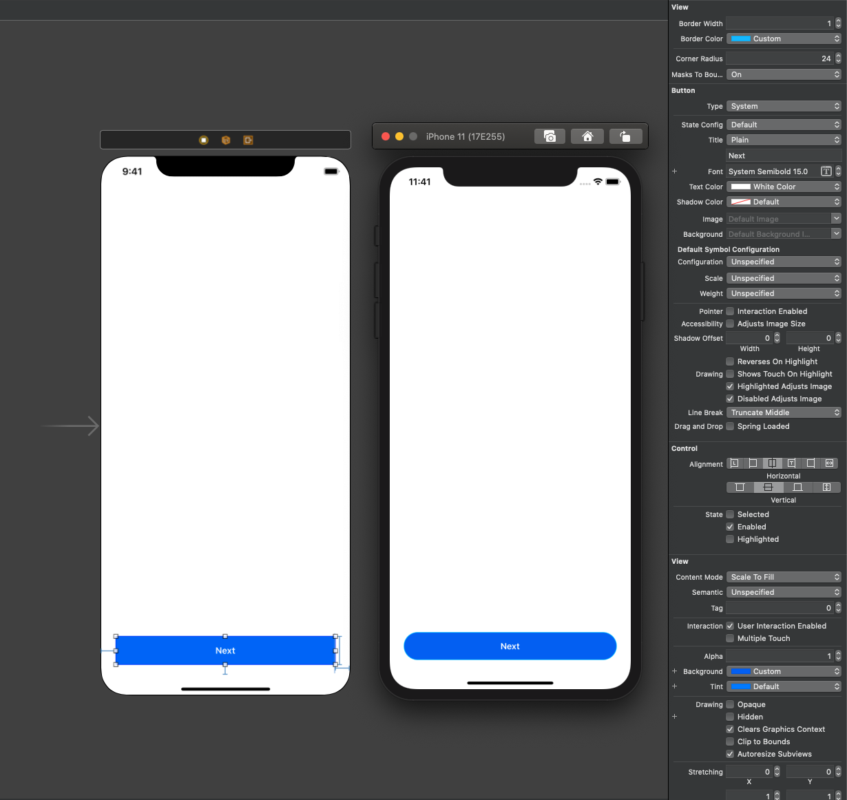
borderWidthdefines border width. 0 (default) means no border. Any positive value creates a border (as long asborderColoris defined and not transparent).borderWidth定义边框宽度。 0(默认)表示没有边框。 任何正值都会创建边框(只要定义了borderColor并且不透明)。borderColordefines the color of a border.borderColor定义边框的颜色。cornerRadiusmakes rounded corners when it’s defined and more than zero.cornerRadius定义后会形成圆角,且大于零。masksToBoundscrops content outside the layer.masksToBounds在图层外部masksToBounds内容。
Let’s look at a couple of examples (see screenshots below):
让我们看几个示例(请参见下面的屏幕截图):
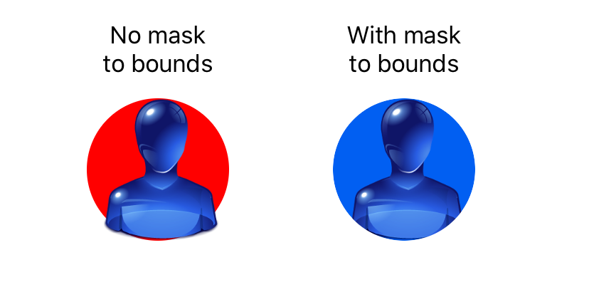
In this picture, there are two UIImageViews with the same transparent PNG, but with different background colors and different masksToBounds. As you can see in the previous screenshot, the masksToBounds attribute affects content but doesn’t affect background.
在此图片中,有两个UIImageViews具有相同的透明PNG,但具有不同的背景颜色和不同的masksToBounds 。 如上图所示, masksToBounds属性影响内容,但不影响背景。
Undertow (Shadows)
A simple rectangular shadow is hardly a problem, but as we want rounded corners, we need to use UIBezierPath to shape our shadow.
一个简单的矩形阴影几乎不是问题,但是由于我们需要圆角,因此需要使用UIBezierPath来成形阴影。
Another problem is that attributes are applied in random order. Well, it’s not completely random, but we can’t be sure that the object will be placed and sized before we create a shadow.
另一个问题是属性是以随机顺序应用的。 好吧,它不是完全随机的,但是我们不能确定在创建阴影之前对象的放置和大小。
Let’s look at the code first:
让我们先看一下代码:
Our shadow is an extension, which means that we can apply it to any UIView subclass. In this example, it’s more a dark glow than a shadow, but with different shadowOffset it will look more shadowy.
我们的影子是一个扩展,这意味着我们可以将其应用于任何UIView子类。 在此示例中,它比阴影更暗,但是阴影阴影shadowOffset不同,则阴影看起来更暗。
Why do we need the updateShadows method? To update all our shadows when the layout is changed! It can be a rotation of the screen, animations and dynamic layout changes, keyboard appearing/disappearing, etc.
为什么我们需要updateShadows方法? 在更改布局时更新所有阴影! 它可以是屏幕的旋转,动画和动态布局的更改,键盘的出现/消失等。
To make it work correctly, we need to add the code below to all our view controllers. The easiest way is to make some common base class for all of them:
为了使其正常工作,我们需要将以下代码添加到所有视图控制器中。 最简单的方法是为所有这些对象创建一些通用的基类:
override func viewDidLayoutSubviews() {super.viewDidLayoutSubviews()
    view.updateShadows()
}
This is how it looks:
看起来是这样的:
Two final notes:
最后两个注意事项:
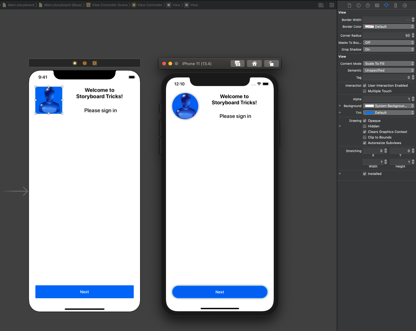
Shadows are not compatible with
masksToBoundsattribute. Mask simply cuts the shadow from the view. If you need to crop content and add a shadow at the same time, add another view, like in the screenshot earlier above.阴影与
masksToBounds属性不兼容。 遮罩只是从视图中剪切阴影。 如果需要裁剪内容并同时添加阴影,请添加另一个视图,如上面的屏幕截图所示。- Don’t add shadows to views with a transparent or partially transparent background; otherwise, you’ll see it through your view. 不要在背景透明或部分透明的视图中添加阴影; 否则,您将通过视图看到它。
UITextField填充 (UITextField Paddings)
If you add UITextField with standard styles, you’ll have a little padding on the left and right sides. But I don’t remember a single case when a client provided me with a design with a standard UITextField look. As soon as we remove the standard border, we get a problem — the text field has no padding. With a frame, shadow, rounded corner, and other effects, it doesn’t look good. Even more, rounded corners can cut some text.
如果您使用标准样式添加UITextField ,则左侧和右侧会有一些填充。 但是我不记得有一个案例,当客户为我提供具有标准UITextField外观的设计时。 删除标准边框后,我们会遇到问题-文本字段没有填充。 具有框架,阴影,圆角和其他效果,效果不好。 甚至更多,圆角可以剪切一些文本。
This problem can be solved with changing insets. We can’t change them in a standard way. We can only create a custom class, a subclass of UITextField:
可以通过更改插图解决此问题。 我们无法以标准方式更改它们。 我们只能创建一个自定义类,它是UITextField的子类:
This class allows you to edit padding on the left and right sides. You can add top and bottom paddings, but it’s usually not necessary.
此类允许您编辑左侧和右侧的填充。 您可以添加顶部和底部填充,但是通常没有必要。
For storyboards, there’s a difference between view subclasses and extensions. In both cases, attributes appear in the Attributes inspector (panel on the right side of the Xcode window). But when you subclass a view, you’ll probably see the result right in the storyboard editor, otherwise only when the app is running.
对于情节提要,视图子类和扩展之间是有区别的。 在这两种情况下,属性都显示在“属性”检查器中(Xcode窗口右侧的面板)。 但是,当您对视图进行子类化时,您可能会在情节提要板编辑器中直接看到结果,否则只能在应用程序运行时才能看到结果。
Unfortunately, the preview of custom views often fails. If you see a black screen instead of your layout, it’s probably the case.
不幸的是,自定义视图的预览通常会失败。 如果看到黑屏而不是布局,则可能是这种情况。
UITextView占位符 (UITextView Placeholder)
UITextField has a property called Placeholder. It can be changed in the storyboard, and as long as you’re not going to change its style, you don’t need to write any code. The situation with UITextView is different.
UITextField具有一个名为Placeholder的属性。 可以在情节提要中对其进行更改,并且只要您不打算更改其样式,就无需编写任何代码。 UITextView的情况有所不同。
In other words, we can’t add multi-line editable text fields in an iOS app with a placeholder right in the storyboard — unless we use custom views.
换句话说,除非使用自定义视图,否则我们无法在故事板中带有占位符的iOS应用程序中添加多行可编辑文本字段。
To add a placeholder to UITextView, I recommend you use a library: https://github.com/devxoul/UITextView-Placeholder.
要将占位符添加到UITextView ,建议您使用一个库: https : //github.com/devxoul/UITextView-Placeholder 。
To install it, add this line to your Pods:
要安装它,请将此行添加到您的Pod中:
pod 'UITextView+Placeholder'The library is written in Objective-C and is compatible with all versions of Swift.
该库是用Objective-C编写的,并且与所有版本的Swift兼容。
It allows you to add a simple attributed placeholder. A simple placeholder can be added right in the storyboard. Don’t forget to run pod install or pod update, and then build your project before editing your storyboard.
它允许您添加一个简单的属性占位符。 可以在情节提要中添加一个简单的占位符。 不要忘记运行pod install或pod update ,然后在编辑情节提要之前构建项目。
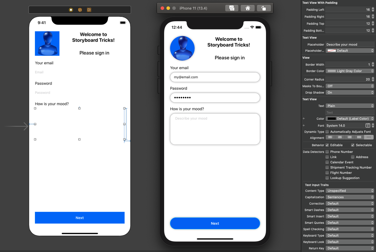
I haven’t explained yet how to make padding in UITextView (and its subclasses). It’s similar to UITextField, but instead of overriding some methods, you need to set a value, which is not editable in the storyboard by default:
我还没有解释如何在UITextView (及其子类)中进行填充。 它类似于UITextField ,但是您需要设置一个值,而不是覆盖某些方法,默认情况下,该值不能在情节提要中进行编辑:
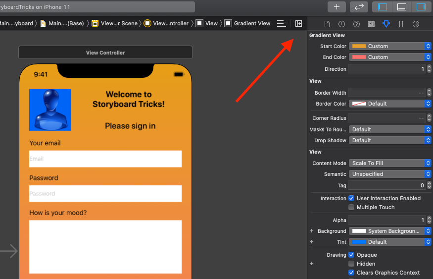
渐变色 (Gradients)
As I mentioned before, views in UIKit have one or more layers. Gradients can be implemented as an additional layer.
如前所述,UIKit中的视图具有一层或多层。 渐变可以实现为附加层。
Adding gradients to all views doesn’t make much sense. We can have problems with subviews inside complex views. Let’s create the simplest version — GradientView, a subclass of UIView. Then, if necessary, you can experiment with other views.
向所有视图添加渐变没有多大意义。 复杂视图中的子视图可能会出现问题。 让我们创建最简单的版本GradientView ,它是UIView的子类。 然后,如有必要,您可以尝试其他视图。
What we need to know about gradient:
我们需要了解的有关渐变的知识:
- Colors — At least two different colors, possibly more 颜色-至少两种不同的颜色,可能更多
- Direction — Horizontal, vertical or diagonal 方向-水平,垂直或对角线
Let’s go for a minimal implementation of only two colors (start and end) and only two direction options (horizontal and vertical):
让我们最小化实现仅两种颜色(开始和结束)和仅两种方向选项(水平和垂直)的实现:
When we have the source code, let’s add a gradient background to our project.
有了源代码后,让我们为项目添加渐变背景。
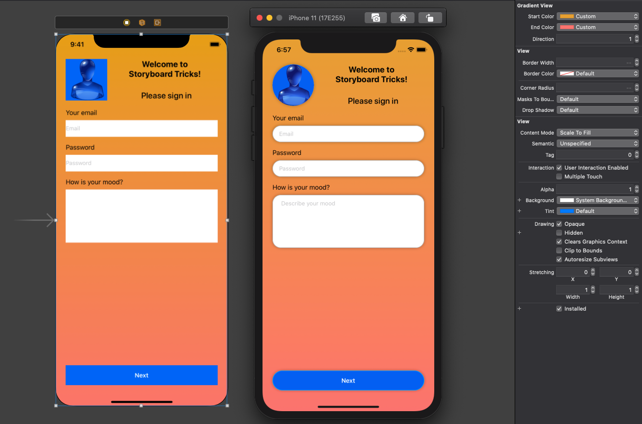
Enums can’t be integrated with the storyboard editor. That’s why we use integer constants: 0 for the horizontal gradient and 1 for the vertical.
枚举不能与情节提要编辑器集成。 这就是为什么我们使用整数常量的原因:水平渐变为0,垂直渐变为1。
Ugly? Absolutely! But the code works. I hope you have a better designer than I am :)
丑陋? 绝对! 但是代码有效。 我希望你有一个比我更好的设计师:)
快速创建插座和动作 (Fast Creation of Outlets and Actions)
This section doesn’t require any additional code but is just a hint about how to use Xcode more effectively. Many people know it, but not everyone.
本节不需要任何其他代码,而只是有关如何更有效地使用Xcode的提示。 很多人都知道,但不是所有人。
Outlets are references for our views inside UIViewController, UITableViewCell, UICollectionViewCell, or a custom UIView subclass. Using outlets, we can get and set properties of our views.
插座是UIViewController , UITableViewCell , UICollectionViewCell或自定义UIView子类中的视图引用。 使用出口,我们可以获取并设置视图的属性。
Actions are callbacks from interactive views, for example, buttons. Actions allow handling of button taps, text editing, changing the values of switches, and checkboxes.
操作是来自交互式视图的回调,例如按钮。 通过操作可以处理按钮的点击,文本编辑,更改开关的值和复选框。
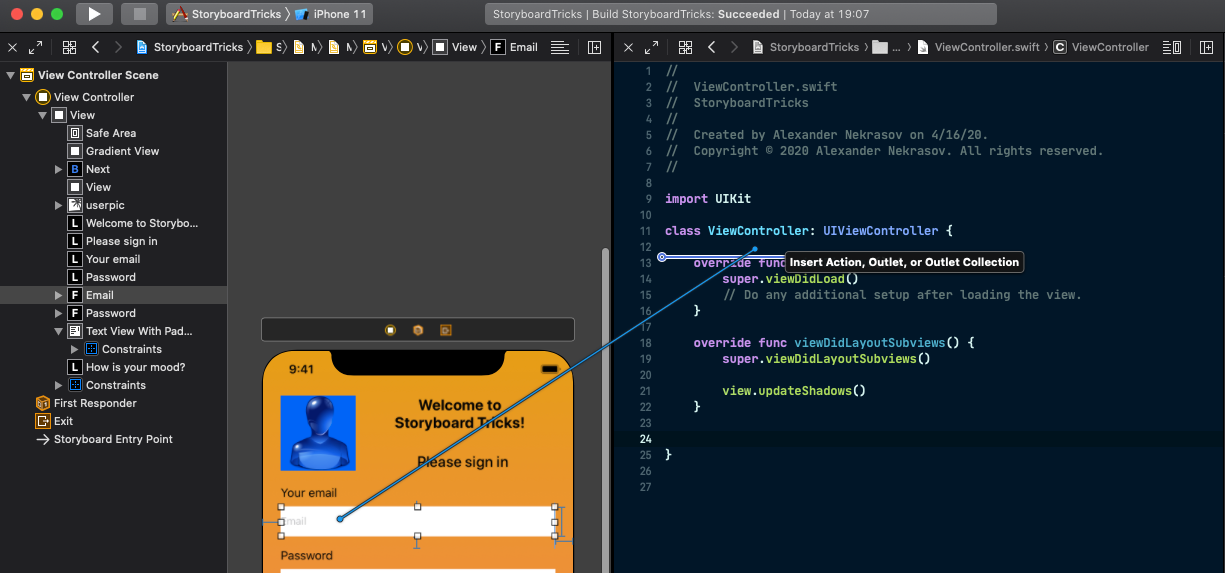
Let’s split Xcode into two horizontal panels. For this, click the “+” button on the top-right corner of the storyboard editor.
让我们将Xcode分成两个水平面板。 为此,请单击情节提要编辑器右上角的“ +”按钮。
Choose a source code file matching your selected view or view controller. Usually, it’s a subclass of UIViewController, UITableViewCell, or UICollectionViewCell. In our case, it will be ViewController.
选择与您选择的视图或视图控制器匹配的源代码文件。 通常,它是UIViewController , UITableViewCell或UICollectionViewCell的子类。 在我们的例子中,它将是ViewController 。
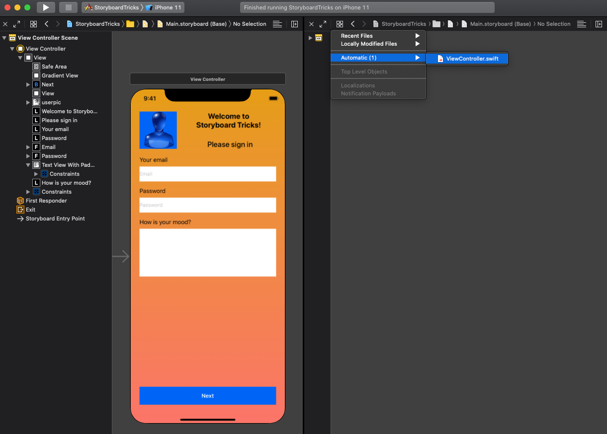
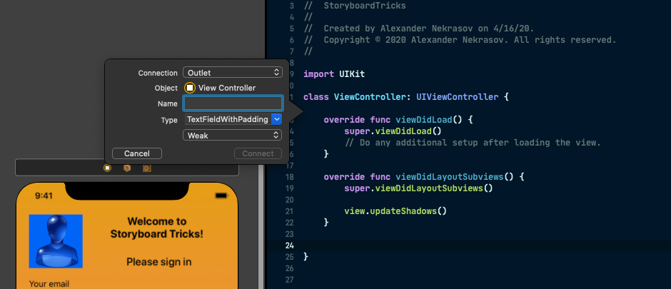
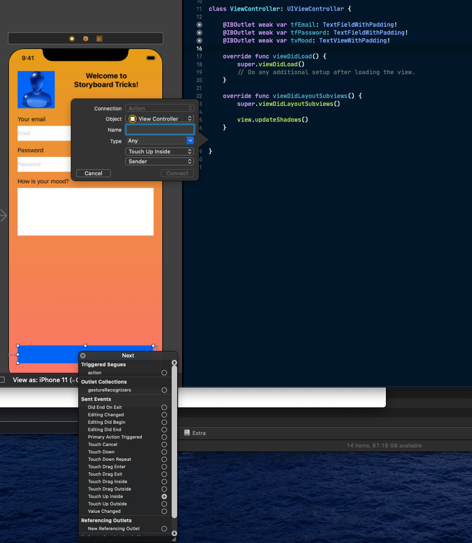
Find the view you need, hold the right mouse button (or Ctrl+button if you have a mouse with only one button), move the cursor to the source code file, and release it. Usually, Xcode makes a good guess about what you need. For UITextField, it will create an outlet. For UIbutton, it creates an action for a TouchUpInside event (which is technically a click/tap).
找到所需的视图,按住鼠标右键(如果鼠标只有一个按钮,则按住Ctrl +按钮),将光标移动到源代码文件,然后释放它。 通常,Xcode会很好地估计您的需求。 对于UITextField ,它将创建一个插座。 对于UIbutton ,它为TouchUpInside事件创建一个动作(从技术上来说是单击/点击)。
If you’re not happy with Xcode’s choice, you can always change it in the pop-up dialog.
如果您对Xcode的选择不满意,可以随时在弹出对话框中进行更改。
It’s the same with actions. Drag a button (or another interactive view) to the source code and you’ll get an action.
动作也一样。 将按钮(或另一个交互式视图)拖到源代码,您将获得一个动作。
That’s it! You can set delegates and data sources, and make other connections the same way.
而已! 您可以设置委托和数据源,并以相同方式进行其他连接。
结论 (Conclusion)
Storyboard editing can be much easier with several custom classes and extensions. You can get much more by adding some pods to your project.
使用多个自定义类和扩展,可以更轻松地进行情节提要板编辑。 通过向项目中添加一些吊舱 ,您可以获得更多。
If you liked these tricks, start using these 10 Useful Swift String Extensions in your iOS projects.
如果您喜欢这些技巧,请在您的iOS项目中开始使用这10个有用的Swift字符串扩展 。
See you next time. Happy coding!
下次见。 编码愉快!
翻译自: https://medium.com/better-programming/how-to-use-uikit-extensions-with-ios-storyboards-3a20fdccaac7
ios uikit


 821
821

 被折叠的 条评论
为什么被折叠?
被折叠的 条评论
为什么被折叠?
 到【灌水乐园】发言


